Embed Size (px)
Citation preview
Capturing and Retaining Users’ Interest
A Study in Managing Home Page Content
The Darim Online Learning NetworkSession #10 November 13 & 14, 2007
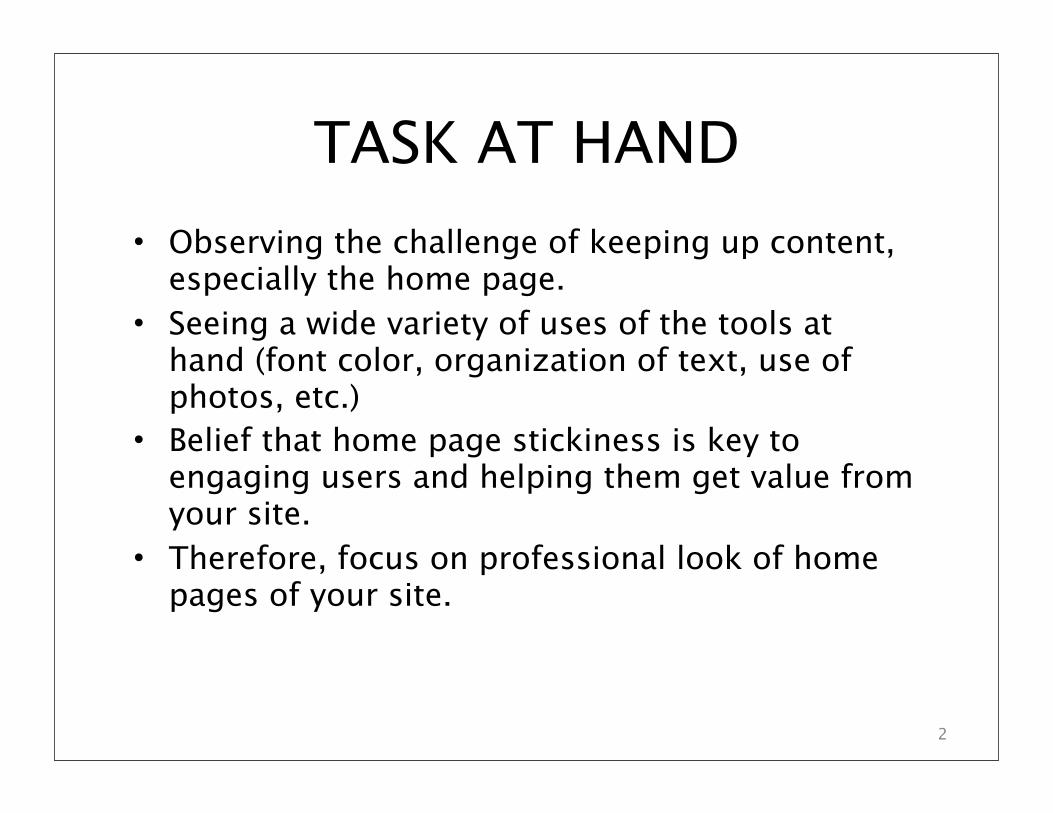
• Observing the challenge of keeping up content, especially the home page.
• Seeing a wide variety of uses of the tools at hand (font color, organization of text, use of photos, etc.)
• Belief that home page stickiness is key to engaging users and helping them get value fromyour site.
• Therefore, focus on professional look of home pages of your site.
TASK AT HAND
2
GOALS
3
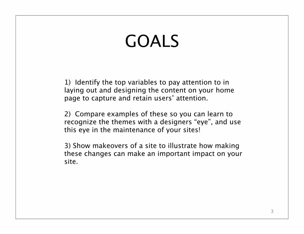
1) Identify the top variables to pay attention to in laying out and designing the content on your home page to capture and retain users’ attention.
2) Compare examples of these so you can learn to recognize the themes with a designers “eye”, and use this eye in the maintenance of your sites!
3) Show makeovers of a site to illustrate how making these changes can make an important impact on your site.
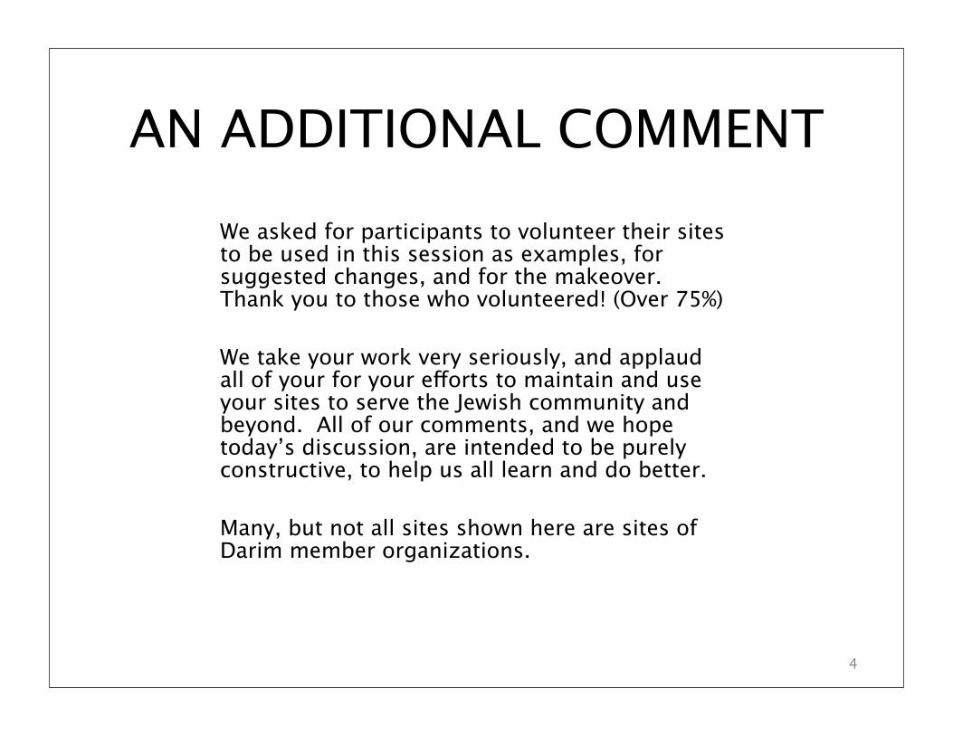
We asked for participants to volunteer their sitesto be used in this session as examples, for suggested changes, and for the makeover.Thank you to those who volunteered! (Over 75%)
We take your work very seriously, and applaud all of your for your e!orts to maintain and use your sites to serve the Jewish community and beyond. All of our comments, and we hope today’s discussion, are intended to be purely constructive, to help us all learn and do better.
Many, but not all sites shown here are sites of Darim member organizations.
AN ADDITIONAL COMMENT
4
SURVEY DATA
5
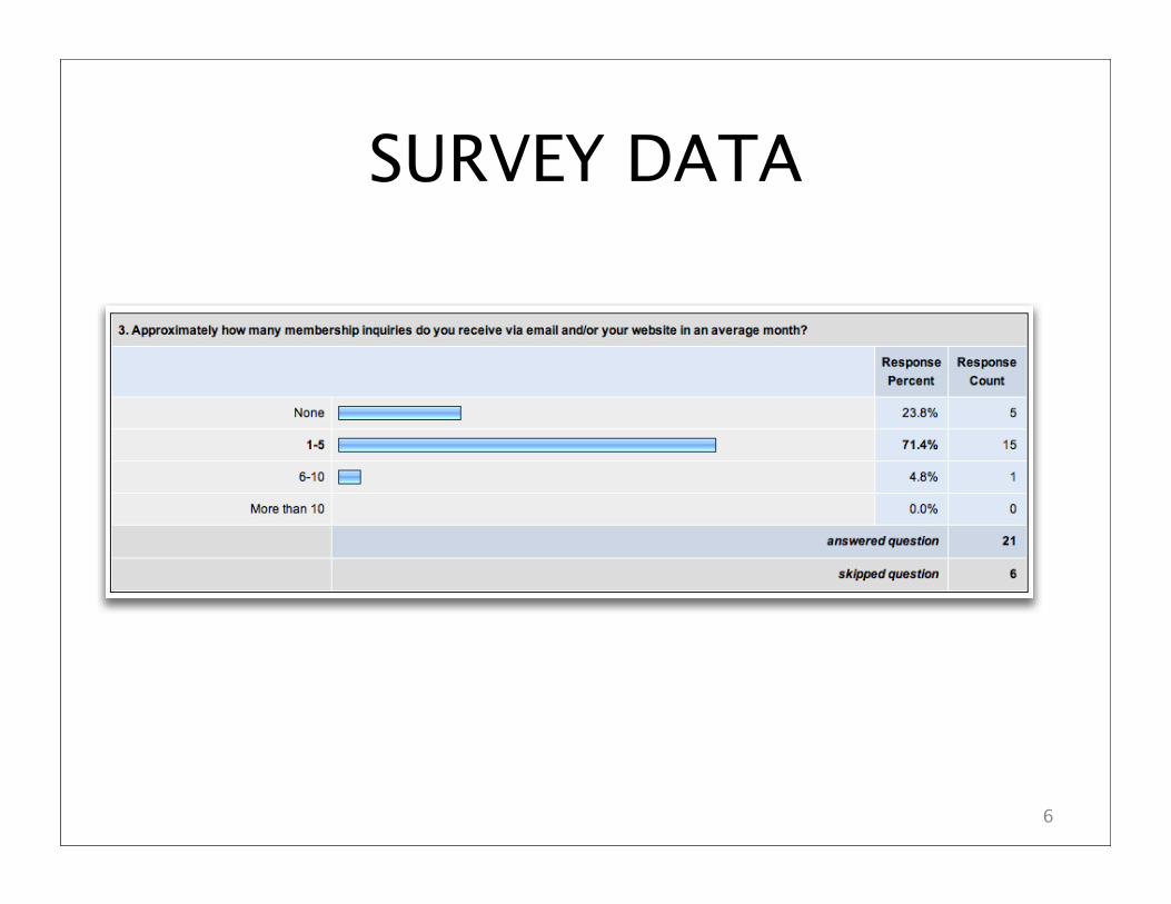
SURVEY DATA
6
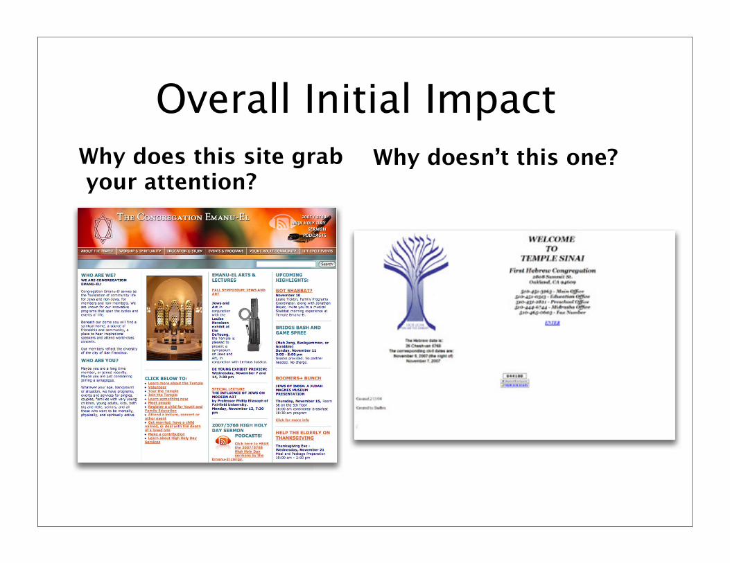
Overall Initial Impact
Why does this site grab your attention?
Why doesn’t this one?
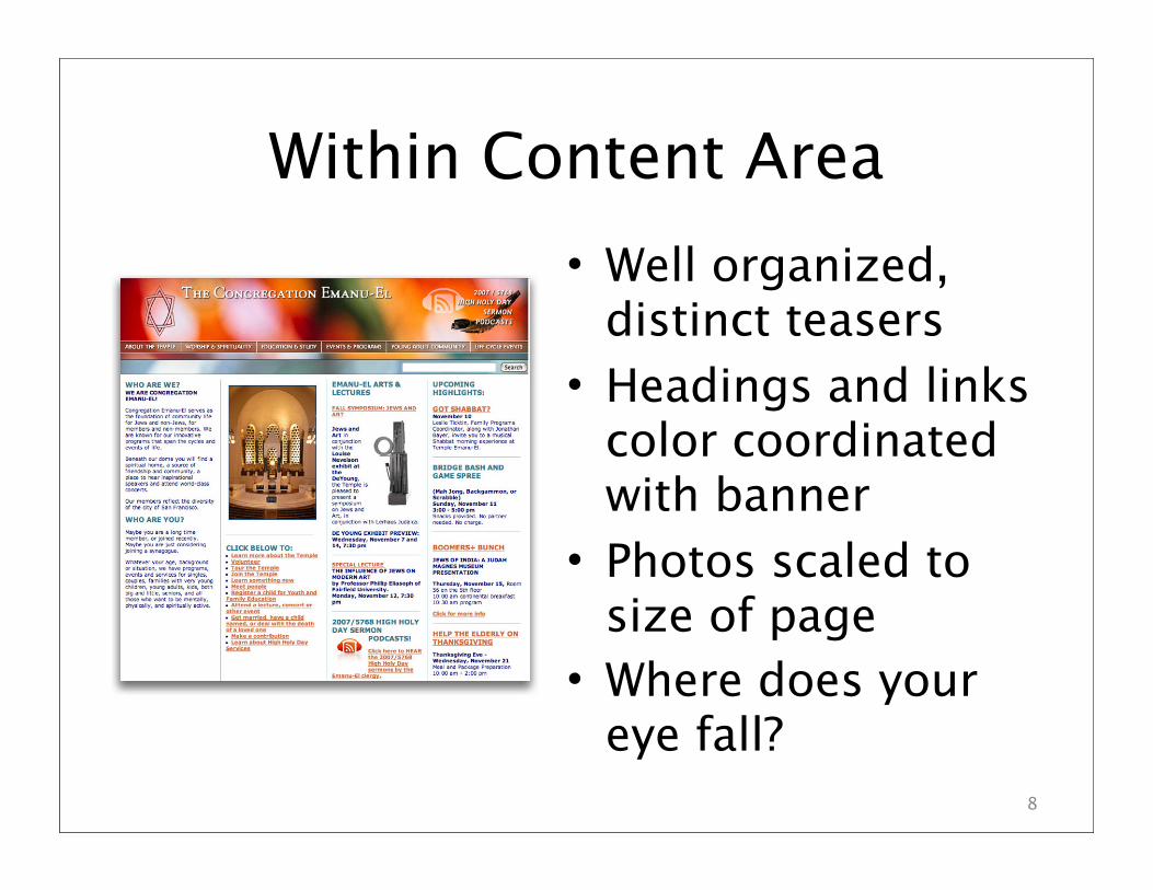
Within Content Area
• Well organized, distinct teasers
• Headings and links color coordinated with banner
• Photos scaled to size of page
• Where does your eye fall?
8
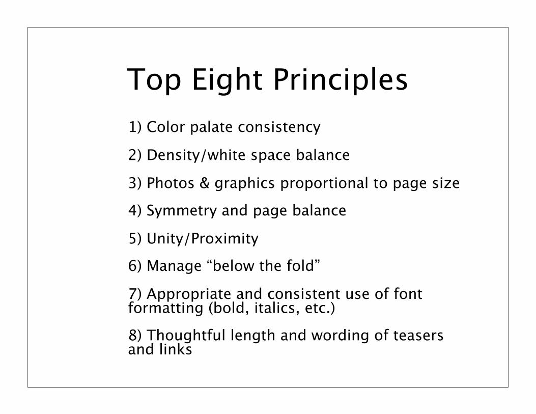
Top Eight Principles
1) Color palate consistency
2) Density/white space balance
3) Photos & graphics proportional to page size
4) Symmetry and page balance
5) Unity/Proximity
6) Manage “below the fold”
7) Appropriate and consistent use of font formatting (bold, italics, etc.)
8) Thoughtful length and wording of teasers and links
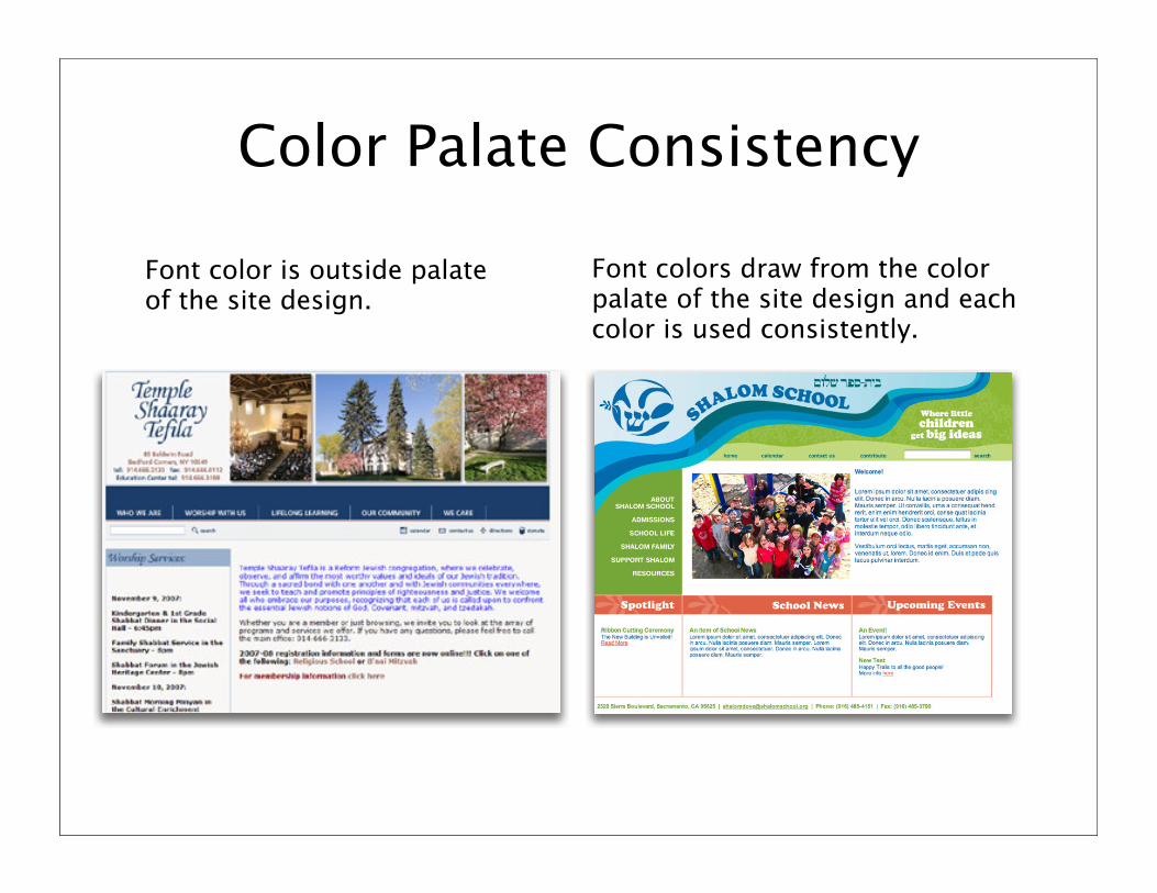
Color Palate Consistency
Font color is outside palate of the site design.
Font colors draw from the color palate of the site design and each color is used consistently.
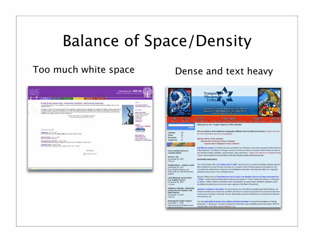
Balance of Space/Density
Too much white space Dense and text heavy
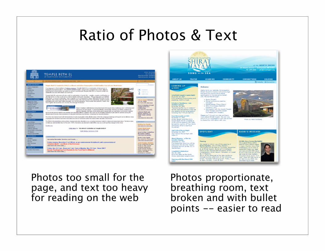
Ratio of Photos & Text
Photos too small for the page, and text too heavy for reading on the web
Photos proportionate, breathing room, text broken and with bullet points -- easier to read
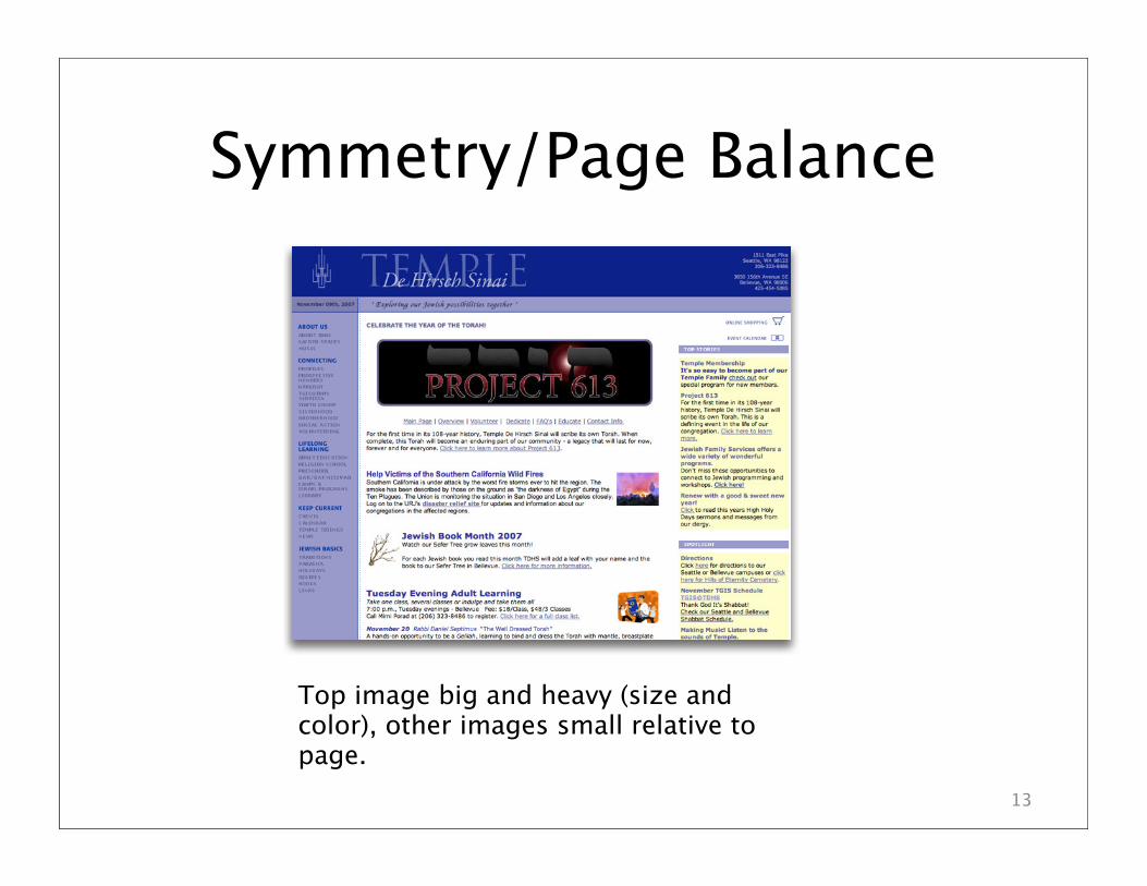
Symmetry/Page Balance
13
Top image big and heavy (size and color), other images small relative to page.
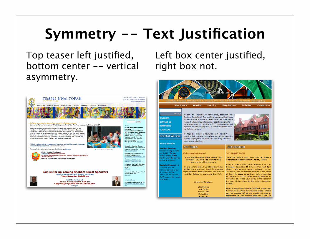
Symmetry -- Text Justification
Left box center justified, right box not.
Top teaser left justified, bottom center -- vertical asymmetry.
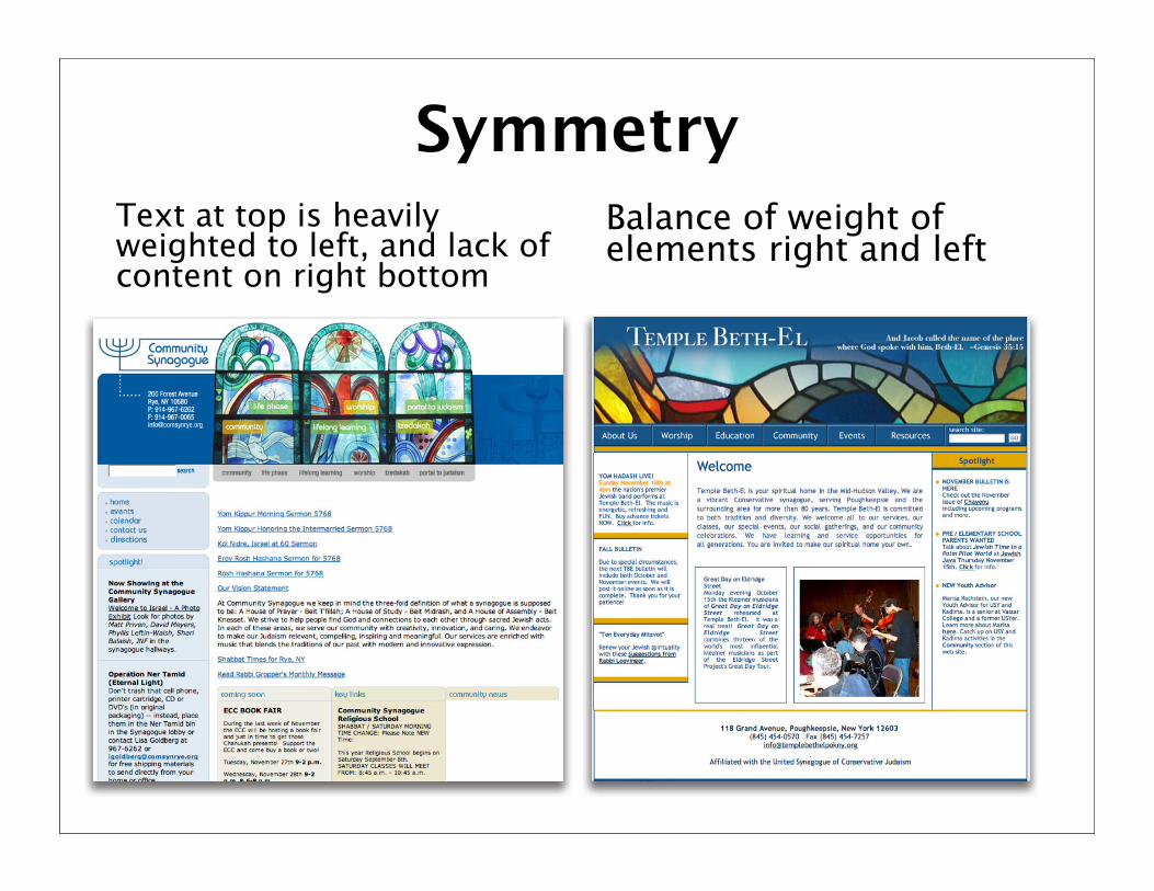
SymmetryText at top is heavily weighted to left, and lack of content on right bottom
Balance of weight of elements right and left
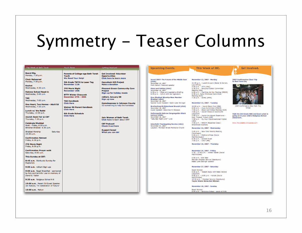
Symmetry - Teaser Columns
16
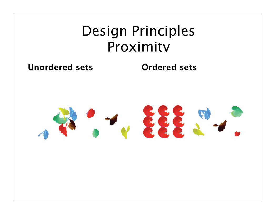
Design Principles Proximity
Unordered sets Ordered sets
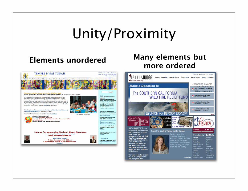
Unity/Proximity
Elements unordered Many elements but more ordered
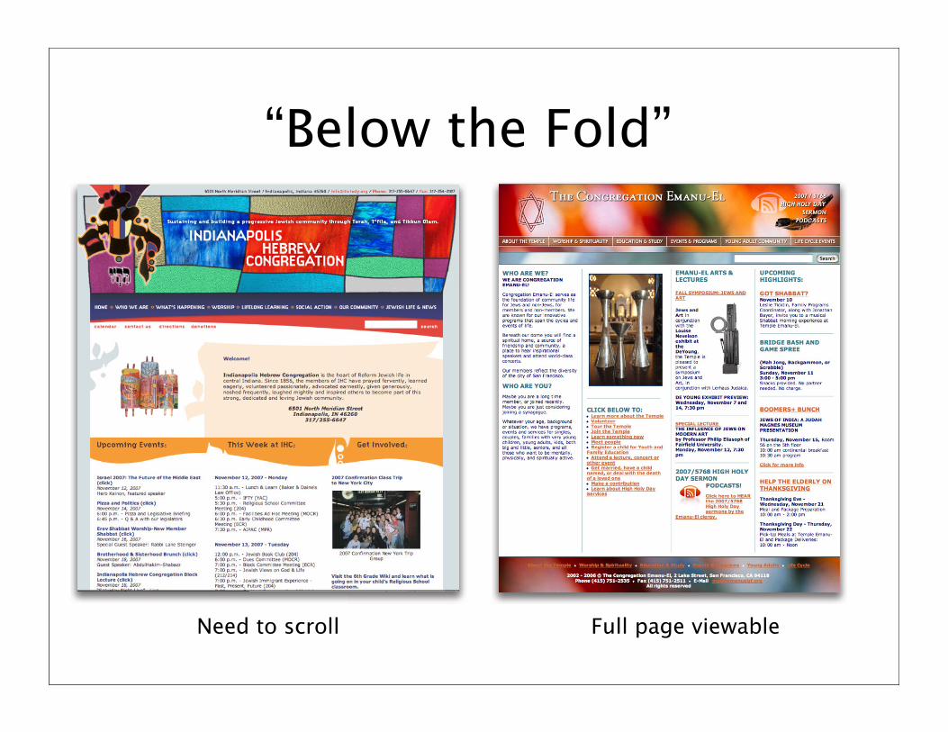
“Below the Fold”
Full page viewableNeed to scroll
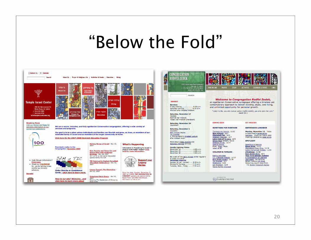
“Below the Fold”
20
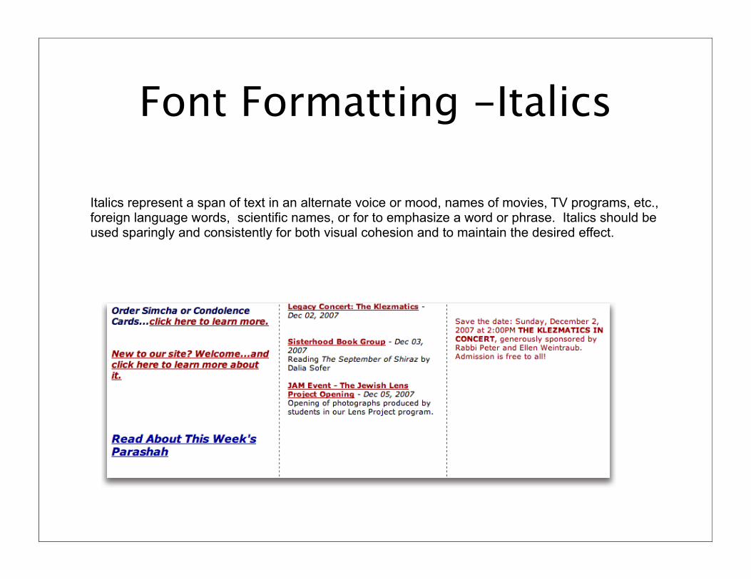
Font Formatting -Italics
Italics represent a span of text in an alternate voice or mood, names of movies, TV programs, etc.,foreign language words, scientific names, or for to emphasize a word or phrase. Italics should beused sparingly and consistently for both visual cohesion and to maintain the desired effect.
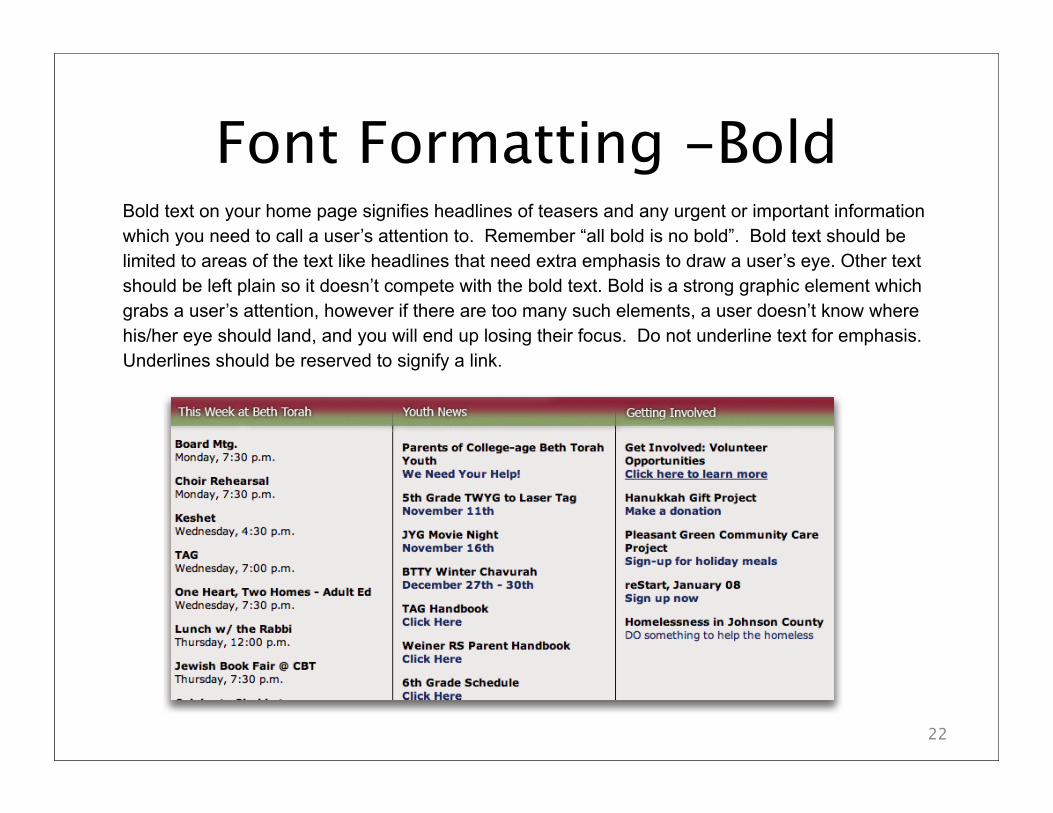
Font Formatting -Bold
22
Bold text on your home page signifies headlines of teasers and any urgent or important information
which you need to call a user’s attention to. Remember “all bold is no bold”. Bold text should be
limited to areas of the text like headlines that need extra emphasis to draw a user’s eye. Other text
should be left plain so it doesn’t compete with the bold text. Bold is a strong graphic element which
grabs a user’s attention, however if there are too many such elements, a user doesn’t know where
his/her eye should land, and you will end up losing their focus. Do not underline text for emphasis.
Underlines should be reserved to signify a link.
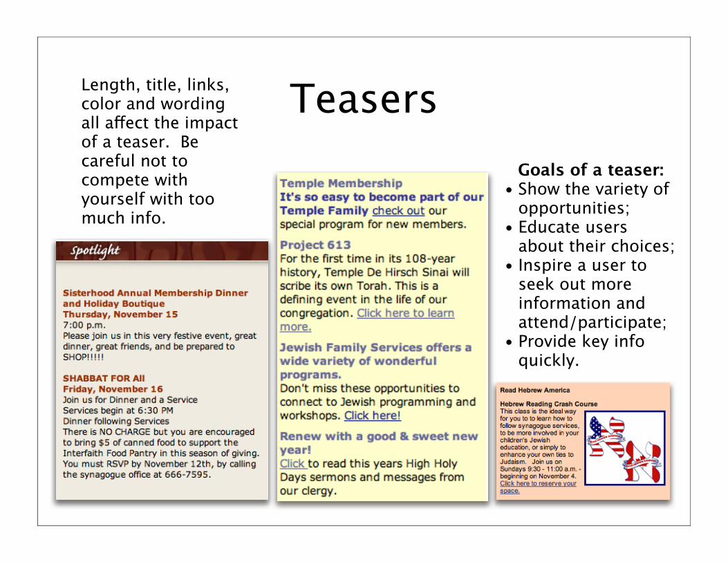
TeasersLength, title, links, color and wording all a!ect the impactof a teaser. Be careful not to compete with yourself with too much info.
Goals of a teaser:• Show the variety of
opportunities;• Educate users
about their choices;• Inspire a user to
seek out more information and attend/participate;
• Provide key info quickly.
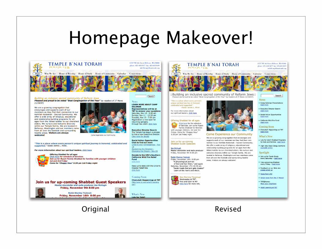
Homepage Makeover!
RevisedOriginal
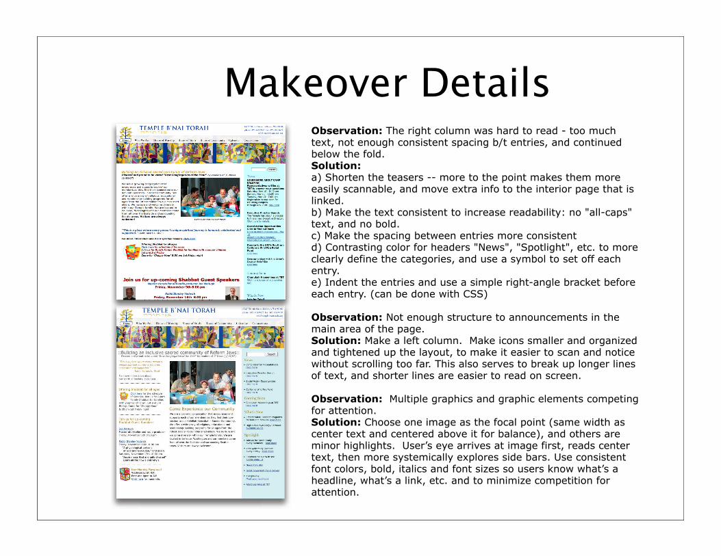
Makeover DetailsObservation: The right column was hard to read - too much text, not enough consistent spacing b/t entries, and continued below the fold.Solution:
a) Shorten the teasers -- more to the point makes them more easily scannable, and move extra info to the interior page that is linked.b) Make the text consistent to increase readability: no "all-caps" text, and no bold.c) Make the spacing between entries more consistent d) Contrasting color for headers "News", "Spotlight", etc. to more clearly define the categories, and use a symbol to set off each entry.e) Indent the entries and use a simple right-angle bracket before each entry. (can be done with CSS)
Observation: Not enough structure to announcements in the main area of the page.Solution: Make a left column. Make icons smaller and organizedand tightened up the layout, to make it easier to scan and notice without scrolling too far. This also serves to break up longer lines of text, and shorter lines are easier to read on screen.
Observation: Multiple graphics and graphic elements competingfor attention.Solution: Choose one image as the focal point (same width as center text and centered above it for balance), and others are minor highlights. User’s eye arrives at image first, reads center text, then more systemically explores side bars. Use consistent font colors, bold, italics and font sizes so users know what’s a headline, what’s a link, etc. and to minimize competition for attention.
Q/A and Discussion
26
How does this help you reflect on your site and site maintenance?
What are obstacles that you find in trying to layout and maintain a strong presence on your home page?
What would you like to know from your peers about their work and process?
What can Darim do to further your knowledge or better support you in this area?
Please note our next session: January 23 and 24, 1:00-2:00pm EasternInspiring Action - Moving Users Beyond Your Home Page
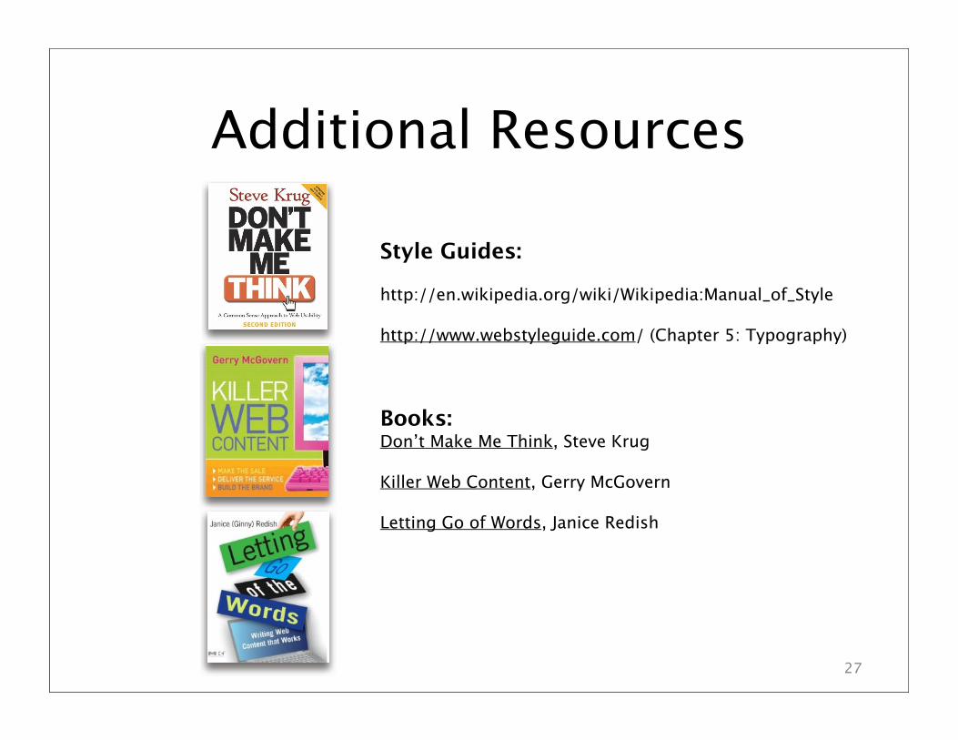
Additional Resources
27
Style Guides:
http://en.wikipedia.org/wiki/Wikipedia:Manual_of_Style
http://www.webstyleguide.com/ (Chapter 5: Typography)
Books:Don’t Make Me Think, Steve Krug
Killer Web Content, Gerry McGovern
Letting Go of Words, Janice Redish