Embed Size (px)
DESCRIPTION
Citation preview
DOUBLE PAGE SPREAD - STATEMENT OF INTENT
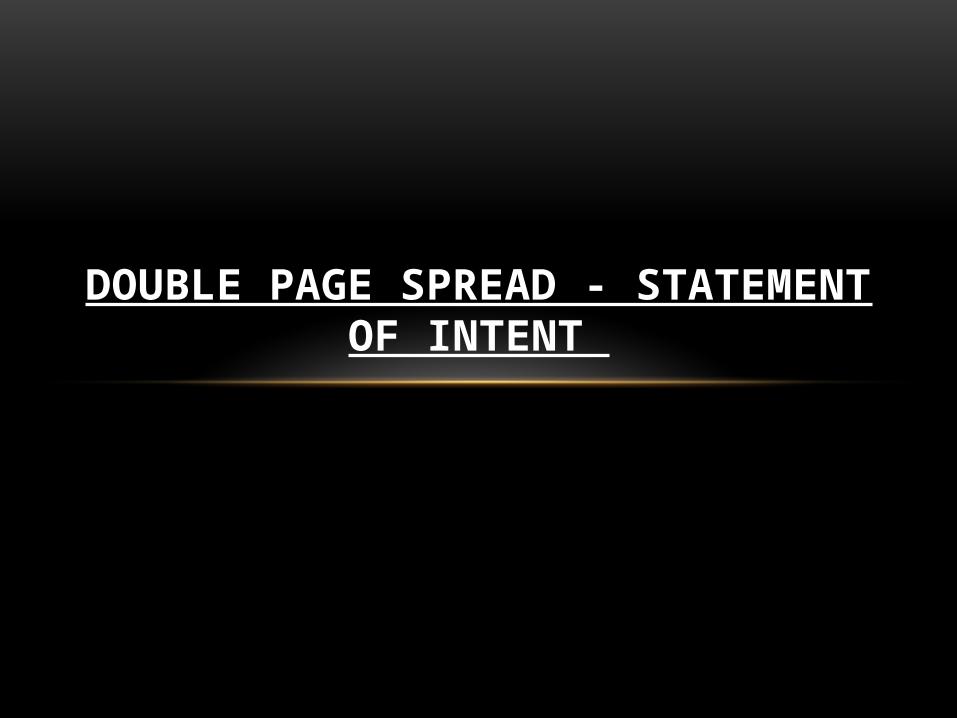
LAYOUT The layout of magazine will use 4 columns to make the double page spread look presentable and organised. The use of the columns will illustrate how the picture will format on page and the text shall take precedence on the other page.
Picture
Text
Headline
Also the 4 columns allows both the picture and text and headline to have an equal balance that will look sophisticated and attract my audience with my style of and simplicity of my double page spread.
Because the alignment of the text has to be very precise I will use the baseline grid to help organise the text.
Pull out quote
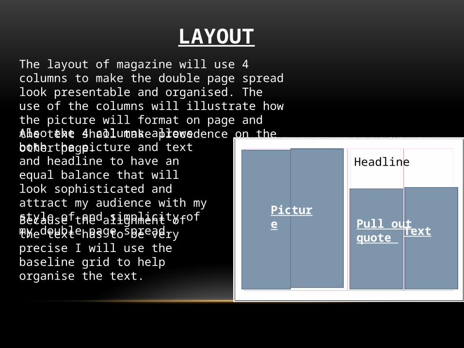
THE PRINCIPLE COMPONENTS
Headline : Has to be large and attractable towards my audience . I will continue relating to my front cover by using my main cover line which is ‘Three rows of Progression’. Which Is a simple phrase that will intrigue the minds of my audience.
Subhead: The byline represented in my double page spread will display a short summary on the artist who I am interviewing and what the interview consists of. The byline will say: ‘We caught up with Gospel’s sweetheart Ms Rene who is new on the scene and is breaking heats with her voice’.
Drop cap : The most common component that is used in a double page spread is the drop cap and to follow conventions I will use the drop cap to signal to the reader where to start reading the interview from.
Pull out quote: Is another important component that is used in the illustration of a double page spread. The pull out quote in my double page spread allows the reader to catch insight into the important phrases and words that the interviewee has mentioned in the interview.
THE IMAGES AND THE EFFECT
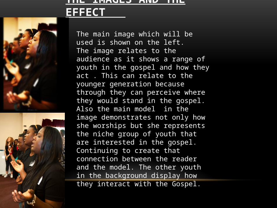
The main image which will be used is shown on the left. The image relates to the audience as it shows a range of youth in the gospel and how they act . This can relate to the younger generation because through they can perceive where they would stand in the gospel. Also the main model in the image demonstrates not only how she worships but she represents the niche group of youth that are interested in the gospel. Continuing to create that connection between the reader and the model. The other youth in the background display how they interact with the Gospel.

THE STORY AND THE EFFECT
The story is based upon the main cover line in the font cover which is
•This is the main story because it relates to the main image of the model singing the Gospel, also the main model in the image is also a new famous Gospel artist called Rene singing with other youth. •The presentation of the story will be an interview. My target audience will be more attracted to the interview because she is doing so well in the industry and becoming increasingly popular so the interview will allow the readers to capture the an insight into her music as well as her life. •The headline is important because the Gospel artist also refers to how she got the stage she wants to be. •In the interview she not only address how she embarked on three stages in her profession but her life in general which will influence my audience greatly as they also get an insight into her life but advice.
COLOUR SCHEME AND FONT
•The colour that has been chosen is red, black and grey.•I have chosen Black for the writing because it simple and classic and also helps the use of the red for the pull out quotes to stand out more.•I have chosen Red because of the pull quotes because they will attract the reader because it’s boldness. •The grey relates to the use of headline. In the headline the part that will be in grey is : ‘ THE THREE ROWS OF’. •The headline: The first part of the headline is in grey because it’s shown is different shades of grey to make the words compliment each other as the colours do. Then the word ‘progression’ will be in red to increase the attraction and to highlight the basis of the story is on progression. •There will two different fonts. The first font will be used for the subhead and the second font will be used for the main text to separate the interview and the information based on the artist.