Embed Size (px)
Citation preview

responsive web designwith css3 & bootstrap

about me

_ Alen Vuletić (@AlenVuletic)_ Junior Web Developer @ Slicejack_ Web dizajn @ Škola za dizajn, grafiku i održivu
gradnju_ Informacijske tehnologije @ Sveučilišni odjel
za stručne studije, Split_ HTML / CSS / JS

what is rwd?

”Responsive design is not about designing for mobile. But it’s not about designing for the desktop, either. Rather, it’s about adopting a more flexible, device-agnostic approach”
Ethan Marcotte
Examples

why is it so important?

Number of smartphones sold to end users worldwideResource: http://statista.com

91% of all U.S. peoplekeep their mobile devicewithin easy reach 24/7

61% of mobile visitors when visit awebsite that is not mobile friendlyjust switch to a competitor’swebsite.

How it works and whattools do we use?
how it works and whattools do we use?

1. viewport
2. media queries
3. grid
4. frameworks

1. viewport
<meta name=”viewport” content=”width=device-width, initial-scale=1”>

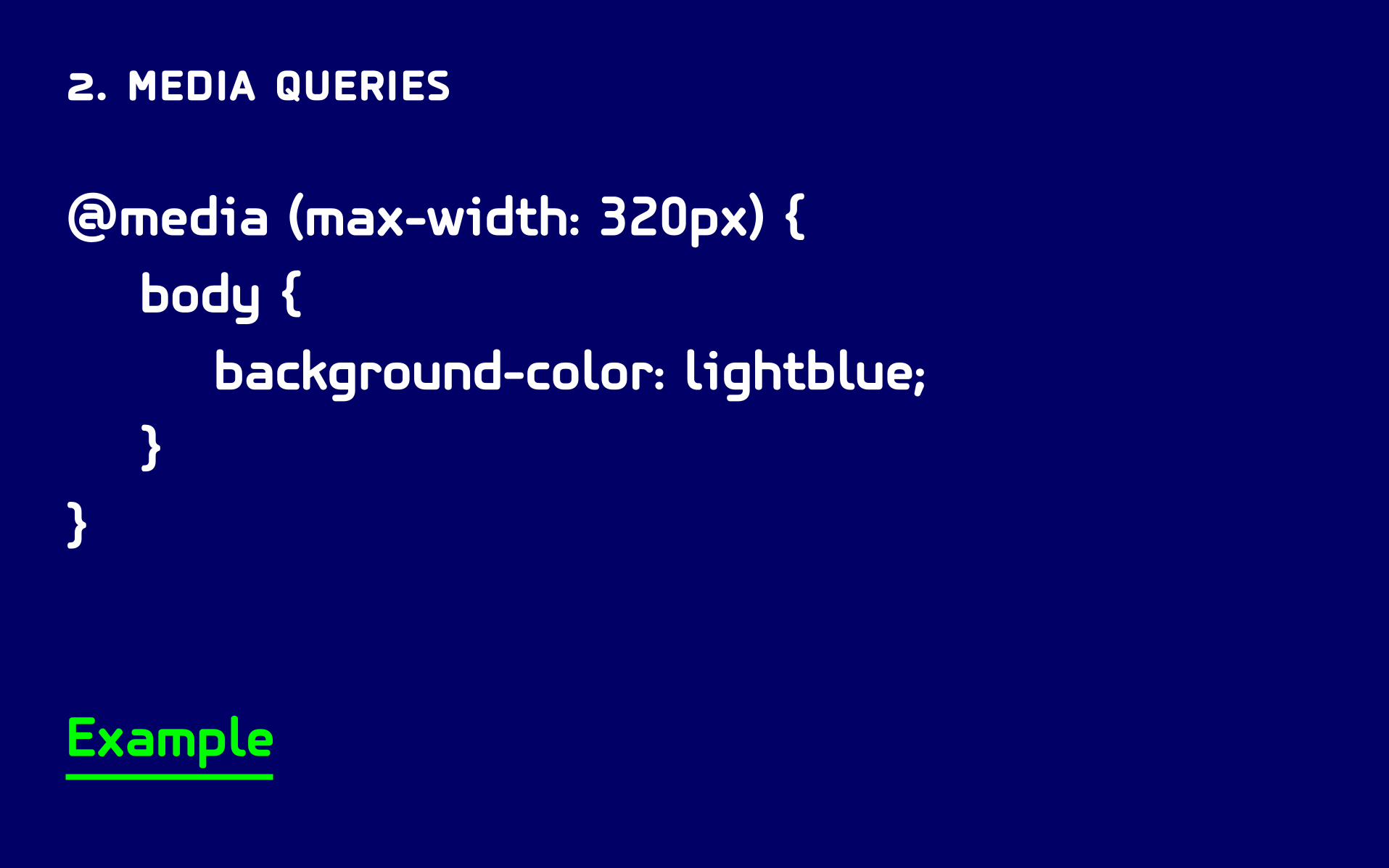
2. media queries
@media (max-width: 320px) { body { background-color: lightblue; }}
Example

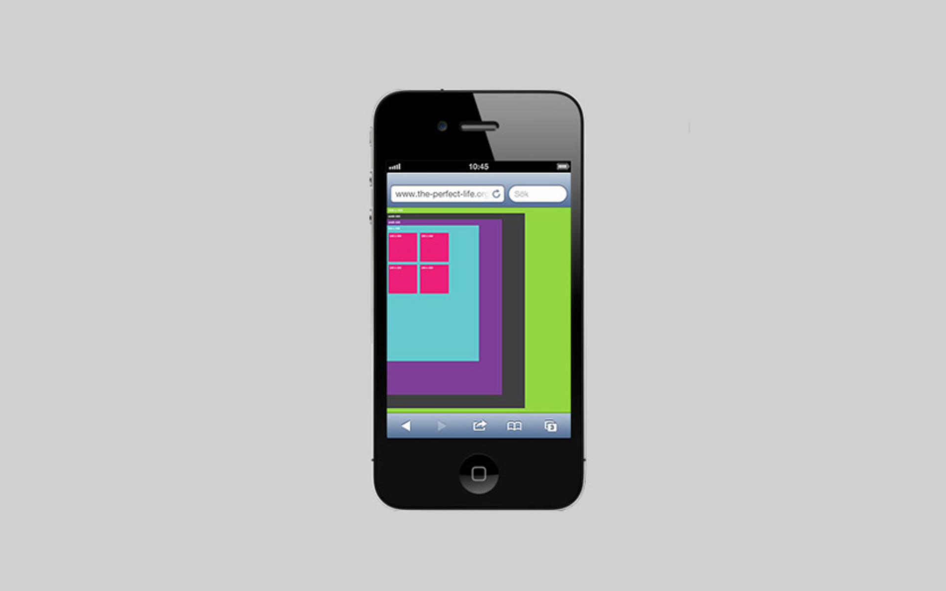
3. grid
For Designers: Guides for column widths and gutters that help keep designs consistent and aligned.For Developers: A collection of prebuilt CSS rules that allow you to apply grid-like layouts to HTML.
Designers example Developers example

4. frameworks
Framework is defined as a package made up of astructure of files and folders of standardized code (HTML, CSS, JS documents etc.) which can be used to support the development of websites, as a basis to start building a site.
Example

live demo


presentation will be published onslicejack.com/blog

questions?

thank you!

Alen Vuletić
Junior Developer @ Slicejack.com
25th Mobile Monday Split