Embed Size (px)
Citation preview

René OlivoBoston, MA
April 14th, 2014
LESSBootstrapImplementing
the right way using

Mobile FirstCSS Framework
Fluid
Grid
Accessibility
Prototyping

The problemThis: Is the same as this:

The problem
● It's not because they have the same number of lines.
● It's not because .row is similar to TR.● It's not because both are using a grid
system.

The problem
We are defining how our website should behave right into the HTML.
.pull-left
.col-md-6
.img-responsive
.show
.clearfix
.hide
.pull-right
.img-circle
.col-sm-offset-2
.row
.sr-only

Why is that a problem?
● It's difficult to integrate it to an existing project.
● It doesn't adapt well to new changes or requirements.

Real life lessonBootstrap 2.x -> 3.x

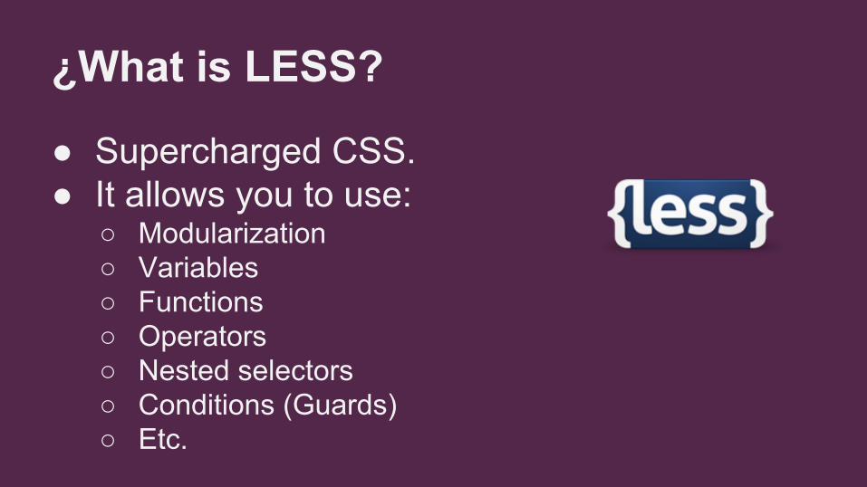
¿What is LESS?
● Supercharged CSS.● It allows you to use:
○ Modularization○ Variables○ Functions○ Operators○ Nested selectors○ Conditions (Guards)○ Etc.

LESS TutorialA short introduction

How can LESS help Bootstrap?
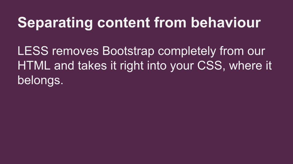
Separating content from behaviour
LESS removes Bootstrap completely from our HTML and takes it right into your CSS, where it belongs.

You can use LESS awesome features
Using modules, variables, operators, mixins and functions improves considerably your workflow.

Reduces the project's size
When you import only the modules that you will need for your project, you can reduce the Bootstrap file considerably.
What I want to use
What Bootstrap makes me use
20%
80%
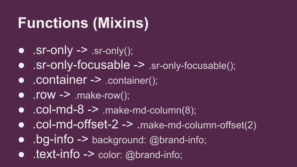
Functions (Mixins)
● .sr-only -> .sr-only();● .sr-only-focusable -> .sr-only-focusable();● .container -> .container();● .row -> .make-row();● .col-md-8 -> .make-md-column(8);● .col-md-offset-2 -> .make-md-column-offset(2)● .bg-info -> background: @brand-info;● .text-info -> color: @brand-info;

Demo

Final remarks● Use SASS, LESS or Stylus for your projects (tutorial).● Don't adapt your HTML to Bootstrap. Don't even adapt
your HTML to your own CSS. ● Use Webcomponents.● Recommended books:

Q&A

Thanks!


![[BOOK] [Bootstrap] [Awesome] Bootstrap-Programming-Cookbook](https://img.pdfslide.us/doc/110x75/577ca6bf1a28abea748c023f/book-bootstrap-awesome-bootstrap-programming-cookbook.jpg)