Embed Size (px)
Citation preview
Pag
e1
Pag
e2
Contents Working Through my HDR Workflow ....................................................................... 3
Surreal HDR Workflow ........................................................................................... 14
Moving Objects in HDR – Using A Single RAW ....................................................... 18
Big Ben Bus Stop HDR Workflow............................................................................ 25
Urbex Photo Essay: IM Power Plant ....................................................................... 32
Roof topping in Ulsan ............................................................................................. 35
Temple at the top workflow article ....................................................................... 39
Realistic vs Surreal HDR – Is it important? ............................................................. 45
Gloucester Cathedral ............................................................................................. 47
Understanding the Adjustment Sliders in Photomatix Pro .................................... 49
HDR in motion: realistic HDR for wildlife photographers ...................................... 52
.............................................................. 60
HDR One Advisor No2 – A Castle on a Hill……………………………………………………… ….61
....................................... 68
5 Things I wish I knew when I started HDR ............................................................ 73
Cathedrals and Churches in HDR ........................................................................... 76
Fritz Photography – Surreal HDR Processing Workflow ........................................ 79
About HDR One ...................................................................................................... 84
Copyright notice: Content found in HDR One Magazine is the property of HDR One and the accredited photographers/authors. This cannot be reproduced, edited, sold, or used in anyway other than for personal use, without express permission from HDR One and the accredited
photographers/authors.
What to Expect HDR One editor, Jimmy McIntyre reviews this month’s issue.
As our second month in existence passes by, HDR One plays host once again to some wonderful HDR photographers who’ve given us a wealth of information that most paid ebooks couldn’t offer.
From tutorials on moving objects and single RAWs, to surreal workflows, and HDR for wildlife, there’s something for everyone in this month’s edition.
In our recent HDR One Advisor feature, James Pawlowski had a particularly difficult challenge ahead of him. The guys at NIK software even gave it a go.
The NIK photo contest is still going (enter here), and we’re holding our first HDR One blog of the year awards. Please vote for your favourite blog.
As well as all that there’s an urbex photo essay, a reflective article from an experienced HDRist, and some great advice for shooting in cathedrals and churches.
The biggest change to the magazine is that it is now open to the public. You can become a contributor and feature on the site and monthly magazine. Read more about it here
Finally, don’t forget to start an HDR One portfolio and show us your best work!
All the best
Jimmy McIntyre
Pag
e3
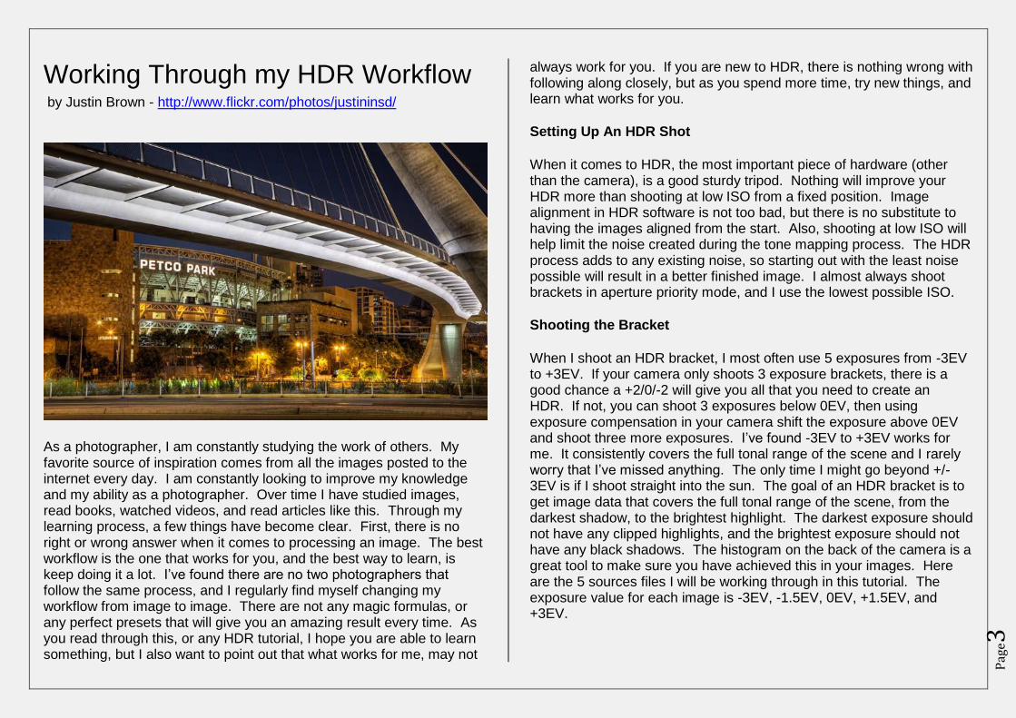
Working Through my HDR Workflow by Justin Brown - http://www.flickr.com/photos/justininsd/
As a photographer, I am constantly studying the work of others. My favorite source of inspiration comes from all the images posted to the internet every day. I am constantly looking to improve my knowledge and my ability as a photographer. Over time I have studied images, read books, watched videos, and read articles like this. Through my learning process, a few things have become clear. First, there is no right or wrong answer when it comes to processing an image. The best workflow is the one that works for you, and the best way to learn, is keep doing it a lot. I’ve found there are no two photographers that follow the same process, and I regularly find myself changing my workflow from image to image. There are not any magic formulas, or any perfect presets that will give you an amazing result every time. As you read through this, or any HDR tutorial, I hope you are able to learn something, but I also want to point out that what works for me, may not
always work for you. If you are new to HDR, there is nothing wrong with following along closely, but as you spend more time, try new things, and learn what works for you.
Setting Up An HDR Shot
When it comes to HDR, the most important piece of hardware (other than the camera), is a good sturdy tripod. Nothing will improve your HDR more than shooting at low ISO from a fixed position. Image alignment in HDR software is not too bad, but there is no substitute to having the images aligned from the start. Also, shooting at low ISO will help limit the noise created during the tone mapping process. The HDR process adds to any existing noise, so starting out with the least noise possible will result in a better finished image. I almost always shoot brackets in aperture priority mode, and I use the lowest possible ISO.
Shooting the Bracket
When I shoot an HDR bracket, I most often use 5 exposures from -3EV to +3EV. If your camera only shoots 3 exposure brackets, there is a good chance a +2/0/-2 will give you all that you need to create an HDR. If not, you can shoot 3 exposures below 0EV, then using exposure compensation in your camera shift the exposure above 0EV and shoot three more exposures. I’ve found -3EV to +3EV works for me. It consistently covers the full tonal range of the scene and I rarely worry that I’ve missed anything. The only time I might go beyond +/-3EV is if I shoot straight into the sun. The goal of an HDR bracket is to get image data that covers the full tonal range of the scene, from the darkest shadow, to the brightest highlight. The darkest exposure should not have any clipped highlights, and the brightest exposure should not have any black shadows. The histogram on the back of the camera is a great tool to make sure you have achieved this in your images. Here are the 5 sources files I will be working through in this tutorial. The exposure value for each image is -3EV, -1.5EV, 0EV, +1.5EV, and +3EV.
Pag
e4
Exporting to Photomatix
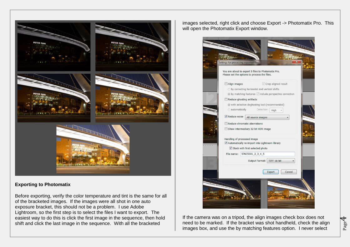
Before exporting, verify the color temperature and tint is the same for all of the bracketed images. If the images were all shot in one auto exposure bracket, this should not be a problem. I use Adobe Lightroom, so the first step is to select the files I want to export. The easiest way to do this is click the first image in the sequence, then hold shift and click the last image in the sequence. With all the bracketed
images selected, right click and choose Export -> Photomatix Pro. This will open the Photomatix Export window.
If the camera was on a tripod, the align images check box does not need to be marked. If the bracket was shot handheld, check the align images box, and use the by matching features option. I never select
Pag
e5
reduce ghosting artefacts, even if subjects are moving in the scene. I don’t think the ghost reduction in Photomatix does a very good job, and it tends to add a lot of noise. This bracket was shot at ISO 400 so I decided to check the reduce noise button. Sometimes I use Lightroom to reduce noise, and sometimes I wait until after the tone mapping is finished to reduce noise, in this case, I checked the box. If the ISO had been any lower I would not have used this feature. I never check the reduce chromatic aberrations box or the show 32-bit box, now I am ready to Export. Press the Export button to open Photomatix.
Tone Mapping in Photomatix
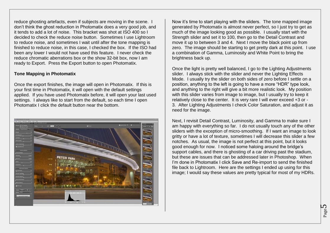
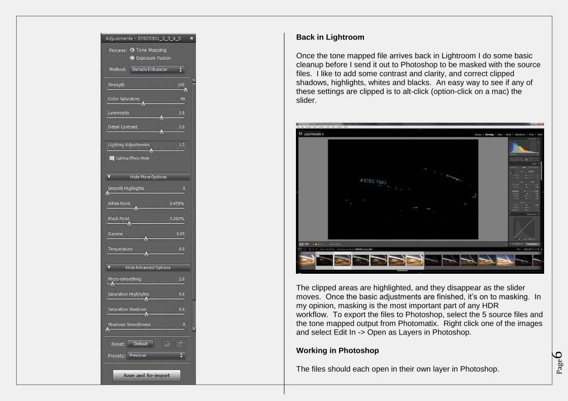
Once the export finishes, the image will open in Photomatix. If this is your first time in Photomatix, it will open with the default settings applied. If you have used Photomatix before, it will open your last used settings. I always like to start from the default, so each time I open Photomatix I click the default button near the bottom.
Now it’s time to start playing with the sliders. The tone mapped image generated by Photomatix is almost never perfect, so I just try to get as much of the image looking good as possible. I usually start with the Strength slider and set it to 100, then go to the Detail Contrast and move it up to between 3 and 4. Next I move the black point up from zero. The image should be starting to get pretty dark at this point. I use a combination of Gamma, Luminosity and White Point to bring the brightness back up.
Once the light is pretty well balanced, I go to the Lighting Adjustments slider. I always stick with the slider and never the Lighting Effects Mode. I usually try the slider on both sides of zero before I settle on a position, anything to the left is going to have a more “HDR” type look, and anything to the right will give a bit more realistic look. My position with this slider varies from image to image, but I usually try to keep it relatively close to the center. It is very rare I will ever exceed +3 or -3. After Lighting Adjustments I check Color Saturation, and adjust it as need for the image.
Next, I revisit Detail Contrast, Luminosity, and Gamma to make sure I am happy with everything so far. I do not usually touch any of the other sliders with the exception of micro-smoothing. If I want an image to look gritty or have a lot of texture, sometimes I will decrease this slider a few notches. As usual, the image is not perfect at this point, but it looks good enough for now. I noticed some haloing around the bridge’s support cables, and there is ghosting of a car driving past the stadium, but these are issues that can be addressed later in Photoshop. When I’m done in Photomatix I click Save and Re-import to send the finished file back to Lightroom. Here are the settings I ended up using for this image; I would say these values are pretty typical for most of my HDRs.
Pag
e6
Back in Lightroom
Once the tone mapped file arrives back in Lightroom I do some basic cleanup before I send it out to Photoshop to be masked with the source files. I like to add some contrast and clarity, and correct clipped shadows, highlights, whites and blacks. An easy way to see if any of these settings are clipped is to alt-click (option-click on a mac) the slider.
The clipped areas are highlighted, and they disappear as the slider moves. Once the basic adjustments are finished, it’s on to masking. In my opinion, masking is the most important part of any HDR workflow. To export the files to Photoshop, select the 5 source files and the tone mapped output from Photomatix. Right click one of the images and select Edit In -> Open as Layers in Photoshop.
Working in Photoshop
The files should each open in their own layer in Photoshop.
Pag
e7
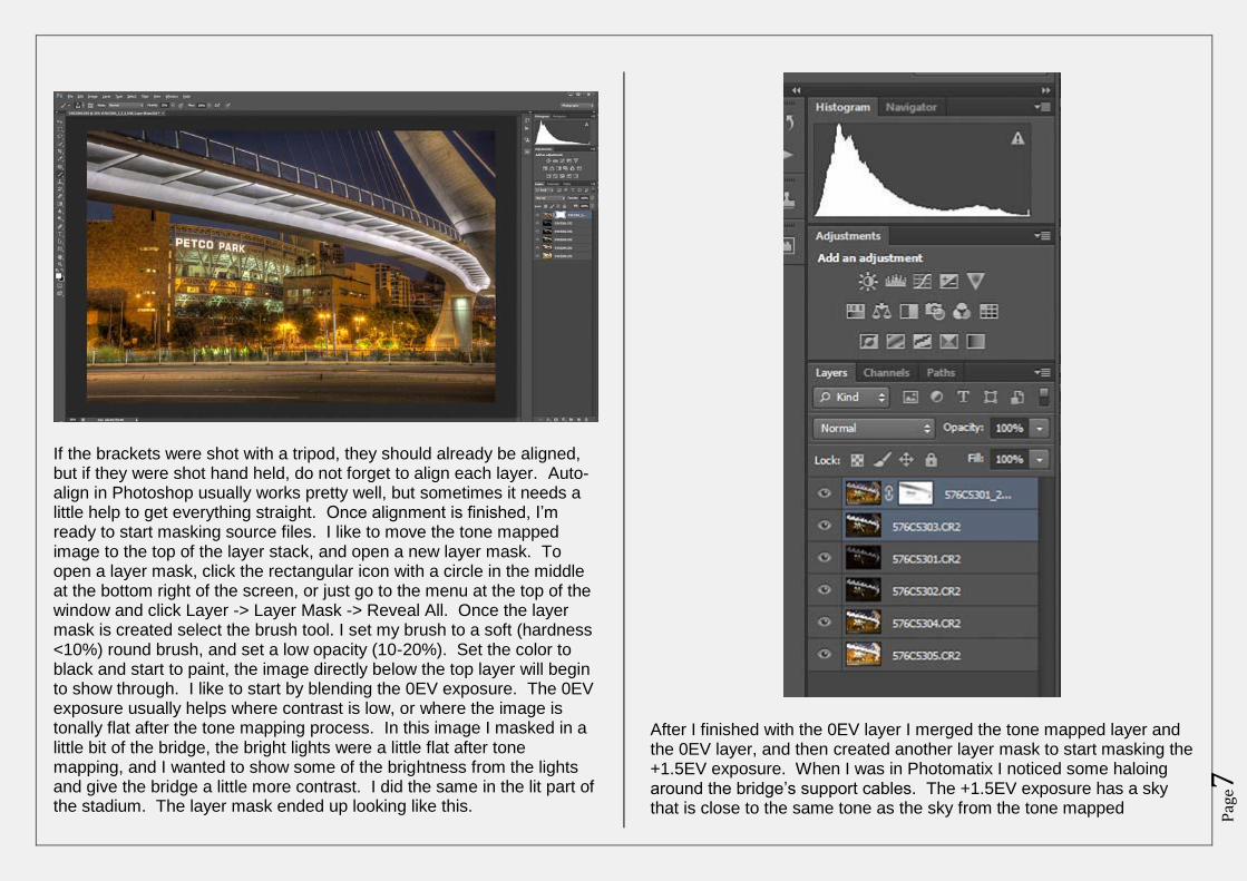
If the brackets were shot with a tripod, they should already be aligned, but if they were shot hand held, do not forget to align each layer. Auto-align in Photoshop usually works pretty well, but sometimes it needs a little help to get everything straight. Once alignment is finished, I’m ready to start masking source files. I like to move the tone mapped image to the top of the layer stack, and open a new layer mask. To open a layer mask, click the rectangular icon with a circle in the middle at the bottom right of the screen, or just go to the menu at the top of the window and click Layer -> Layer Mask -> Reveal All. Once the layer mask is created select the brush tool. I set my brush to a soft (hardness <10%) round brush, and set a low opacity (10-20%). Set the color to black and start to paint, the image directly below the top layer will begin to show through. I like to start by blending the 0EV exposure. The 0EV exposure usually helps where contrast is low, or where the image is tonally flat after the tone mapping process. In this image I masked in a little bit of the bridge, the bright lights were a little flat after tone mapping, and I wanted to show some of the brightness from the lights and give the bridge a little more contrast. I did the same in the lit part of the stadium. The layer mask ended up looking like this.
After I finished with the 0EV layer I merged the tone mapped layer and the 0EV layer, and then created another layer mask to start masking the +1.5EV exposure. When I was in Photomatix I noticed some haloing around the bridge’s support cables. The +1.5EV exposure has a sky that is close to the same tone as the sky from the tone mapped
Pag
e8
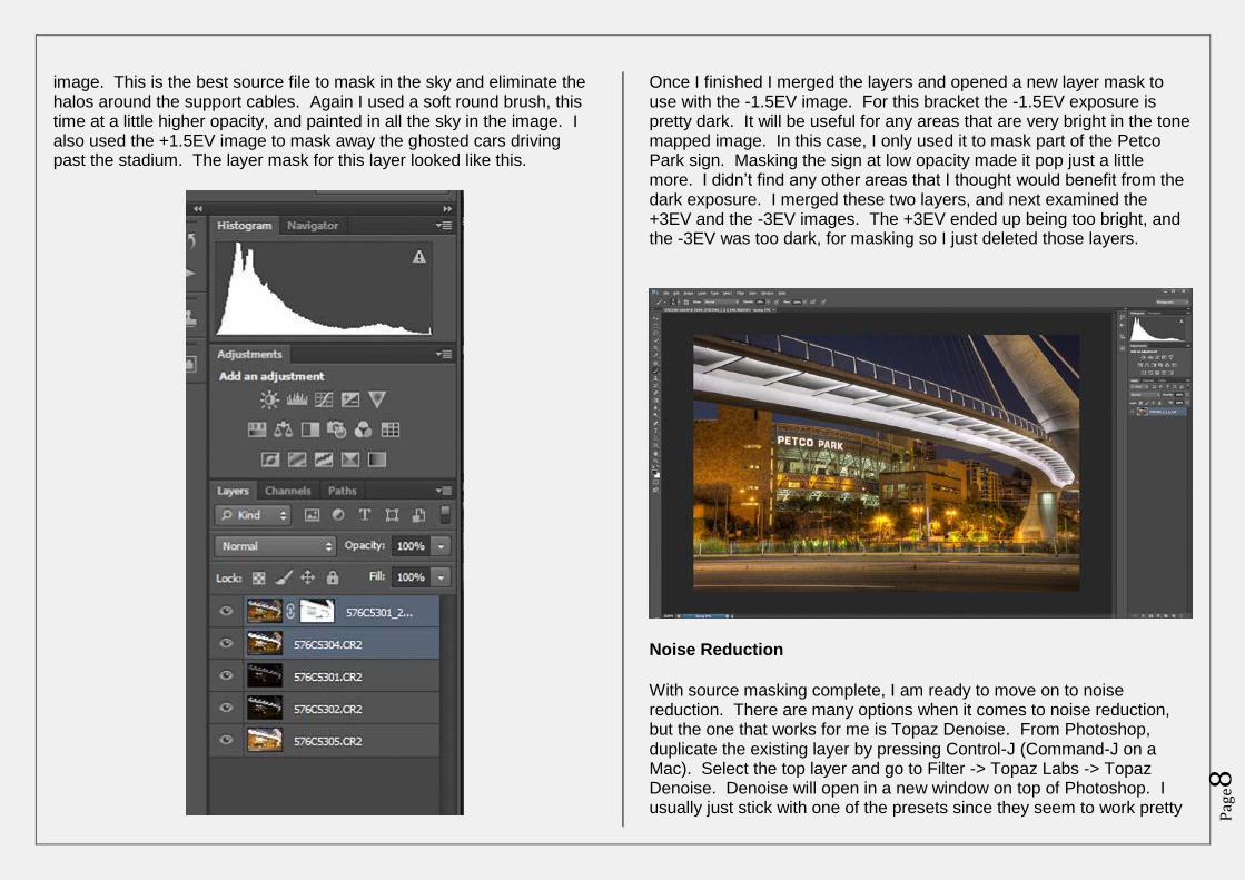
image. This is the best source file to mask in the sky and eliminate the halos around the support cables. Again I used a soft round brush, this time at a little higher opacity, and painted in all the sky in the image. I also used the +1.5EV image to mask away the ghosted cars driving past the stadium. The layer mask for this layer looked like this.
Once I finished I merged the layers and opened a new layer mask to use with the -1.5EV image. For this bracket the -1.5EV exposure is pretty dark. It will be useful for any areas that are very bright in the tone mapped image. In this case, I only used it to mask part of the Petco Park sign. Masking the sign at low opacity made it pop just a little more. I didn’t find any other areas that I thought would benefit from the dark exposure. I merged these two layers, and next examined the +3EV and the -3EV images. The +3EV ended up being too bright, and the -3EV was too dark, for masking so I just deleted those layers.
Noise Reduction
With source masking complete, I am ready to move on to noise reduction. There are many options when it comes to noise reduction, but the one that works for me is Topaz Denoise. From Photoshop, duplicate the existing layer by pressing Control-J (Command-J on a Mac). Select the top layer and go to Filter -> Topaz Labs -> Topaz Denoise. Denoise will open in a new window on top of Photoshop. I usually just stick with one of the presets since they seem to work pretty
Pag
e9
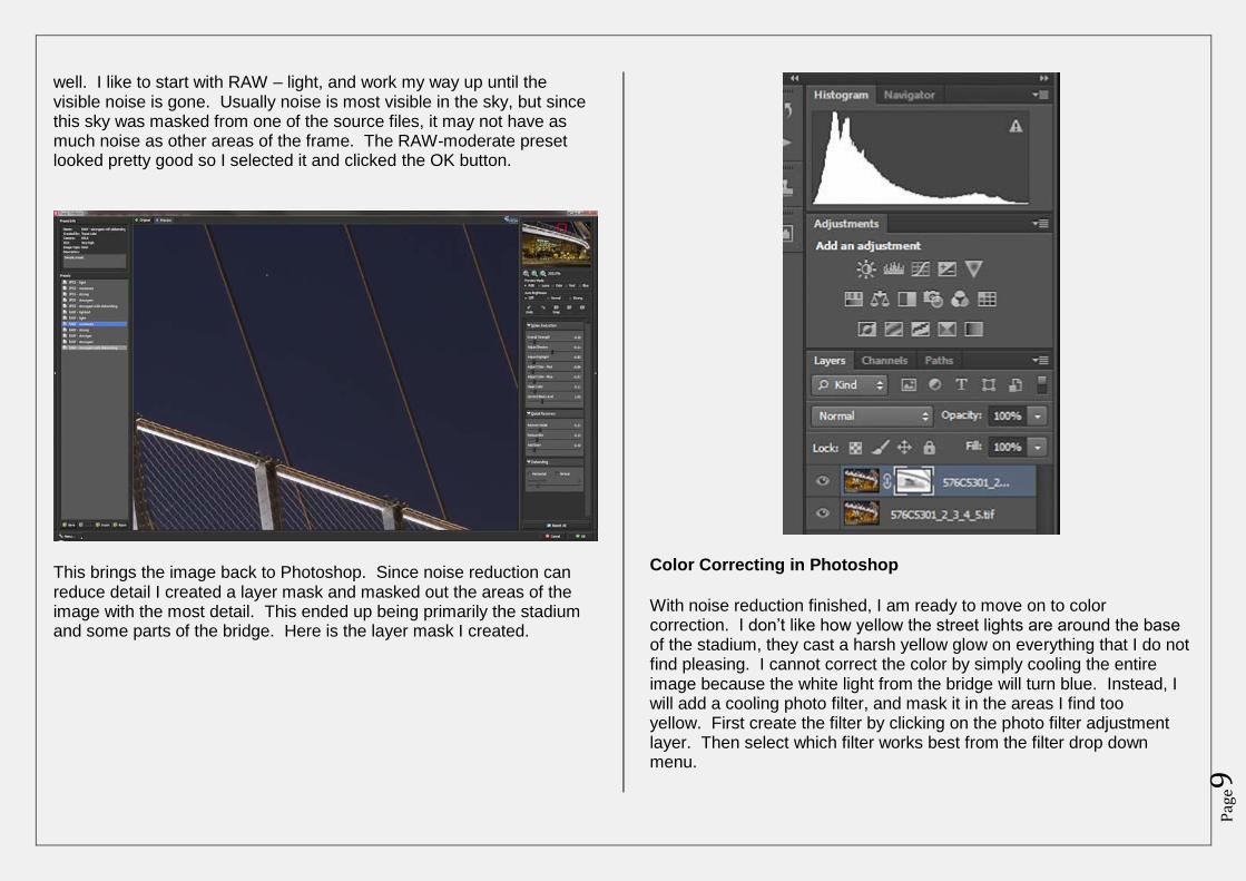
well. I like to start with RAW – light, and work my way up until the visible noise is gone. Usually noise is most visible in the sky, but since this sky was masked from one of the source files, it may not have as much noise as other areas of the frame. The RAW-moderate preset looked pretty good so I selected it and clicked the OK button.
This brings the image back to Photoshop. Since noise reduction can reduce detail I created a layer mask and masked out the areas of the image with the most detail. This ended up being primarily the stadium and some parts of the bridge. Here is the layer mask I created.
Color Correcting in Photoshop
With noise reduction finished, I am ready to move on to color correction. I don’t like how yellow the street lights are around the base of the stadium, they cast a harsh yellow glow on everything that I do not find pleasing. I cannot correct the color by simply cooling the entire image because the white light from the bridge will turn blue. Instead, I will add a cooling photo filter, and mask it in the areas I find too yellow. First create the filter by clicking on the photo filter adjustment layer. Then select which filter works best from the filter drop down menu.
Pag
e10
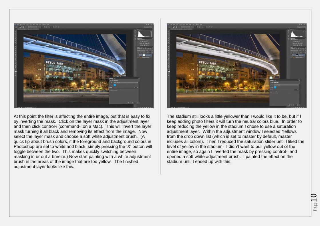
At this point the filter is affecting the entire image, but that is easy to fix by inverting the mask. Click on the layer mask in the adjustment layer and then click control-i (command-i on a Mac). This will invert the layer mask turning it all black and removing its effect from the image. Now select the layer mask and choose a soft white adjustment brush. (A quick tip about brush colors, if the foreground and background colors in Photoshop are set to white and black, simply pressing the ‘X’ button will toggle between the two. This makes quickly switching between masking in or out a breeze.) Now start painting with a white adjustment brush in the areas of the image that are too yellow. The finished adjustment layer looks like this.
The stadium still looks a little yellower than I would like it to be, but if I keep adding photo filters it will turn the neutral colors blue. In order to keep reducing the yellow in the stadium I chose to use a saturation adjustment layer. Within the adjustment window I selected Yellows from the drop down list (which is set to master by default, master includes all colors). Then I reduced the saturation slider until I liked the level of yellow in the stadium. I didn’t want to pull yellow out of the entire image, so again I inverted the mask by pressing control-i and opened a soft white adjustment brush. I painted the effect on the stadium until I ended up with this.
Pag
e11
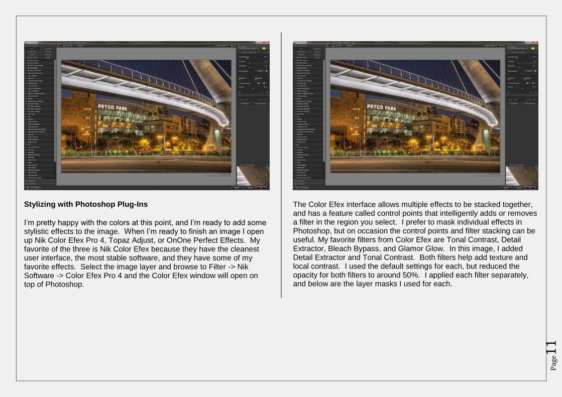
Stylizing with Photoshop Plug-Ins
I’m pretty happy with the colors at this point, and I’m ready to add some stylistic effects to the image. When I’m ready to finish an image I open up Nik Color Efex Pro 4, Topaz Adjust, or OnOne Perfect Effects. My favorite of the three is Nik Color Efex because they have the cleanest user interface, the most stable software, and they have some of my favorite effects. Select the image layer and browse to Filter -> Nik Software -> Color Efex Pro 4 and the Color Efex window will open on top of Photoshop.
The Color Efex interface allows multiple effects to be stacked together, and has a feature called control points that intelligently adds or removes a filter in the region you select. I prefer to mask individual effects in Photoshop, but on occasion the control points and filter stacking can be useful. My favorite filters from Color Efex are Tonal Contrast, Detail Extractor, Bleach Bypass, and Glamor Glow. In this image, I added Detail Extractor and Tonal Contrast. Both filters help add texture and local contrast. I used the default settings for each, but reduced the opacity for both filters to around 50%. I applied each filter separately, and below are the layer masks I used for each.
Pag
e12
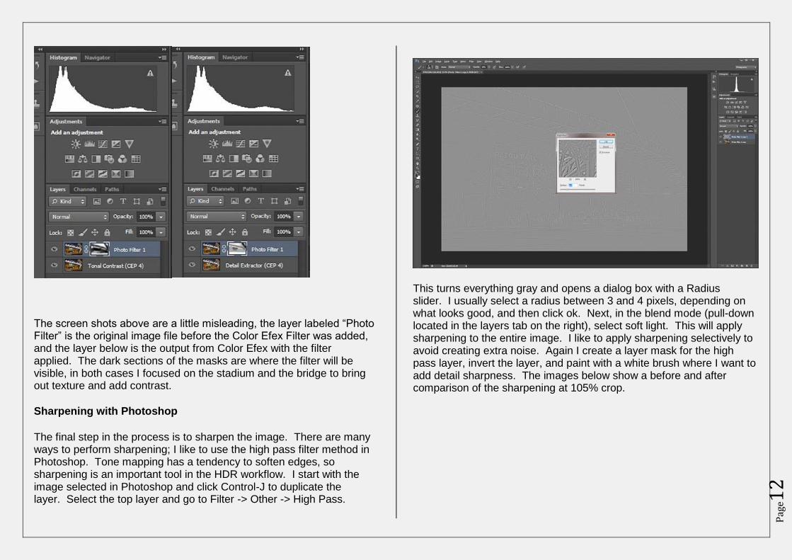
The screen shots above are a little misleading, the layer labeled “Photo Filter” is the original image file before the Color Efex Filter was added, and the layer below is the output from Color Efex with the filter applied. The dark sections of the masks are where the filter will be visible, in both cases I focused on the stadium and the bridge to bring out texture and add contrast.
Sharpening with Photoshop
The final step in the process is to sharpen the image. There are many ways to perform sharpening; I like to use the high pass filter method in Photoshop. Tone mapping has a tendency to soften edges, so sharpening is an important tool in the HDR workflow. I start with the image selected in Photoshop and click Control-J to duplicate the layer. Select the top layer and go to Filter -> Other -> High Pass.
This turns everything gray and opens a dialog box with a Radius slider. I usually select a radius between 3 and 4 pixels, depending on what looks good, and then click ok. Next, in the blend mode (pull-down located in the layers tab on the right), select soft light. This will apply sharpening to the entire image. I like to apply sharpening selectively to avoid creating extra noise. Again I create a layer mask for the high pass layer, invert the layer, and paint with a white brush where I want to add detail sharpness. The images below show a before and after comparison of the sharpening at 105% crop.
Pag
e13
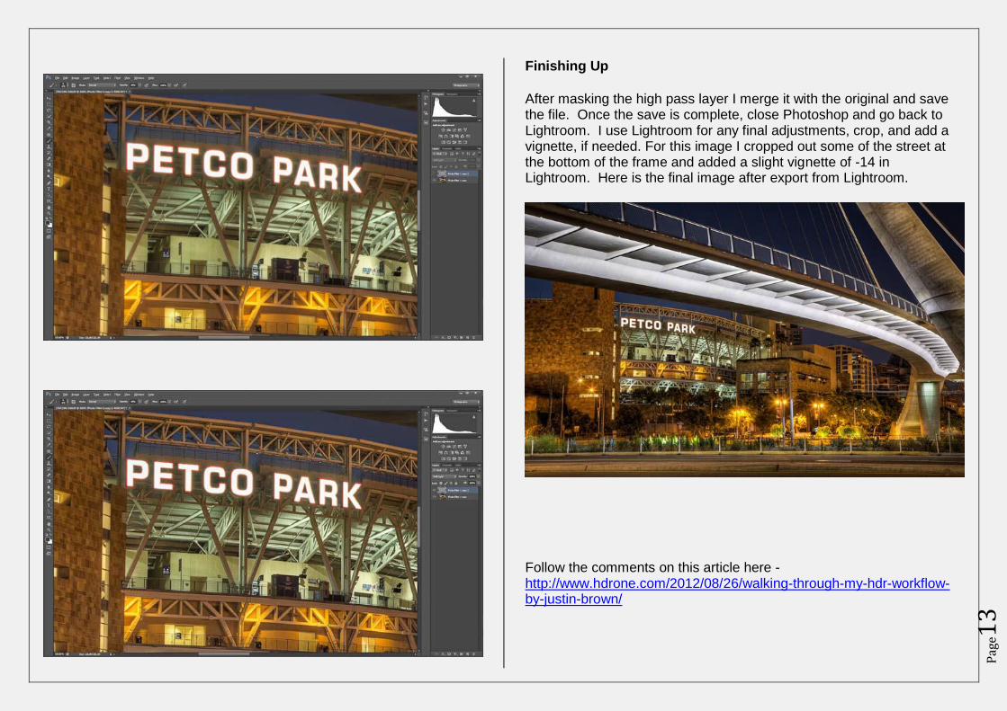
Finishing Up
After masking the high pass layer I merge it with the original and save the file. Once the save is complete, close Photoshop and go back to Lightroom. I use Lightroom for any final adjustments, crop, and add a vignette, if needed. For this image I cropped out some of the street at the bottom of the frame and added a slight vignette of -14 in Lightroom. Here is the final image after export from Lightroom.
Follow the comments on this article here - http://www.hdrone.com/2012/08/26/walking-through-my-hdr-workflow-by-justin-brown/
Pag
e14
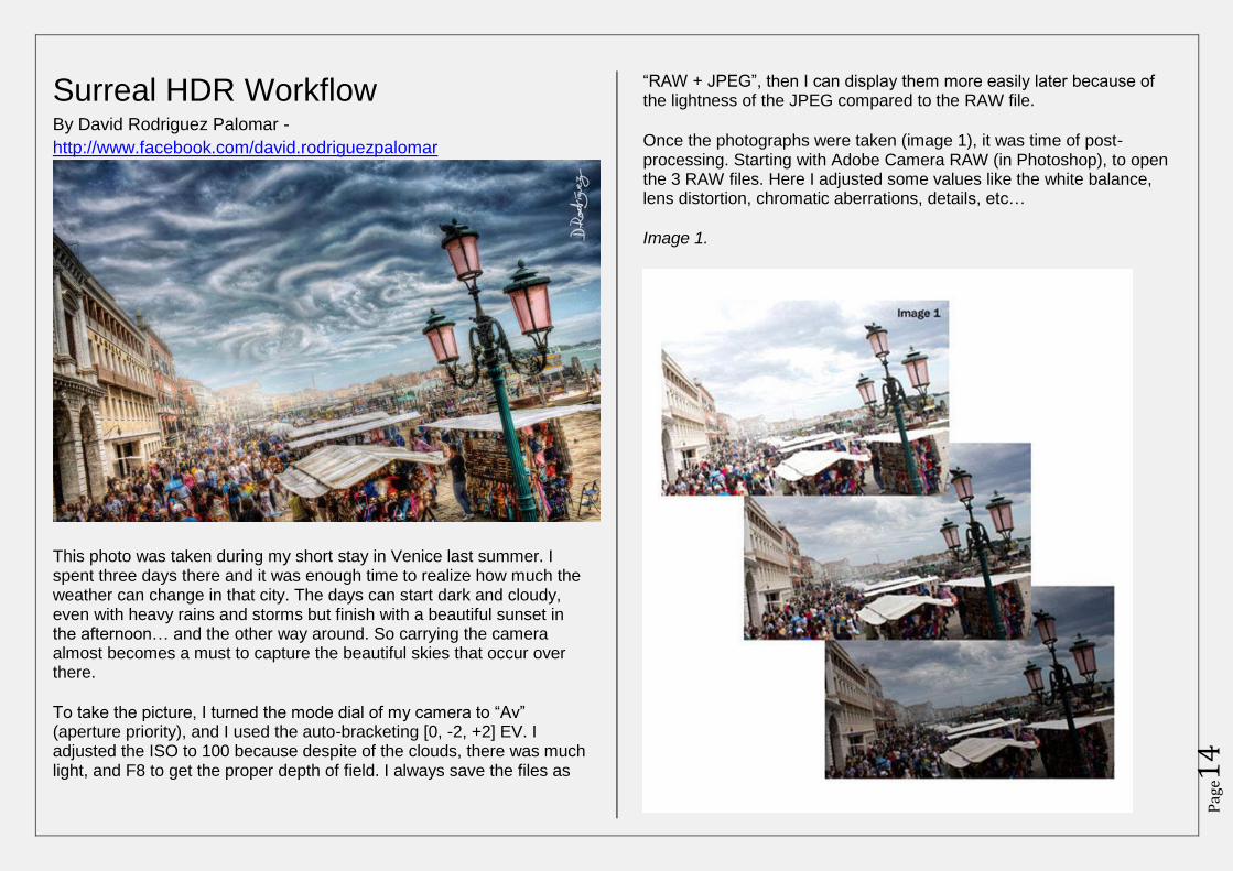
Surreal HDR Workflow By David Rodriguez Palomar -
http://www.facebook.com/david.rodriguezpalomar
This photo was taken during my short stay in Venice last summer. I spent three days there and it was enough time to realize how much the weather can change in that city. The days can start dark and cloudy, even with heavy rains and storms but finish with a beautiful sunset in the afternoon… and the other way around. So carrying the camera almost becomes a must to capture the beautiful skies that occur over there.
To take the picture, I turned the mode dial of my camera to “Av” (aperture priority), and I used the auto-bracketing [0, -2, +2] EV. I adjusted the ISO to 100 because despite of the clouds, there was much light, and F8 to get the proper depth of field. I always save the files as
“RAW + JPEG”, then I can display them more easily later because of the lightness of the JPEG compared to the RAW file.
Once the photographs were taken (image 1), it was time of post-processing. Starting with Adobe Camera RAW (in Photoshop), to open the 3 RAW files. Here I adjusted some values like the white balance, lens distortion, chromatic aberrations, details, etc…
Image 1.
Pag
e15
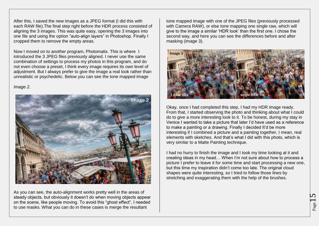
After this, I saved the new images as a JPEG format (I did this with each RAW file).The final step right before the HDR process consisted of aligning the 3 images. This was quite easy, opening the 3 images into one file and using the option “auto-align layers” in Photoshop. Finally I cropped them to remove the empty areas.
Now I moved on to another program, Photomatix. This is where I introduced the 3 JPEG files previously aligned. I never use the same combination of settings to process my photos in this program, and do not even choose a preset, I think every image requires its own level of adjustment. But I always prefer to give the image a real look rather than unrealistic or psychedelic. Below you can see the tone mapped image
Image 2.
As you can see, the auto-alignment works pretty well in the areas of steady objects, but obviously it doesn’t do when moving objects appear on the scene, like people moving. To avoid this “ghost effect“, I needed to use masks. What you can do in these cases is merge the resultant
tone mapped image with one of the JPEG files (previously processed with Camera RAW), or else tone mapping one single raw, which will give to the image a similar ‘HDR look’ than the first one. I chose the second way, and here you can see the differences before and after masking (image 3).
Okay, once I had completed this step, I had my HDR image ready. From that, I started observing the photo and thinking about what I could do to give a more interesting look to it. To be honest, during my stay in Venice I wanted to take a picture that later I’d have used as a reference to make a painting or a drawing. Finally I decided It’d be more interesting if I combined a picture and a painting together, I mean, real elements with sketches. And that’s what I did with this photo, which is very similar to a Matte Painting technique.
I had no hurry to finish the image and I took my time looking at it and creating ideas in my head… When I’m not sure about how to process a picture I prefer to leave it for some time and start processing a new one, but this time my inspiration didn’t come too late. The original cloud shapes were quite interesting, so I tried to follow those lines by stretching and exaggerating them with the help of the brushes.
Pag
e16
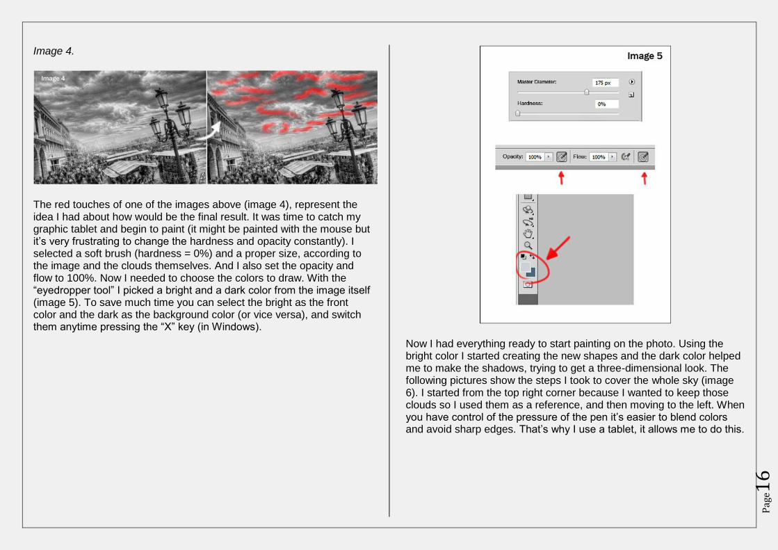
Image 4.
The red touches of one of the images above (image 4), represent the idea I had about how would be the final result. It was time to catch my graphic tablet and begin to paint (it might be painted with the mouse but it’s very frustrating to change the hardness and opacity constantly). I selected a soft brush (hardness = 0%) and a proper size, according to the image and the clouds themselves. And I also set the opacity and flow to 100%. Now I needed to choose the colors to draw. With the “eyedropper tool” I picked a bright and a dark color from the image itself (image 5). To save much time you can select the bright as the front color and the dark as the background color (or vice versa), and switch them anytime pressing the “X” key (in Windows).
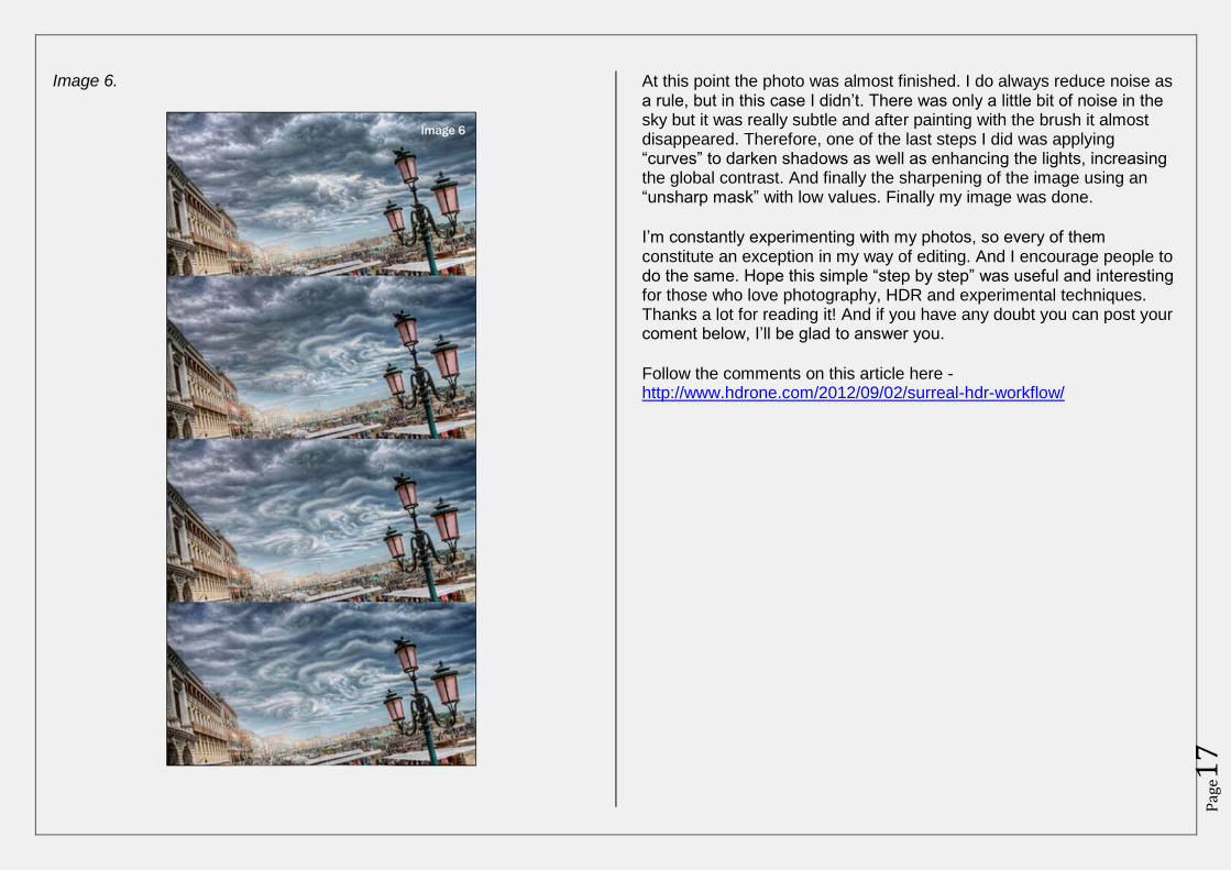
Now I had everything ready to start painting on the photo. Using the bright color I started creating the new shapes and the dark color helped me to make the shadows, trying to get a three-dimensional look. The following pictures show the steps I took to cover the whole sky (image 6). I started from the top right corner because I wanted to keep those clouds so I used them as a reference, and then moving to the left. When you have control of the pressure of the pen it’s easier to blend colors and avoid sharp edges. That’s why I use a tablet, it allows me to do this.
Pag
e17
Image 6.
At this point the photo was almost finished. I do always reduce noise as a rule, but in this case I didn’t. There was only a little bit of noise in the sky but it was really subtle and after painting with the brush it almost disappeared. Therefore, one of the last steps I did was applying “curves” to darken shadows as well as enhancing the lights, increasing the global contrast. And finally the sharpening of the image using an “unsharp mask” with low values. Finally my image was done.
I’m constantly experimenting with my photos, so every of them constitute an exception in my way of editing. And I encourage people to do the same. Hope this simple “step by step” was useful and interesting for those who love photography, HDR and experimental techniques. Thanks a lot for reading it! And if you have any doubt you can post your coment below, I’ll be glad to answer you.
Follow the comments on this article here - http://www.hdrone.com/2012/09/02/surreal-hdr-workflow/
Pag
e18
Moving Objects in HDR – Using A
Single RAW By Jimmy McIntyre – http://strange-lands.com/daily
In order to capture the full range of light in any given scene we often have to use multiple exposures. The number of exposures needed varies greatly from scene to scene. Sometimes, however, we are forced into a situation where only one image is usable for the HDR process.
Why use a single image?
Often when light is sparse and we can’t use a tripod it is almost impossible to capture those higher exposure shots. We can crank up the ISO but any HDR photographer can tell you how disastrous that can be. HDR programs simply can’t handle high noise levels.
A second reason for only capturing one image is excessive movement. Moving objects aren’t usually a challenge to fix using Photomatix’s deghosting function and then cleaning up in Photoshop. But sometimes movement is so excessive the images won’t align correctly.
When can’t you use a single image?
When the scenes are too contrasting the 0 exposure shot will not encompass a sufficient range of light. For example, during a sunny day objects in the foreground may look fine while the sky is often completely white. Even if you manually lower the exposures in Lightroom or an equivalent later, it’s unlikely you’ll be able to salvage much detail.
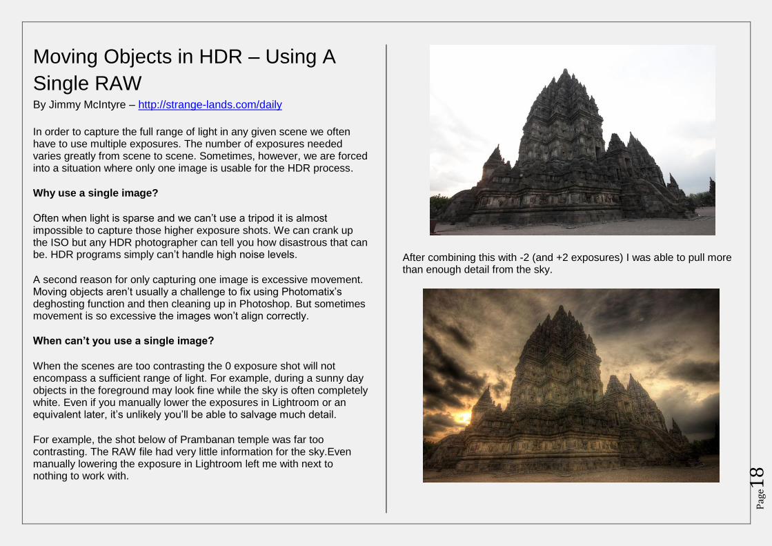
For example, the shot below of Prambanan temple was far too contrasting. The RAW file had very little information for the sky.Even manually lowering the exposure in Lightroom left me with next to nothing to work with.
After combining this with -2 (and +2 exposures) I was able to pull more than enough detail from the sky.
Pag
e19
What we’ll do today
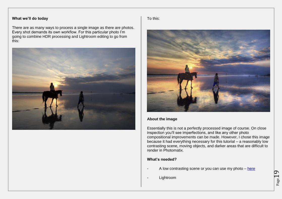
There are as many ways to process a single image as there are photos. Every shot demands its own workflow. For this particular photo I’m going to combine HDR processing and Lightroom editing to go from this:
To this:
About the image
Essentially this is not a perfectly processed image of course. On close inspection you’ll see imperfections, and like any other photo compositional improvements can be made. However, I chose this image because it had everything necessary for this tutorial – a reasonably low contrasting scene, moving objects, and darker areas that are difficult to render in Photomatix.
What’s needed?
- A low contrasting scene or you can use my photo – here
- Lightroom
Pag
e20
- Photoshop
- Photomatix
- Noise removal software (I’ll use Topaz Denoise)
- This image http://www.mediafire.com/?gzgyh1tb5i5seez
- A moderate understanding of photoshop
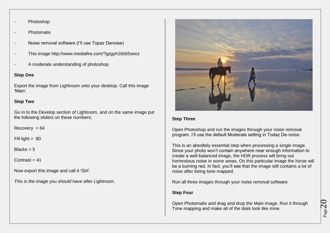
Step One
Export the image from Lightroom onto your desktop. Call this image ‘Main’.
Step Two
Go in to the Develop section of Lightroom, and on the same image put the following sliders on these numbers:
Recovery = 64
Fill light = 80
Blacks = 5
Contrast = 41
Now export this image and call it ‘Girl’.
This is the image you should have after Lightroom.
Step Three
Open Photoshop and run the images through your noise removal program. I’ll use the default Moderate setting in Todaz De-noise.
This is an absoltely essential step when processing a single image. Since your photo won’t contain anywhere near enough information to create a well-balanced image, the HDR process will bring out horrendous noise in some areas. On this particular image the horse will be a burning red. In fact, you’ll see that the image still contains a lot of noise after being tone mapped.
Run all three images through your noise removal software.
Step Four
Open Photomatix and drag and drop the Main image. Run it through Tone mapping and make all of the dials look like mine.
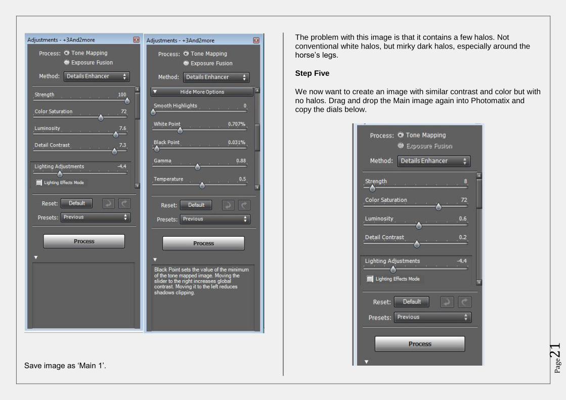
Pag
e21
Save image as ‘Main 1’.
The problem with this image is that it contains a few halos. Not conventional white halos, but mirky dark halos, especially around the horse’s legs.
Step Five
We now want to create an image with similar contrast and color but with no halos. Drag and drop the Main image again into Photomatix and copy the dials below.
Pag
e22
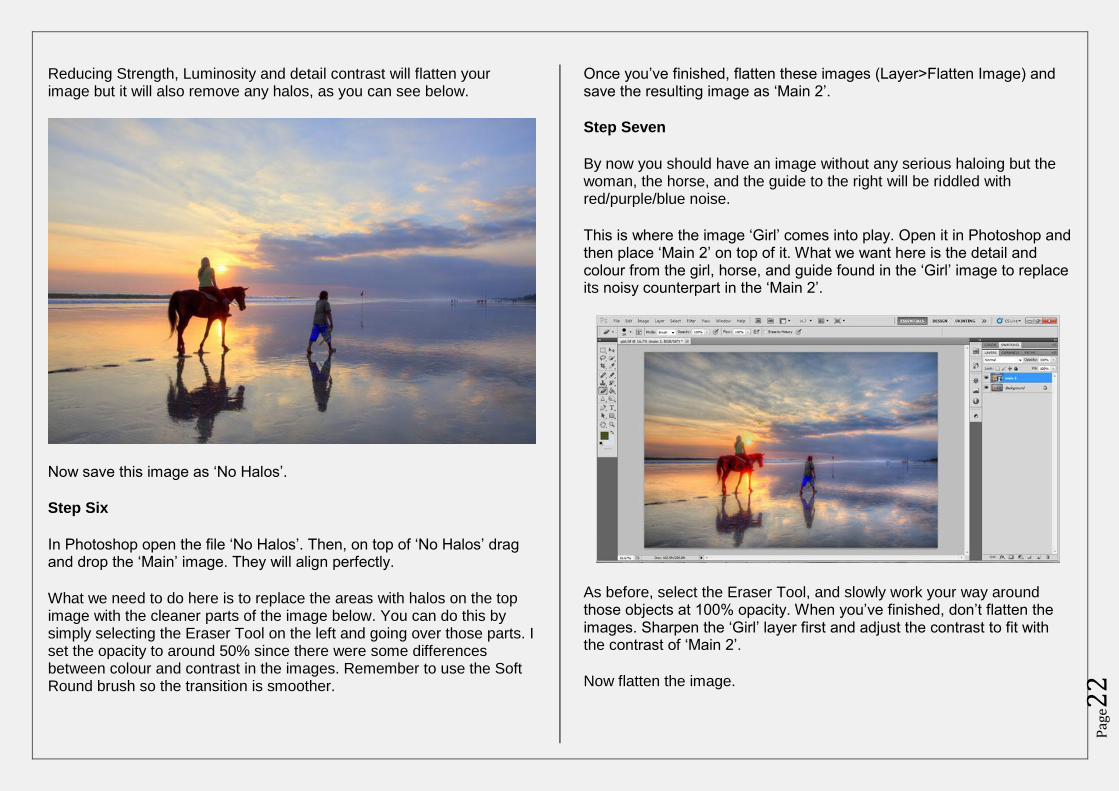
Reducing Strength, Luminosity and detail contrast will flatten your image but it will also remove any halos, as you can see below.
Now save this image as ‘No Halos’.
Step Six
In Photoshop open the file ‘No Halos’. Then, on top of ‘No Halos’ drag and drop the ‘Main’ image. They will align perfectly.
What we need to do here is to replace the areas with halos on the top image with the cleaner parts of the image below. You can do this by simply selecting the Eraser Tool on the left and going over those parts. I set the opacity to around 50% since there were some differences between colour and contrast in the images. Remember to use the Soft Round brush so the transition is smoother.
Once you’ve finished, flatten these images (Layer>Flatten Image) and save the resulting image as ‘Main 2’.
Step Seven
By now you should have an image without any serious haloing but the woman, the horse, and the guide to the right will be riddled with red/purple/blue noise.
This is where the image ‘Girl’ comes into play. Open it in Photoshop and then place ‘Main 2’ on top of it. What we want here is the detail and colour from the girl, horse, and guide found in the ‘Girl’ image to replace its noisy counterpart in the ‘Main 2’.
As before, select the Eraser Tool, and slowly work your way around those objects at 100% opacity. When you’ve finished, don’t flatten the images. Sharpen the ‘Girl’ layer first and adjust the contrast to fit with the contrast of ‘Main 2’.
Now flatten the image.
Pag
e23
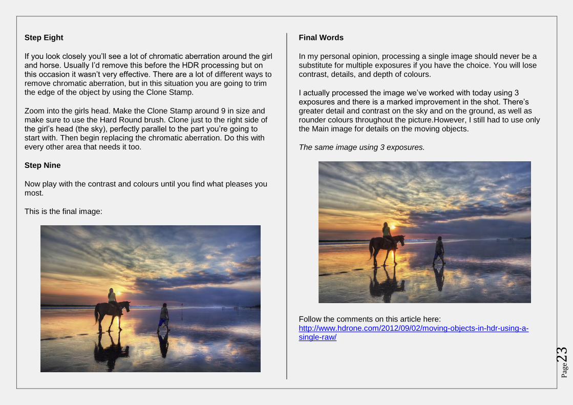
Step Eight
If you look closely you’ll see a lot of chromatic aberration around the girl and horse. Usually I’d remove this before the HDR processing but on this occasion it wasn’t very effective. There are a lot of different ways to remove chromatic aberration, but in this situation you are going to trim the edge of the object by using the Clone Stamp.
Zoom into the girls head. Make the Clone Stamp around 9 in size and make sure to use the Hard Round brush. Clone just to the right side of the girl’s head (the sky), perfectly parallel to the part you’re going to start with. Then begin replacing the chromatic aberration. Do this with every other area that needs it too.
Step Nine
Now play with the contrast and colours until you find what pleases you most.
This is the final image:
Final Words
In my personal opinion, processing a single image should never be a substitute for multiple exposures if you have the choice. You will lose contrast, details, and depth of colours.
I actually processed the image we’ve worked with today using 3 exposures and there is a marked improvement in the shot. There’s greater detail and contrast on the sky and on the ground, as well as rounder colours throughout the picture.However, I still had to use only the Main image for details on the moving objects.
The same image using 3 exposures.
Follow the comments on this article here: http://www.hdrone.com/2012/09/02/moving-objects-in-hdr-using-a-single-raw/
Pag
e25
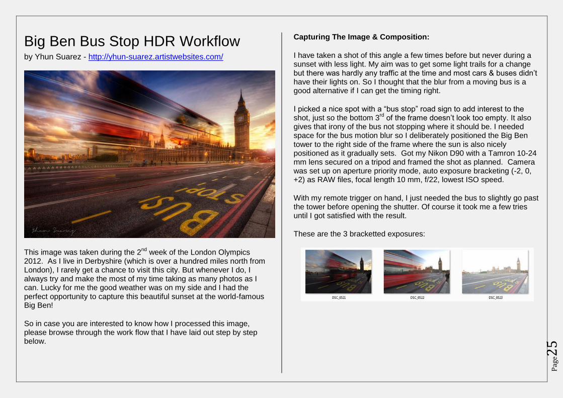
Big Ben Bus Stop HDR Workflow by Yhun Suarez - http://yhun-suarez.artistwebsites.com/
This image was taken during the 2nd
week of the London Olympics 2012. As I live in Derbyshire (which is over a hundred miles north from London), I rarely get a chance to visit this city. But whenever I do, I always try and make the most of my time taking as many photos as I can. Lucky for me the good weather was on my side and I had the perfect opportunity to capture this beautiful sunset at the world-famous Big Ben!
So in case you are interested to know how I processed this image, please browse through the work flow that I have laid out step by step below.
Capturing The Image & Composition:
I have taken a shot of this angle a few times before but never during a sunset with less light. My aim was to get some light trails for a change but there was hardly any traffic at the time and most cars & buses didn’t have their lights on. So I thought that the blur from a moving bus is a good alternative if I can get the timing right.
I picked a nice spot with a “bus stop” road sign to add interest to the shot, just so the bottom 3
rd of the frame doesn’t look too empty. It also
gives that irony of the bus not stopping where it should be. I needed space for the bus motion blur so I deliberately positioned the Big Ben tower to the right side of the frame where the sun is also nicely positioned as it gradually sets. Got my Nikon D90 with a Tamron 10-24 mm lens secured on a tripod and framed the shot as planned. Camera was set up on aperture priority mode, auto exposure bracketing (-2, 0, +2) as RAW files, focal length 10 mm, f/22, lowest ISO speed.
With my remote trigger on hand, I just needed the bus to slightly go past the tower before opening the shutter. Of course it took me a few tries until I got satisfied with the result.
These are the 3 bracketted exposures:
Pag
e26
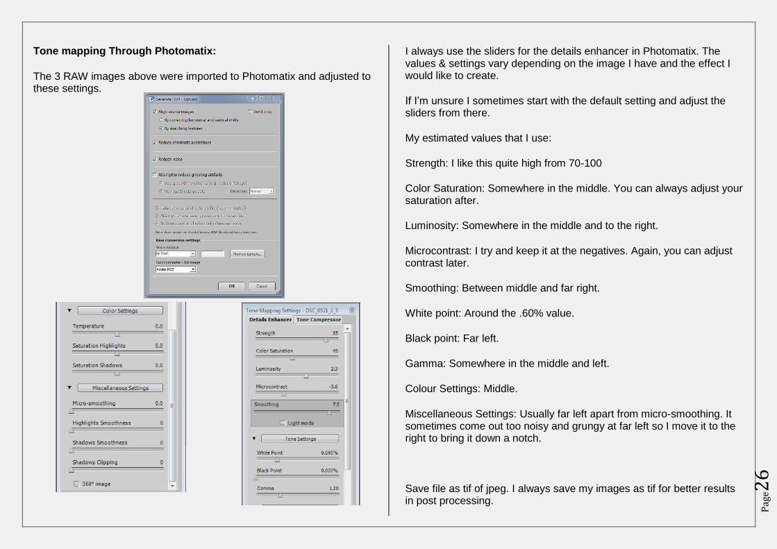
Tone mapping Through Photomatix:
The 3 RAW images above were imported to Photomatix and adjusted to these settings.
I always use the sliders for the details enhancer in Photomatix. The values & settings vary depending on the image I have and the effect I would like to create.
If I’m unsure I sometimes start with the default setting and adjust the sliders from there.
My estimated values that I use:
Strength: I like this quite high from 70-100
Color Saturation: Somewhere in the middle. You can always adjust your saturation after.
Luminosity: Somewhere in the middle and to the right.
Microcontrast: I try and keep it at the negatives. Again, you can adjust contrast later.
Smoothing: Between middle and far right.
White point: Around the .60% value.
Black point: Far left.
Gamma: Somewhere in the middle and left.
Colour Settings: Middle.
Miscellaneous Settings: Usually far left apart from micro-smoothing. It sometimes come out too noisy and grungy at far left so I move it to the right to bring it down a notch.
Save file as tif of jpeg. I always save my images as tif for better results in post processing.
Pag
e27
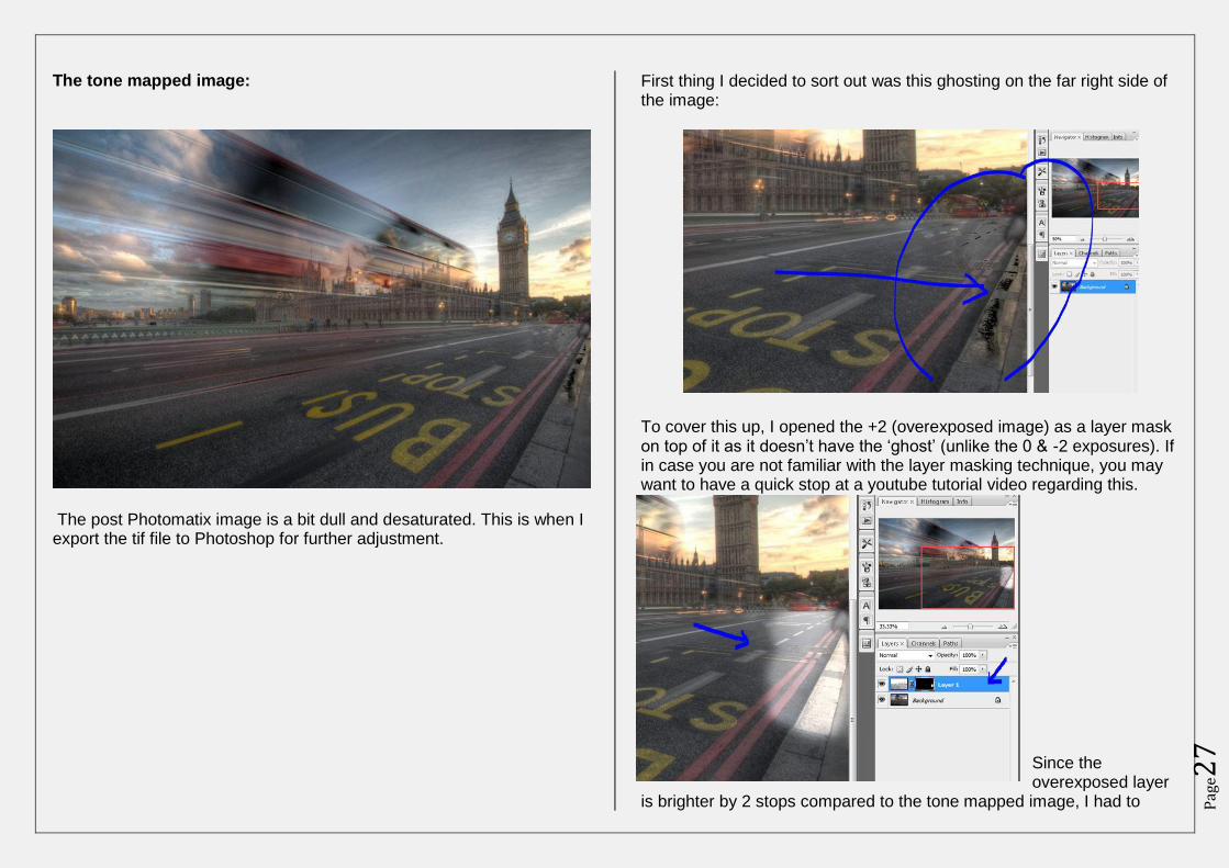
The tone mapped image:
The post Photomatix image is a bit dull and desaturated. This is when I export the tif file to Photoshop for further adjustment.
First thing I decided to sort out was this ghosting on the far right side of the image:
To cover this up, I opened the +2 (overexposed image) as a layer mask on top of it as it doesn’t have the ‘ghost’ (unlike the 0 & -2 exposures). If in case you are not familiar with the layer masking technique, you may want to have a quick stop at a youtube tutorial video regarding this.
Since the overexposed layer
is brighter by 2 stops compared to the tone mapped image, I had to
Pag
e28
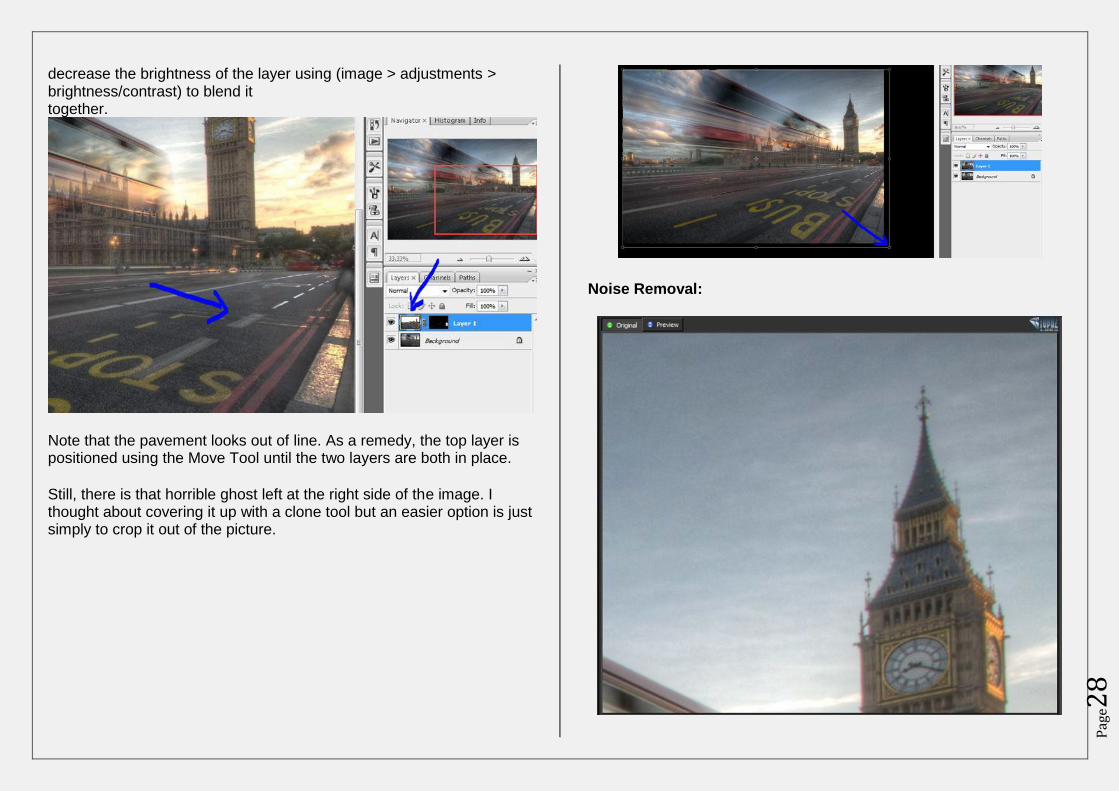
decrease the brightness of the layer using (image > adjustments > brightness/contrast) to blend it together.
Note that the pavement looks out of line. As a remedy, the top layer is positioned using the Move Tool until the two layers are both in place.
Still, there is that horrible ghost left at the right side of the image. I thought about covering it up with a clone tool but an easier option is just simply to crop it out of the picture.
Noise Removal:
Pag
e29
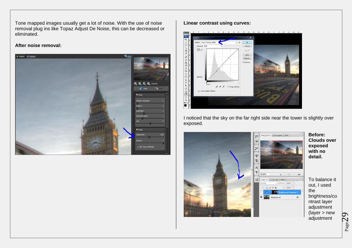
Tone mapped images usually get a lot of noise. With the use of noise removal plug ins like Topaz Adjust De Noise, this can be decreased or eliminated.
After noise removal:
Linear contrast using curves:
I noticed that the sky on the far right side near the tower is slightly over exposed.
Before: Clouds over exposed with no detail.
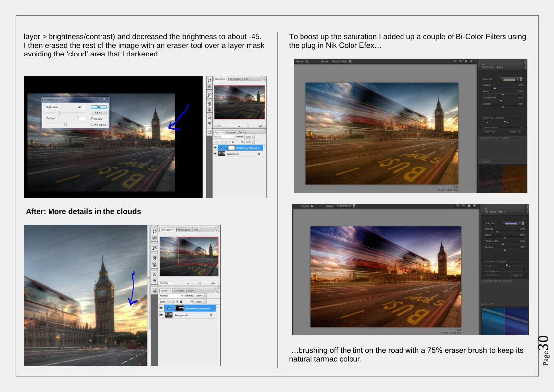
To balance it out, I used the brightness/contrast layer adjustment (layer > new adjustment
Pag
e30
layer > brightness/contrast) and decreased the brightness to about -45. I then erased the rest of the image with an eraser tool over a layer mask avoiding the ‘cloud’ area that I darkened.
After: More details in the clouds
To boost up the saturation I added up a couple of Bi-Color Filters using the plug in Nik Color Efex…
…brushing off the tint on the road with a 75% eraser brush to keep its natural tarmac colour.
Pag
e31
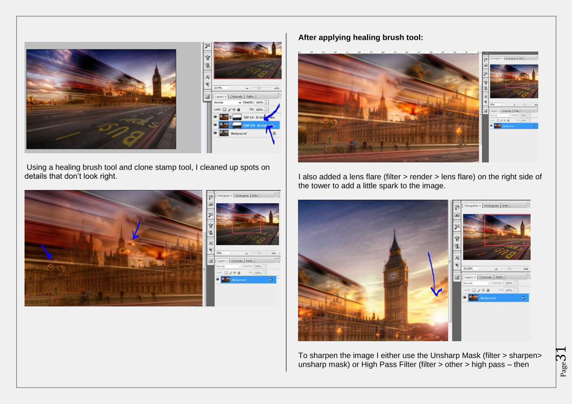
Using a healing brush tool and clone stamp tool, I cleaned up spots on details that don’t look right.
After applying healing brush tool:
I also added a lens flare (filter > render > lens flare) on the right side of the tower to add a little spark to the image.
To sharpen the image I either use the Unsharp Mask (filter > sharpen> unsharp mask) or High Pass Filter (filter > other > high pass – then
Pag
e32
choose overlay). With this image, I used the Unsharp Mask with the Amount 100%, Radius 4.0 pixels & Threshold of 0.
Similarly, I also apply a lower radius value for the High Pass Filter and use the outline of the image as a guide as to how much sharpening I would like to add.
The sky (and other areas that don’t need sharpening) was erased using a layer mask as some noise appeared during sharpening.
To follow comments on this article click here: http://www.hdrone.com/2012/09/09/big-ben-bus-stop-hdr-workflow-by-yhun-suarez/
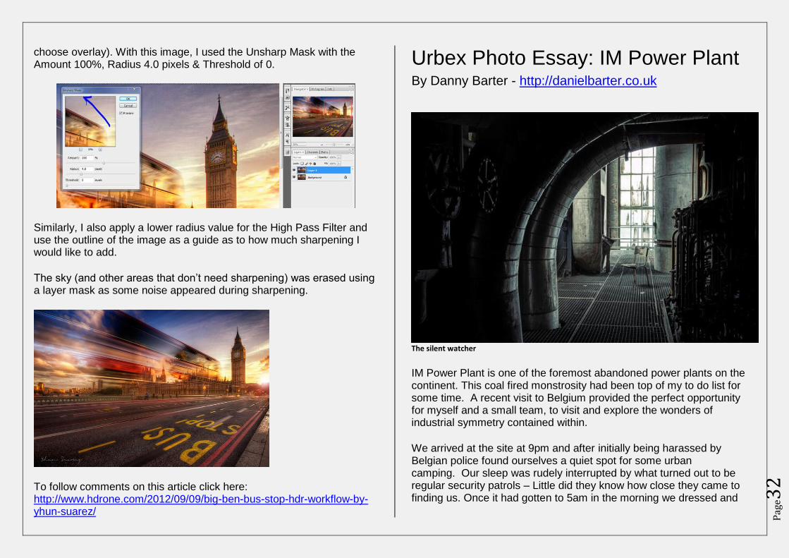
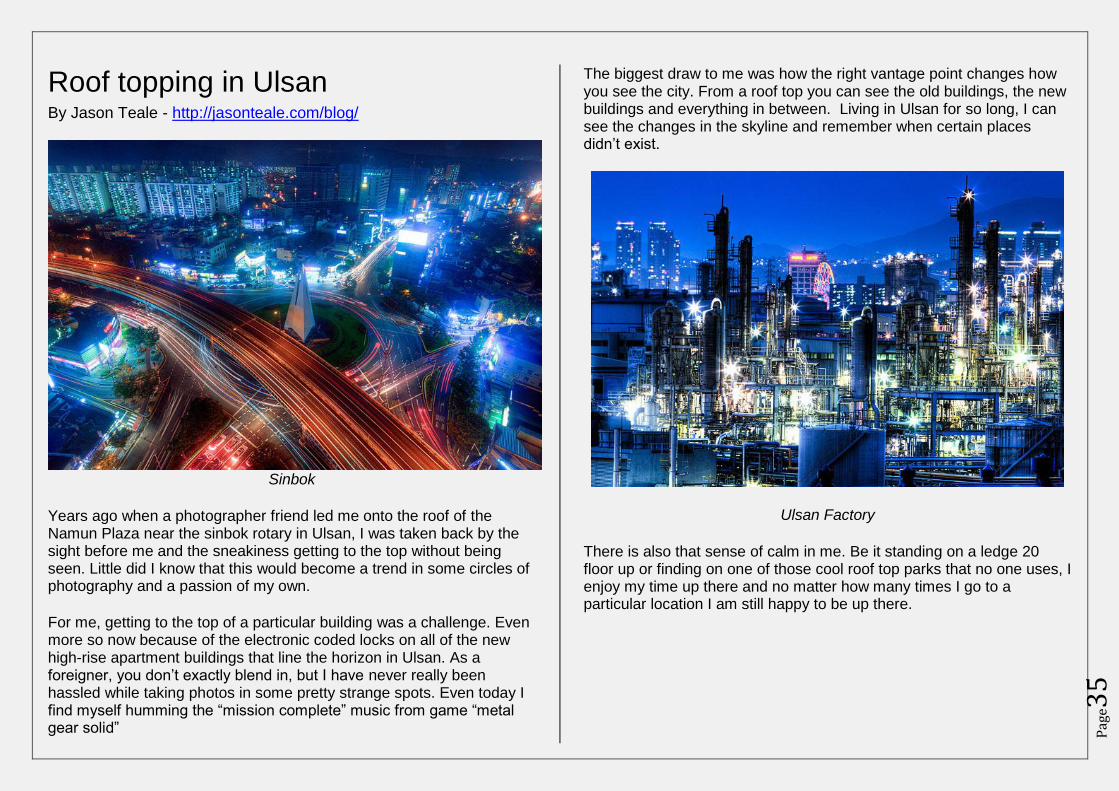
Urbex Photo Essay: IM Power Plant By Danny Barter - http://danielbarter.co.uk
The silent watcher
IM Power Plant is one of the foremost abandoned power plants on the continent. This coal fired monstrosity had been top of my to do list for some time. A recent visit to Belgium provided the perfect opportunity for myself and a small team, to visit and explore the wonders of industrial symmetry contained within.
We arrived at the site at 9pm and after initially being harassed by Belgian police found ourselves a quiet spot for some urban camping. Our sleep was rudely interrupted by what turned out to be regular security patrols – Little did they know how close they came to finding us. Once it had gotten to 5am in the morning we dressed and
Pag
e33
ready ourselves for what was to be quite an experience. IM was our oyster and I for one wanted to peel back its shell and dive right in.
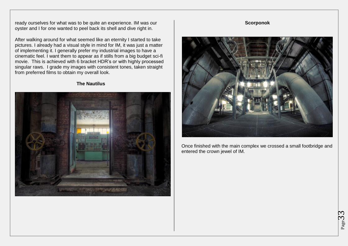
After walking around for what seemed like an eternity I started to take pictures. I already had a visual style in mind for IM, it was just a matter of implementing it. I generally prefer my industrial images to have a cinematic feel. I want them to appear as if stills from a big budget sci-fi movie. This is achieved with 6 bracket HDR’s or with highly processed singular raws. I grade my images with consistent tones, taken straight from preferred films to obtain my overall look.
The Nautilus
Scorponok
Once finished with the main complex we crossed a small footbridge and entered the crown jewel of IM.
Pag
e34
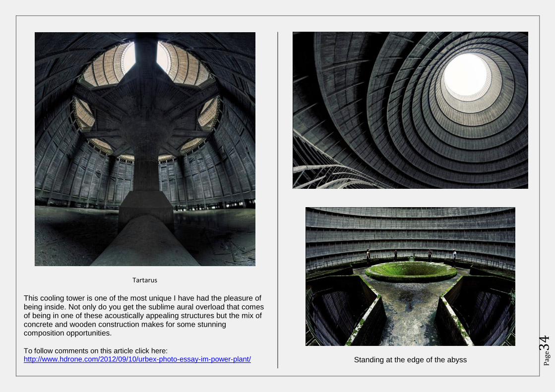
Tartarus
This cooling tower is one of the most unique I have had the pleasure of being inside. Not only do you get the sublime aural overload that comes of being in one of these acoustically appealing structures but the mix of concrete and wooden construction makes for some stunning composition opportunities.
To follow comments on this article click here: http://www.hdrone.com/2012/09/10/urbex-photo-essay-im-power-plant/
The Cyclops
Standing at the edge of the abyss
Pag
e35
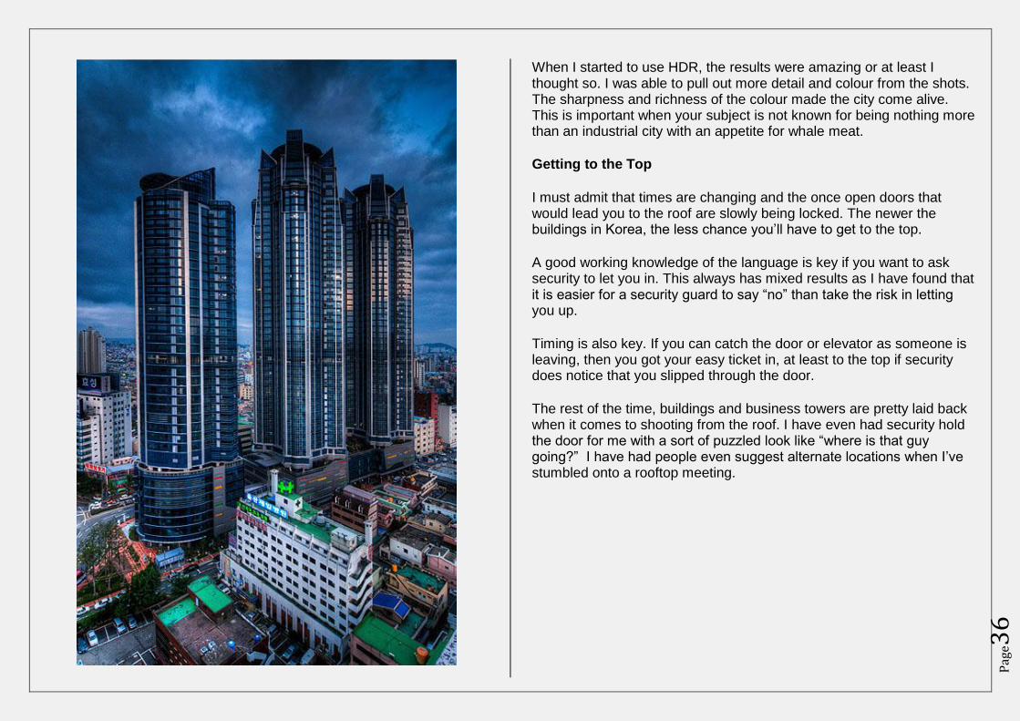
Roof topping in Ulsan By Jason Teale - http://jasonteale.com/blog/
Sinbok
Years ago when a photographer friend led me onto the roof of the Namun Plaza near the sinbok rotary in Ulsan, I was taken back by the sight before me and the sneakiness getting to the top without being seen. Little did I know that this would become a trend in some circles of photography and a passion of my own.
For me, getting to the top of a particular building was a challenge. Even more so now because of the electronic coded locks on all of the new high-rise apartment buildings that line the horizon in Ulsan. As a foreigner, you don’t exactly blend in, but I have never really been hassled while taking photos in some pretty strange spots. Even today I find myself humming the “mission complete” music from game “metal gear solid”
The biggest draw to me was how the right vantage point changes how you see the city. From a roof top you can see the old buildings, the new buildings and everything in between. Living in Ulsan for so long, I can see the changes in the skyline and remember when certain places didn’t exist.
Ulsan Factory
There is also that sense of calm in me. Be it standing on a ledge 20 floor up or finding on one of those cool roof top parks that no one uses, I enjoy my time up there and no matter how many times I go to a particular location I am still happy to be up there.
Pag
e36
When I started to use HDR, the results were amazing or at least I thought so. I was able to pull out more detail and colour from the shots. The sharpness and richness of the colour made the city come alive. This is important when your subject is not known for being nothing more than an industrial city with an appetite for whale meat.
Getting to the Top
I must admit that times are changing and the once open doors that would lead you to the roof are slowly being locked. The newer the buildings in Korea, the less chance you’ll have to get to the top.
A good working knowledge of the language is key if you want to ask security to let you in. This always has mixed results as I have found that it is easier for a security guard to say “no” than take the risk in letting you up.
Timing is also key. If you can catch the door or elevator as someone is leaving, then you got your easy ticket in, at least to the top if security does notice that you slipped through the door.
The rest of the time, buildings and business towers are pretty laid back when it comes to shooting from the roof. I have even had security hold the door for me with a sort of puzzled look like “where is that guy going?” I have had people even suggest alternate locations when I’ve stumbled onto a rooftop meeting.
Pag
e37
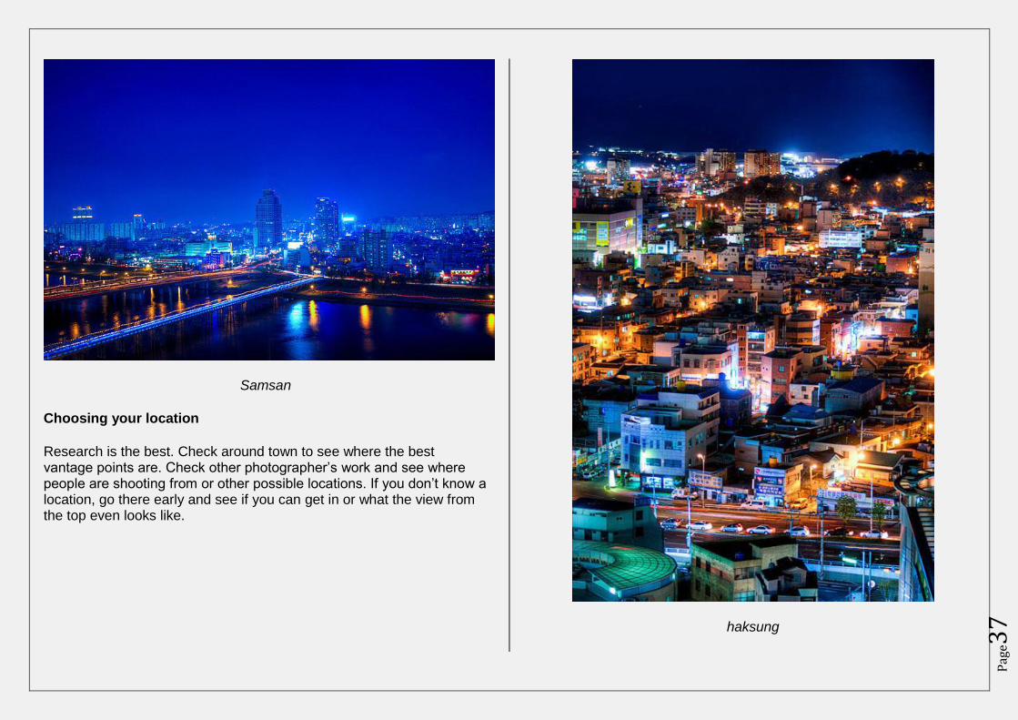
Samsan
Choosing your location
Research is the best. Check around town to see where the best vantage points are. Check other photographer’s work and see where people are shooting from or other possible locations. If you don’t know a location, go there early and see if you can get in or what the view from the top even looks like.
haksung
Pag
e38
Often a location may seem cool from street level and then not really pan out once you are on top. A few weeks ago, I was trying to get a shot of the Samsandong area in Ulsan. I got to the roof, scaled over a plastic skylight, only to find that the view was not that interesting or at least not what I was hoping for. It is all just a part of the game.
Roof topping as this style is now referred to is invigorating. With new places popping up all the time there is alway somewhere to shoot from. There will always be one more challenge to see if you can get in it. With that in mind, get out there and see what the world looks like in HDR… from the top.
To follow comments on this article click here:
http://www.hdrone.com/2012/09/12/roof-topping-in-ulsan/
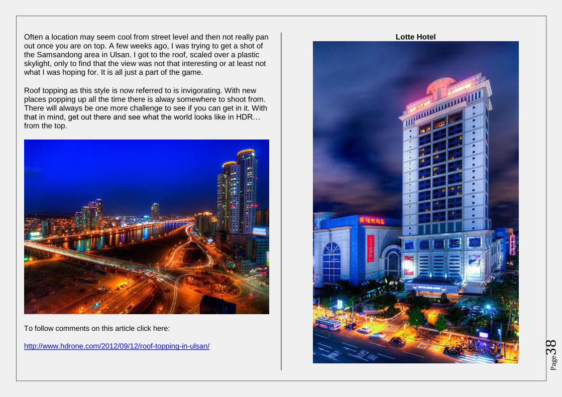
Lotte Hotel
Pag
e39
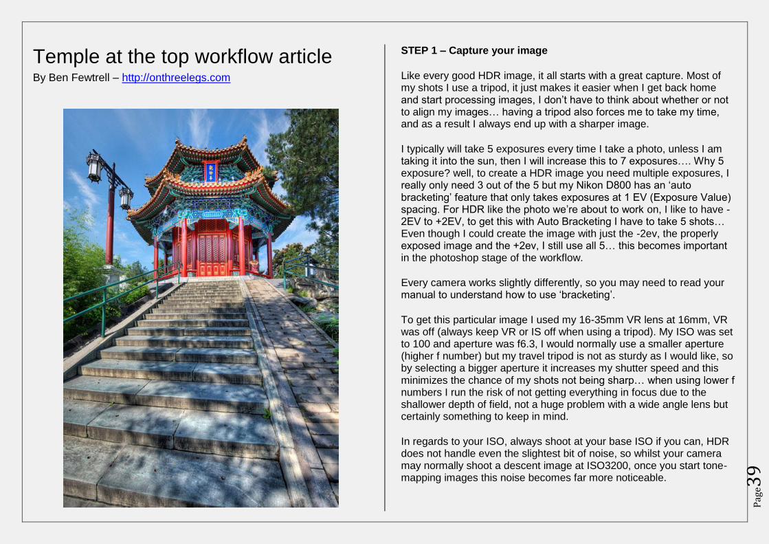
Temple at the top workflow article By Ben Fewtrell – http://onthreelegs.com
STEP 1 – Capture your image
Like every good HDR image, it all starts with a great capture. Most of my shots I use a tripod, it just makes it easier when I get back home and start processing images, I don’t have to think about whether or not to align my images… having a tripod also forces me to take my time, and as a result I always end up with a sharper image.
I typically will take 5 exposures every time I take a photo, unless I am taking it into the sun, then I will increase this to 7 exposures…. Why 5 exposure? well, to create a HDR image you need multiple exposures, I really only need 3 out of the 5 but my Nikon D800 has an ‘auto bracketing’ feature that only takes exposures at 1 EV (Exposure Value) spacing. For HDR like the photo we’re about to work on, I like to have -2EV to +2EV, to get this with Auto Bracketing I have to take 5 shots… Even though I could create the image with just the -2ev, the properly exposed image and the +2ev, I still use all 5… this becomes important in the photoshop stage of the workflow.
Every camera works slightly differently, so you may need to read your manual to understand how to use ‘bracketing’.
To get this particular image I used my 16-35mm VR lens at 16mm, VR was off (always keep VR or IS off when using a tripod). My ISO was set to 100 and aperture was f6.3, I would normally use a smaller aperture (higher f number) but my travel tripod is not as sturdy as I would like, so by selecting a bigger aperture it increases my shutter speed and this minimizes the chance of my shots not being sharp… when using lower f numbers I run the risk of not getting everything in focus due to the shallower depth of field, not a huge problem with a wide angle lens but certainly something to keep in mind.
In regards to your ISO, always shoot at your base ISO if you can, HDR does not handle even the slightest bit of noise, so whilst your camera may normally shoot a descent image at ISO3200, once you start tone-mapping images this noise becomes far more noticeable.
Pag
e40
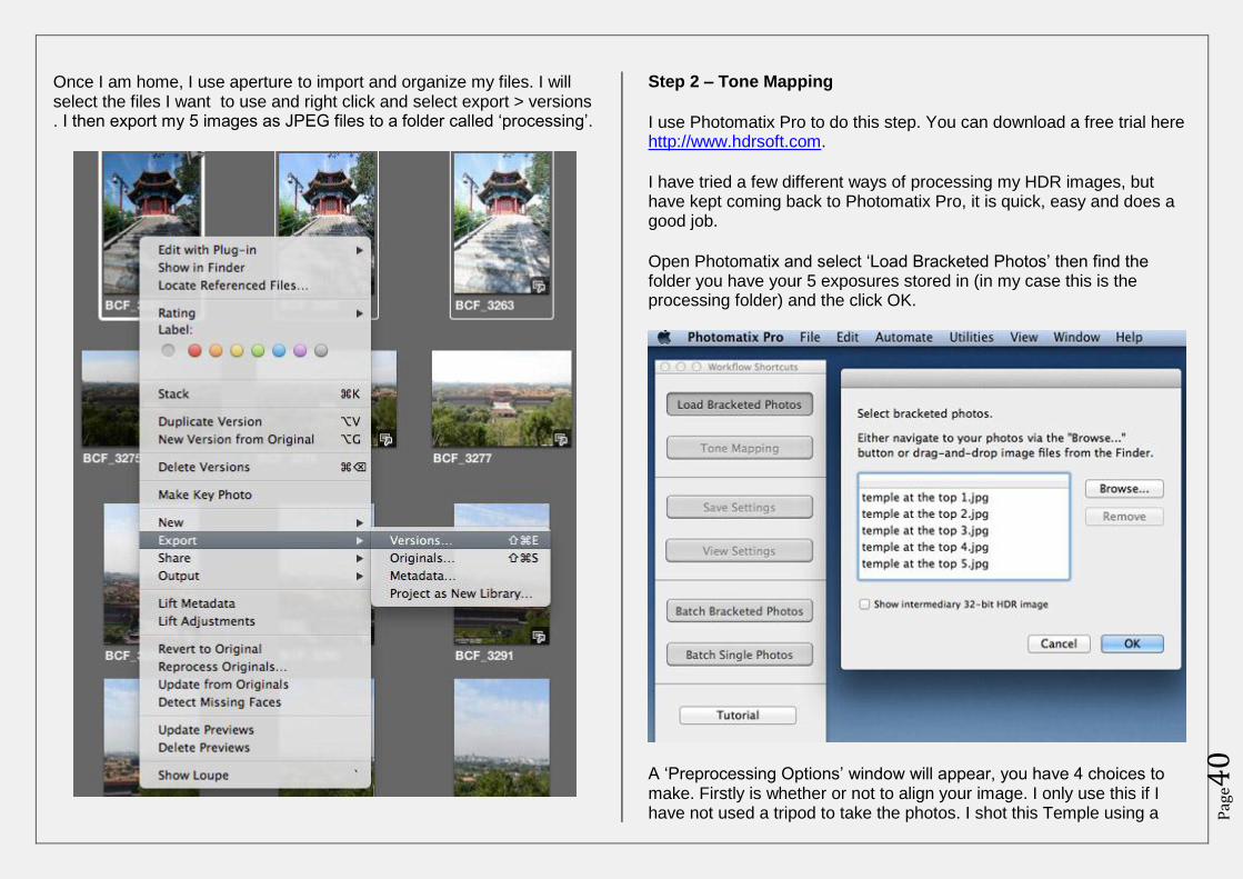
Once I am home, I use aperture to import and organize my files. I will select the files I want to use and right click and select export > versions . I then export my 5 images as JPEG files to a folder called ‘processing’.
Step 2 – Tone Mapping
I use Photomatix Pro to do this step. You can download a free trial here http://www.hdrsoft.com.
I have tried a few different ways of processing my HDR images, but have kept coming back to Photomatix Pro, it is quick, easy and does a good job.
Open Photomatix and select ‘Load Bracketed Photos’ then find the folder you have your 5 exposures stored in (in my case this is the processing folder) and the click OK.
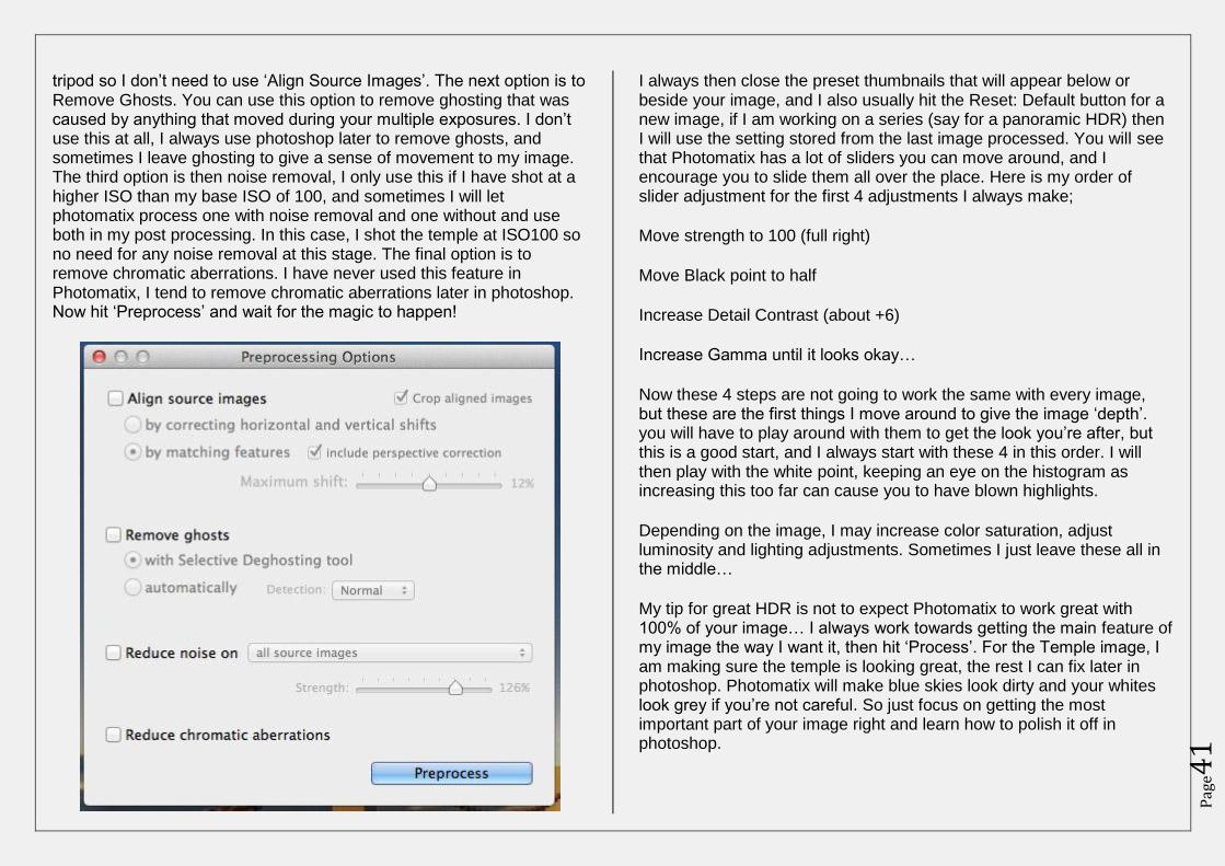
A ‘Preprocessing Options’ window will appear, you have 4 choices to make. Firstly is whether or not to align your image. I only use this if I have not used a tripod to take the photos. I shot this Temple using a
Pag
e41
tripod so I don’t need to use ‘Align Source Images’. The next option is to Remove Ghosts. You can use this option to remove ghosting that was caused by anything that moved during your multiple exposures. I don’t use this at all, I always use photoshop later to remove ghosts, and sometimes I leave ghosting to give a sense of movement to my image. The third option is then noise removal, I only use this if I have shot at a higher ISO than my base ISO of 100, and sometimes I will let photomatix process one with noise removal and one without and use both in my post processing. In this case, I shot the temple at ISO100 so no need for any noise removal at this stage. The final option is to remove chromatic aberrations. I have never used this feature in Photomatix, I tend to remove chromatic aberrations later in photoshop. Now hit ‘Preprocess’ and wait for the magic to happen!
I always then close the preset thumbnails that will appear below or beside your image, and I also usually hit the Reset: Default button for a new image, if I am working on a series (say for a panoramic HDR) then I will use the setting stored from the last image processed. You will see that Photomatix has a lot of sliders you can move around, and I encourage you to slide them all over the place. Here is my order of slider adjustment for the first 4 adjustments I always make;
Move strength to 100 (full right)
Move Black point to half
Increase Detail Contrast (about +6)
Increase Gamma until it looks okay…
Now these 4 steps are not going to work the same with every image, but these are the first things I move around to give the image ‘depth’. you will have to play around with them to get the look you’re after, but this is a good start, and I always start with these 4 in this order. I will then play with the white point, keeping an eye on the histogram as increasing this too far can cause you to have blown highlights.
Depending on the image, I may increase color saturation, adjust luminosity and lighting adjustments. Sometimes I just leave these all in the middle…
My tip for great HDR is not to expect Photomatix to work great with 100% of your image… I always work towards getting the main feature of my image the way I want it, then hit ‘Process’. For the Temple image, I am making sure the temple is looking great, the rest I can fix later in photoshop. Photomatix will make blue skies look dirty and your whites look grey if you’re not careful. So just focus on getting the most important part of your image right and learn how to polish it off in photoshop.
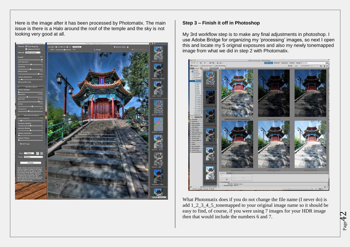
Pag
e42
Here is the image after it has been processed by Photomatix. The main issue is there is a Halo around the roof of the temple and the sky is not looking very good at all.
Step 3 – Finish it off in Photoshop
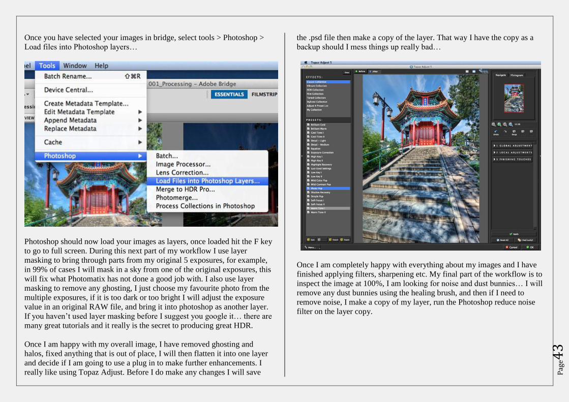
My 3rd workflow step is to make any final adjustments in photoshop. I use Adobe Bridge for organizing my ‘processing’ images, so next I open this and locate my 5 original exposures and also my newly tonemapped image from what we did in step 2 with Photomatix.
What Photomatix does if you do not change the file name (I never do) is
add 1_2_3_4_5_tonemapped to your original image name so it should be
easy to find, of course, if you were using 7 images for your HDR image
then that would include the numbers 6 and 7.
Pag
e43
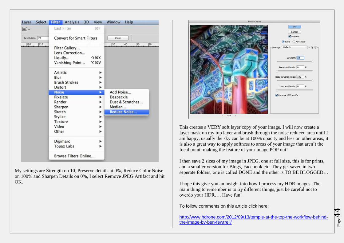
Once you have selected your images in bridge, select tools > Photoshop >
Load files into Photoshop layers…
Photoshop should now load your images as layers, once loaded hit the F key
to go to full screen. During this next part of my workflow I use layer
masking to bring through parts from my original 5 exposures, for example,
in 99% of cases I will mask in a sky from one of the original exposures, this
will fix what Photomatix has not done a good job with. I also use layer
masking to remove any ghosting, I just choose my favourite photo from the
multiple exposures, if it is too dark or too bright I will adjust the exposure
value in an original RAW file, and bring it into photoshop as another layer.
If you haven’t used layer masking before I suggest you google it… there are
many great tutorials and it really is the secret to producing great HDR.
Once I am happy with my overall image, I have removed ghosting and
halos, fixed anything that is out of place, I will then flatten it into one layer
and decide if I am going to use a plug in to make further enhancements. I
really like using Topaz Adjust. Before I do make any changes I will save
the .psd file then make a copy of the layer. That way I have the copy as a
backup should I mess things up really bad…
Once I am completely happy with everything about my images and I have
finished applying filters, sharpening etc. My final part of the workflow is to
inspect the image at 100%, I am looking for noise and dust bunnies… I will
remove any dust bunnies using the healing brush, and then if I need to
remove noise, I make a copy of my layer, run the Photoshop reduce noise
filter on the layer copy.
Pag
e44
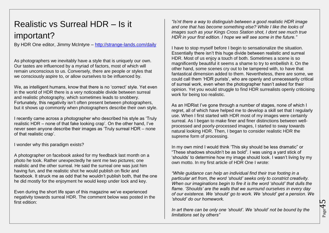
My settings are Strength on 10, Preserve details at 0%, Reduce Color Noise
on 100% and Sharpen Details on 0%, I select Remove JPEG Artifact and hit
OK.
This creates a VERY soft layer copy of your image, I will now create a
layer mask on my top layer and brush through the noise reduced area until I
am happy, usually the sky can be at 100% opacity and less on other areas, it
is also a great way to apply softness to areas of your image that aren’t the
focal point, making the feature of your image POP out!
I then save 2 sizes of my image in JPEG, one at full size, this is for prints,
and a smaller version for Blogs, Facebook etc. They get saved in two
seperate folders, one is called DONE and the other is TO BE BLOGGED…
I hope this give you an insight into how I process my HDR images. The
main thing to remember is to try different things, just be careful not to
overdo your HDR…. Have fun!
To follow comments on this article click here:
http://www.hdrone.com/2012/09/13/temple-at-the-top-the-workflow-behind-the-image-by-ben-fewtrell/
Pag
e45
Realistic vs Surreal HDR – Is it
important? By HDR One editor, Jimmy McIntyre – http://strange-lands.com/daily
As photographers we inevitably have a style that is uniquely our own. Our tastes are influenced by a myriad of factors, most of which will remain unconscious to us. Conversely, there are people or styles that we consciously aspire to, or allow ourselves to be influenced by.
We, as intelligent humans, know that there is no ‘correct’ style. Yet even in the world of HDR there is a very noticeable divide between surreal and realistic photography, which sometimes leads to snobbery. Fortunately, this negativity isn’t often present between photographers, but it shows up commonly when photographers describe their own style.
I recently came across a photographer who described his style as ‘Truly realistic HDR – none of that fake looking crap’. On the other hand, I’ve never seen anyone describe their images as ‘Truly surreal HDR – none of that realistic crap’.
I wonder why this paradigm exists?
A photographer on facebook asked for my feedback last month on a photo he took. Rather unexpectedly he sent me two pictures; one realistic and the other surreal. He said the surreal one was just him having fun, and the realistic shot he would publish on flickr and facebook. It struck me as odd that he wouldn’t publish both, that the one he did mostly for the enjoyment he would keep under lock and key.
Even during the short life span of this magazine we’ve experienced negativity towards surreal HDR. The comment below was posted in the first edition:
“Is’nt there a way to distinguish between a good realistic HDR image and one that has become something else? While I like the looks of images such as your Kings Cross Station shot, I dont see much true HDR in your first edition. I hope we will see some in the future.”
I have to stop myself before I begin to sensationalize the situation. Essentially there isn’t this huge divide between realistic and surreal HDR. Most of us enjoy a touch of both. Sometimes a scene is so magnificently beautiful it seems a shame to try to embellish it. On the other hand, some scenes cry out to be tampered with, to have that fantastical dimension added to them. Nevertheless, there are some, we could call them ‘HDR purists’, who are openly and unnecessarily critical of surreal work, even when the photographer hasn’t asked for their opinion. Yet you would struggle to find HDR surrealists openly criticising work for being too realistic.
As an HDRist I’ve gone through a number of stages, none of which I regret, all of which have helped me to develop a skill set that I regularly use. When I first started with HDR most of my images were certainly surreal. As I began to make finer and finer distinctions between well-processed and poorly-processed images, I started to sway towards natural looking HDR. Then, I began to consider realistic HDR the supreme form of processing.
In my own mind I would think ‘This sky should be less dramatic” or “These shadows shouldn’t be as bold”. I was using a yard stick of ‘shoulds’ to determine how my image should look. I wasn’t living by my own motto. In my first article of HDR One I wrote:
“While guidance can help an individual find their true footing in a particular art from, the word ‘should’ seeks only to constrict creativity. When our imaginations begin to fire it is the word ‘should’ that dulls the flame. ‘Shoulds’ are the walls that we surround ourselves in every day of our existence. We ‘should’ go to work. We ‘should’ get a pension. We ‘should’ do our homework.
In art there can be only one ‘should’. We ‘should’ not be bound by the limitations set by others”
Pag
e46
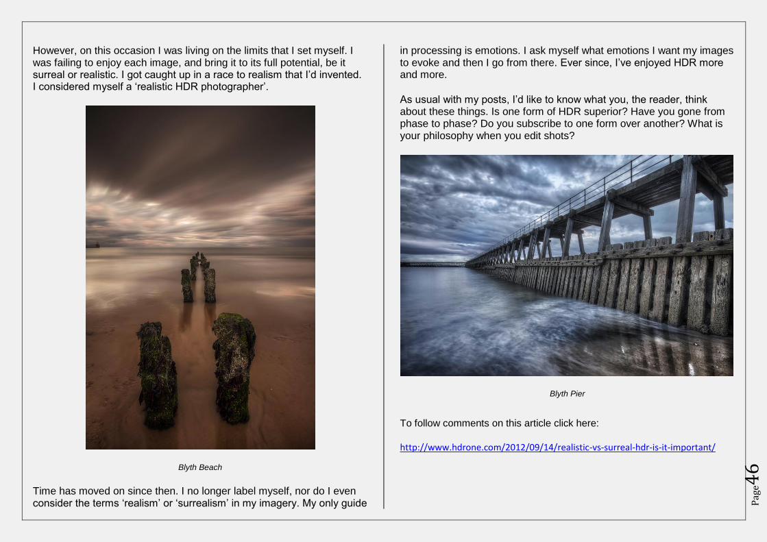
However, on this occasion I was living on the limits that I set myself. I was failing to enjoy each image, and bring it to its full potential, be it surreal or realistic. I got caught up in a race to realism that I’d invented. I considered myself a ‘realistic HDR photographer’.
Blyth Beach
Time has moved on since then. I no longer label myself, nor do I even consider the terms ‘realism’ or ‘surrealism’ in my imagery. My only guide
in processing is emotions. I ask myself what emotions I want my images to evoke and then I go from there. Ever since, I’ve enjoyed HDR more and more.
As usual with my posts, I’d like to know what you, the reader, think about these things. Is one form of HDR superior? Have you gone from phase to phase? Do you subscribe to one form over another? What is your philosophy when you edit shots?
Blyth Pier
To follow comments on this article click here: http://www.hdrone.com/2012/09/14/realistic-vs-surreal-hdr-is-it-important/
Pag
e47
Gloucester Cathedral By Tim Knifton – http://www.facebook.com/TimKniftonPhotography
Visited on 25th August with another HDR photographer and good friend
of mine.
A little bit of the history
Gloucester Cathedral has been a place of Christian worship continuously for over 1300 years, since Osric, an Anglo-Saxon prince, founded a religious house here in 678-9 AD. Little is known for certain about the communities which worshipped here or the buildings they used over the next 400 years although it is believed that the Benedictine Rule was introduced here early in the 11th century.
A record of the building fabric is made before and during stonework conservation, detailing the information that repair works uncover about building history and early building techniques.
The visit
We arrived at 7:30am as they were just about to open up. We were told that the early morning is the best time before the tourists arrive so that you can manage to get the Cloisters photographed without other people being in them or jostling for position.
As the weather wasn’t great, we had the whole place more or less to ourselves and never had to wait for another person to move out of the way.
The place is an architectural masterpiece – for photographing as well as just wandering around and marvelling at the building itself.
Pag
e48
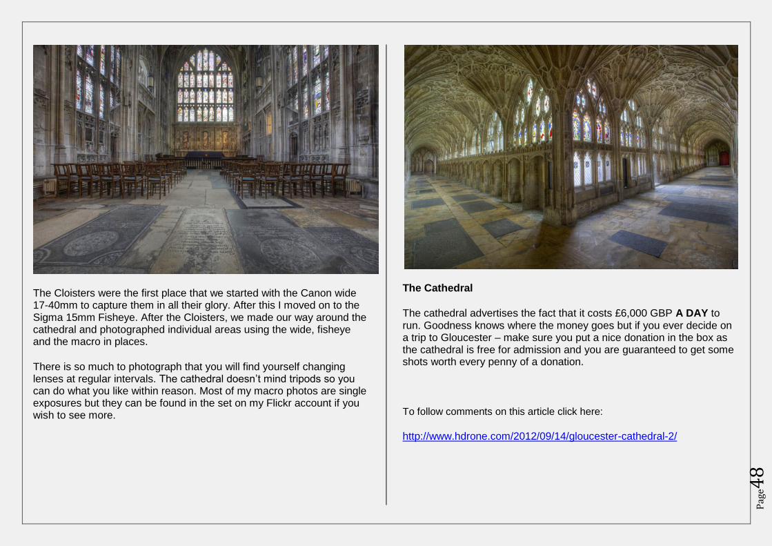
The Cloisters were the first place that we started with the Canon wide 17-40mm to capture them in all their glory. After this I moved on to the Sigma 15mm Fisheye. After the Cloisters, we made our way around the cathedral and photographed individual areas using the wide, fisheye and the macro in places.
There is so much to photograph that you will find yourself changing lenses at regular intervals. The cathedral doesn’t mind tripods so you can do what you like within reason. Most of my macro photos are single exposures but they can be found in the set on my Flickr account if you wish to see more.
The Cathedral
The cathedral advertises the fact that it costs £6,000 GBP A DAY to run. Goodness knows where the money goes but if you ever decide on a trip to Gloucester – make sure you put a nice donation in the box as the cathedral is free for admission and you are guaranteed to get some shots worth every penny of a donation.
To follow comments on this article click here:
http://www.hdrone.com/2012/09/14/gloucester-cathedral-2/
Pag
e49
Understanding the Adjustment
Sliders in Photomatix Pro By Curt Fleenor - http://www.curtfleenor.com/
Photomatix is at the core most people’s HDR processing but it comes with a bit of a learning curve. There are so many adjustment sliders available that wrapping your mind around them all can be somewhat intimidating. Adding to the confusion is their tendency to interact with each other in sometimes unpredictable ways.
Most of the time when I’m processing an image in Photomatix I will slowly move each slider to each of its extreme points just to see what effect it has until I find the best setting. I have read many posts by other photographers who also use this method but at some point you want to understand the intended effect of the sliders. Knowing what each one is supposed to do can make your processing experience faster and a little more pleasant.
Photomatix ships with several presets that can set you up with a good starting point but I think most people prefer the “Default” preset! This one sets everything back to the default settings so you can begin to apply your own feel to the image. It’s important to reset to the defaults each time you start Photomatix because it remembers the settings that
were used the last time it was open.
Photomatix has two processing methods: Tone Mapping and Exposure Fusion. Details Enhancer gives you a wide range of controls
and the most flexibility when processing. Since I have only ever used this method those are the adjustment sliders that I’ll be discussing in this article.
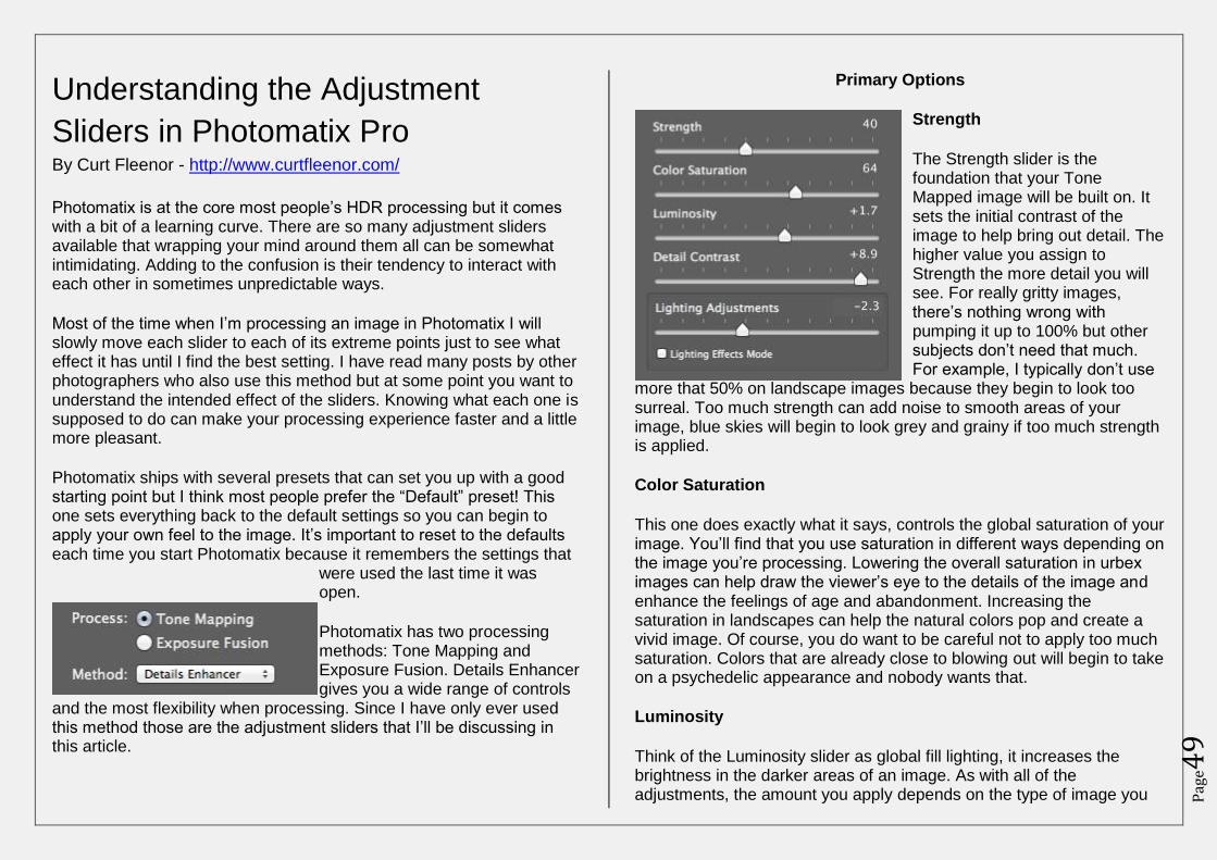
Primary Options
Strength
The Strength slider is the foundation that your Tone Mapped image will be built on. It sets the initial contrast of the image to help bring out detail. The higher value you assign to Strength the more detail you will see. For really gritty images, there’s nothing wrong with pumping it up to 100% but other subjects don’t need that much. For example, I typically don’t use
more that 50% on landscape images because they begin to look too surreal. Too much strength can add noise to smooth areas of your image, blue skies will begin to look grey and grainy if too much strength is applied.
Color Saturation
This one does exactly what it says, controls the global saturation of your image. You’ll find that you use saturation in different ways depending on the image you’re processing. Lowering the overall saturation in urbex images can help draw the viewer’s eye to the details of the image and enhance the feelings of age and abandonment. Increasing the saturation in landscapes can help the natural colors pop and create a vivid image. Of course, you do want to be careful not to apply too much saturation. Colors that are already close to blowing out will begin to take on a psychedelic appearance and nobody wants that.
Luminosity
Think of the Luminosity slider as global fill lighting, it increases the brightness in the darker areas of an image. As with all of the adjustments, the amount you apply depends on the type of image you
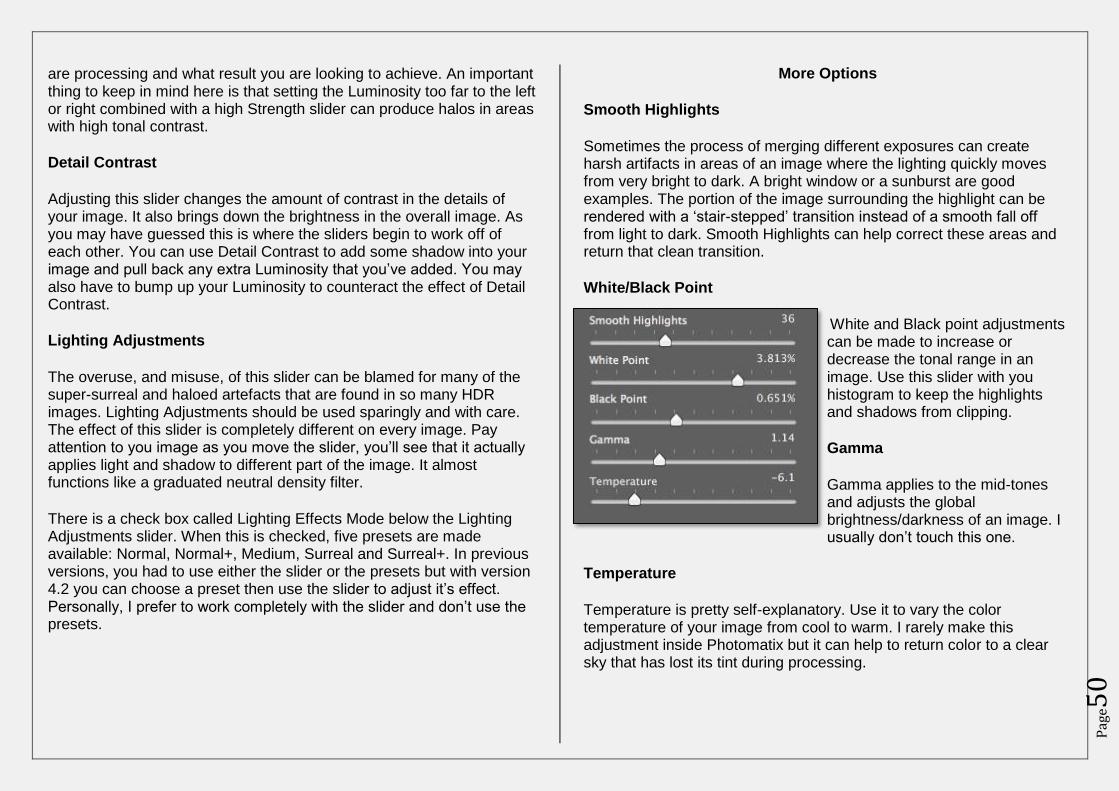
Pag
e50
are processing and what result you are looking to achieve. An important thing to keep in mind here is that setting the Luminosity too far to the left or right combined with a high Strength slider can produce halos in areas with high tonal contrast.
Detail Contrast
Adjusting this slider changes the amount of contrast in the details of your image. It also brings down the brightness in the overall image. As you may have guessed this is where the sliders begin to work off of each other. You can use Detail Contrast to add some shadow into your image and pull back any extra Luminosity that you’ve added. You may also have to bump up your Luminosity to counteract the effect of Detail Contrast.
Lighting Adjustments
The overuse, and misuse, of this slider can be blamed for many of the super-surreal and haloed artefacts that are found in so many HDR images. Lighting Adjustments should be used sparingly and with care. The effect of this slider is completely different on every image. Pay attention to you image as you move the slider, you’ll see that it actually applies light and shadow to different part of the image. It almost functions like a graduated neutral density filter.
There is a check box called Lighting Effects Mode below the Lighting Adjustments slider. When this is checked, five presets are made available: Normal, Normal+, Medium, Surreal and Surreal+. In previous versions, you had to use either the slider or the presets but with version 4.2 you can choose a preset then use the slider to adjust it’s effect. Personally, I prefer to work completely with the slider and don’t use the presets.
More Options
Smooth Highlights
Sometimes the process of merging different exposures can create harsh artifacts in areas of an image where the lighting quickly moves from very bright to dark. A bright window or a sunburst are good examples. The portion of the image surrounding the highlight can be rendered with a ‘stair-stepped’ transition instead of a smooth fall off from light to dark. Smooth Highlights can help correct these areas and return that clean transition.
White/Black Point
White and Black point adjustments can be made to increase or decrease the tonal range in an image. Use this slider with you histogram to keep the highlights and shadows from clipping.
Gamma
Gamma applies to the mid-tones and adjusts the global brightness/darkness of an image. I usually don’t touch this one.
Temperature
Temperature is pretty self-explanatory. Use it to vary the color temperature of your image from cool to warm. I rarely make this adjustment inside Photomatix but it can help to return color to a clear sky that has lost its tint during processing.
Pag
e51
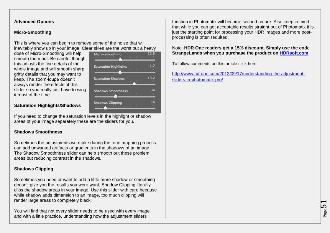
Advanced Options
Micro-Smoothing
This is where you can begin to remove some of the noise that will inevitably show up in your image. Clear skies are the worst but a heavy dose of Micro-Smoothing will help smooth them out. Be careful though, this adjusts the fine details of the whole image and will smooth sharp, gritty details that you may want to keep. The zoom-loupe doesn’t always render the effects of this slider so you really just have to wing it most of the time.
Saturation Highlights/Shadows
If you need to change the saturation levels in the highlight or shadow areas of your image separately these are the sliders for you.
Shadows Smoothness
Sometimes the adjustments we make during the tone mapping process can add unwanted artifacts or gradients in the shadows of an image. The Shadow Smoothness slider can help smooth out these problem areas but reducing contrast in the shadows.
Shadows Clipping
Sometimes you need or want to add a little more shadow or smoothing doesn’t give you the results you were want. Shadow Clipping literally clips the shadow areas in your image. Use this slider with care because while shadow adds dimension to an image, too much clipping will render large areas to completely black.
You will find that not every slider needs to be used with every image and with a little practice, understanding how the adjustment sliders
function in Photomatix will become second nature. Also keep in mind that while you can get acceptable results straight out of Photomatix it is just the starting point for processing your HDR images and more post-processing is often required.
Note: HDR One readers get a 15% discount. Simply use the code StrangeLands when you purchase the product on HDRsoft.com
To follow comments on this article click here:
http://www.hdrone.com/2012/09/17/understanding-the-adjustment-
sliders-in-photomatix-pro/
Pag
e52
HDR in motion: realistic HDR for
wildlife photographers By Jim Austin - http://www.jimages.com/
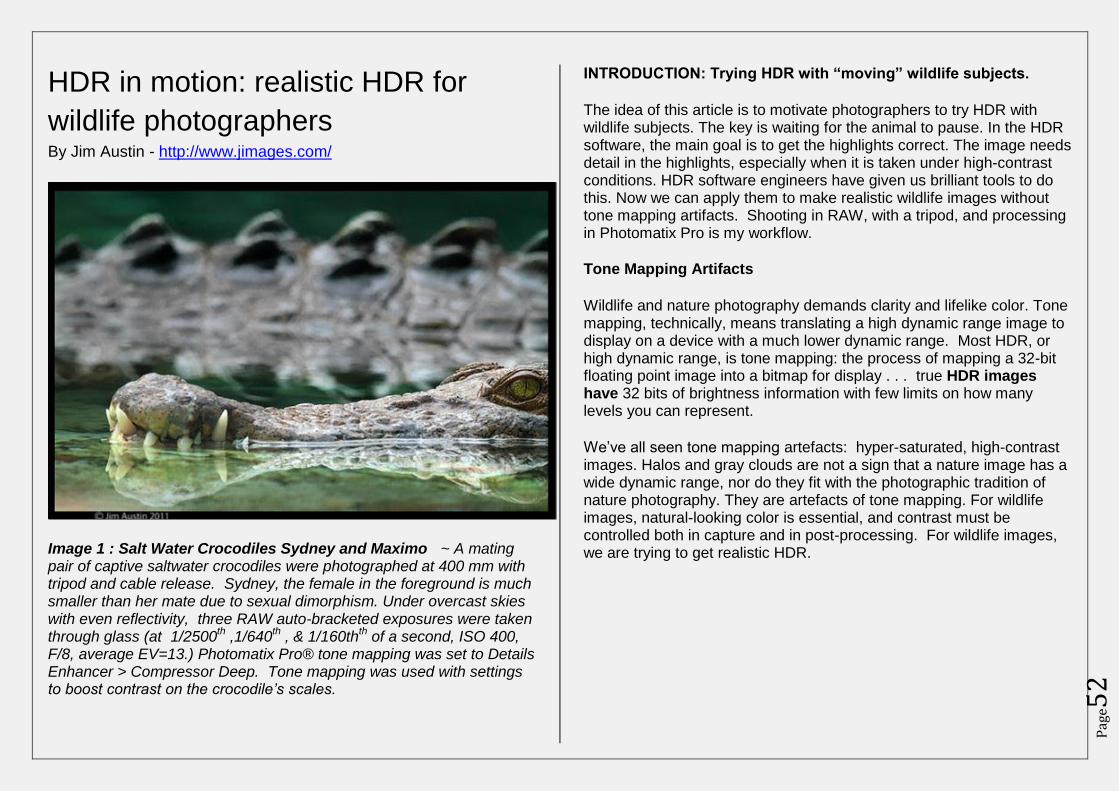
Image 1 : Salt Water Crocodiles Sydney and Maximo ~ A mating pair of captive saltwater crocodiles were photographed at 400 mm with tripod and cable release. Sydney, the female in the foreground is much smaller than her mate due to sexual dimorphism. Under overcast skies with even reflectivity, three RAW auto-bracketed exposures were taken through glass (at 1/2500
th ,1/640
th , & 1/160th
th of a second, ISO 400,
F/8, average EV=13.) Photomatix Pro® tone mapping was set to Details Enhancer > Compressor Deep. Tone mapping was used with settings to boost contrast on the crocodile’s scales.
INTRODUCTION: Trying HDR with “moving” wildlife subjects.
The idea of this article is to motivate photographers to try HDR with wildlife subjects. The key is waiting for the animal to pause. In the HDR software, the main goal is to get the highlights correct. The image needs detail in the highlights, especially when it is taken under high-contrast conditions. HDR software engineers have given us brilliant tools to do this. Now we can apply them to make realistic wildlife images without tone mapping artifacts. Shooting in RAW, with a tripod, and processing in Photomatix Pro is my workflow.
Tone Mapping Artifacts
Wildlife and nature photography demands clarity and lifelike color. Tone mapping, technically, means translating a high dynamic range image to display on a device with a much lower dynamic range. Most HDR, or high dynamic range, is tone mapping: the process of mapping a 32-bit floating point image into a bitmap for display . . . true HDR images have 32 bits of brightness information with few limits on how many levels you can represent.
We’ve all seen tone mapping artefacts: hyper-saturated, high-contrast images. Halos and gray clouds are not a sign that a nature image has a wide dynamic range, nor do they fit with the photographic tradition of nature photography. They are artefacts of tone mapping. For wildlife images, natural-looking color is essential, and contrast must be controlled both in capture and in post-processing. For wildlife images, we are trying to get realistic HDR.
Pag
e53
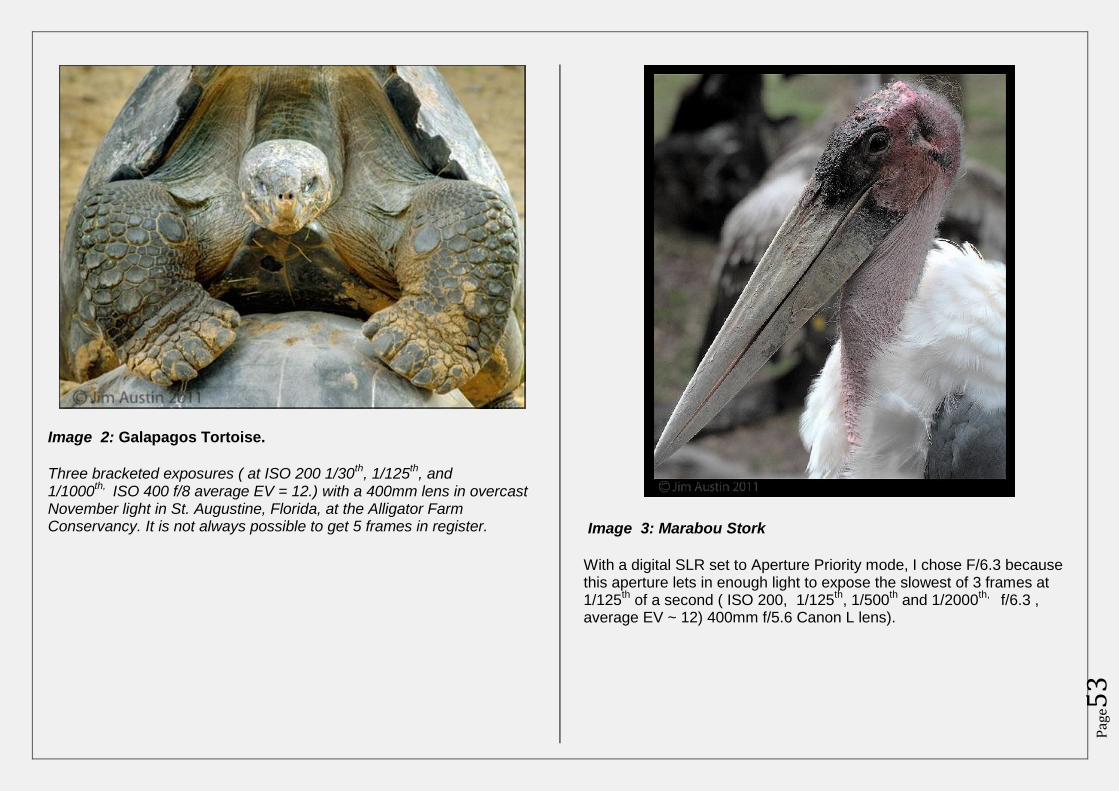
Image 2: Galapagos Tortoise.
Three bracketed exposures ( at ISO 200 1/30th, 1/125
th, and
1/1000th,
ISO 400 f/8 average EV = 12.) with a 400mm lens in overcast November light in St. Augustine, Florida, at the Alligator Farm Conservancy. It is not always possible to get 5 frames in register.
Image 3: Marabou Stork
With a digital SLR set to Aperture Priority mode, I chose F/6.3 because this aperture lets in enough light to expose the slowest of 3 frames at 1/125
th of a second ( ISO 200, 1/125
th, 1/500
th and 1/2000
th, f/6.3 ,
average EV ~ 12) 400mm f/5.6 Canon L lens).

Pag
e54
TECHNIQUES : Find the stillness within the movement
1. LOWER your ISO (International Organization for Standardization)
Photograph at the lowest ISO possible to minimize noise in your nature prints. Use RAW file capture at the highest resolution setting on your camera. Use a tripod instead of raising ISO.
2. TURN off the AUTO
Turn off IS/ VR/OS which are acronyms for image stabilization. Yes, it is an amazing tool, but turn it off to register your frames in a bracketed HDR series. With Auto-Bracketing (AEB) set, and Aperture Priority (Av) mode selected, turn off the Auto-focus. Do not use auto ISO, do not zoom, and do not use the self-timer.
3. WHITE BALANCE for the best color
Remember to adjust your white balance in the camera menu. Although Auto White Balance can work well, try Manual White Balance settings with a white/gray card, a sheet of white paper or customized white balance gear. Lightroom or Aperture presets may do this more conveniently for your workflow.
4. SPEEDS, STICKS & STILLNESS for stability
I know from practice that 1/60th to 1/125
th is about the slowest range of
shutter speeds for stable shots with this 400 mm lens ( Vibration Reduction/Image Stabilization were not used.) A rule of thumb is to choose a shutter speed equivalent to the focal length of the lens. However, most of you reading will be trying even slower shutter speeds because you are using steady tripods or “sticks”.
Even with a sturdy tripod-mounted camera, shutter speeds slower than 1/60
th of a second place my setup at risk for both subject and camera
movement. So, to minimize subject movement, the main idea is to wait for moments of stillness when the wildlife animal pauses.
5. STICK with It.
Be persistent. When photographing a restless animal, it will take more tries to get a sequence of three identical bracketed images. To do this, wait for those short slices of time when the animal pauses for a split second. Expose your frames. Then, hang around for the next “in-between” moment and take yet another bracketed series. Practice on captive animals first, then move to wild ones for more adventure.
Take off your watch and slow down. Be on “animal time.” Think about how the animal feels and moves once it sees you. At first, stay far away and watch. Then, slowly, after the subject settles a little, approach stealthily, crouch down, and be still. Lower your lens to the animal’s eye level.
WORKFLOW for Realistic Wildlife Images
Because HDR software needs identical frames, any differences in the bracketed images makes it harder for software to align the frames. “Ghosting” happens when the subject moves between frames of a series of multiple exposures. Correcting ghosting artifacts takes time. Software programs have built-in ghosting formulas but running them discards some exposure data as it applies only single exposure information to parts of the entire photograph. Prevention is better than treatment.
Pag
e55
Click to enlarge
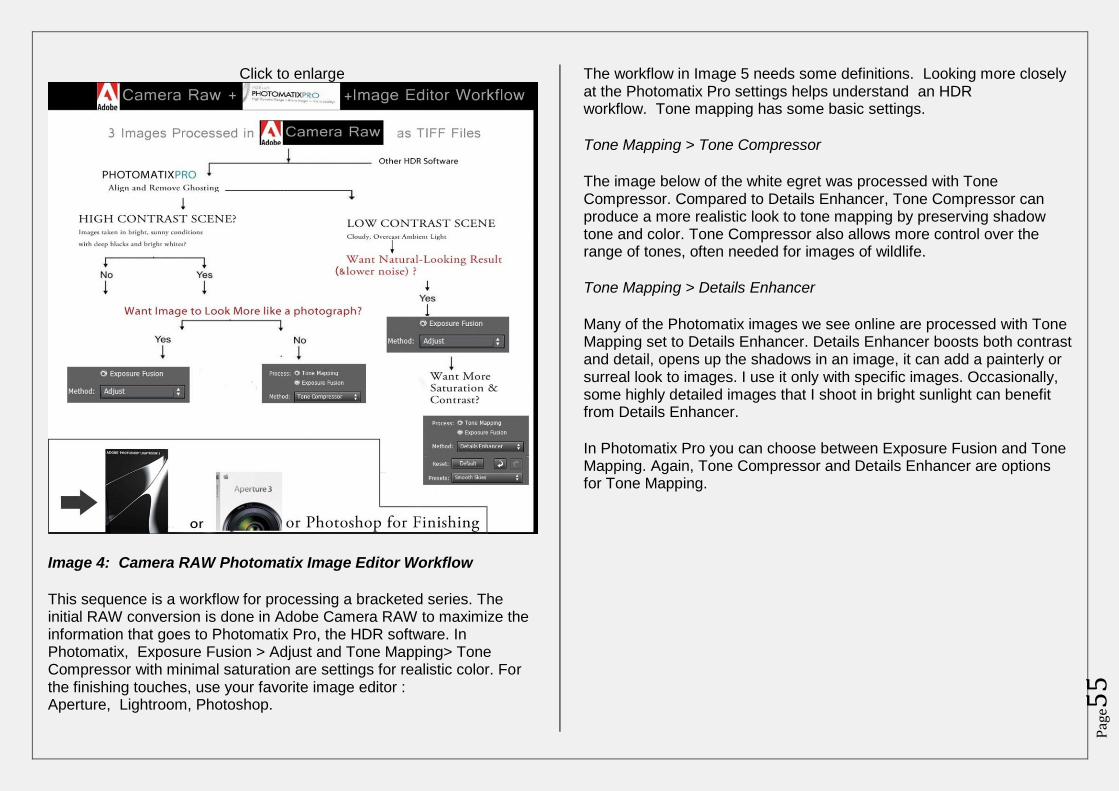
Image 4: Camera RAW Photomatix Image Editor Workflow
This sequence is a workflow for processing a bracketed series. The initial RAW conversion is done in Adobe Camera RAW to maximize the information that goes to Photomatix Pro, the HDR software. In Photomatix, Exposure Fusion > Adjust and Tone Mapping> Tone Compressor with minimal saturation are settings for realistic color. For the finishing touches, use your favorite image editor : Aperture, Lightroom, Photoshop.
The workflow in Image 5 needs some definitions. Looking more closely at the Photomatix Pro settings helps understand an HDR workflow. Tone mapping has some basic settings.
Tone Mapping > Tone Compressor
The image below of the white egret was processed with Tone Compressor. Compared to Details Enhancer, Tone Compressor can produce a more realistic look to tone mapping by preserving shadow tone and color. Tone Compressor also allows more control over the range of tones, often needed for images of wildlife.
Tone Mapping > Details Enhancer
Many of the Photomatix images we see online are processed with Tone Mapping set to Details Enhancer. Details Enhancer boosts both contrast and detail, opens up the shadows in an image, it can add a painterly or surreal look to images. I use it only with specific images. Occasionally, some highly detailed images that I shoot in bright sunlight can benefit from Details Enhancer.
In Photomatix Pro you can choose between Exposure Fusion and Tone Mapping. Again, Tone Compressor and Details Enhancer are options for Tone Mapping.
Pag
e56
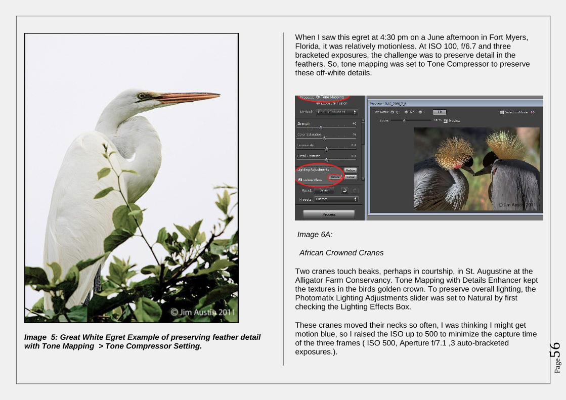
Image 5: Great White Egret Example of preserving feather detail with Tone Mapping > Tone Compressor Setting.
When I saw this egret at 4:30 pm on a June afternoon in Fort Myers, Florida, it was relatively motionless. At ISO 100, f/6.7 and three bracketed exposures, the challenge was to preserve detail in the feathers. So, tone mapping was set to Tone Compressor to preserve these off-white details.
Image 6A:
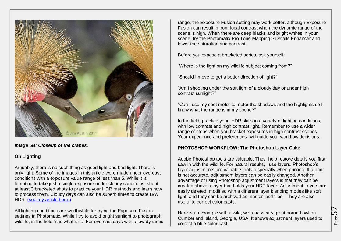
African Crowned Cranes
Two cranes touch beaks, perhaps in courtship, in St. Augustine at the Alligator Farm Conservancy. Tone Mapping with Details Enhancer kept the textures in the birds golden crown. To preserve overall lighting, the Photomatix Lighting Adjustments slider was set to Natural by first checking the Lighting Effects Box.
These cranes moved their necks so often, I was thinking I might get motion blue, so I raised the ISO up to 500 to minimize the capture time of the three frames ( ISO 500, Aperture f/7.1 ,3 auto-bracketed exposures.).
Pag
e57
Image 6B: Closeup of the cranes.
On Lighting
Arguably, there is no such thing as good light and bad light. There is only light. Some of the images in this article were made under overcast conditions with a exposure value range of less than 5. While it is tempting to take just a single exposure under cloudy conditions, shoot at least 3 bracketed shots to practice your HDR methods and learn how to process them. Cloudy days can also be superb times to create B/W HDR (see my article here.)
All lighting conditions are worthwhile for trying the Exposure Fusion settings in Photomatix. While I try to avoid bright sunlight to photograph wildlife, in the field “it is what it is.” For overcast days with a low dynamic
range, the Exposure Fusion setting may work better, although Exposure Fusion can result in poor local contrast when the dynamic range of the scene is high. When there are deep blacks and bright whites in your scene, try the Photomatix Pro Tone Mapping > Details Enhancer and lower the saturation and contrast.
Before you expose a bracketed series, ask yourself:
“Where is the light on my wildlife subject coming from?”
“Should I move to get a better direction of light?”
“Am I shooting under the soft light of a cloudy day or under high contrast sunlight?”
“Can I use my spot meter to meter the shadows and the highlights so I know what the range is in my scene?”
In the field, practice your HDR skills in a variety of lighting conditions, with low contrast and high contrast light. Remember to use a wider range of stops when you bracket exposures in high contrast scenes. Your experience and preferences will guide your workflow decisions.
PHOTOSHOP WORKFLOW: The Photoshop Layer Cake
Adobe Photoshop tools are valuable. They help restore details you first saw in with the wildlife. For natural results, I use layers. Photoshop’s layer adjustments are valuable tools, especially when printing. If a print is not accurate, adjustment layers can be easily changed. Another advantage of using Photoshop adjustment layers is that they can be created above a layer that holds your HDR layer. Adjustment Layers are easily deleted, modified with a different layer blending modes like soft light, and they can be archived as master .psd files. They are also useful to correct color casts.
Here is an example with a wild, wet and weary great horned owl on Cumberland Island, Georgia, USA. It shows adjustment layers used to correct a blue color cast.
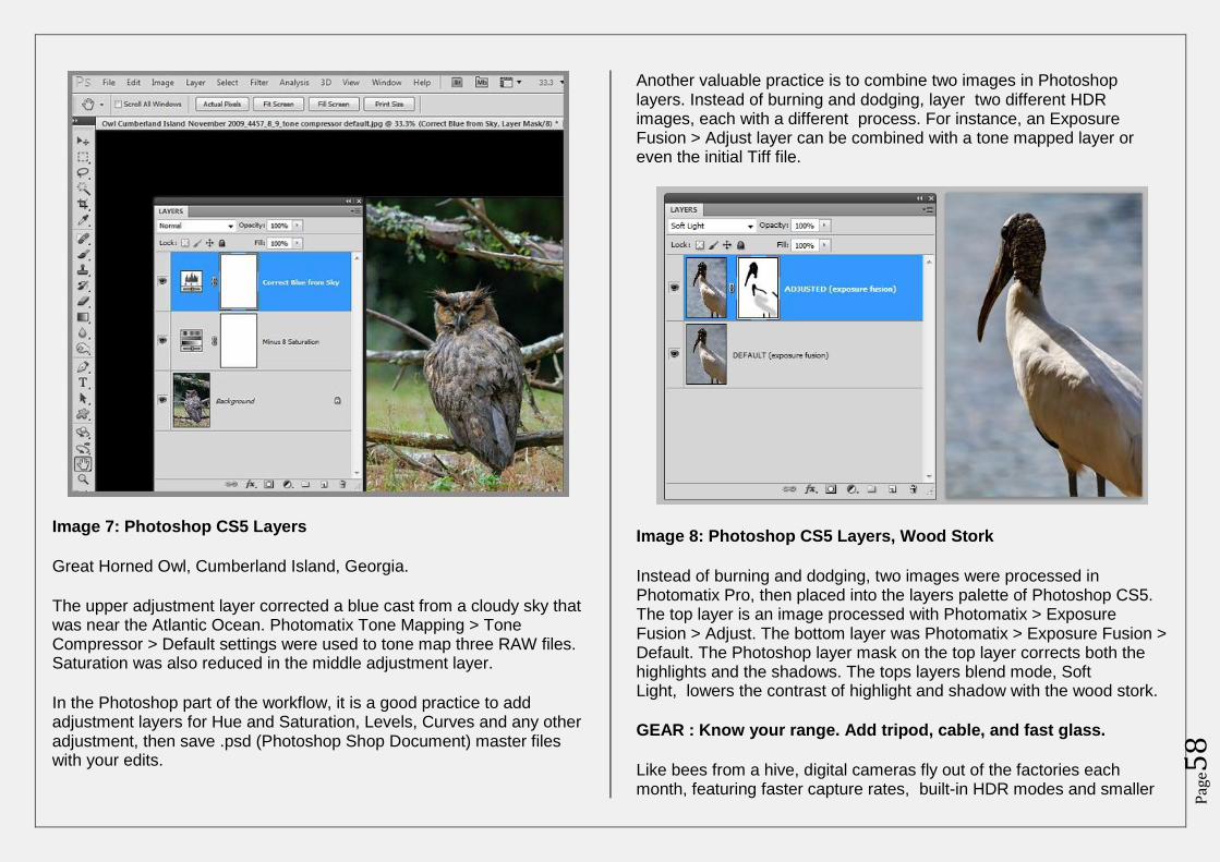
Pag
e58
Image 7: Photoshop CS5 Layers
Great Horned Owl, Cumberland Island, Georgia.
The upper adjustment layer corrected a blue cast from a cloudy sky that was near the Atlantic Ocean. Photomatix Tone Mapping > Tone Compressor > Default settings were used to tone map three RAW files. Saturation was also reduced in the middle adjustment layer.
In the Photoshop part of the workflow, it is a good practice to add adjustment layers for Hue and Saturation, Levels, Curves and any other adjustment, then save .psd (Photoshop Shop Document) master files with your edits.
Another valuable practice is to combine two images in Photoshop layers. Instead of burning and dodging, layer two different HDR images, each with a different process. For instance, an Exposure Fusion > Adjust layer can be combined with a tone mapped layer or even the initial Tiff file.
Image 8: Photoshop CS5 Layers, Wood Stork
Instead of burning and dodging, two images were processed in Photomatix Pro, then placed into the layers palette of Photoshop CS5. The top layer is an image processed with Photomatix > Exposure Fusion > Adjust. The bottom layer was Photomatix > Exposure Fusion > Default. The Photoshop layer mask on the top layer corrects both the highlights and the shadows. The tops layers blend mode, Soft Light, lowers the contrast of highlight and shadow with the wood stork.
GEAR : Know your range. Add tripod, cable, and fast glass.
Like bees from a hive, digital cameras fly out of the factories each month, featuring faster capture rates, built-in HDR modes and smaller
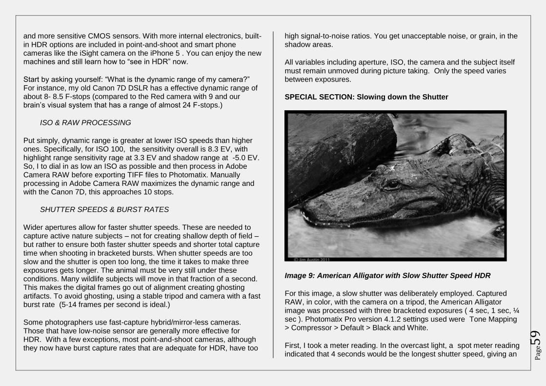
Pag
e59
and more sensitive CMOS sensors. With more internal electronics, built-in HDR options are included in point-and-shoot and smart phone cameras like the iSight camera on the iPhone 5 . You can enjoy the new machines and still learn how to “see in HDR” now.
Start by asking yourself: “What is the dynamic range of my camera?” For instance, my old Canon 7D DSLR has a effective dynamic range of about 8- 8.5 F-stops (compared to the Red camera with 9 and our brain’s visual system that has a range of almost 24 F-stops.)
ISO & RAW PROCESSING
Put simply, dynamic range is greater at lower ISO speeds than higher ones. Specifically, for ISO 100, the sensitivity overall is 8.3 EV, with highlight range sensitivity rage at 3.3 EV and shadow range at -5.0 EV. So, I to dial in as low an ISO as possible and then process in Adobe Camera RAW before exporting TIFF files to Photomatix. Manually processing in Adobe Camera RAW maximizes the dynamic range and with the Canon 7D, this approaches 10 stops.
SHUTTER SPEEDS & BURST RATES
Wider apertures allow for faster shutter speeds. These are needed to capture active nature subjects – not for creating shallow depth of field – but rather to ensure both faster shutter speeds and shorter total capture time when shooting in bracketed bursts. When shutter speeds are too slow and the shutter is open too long, the time it takes to make three exposures gets longer. The animal must be very still under these conditions. Many wildlife subjects will move in that fraction of a second. This makes the digital frames go out of alignment creating ghosting artifacts. To avoid ghosting, using a stable tripod and camera with a fast burst rate (5-14 frames per second is ideal.)
Some photographers use fast-capture hybrid/mirror-less cameras. Those that have low-noise sensor are generally more effective for HDR. With a few exceptions, most point-and-shoot cameras, although they now have burst capture rates that are adequate for HDR, have too
high signal-to-noise ratios. You get unacceptable noise, or grain, in the shadow areas.
All variables including aperture, ISO, the camera and the subject itself must remain unmoved during picture taking. Only the speed varies between exposures.
SPECIAL SECTION: Slowing down the Shutter
Image 9: American Alligator with Slow Shutter Speed HDR
For this image, a slow shutter was deliberately employed. Captured RAW, in color, with the camera on a tripod, the American Alligator image was processed with three bracketed exposures ( 4 sec, 1 sec, ¼ sec ). Photomatix Pro version 4.1.2 settings used were Tone Mapping > Compressor > Default > Black and White.
First, I took a meter reading. In the overcast light, a spot meter reading indicated that 4 seconds would be the longest shutter speed, giving an
Pag
e60
exposure that I believed would pull detail from the shadows. I chose a small aperture in Aperture Priority (Av) mode at ISO 100. Because this gator was motionless, it was an ideal subject for trying a long, slow shutter speed to blur the water from a nearby inlet.
Summary
Nature and wildlife photographers have choices. To honor the craft, images can be processed with a subtle touch. It is easy to overdo the magic of the tools with too many spells; over-saturation, over-processing and tone mapping artifacts. To resist the urge to process pictures with tone-mapping artifacts is a challenge for creative digital artists and thoughtful nature photographers, but nature has her own wisdom and we have options to employ our tools while guided with a more natural vision.
FAQ: What is exposure value?
An increase in one exposure value (EV) corresponds to a doubling of exposure. EV is a number that shows combinations of shutter speeds and apertures that give the same exposure effect in scenes with similar brightness and ISO. For instance, at ISO 100, the combination of a 1 second shutter speed and an aperture of f/1.4 is defined as EV 1.
EV also indicates a range of sensitivity. The lower the number the more sensitive a meter is to light. EV is a scale of values that shows how sensitive a built in metering system or off camera meter is. On a 35 mm SLR, an EV range might be EV 3 to EV 18 or EV -1 to EV21. For an EV table, see Bloch, Bethke, Vogl, Steinmuller 2010 The HDRI Handbook: High Dynamic Range Imaging for Photographers and CG Artists, page 82 and Fred Parker’s website at http://www.fredparker.com/ultexp1.htm
To follow comments on this article click here:
http://www.hdrone.com/2012/09/19/hdr-in-motion-realistic-hdr-for-wildlife-photographers/
Realistic HDR by Alex Koloskov & Genia Larionova
Click here to view more details
Top 10 HDR Mistakes & How To Fix Them by Trey
Ratcliff
Click here to view more details
HDR Video Tutorial By Trey Ratcliff
Click here to view more details
Getting Out of Auto by Bethany Salvon (Beginners Photography)
Click here to view more details
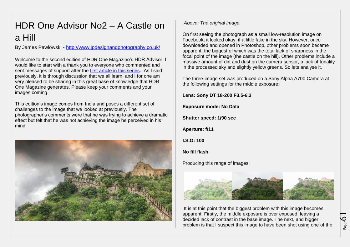
Pag
e61
HDR One Advisor No2 – A Castle on
a Hill By James Pawlowski - http://www.jpdesignandphotography.co.uk/
Welcome to the second edition of HDR One Magazine’s HDR Advisor. I would like to start with a thank you to everyone who commented and sent messages of support after the first article in this series. As I said previously, it is through discussion that we all learn, and I for one am very pleased to be sharing in this great base of knowledge that HDR One Magazine generates. Please keep your comments and your images coming.
This edition’s image comes from India and poses a different set of challenges to the image that we looked at previously. The photographer’s comments were that he was trying to achieve a dramatic effect but felt that he was not achieving the image he perceived in his mind.
Above: The original image.
On first seeing the photograph as a small low-resolution image on Facebook, it looked okay, if a little fake in the sky. However, once downloaded and opened in Photoshop, other problems soon became apparent, the biggest of which was the total lack of sharpness in the focal point of the image (the castle on the hill). Other problems include a massive amount of dirt and dust on the camera sensor, a lack of tonality in the processed sky and slightly yellow greens. So lets analyse it.
The three-image set was produced on a Sony Alpha A700 Camera at the following settings for the middle exposure:
Lens: Sony DT 18-200 F3.5-6.3
Exposure mode: No Data
Shutter speed: 1/90 sec
Aperture: f/11
I.S.O: 100
No fill flash
Producing this range of images:
It is at this point that the biggest problem with this image becomes apparent. Firstly, the middle exposure is over exposed, leaving a decided lack of contrast in the base image. The next, and bigger problem is that I suspect this image to have been shot using one of the
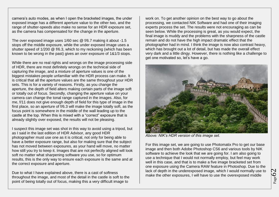
Pag
e62
camera’s auto modes, as when I open the bracketed images, the under exposed image has a different aperture value to the other two, and the range of shutter-speeds also make no sense for an HDR exposure set, as the camera has compensated for the change in the aperture.
The over exposed image uses 1/60 sec @ f/6.7 making it about -1.5 stops off the middle exposure, while the under exposed image uses a shutter speed of 1/200 @ f/6.3, which to my reckoning (which has been known to be wrong in the past) gives an over exposure of 1&1/3 stops.
While there are no real rights and wrongs on the image processing side of HDR, there are most definitely wrongs on the technical side of capturing the image, and a mixture of aperture values is one of the biggest mistakes people unfamiliar with the HDR process can make. It is critical that all the aperture values are the same throughout your HDR sets. This is for a variety of reasons. Firstly, as you change the aperture, the depth of field alters making certain parts of the image soft or totally out of focus. Secondly, changing the aperture value on your camera can change the tonal range captured in the images. Also, for me, f/11 does not give enough depth of field for this type of image in the first place, so an aperture of f/6.3 will make the image totally soft, as the focus point is somewhere in the middle of the wall leading up to the castle at the top. When this is mixed with a “correct” exposure that is already slightly over exposed, the results will not be pleasing.
I suspect this image set was shot in this way to avoid using a tripod, but as I said in the last edition of HDR Advisor, any good HDR photographer must use one as it is critical, not only for being able to have a better exposure range, but also for making sure that the subject has not moved between exposures, as your hand will move, no matter how still you try to keep it. Images that are not perfectly aligned will look soft no matter what sharpening software you use, so for optimum results, this is the only way to ensure each exposure is the same and at the correct exposure and aperture.
Due to what I have explained above, there is a cast of softness throughout the image, and most of the detail in the castle is soft to the point of being totally out of focus, making this a very difficult image to
work on. To get another opinion on the best way to go about the processing, we contacted NIK Software and had one of their imaging experts process the set. The results were not encouraging as can be seen below. While the processing is great, as you would expect, the final image is muddy and the problems with the sharpness of the castle remain and do not have the high impact dramatic effect that the photographer had in mind. I think the image is now also contrast heavy, which has brought out a lot of detail, but has made the overall effect very dark and a little dingy. However, there is nothing like a challenge to get one motivated so, let’s have a go.
Above: NIK’s HDR version of this image set.
For this image set, we are going to use Photomatix Pro to get our base image and then both Adobe Photoshop CS6 and various tools by NIK software to achieve the look that we are going for. I am also going to use a technique that I would not normally employ, but feel may work well in this case, and that is to make a five image bracketed set from one exposure using the Camera RAW feature in Photoshop. Due to the lack of depth in the underexposed image, which I would normally use to make the other exposures, I will have to use the overexposed middle
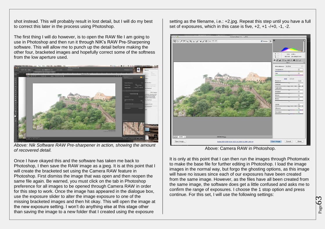
Pag
e63
shot instead. This will probably result in lost detail, but I will do my best to correct this later in the process using Photoshop.
The first thing I will do however, is to open the RAW file I am going to use in Photoshop and then run it through NIK’s RAW Pre-Sharpening software. This will allow me to punch up the detail before making the other four, bracketed images and hopefully correct some of the softness from the low aperture used.
Above: Nik Software RAW Pre-sharpener in action, showing the amount of recovered detail.
Once I have okayed this and the software has taken me back to Photoshop, I then save the RAW image as a jpeg. It is at this point that I will create the bracketed set using the Camera RAW feature in Photoshop. First dismiss the image that was open and then reopen the same file again. Be warned, you must click on the tab in Photoshop preference for all images to be opened through Camera RAW in order for this step to work. Once the image has appeared in the dialogue box, use the exposure slider to alter the image exposure to one of the missing bracketed images and then hit okay. This will open the image at the new exposure setting. I won’t do anything else at this stage other than saving the image to a new folder that I created using the exposure
setting as the filename, i.e.: +2.jpg. Repeat this step until you have a full set of exposures, which in this case is five, +2, +1 -/+0, -1, -2.
Above: Camera RAW in Photoshop.
It is only at this point that I can then run the images through Photomatix to make the base file for further editing in Photoshop. I load the image images in the normal way, but forgo the ghosting options, as this image will have no issues since each of our exposures have been created from the same image. However, as the files have all been created from the same image, the software does get a little confused and asks me to confirm the range of exposures. I choose the 1 stop option and press continue. For this set, I will use the following settings:
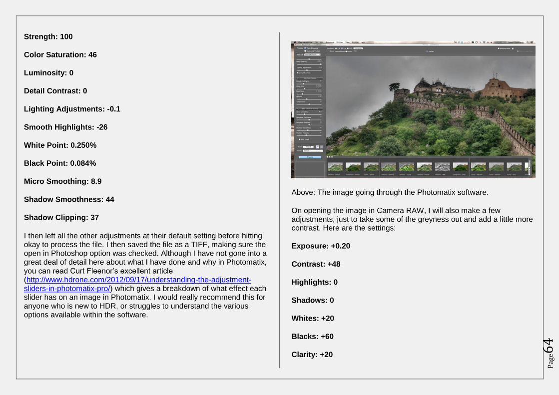
Pag
e64
Strength: 100
Color Saturation: 46
Luminosity: 0
Detail Contrast: 0
Lighting Adjustments: -0.1
Smooth Highlights: -26
White Point: 0.250%
Black Point: 0.084%
Micro Smoothing: 8.9
Shadow Smoothness: 44
Shadow Clipping: 37
I then left all the other adjustments at their default setting before hitting okay to process the file. I then saved the file as a TIFF, making sure the open in Photoshop option was checked. Although I have not gone into a great deal of detail here about what I have done and why in Photomatix, you can read Curt Fleenor’s excellent article (http://www.hdrone.com/2012/09/17/understanding-the-adjustment-sliders-in-photomatix-pro/) which gives a breakdown of what effect each slider has on an image in Photomatix. I would really recommend this for anyone who is new to HDR, or struggles to understand the various options available within the software.
Above: The image going through the Photomatix software.
On opening the image in Camera RAW, I will also make a few adjustments, just to take some of the greyness out and add a little more contrast. Here are the settings:
Exposure: +0.20
Contrast: +48
Highlights: 0
Shadows: 0
Whites: +20
Blacks: +60
Clarity: +20
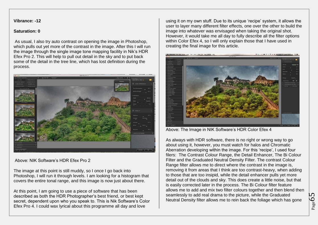
Pag
e65
Vibrance: -12
Saturation: 0
As usual, I also try auto contrast on opening the image in Photoshop, which pulls out yet more of the contrast in the image. After this I will run the image through the single image tone mapping facility in Nik’s HDR Efex Pro 2. This will help to pull out detail in the sky and to put back some of the detail in the tree line, which has lost definition during the process.
Above: NIK Software’s HDR Efex Pro 2
The image at this point is still muddy, so I once I go back into Photoshop, I will run it through levels. I am looking for a histogram that covers the entire tonal range, and this image is now just about there.
At this point, I am going to use a piece of software that has been described as both the HDR Photographer’s best friend, or best kept secret, dependent upon who you speak to. This is Nik Software’s Color Efex Pro 4. I could wax lyrical about this programme all day and love
using it on my own stuff. Due to its unique ‘recipe’ system, it allows the user to layer many different filter effects, one over the other to build the image into whatever was envisaged when taking the original shot. However, it would take me all day to fully describe all the filter options within Color Efex 4, so I will only explain those that I have used in creating the final image for this article.
Above: The Image in NIK Software’s HDR Color Efex 4
As always with HDR software, there is no right or wrong way to go about using it, however, you must watch for halos and Chromatic Aberration developing within the image. For this ‘recipe’, I used four filers: The Contrast Colour Range, the Detail Enhancer, The Bi Colour Filter and the Graduated Neutral Density Filter. The contrast Colour Range filter allows me to direct where the contrast in the image is, removing it from areas that I think are too contrast-heavy, when adding to those that are too insipid, while the detail enhancer pulls yet more detail out of the clouds and sky. This does create a little noise, but that is easily corrected later in the process. The Bi Colour filter feature allows me to add and mix two filter colours together and then blend then seamlessly to add real drama to the picture, while the Graduated Neutral Density filter allows me to rein back the foliage which has gone
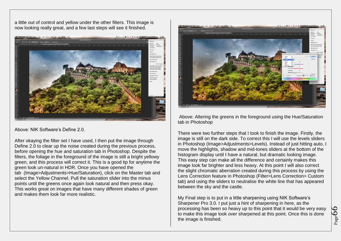
Pag
e66
a little out of control and yellow under the other filters. This image is now looking really great, and a few last steps will see it finished.
Above: NIK Software’s Define 2.0.
After okaying the filter set I have used, I then put the image through Define 2.0 to clear up the noise created during the previous process, before opening the hue and saturation tab in Photoshop. Despite the filters, the foliage in the foreground of the image is still a bright yellowy green, and this process will correct it. This is a good tip for anytime the green look un-natural in HDR. Once you have opened the tab (Image>Adjustments>Hue/Saturation), click on the Master tab and select the Yellow Channel. Pull the saturation slider into the minus points until the greens once again look natural and then press okay. This works great on images that have many different shades of green and makes them look far more realistic.
Above: Altering the greens in the foreground using the Hue/Saturation tab in Photoshop
There were two further steps that I took to finish the image. Firstly, the image is still on the dark side. To correct this I will use the levels sliders in Photoshop (Image>Adjustments>Levels). Instead of just hitting auto, I move the highlights, shadow and mid-tones sliders at the bottom of the histogram display until I have a natural, but dramatic looking image. This easy step can make all the difference and certainly makes this image look far brighter and less heavy. At this point I will also correct the slight chromatic aberration created during this process by using the Lens Correction feature in Photoshop (Filter>Lens Correction> Custom tab) and using the sliders to neutralise the white line that has appeared between the sky and the castle.
My Final step is to put in a little sharpening using NIK Software’s Sharpener Pro 3.0. I put just a hint of sharpening in here, as the processing has been so heavy up to this point that it would be very easy to make this image look over sharpened at this point. Once this is done the image is finished.
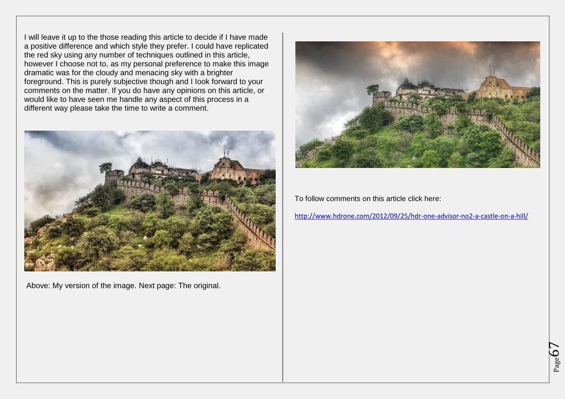
Pag
e67
I will leave it up to the those reading this article to decide if I have made a positive difference and which style they prefer. I could have replicated the red sky using any number of techniques outlined in this article, however I choose not to, as my personal preference to make this image dramatic was for the cloudy and menacing sky with a brighter foreground. This is purely subjective though and I Iook forward to your comments on the matter. If you do have any opinions on this article, or would like to have seen me handle any aspect of this process in a different way please take the time to write a comment.
Above: My version of the image. Next page: The original.
To follow comments on this article click here:
http://www.hdrone.com/2012/09/25/hdr-one-advisor-no2-a-castle-on-a-hill/
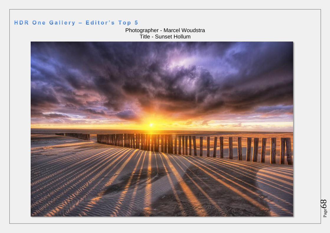
Pag
e68
Photographer - Marcel Woudstra Title - Sunset Hollum
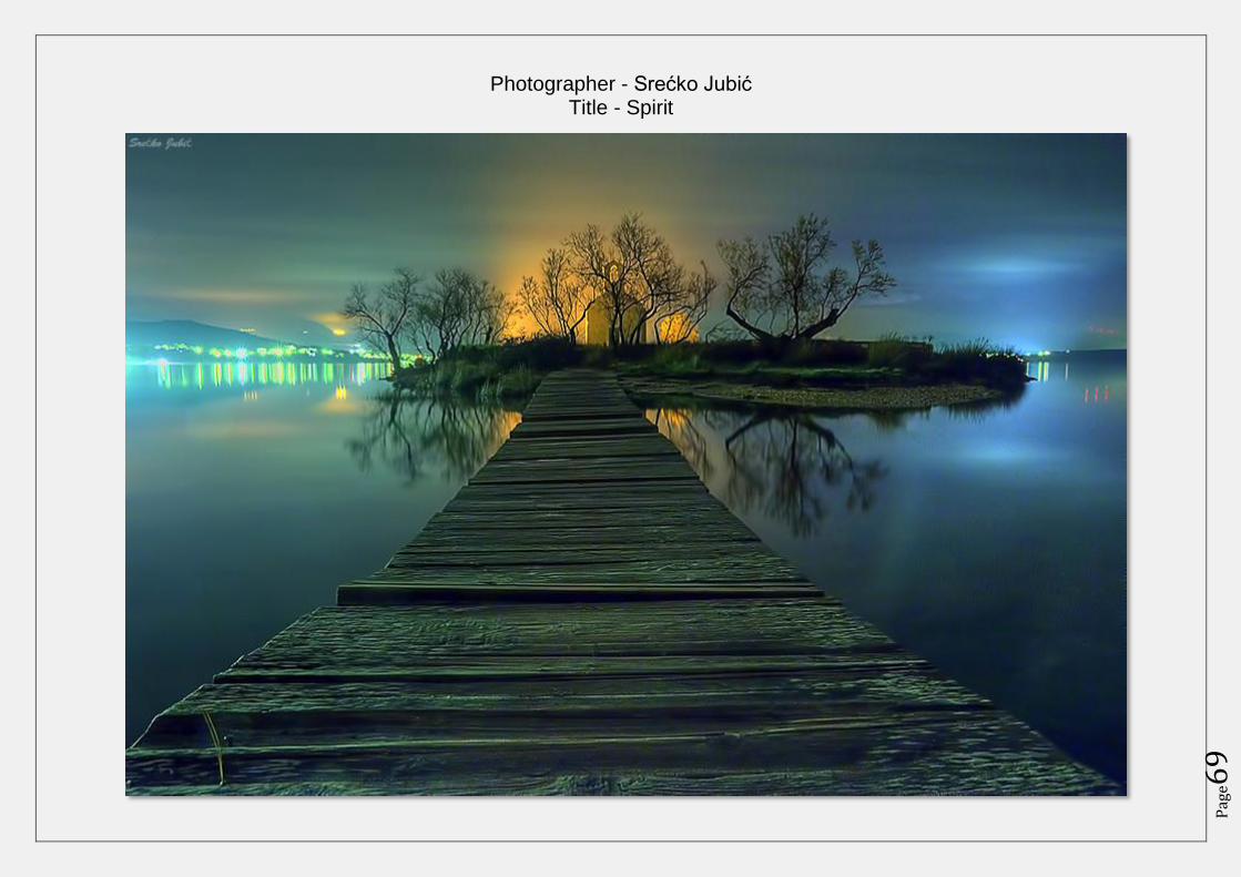
Pag
e69
Photographer - Srećko Jubić Title - Spirit
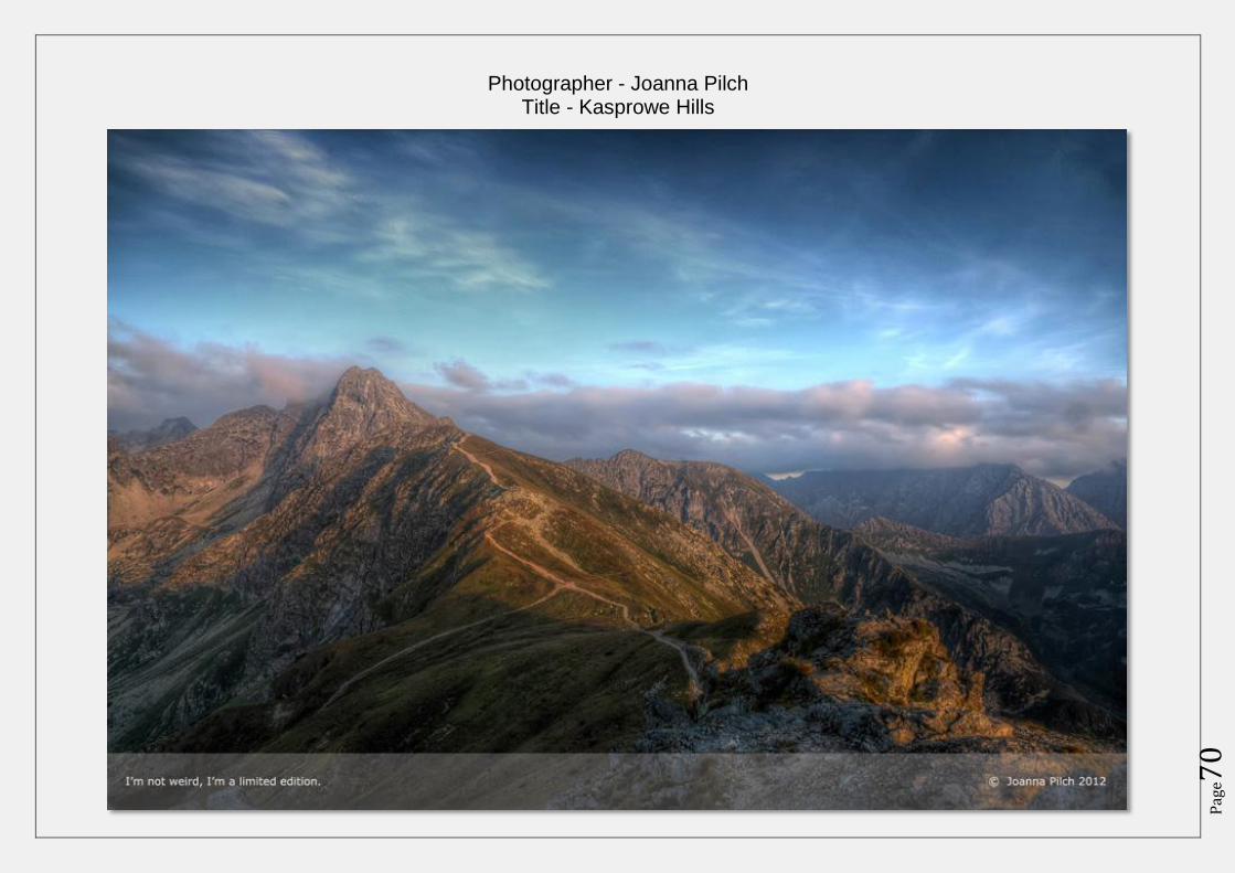
Pag
e70
Photographer - Joanna Pilch Title - Kasprowe Hills
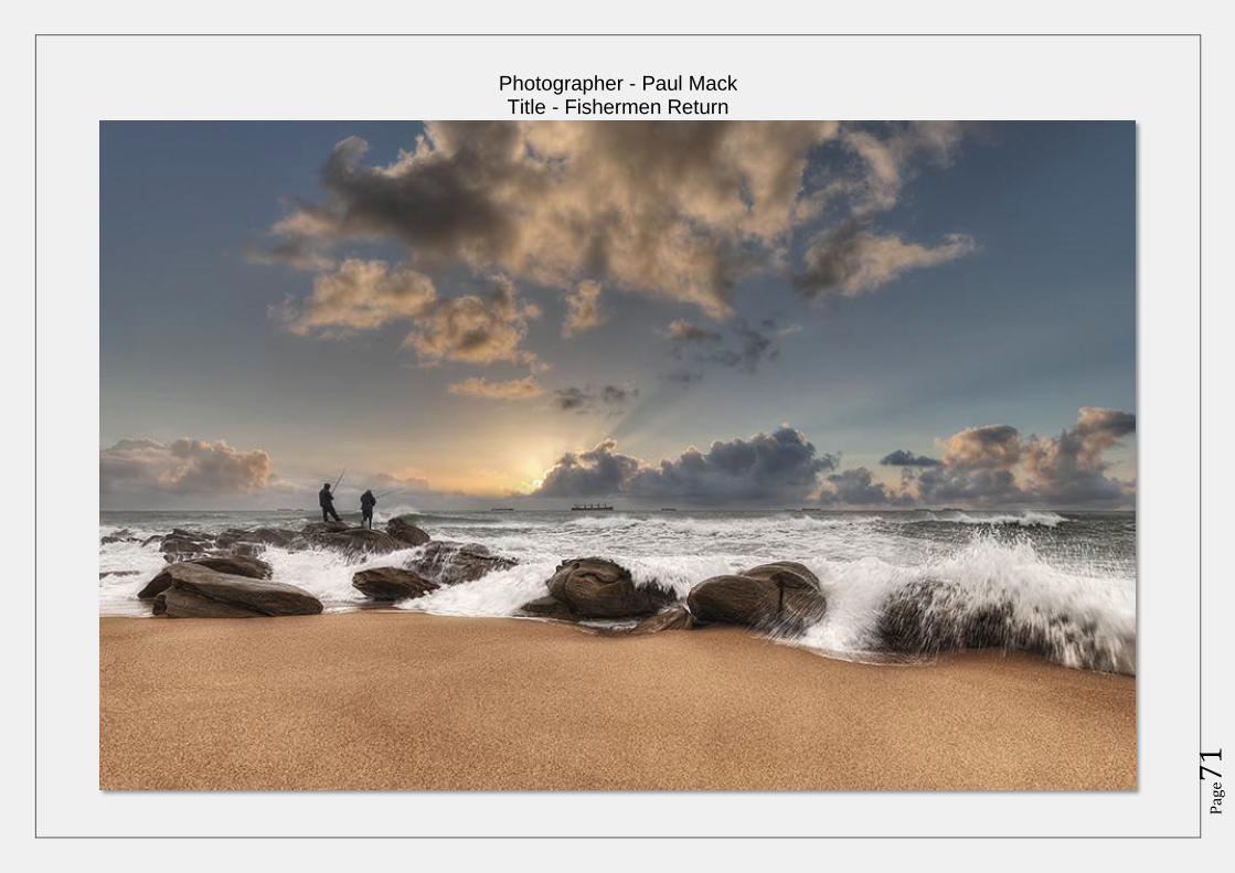
Pag
e71
Photographer - Paul Mack Title - Fishermen Return
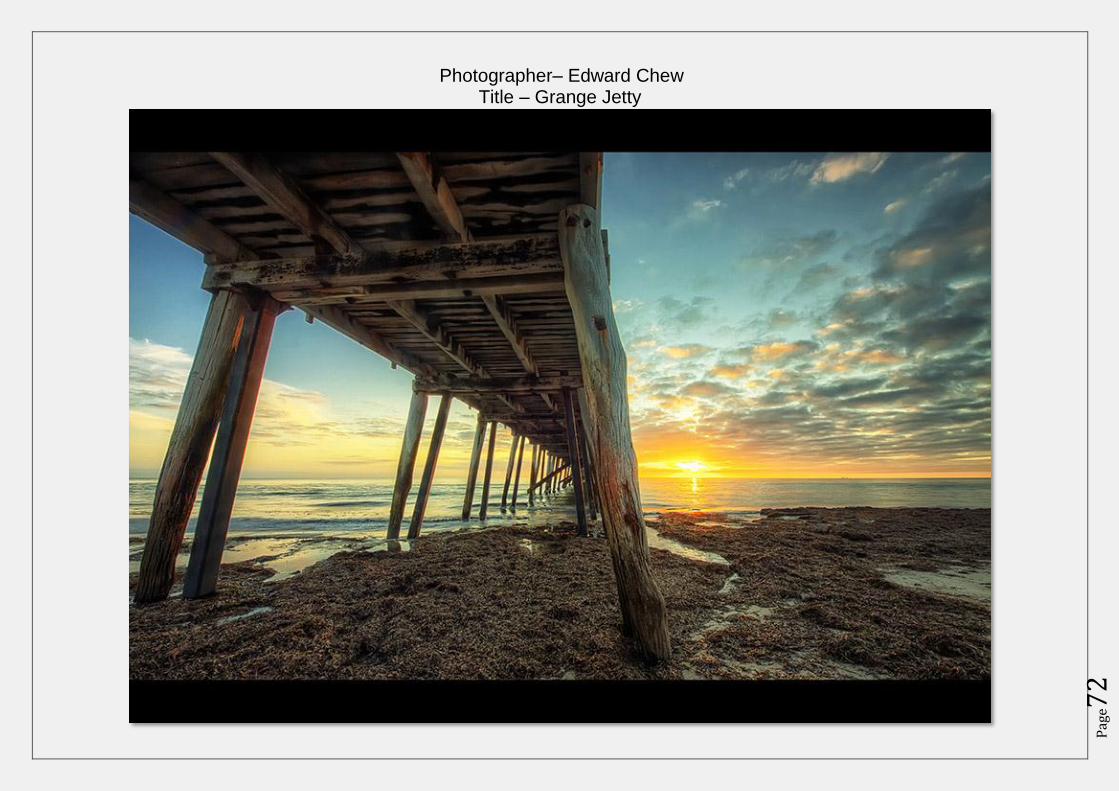
Pag
e72
Photographer– Edward Chew Title – Grange Jetty
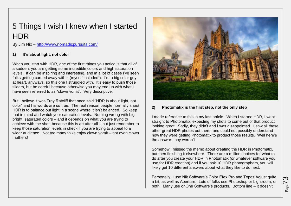
Pag
e73
5 Things I wish I knew when I started
HDR By Jim Nix – http://www.nomadicpursuits.com/
1) It’s about light, not color
When you start with HDR, one of the first things you notice is that all of a sudden, you are getting some incredible colors and high saturation levels. It can be inspiring and interesting, and in a lot of cases I’ve seen folks getting carried away with it (myself included!). I’m a big color guy at heart, anyways, so this one I struggled with. It’s easy to push those sliders, but be careful because otherwise you may end up with what I have seen referred to as “clown vomit”. Very descriptive.
But I believe it was Trey Ratcliff that once said “HDR is about light, not color” and his words are so true. The real reason people normally shoot HDR is to balance out light in a scene where it isn’t balanced. So keep that in mind and watch your saturation levels. Nothing wrong with big bright, saturated colors – and it depends on what you are trying to achieve with the shot, because this is art after all – but just remember to keep those saturation levels in check if you are trying to appeal to a wider audience. Not too many folks enjoy clown vomit – not even clown mothers!
2) Photomatix is the first step, not the only step
I made reference to this in my last article. When I started HDR, I went straight to Photomatix, expecting my shots to come out of that product looking great. Sadly, they didn’t and I was disappointed. I saw all these other great HDR photos out there, and could not possibly understand how they were getting Photomatix to product those results. Well here’s the answer: they weren’t.
Somehow I missed the memo about creating the HDR in Photomatix, but then finishing it elsewhere. There are a million choices for what to do after you create your HDR in Photomatix (or whatever software you use for HDR creation) and if you ask 10 HDR photographers, you will likely get 10 different answers about what they like to do next.
Personally, I use Nik Software’s Color Efex Pro and Topaz Adjust quite a bit, as well as Aperture. Lots of folks use Photoshop or Lightroom, or both. Many use onOne Software’s products. Bottom line – it doesn’t
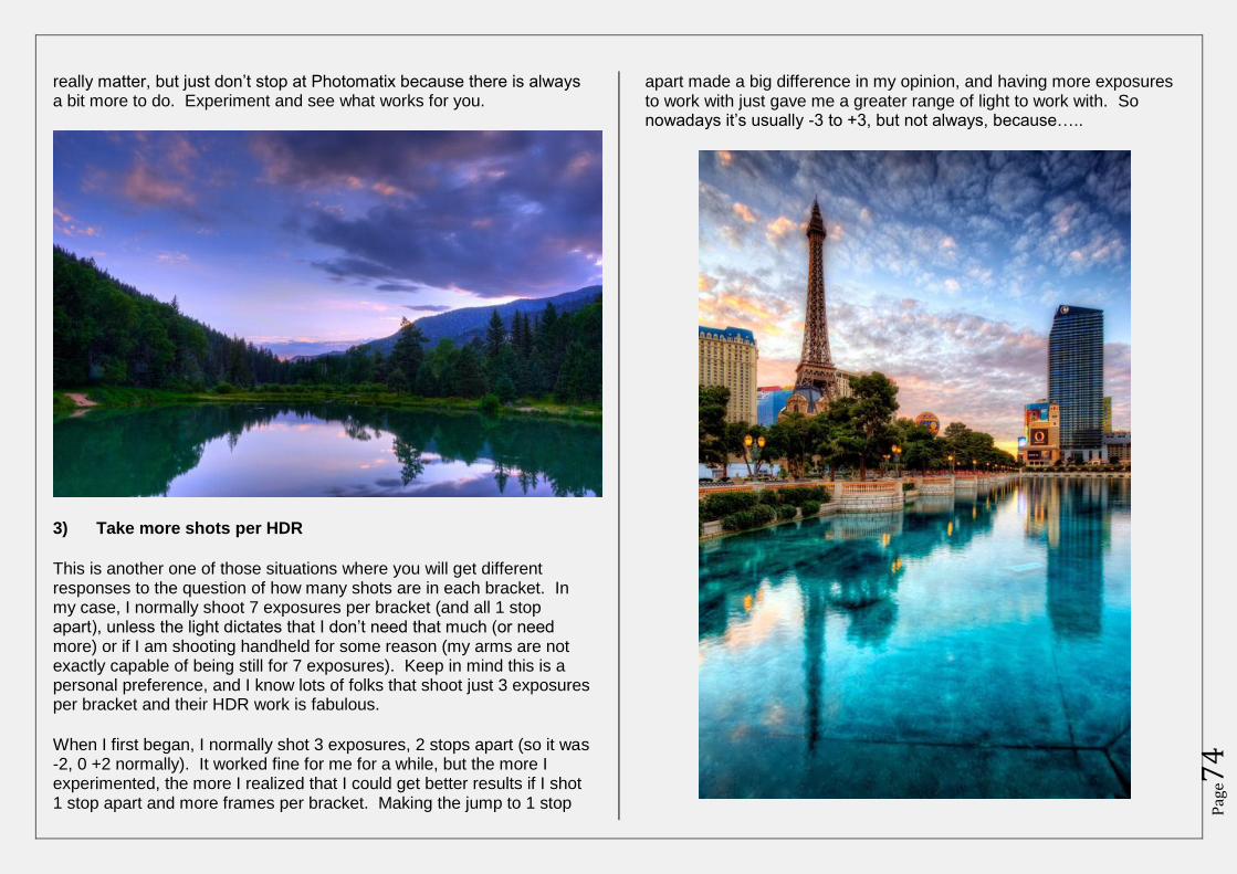
Pag
e74
really matter, but just don’t stop at Photomatix because there is always a bit more to do. Experiment and see what works for you.
3) Take more shots per HDR
This is another one of those situations where you will get different responses to the question of how many shots are in each bracket. In my case, I normally shoot 7 exposures per bracket (and all 1 stop apart), unless the light dictates that I don’t need that much (or need more) or if I am shooting handheld for some reason (my arms are not exactly capable of being still for 7 exposures). Keep in mind this is a personal preference, and I know lots of folks that shoot just 3 exposures per bracket and their HDR work is fabulous.
When I first began, I normally shot 3 exposures, 2 stops apart (so it was -2, 0 +2 normally). It worked fine for me for a while, but the more I experimented, the more I realized that I could get better results if I shot 1 stop apart and more frames per bracket. Making the jump to 1 stop
apart made a big difference in my opinion, and having more exposures to work with just gave me a greater range of light to work with. So nowadays it’s usually -3 to +3, but not always, because…..
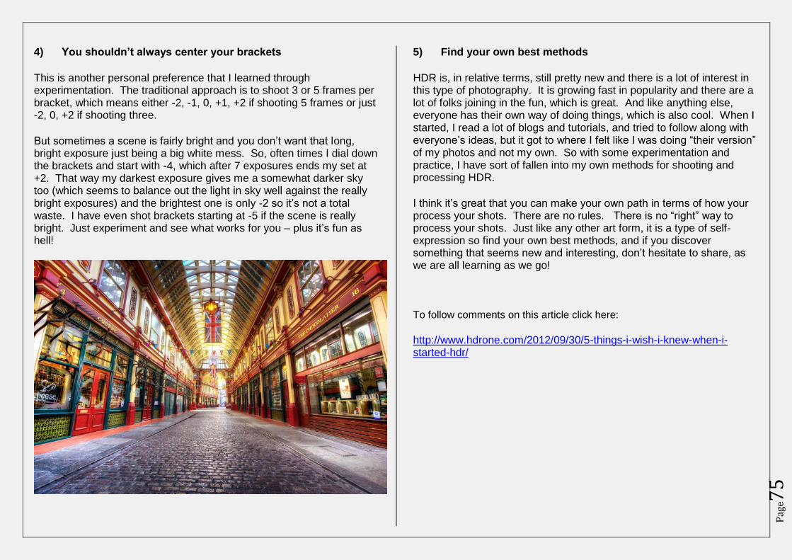
Pag
e75
4) You shouldn’t always center your brackets
This is another personal preference that I learned through experimentation. The traditional approach is to shoot 3 or 5 frames per bracket, which means either -2, -1, 0, +1, +2 if shooting 5 frames or just -2, 0, +2 if shooting three.
But sometimes a scene is fairly bright and you don’t want that long, bright exposure just being a big white mess. So, often times I dial down the brackets and start with -4, which after 7 exposures ends my set at +2. That way my darkest exposure gives me a somewhat darker sky too (which seems to balance out the light in sky well against the really bright exposures) and the brightest one is only -2 so it’s not a total waste. I have even shot brackets starting at -5 if the scene is really bright. Just experiment and see what works for you – plus it’s fun as hell!
5) Find your own best methods
HDR is, in relative terms, still pretty new and there is a lot of interest in this type of photography. It is growing fast in popularity and there are a lot of folks joining in the fun, which is great. And like anything else, everyone has their own way of doing things, which is also cool. When I started, I read a lot of blogs and tutorials, and tried to follow along with everyone’s ideas, but it got to where I felt like I was doing “their version” of my photos and not my own. So with some experimentation and practice, I have sort of fallen into my own methods for shooting and processing HDR.
I think it’s great that you can make your own path in terms of how your process your shots. There are no rules. There is no “right” way to process your shots. Just like any other art form, it is a type of self-expression so find your own best methods, and if you discover something that seems new and interesting, don’t hesitate to share, as we are all learning as we go!
To follow comments on this article click here:
http://www.hdrone.com/2012/09/30/5-things-i-wish-i-knew-when-i-started-hdr/
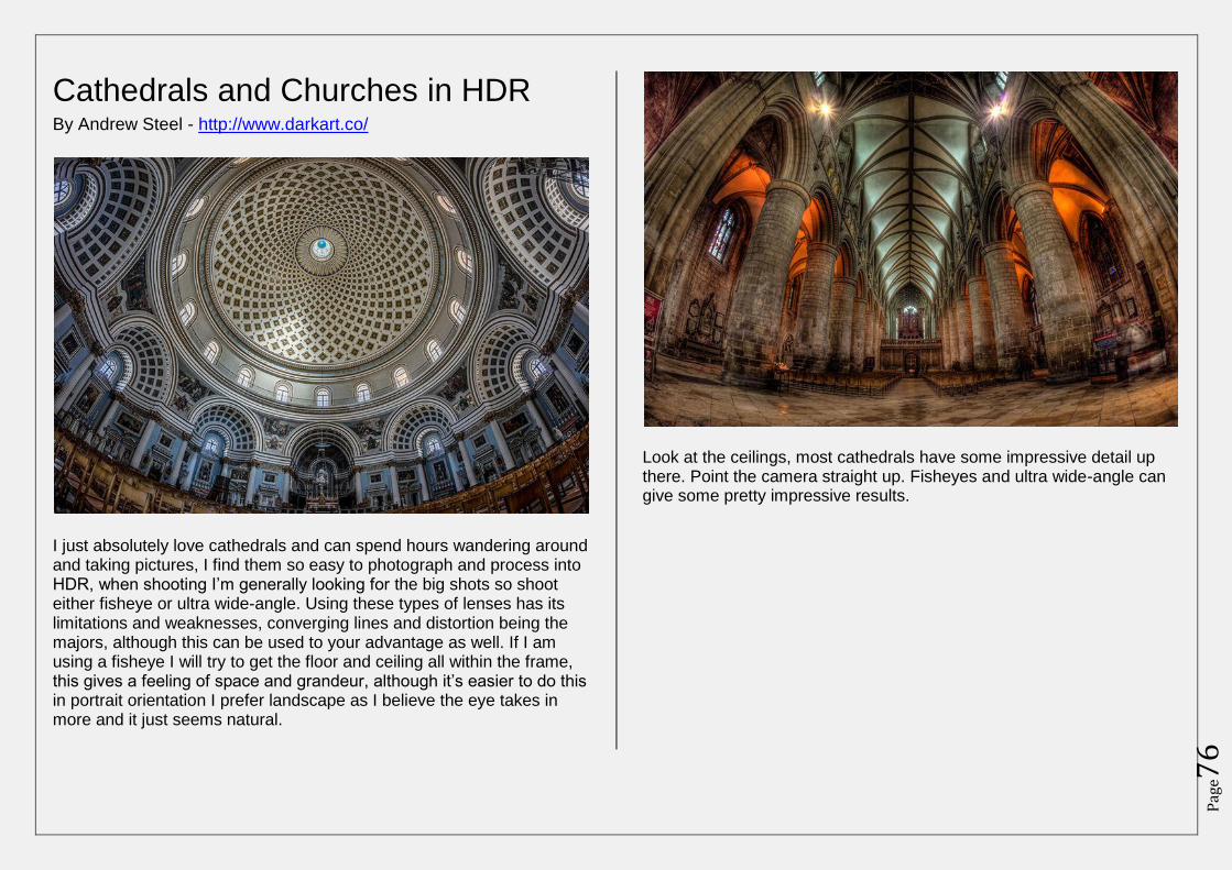
Pag
e76
Cathedrals and Churches in HDR By Andrew Steel - http://www.darkart.co/
I just absolutely love cathedrals and can spend hours wandering around and taking pictures, I find them so easy to photograph and process into HDR, when shooting I’m generally looking for the big shots so shoot either fisheye or ultra wide-angle. Using these types of lenses has its limitations and weaknesses, converging lines and distortion being the majors, although this can be used to your advantage as well. If I am using a fisheye I will try to get the floor and ceiling all within the frame, this gives a feeling of space and grandeur, although it’s easier to do this in portrait orientation I prefer landscape as I believe the eye takes in more and it just seems natural.
Look at the ceilings, most cathedrals have some impressive detail up there. Point the camera straight up. Fisheyes and ultra wide-angle can give some pretty impressive results.
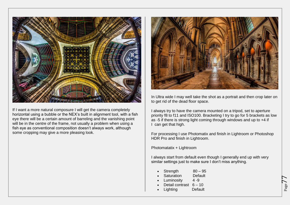
Pag
e77
If I want a more natural composure I will get the camera completely horizontal using a bubble or the NEX’s built in alignment tool, with a fish eye there will be a certain amount of barreling and the vanishing point will be in the centre of the frame, not usually a problem when using a fish eye as conventional composition doesn’t always work, although some cropping may give a more pleasing look.
In Ultra wide I may well take the shot as a portrait and then crop later on to get rid of the dead floor space.
I always try to have the camera mounted on a tripod, set to aperture priority f8 to f11 and ISO100. Bracketing I try to go for 5 brackets as low as -5 if there is strong light coming through windows and up to +4 if I can get that high.
For processing I use Photomatix and finish in Lightroom or Photoshop HDR Pro and finish in Lightroom.
Photomatatix + Lightroom
I always start from default even though I generally end up with very similar settings just to make sure I don’t miss anything.
Strength 80 – 95 Saturation Default Luminosity 4 -9 Detail contrast 6 – 10 Lighting Default
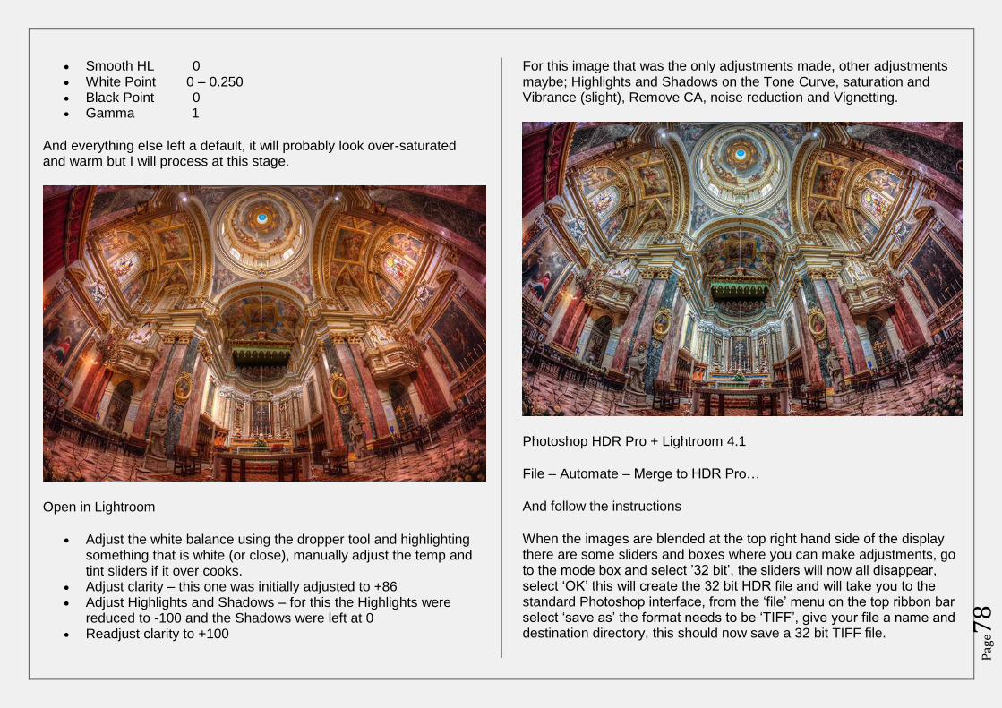
Pag
e78
Smooth HL 0 White Point 0 – 0.250 Black Point 0 Gamma 1
And everything else left a default, it will probably look over-saturated and warm but I will process at this stage.
Open in Lightroom
Adjust the white balance using the dropper tool and highlighting something that is white (or close), manually adjust the temp and tint sliders if it over cooks.
Adjust clarity – this one was initially adjusted to +86 Adjust Highlights and Shadows – for this the Highlights were
reduced to -100 and the Shadows were left at 0 Readjust clarity to +100
For this image that was the only adjustments made, other adjustments maybe; Highlights and Shadows on the Tone Curve, saturation and Vibrance (slight), Remove CA, noise reduction and Vignetting.
Photoshop HDR Pro + Lightroom 4.1
File – Automate – Merge to HDR Pro…
And follow the instructions
When the images are blended at the top right hand side of the display there are some sliders and boxes where you can make adjustments, go to the mode box and select ’32 bit’, the sliders will now all disappear, select ‘OK’ this will create the 32 bit HDR file and will take you to the standard Photoshop interface, from the ‘file’ menu on the top ribbon bar select ‘save as’ the format needs to be ‘TIFF’, give your file a name and destination directory, this should now save a 32 bit TIFF file.
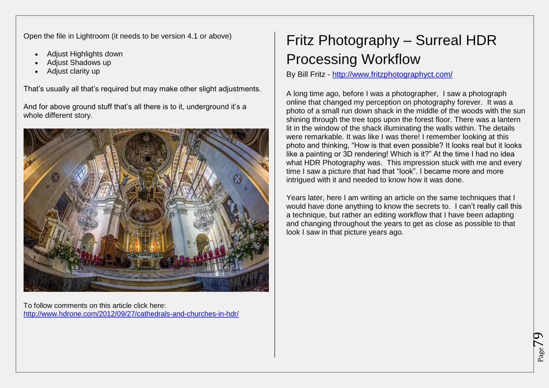
Pag
e79
Open the file in Lightroom (it needs to be version 4.1 or above)
Adjust Highlights down Adjust Shadows up Adjust clarity up
That’s usually all that’s required but may make other slight adjustments.
And for above ground stuff that’s all there is to it, underground it’s a whole different story.
To follow comments on this article click here: http://www.hdrone.com/2012/09/27/cathedrals-and-churches-in-hdr/
Fritz Photography – Surreal HDR
Processing Workflow By Bill Fritz - http://www.fritzphotographyct.com/
A long time ago, before I was a photographer, I saw a photograph online that changed my perception on photography forever. It was a photo of a small run down shack in the middle of the woods with the sun shining through the tree tops upon the forest floor. There was a lantern lit in the window of the shack illuminating the walls within. The details were remarkable. It was like I was there! I remember looking at this photo and thinking, “How is that even possible? It looks real but it looks like a painting or 3D rendering! Which is it?” At the time I had no idea what HDR Photography was. This impression stuck with me and every time I saw a picture that had that “look”. I became more and more intrigued with it and needed to know how it was done.
Years later, here I am writing an article on the same techniques that I would have done anything to know the secrets to. I can’t really call this a technique, but rather an editing workflow that I have been adapting and changing throughout the years to get as close as possible to that look I saw in that picture years ago.
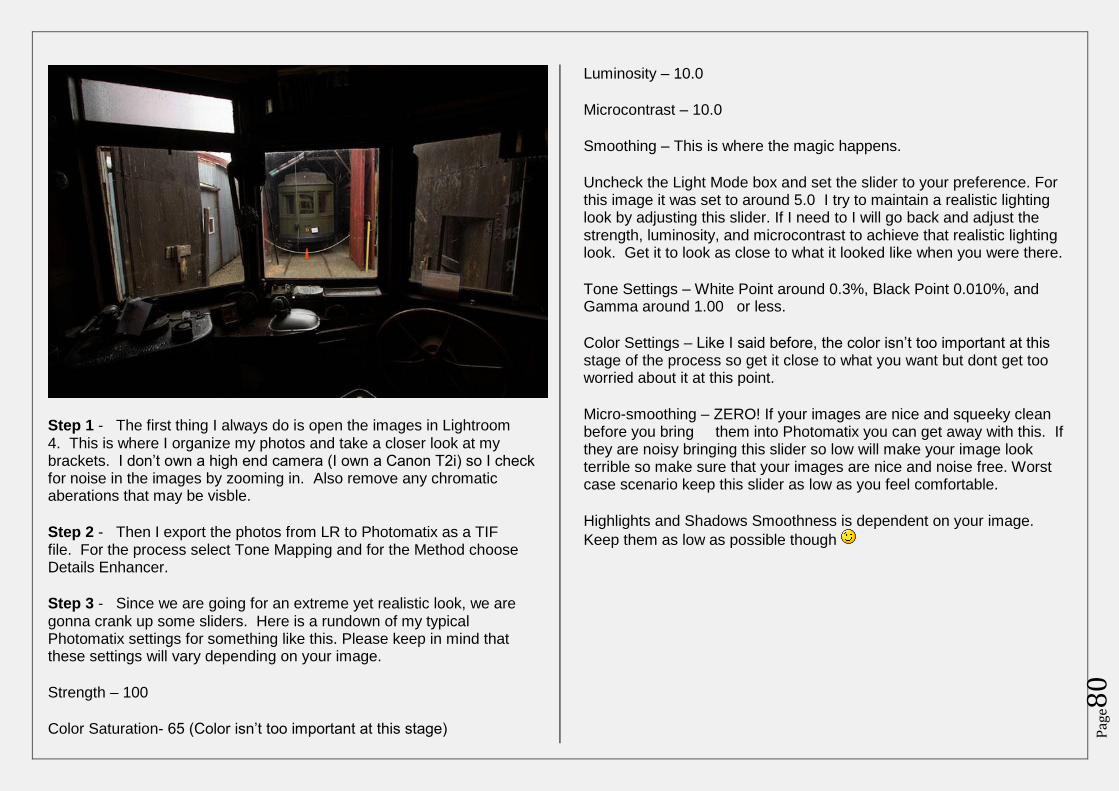
Pag
e80
Step 1 - The first thing I always do is open the images in Lightroom 4. This is where I organize my photos and take a closer look at my brackets. I don’t own a high end camera (I own a Canon T2i) so I check for noise in the images by zooming in. Also remove any chromatic aberations that may be visble.
Step 2 - Then I export the photos from LR to Photomatix as a TIF file. For the process select Tone Mapping and for the Method choose Details Enhancer.
Step 3 - Since we are going for an extreme yet realistic look, we are gonna crank up some sliders. Here is a rundown of my typical Photomatix settings for something like this. Please keep in mind that these settings will vary depending on your image.
Strength – 100
Color Saturation- 65 (Color isn’t too important at this stage)
Luminosity – 10.0
Microcontrast – 10.0
Smoothing – This is where the magic happens.
Uncheck the Light Mode box and set the slider to your preference. For this image it was set to around 5.0 I try to maintain a realistic lighting look by adjusting this slider. If I need to I will go back and adjust the strength, luminosity, and microcontrast to achieve that realistic lighting look. Get it to look as close to what it looked like when you were there.
Tone Settings – White Point around 0.3%, Black Point 0.010%, and Gamma around 1.00 or less.
Color Settings – Like I said before, the color isn’t too important at this stage of the process so get it close to what you want but dont get too worried about it at this point.
Micro-smoothing – ZERO! If your images are nice and squeeky clean before you bring them into Photomatix you can get away with this. If they are noisy bringing this slider so low will make your image look terrible so make sure that your images are nice and noise free. Worst case scenario keep this slider as low as you feel comfortable.
Highlights and Shadows Smoothness is dependent on your image.
Keep them as low as possible though
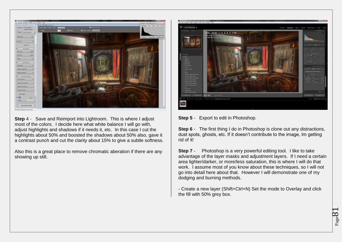
Pag
e81
Step 4 - Save and Reimport into Lightroom. This is where I adjust most of the colors. I decide here what white balance I will go with, adjust highlights and shadows if it needs it, etc. In this case I cut the highlights about 50% and boosted the shadows about 50% also, gave it a contrast punch and cut the clarity about 15% to give a subtle softness.
Also this is a great place to remove chromatic aberation if there are any showing up still.
Step 5 - Export to edit in Photoshop.
Step 6 - The first thing I do in Photoshop is clone out any distractions, dust spots, ghosts, etc. If it doesn’t contribute to the image, Im getting rid of it!
Step 7 - Photoshop is a very powerful editing tool. I like to take advantage of the layer masks and adjustment layers. If I need a certain area lighter/darker, or more/less saturation, this is where I will do that work. I assume most of you know about these techniques, so I will not go into detail here about that. However I will demonstrate one of my dodging and burning methods.
- Create a new layer (Shift+Ctrl+N) Set the mode to Overlay and click the fill with 50% grey box.
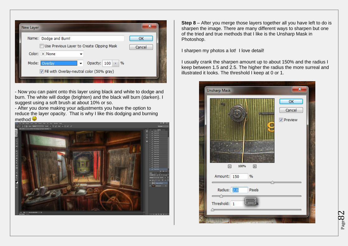
Pag
e82
- Now you can paint onto this layer using black and white to dodge and burn. The white will dodge (brighten) and the black will burn (darken). I suggest using a soft brush at about 10% or so. - After you done making your adjustments you have the option to reduce the layer opacity. That is why I like this dodging and burning
method
Step 8 – After you merge those layers together all you have left to do is sharpen the image. There are many different ways to sharpen but one of the tried and true methods that I like is the Unsharp Mask in Photoshop.
I sharpen my photos a lot! I love detail!
I usually crank the sharpen amount up to about 150% and the radius I keep between 1.5 and 2.5. The higher the radius the more surreal and illustrated it looks. The threshold I keep at 0 or 1.
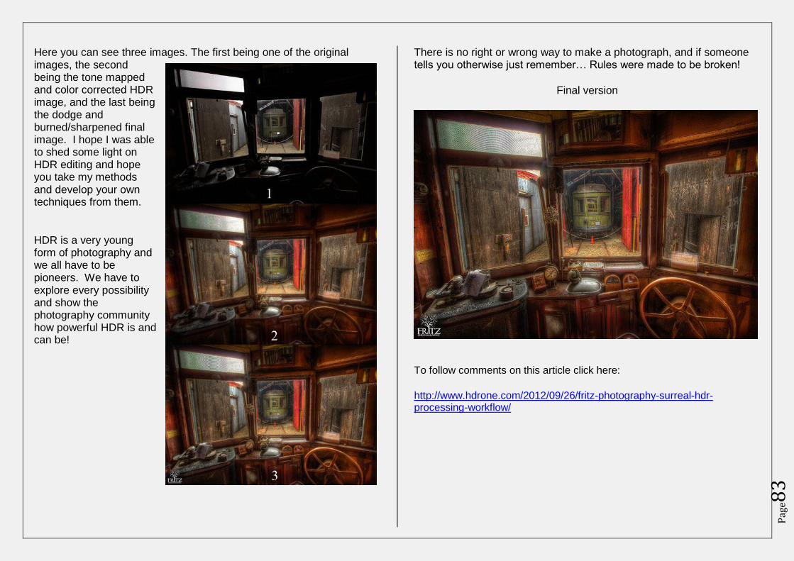
Pag
e83
Here you can see three images. The first being one of the original images, the second being the tone mapped and color corrected HDR image, and the last being the dodge and burned/sharpened final image. I hope I was able to shed some light on HDR editing and hope you take my methods and develop your own techniques from them.
HDR is a very young form of photography and we all have to be pioneers. We have to explore every possibility and show the photography community how powerful HDR is and can be!
There is no right or wrong way to make a photograph, and if someone tells you otherwise just remember… Rules were made to be broken!
Final version
To follow comments on this article click here:
http://www.hdrone.com/2012/09/26/fritz-photography-surreal-hdr-processing-workflow/
Pag
e84
About HDR One
HDR One is the result of a community’s commitment and passion for one of the most
exciting forms of photography today, High Dynamic Range (HDR).
Every day high quality HDR photos are added to its gallery, and every Sunday new articles
around the development, practice, improvement, and joy of HDR photography will be
available.
Its contributors are members of the HDR community whose enthusiasm for HDR knows no
bounds. HDR One is also an open forum. Anyone can submit their work for consideration.
Breaking from the traditional magazine format, HDR One takes advantage of the digital age.
The magazine is fully interactive and comments are always welcome.
The magazine also has an interactive Q&A section where members of the community help
each other – HDR Forum.
What HDR One is not
This will never become a spammy sales magazine. There will never be pop-ups, there will
never be paid guest posts, and there will never be partial reviews. We will accept sponsorship
from reputable companies in photography in the future to help with the costs of running the
magazine. However, sponsorship will never conflict with the integrity of the magazine.
Contributors
Magazine Editor – Jimmy McIntyre
Jimmy McIntyre is a full-time traveller, HDR photographer and language
learner. Having been on the road for a number of years now, he is technically
homeless. His journey for the next 2.5 years will take him far and wide. At
the end of it he expects to be a pillar of wisdom, fluent in every language in
the world, and slightly more bald – unfortunately .
Read more about his journey on his daily HDR Travel Blog and subscribe to his updates on
facebook – Jimmy McIntyre.
Regular Contributor & Media Manager – James Pawlowski
James Pawlowski is a photographer and designer based in the UK. After
spending 12 years as a photojournalist in various parts of the world, James
left photography to gain a degree in International Relations and Security
Studies. On finishing university, James once again picked up his cameras and
now runs his own photographic and design business, where he mixes his
talents to provide a select group of clients with bespoke photography, websites and print
media solutions.
Pag
e85
James is also the resident imaging expert, researcher and media advisor to the Forgotten
Conflicts of the Far East charity, which aims to collect the testimonies and images of service
personnel who fought in the UK’s ‘forgotten’ cold war conflicts. James is available for
commissions anywhere in the world and would be more than happy to speak to you about
your requirements. James’ website is at: www.jpdesignandphotography.co.uk or you can
contact him by e-mail on [email protected]
Regular Contributor – Andrew Steel
I have been shooting DSLR for the last 4 years using Canons, early this year I
moved on to the Sony NEX-5, I am convinced that for my type of
photography the CSC’s are the right way to go so in the last month I have
upgraded to the NEX-7 with a Rokinon 8mm fisheye. Every shoot now is
with the intention of processing in HDR except for some night time
photography when it is just not possible to get enough light on the sensor.
My online stuff can be found:
https://www.facebook.com/AndrewSteelPhotography
http://www.darkart.co/
Regular Contributor – Ben Fewtrell
Ben Fewtrell is based in Sydney, Australia and has been a keen photographer
since the 1990’s. He fell in love with HDR in early 2012 and now processes
95% of his images this way. His main interest is landscape photography and
most mornings you will find Ben with his Nikon D800 on the coast of
Sydney waiting for the sun to rise… you can find him at
www.facebook.com/on3legs or follow his blog www.on3legs.com
Regular Contibutor – Bill Fritz
Age: 23
Location: Connecticut, USA
Profession: Wedding/Landscape Photography
At the age of 15, Bill started his career as a photographer with his
Grandfather who owned his own Wedding and Event photography business called Video
Affair (founded in 1982). Now, almost ten years later, Bill still works with his grandfather
and runs his own business Fritz Photography.
Bill is well known for his unique style and his advanced HDR techniques. If he is not
shooting HDR photography, he is teaching it to the thousands of followers he has acquired
throughout the years.
Pag
e86
www.fritzphotographyct.com
www.facebook.com/fritzphotography
Regular Contributor – Chris Mitchell
Chris Mitchell counts himself as many things, photographer amongst
them. Although he has been taking pictures for many years, it was his
discovery of the possibilities offered by high dynamic range (hdr) techniques
that really fired his passion for the art of photography. He is based in
Melbourne, Australia and most enjoys landscape and architectural
photography as well as creative documentation of the rich and colourful local street art scene.
The progression of Chris’ photographic work can be seen at
http://www.flickr.com/photos/phase-one/
Regular Contributor – Curt Fleenor
Living in Southwest Virginia between the foothills of the Appalachian
Mountains and the Great Smoky Mountains I am never lacking
for photographic opportunities. This is a beautiful area with an abundance of
landscape, natural, historic and architectural subjects.
My photographic journey has taken me from simple landscape photos into the world of High
Dynamic Range (HDR) images and long exposures. I use these disciplines to bring out the
beauty of the world around us. Landscape photography is my first love but great images are
everywhere and there is an ever-expanding set of tools available to the modern photographer
to help create a unique vision.
This is an amazing field whose technology is expanding exponentially and I am willing to try
it all!
http://www.CurtFleenor.com
Regular Contributor – Dan Marbaix
My name is Dan (not Don as I’m sometimes known) 32 and I’m from
London. Joined flickr and got into urbex in 2009 and not looked back
since.Now theres 3 things I can’t live without urbex, the dog and the wife.
Not in that order!
See my work here: http://www.flickr.com/photos/odins_raven/ &
www.facebook.com/odinsravenphotography
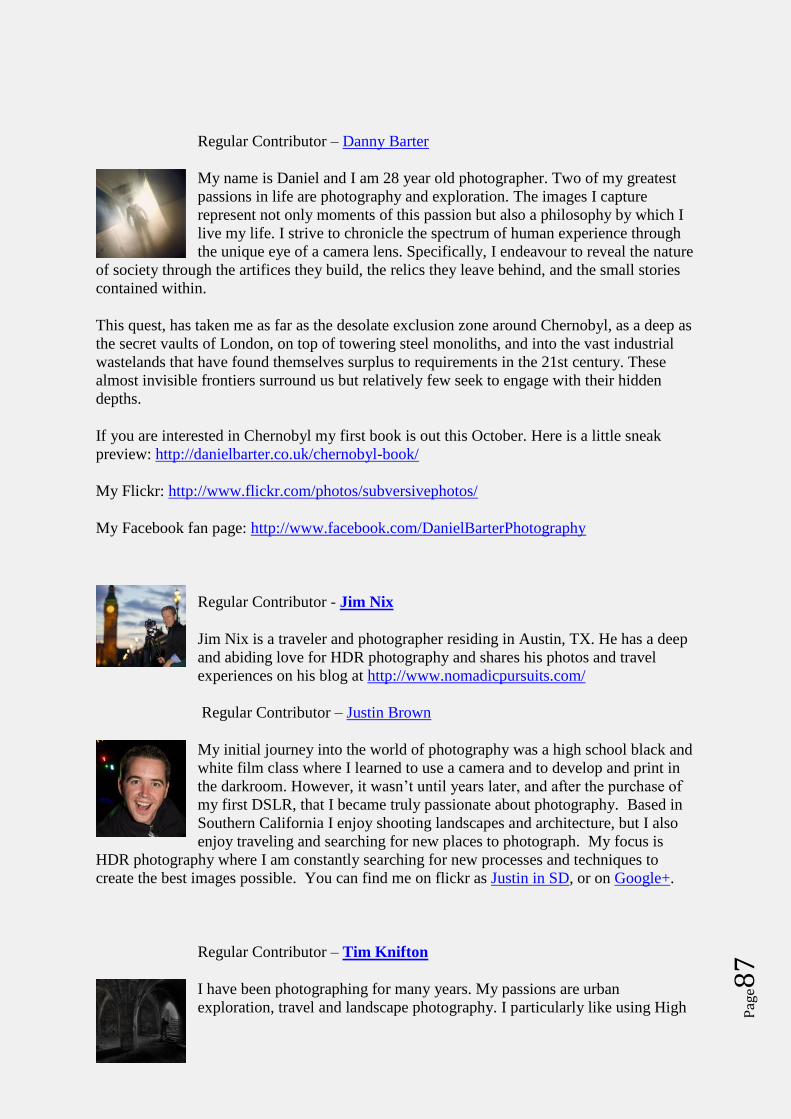
Pag
e87
Regular Contributor – Danny Barter
My name is Daniel and I am 28 year old photographer. Two of my greatest
passions in life are photography and exploration. The images I capture
represent not only moments of this passion but also a philosophy by which I
live my life. I strive to chronicle the spectrum of human experience through
the unique eye of a camera lens. Specifically, I endeavour to reveal the nature
of society through the artifices they build, the relics they leave behind, and the small stories
contained within.
This quest, has taken me as far as the desolate exclusion zone around Chernobyl, as a deep as
the secret vaults of London, on top of towering steel monoliths, and into the vast industrial
wastelands that have found themselves surplus to requirements in the 21st century. These
almost invisible frontiers surround us but relatively few seek to engage with their hidden
depths.
If you are interested in Chernobyl my first book is out this October. Here is a little sneak
preview: http://danielbarter.co.uk/chernobyl-book/
My Flickr: http://www.flickr.com/photos/subversivephotos/
My Facebook fan page: http://www.facebook.com/DanielBarterPhotography
Regular Contributor - Jim Nix
Jim Nix is a traveler and photographer residing in Austin, TX. He has a deep
and abiding love for HDR photography and shares his photos and travel
experiences on his blog at http://www.nomadicpursuits.com/
Regular Contributor – Justin Brown
My initial journey into the world of photography was a high school black and
white film class where I learned to use a camera and to develop and print in
the darkroom. However, it wasn’t until years later, and after the purchase of
my first DSLR, that I became truly passionate about photography. Based in
Southern California I enjoy shooting landscapes and architecture, but I also
enjoy traveling and searching for new places to photograph. My focus is
HDR photography where I am constantly searching for new processes and techniques to
create the best images possible. You can find me on flickr as Justin in SD, or on Google+.
Regular Contributor – Tim Knifton
I have been photographing for many years. My passions are urban
exploration, travel and landscape photography. I particularly like using High
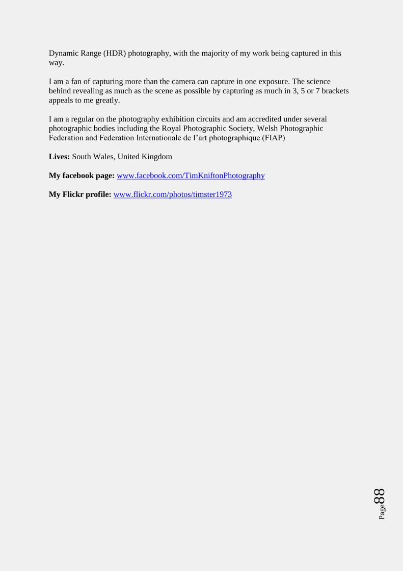
Pag
e88
Dynamic Range (HDR) photography, with the majority of my work being captured in this
way.
I am a fan of capturing more than the camera can capture in one exposure. The science
behind revealing as much as the scene as possible by capturing as much in 3, 5 or 7 brackets
appeals to me greatly.
I am a regular on the photography exhibition circuits and am accredited under several
photographic bodies including the Royal Photographic Society, Welsh Photographic
Federation and Federation Internationale de I’art photographique (FIAP)
Lives: South Wales, United Kingdom
My facebook page: www.facebook.com/TimKniftonPhotography
My Flickr profile: www.flickr.com/photos/timster1973