Embed Size (px)
Citation preview

EVALUATION
By Josh Baugh

Question 1 - in what ways does your media product use, develop or challenge forms and conventions of real media products?
My music magazine, Anthem, was produced to look similar to Q Magazine; using the same colour scheme and similar photos and layouts.
I did this because Q magazine is my most favourable music magazine on the market, because of eye catching front covers. I feel that my magazine has achieved that same appealing effect.
The masthead, itself, is simple but effective. Being so simple, it’s easy to remember, allowing the ‘reader’ to almost instantly recognise the logo.
I have used the same shape as the original magazine, but tilted at 90 degrees to maintain my own personal branding.
FRONT COVERThe Pug image and pull quotes are all relevant to my chosen genre of music, Rock / indie. As are of Q’s. This is once again referring to Q’s style and layout.
As you may know, Q have a award ceremony, praising their best featured artists from the magazine. I decided to produce my very own award ceremony, “Anthem Awards.”

CONTENTS PAGE
Again, as you can see, my contents page is somewhat similar to that of Q’s.
I almost copied the exact layout, adding my own individual effects that make it my magazine.
This is a screenshot of an online video that shows an interview of the band. ‘False Society,’ a made up band of mine. This is a metaphorical use of synergy for my magazine, advertising for the other media platforms that my magazine possesses.
Article
My article page was the most technical page in my magazine. It was constructed using a number of layers to produce a professional finish.
The masthead remains throughout the pages, maintaining the branding of my company.
The background gives the page a bit of definition, but subtly – not distorting the ability to read the text.
Drop text and pull quotes were inserted to make the page look like a real magazine.
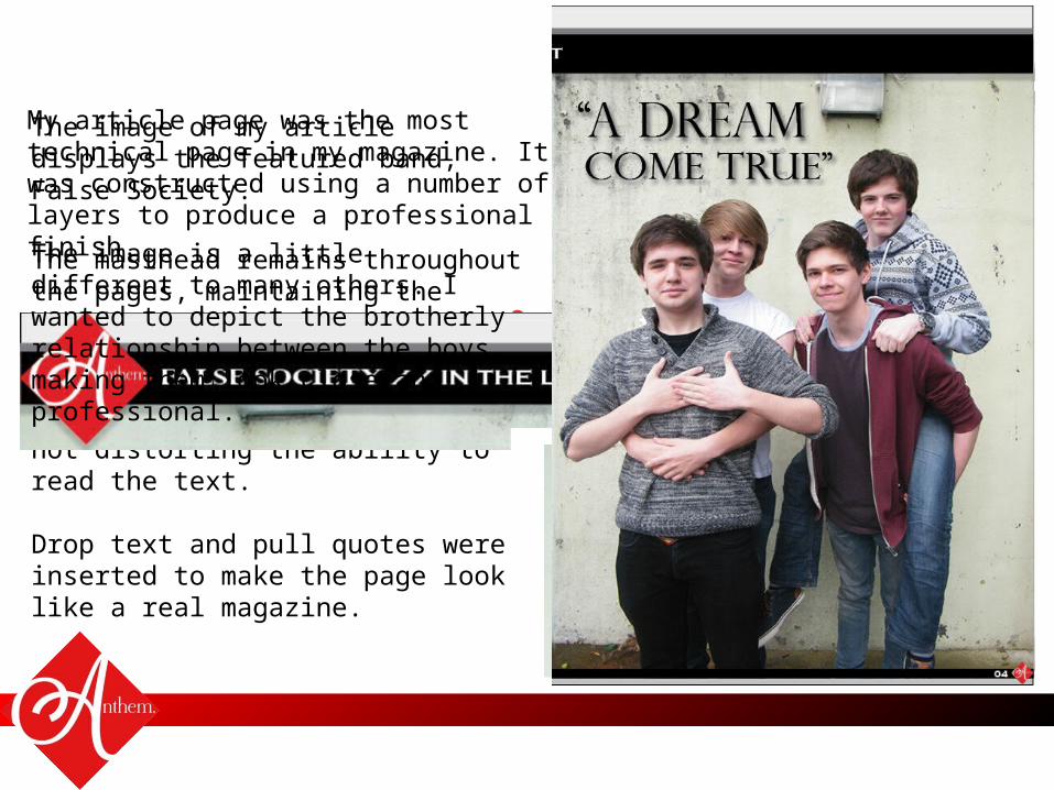
The image of my article displays the featured band, False Society.
The image is a little different to many others. I wanted to depict the brotherly relationship between the boys, making them look close and professional.