Embed Size (px)
Citation preview

In what ways does your media product use, develop or challenge forms and conventions of real media products?
My media products develops forms and conventions of real media products through the use of clearly defined colour scheme to reveal a house style which helps the target audience to familiarise themselves with the brand, making my magazine more popular. In addition, the use of shot featured uses forms and conventions of real media products as medium close-ups are commonly used on the front cover of magazines, for example VIBE and Q. Other conventions included, the model is framed centrally with cover lines positioned at either side drawing attention to him which can be used as star marketing as he is a familiar face. This compares to existing media products which promote celebrity culture. The masthead is also conventional as this is what majority of traditional existing magazines, with the exception of ‘Q’ and ‘Clash’ magazine feature. Furthermore, the bar code shows another way to transfer data. The symbols of the barcode signify several factors, such as manufacturer, price and name of a product. Barcodes are scanned to transfer information about a particular item to a computer and is commonly featured on media products.

How does your media product represent particular social groups?
My media product represents group C2 of the socio-economic groups, as middle and upper class individuals tend, stereotypically to not favour Rap/Hip-hop music. In addition, my product represents the use of slang which is commonly used in Rap and those from the C2/D/E category, and also the type of clothing the model wears on the front cover. The preferred reading is a young, aspirational role model for my target audience. However, there are negative perspectives related to my genre and the type of clothes worn, for example, the model on my front cover was wearing a black coat with a furry hood and a Nike hat which is often viewed as undesirable, the black making the image more menacing. This contributes to stereotypes as rappers do not attain the same clothing style. The oppositional reading would link to Dick Hebdige’s theory that young people are trouble In addition, as no females are presented in my magazine; this reinforces gender stereotypes which proposes the dominate readers of my magazine are males. However, if I was to create another magazine, I would include females in it. Despite this, the preferred reading is rappers are good role models and inspire young people regardless of stereotypes.
InterMedia Partners is the company that would distribute my media product as their readers are Hip-hop/rap fans, similar to my own. As they are already in charge of distributing ‘VIBE’ magazines, they would be interested in distributing mine as I would have something different to offer. Firstly, my magazine issued tickets to be won by the audience to see celebrities which is an aspect which ‘VIBE’ magazine unique selling points does not possess. This proposes my magazine has better audience appeal as it offers personal things, for example tickets so that the audience would be a regular reader.
What kind of media institution might distribute your media product and why?

My target audience would be boys and girls as the rap/hip-hop genre is not necessarily aimed at a gender skew. According to psychographic categorisation, my target audience are mainstreamers as they would seek security and conformity, buying established trusted brands. However, according to socio-economic groups, my target audience are C2/D/E as they would be skilled working class due to the majority of lower, middle and upper class people not being huge fans of rap/hip-hop which is due to class stereotypes. The age range of my target audience is 16 to 28 year olds. The primary audience would be the 16-25 year olds while the secondary audience would be 26-28 year olds and the pre-existing audience which are the fans of the celebrity.
Who would be the audience for your media product?

How did you attract/address your audience?
The use of the colours white and orange which connotes purity, energy and creativity is one aspect which attracted my audience as they are also bright colours. A similar technique is also used in KERRANG! And VIBE magazine. The use of the medium mid-shot of the model on the front cover created a sense of mystery and action as the model was not making eye-contact with the camera. The age of the people featured in my magazine are young, which shows the uses and gratification theory can be applied to this as personal identity as the people featured could be considered as role models by the audience using the media (magazine) to find out about themselves. Using star marketing also boosts the attraction of the magazine for the audience as the model carries the magazine and its name. In addition, the name of the magazine is effective as the name suits my genre and also my target audience as they are young and can relate to the name. The use of the short and snappy language will help my target audience to recognise the magazine immediately. In addition, the colloquial language is used to create a natural and realistic effect and is an informal mode of address. This also reflects upon the working class region as colloquial language is used mostly amongst young people.
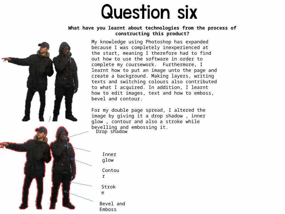
What have you learnt about technologies from the process of constructing this product?
My knowledge using Photoshop has expanded because I was completely inexperienced at the start, meaning I therefore had to find out how to use the software in order to complete my coursework. Furthermore, I learnt how to put an image unto the page and create a background. Making layers, writing texts and switching colours also contributed to what I acquired. In addition, I learnt how to edit images, text and how to emboss, bevel and contour.
For my double page spread, I altered the image by giving it a drop shadow , inner glow , contour and also a stroke while bevelling and embossing it.
Drop shadow
Inner glow
Contour
Stroke
Bevel and Emboss

My knowledge using Photoshop has expanded vigorously since I was completely inexperienced at the start, meaning I therefore had to find out how to use the software in order to complete my coursework. My double page spread was completed until I realised there were no existing columns and the size of the writing was too big. For this reason I alternated the structure of my double page spread to make it appear like a conventional one.
Using the ruler from the view button, I made lines to form columns so I could write up the interview with the model. I also made the background lighter in order for the audience to view the text. Adding a title also made it easier to know what information the page contained. In addition, I included a pull and an actual quote to fill up the blank spaces. All this was due to the fact my learning progressed rapidly over the weeks by watching videos on YouTube and asking questioning my peers. Overall, I have gained experience which helped me to complete my main task and also caused me to be motivated in order to create a better magazine and achieve a high grade.
Looking back at your preliminary task, what do you feel you have learnt in the progression from it to the full task?