Embed Size (px)
Citation preview

*

*Magazine name – Alt-Rhythm

*Frequency of magazine
*– Once a month

** James is 19 and living in York, he currently is in higher
education at a 6th form college. He has a part time job on the weekend and is subscribed to alt-rhythm. He uses the money he gets from his job on going out on weekends and going to see his favourite bands live. His favourite gig he has been to was The stone roses at Heaton park and is looking forward to seeing the Courteeners there. He still believes that the 90’s era of Brit pop will never be bettered. He looks forward to the summer as it festival season, the annual trip to leeds festival will be certain for him along side his first time at Glastonbury, James is a big collector of vinyls and has all of Oasis’ albums on it.

*Cover price of magazine will be
£3.99
*
*
*The target audience of my magazine will be
any gender, usual gig goers or people looking to
go to more gigs. Regular festival goers or
people looking to go to their first one. My
target age for my magazine would be around
the young adult age (from middle age teen to
late twenties).

*
*To provide all the best news, information and
updates in the alternative world of music
directly to the people who want to read about
it most.

*
*The genre of my magazine will be spread from
Indie rock, Rock, brit pop, and alternative
rock.

*Fonts
Lemon/milk font
Alpaca solidify
shruti
I am going to use the top font for
my headline, as it is block and
stands out on the page with a red
or white background to it. The
second text is going to be for the
cover lines. The third text will be
used for any paragraphs or main
body text as it is easy to read.
I chose these four colours for
the main colours of my
magazine because they fit the
style and genre that the
magazine is.

*

**Examples of potential shots
Lead singer photo with
headline across the middle
with text and sub headlines
around the edges. Similar
colours throughout the front
page. Long shot of full
person(s). Medium close up
or a medium shot would be
used for the front cover.

Contents page example shots
I will use live shots for
the thumbnails in the
contents page and
have text and subhead
lines wrapped around
them.
Album covers that
are featured in the
magazine in reviews
or ads.
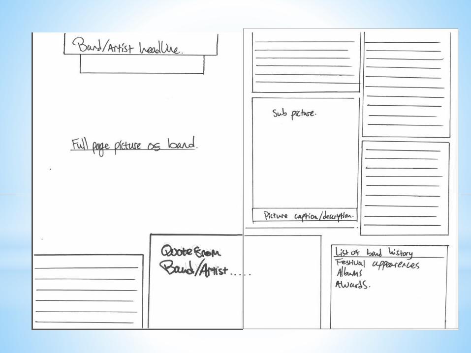
For the double spread I will
use either a medium shot or
a medium close up for this
with the text wrapped
around it. Potentially a live
shot of the artist beside it.

Front
cover
AdvertAdvert
Advert
Advert
Double
spreadDouble
spread
contents