Embed Size (px)
Citation preview
Inspirations
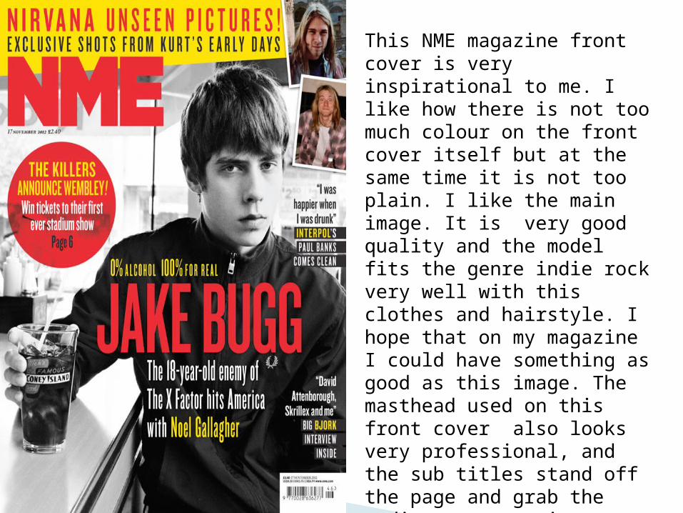
This NME magazine front cover is very inspirational to me. I like how there is not too much colour on the front cover itself but at the same time it is not too plain. I like the main image. It is very good quality and the model fits the genre indie rock very well with this clothes and hairstyle. I hope that on my magazine I could have something as good as this image. The masthead used on this front cover also looks very professional, and the sub titles stand off the page and grab the audiences attention very well. I like the way the front cover is packed with information so that it attracts the attention of the audience and gives them an idea of what the magazine will contain.
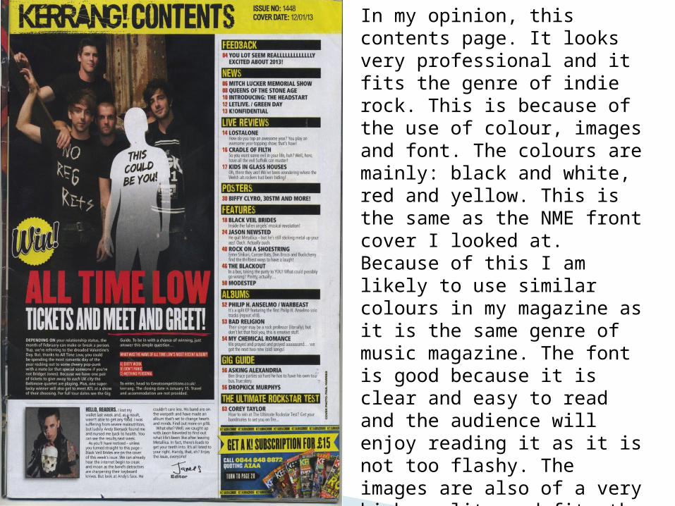
In my opinion, this contents page. It looks very professional and it fits the genre of indie rock. This is because of the use of colour, images and font. The colours are mainly: black and white, red and yellow. This is the same as the NME front cover I looked at. Because of this I am likely to use similar colours in my magazine as it is the same genre of music magazine. The font is good because it is clear and easy to read and the audience will enjoy reading it as it is not too flashy. The images are also of a very high quality and fits the genre. I also like the layout of the page as everything is spread out nicely .On the whole this is a very inspiring piece of work for me and has given me a few ideas for my own magazine.
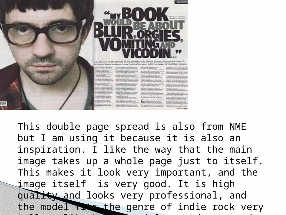
This double page spread is also from NME but I am using it because it is also an inspiration. I like the way that the main image takes up a whole page just to itself. This makes it look very important, and the image itself is very good. It is high quality and looks very professional, and the model fits the genre of indie rock very well. I like how the title stands out and catches your attention and I also like how the page is not too colourful.