Embed Size (px)
Citation preview
Exploring design features for print work
I’ve decided to focus on ‘What’s On TV!’ (as this is the one I am going to use) and Hollyoaks’ posters
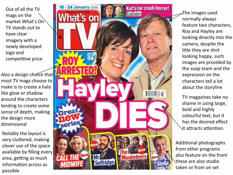
The images used normally always feature two characters, Roy and Hayley are looking directly into the camera, despite the Ftle they are shot looking happy, such images are provided by the soap team and the expression on the characters tell a lot about the storyline
Also a design choice that most TV mags choose to make is to create a halo like glow or shadow around the characters lending to create some sense of depth, making the design more dimensional
TV magazines take no shame in using large, bold and highly colourful text, but it has the desired effect it aKracts aKenFon.
AddiFonal photographs from other programs also feature on the front these are also studio taken or from on set
Notably the layout is very cluKered, making clever use of the space available by filling every area, geOng as much informaFon across as possible
Out of all the TV mags on the market What’s On TV stands out to have clear imagery with a newly developed logo and compeFFve price
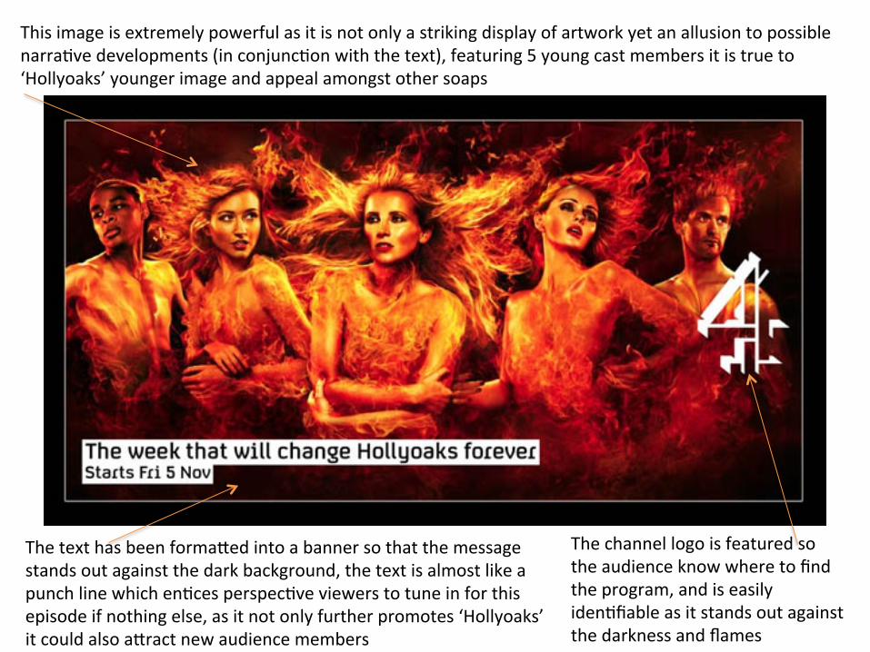
This image is extremely powerful as it is not only a striking display of artwork yet an allusion to possible narraFve developments (in conjuncFon with the text), featuring 5 young cast members it is true to ‘Hollyoaks’ younger image and appeal amongst other soaps
The channel logo is featured so the audience know where to find the program, and is easily idenFfiable as it stands out against the darkness and flames
The text has been formaKed into a banner so that the message stands out against the dark background, the text is almost like a punch line which enFces perspecFve viewers to tune in for this episode if nothing else, as it not only further promotes ‘Hollyoaks’ it could also aKract new audience members
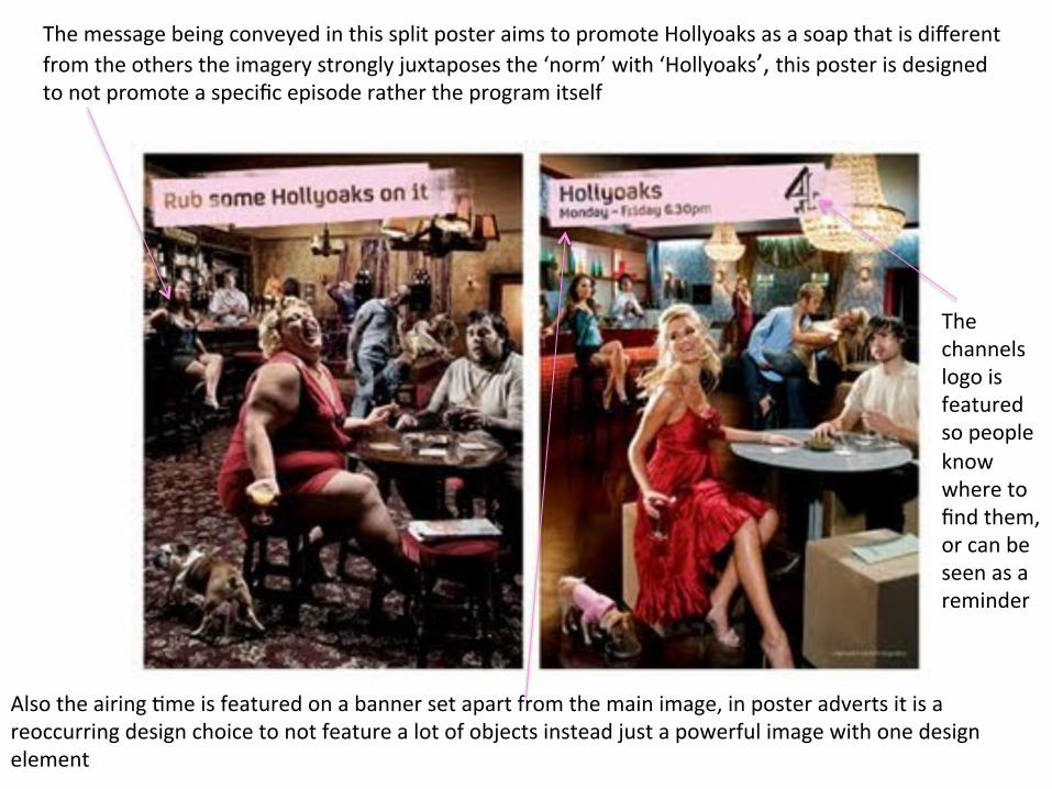
The message being conveyed in this split poster aims to promote Hollyoaks as a soap that is different from the others the imagery strongly juxtaposes the ‘norm’ with ‘Hollyoaks’, this poster is designed to not promote a specific episode rather the program itself
The channels logo is featured so people know where to find them, or can be seen as a reminder
Also the airing Fme is featured on a banner set apart from the main image, in poster adverts it is a reoccurring design choice to not feature a lot of objects instead just a powerful image with one design element
![Worms Exploring Geometrical Features of Phase Transitions · [N. Prokof’ev & B. Svistunov, Phys. Rev. Lett. 87 (2001) 160601] Wolfhard Janke Worms Exploring Geometrical Features](https://img.pdfslide.us/doc/110x75/5f5fb5e1221a925b0f515160/worms-exploring-geometrical-features-of-phase-n-prokofaev-b-svistunov.jpg)


![[0pt]Exploring Linguistic Features for Web Spam Detection A ...airweb.cse.lehigh.edu/2008/slides/piskorski_2008...Exploring Linguistic Features for Web Spam Detection A Preliminary](https://img.pdfslide.us/doc/110x75/5f9ae5e8af0f4153086c5303/0ptexploring-linguistic-features-for-web-spam-detection-a-exploring-linguistic.jpg)