Embed Size (px)
Citation preview

Applications of Microbiolgical Data
Tim SandleMicrobiology information
resource: http://www.pharmamicroresources.com/
Introduction
Distribution of microbiological data Use of trend charts Calculation of warning and action
levels
Introduction
Examples from environmental monitoring and water testing
Broad and illustrative overview Written paper with more detail
Distribution of microbiological data
Why study distribution?• Impact on sampling• Impact on trending• Impact upon calculation of warning and
action levels
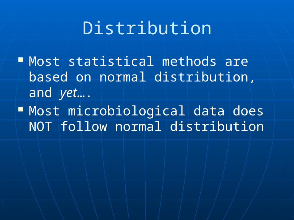
Distribution
Most statistical methods are based on normal distribution, and yet….
Most microbiological data does NOT follow normal distribution
Distribution
Micro-organisms, such as those in a typical, free-flowing water system, follow Poisson distribution
For example…
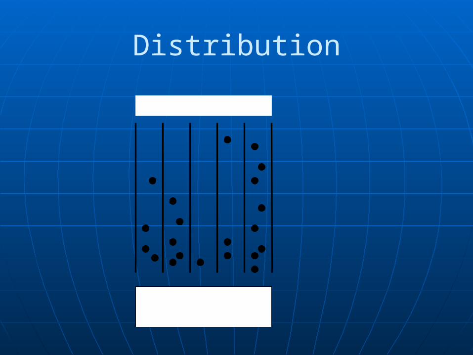
Distribution
S1 S2 S3S4 S5
Where S = sample= micro-organism
Distribution
And microbial counts tend to be skewed (or positive or negative exponential distribution)
For example, a Water-for-Injection system…
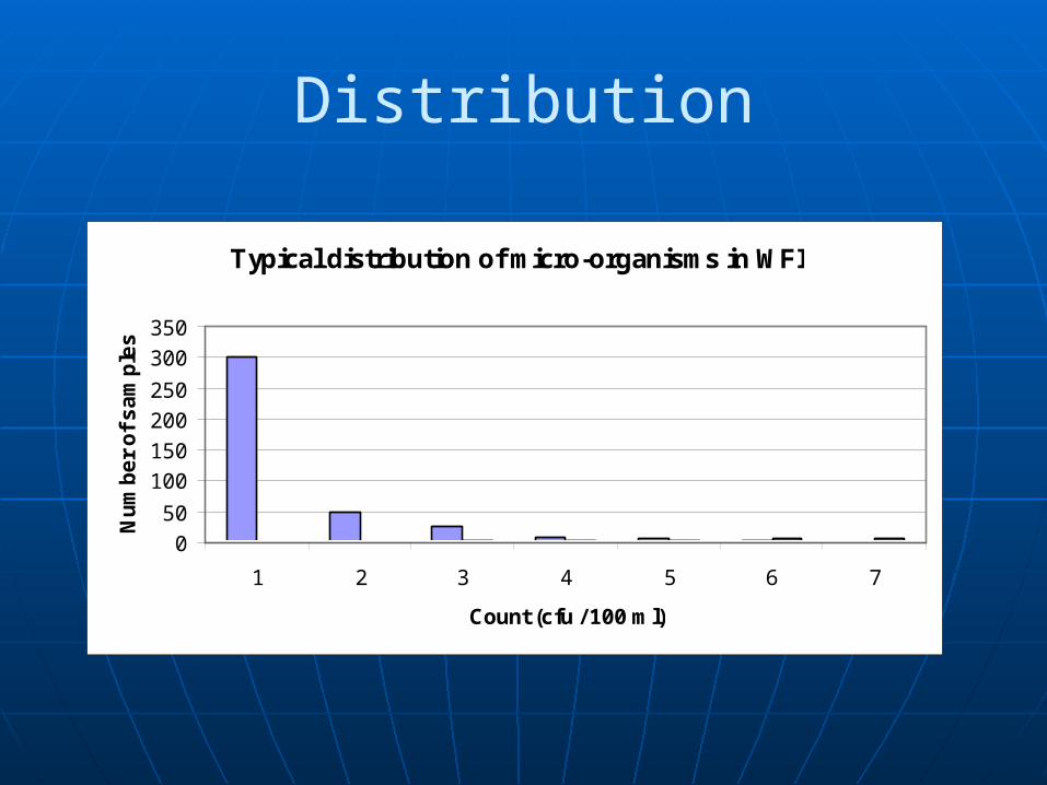
Distribution
Typical distribution of micro-organisms in WFI
0
50
100
150
200
250
300
350
1 2 3 4 5 6 7
Count (cfu / 100 ml)
Nu
mb
er
of
sa
mp
les
Distribution
So, what can we do about it?
Skewed question mark
Distribution
Well:a) Use complex calculations and Poisson distribution tables, orb) Attempt to transform then data
We’ll go for the second option
Distribution
A general rule is:• For low count data e.g. Grade A
monitoring and WFI systems, take the square root
• For higher count data, e.g. Grade C and D environmental monitoring or a purified water system, convert the data into logarithms
Distribution
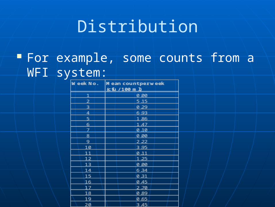
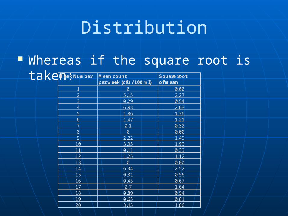
For example, some counts from a WFI system:
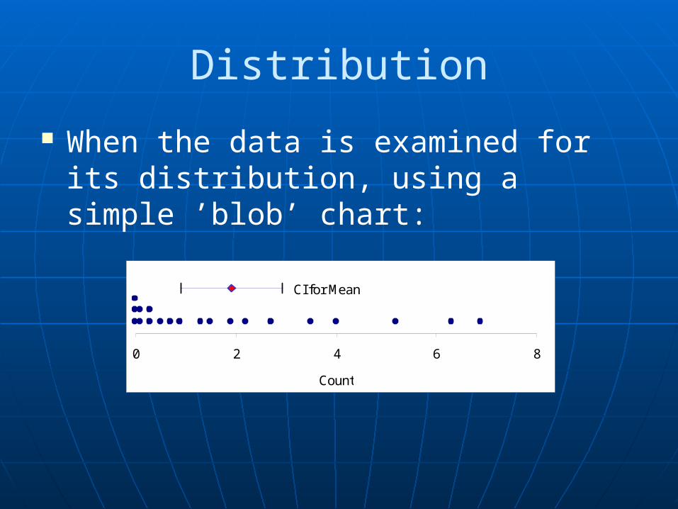
Distribution
When the data is examined for its distribution, using a simple ’blob’ chart:
CI for Mean
0 2 4 6 8
Count
Distribution
Whereas if the square root is taken:Week Number Mean count Square root
per week (cfu / 100 ml) of mean1 0 0.002 5.15 2.273 0.29 0.544 6.93 2.635 1.86 1.366 1.47 1.217 0.1 0.328 0 0.009 2.22 1.4910 3.95 1.9911 0.11 0.3312 1.25 1.1213 0 0.0014 6.34 2.5215 0.31 0.5616 0.45 0.6717 2.7 1.6418 0.89 0.9419 0.65 0.8120 3.45 1.86
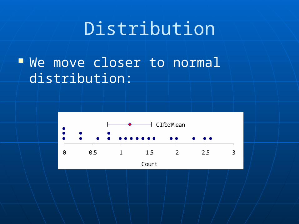
Distribution
We move closer to normal distribution:
CI for Mean
0 0.5 1 1.5 2 2.5 3
Count
Distribution
Logarithms work in a similar way for higher counts
Remember to add ‘+1’ to zero counts (and therefore, +1 to all counts)
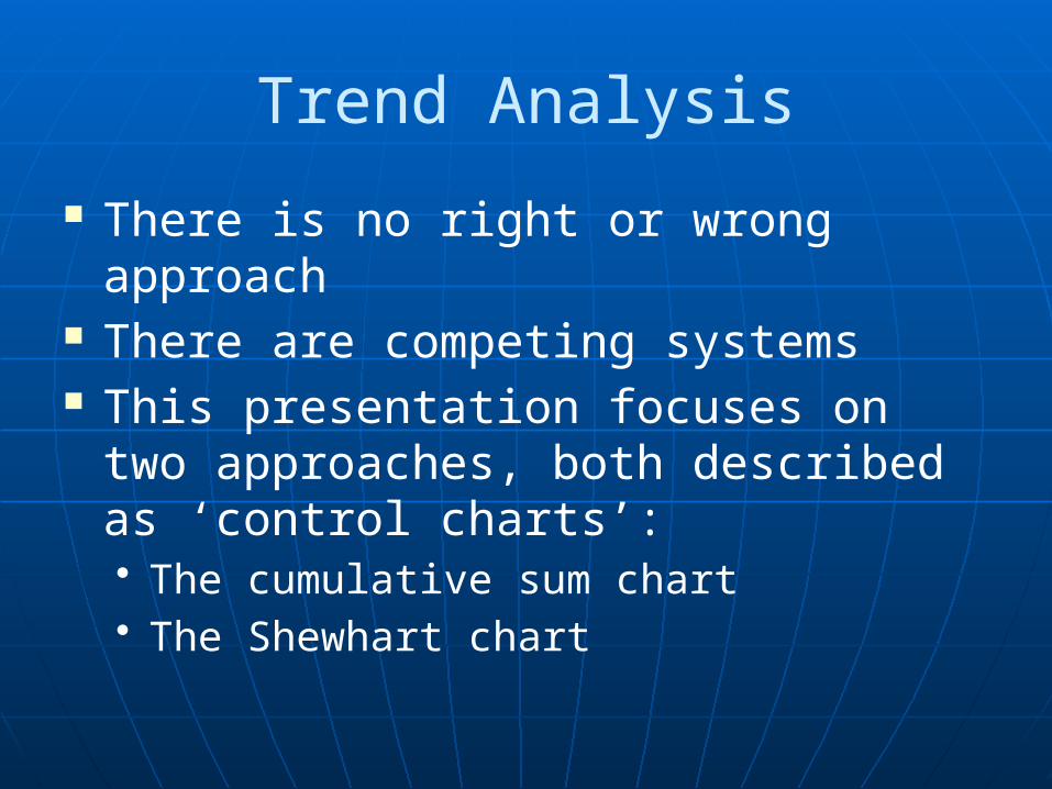
Trend Analysis
There is no right or wrong approach There are competing systems This presentation focuses on two
approaches, both described as ‘control charts’:• The cumulative sum chart• The Shewhart chart
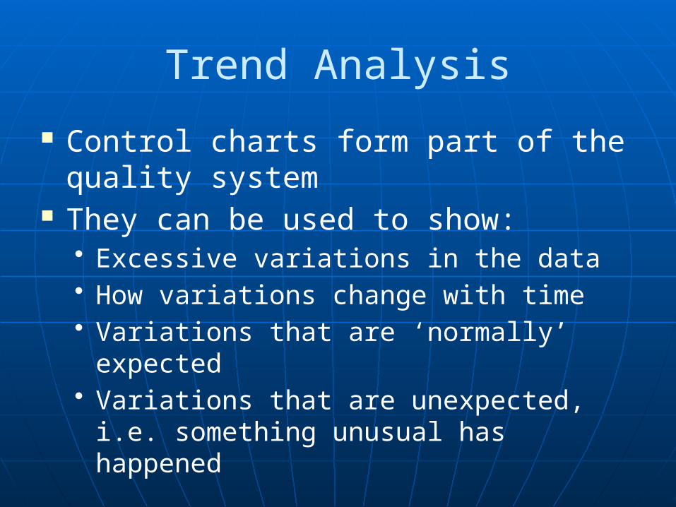
Trend Analysis
Control charts form part of the quality system
They can be used to show:• Excessive variations in the data• How variations change with time• Variations that are ‘normally’ expected• Variations that are unexpected, i.e.
something unusual has happened
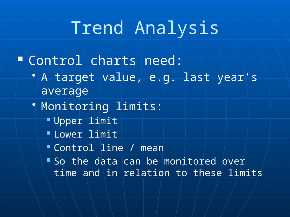
Trend Analysis
Control charts need:• A target value, e.g. last year’s average• Monitoring limits:
Upper limit Lower limit Control line / mean So the data can be monitored over time and
in relation to these limits
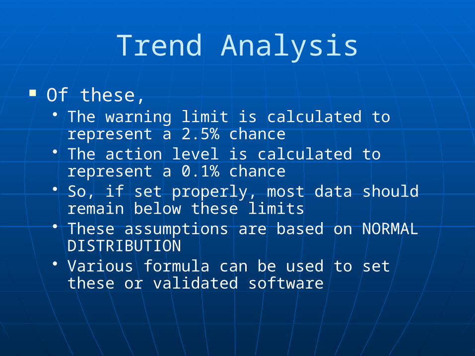
Trend Analysis
Of these,• The warning limit is calculated to represent a
2.5% chance• The action level is calculated to represent a
0.1% chance• So, if set properly, most data should remain
below these limits• These assumptions are based on NORMAL
DISTRIBUTION• Various formula can be used to set these or
validated software
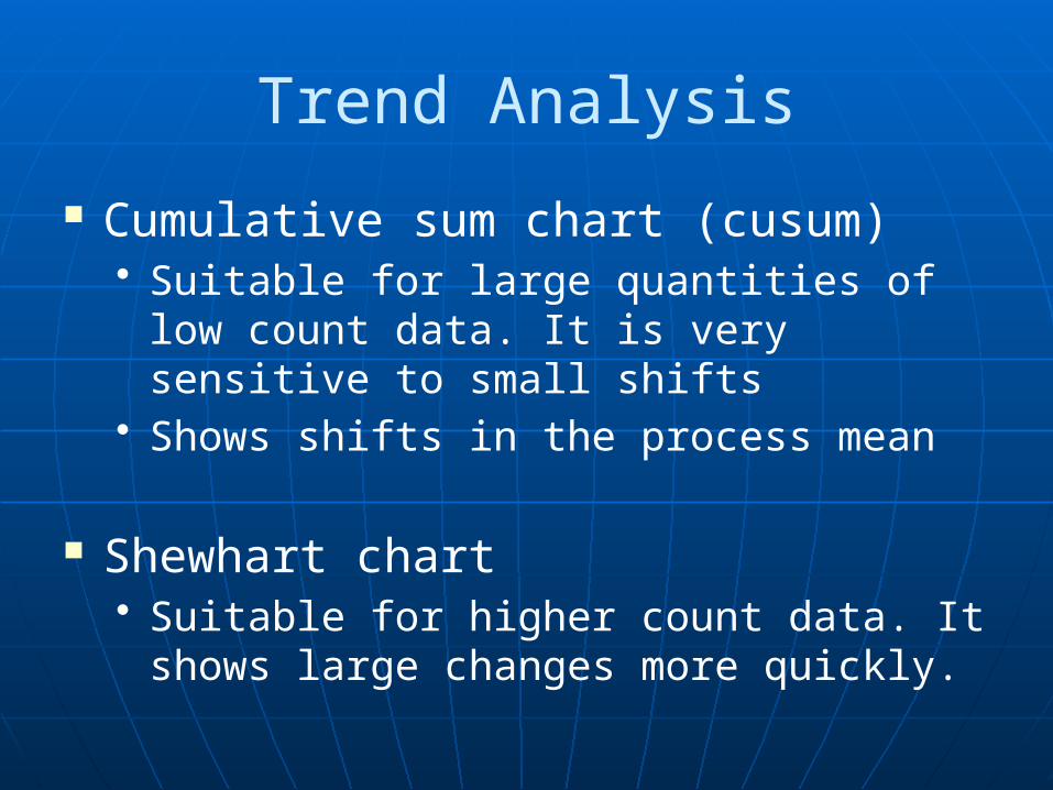
Trend Analysis
Cumulative sum chart (cusum)• Suitable for large quantities of low count
data. It is very sensitive to small shifts• Shows shifts in the process mean
Shewhart chart• Suitable for higher count data. It shows
large changes more quickly.
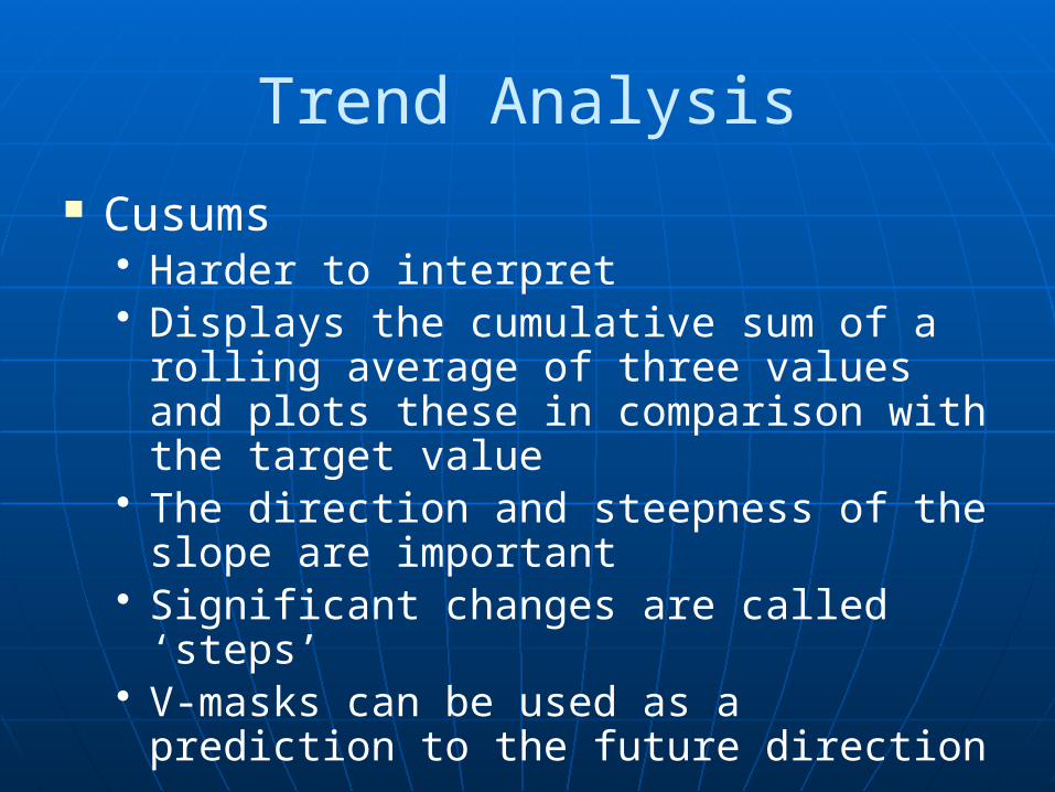
Trend Analysis
Cusums• Harder to interpret• Displays the cumulative sum of a rolling
average of three values and plots these in comparison with the target value
• The direction and steepness of the slope are important
• Significant changes are called ‘steps’• V-masks can be used as a prediction to
the future direction
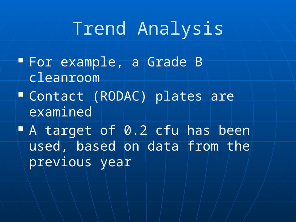
Trend Analysis
For example, a Grade B cleanroom Contact (RODAC) plates are
examined A target of 0.2 cfu has been used,
based on data from the previous year
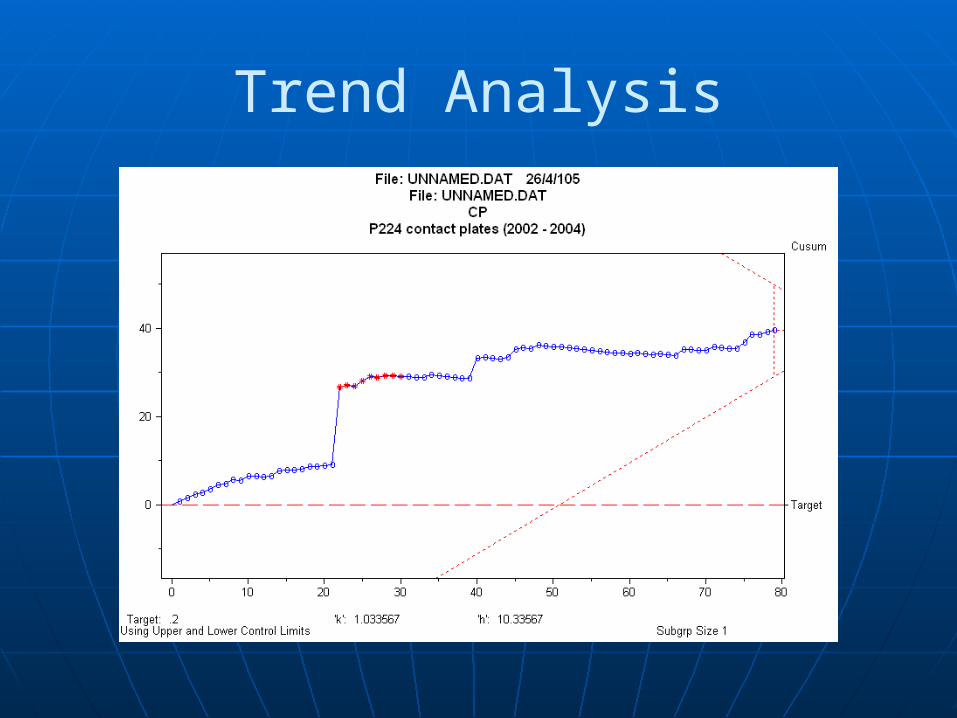
Trend Analysis
Trend Analysis
Shewhart charts• Powerful for distinguishing between
special causes and common causes• Common causes are inherent to the
process and are long-term• Special causes are where something has
changed and maybe of a long or short term
Trend Analysis
Examples of special causes:• a) A certain process • b) A certain outlet • c) A certain method of sanitisation, etc. • d) Sampling technique• e) Equipment malfunction e.g. pumps, UV
lamps• f) Cross contamination in laboratory• g) Engineering work• h) Sanitisation frequencies
Trend Analysis
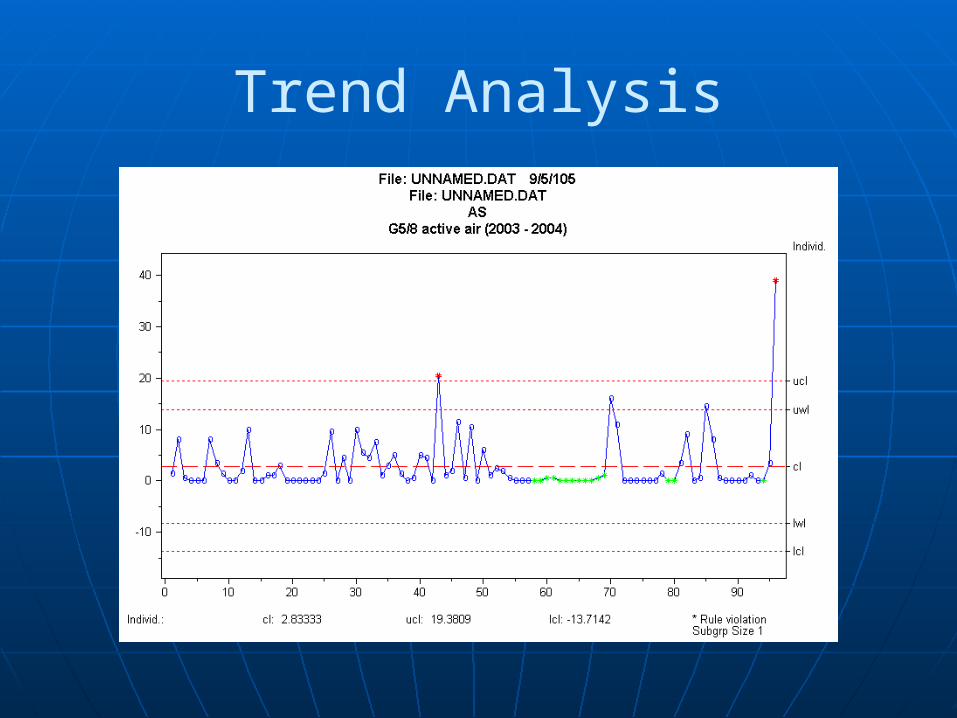
For example, a Grade C cleanroom• Active air-samples are examined• A target of 1.5, based on historical data
Trend Analysis
Trend Analysis
The previous charts were prepared using a statistical software package
However, MS Excel can also be used The next example is of a WFI system Notice the data has been converted
by taking the square root of each value
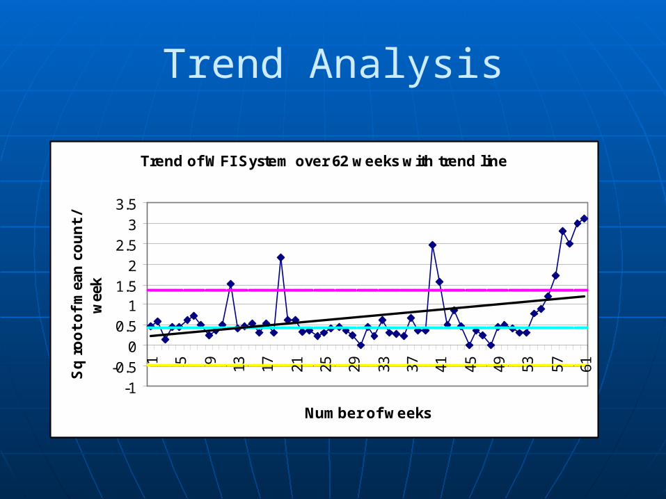
Trend Analysis
Trend of WFI System over 62 weeks with trend line
-1-0.5
00.5
11.5
22.5
33.5
1 5 9 13 17 21 25 29 33 37 41 45 49 53 57 61
Number of weeks
Sq
ro
ot
of
mea
n c
ou
nt
/ w
eek
Trend Analysis
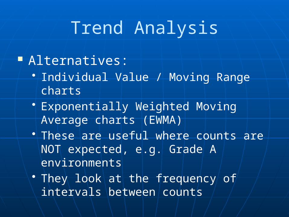
Alternatives:• Individual Value / Moving Range charts• Exponentially Weighted Moving Average
charts (EWMA)• These are useful where counts are NOT
expected, e.g. Grade A environments• They look at the frequency of intervals
between counts
Trend Analysis
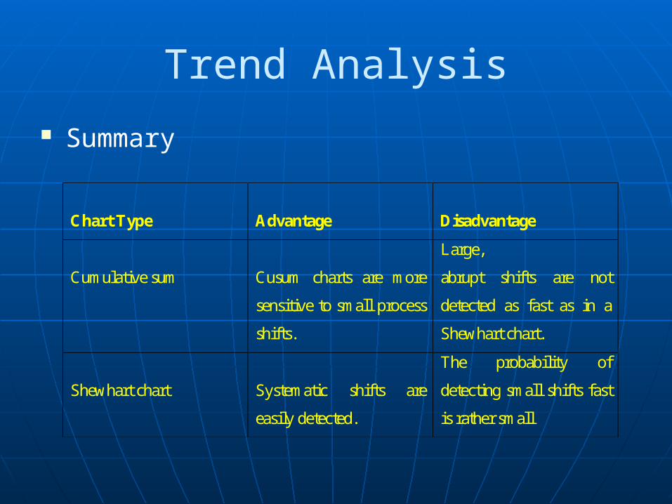
Summary
Chart Type
Advantage
Disadvantage
Cumulative sum
Cusum charts are more
sensitive to small process
shifts.
Large,
abrupt shifts are not
detected as fast as in a
Shewhart chart.
Shewhart chart
Systematic shifts are
easily detected.
The probability of
detecting small shifts fast
is rather small
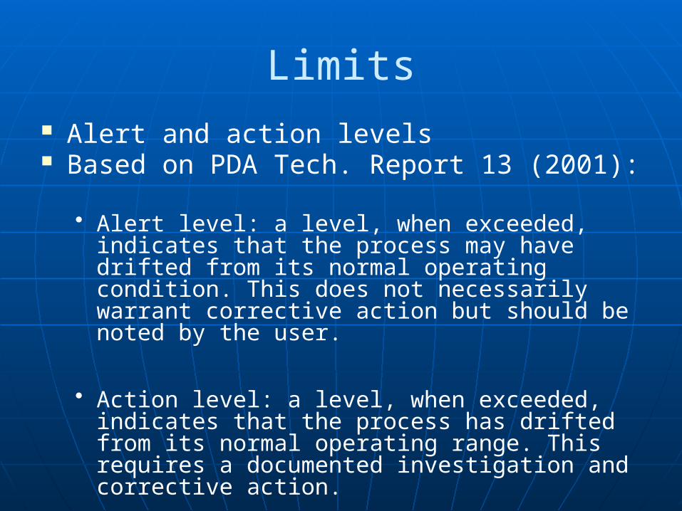
Limits Alert and action levels Based on PDA Tech. Report 13 (2001):
• Alert level: a level, when exceeded, indicates that the process may have drifted from its normal operating condition. This does not necessarily warrant corrective action but should be noted by the user.
• Action level: a level, when exceeded, indicates that the process has drifted from its normal operating range. This requires a documented investigation and corrective action.
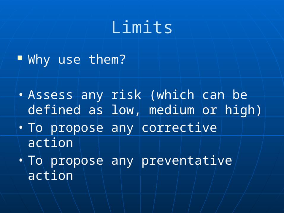
Limits
Why use them?
• Assess any risk (which can be defined as low, medium or high)
• To propose any corrective action• To propose any preventative action
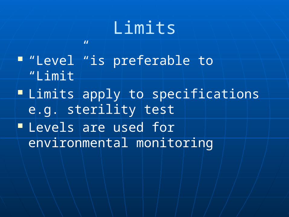
Limits
“Level” is preferable to “Limit” Limits apply to specifications e.g.
sterility test Levels are used for environmental
monitoring
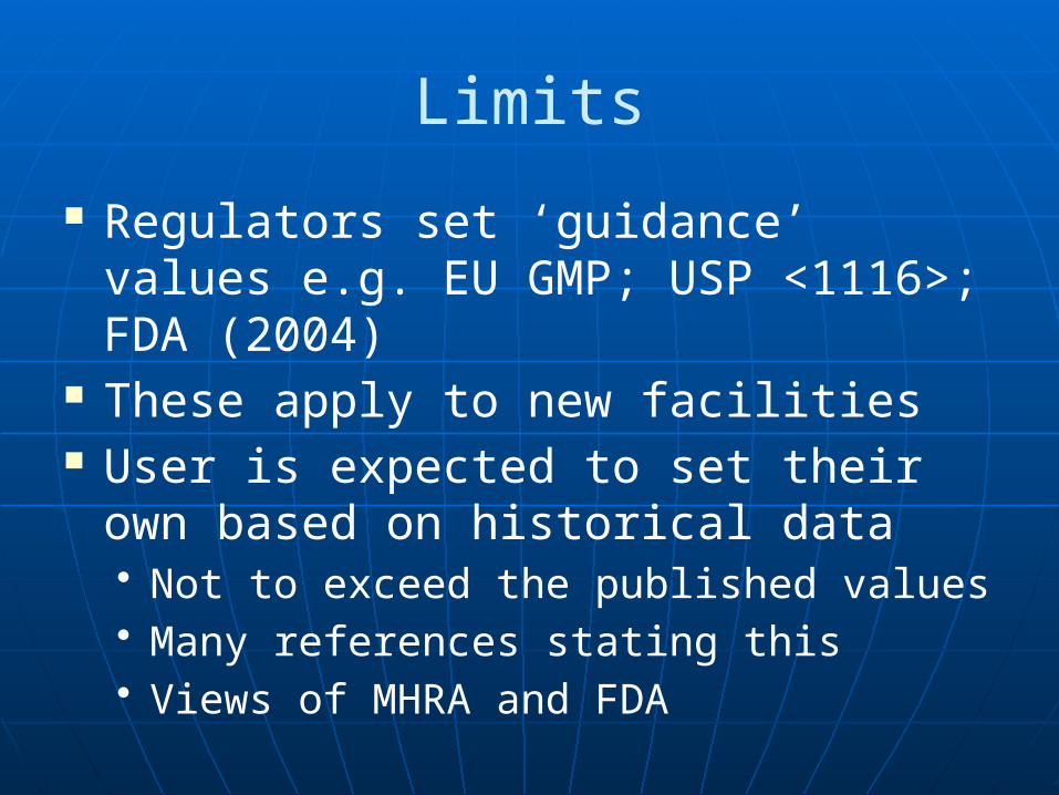
Limits
Regulators set ‘guidance’ values e.g. EU GMP; USP <1116>; FDA (2004)
These apply to new facilities User is expected to set their own
based on historical data• Not to exceed the published values• Many references stating this• Views of MHRA and FDA
Limits
Things to consider:• The length of time that the facility has been in
use for• How often the user intends to use the limits for
(i.e. when the user intends to re-assess or re-calculate the limits. Is this yearly? Two yearly? And so on).
• Custom and practice in the user’s organisation (e.g. is there a preferred statistical technique?)
• They be calculated from an historical analysis of data.
• Uses a statistical technique.
Limits
Historical data• Aim for a minimum of 100 results• Ideally one year, to account for seasonal
variations
Limits
Statistical methods:• Percentile cut-off• Normal distribution• Exponential distribution• Non-parametric tolerance limits• Weibull distribution
Recommended by PDA Technical Report, No. 13
Limits
Assumptions:
a) The previous period was ‘normal’ and that future excursions above the limits are deviations from the normb) Outliers have been accounted for
Limits
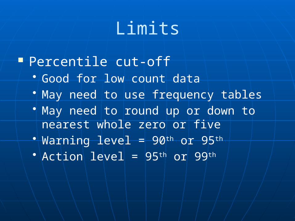
Percentile cut-off• Good for low count data• May need to use frequency tables• May need to round up or down to
nearest whole zero or five• Warning level = 90th or 95th
• Action level = 95th or 99th
Limits
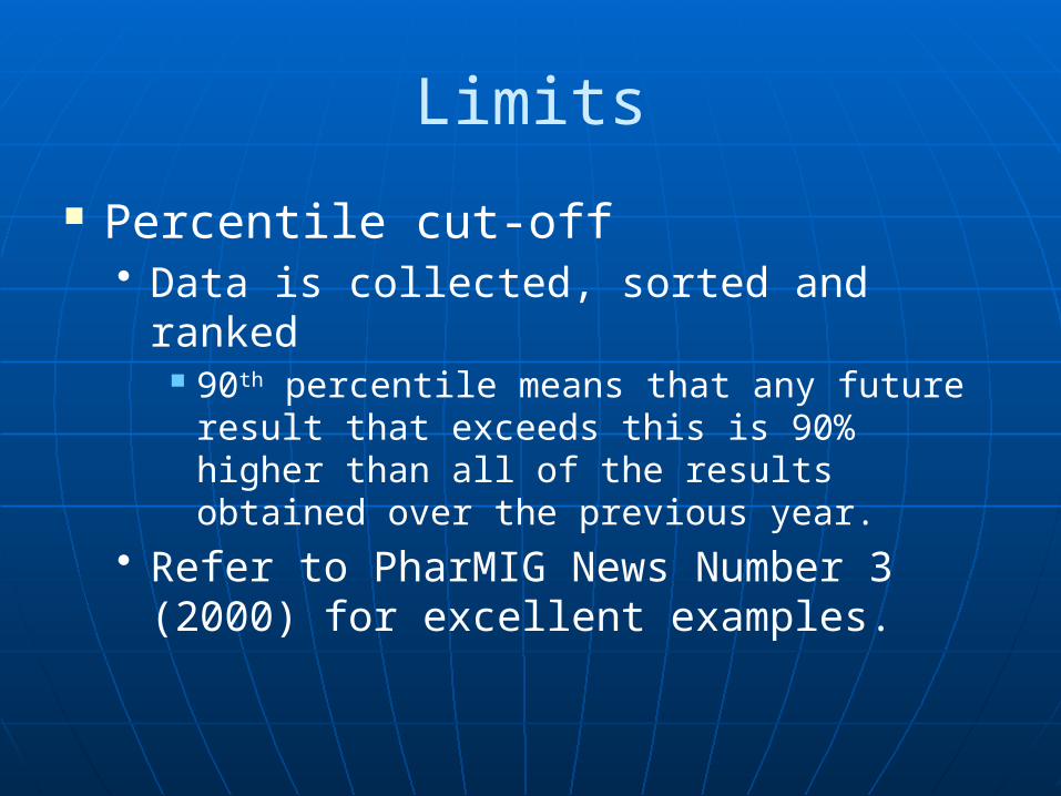
Percentile cut-off• Data is collected, sorted and ranked
90th percentile means that any future result that exceeds this is 90% higher than all of the results obtained over the previous year.
• Refer to PharMIG News Number 3 (2000) for excellent examples.
Limits
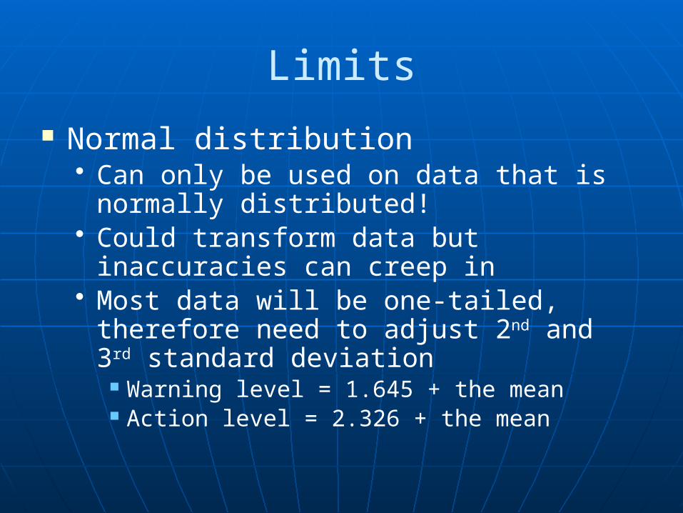
Normal distribution• Can only be used on data that is
normally distributed!• Could transform data but inaccuracies
can creep in• Most data will be one-tailed, therefore
need to adjust 2nd and 3rd standard deviation
Warning level = 1.645 + the mean Action level = 2.326 + the mean
Limits
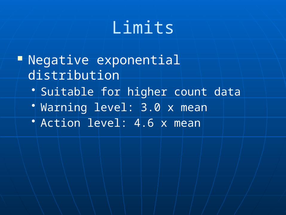
Negative exponential distribution• Suitable for higher count data• Warning level: 3.0 x mean• Action level: 4.6 x mean
Limits
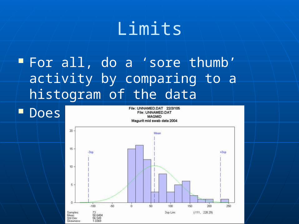
For all, do a ‘sore thumb’ activity by comparing to a histogram of the data
Does it feel right?
Conclusion
We have looked at:• Distribution of microbiological data• Trending
Cusum charts Shewhart charts
• Setting warning and action levels Percentile cut-off Normal distribution approach Negative exponential approach
Conclusion
Key points:• Most micro-organisms and microbial
counts do not follow normal distribution• Data can be transformed• Inspectors expect some trending and
user defined monitoring levels• Don’t forget to be professional
microbiologists – it isn’t all numbers!

Just a thought…
This has been a broad over-view If there is merit in a more ‘hands on’
training course, please indicate on your post-conference questionnaires.

Thank you