Embed Size (px)
Citation preview
Schuh Responsive:Lessons learned
@mcmillanstu
Stuart McMillan, Deputy Head of Ecommerce
#IRX15
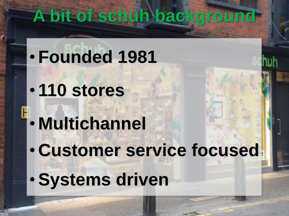
A bit of schuh background
• Founded 1981
• 110 stores
• Multichannel
• Customer service focused
• Systems driven

This isn’t a crusade.
(or if it is, it’s certainly not a responsive design crusade)
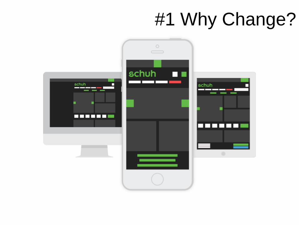
#1 Why Change?
o Increased device diversity in our traffic.
o Tired mobile site, under-prioritised.
o Desktop site not touch-optimised.
o Desktop site under-utilising screen space.
o Inconsistent user experience.
o Development inefficiencies.
o Underperforming SEO.
Why change?
The simplest
change is no
change at all
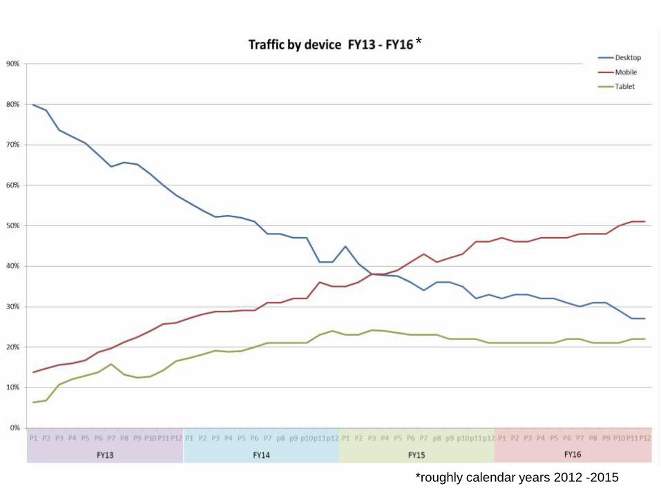
*roughly calendar years 2012 -2015
*
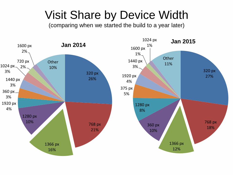
320 px26%
768 px21%
1366 px16%
1280 px10%
1920 px4%
360 px3%
1440 px3%
1024 px3%
720 px2%
1600 px2%
Other10%
Jan 2014
320 px27%
768 px18%
1366 px12%
360 px10%
1280 px8%
375 px5%
1920 px4%
1440 px3%
1600 px1%
1024 px1%
Other11%
Jan 2015
Visit Share by Device Width(comparing when we started the build to a year later)
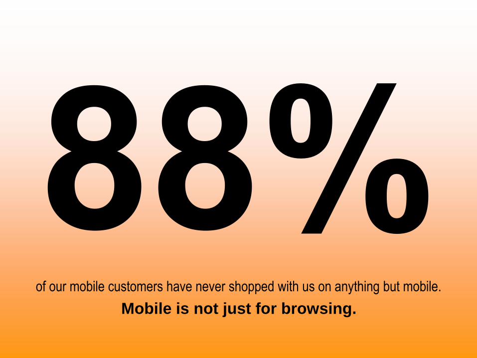
of our mobile customers have never shopped with us on anything but mobile.
Mobile is not just for browsing.
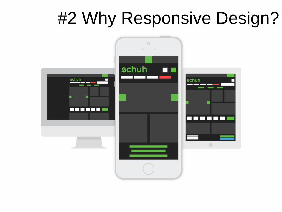
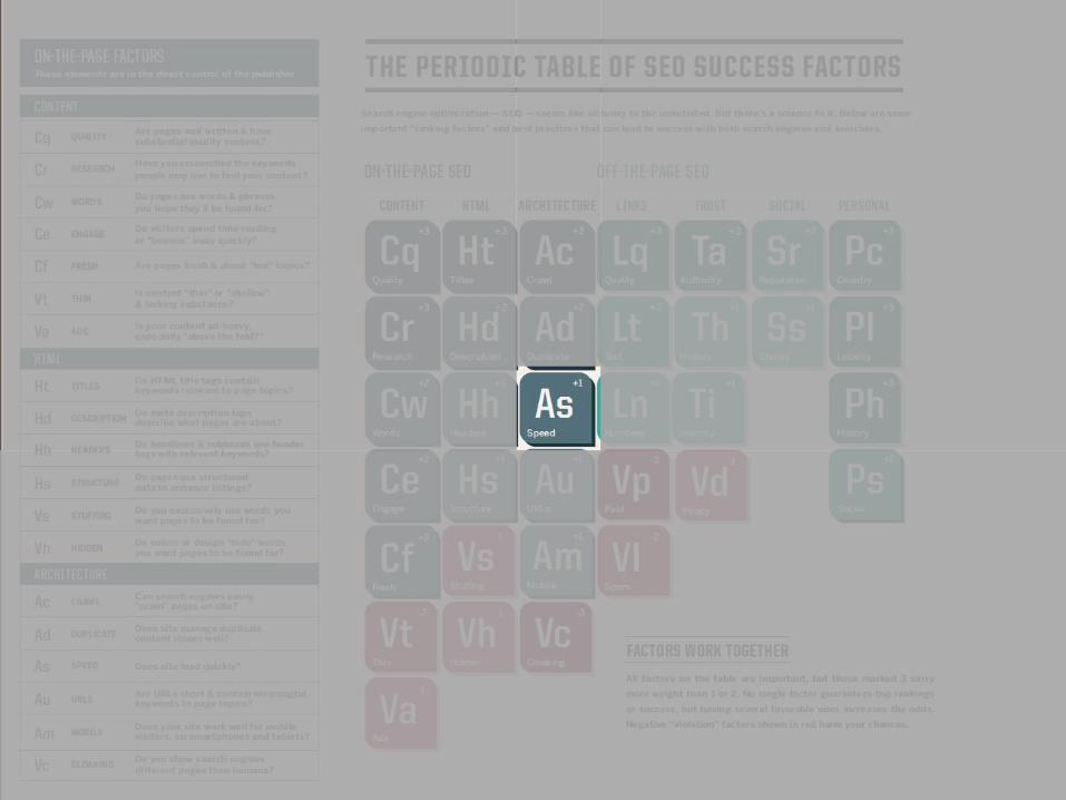
#2 Why Responsive Design?
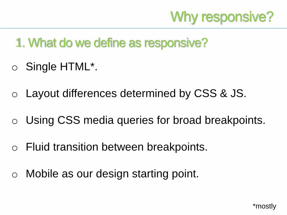
o Single HTML*.
o Layout differences determined by CSS & JS.
o Using CSS media queries for broad breakpoints.
o Fluid transition between breakpoints.
o Mobile as our design starting point.
Why responsive?
*mostly
1. What do we define as responsive?
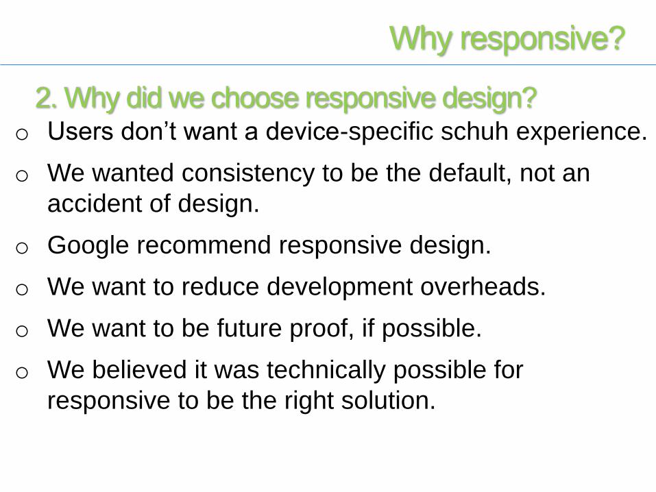
o Users don’t want a device-specific schuh experience.
o We wanted consistency to be the default, not an
accident of design.
o Google recommend responsive design.
o We want to reduce development overheads.
o We want to be future proof, if possible.
o We believed it was technically possible for
responsive to be the right solution.
Why responsive?
2. Why did we choose responsive design?
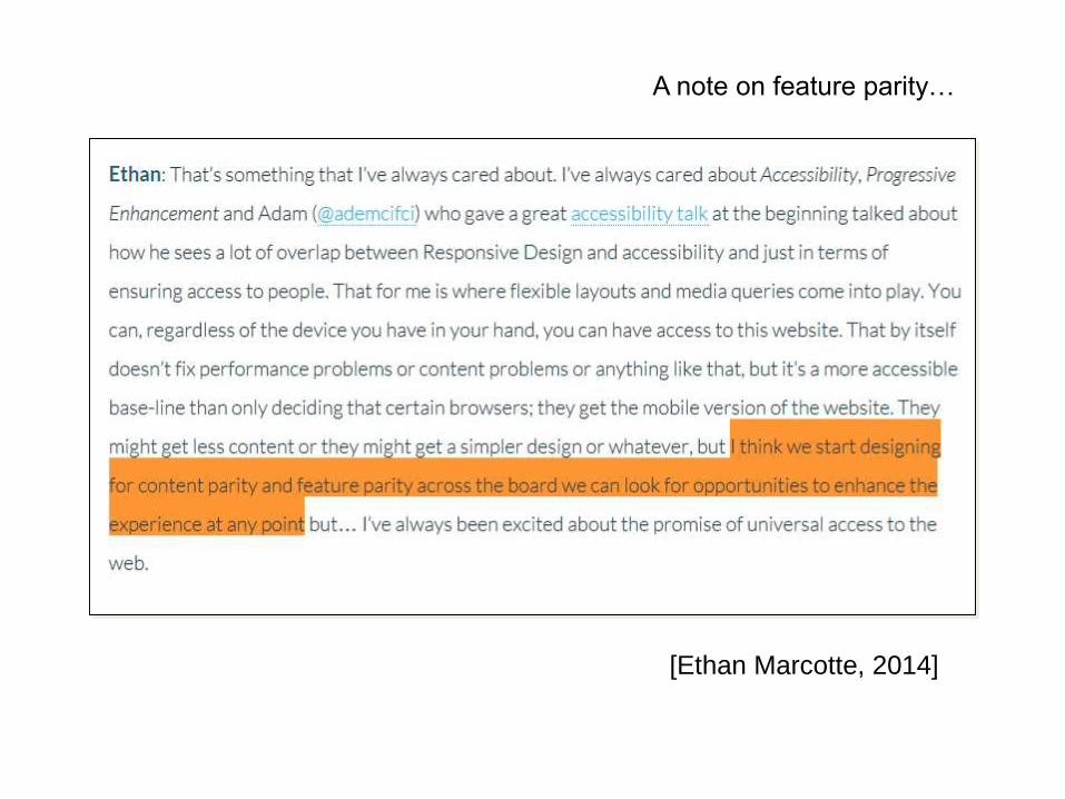
[Ethan Marcotte, 2014]
A note on feature parity…
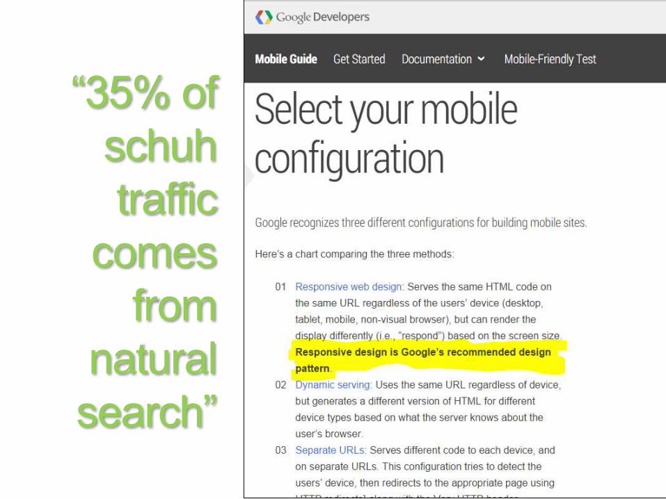
“35% of
schuh
traffic
comes
from
natural
search”
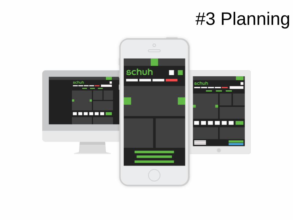
#3 Planning
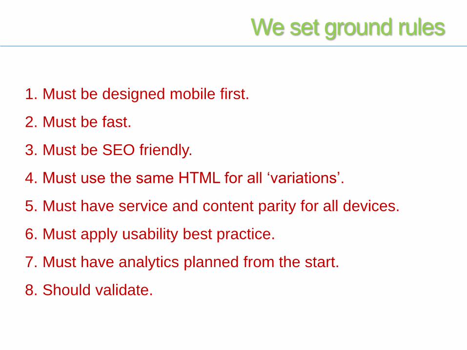
We set ground rules
1. Must be designed mobile first.
2. Must be fast.
3. Must be SEO friendly.
4. Must use the same HTML for all ‘variations’.
5. Must have service and content parity for all devices.
6. Must apply usability best practice.
7. Must have analytics planned from the start.
8. Should validate.
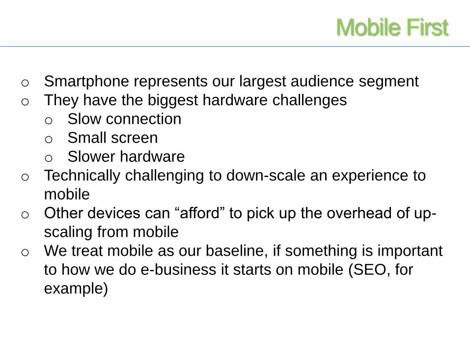
o Smartphone represents our largest audience segment
o They have the biggest hardware challenges
o Slow connection
o Small screen
o Slower hardware
o Technically challenging to down-scale an experience to
mobile
o Other devices can “afford” to pick up the overhead of up-
scaling from mobile
o We treat mobile as our baseline, if something is important
to how we do e-business it starts on mobile (SEO, for
example)
Mobile First
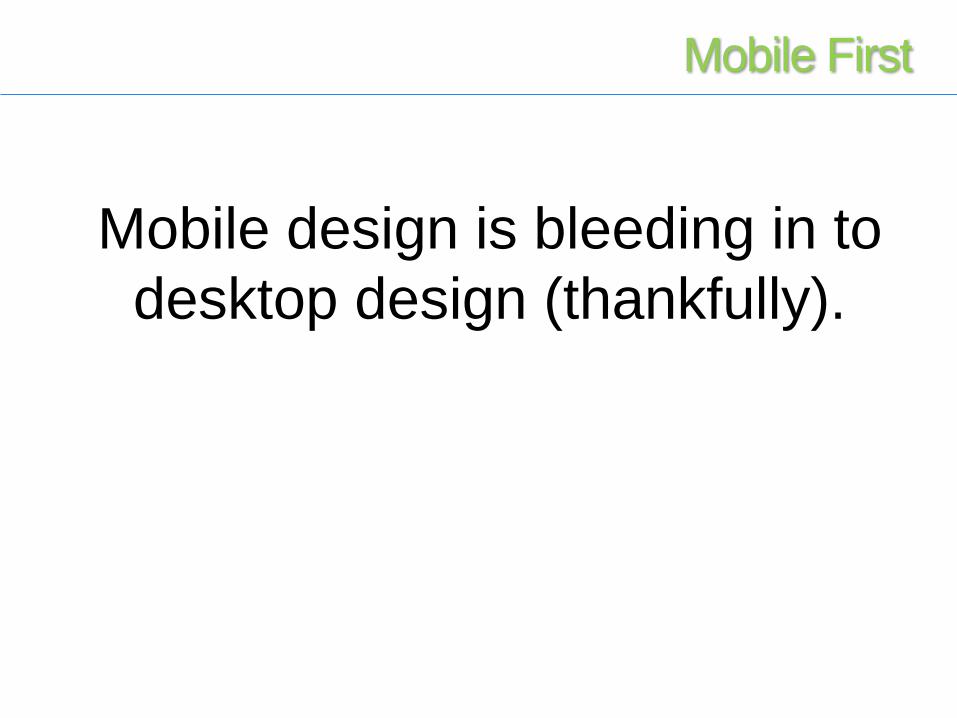
Mobile design is bleeding in to
desktop design (thankfully).
Mobile First
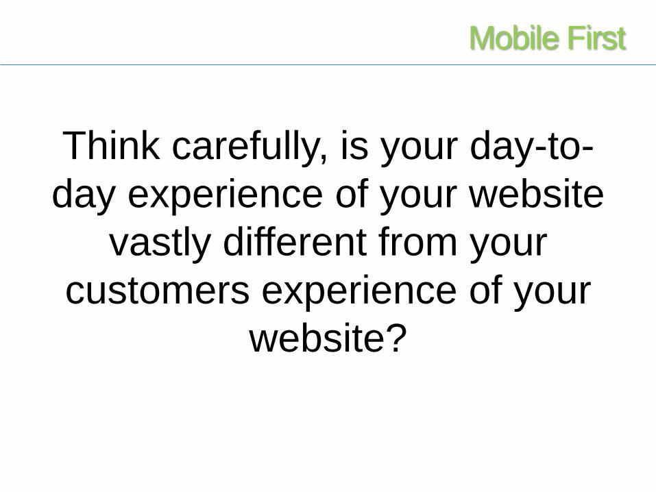
Think carefully, is your day-to-
day experience of your website
vastly different from your
customers experience of your
website?
Mobile First
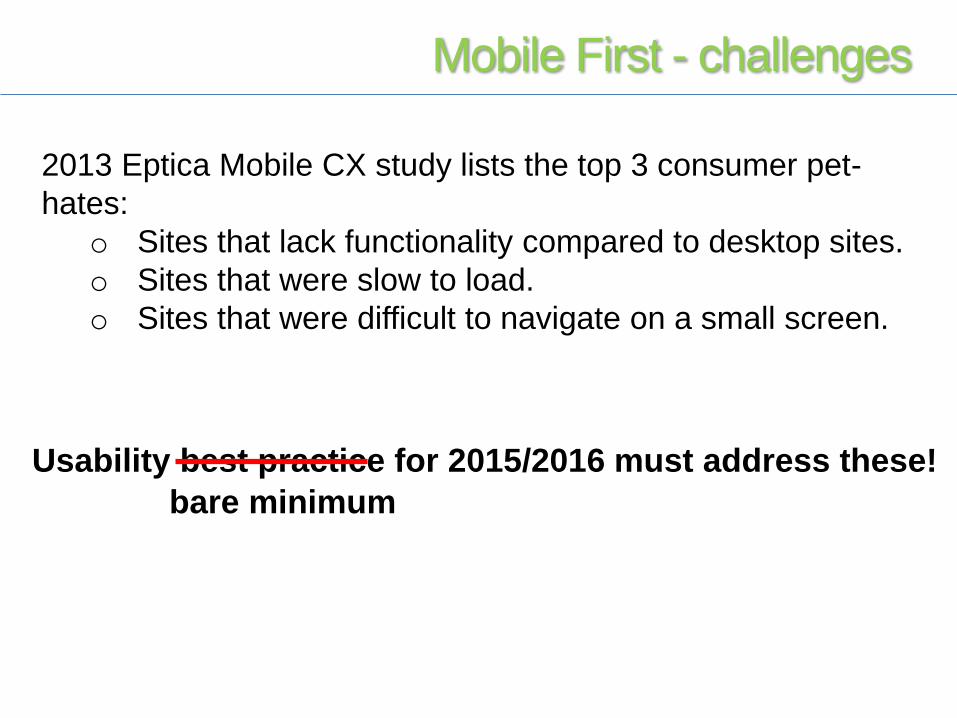
2013 Eptica Mobile CX study lists the top 3 consumer pet-
hates:
o Sites that lack functionality compared to desktop sites.
o Sites that were slow to load.
o Sites that were difficult to navigate on a small screen.
Usability best practice for 2015/2016 must address these!
bare minimum
Mobile First - challenges
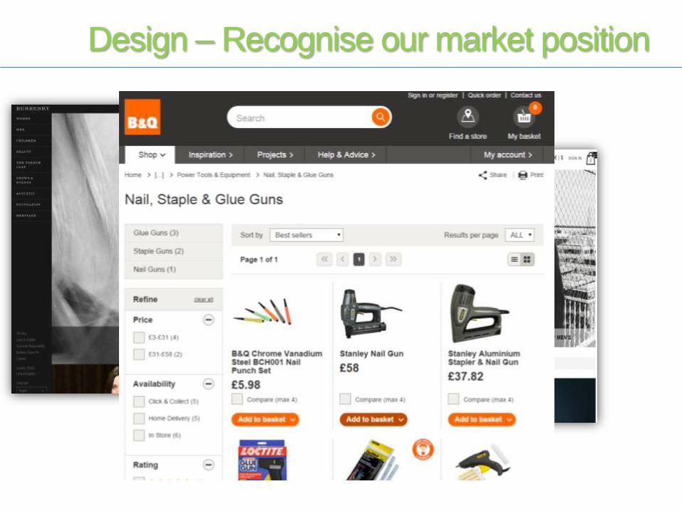
Design – Recognise our market position
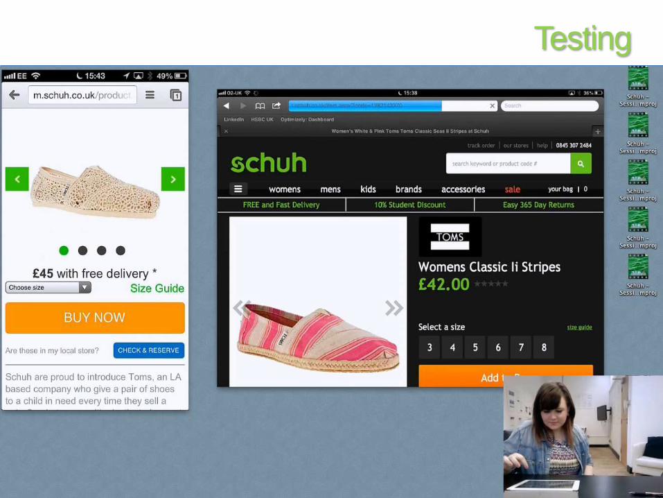
Testing
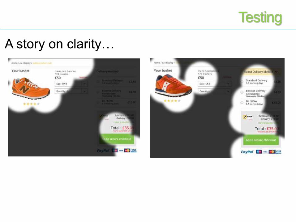
A story on clarity…
Testing
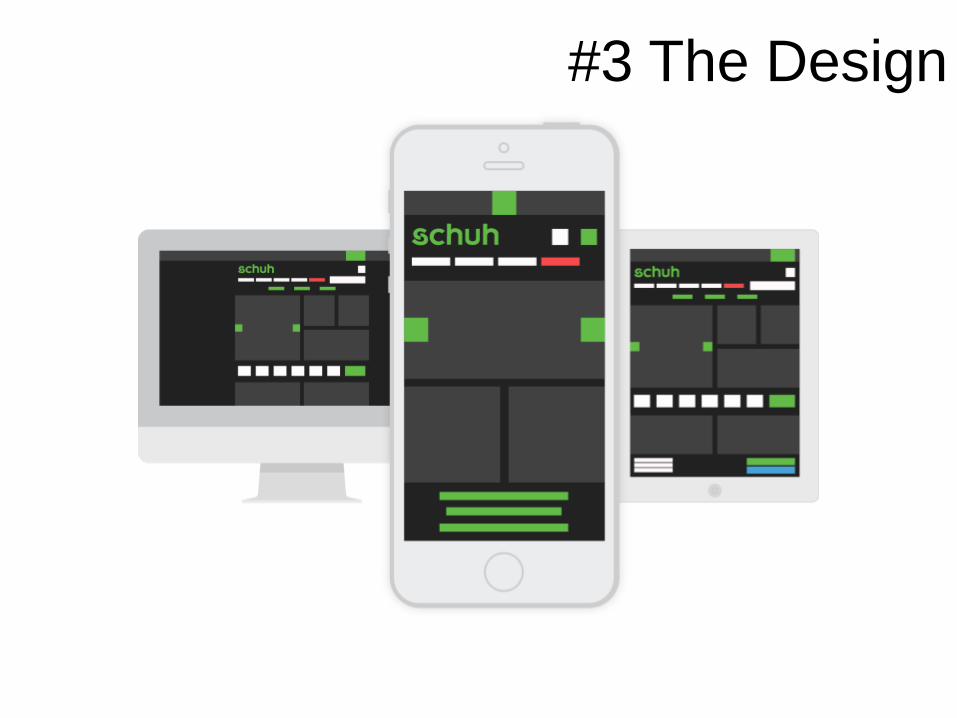
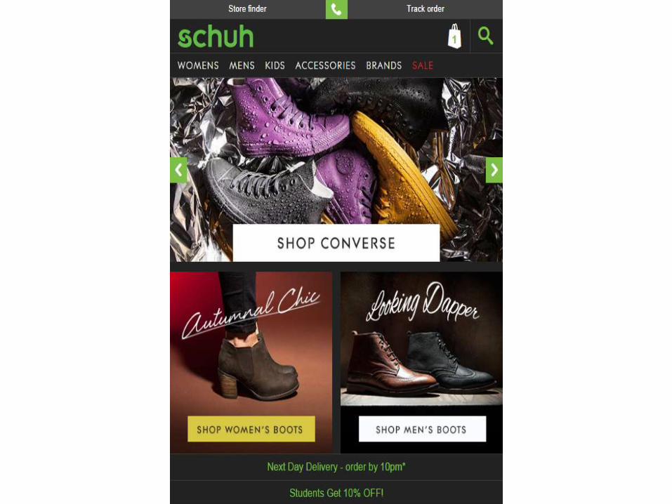
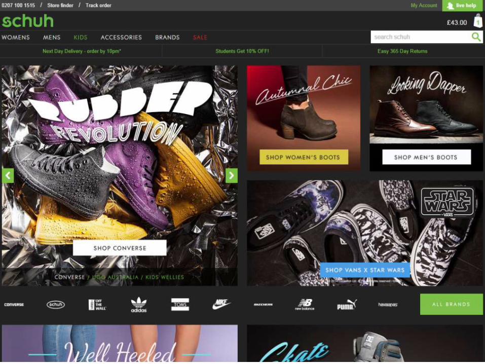
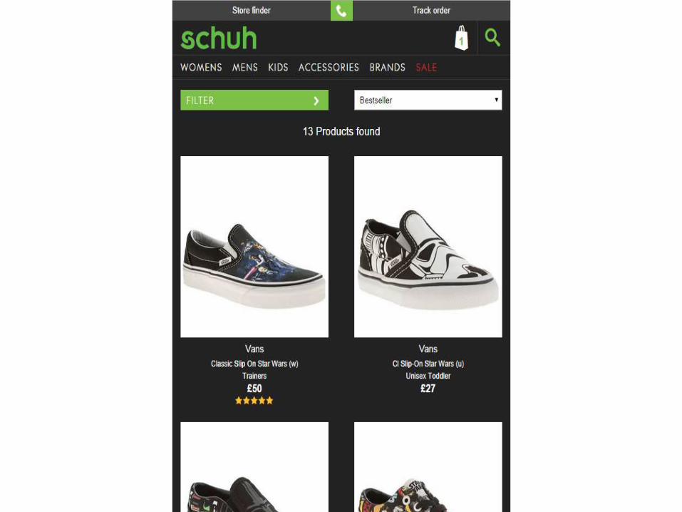
#3 The Design

Homepage

Category Page
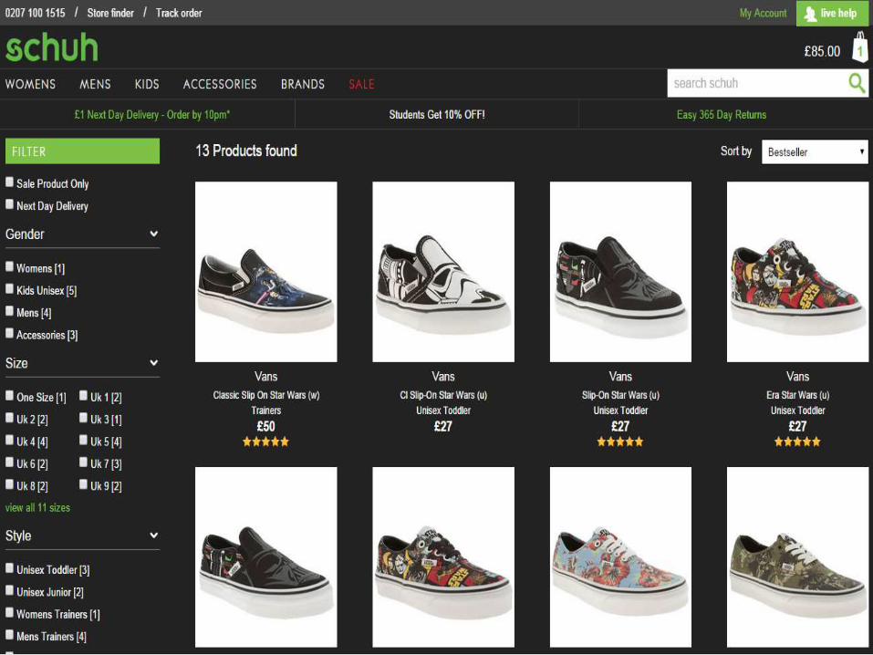

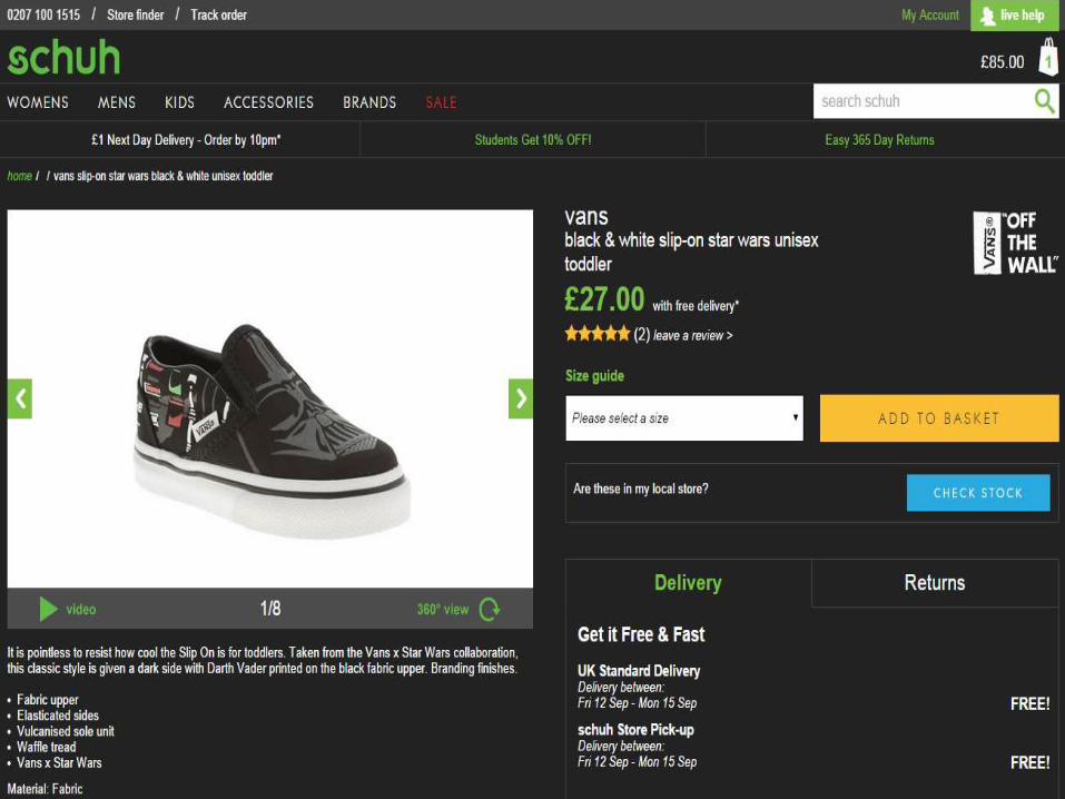
Product Page
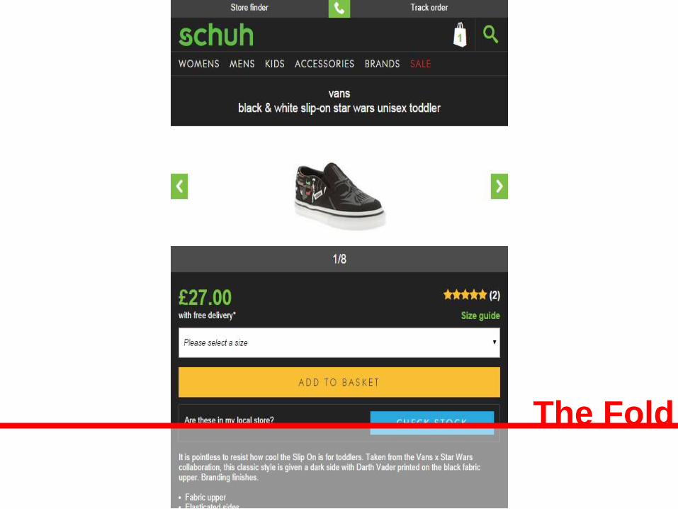
The Fold

#4 Lessons Learned
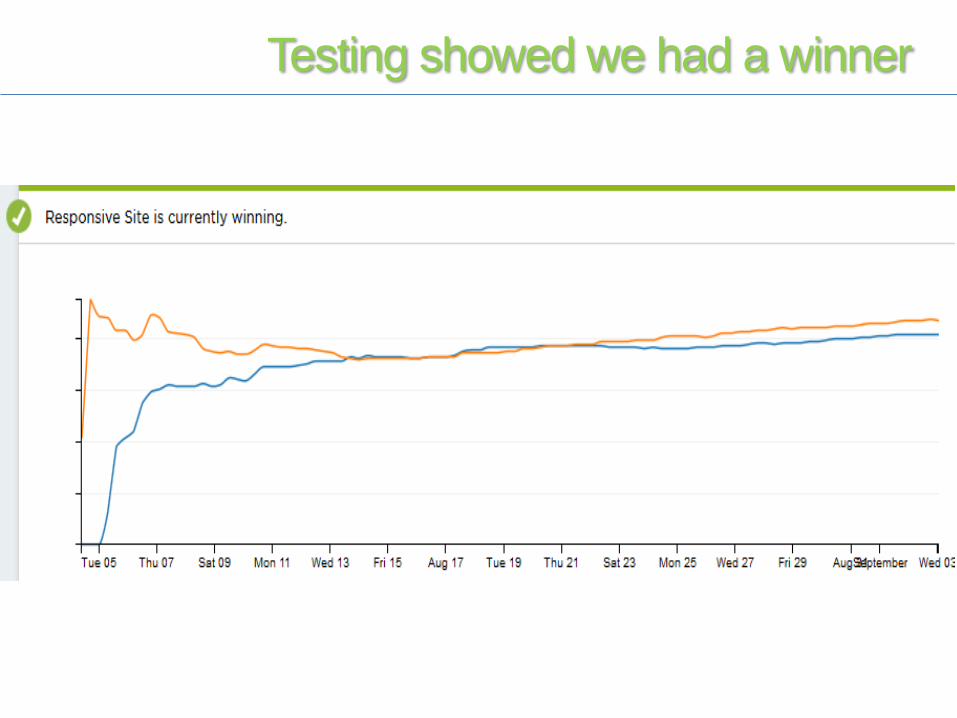
Testing showed we had a winner
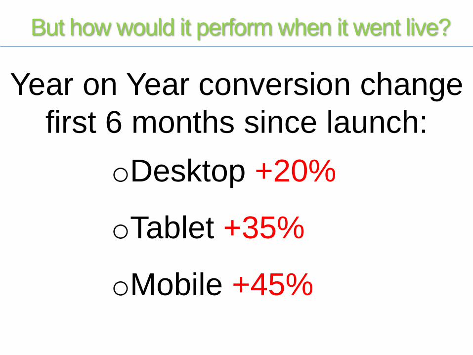
But how would it perform when it went live?
oDesktop +20%
oTablet +35%
oMobile +45%
Year on Year conversion change
first 6 months since launch:
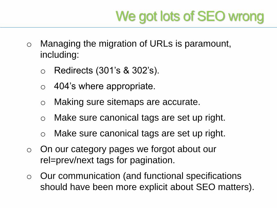
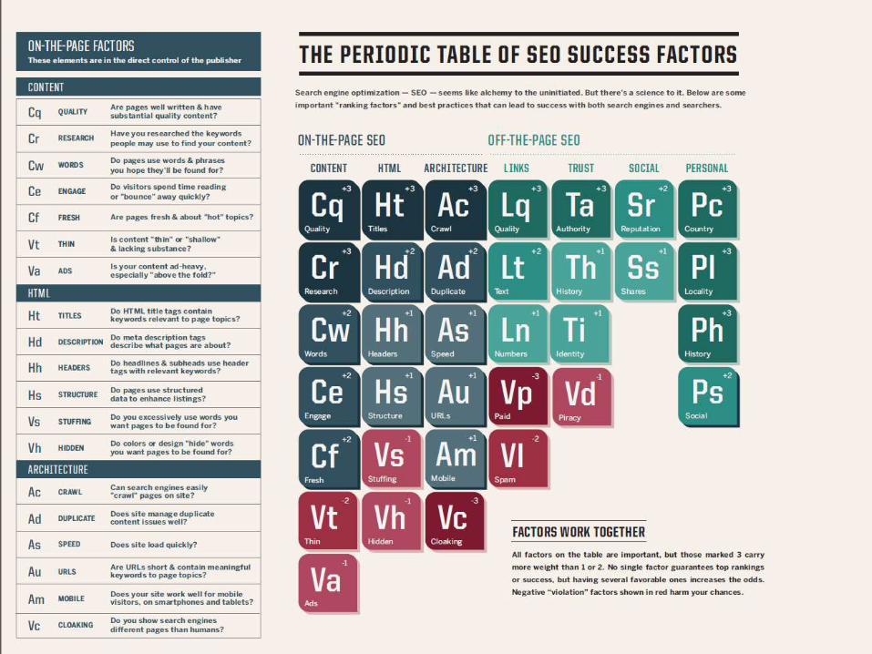
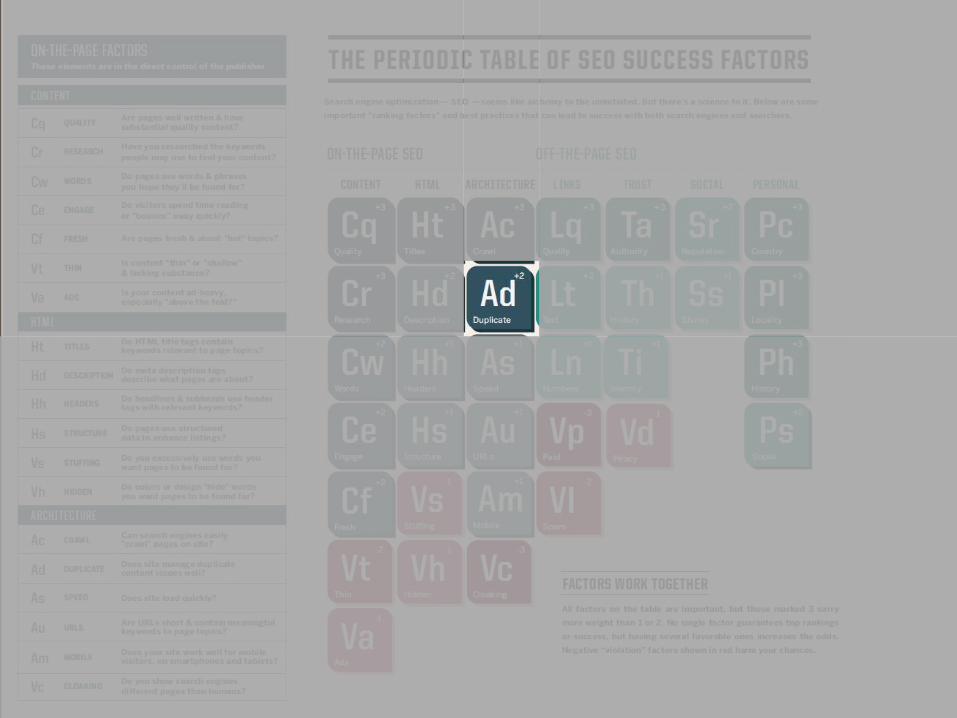
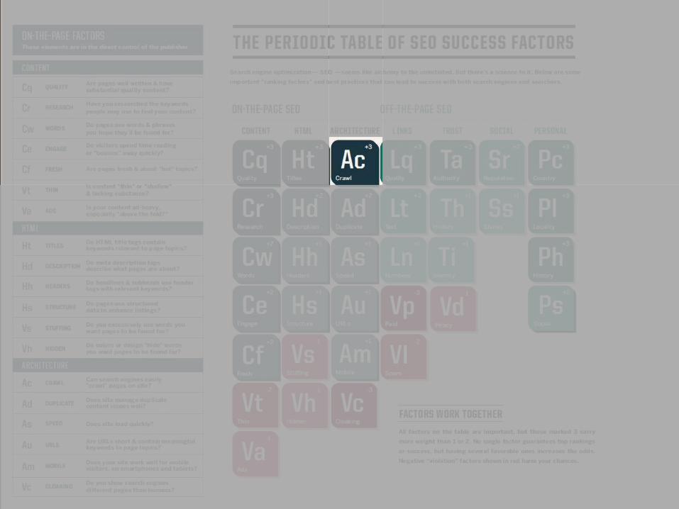
We got lots of SEO wrong
o Managing the migration of URLs is paramount,
including:
o Redirects (301’s & 302’s).
o 404’s where appropriate.
o Making sure sitemaps are accurate.
o Make sure canonical tags are set up right.
o Make sure canonical tags are set up right.
o On our category pages we forgot about our
rel=prev/next tags for pagination.
o Our communication (and functional specifications
should have been more explicit about SEO matters).
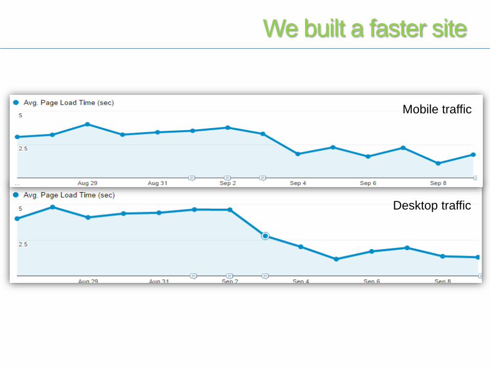
We built a faster site
Mobile traffic
Desktop traffic
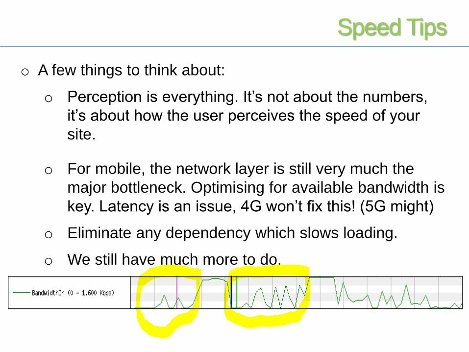
o A few things to think about:
o Perception is everything. It’s not about the numbers,
it’s about how the user perceives the speed of your
site.
o For mobile, the network layer is still very much the
major bottleneck. Optimising for available bandwidth is
key. Latency is an issue, 4G won’t fix this! (5G might)
o Eliminate any dependency which slows loading.
o We still have much more to do.
Speed Tips
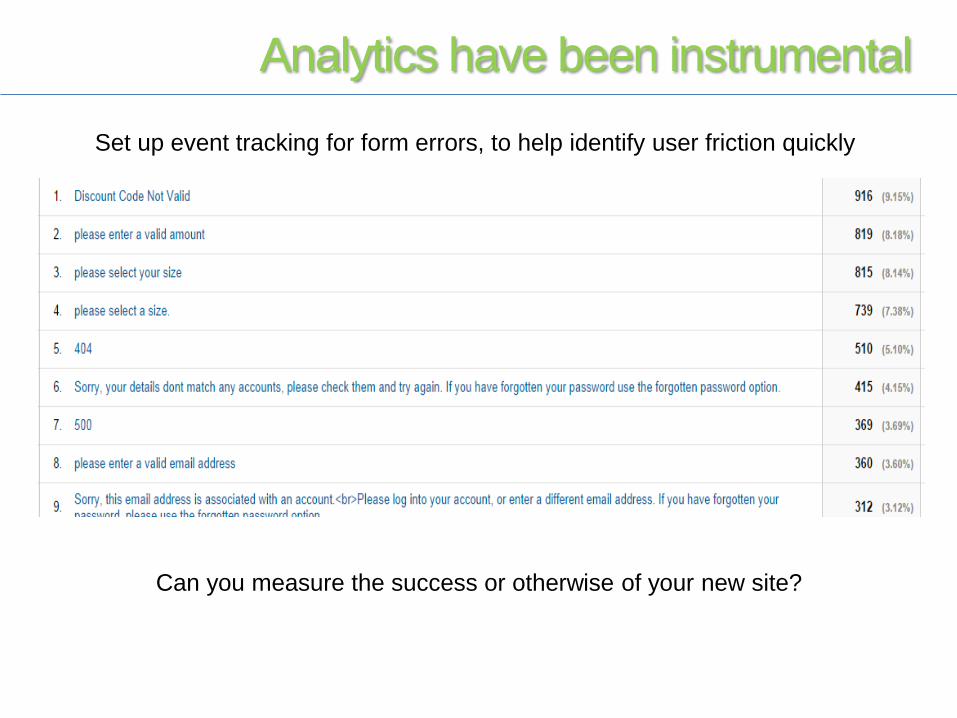
Set up event tracking for form errors, to help identify user friction quickly
Can you measure the success or otherwise of your new site?
Analytics have been instrumental
o We should have done a better job at setting expectations
around initial traffic drops.
o We started the roll-out (test) in July but were willing to delay the
full launch. Couldn’t have done that in November.
o Split testing was essential for finding issues.
o Check, double check and triple check the digital marketing
aspects of the launch. Be prepared to spend more for a time.
o Build in remediation time in to future project plans.
Rollout
o We knew we’d have a temporary organic traffic
drop when the site was bedding in, but how big
would it be?
o Feed breakages.
o Tracking and tagging.
o SEO snagging. Bringing two sites together was
never going to be easy.
Unknowns
o Lots of split testing.
o Checkout Login.
o Delivery Option Selection.
o Site Speed. I think we can be 25% faster.
o SEO snagging.
o Account area.
o HTML tidy up.
To-Do List

It can be done!

The Future:Evolving the User Experience

Ask me something!
Stuart McMillan
Deputy Head of Ecommerce
@mcmillanstu #IRX15