Embed Size (px)
Citation preview

© 2016 Drexel University | [email protected]
PHILADELPHIA HOUSE PRICE INDICES
KEVIN C. GILLEN, Ph.D.
Disclaimers and Acknowledgments: The Lindy Institute for Urban Innovation at Drexel University provides this report free of charge to the public. Thereport is produced by Kevin C. Gillen Ph.D.. The author thanks Azavea.com, the Philadelphia Office of Property Assessment, the Federal HousingFinance Agency, Case-Shiller MacroMarkets LLC, RealtyTrac, Zillow.com, Trulia.com and the NAHB for making their data publicly available. © 2016,Drexel University, All Rights Reserved.
August 8, 2016

© 2016 Drexel University | [email protected]
* Empirically estimated by Kevin C. Gillen, Ph.D. **Courtesy of the Federal Housing Finance Agency (FHFA). HPIs are available through 2015Q4 only.“MSA”=Metropolitan Statistical Area, which is the entire 9-county region.
100.0
150.0
200.0
250.0
300.0
350.0
400.0
450.0
500.0
550.0
600.0
House Price Indices 1980-2016: 1980Q1=100Philadelphia County v. Philadelphia MSA and U.S. Average
Phila. County*
Phila. MSA**
U.S. Avg.**
Q2

© 2016 Drexel University | [email protected]
PeriodPhiladelphia
County*Philadelphia
MSA**U.S.A.**
37-Year 161.9% 172.4% 134.1%
10-Year 10.5% 7.6% 3.6%
1-Year 13.0% 4.0% 5.5%
1-Quarter 6.2% 2.2% 1.3%
*Empirically estimated by Kevin C. Gillen Ph.D.
**Source: U.S. Federal Housing Finance Agency (FHFA). These numbers are through 2016Q1 only. “MSA”=“Metropolitan Statistical Area”, which is the entire 10-county region.
Total House Price Appreciation Rates by Geographic Market

© 2016 Drexel University | [email protected]
*Source: S&P/Case-Shiller. The 10-City Composite index includes Boston, Chicago, Denver, Las Vegas, Los Angeles, Miami, New York, San Diego, San Francisco, and Washington, DC. It does not include Philadelphia.
90.0
140.0
190.0
240.0
290.0
340.0
390.0
1987
1988
1989
1990
1991
1992
1993
1994
1995
1996
1997
1998
1999
2000
2001
2002
2003
2004
2005
2006
2007
2008
2009
2010
2011
2012
2013
2014
2015
2016
House Price Appreciation 1987-2016:
Philadelphia v. 10-City Composite
10-City Composite*
Philadelphia
% Change 10-City Philadelphia1998 to Peak: +173% +137%From Peak: -11% +1%

© 2016 Drexel University | [email protected]
*Source: S&P/Case-Shiller. The 10-City Composite index includes Boston, Chicago, Denver, Las Vegas, Los Angeles, Miami, New York, San Diego, San Francisco, and Washington, DC. It does not include Philadelphia.
-25.0%
-20.0%
-15.0%
-10.0%
-5.0%
0.0%
5.0%
10.0%
15.0%
20.0%
25.0%
1987
1988
1989
1990
1991
1992
1993
1994
1995
1996
1997
1998
1999
2000
2001
2002
2003
2004
2005
2006
2007
2008
2009
2010
2011
2012
2013
2014
2015
2016
YoY House Price Change (%) 1987-2016:
Philadelphia v. 10-City Composite
10-City Composite*
Philadelphia
This chart shows the percent change in the respective house price indices from one year ago, which proxies for the annaul average house price appreciation rate in each market.

© 2016 Drexel University | [email protected]
* All indices empirically estimated by Kevin C. Gillen, Ph.D.
100.0
200.0
300.0
400.0
500.0
600.0
700.0
800.0
Philadelphia House Price Indices by Neighborhood: 1980-20161980Q1=100
CtrCity/Fairmount
Kensington/Frankford
Lower NE Phila.
North Phila.
NW Phila.
South Phila.
Univ. City
Upper NE Phila.
West Phila.
Q2

© 2016 Drexel University | [email protected]
Period
Center City/
FairmountKensington/Frankford
Lower NE
Phila.North Phila.
NW Phila.
South Phila.
Univ. City
Upper NE
Phila.West Phila.
36-year 170.4% 160.7% 138.0% 165.5% 176.8% 205.1% 185.7% 165.8% 170.8%
10-year 5.9% 8.1% -7.5% 5.4% 1.1% 28.4% 13.2% -3.4% 10.4%
1-Year 1.9% 9.5% 8.6% 7.9% 7.1% 12.2% -6.4% 4.6% 6.3%
1-Quarter 3.4% 0.8% 3.1% 11.7% 5.1% 4.2% 15.0% 1.7% 11.8%
Philadelphia House Price Appreciation Rates by Neighborhood
This table gives the total % change in average house prices by neighborhood, through 2016 Q2, from different starting points in time.

© 2016 Drexel University | [email protected]
* Empirically estimated by Kevin C. Gillen, PhD
$0
$20,000
$40,000
$60,000
$80,000
$100,000
$120,000
$140,000198
0
198
1
198
2
198
3
198
4
198
5
198
6
198
7
198
8
198
9
199
0
199
1
199
2
199
3
199
4
199
5
199
6
199
7
199
8
199
9
200
0
200
1
200
2
200
3
200
4
200
5
200
6
200
7
200
8
200
9
201
0
201
1
201
2
201
3
201
4
201
5
201
6
Median Philadelphia House Price v. Indexed Philadelphia House Price1980-2016
Median Price
Indexed Price*
Q1

© 2016 Drexel University | [email protected]
$0
$5,000
$10,000
$15,000
$20,000
$25,000
$30,000
$35,000
$40,000
$45,000
19
80
19
81
19
82
19
83
19
84
19
85
19
86
19
87
19
88
19
89
19
90
19
91
19
92
19
93
19
94
19
95
19
96
19
97
19
98
19
99
20
00
20
01
20
02
20
03
20
04
20
05
20
06
20
07
20
08
20
09
20
10
20
11
20
12
20
13
20
14
20
15
20
16
Average House Price Minus Median House Price: 1980-2016

© 2016 Drexel University | [email protected]
*Only arms-length transactions between private sector entities were included in these numbers.
0
1,000
2,000
3,000
4,000
5,000
6,000
7,000
8,000
19
80
19
81
19
82
19
83
19
84
19
85
19
86
19
87
19
88
19
89
19
90
19
91
19
92
19
93
19
94
19
95
19
96
19
97
19
98
19
99
20
00
20
01
20
02
20
03
20
04
20
05
20
06
20
07
20
08
20
09
20
10
20
11
20
12
20
13
20
14
20
15
20
16
Number of Philadelphia House Sales* per Quarter: 1980-2016
Q1
Q2
Q3
Q4
Qtly. Average

© 2016 Drexel University | [email protected]
*Only arms-length transactions between private sector entities were included in these numbers.
0
5
10
15
20
25
30
35
40
1997 1998 1999 2000 2001 2002 2003 2004 2005 2006 2007 2008 2009 2010 2011 2012 2013 2014 2015 2016
Number of Philadelphia Home Sales* per Quarter
with Price>=$1 Million: 1997-2016
Q1
Q2
Q3
Q4
Qtly. Average

© 2016 Drexel University | [email protected]
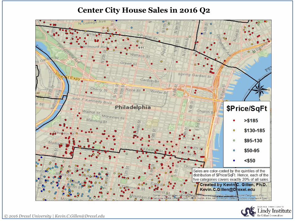
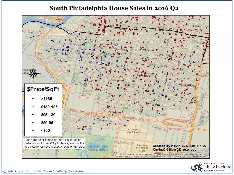
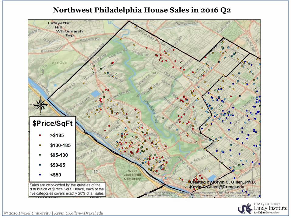
2016 Q2 House Price Rate of Change by NeighborhoodUpper NE Phila: +1.7%
Lower NE Phila: +3.1%
North Phila: +11.7%
Kensington/Frankford: +0.8%
Center City/Fairmount: +3.4%
South Phila: +4.2%
NW Phila: +5.1%
Univ. City: +15.0%
West Phila: +11.8%
Note: Each neighborhood is extruded by its average change in house values during 2016 Q2 in order to reflect its growth (or depreciation) rate relative to other neighborhoods.

© 2016 Drexel University | [email protected]
+$1 Million Dollar House Sales in 2016 Q2
PRICE ADDRESS
$1,030,000 2316 GREEN ST
$1,070,000 272 S 03RD ST
$1,090,000 1617 LOMBARD ST
$1,095,000 1630 NORTH ST
$1,100,000 210 SPRUCE ST
$1,150,000 30 W BELLS MILL RD
$1,200,000 510 DELANCEY ST
$1,235,000 8864 GERMANTOWN AVE
$1,255,000 2135 GREEN ST
$1,295,000 616 S AMERICAN ST
$1,325,000 2129 WALNUT ST
$1,500,000 1311 IRVING ST
$1,500,000 1211 NOBLE ST
$1,550,000 1024 CLINTON ST
$1,559,500 701 S 15TH ST
$1,650,000 823 S MILDRED ST
$1,650,000 2121 PINE ST
$1,693,500 528 SPRUCE ST
$1,700,000 2511 PANAMA ST
$1,730,000 2044 WAVERLY ST
$1,967,000 1932 PANAMA ST
$2,800,000 1832 DELANCEY PL
$3,218,544 460 W CHESTNUT HIL AVE
$3,900,000 2108 SPRUCE ST

© 2016 Drexel University | [email protected]
-200%
-150%
-100%
-50%
0%
50%
100%
150%
200%
-50.0
50.0
150.0
250.0
350.0
450.0
550.0
1980
1981
1982
1983
1984
1985
1986
1987
1988
1989
1990
1991
1992
1993
1994
1995
1996
1997
1998
1999
2000
2001
2002
2003
2004
2005
2006
2007
2008
2009
2010
2011
2012
2013
2014
2015
2016
HP
I: 1
98
0Q
1=1
00
Philadelphia House Price Diffusion Index
Philadelphia HPI
Diffusion Index
The diffusion index measures how varied the direction of house price changes are across Philadelphia neighborhoods. It is computed as the percent difference between the number of neighborhoods in which prices rose in a given quarter, and the number of neighborhoods in which prices fell. A value of -100% indicates that prices fell in all neighborhoods in
a given quarter, while a value of +100% indicates that prices rose in all neighborhoods. A value of 0% indicates that house price changes were evenly split between increases and decreases, across neighborhoods. Diffusion indexes are commonly used in financial economics as a leading indicator of turning points in a market's direction.

© 2016 Drexel University | [email protected]
0%
10%
20%
30%
40%
50%
60%
70%
80%
90%
100%
-50.0
50.0
150.0
250.0
350.0
450.0
550.0
1980
19
81
1982
1983
19
85
19
86
1987
19
88
19
90
1991
1992
19
93
1995
1996
19
97
1998
2000
20
01
2002
2003
20
05
20
06
2007
20
08
20
10
2011
2012
20
13
2015
2016
HP
I: 1
98
0Q
1=1
00Philadelphia House Prices: Declines v. House Price Index
Pct. Declining
Philadelphia HPI
This chart compares the Philadelphia House Price Index (in red) to the percent of Philadelphia neighborhoods that experienced house price declines (in blue) , in each quarter from 1980-2016.
%D
eclin
ing

© 2016 Drexel University | [email protected]
0.00%
1.00%
2.00%
3.00%
4.00%
5.00%
6.00%
7.00%
1980
1981
1982
1983
1984
1985
1986
1987
1988
1989
1990
1991
1992
1993
1994
1995
1996
1997
1998
1999
2000
2001
2002
2003
2004
2005
2006
2007
2008
2009
2010
2011
2012
2013
2014
2015
2016
Dispersion Index of Philadelphia Housing
The Dispersion Index measures how varied house price changes are across the city's neighborhoods. It is computed as the standard deviation of quarterly house prices changes across submarkets. High values of the index imply large variation in house price changes between different neighborhods, while low values imply that house price changes are relatively the same across the city.

© 2016 Drexel University | [email protected]
0.50
0.75
1.00
1.25
1.50
1.75
2.00
2.25
2.50
2.75
3.00
3.25
3.50
198
0
198
1
198
2
198
3
198
4
198
5
198
6
198
7
198
8
198
9
199
0
199
1
199
2
199
3
199
4
199
5
199
6
199
7
199
8
199
9
200
0
200
1
200
2
200
3
200
4
200
5
200
6
200
7
200
8
200
9
201
0
201
1
201
2
201
3
201
4
201
5
201
6
Philadelphia Housing Affordability* Index: 1980-2016
*Affordability is measured as the ratio of the median Philadelphia house price to the median Philadelphia household income. High values of
the index mean that housing has become less affordable to the average Philadelphian. Contact [email protected] for details.

© 2016 Drexel University | [email protected]
4.0
5.0
6.0
7.0
8.0
9.0
10.0
11.0
12.0
13.0
14.0
15.0
Average House Price-to-Rent Ratios*: 1980-2016
Philadelphia v. U.S.
U.S.
Philadelphia
*Computed by taking the ratio of average house price to the average annual rent of a comparable housing unit. The P/R ratio is to real estate what the P/E ratio is to other assets. Contact [email protected] for further details.
© 2016 Drexel University | [email protected]
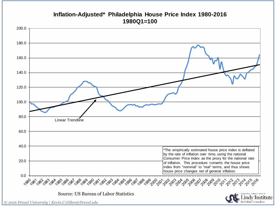
Source: US Bureau of Labor Statistics
0.0
20.0
40.0
60.0
80.0
100.0
120.0
140.0
160.0
180.0
200.0
Inflation-Adjusted* Philadelphia House Price Index 1980-2016
1980Q1=100
*The empirically estimated house price index is deflated by the rate of inflation over time, using the national Consumer Price Index as the proxy for the national rate
of inflation. This procedure converts the house price index from "nominal" to "real" terms, and thus shows house price changes net of general inflation.
Linear Trendline

© 2016 Drexel University | [email protected]: Trend MLS
“%Absorbed” is defined as the percent of homes listed for sale in a given month that also sold in that same month.
0%
5%
10%
15%
20%
25%
30%
35%
40%
45%
0
2,000
4,000
6,000
8,000
10,000
12,000
14,000
Philadelphia Houses Listed For Sale: Inventory v. Absorption Rate
# Houses Listed For Sale
% Absorbed
# H
om
es L
iste
d "
Fo
r S
ale
" %A
bso
rbe
d =
(#S
ale
s/#
Lis
ting
s)

© 2016 Drexel University | [email protected]: Trend MLS
“%Absorbed” is defined as the percent of homes listed for sale in a given month that also sold in that same month.
0.0
2.0
4.0
6.0
8.0
10.0
12.0
14.0
16.0
18.0
20.0
20
01
2001
2002
20
02
2002
2003
20
03
20
03
2004
20
04
20
04
2005
2005
20
05
2006
2006
20
06
20
07
2007
20
07
20
08
2008
2008
20
09
2009
2009
20
10
20
10
2010
20
11
20
11
2011
2012
20
12
2012
2013
20
13
20
13
2014
20
14
20
14
2015
2015
20
16
2016
Months' Supply of Inventory in Philadelphia
Seller's Market
Balanced Market
Buyer's Market
Months' Supply of Inventory measures how many months it would take to completely burn off the existing inventory of homes currently l isted for sale, given their current pace of
sales. 5-7 months is considered a normal, balanced market. More than 7 months indicates a Buyer's market, and less than 5 months indicates a Seller's market.
© 2016 Drexel University | [email protected]: Trend MLS
“%Absorbed” is defined as the percent of homes listed for sale in a given month that also sold in that same month.
30
40
50
60
70
80
90
100
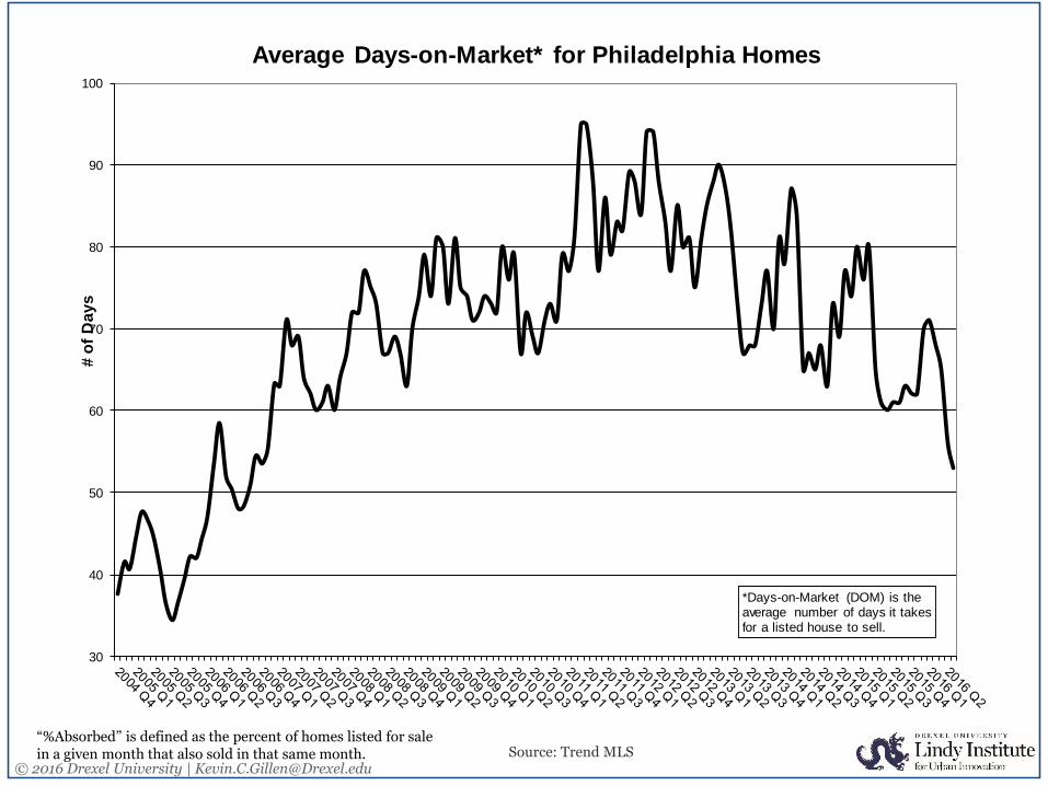
Average Days-on-Market* for Philadelphia Homes
*Days-on-Market (DOM) is the average number of days it takes for a listed house to sell.
# o
f D
ay
s

© 2016 Drexel University | [email protected]
Source: National Assoc. of Homebuilders (NAHB)/Wells Fargo
0
10
20
30
40
50
60
70
80
901
98
5
198
6
198
7
198
8
198
9
199
0
199
1
199
2
199
3
199
4
199
5
199
6
199
7
199
8
199
9
200
0
200
1
200
2
200
3
200
4
200
5
200
6
200
7
200
8
200
9
201
0
201
1
201
2
201
3
201
4
201
5
201
6
Index of Homebuilder Sentiment: 1985-2016
(Seasonally Adjusted)
National
Northeast
The Index represents the current sentiment of U.S. homebuilders. The index is computed via a regular monthly survey of homebuilders. An index value above 50 indicates that more
builder are optimistic than pessimistic, while an index value below 50 indicates that more builders are pessimistic than optimistic.

© 2016 Drexel University | [email protected]
Source: finance.yahoo.com
$0
$50
$100
$150
$200
$250
$30020
02
20
02
20
03
20
03
20
03
20
03
20
04
20
04
20
04
20
04
20
05
20
05
20
05
20
05
20
06
20
06
20
06
20
06
20
07
20
07
20
07
20
07
20
08
20
08
20
08
20
08
20
09
20
09
20
09
20
10
20
10
20
10
20
10
20
11
20
11
20
11
20
11
20
12
20
12
20
12
20
12
20
13
20
13
20
13
20
13
20
14
20
14
20
14
20
14
20
15
20
15
20
15
20
15
20
16
20
16
Philadelphia Stock Exchange Housing Sector Index: 2002-2015
The PHLX Housing Sector Index is a modified cap-weighted index composed of 20 companies whose primary lines of business are directly associated with the
U.S. housing construction market. The index composition encompasses residential builders, suppliers of aggregate, lumber and other construction materials,
manufactured housing and mortgage insurers.
Note: the index underwent a significant rebalancing in January of 2006.

© 2016 Drexel University | [email protected]
140,000
145,000
150,000
155,000
160,000
165,000
170,000
175,000
180,000
185,000
190,000
0
500
1,000
1,500
2,000
2,500
3,000
3,500
4,000
4,50019
90
1991
1992
1993
1994
1995
1996
1997
1998
1999
2000
2001
2002
2003
2004
2005
2006
2007
2008
2009
2010
2011
2012
2013
2014
2015
20
16
***
Single-Family* Multifamily** Center City Pop.
*Structures with 1-4 dwelling units**Structures with >=5 dwelling units
# o
f Un
its
***Note: 2016 Numbers are YTD numbers through June 2016.
Building Permits Issued for Construction of Residential Units in Philadelphia: Single-Family v. Multifamily
Sources: U.S. CensusCenter City District
Po
pu
lati
on
© 2016 Drexel University | [email protected]
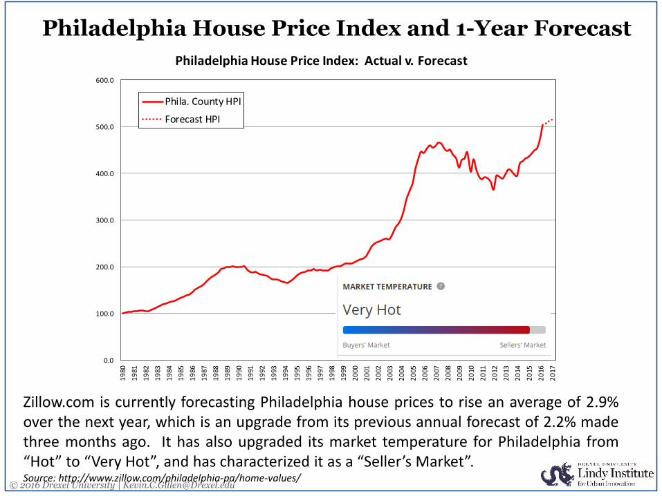
Philadelphia House Price Index and 1-Year Forecast
Zillow.com is currently forecasting Philadelphia house prices to rise an average of 2.9%over the next year, which is an upgrade from its previous annual forecast of 2.2% madethree months ago. It has also upgraded its market temperature for Philadelphia from“Hot” to “Very Hot”, and has characterized it as a “Seller’s Market”.Source: http://www.zillow.com/philadelphia-pa/home-values/
0.0
100.0
200.0
300.0
400.0
500.0
600.0
19
80
19
81
19
82
19
83
19
84
19
85
19
86
19
87
19
88
19
89
19
90
19
91
19
92
19
93
19
94
19
95
19
96
19
97
19
98
19
99
20
00
20
01
20
02
20
03
20
04
20
05
20
06
20
07
20
08
20
09
20
10
20
11
20
12
20
13
20
14
20
15
20
16
20
17
Philadelphia House Price Index: Actual v. Forecast
Phila. County HPI
Forecast HPI

![[XLS] · Web viewPark, Krishi Anusandhan Bhawan, Gas Store, Petrol Pump, NPL and its Staff Qtr, NI STDS, NISCOM Warden Bungloew 4 type Qtrs 1-4 with Servants Qtrs E-Type Qtrs 1-2,](https://img.pdfslide.us/doc/110x75/5add5bdb7f8b9a4a268d73c9/xls-viewpark-krishi-anusandhan-bhawan-gas-store-petrol-pump-npl-and-its-staff.jpg)