Embed Size (px)
Citation preview
Keller Williams Ottawa Realty
Source: OREB
0
200
400
600
800
1,000
1,200
1,400
1,600
1,800
2,000
Jan Feb Mar Apr May Jun Jul Aug Sep Oct Nov Dec
Units
Ottawa MLS® Unit Sales
2013 2014 5 year AVG
Explanation: This chart plots monthly MLS® sales for the current year and the previous year. The blue line shows the
5 year average sales trend. The seasonal trend can be seen as well as a comparison to the previous year each month.
Keller Williams Ottawa Realty
Source: OREB
220,000
240,000
260,000
280,000
300,000
320,000
340,000
360,000
380,000
400,000
Jan Feb Mar Apr May Jun Jul Aug Sep Oct Nov Dec
Avg. Sale $
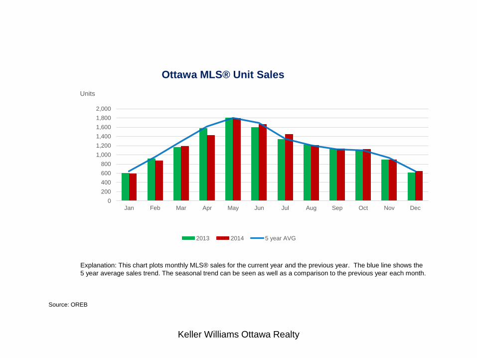
Average Sale Price
2013 2014 5 year AVG
Explanation: This chart plots monthly MLS® average sales price for the current year and the previous year. The blue line shows
the 5 year average sale price trend. The seasonal trend can be seen as well as a comparison to the previous year each month.
Keller Williams Ottawa Realty
Source: OREB
0
10
20
30
40
50
60
70
Jan Feb Mar Apr May Jun Jul Aug Sep Oct Nov Dec
Days
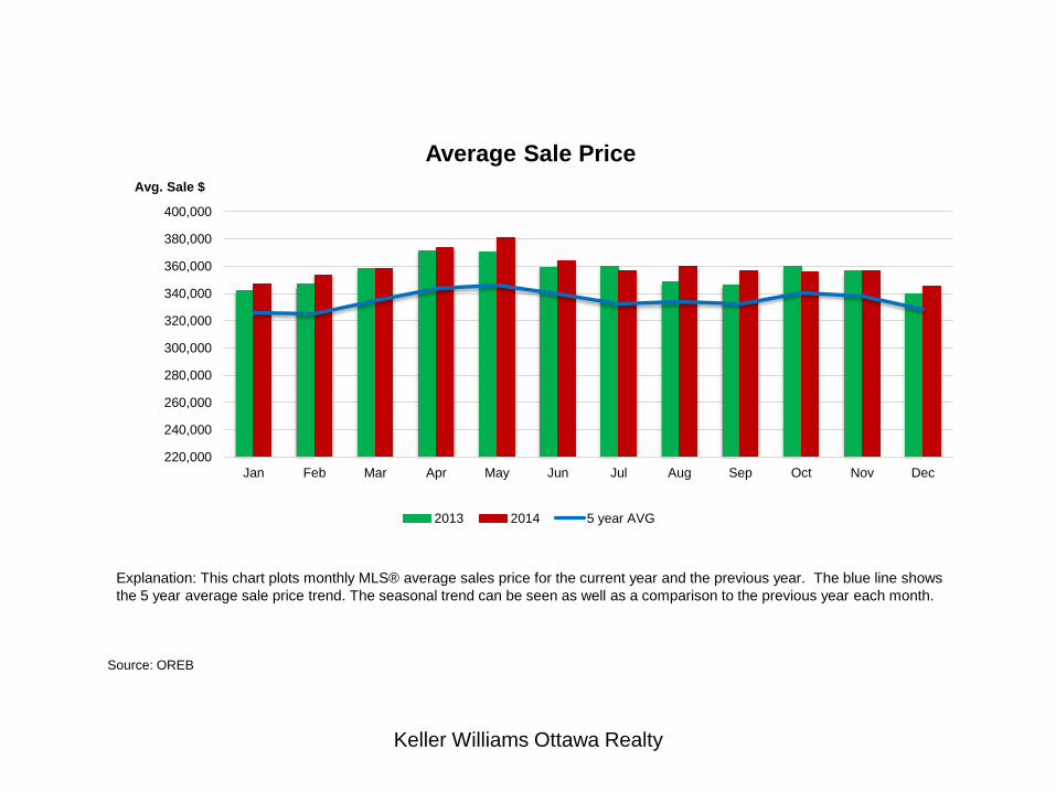
Average Selling Time
2013 2014
Explanation: This chart plots monthly MLS® selling time for the current year and the previous year. The seasonal trend
can be seen as well as a comparison to the previous year each month.
Keller Williams Ottawa Realty
Source: OREB
0
1,000
2,000
3,000
4,000
5,000
6,000
7,000
8,000
9,000
10,000
Jan Feb Mar Apr May Jun Jul Aug Sep Oct Nov Dec
Units
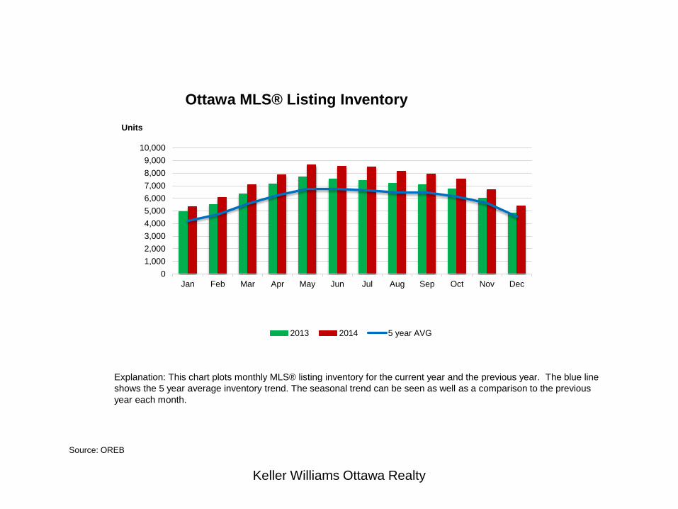
Ottawa MLS® Listing Inventory
2013 2014 5 year AVG
Explanation: This chart plots monthly MLS® listing inventory for the current year and the previous year. The blue line
shows the 5 year average inventory trend. The seasonal trend can be seen as well as a comparison to the previous
year each month.
Keller Williams Ottawa Realty
Source: OREB
0
500
1,000
1,500
2,000
2,500
3,000
3,500
4,000
4,500
Jan Feb Mar Apr May Jun Jul Aug Sep Oct Nov Dec
Units
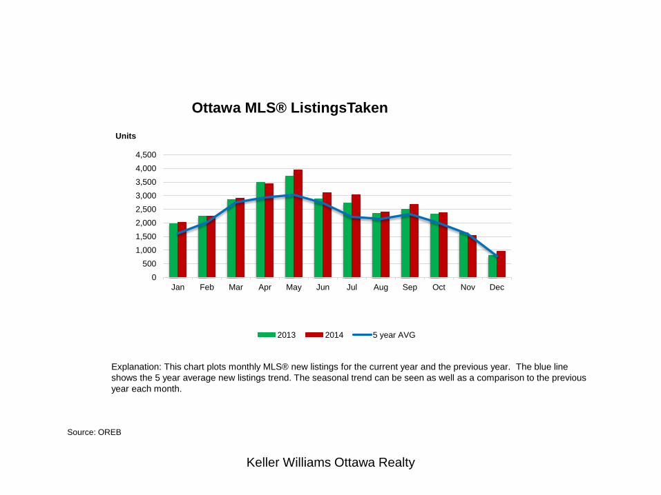
Ottawa MLS® ListingsTaken
2013 2014 5 year AVG
Explanation: This chart plots monthly MLS® new listings for the current year and the previous year. The blue line
shows the 5 year average new listings trend. The seasonal trend can be seen as well as a comparison to the previous
year each month.

Keller Williams Ottawa Realty
Source: OREB
0
2
4
6
8
10
12
Inventory Absorption Rate
RES CONDO
Explanation: This chart plots monthly MLS® absorption rate for two years. The absorption rate is the # of months it
would take to sell off existing listing inventory at the current pace of sales. The red line shows the condo absorption
rate and the blue line shows the rate for residential homes.
# of Months
Keller Williams Ottawa Realty
5%
10%
15%
20%
25%
30%
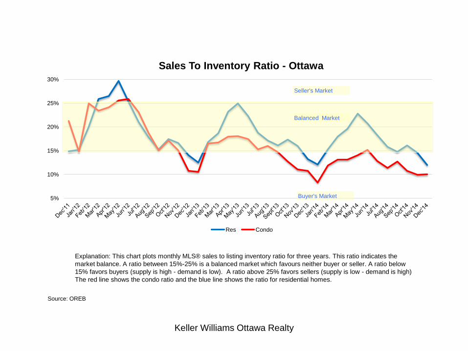
Sales To Inventory Ratio - Ottawa
Res Condo
Seller's Market
Balanced Market
Buyer's Market
Source: OREB
Explanation: This chart plots monthly MLS® sales to listing inventory ratio for three years. This ratio indicates the
market balance. A ratio between 15%-25% is a balanced market which favours neither buyer or seller. A ratio below
15% favors buyers (supply is high - demand is low). A ratio above 25% favors sellers (supply is low - demand is high)
The red line shows the condo ratio and the blue line shows the ratio for residential homes.
Keller Williams Ottawa Realty
Source: OREB
0
200
400
600
800
1000
1200
1400
1600
1800
2000
Dec'1
2
Jan
'13
Fe
b'1
3
Ma
r'1
3
Ap
r'1
3
Ma
y'1
3
Jun
'13
Jul'1
3
Au
g'1
3
Se
pt'13
Oct'1
3
Nov'1
3
Dec'1
3
Jan
'14
Fe
b'1
4
Ma
r'1
4
Ap
r'1
4
Ma
y'1
4
Jun
'14
Jul'1
4
Au
g'1
4
Se
p'1
4
Oct'1
4
Nov'1
4
Dec'1
4
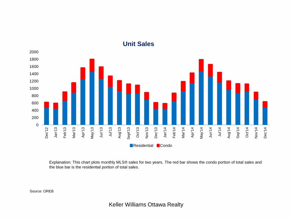
Unit Sales
Residential Condo
Explanation: This chart plots monthly MLS® sales for two years. The red bar shows the condo portion of total sales and
the blue bar is the residential portion of total sales.

Keller Williams Ottawa Realty
225,000
245,000
265,000
285,000
305,000
325,000
345,000
365,000
385,000
405,000
425,000D
ec'1
2
Jan
'13
Fe
b'1
3
Ma
r'1
3
Ap
r'1
3
Ma
y'1
3
Jun
'13
Jul'1
3
Au
g'1
3
Se
pt'13
Oct'1
3
Nov'1
3
Dec'1
3
Jan
'14
Fe
b'1
4
Ma
r'1
4
Ap
r'1
4
Ma
y'1
4
Jun
'14
Jul'1
4
Au
g'1
4
Se
p'1
4
Oct'1
4
Nov'1
4
Dec'1
4
Avg. Sale Price
Residential Condo Res + Condo
Source: OREB
Explanation: This chart plots monthly MLS® average sale price for two years. The red bar is condo and the blue bar is
residential. The green line is the combined average sale price.
Keller Williams Ottawa Realty
Source: OREB
-5.0%
0.0%
5.0%
10.0%
15.0%
20.0%
25.0%
30.0%
$0
$50,000
$100,000
$150,000
$200,000
$250,000
$300,000
$350,000
$400,000
195
61
95
71
95
81
95
91
96
01
96
11
96
21
96
31
96
41
96
51
96
61
96
71
96
81
96
91
97
01
97
11
97
21
97
31
97
41
97
51
97
61
97
71
97
81
97
91
98
01
98
11
98
21
98
31
98
41
98
51
98
61
98
71
98
81
98
91
99
01
99
11
99
21
99
31
99
41
99
51
99
61
99
71
99
81
99
92
00
02
00
12
00
22
00
32
00
42
00
52
00
62
00
72
00
82
00
92
01
02
01
12
01
22
01
32
01
4
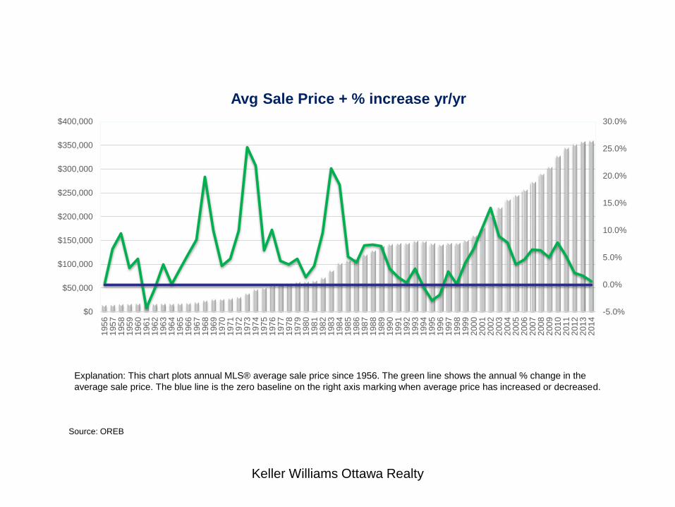
Avg Sale Price + % increase yr/yr
Explanation: This chart plots annual MLS® average sale price since 1956. The green line shows the annual % change in the
average sale price. The blue line is the zero baseline on the right axis marking when average price has increased or decreased.
Keller Williams Ottawa Realty
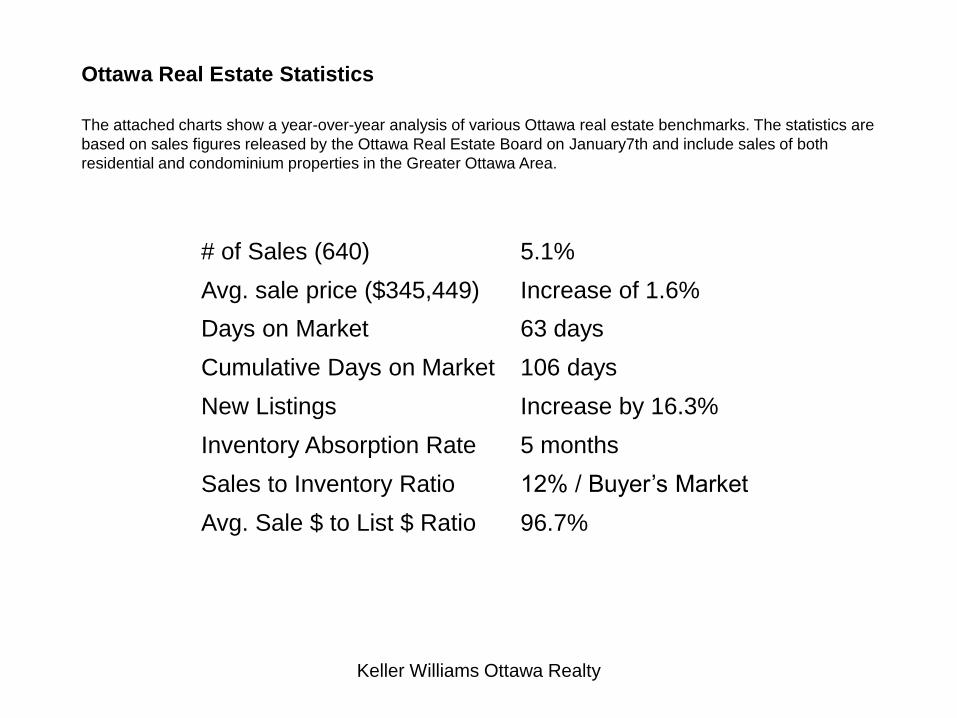
# of Sales (640) 5.1%
Avg. sale price ($345,449) Increase of 1.6%
Days on Market 63 days
Cumulative Days on Market 106 days
New Listings Increase by 16.3%
Inventory Absorption Rate 5 months
Sales to Inventory Ratio 12% / Buyer’s Market
Avg. Sale $ to List $ Ratio 96.7%
Ottawa Real Estate Statistics
The attached charts show a year-over-year analysis of various Ottawa real estate benchmarks. The statistics are
based on sales figures released by the Ottawa Real Estate Board on January7th and include sales of both
residential and condominium properties in the Greater Ottawa Area.
Keller Williams Ottawa Realty
Source: OREB
0
50
100
150
200
250
300
Jan Feb Mar Apr May Jun Jul Aug Sep Oct Nov Dec
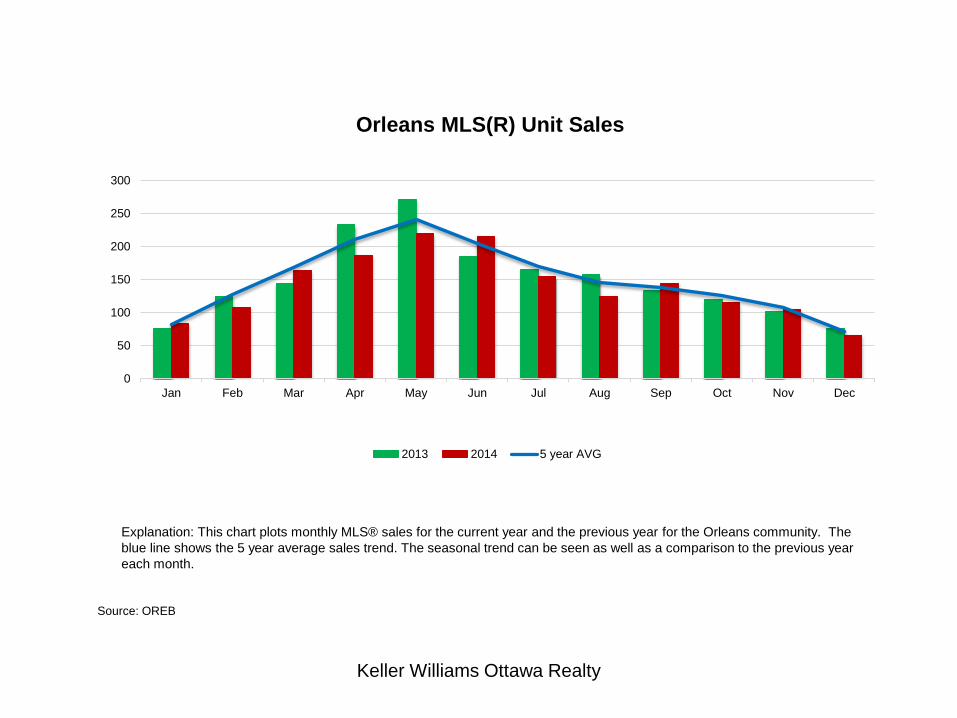
Orleans MLS(R) Unit Sales
2013 2014 5 year AVG
Explanation: This chart plots monthly MLS® sales for the current year and the previous year for the Orleans community. The
blue line shows the 5 year average sales trend. The seasonal trend can be seen as well as a comparison to the previous year
each month.