Embed Size (px)
Citation preview
Why you shouldn’t worry about the number of slides in your
P O W E R P O I N T
April 24, 2015

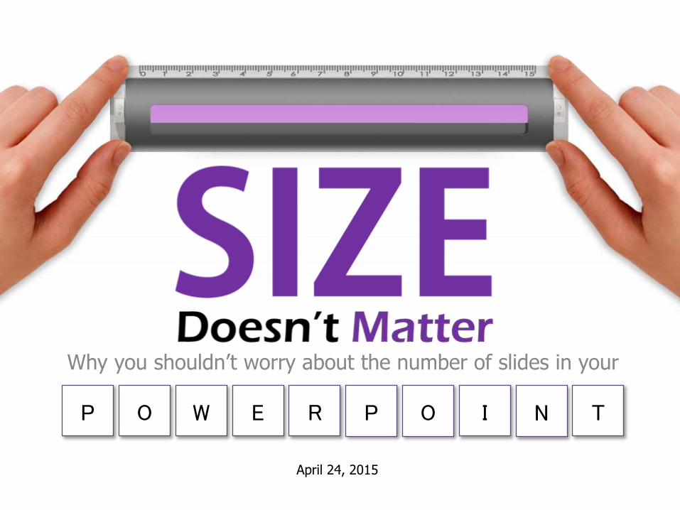
Thepresentations out there
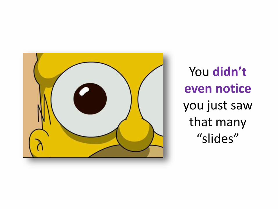
You didn’t even noticeyou just saw that many
“slides”

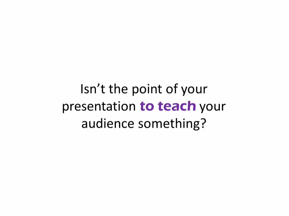
?Why

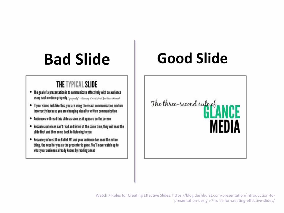
Bad Slide Good Slide
Watch 7 Rules for Creating Effective Slides: https://blog.dashburst.com/presentation/introduction-to-presentation-design-7-rules-for-creating-effective-slides/
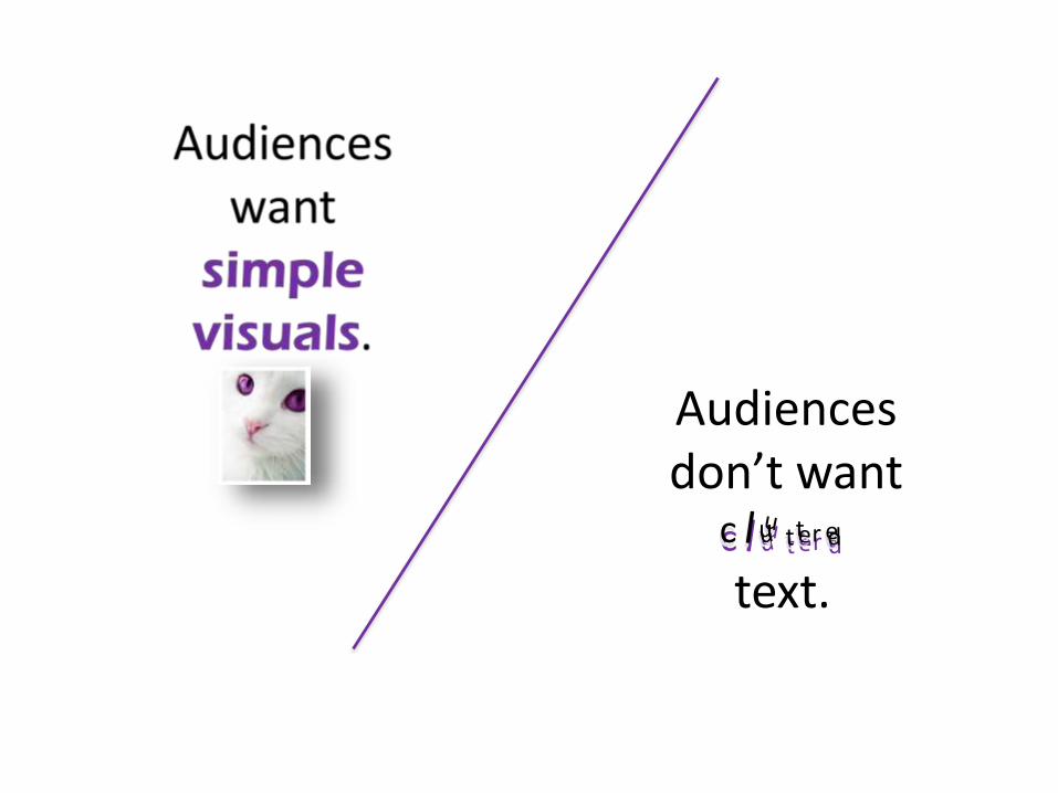
dc u tt r edc u tt r edc u tt r e
text.
Audiences don’t want
Bad Good
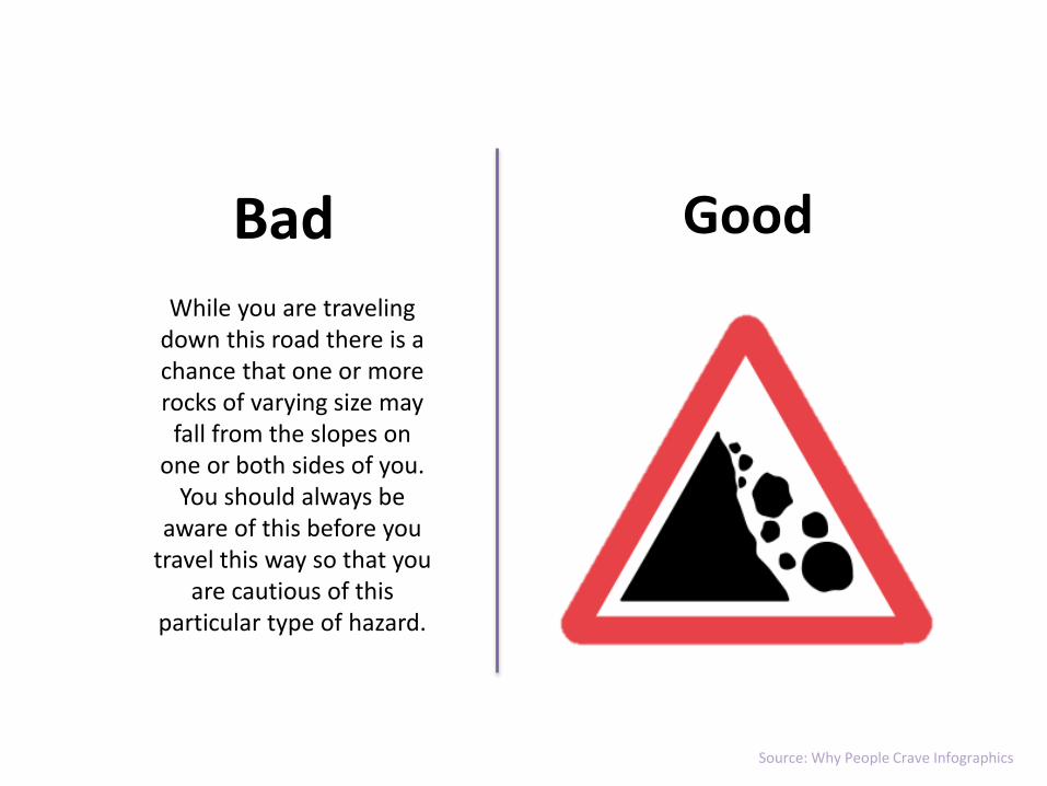
While you are traveling down this road there is a chance that one or more rocks of varying size may
fall from the slopes on one or both sides of you.
You should always be aware of this before you
travel this way so that you are cautious of this
particular type of hazard.
Source: Why People Crave Infographics
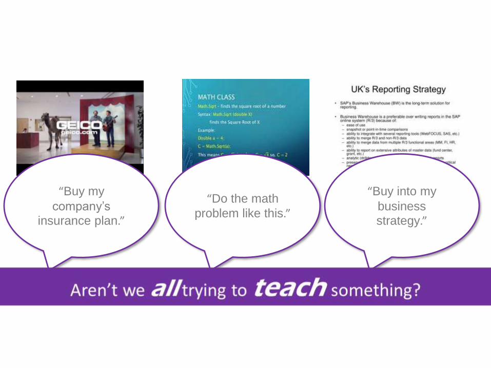
“Buy my
company’s
insurance plan.”
“Do the math
problem like this.”
“Buy into my
business
strategy.”

Source: 13 Reasons Why Your Brain Craves Infographics
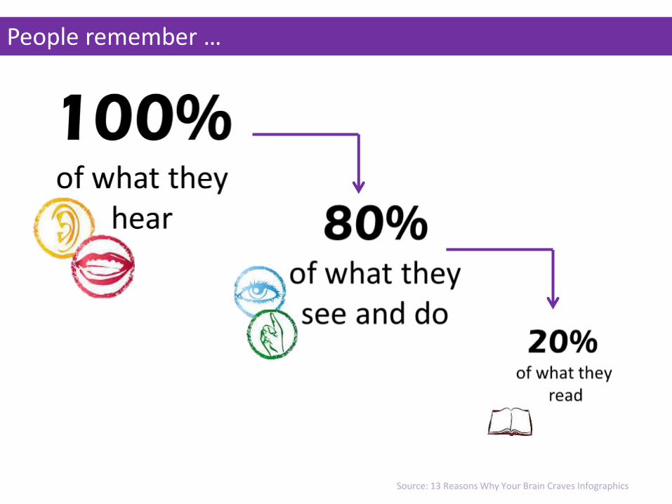
People remember …
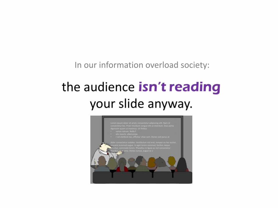
In our information overload society:
Lorem ipsum dolor sit amet, consectetur adipiscing elit. Nam id consectetur leo. Proin tincidunt congue elit ut interdum. Duis portadignissim quam ut maximus. Ut finibus• varius rutrum. Nulla f• elis mauris, ullamcorpe• r vel eleifend nec, efficitur vitae sem. Donec sed purus at
dolor consectetur sodales. Vestibulum nisl erat, tempor eu leo auctor, posuere euismod augue. In eget lorem euismod, facilisis nequeefficitur, commodo lorem. Phasellus in ligula ac nisl consecteturfaucibus et at urna. Donec cursus, augue ac v
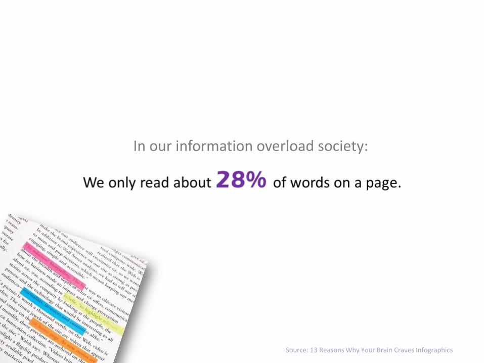
In our information overload society:
Source: 13 Reasons Why Your Brain Craves Infographics
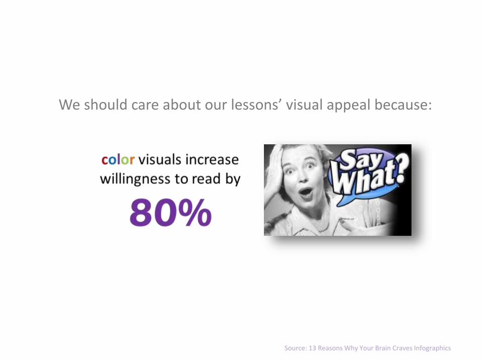
We should care about our lessons’ visual appeal because:
Source: 13 Reasons Why Your Brain Craves Infographics
“ “
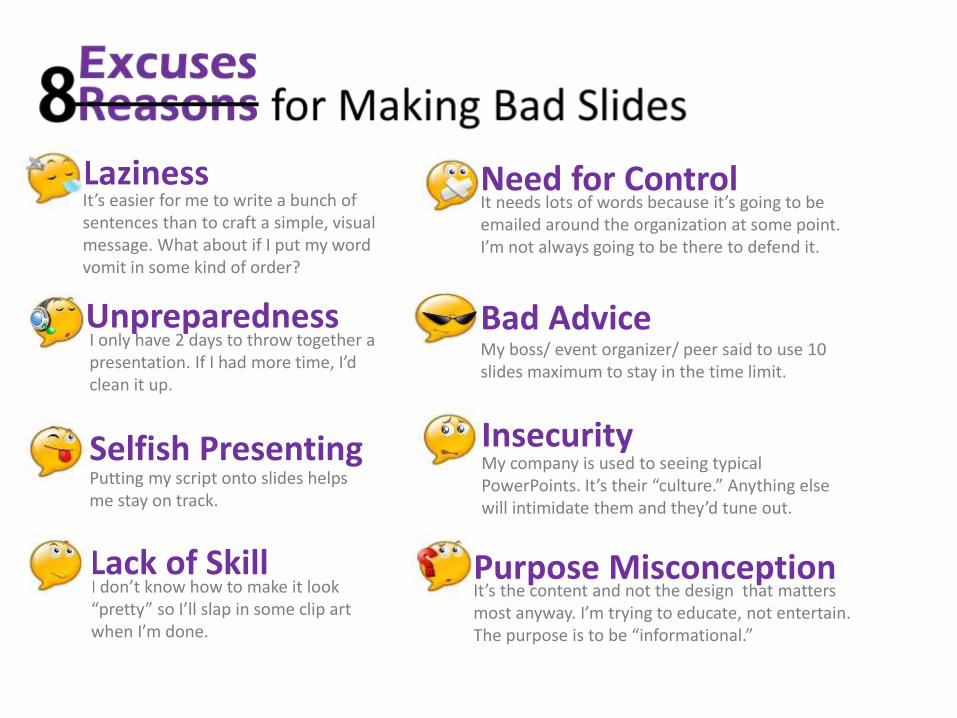
LazinessIt’s easier for me to write a bunch of sentences than to craft a simple, visual message. What about if I put my word vomit in some kind of order?
I only have 2 days to throw together a presentation. If I had more time, I’d clean it up.
Putting my script onto slides helps me stay on track.
Need for ControlIt needs lots of words because it’s going to be emailed around the organization at some point. I’m not always going to be there to defend it.
Bad AdviceMy boss/ event organizer/ peer said to use 10 slides maximum to stay in the time limit.
My company is used to seeing typical PowerPoints. It’s their “culture.” Anything else will intimidate them and they’d tune out.
I don’t know how to make it look “pretty” so I’ll slap in some clip art when I’m done.
It’s the content and not the design that matters most anyway. I’m trying to educate, not entertain. The purpose is to be “informational.”
Selfish Presenting
Purpose Misconception
Unpreparedness
Lack of Skill
Insecurity
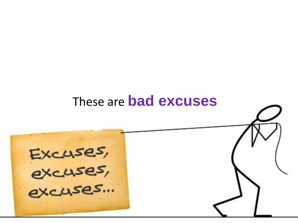
These are bad excuses
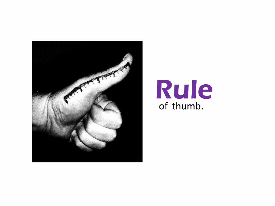
of thumb.

SIZEo
f the slid
e deck
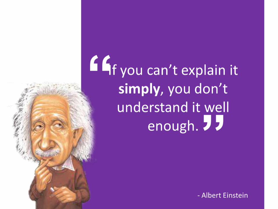
Simplicity & information design does.
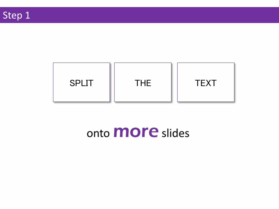
SPLIT THE TEXT
Step 1
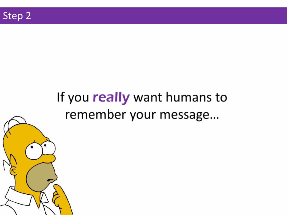
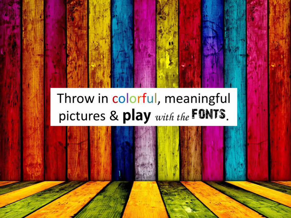
Step 2
If you’re feeling ambitious …
Step 3

(to name a few)
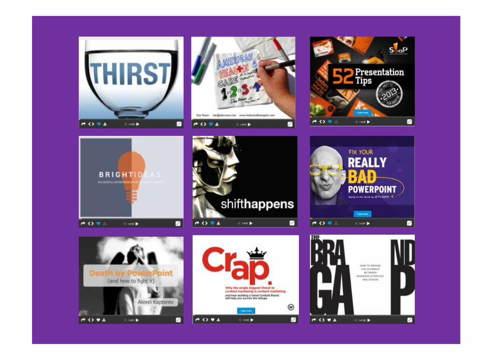
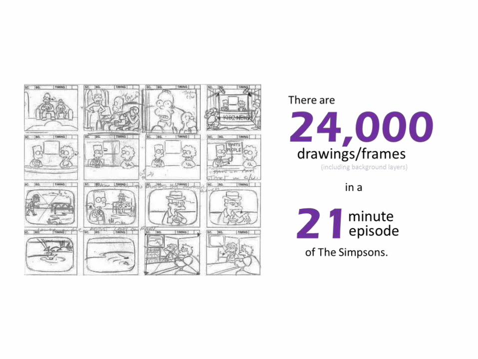
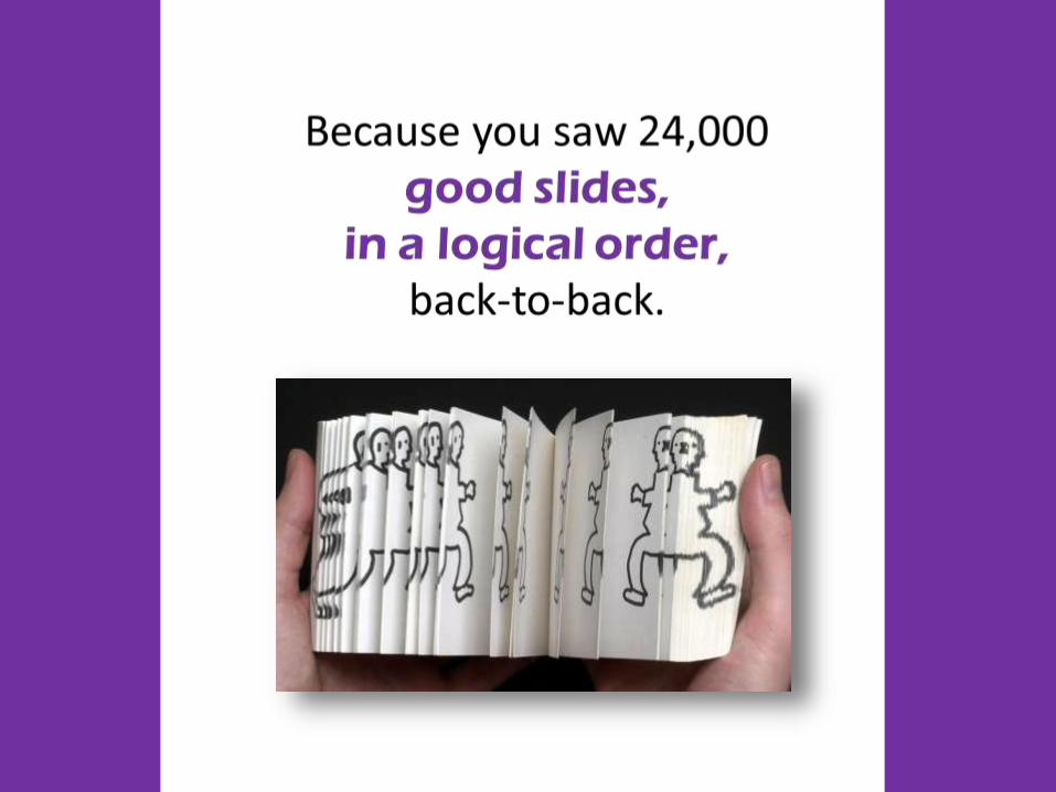
Intro:• The best presentations out there contain an average of 63 slids.• An episode of the Simpsons has 24,000 frames but you didn’t realize you saw that many “slides” because you saw
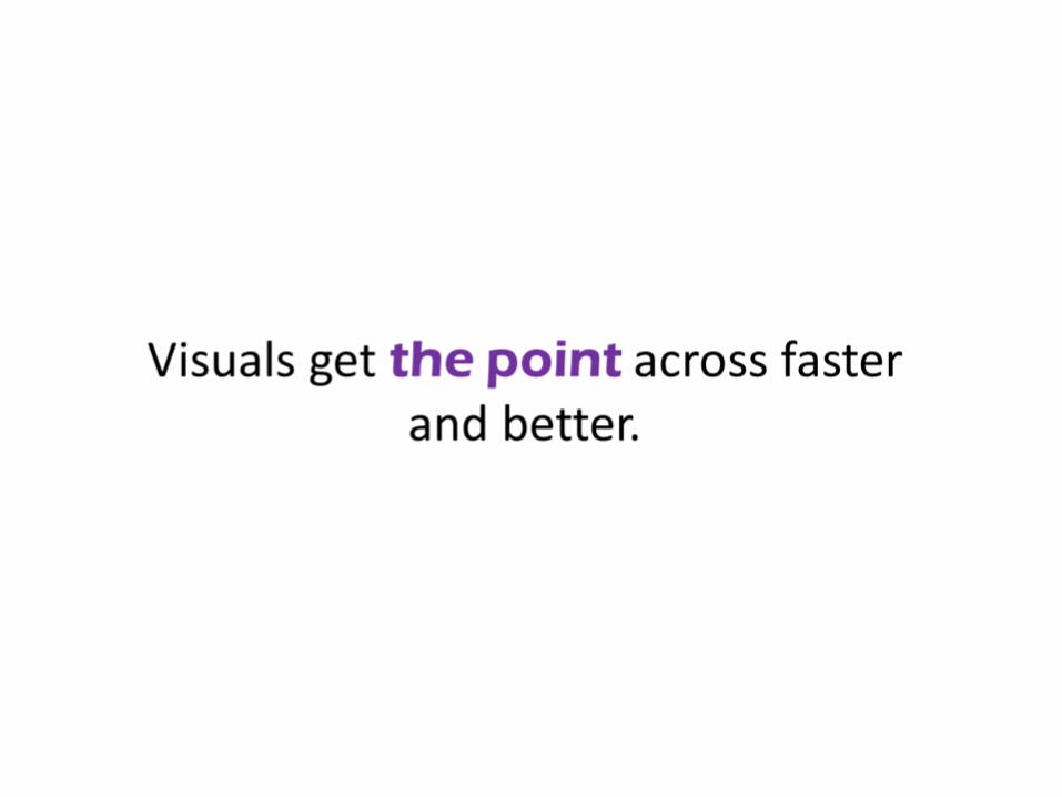
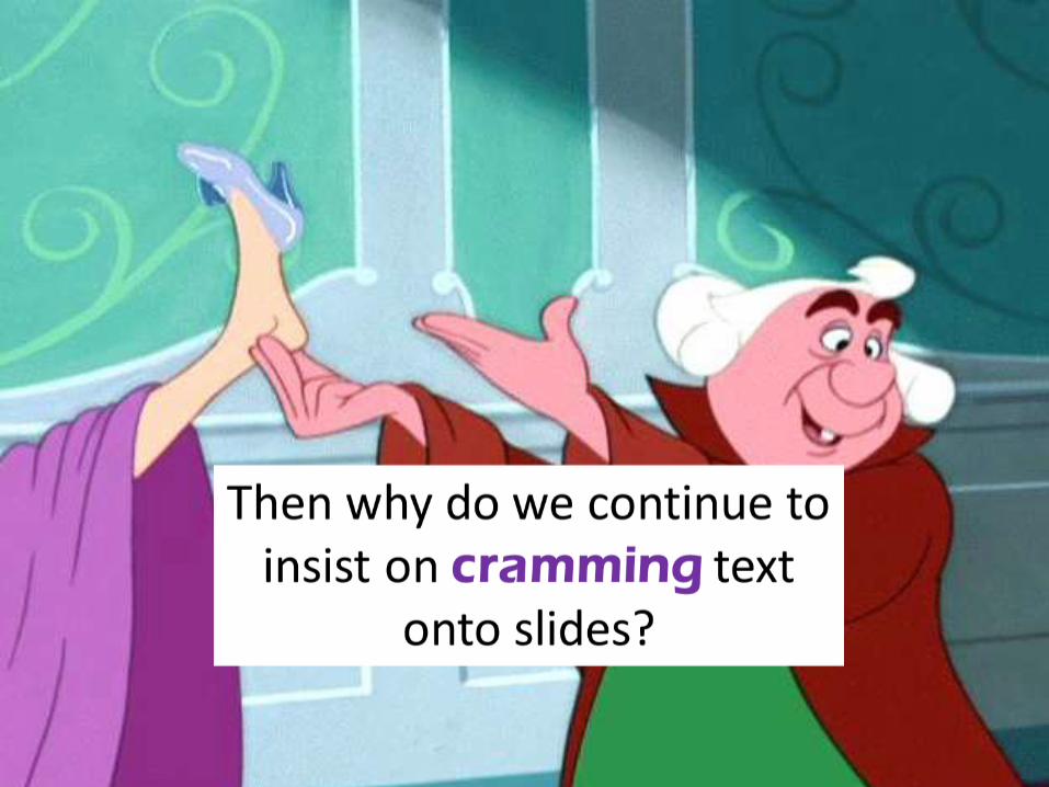
24,000 good slides, in logical order, back to back.A good slide keeps the audience in mind, with simple visuals that get the point across faster unlike a bad one with lots of cluttered text. The point of any presentation is to teach something, whether it be in marketing, education or business. So make the lesson easy for the audience to get. In our information overload society: • your audience isn’t reaing your slide anyway• People remember 100% of what they hear, 80% of what they see & do, 20% of what they read• 28% words on page• 80% willingness to read increased with color visuals• Simple right? “If you can’t explain it simply, you don’t understand it well enough.” – EinsteinThen why do we insist on cramming text into slides? 8 excuses for making bad slides: • Laziness: It’s easier for me to write a bunch of sentences than to craft a simple, visual message. What about if I put my
word vomit in some kind of order?• Unpreparedness: I only have 2 days to throw together a presentation. If I had more time, I’d clean it up.• Selfish Presenting: Putting my script onto slides helps me stay on track.• Lack of Skill: I don’t know how to make it look “pretty” so I’ll slap in some clip art when I’m done. • Need for Control: It needs lots of words because it’s going to be emailed around the organization at some point. I’m
not always going to be there to defend it.• Bad advice: My boss/ event organizer/ peer said to use 10 slides maximum to stay in the time limit.• Insecurity: My company is used to seeing typical PowerPoints. It’s their “culture.” Anything else will intimidate them
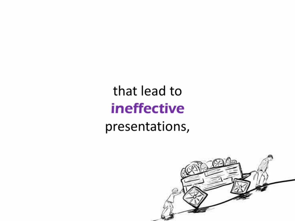
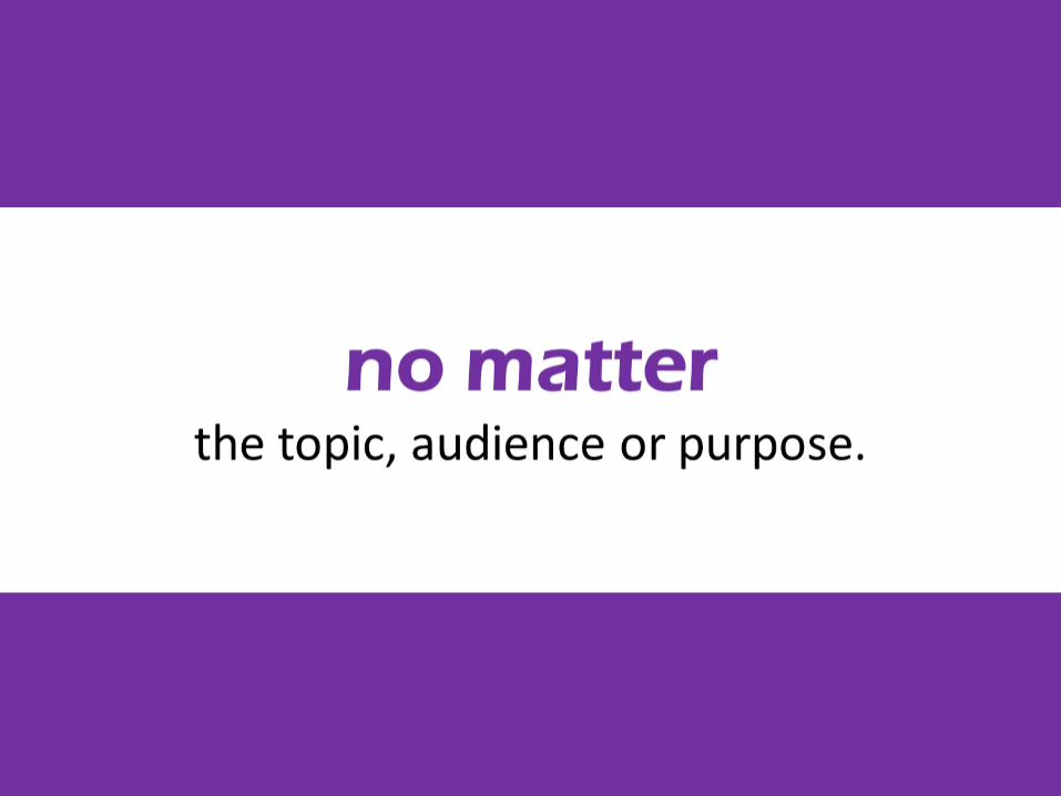
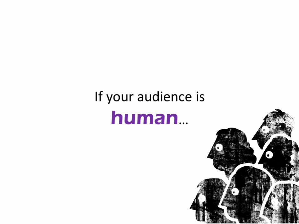
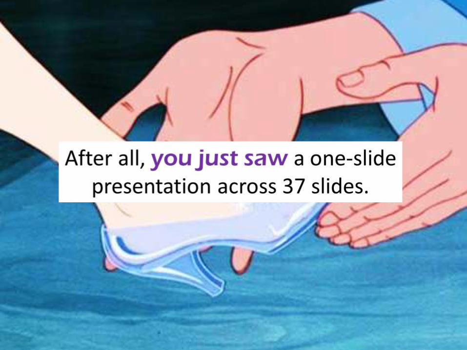
and they’d tune out.• Purpose MisconceptionThese are bad excuses that lead to ineffective presentations, no matter the topic, audience or purpose. Rule of thumb: • If your audience is human, size of a presentation doesn’t matter but simplicity and information design does.• If you really want humans to remember your message, throw in colorful, meaningful pictures and play with fonts.• If you’re feeling ambitious, learn more from slideshare.com presentations on truly great slide design.Close: After all, you just saw a one slide presentation in 38 slides. (By Whitney Power)
Images/References
Purple Ruler: http://www.readassist.ie/ruler/images/purple.png
Simpsons Storyboard: http://www.quora.com/How-many-pages-of-drawings-does-it-take-to-make-a-20-min-cartoon-like-The-Simpsons
Flip Book: http://www.thelocal.de/userdata/images/article/de/33793.jpg
Thinking Man: http://listen-hard.com/wp-content/uploads/2014/09/thinking-man.jpg
Audience: http://www.protoast.com/cty/roles/files/audience.gif
Bad Slide/ Good Slide: https://blog.dashburst.com/presentation/introduction-to-presentation-design-7-rules-for-creating-effective-slides/
Falling Rocks: “13 Reasons Why Your Brain Craves Infographics” Wh
All Teaching Something: https://encrypted-
tbn0.gstatic.com/images?q=tbn:ANd9GcSz9bnyjU_spmtnLu3YHEg1pEpfFmYL8Ydjmfc0xBrhuOvOlRb3
Now I Get It: https://morganelizabeth60.files.wordpress.com/2013/08/oh-i-see.jpg
Hear, See, Do Read Icons: Fark.com http://img.fark.net/images/cache/850/l/lQ/fark_lQeEhqiqYR007pgA_nclTBcMB6I.jpg?t=s7h-
DdeH3kKwXPj_22USMw&f=1430712000
Presenter Guy: http://churchm.ag/wp-content/uploads/2014/09/presentation-2.jpg
Highlighted Paper: http://www.whydidyouwearthat.com/wp-content/uploads/2012/01/1_s.jpeg
Einstein: http://cdn.dogomedia.com/system/ckeditor_assets/pictures/5186cf0b1860e00508005fd3/content_einstein.png
Cramming Glass Slipper: http://media.offbeatempire.com/wp-content/blogs.dir/4/files/2015/12/cinderella584.jpg
8 Excuses adapted from/ expanded to: http://scottberkun.com/2009/why-do-people-make-bad-slides/
8 Excuses Smiley Icons: http://3.bp.blogspot.com/-SXovI7VB8rQ/UOmnKqAolhI/AAAAAAAAJFk/3ECYrCoY-IA/s1600/stubborn.png
Bad Excuses Stick Man: http://faselshenstone.com/wp-content/uploads/2014/08/Excuses-2.jpg
Square Wheels: http://peopleprofits.com/sites/peopleprofits.com/files/Squared%20wheels%20-%20People%20Profits.jpg
Rule of Thumb: https://mwaldrondotnet.files.wordpress.com/2014/11/rule-of-thumb-waldron.jpg
Human Profiles: http://cdn.mysitemyway.com/etc-mysitemyway/icons/legacy-previews/icons/black-ink-grunge-stamps-textures-icons-
people-things/060150-black-ink-grunge-stamp-textures-icon-people-things-people-audience.png
Colorful Wall: http://www.viewfacebookcovers.com/images/uploads/f2012112614.Colorful-Wood-Wall.jpg
Cinderella Shoe Fit: http://static.tvtropes.org/pmwiki/pub/images/cinderella_glass_slipper_fitting.jpg