Embed Size (px)
Citation preview
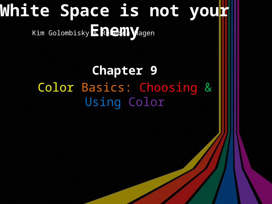
White Space is not your Enemy
Chapter 9Color Basics: Choosing & Using Color
Kim Golombisky & Rebecca Hagen
What color can do
According to Golombisky and Hagen, many designers use color to:
• Grab our attention.• Organize visual flow.• Evoke emotions in the viewer.
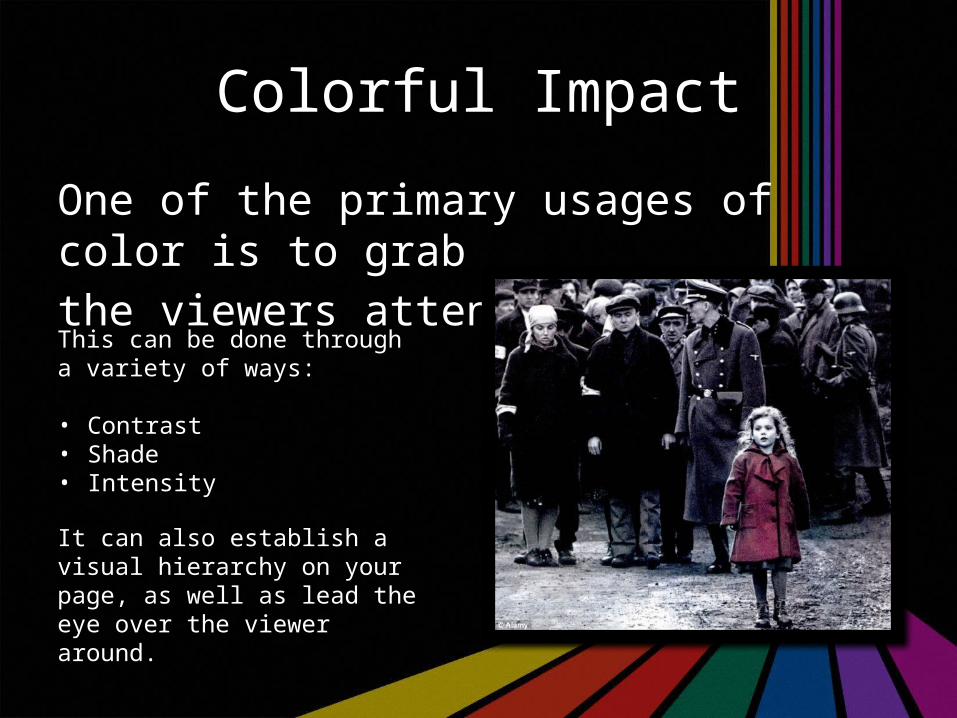
Colorful Impact
One of the primary usages of color is to grab the viewers attention.
This can be done through a variety of ways:
• Contrast• Shade• Intensity
It can also establish a visual hierarchy on your page, as well as lead the eye over the viewer around.
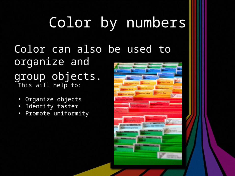
Color by numbers
Color can also be used to organize and group objects.
This will help to:
• Organize objects• Identify faster• Promote uniformity
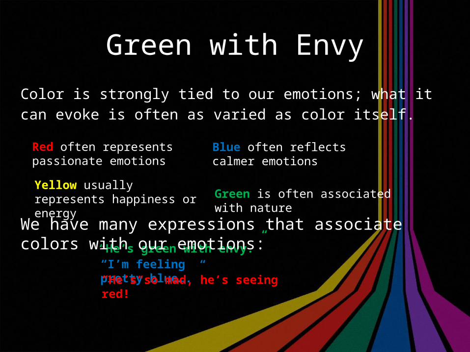
Green with Envy
Color is strongly tied to our emotions; what it can evoke is often as varied as color itself.
Red often represents passionate emotions
Blue often reflects calmer emotions
“He’s green with envy.”“I’m feeling pretty blue….”
Yellow usually represents happiness or energy Green is often associated with nature
We have many expressions that associate colors with our emotions:
“He’s so mad, he’s seeing red!”
Color is Culturally Crafted
Depending on where you are, colors can mean many different things. Red and Green might represent Christmas in North America, but what about in other countries?In China, some brides will wear red wedding dresses, as they don’t associate white with purity like North American cultures do.
In some Pacific Rim cultures, they wear white clothing when they mourn, whereas in North America we traditionally wear black.
Know the cultural context of your colors!
It’s Tweetin’ Time
Think of one of your favorite seasons. Tweet some of the colors that are associated with them.
#
Taste the RainbowThere are an endless number of colors and shades, so picking the right color can be quite daunting. This chapter provides three venues to help you narrow it down:• History• Nature• Color Wheel
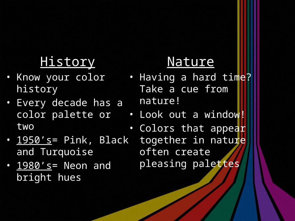
History• Know your color history• Every decade has a color
palette or two• 1950’s= Pink, Black and
Turquoise• 1980’s= Neon and bright
hues
Nature• Having a hard time? Take a
cue from nature!• Look out a window!• Colors that appear together
in nature often create pleasing palettes
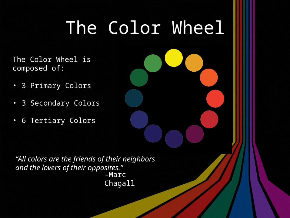
The Color Wheel
The Color Wheel is composed of:
• 3 Primary Colors
• 3 Secondary Colors
• 6 Tertiary Colors
“All colors are the friends of their neighbors and the lovers of their opposites.”
-Marc Chagall
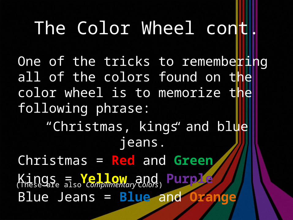
The Color Wheel cont.
One of the tricks to remembering all of the colors found on the color wheel is to memorize the following phrase:
“Christmas, kings and blue jeans.”Christmas = Red and GreenKings = Yellow and PurpleBlue Jeans = Blue and Orange
(These are also Complimentary Colors)
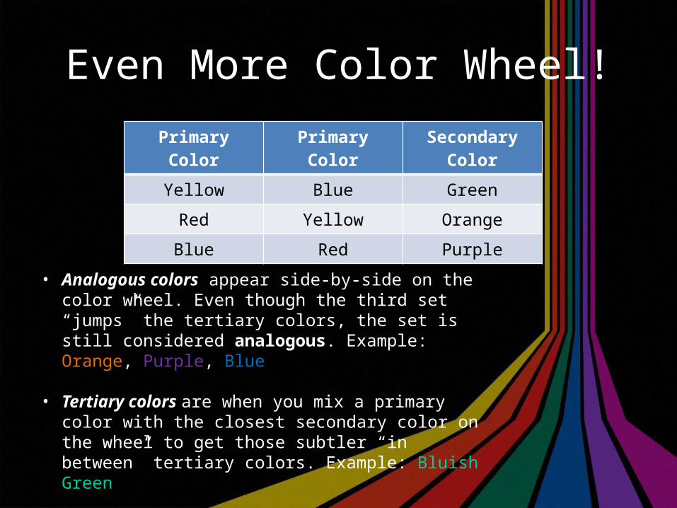
Even More Color Wheel!Primary Color Primary Color Secondary Color
Yellow Blue Green
Red Yellow Orange
Blue Red Purple
• Analogous colors appear side-by-side on the color wheel. Even though the third set “jumps” the tertiary colors, the set is still considered analogous. Example: Orange, Purple, Blue
• Tertiary colors are when you mix a primary color with the closest secondary color on the wheel to get those subtler “in between” tertiary colors. Example: Bluish Green
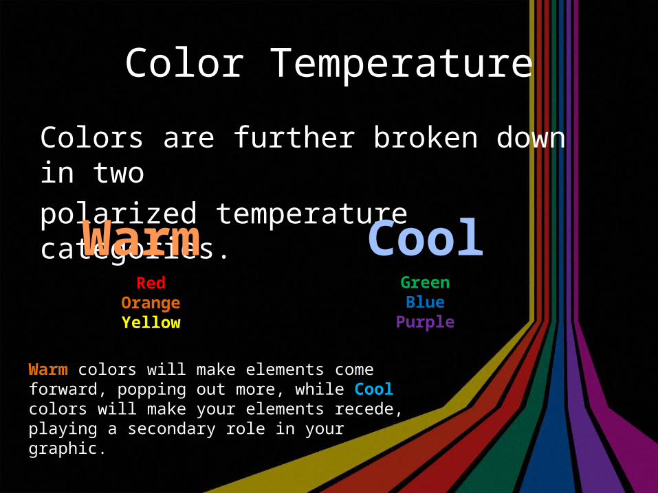
Color Temperature
Colors are further broken down in two polarized temperature categories.
Warm CoolRed
OrangeYellow
GreenBlue
Purple
Warm colors will make elements come forward, popping out more, while Cool colors will make your elements recede, playing a secondary role in your graphic.
Tweetin’ Time Two
Find an advertisement that represents either the Warm or the Cool color motif. then tweet it to me.
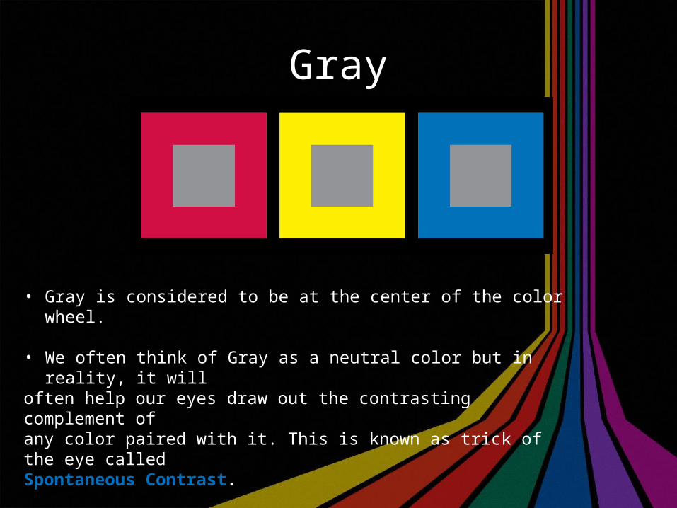
Gray
• Gray is considered to be at the center of the color wheel.
• We often think of Gray as a neutral color but in reality, it will often help our eyes draw out the contrasting complement of any color paired with it. This is known as trick of the eye called Spontaneous Contrast..
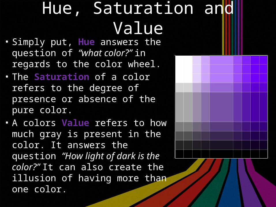
Hue, Saturation and Value• Simply put, Hue answers the
question of “what color?” in regards to the color wheel.
• The Saturation of a color refers to the degree of presence or absence of the pure color.
• A colors Value refers to how much gray is present in the color. It answers the question “How light of dark is the color?” It can also create the illusion of having more than one color.
Battle of the Titans
Print Versus ScreenWhat appears on your monitor does not necessarily represent what will come out on the page.
• Electronic Color (Screen) uses overlapping light to achieve color.• Printed Color (Print) is manufactured and then layered inks.
CMYK
CMYK is the realm of print design.Blue = CyanRed = MagentaYellow = Yellow
K, which is the mixture of C+M+Y,produces Black.
CMYK 2
• The most common printing technology uses the 4-color process.• This means the colors are layered on, in order, to create your colors.
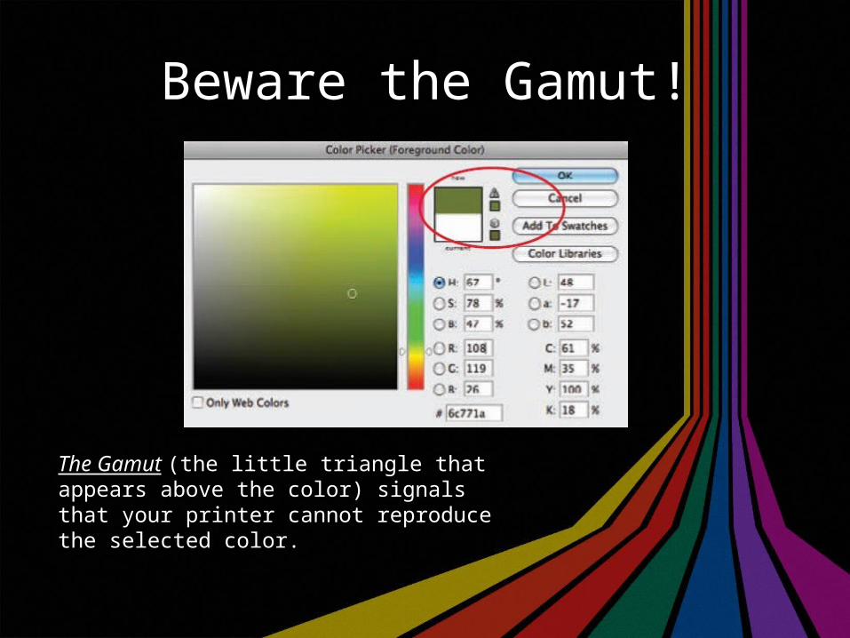
Beware the Gamut!
The Gamut (the little triangle that appears above the color) signals that your printer cannot reproduce the selected color.
Pantone not Pantene
• You don’t have to always mix your own colors.• These are called Matched Colors or Spot Colors• Pantone created the PANTONE MATCHING SYSTEM.• When printing with these, printers only need to create a plate for the colors selected, not all four like CMYK.
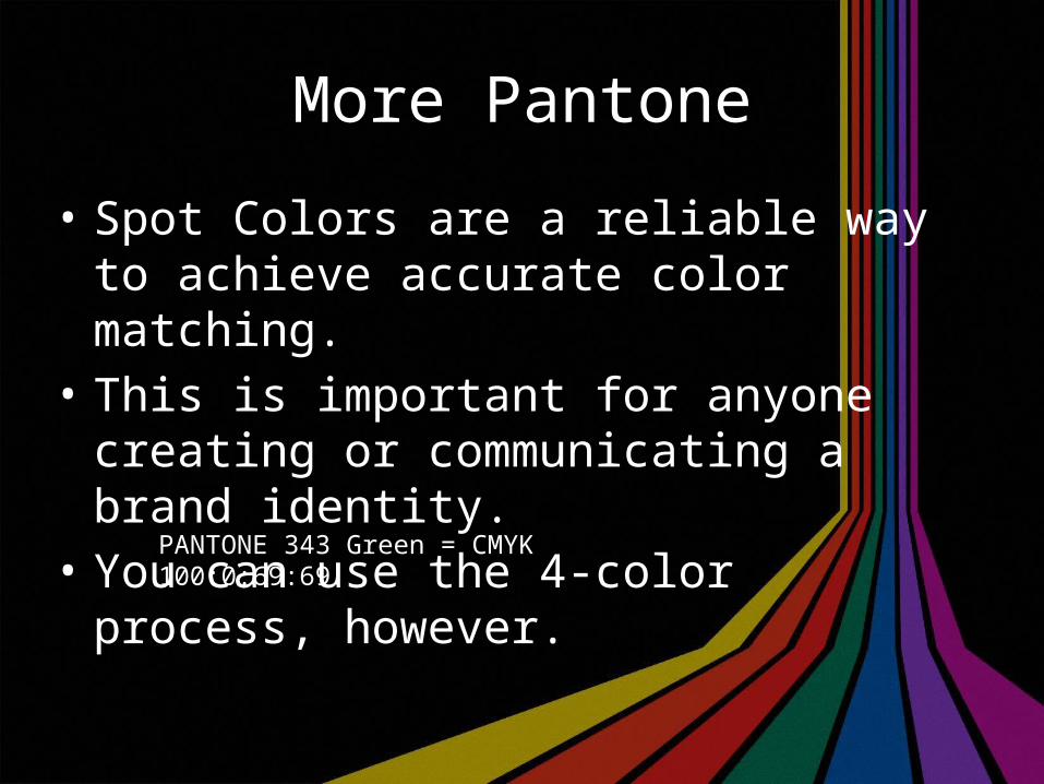
More Pantone
• Spot Colors are a reliable way to achieve accurate color matching.
• This is important for anyone creating or communicating a brand identity.
• You can use the 4-color process, however.
PANTONE 343 Green = CMYK 100:0:69:69
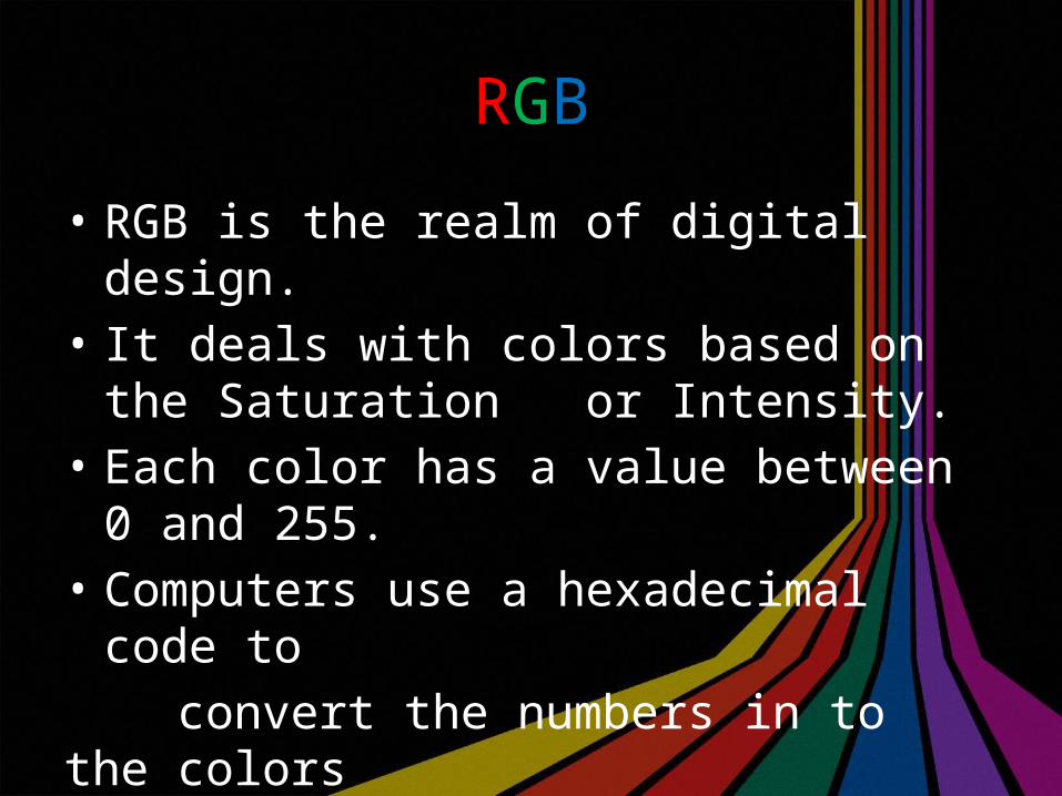
RGB
• RGB is the realm of digital design.• It deals with colors based on the Saturation
or Intensity.• Each color has a value between 0 and 255.• Computers use a hexadecimal code to convert the numbers in to the colors we see.
255 Problems, but a Printer ain’t 1
• The main issue with RGB is that for front- end design, not all monitors are the same.
• Many people don’t even configure their monitors properly.
• There are “Web safe palettes” but they are incredibly limited.
Tips and Tricks
• Choose one main color and add only one or two accent colors.
“Less is More” • Make your colors work for your communication purpose• Design for visibility and readability • Splashes of color can add visual emphasis
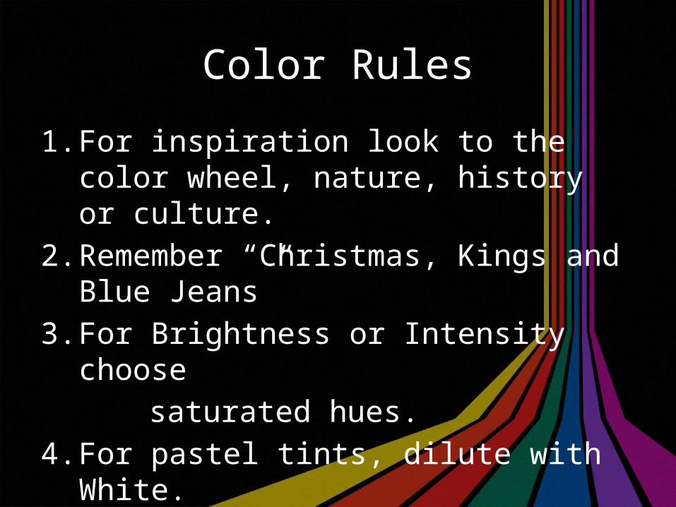
Color Rules
1. For inspiration look to the color wheel, nature, history or culture.
2. Remember “Christmas, Kings and Blue Jeans”3. For Brightness or Intensity choose saturated hues.4. For pastel tints, dilute with White.5. For earth tones, dull with Black
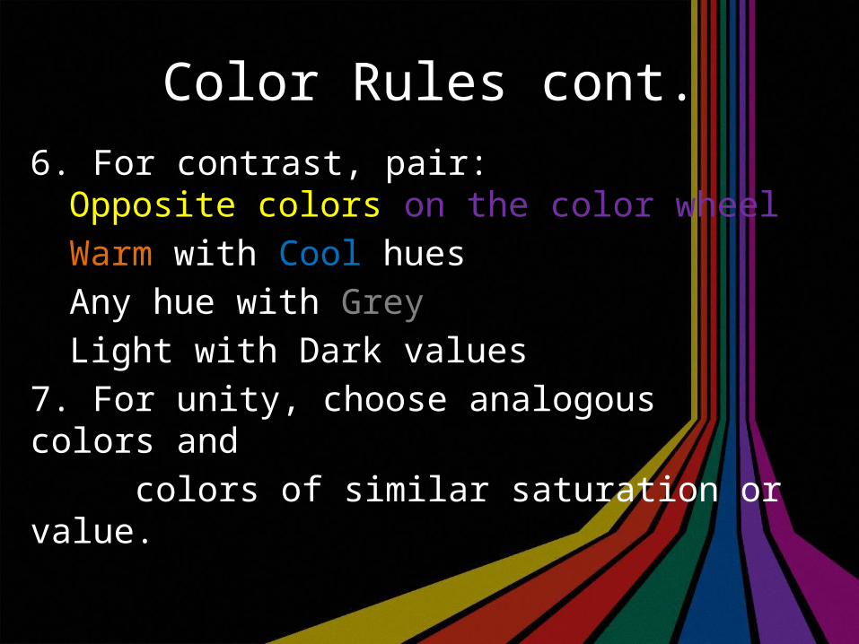
Color Rules cont.6. For contrast, pair:
Opposite colors on the color wheelWarm with Cool huesAny hue with GreyLight with Dark values
7. For unity, choose analogous colors and colors of similar saturation or value.
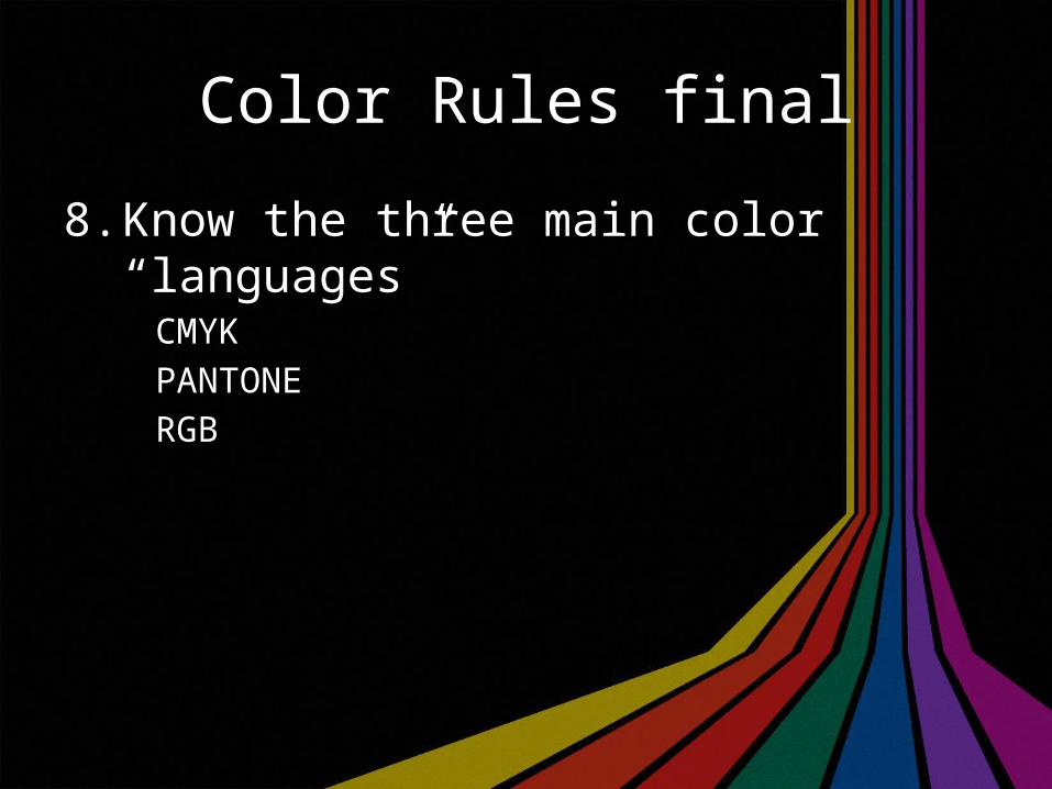
Color Rules final
8. Know the three main color “languages”CMYKPANTONERGB
Tweetin’ Time Three
• The Color Testhttp://color.method.ac/
• Test your ability to differentiate Hueshttp://www.xrite.com/online-color-test-challenge
• Color Of My Soundshttp://www.colorofmysound.com/
• Color Blindness Testhttp://enchroma.com/test/#&ui-state=dialog
THE END