Embed Size (px)
Citation preview
The purse scooper’s site
gets an update!The Purse Scooper’s Site is going under construction
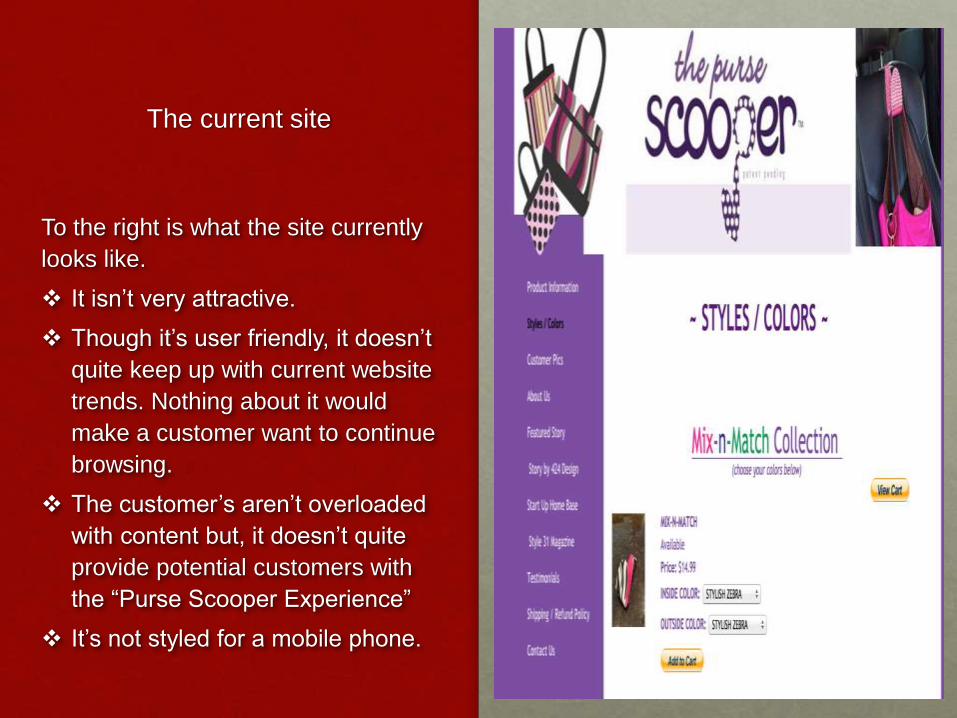
The current site
To the right is what the site currently
looks like.
It isn’t very attractive.
Though it’s user friendly, it doesn’t
quite keep up with current website
trends. Nothing about it would
make a customer want to continue
browsing.
The customer’s aren’t overloaded
with content but, it doesn’t quite
provide potential customers with
the “Purse Scooper Experience”
It’s not styled for a mobile phone.
Let’s talk about growth!
According to http://www.smartinsights.com/mobile-
marketing/mobile-marketing-analytics/mobile-
marketing-statistics/ , Smartphone & Tablet usage
nearly doubled from 2012 to 2013. This means, more
people are using their phones and the number of
people using the desktop to visit different site is
decreasing. The more that technology advances, the
more important it becomes for business to keep up
with those advances and keep their sites updated.
Mobile design
Due to the growth in mobile & tablet usage, it’s important to make sure your sight is also designed for mobiles.
According to http://www.pewinternet.org/fact-sheets/mobile-technology-fact-sheet/, 90% of people have mobile phones, 58% of them have smartphones. 42% of Americans own tablets. 63% of them use the internet on their device & 34% of them use their device as their main source for the internet. 1.2 Billion people access the internet from their device.
Mobile/tablet usage has impacted web design because so many people want to have everything at their fingertips. It’s more convenient to access the internet from wherever you are whenever you want, vs. having to wait to get in front of a desktop computer to get online. To be able to swipe and have what you want right in front of you is one good reason mobile usage has impacted web design.
HTML5 has made graphics and videos that are on these sites viewable from your device.
Making your site accessible
• HTML 5 allows your website to be functional on both
desktop and mobile devices. It allows your business
to use attractive graphics and videos.
• CSS – Cascading Style Sheets are how your
graphics or HTML content are displayed. Ex: Fonts,
layouts, colors, etc.
• W3C
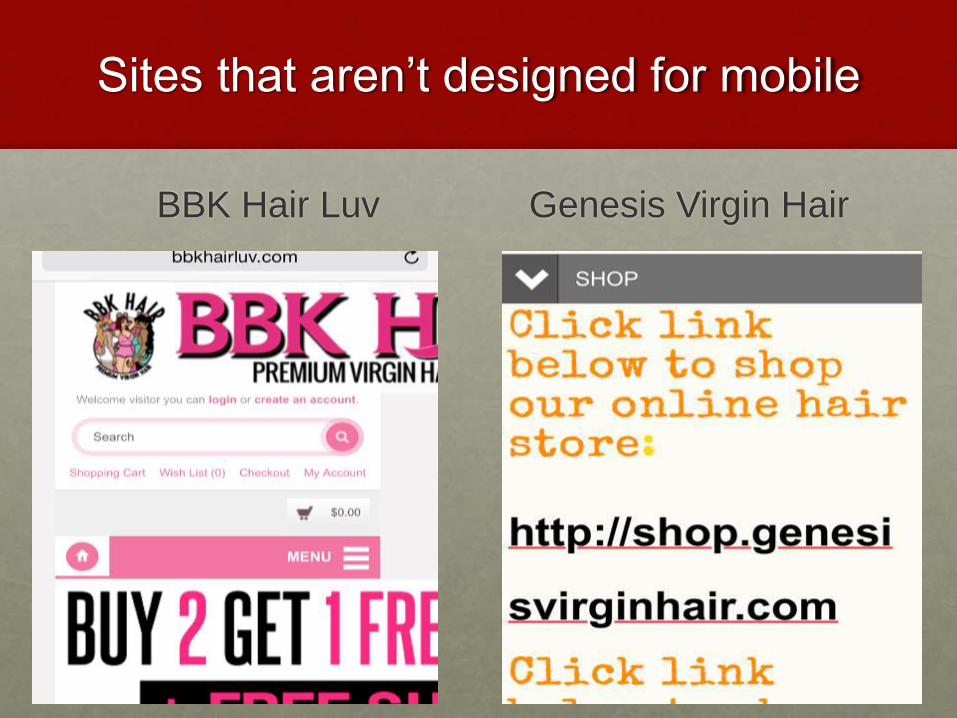
Sites that aren’t designed for mobile
BBK Hair Luv Genesis Virgin Hair
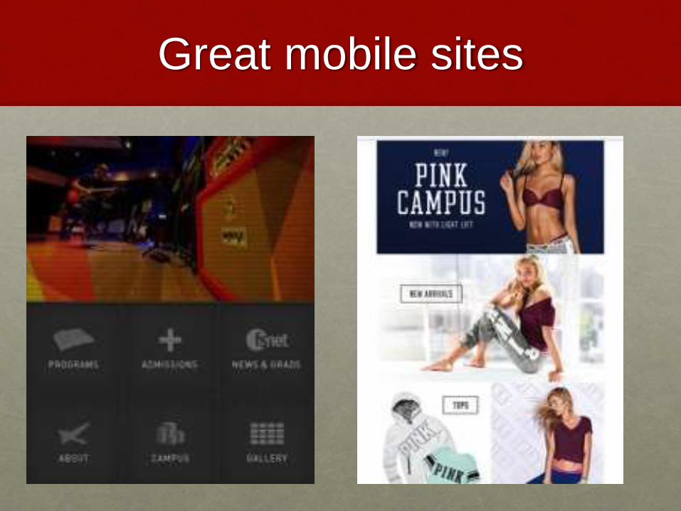
Great mobile sites
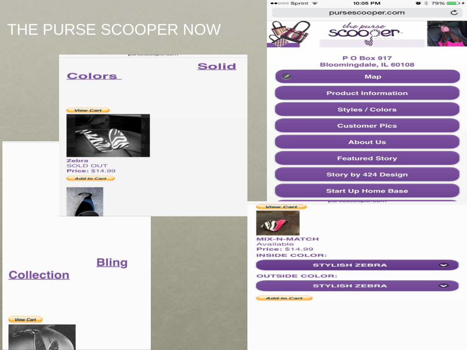
THE PURSE SCOOPER NOW
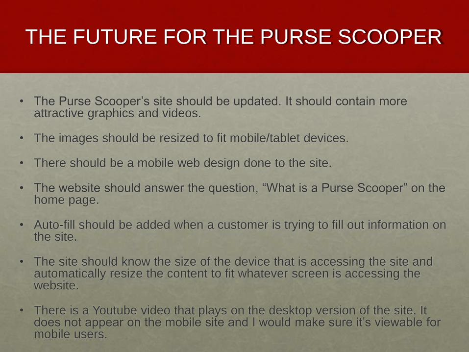
THE FUTURE FOR THE PURSE SCOOPER
• The Purse Scooper’s site should be updated. It should contain more attractive graphics and videos.
• The images should be resized to fit mobile/tablet devices.
• There should be a mobile web design done to the site.
• The website should answer the question, “What is a Purse Scooper” on the home page.
• Auto-fill should be added when a customer is trying to fill out information on the site.
• The site should know the size of the device that is accessing the site and automatically resize the content to fit whatever screen is accessing the website.
• There is a Youtube video that plays on the desktop version of the site. It does not appear on the mobile site and I would make sure it’s viewable for mobile users.
REFERENCES
http://www.pewinternet.org/fact-sheets/mobile-technology-fact-sheet/
http://www.smartinsights.com/mobile-marketing/mobile-marketing-
analytics/mobile-marketing-statistics/