Embed Size (px)
Citation preview
Evaluationby Charlotte Frost
In what way does your media product use, develop or challenge
forms and conventions of real media products?My magazine uses real conventions like
professional music magazines. It has similar layouts to multiple other magazines (see in my research) Kerrang, Q, NME. The title is features at the top in a banner. The double page spread has featured multiple pictures of my musicians, including pictures of them with musical props. I have kept the background rather plain but interesting. I have used photo editing to change brightness and contrast to make my photos look ideal, and removed any spots. I have also used drops caps and repeated colour schemes, and more, all that are apart of music genre.
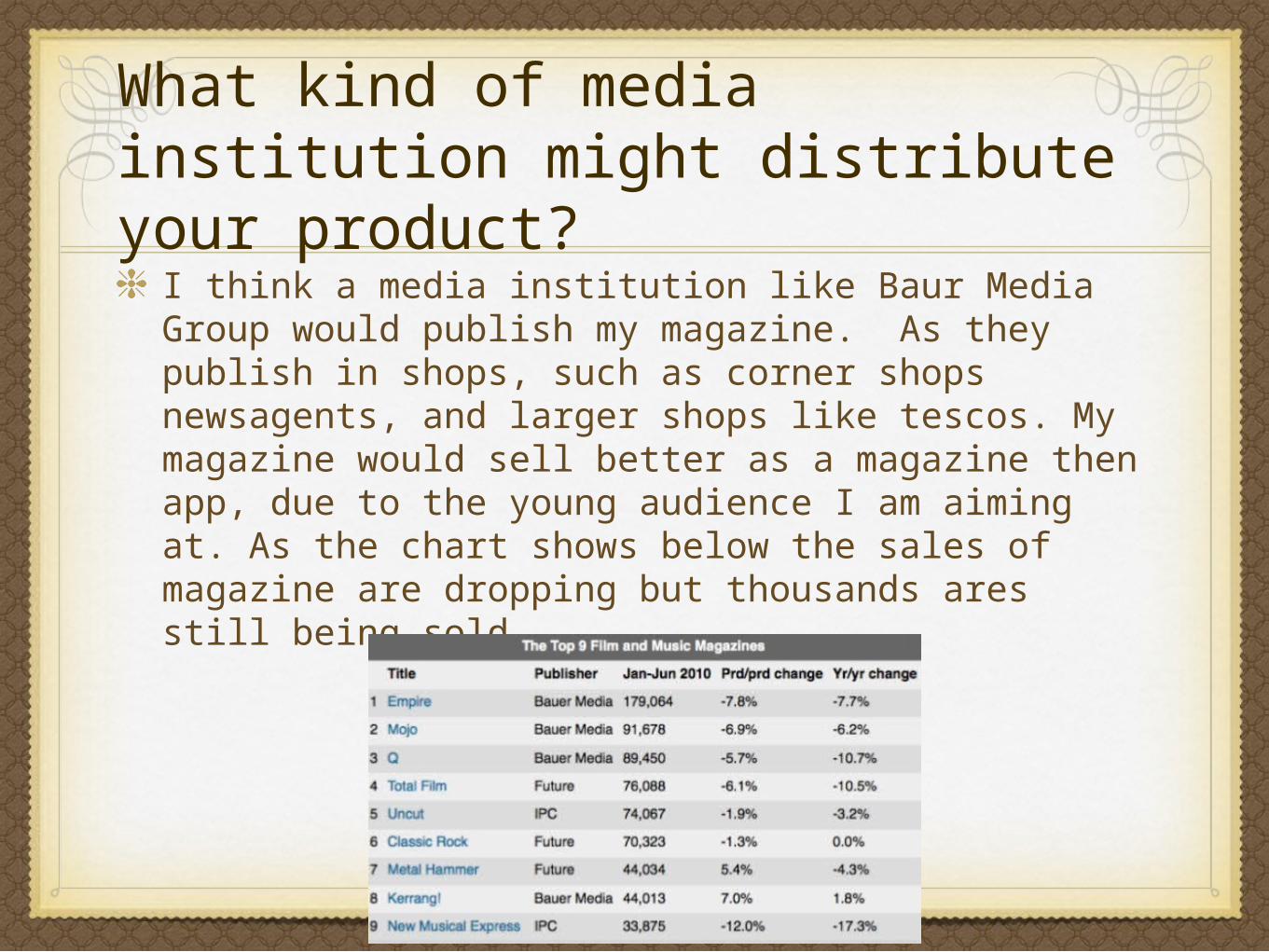
What kind of media institution might distribute your product?
I think a media institution like Baur Media Group would publish my magazine. As they publish in shops, such as corner shops newsagents, and larger shops like tescos. My magazine would sell better as a magazine then app, due to the young audience I am aiming at. As the chart shows below the sales of magazine are dropping but thousands ares still being sold.
How does your media products represent particular social group?
• The social group I have represented are young teenage girls who are interested in the pop music genre.
My magazine features a young girl with trendy hairstyle. The setting is on beach dunes which is applicable to the Summer Addition of this magazine. The bright colours of the font pink and purple have a summer feel about them, which is indicative of flowers and berry of this time of year. The overall pale blue look of the front cover is comparative to the blue skys of summer, and has an outdoor music festival feel about it.
My magazine has a large hip ‘selfie’ style photo image on the front cover which is in keeping with trend of the time.
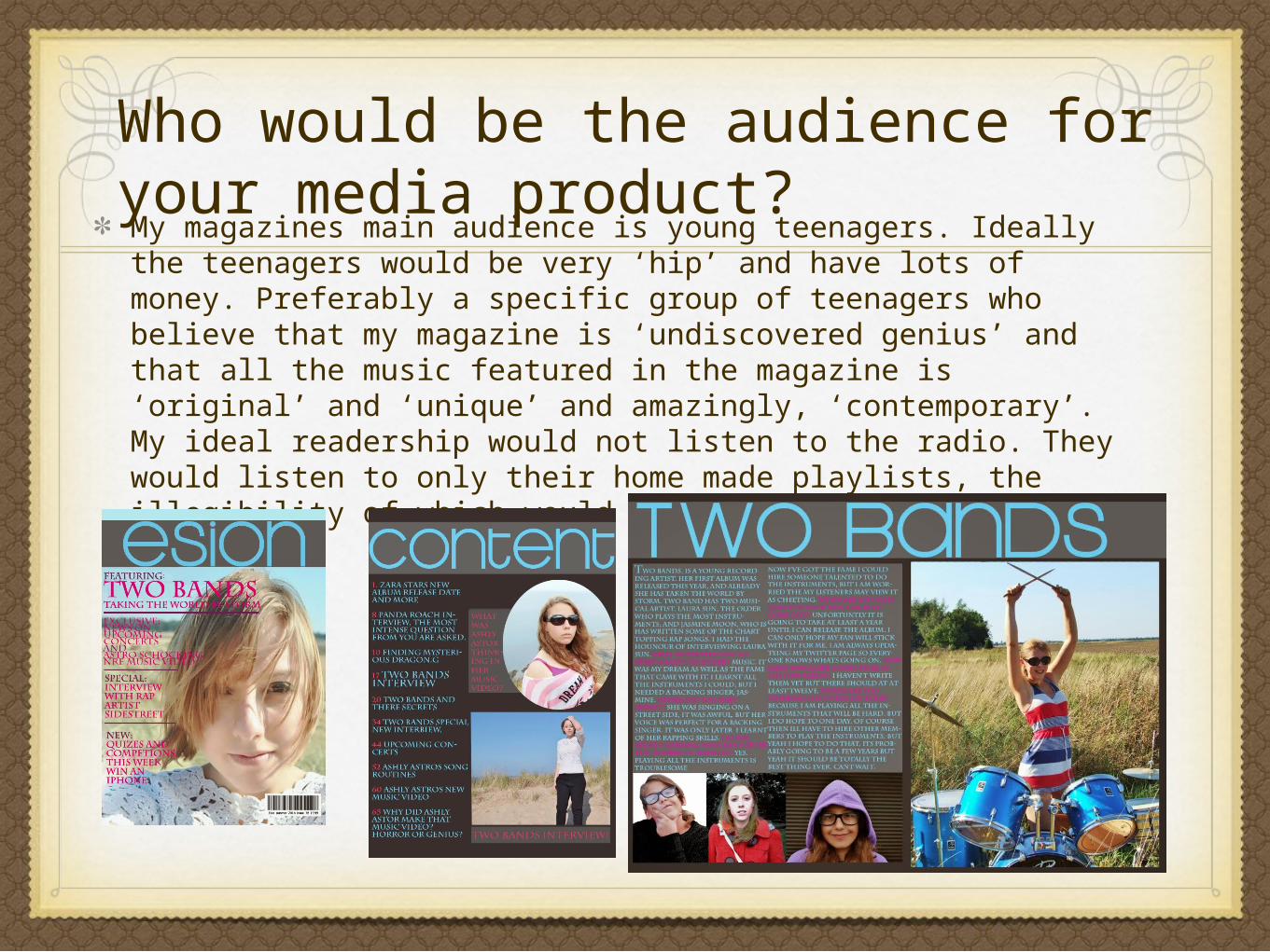
Who would be the audience for your media product?My magazines main audience is young teenagers. Ideally the teenagers would be very ‘hip’ and have lots of money. Preferably a specific group of teenagers who believe that my magazine is ‘undiscovered genius’ and that all the music featured in the magazine is ‘original’ and ‘unique’ and amazingly, ‘contemporary’. My ideal readership would not listen to the radio. They would listen to only their home made playlists, the illegibility of which would be questionable.

Banner changed
Banner now looks much neater
Sub- titles and boxes now look much neater and nice
Better quality background and photo
Bar code, price and date added
Better title
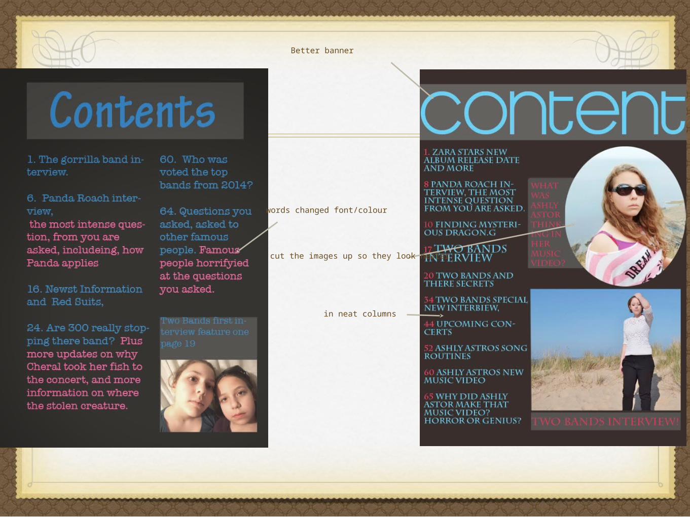
Better banner
words changed font/colour
in neat columns
cut the images up so they look neater
Text
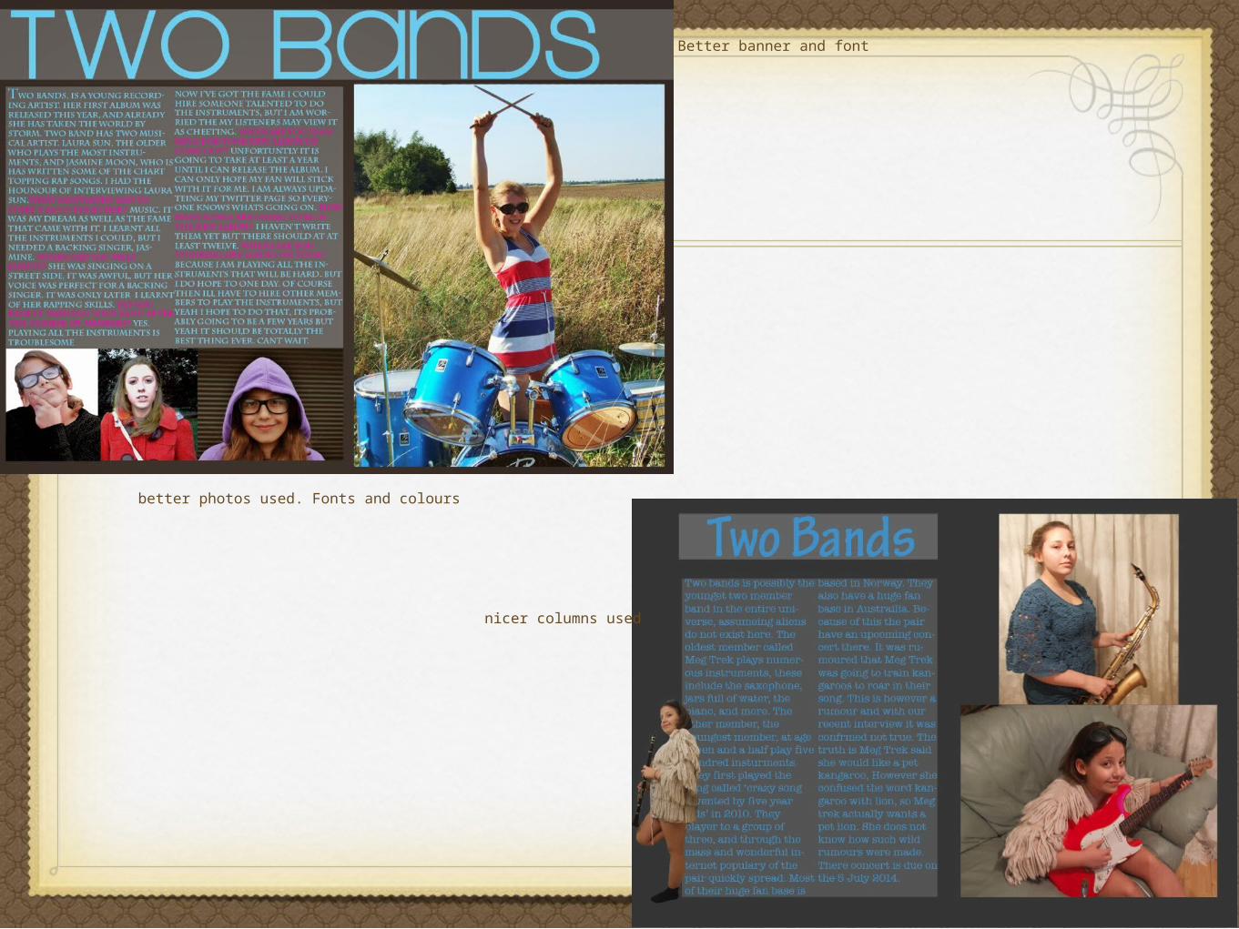
Better banner and font
nicer columns used
better photos used. Fonts and colours
What have you learnt about technologies from the process of
constructing this product? my product
• To create my product I started with research. I researched different music magazines, the front covers, the contents, the double page spread. I quickly drafted several optional ways I could have my own magazine look with inspiration from my research magazine. I research this by using the internet.I used scanner to put magazines I had brought online digitally. Next I shot my own photographs. I took photos using a digital fukifilm camera. I was already aware of how to use this camera, however I did learn that putting the flash on, was a very bad idea. I used photoshop. I edited my photographs so that they were not ugly. I did this by removing any disgusting marks on my models face. I brightening and changing the contrast so that the colours in the photograph were visually pleasing. I then made my first version of the magazine. I improved this in a second version. I then quickly fixed anything in my second version that didn’t work or needed fixing, or the colours changing, and made my final version of the magazine. In my final version I fixed any mistakes and removed any photos i did not feel worked well.
How did you attract/address your audience?
I attracted my audience by using a bright colour scheme, eye grabbing subheadings, and big titles. I also immediately grabbed my audience attention by featuring what would be famous musicians. I choose a layout on the magazine that I felt would be best. I chose the costume for my model to wear to look.
I also attracted them by using images of a young teenage girl of the front cover. As it the magazine was a quarterly magazine I chose a Summer Addition. In which I used bright coloured font and pale blue on the cover and through the magazine. The setting where of places you associate with Summer – beach and open fields (music festivals). The name itself is a semi-palindrome; it is the word NOISE in reverse. The word ESION has a balance appearance. It also is a way to express the word noise in an artistic way. Noise – Definition:
verb archaic
- talk about or make known publicly.
The definition of noise seems appropriate for a magazine that you would want talked about.
Conventions
• I have learnt that the conventions of musical magazine, are all very similar. They are all almost exactly the same but that of the colour of the words and angle of the title, and font. I have learnt a lot since doing the student magazines, such as all magazines are stupidly simple, and they are not allowed to be complicated, as all that is unique in a magazine comes singularly from the writing inside it. From my first sketches on how I was going to do this magazine, has evolved immensely for the best.