Embed Size (px)
Citation preview
Move your s i te to the top!
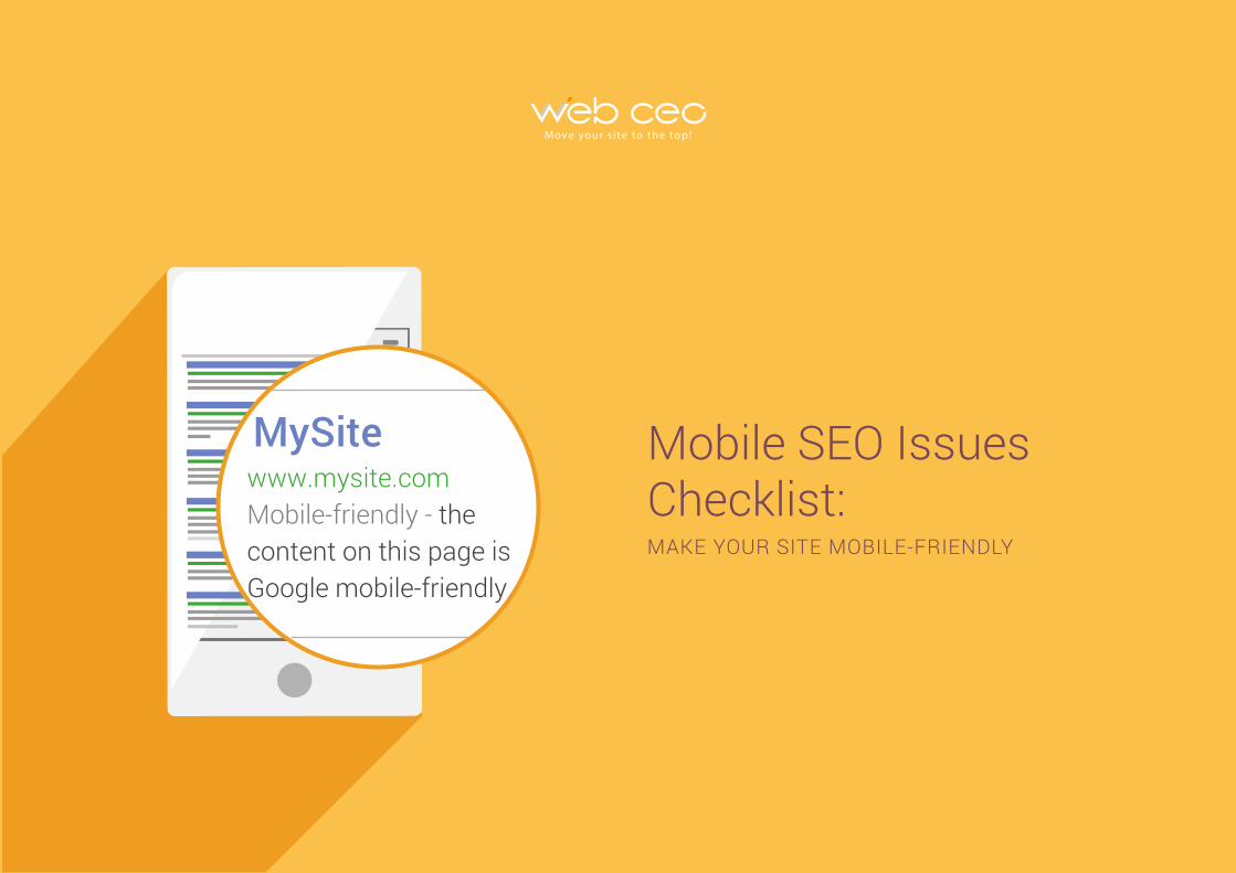
Mobile SEO Issues Checklist:MAKE YOUR SITE MOBILE-FRIENDLY
MySitewww.mysite.com Mobile-friendly - the content on this page is Google mobile-friendly.
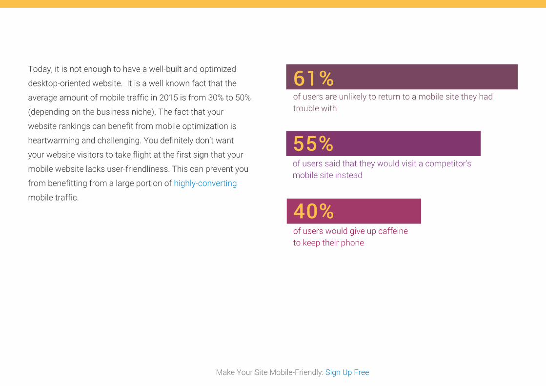
Today, it is not enough to have a well-built and optimized
desktop-oriented website. It is a well known fact that the
average amount of mobile traffic in 2015 is from 30% to 50%
(depending on the business niche). The fact that your
website rankings can benefit from mobile optimization is
heartwarming and challenging. You definitely don’t want
your website visitors to take flight at the first sign that your
mobile website lacks user-friendliness. This can prevent you
from benefitting from a large portion of highly-converting
mobile traffic.
Make Your Site Mobile-Friendly: Sign Up Free
61% of users are unlikely to return to a mobile site they had trouble with
55%of users said that they would visit a competitor's mobile site instead
40%of users would give up caffeine to keep their phone
Make Your Site Mobile-Friendly: Sign Up Free
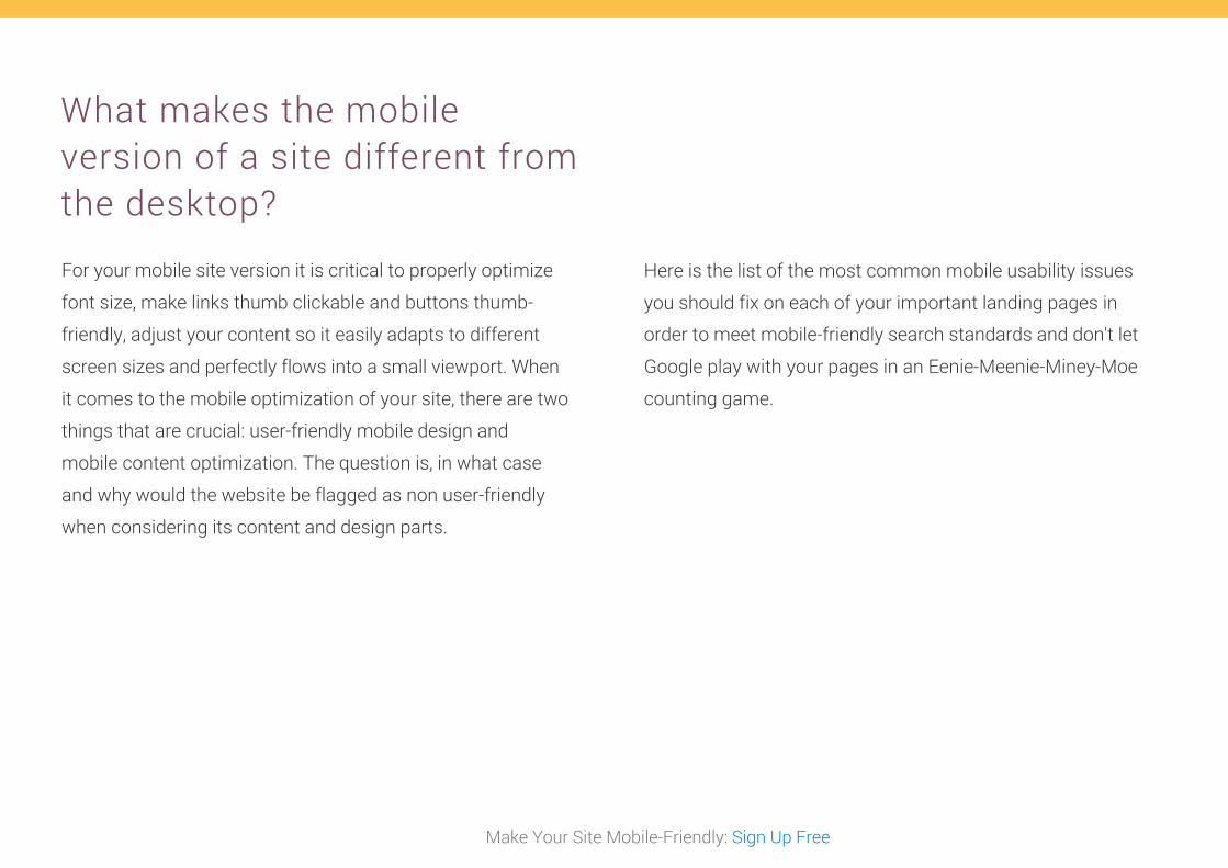
For your mobile site version it is critical to properly optimize
font size, make links thumb clickable and buttons thumb-
friendly, adjust your content so it easily adapts to different
screen sizes and perfectly flows into a small viewport. When
it comes to the mobile optimization of your site, there are two
things that are crucial: user-friendly mobile design and
mobile content optimization. The question is, in what case
and why would the website be flagged as non user-friendly
when considering its content and design parts.
Here is the list of the most common mobile usability issues
you should fix on each of your important landing pages in
order to meet mobile-friendly search standards and don't let
Google play with your pages in an Eenie-Meenie-Miney-Moe
counting game.
What makes the mobile version of a site different from the desktop?
Make Your Site Mobile-Friendly: Sign Up Free
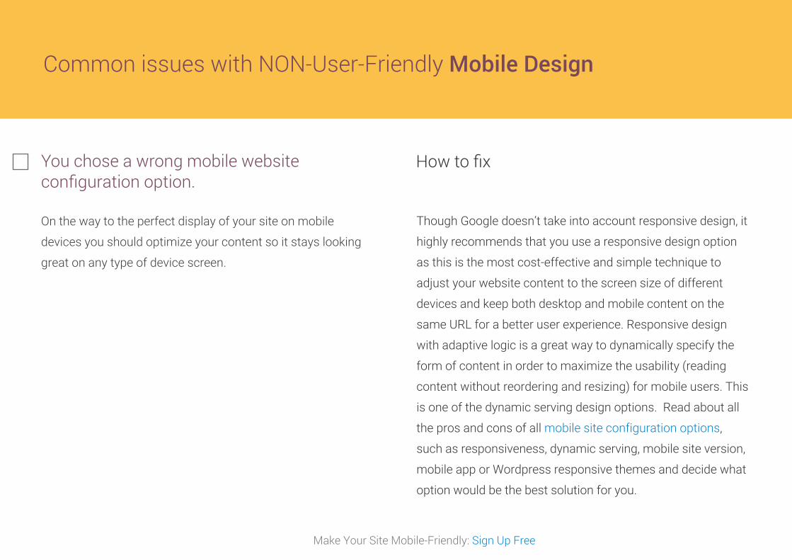
Common issues with NON-User-Friendly Mobile Design
You chose a wrong mobile website configuration option.
On the way to the perfect display of your site on mobile
devices you should optimize your content so it stays looking
great on any type of device screen.
How to fix
Though Google doesn’t take into account responsive design, it
highly recommends that you use a responsive design option
as this is the most cost-effective and simple technique to
adjust your website content to the screen size of different
devices and keep both desktop and mobile content on the
same URL for a better user experience. Responsive design
with adaptive logic is a great way to dynamically specify the
form of content in order to maximize the usability (reading
content without reordering and resizing) for mobile users. This
is one of the dynamic serving design options. Read about all
the pros and cons of all mobile site configuration options,
such as responsiveness, dynamic serving, mobile site version,
mobile app or Wordpress responsive themes and decide what
option would be the best solution for you.
Make Your Site Mobile-Friendly: Sign Up Free
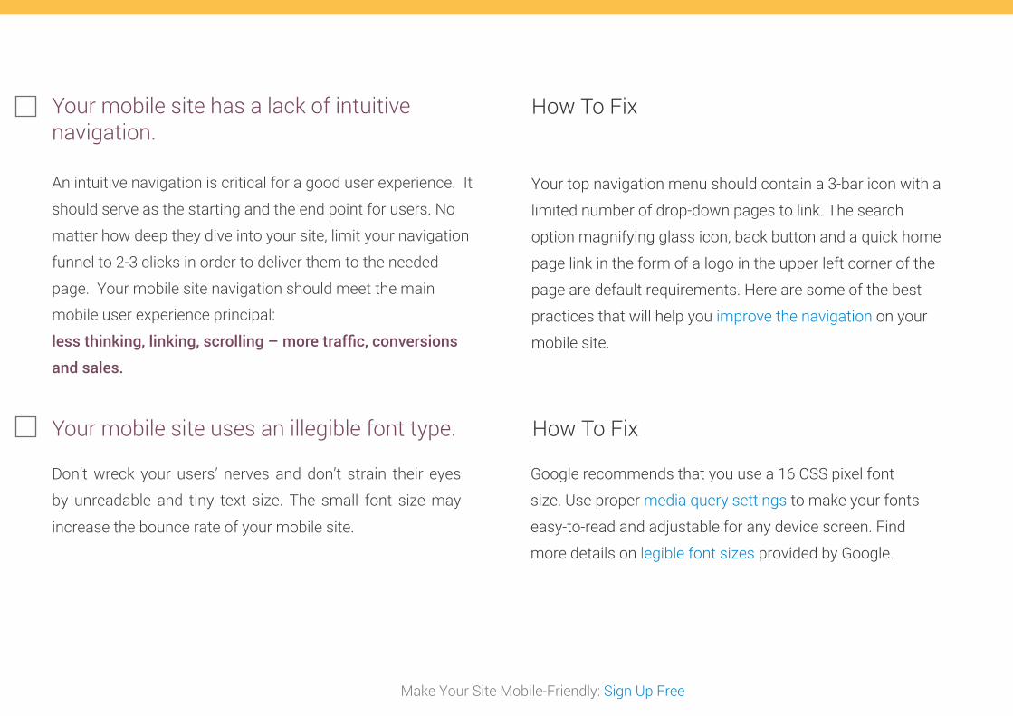
Your mobile site has a lack of intuitive navigation.
An intuitive navigation is critical for a good user experience. It
should serve as the starting and the end point for users. No
matter how deep they dive into your site, limit your navigation
funnel to 2-3 clicks in order to deliver them to the needed
page. Your mobile site navigation should meet the main
mobile user experience principal:
less thinking, linking, scrolling – more traffic, conversions
and sales.
How To Fix
Your top navigation menu should contain a 3-bar icon with a
limited number of drop-down pages to link. The search
option magnifying glass icon, back button and a quick home
page link in the form of a logo in the upper left corner of the
page are default requirements. Here are some of the best
practices that will help you improve the navigation on your
mobile site.
Your mobile site uses an illegible font type.
Don’t wreck your users’ nerves and don’t strain their eyes
by unreadable and tiny text size. The small font size may
increase the bounce rate of your mobile site.
How To Fix
Google recommends that you use a 16 CSS pixel font
size. Use proper media query settings to make your fonts
easy-to-read and adjustable for any device screen. Find
more details on legible font sizes provided by Google.
Make Your Site Mobile-Friendly: Sign Up Free
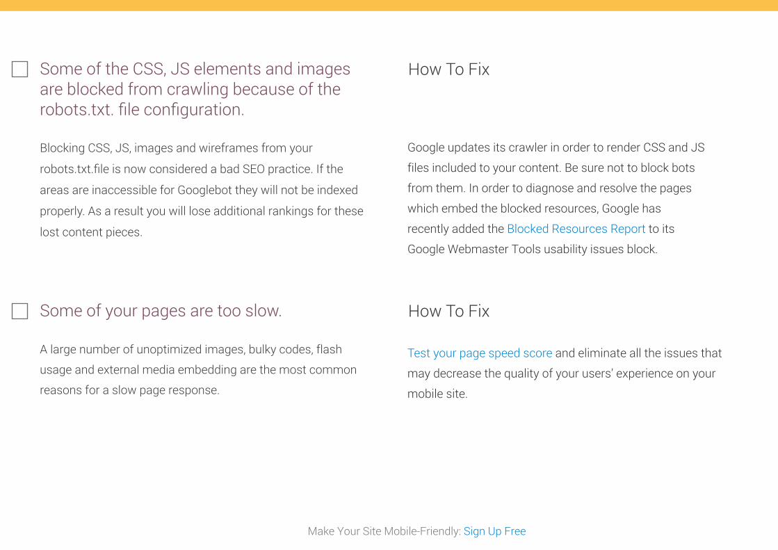
Some of the CSS, JS elements and images are blocked from crawling because of the robots.txt. file configuration.
Blocking CSS, JS, images and wireframes from your
robots.txt.file is now considered a bad SEO practice. If the
areas are inaccessible for Googlebot they will not be indexed
properly. As a result you will lose additional rankings for these
lost content pieces.
How To Fix
Google updates its crawler in order to render CSS and JS
files included to your content. Be sure not to block bots
from them. In order to diagnose and resolve the pages
which embed the blocked resources, Google has
recently added the Blocked Resources Report to its
Google Webmaster Tools usability issues block.
Some of your pages are too slow.
A large number of unoptimized images, bulky codes, flash
usage and external media embedding are the most common
reasons for a slow page response.
How To Fix
Test your page speed score and eliminate all the issues that
may decrease the quality of your users’ experience on your
mobile site.
Make Your Site Mobile-Friendly: Sign Up Free
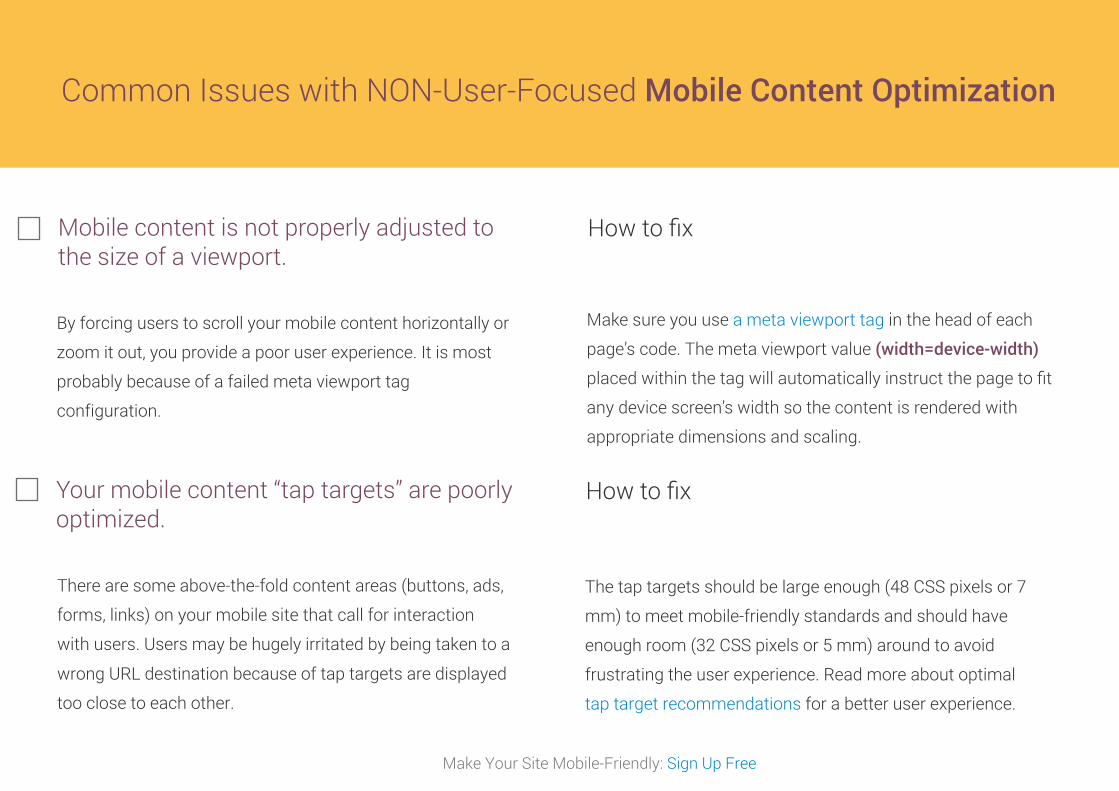
Common Issues with NON-User-Focused Mobile Content Optimization
Mobile content is not properly adjusted to the size of a viewport.
How to fix
Make sure you use a meta viewport tag in the head of each
page’s code. The meta viewport value (width=device-width)
placed within the tag will automatically instruct the page to fit
any device screen’s width so the content is rendered with
appropriate dimensions and scaling.
Your mobile content “tap targets” are poorly optimized.
There are some above-the-fold content areas (buttons, ads,
forms, links) on your mobile site that call for interaction
with users. Users may be hugely irritated by being taken to a
wrong URL destination because of tap targets are displayed
too close to each other.
How to fix
The tap targets should be large enough (48 CSS pixels or 7
mm) to meet mobile-friendly standards and should have
enough room (32 CSS pixels or 5 mm) around to avoid
frustrating the user experience. Read more about optimal
tap target recommendations for a better user experience.
By forcing users to scroll your mobile content horizontally or
zoom it out, you provide a poor user experience. It is most
probably because of a failed meta viewport tag
configuration.
Make Your Site Mobile-Friendly: Sign Up Free
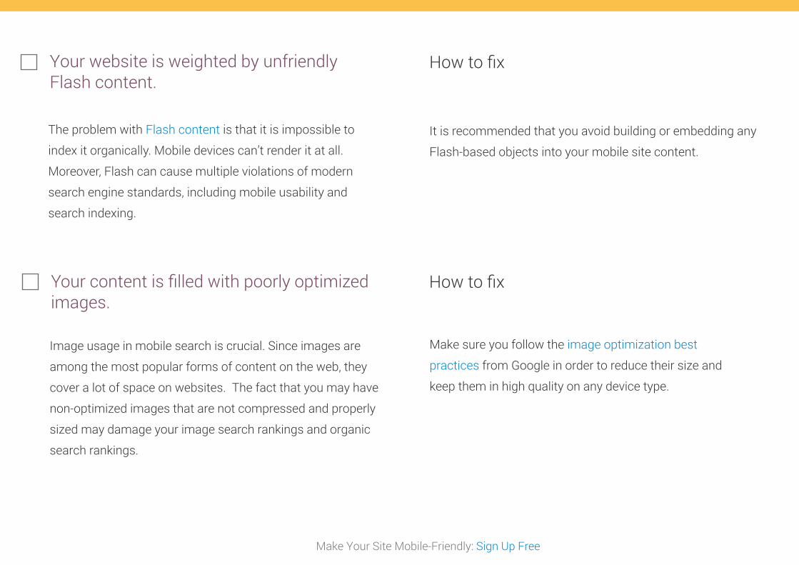
Your website is weighted by unfriendly Flash content.
How to fix
It is recommended that you avoid building or embedding any
Flash-based objects into your mobile site content.
The problem with Flash content is that it is impossible to
index it organically. Mobile devices can’t render it at all.
Moreover, Flash can cause multiple violations of modern
search engine standards, including mobile usability and
search indexing.
Your content is filled with poorly optimized images.
How to fix
Image usage in mobile search is crucial. Since images are
among the most popular forms of content on the web, they
cover a lot of space on websites. The fact that you may have
non-optimized images that are not compressed and properly
sized may damage your image search rankings and organic
search rankings.
Make sure you follow the image optimization best
practices from Google in order to reduce their size and
keep them in high quality on any device type.
Make Your Site Mobile-Friendly: Sign Up Free
Your mobile site has too many non-optimized and time-consuming redirects.
How to fix
Time-consuming redirect lag times between user-agent and
web server may add extra seconds to load a page. For the best
mobile user experience, we recommend that you get rid of all
the redirects. You will be very lucky if a user that landed on
your site has good patience and a good temper. Learn more
about mobile redirect optimization here.
The mobile usability and page speed score of your
site can be negatively affected by excessive usage of
redirects. The worst scenario of using multiple
redirect chains is the high bounce rate of your
website. There are 3 types of redirects:
Canonical redirects –
mysite.com >> www.mysite.com
Secure page redirects –
http://www.mysite.com >> https://www.mysite.com
Mobile version redirects –
http://www.mysite.com >> http://m.example.com
site
Use a “Desktop (PC) site” (instead of “Full site”) link in the code
of mobile pages of your site to provide users with optional
access to a desktop version, because it may contain more
information and provide a better user experience for those
who choose this option.
Keep calls-to-actions centered and at the front. Test them
on various types of mobile devices. Ideally, the screen
should not be zoomed in so the mobile user could have a
full view of a lengthy call-to-action button.
Make click-to-call buttons (for Skype or phone numbers)
visible and easy-to-tap on your mobile site. This may increase
your conversion rate.
Compression of images can minimize the size of uploaded
files, which makes the page easier and its speed optimal.
Conduct detailed mobile-focused keyword research using the
Mobile Trends Data from the Google Keyword Planner in
combination with the Top Mobile Search Queries report of
your Google Webmaster Tools account.
Segment your targeted terms into 2 categories (desktop and
mobile) and start tracking your mobile vs desktop rankings in
order to take note of any fluctuations. Do side-by-side
monitoring of your competitive mobile rankings. As soon as
you notice any positive or negative changes, update your
mobile optimization strategy to overperform your competition
in mobile search.
Since Google no longer shows the actual page URL on
mobile search results but provides searchers with
breadcrumb-like URLs it would be a good SEO practice to
structure your displayed page URLs with the help of
schema.org to make them clean and descriptive.
Design and SEO recommendations for being mobile-friendly after the apocalypse.
Make Your Site Mobile-Friendly: Sign Up Free
1.
2.
3.
4.
5.
6.
7.
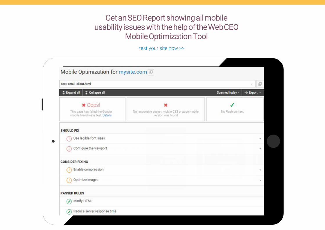
Get an SEO Report showing all mobile usability issues with the help of the Web CEO
Mobile Optimization Tooltest your site now >>
Follow us on social media
+
Have any questions?
LIVE CHAT
MAKE YOUR SITE MOBILE-FRIENDLY


![[Infographic] WordPress SEO Checklist](https://img.pdfslide.us/doc/110x75/55cba668bb61eb951b8b45d6/infographic-wordpress-seo-checklist.jpg)