Embed Size (px)
Citation preview
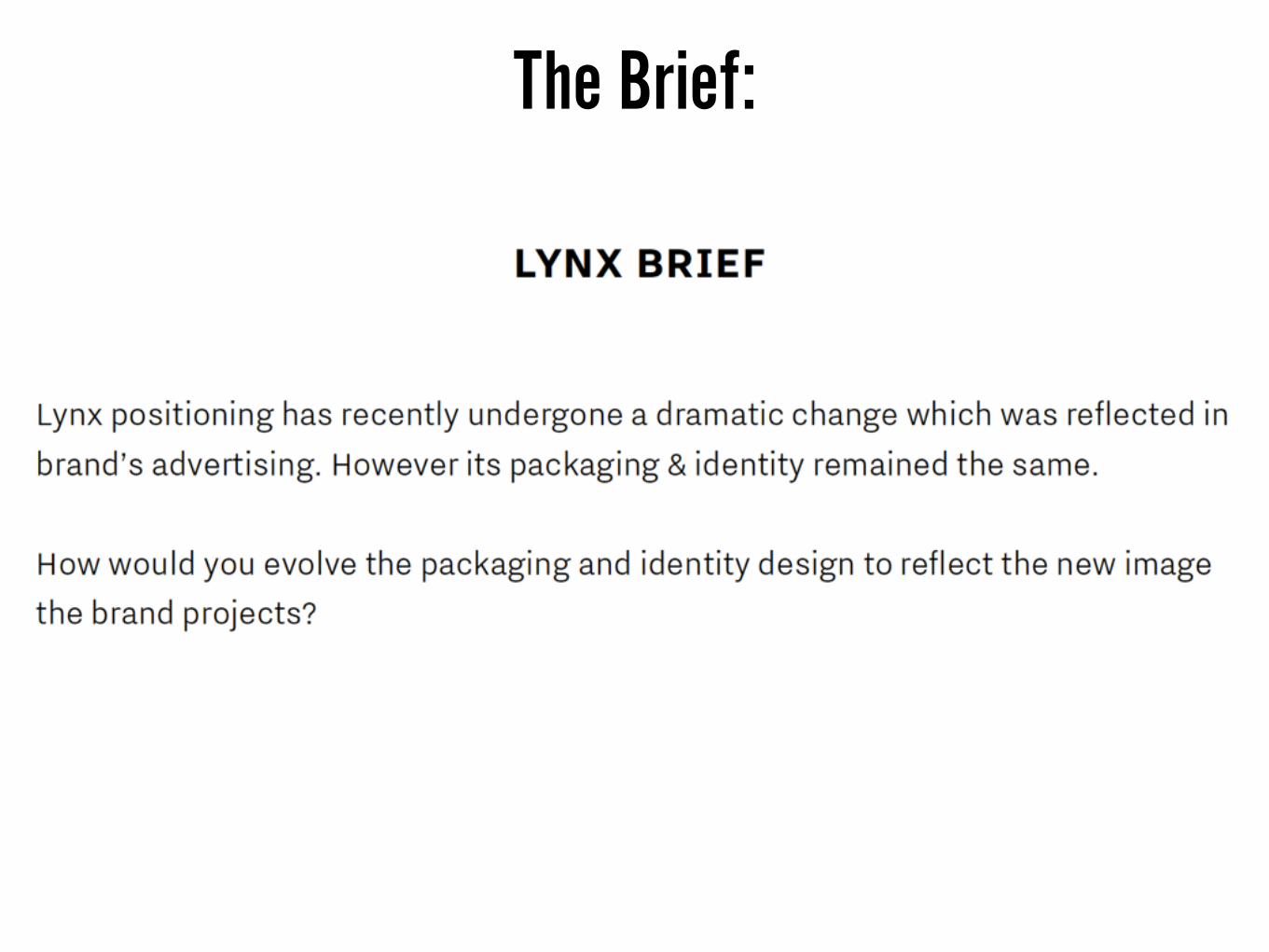
The Brief:

The most recent packaging design.
Created by PB Creative at the beginning of 2016.
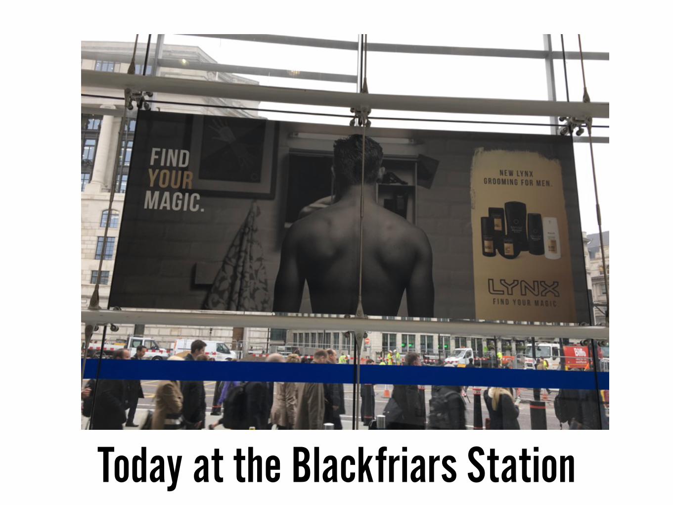
Today at the Blackfriars Station
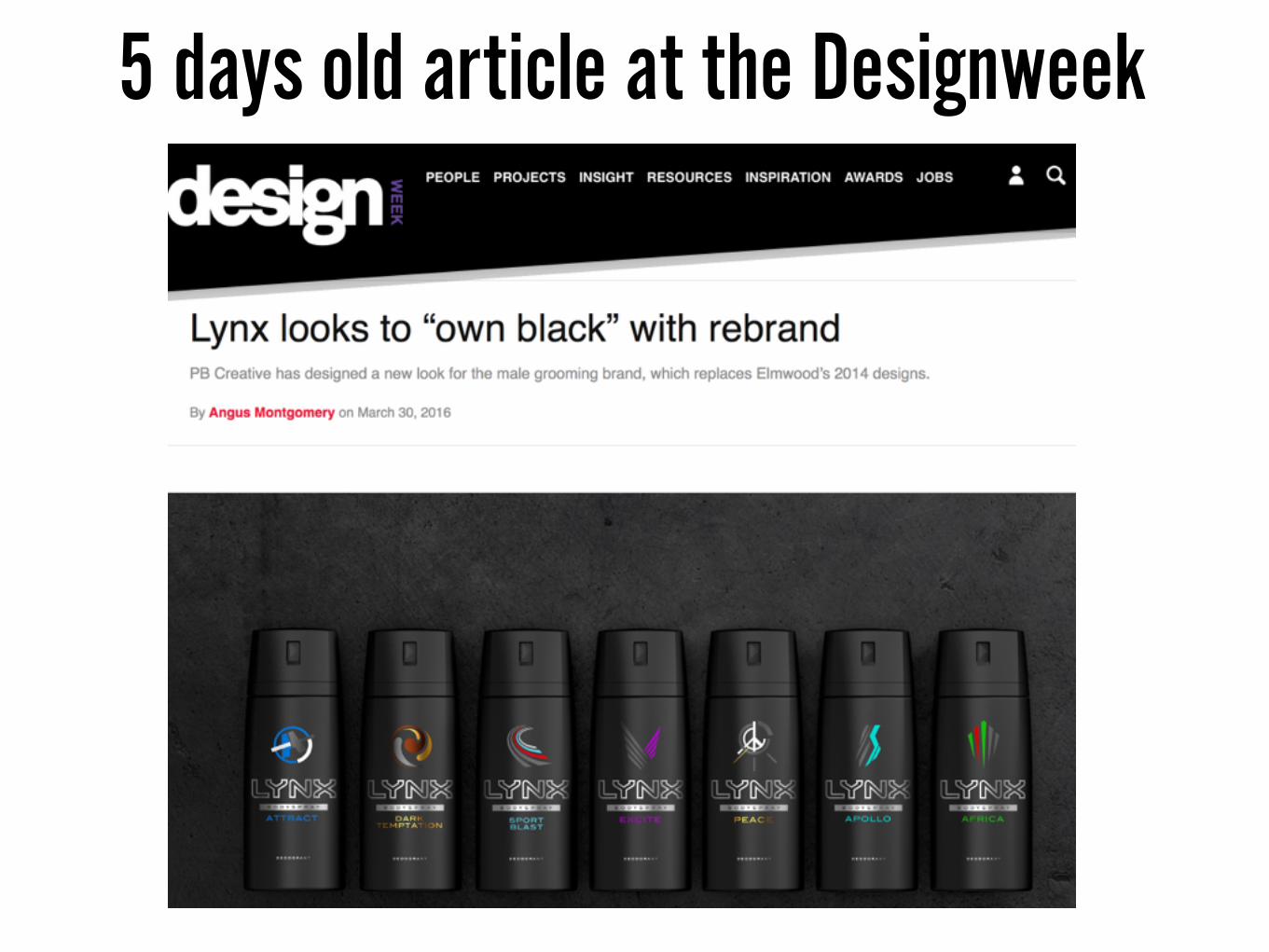
5 days old article at the Designweek

A TWIST:
THIS IS GOING TO BE A PRESENTATION ABOUT
LYNX CURRENT PACKAGING DESIGN (2016)
WHAT HAS IMPROVED AND WHAT WENT SOUTH
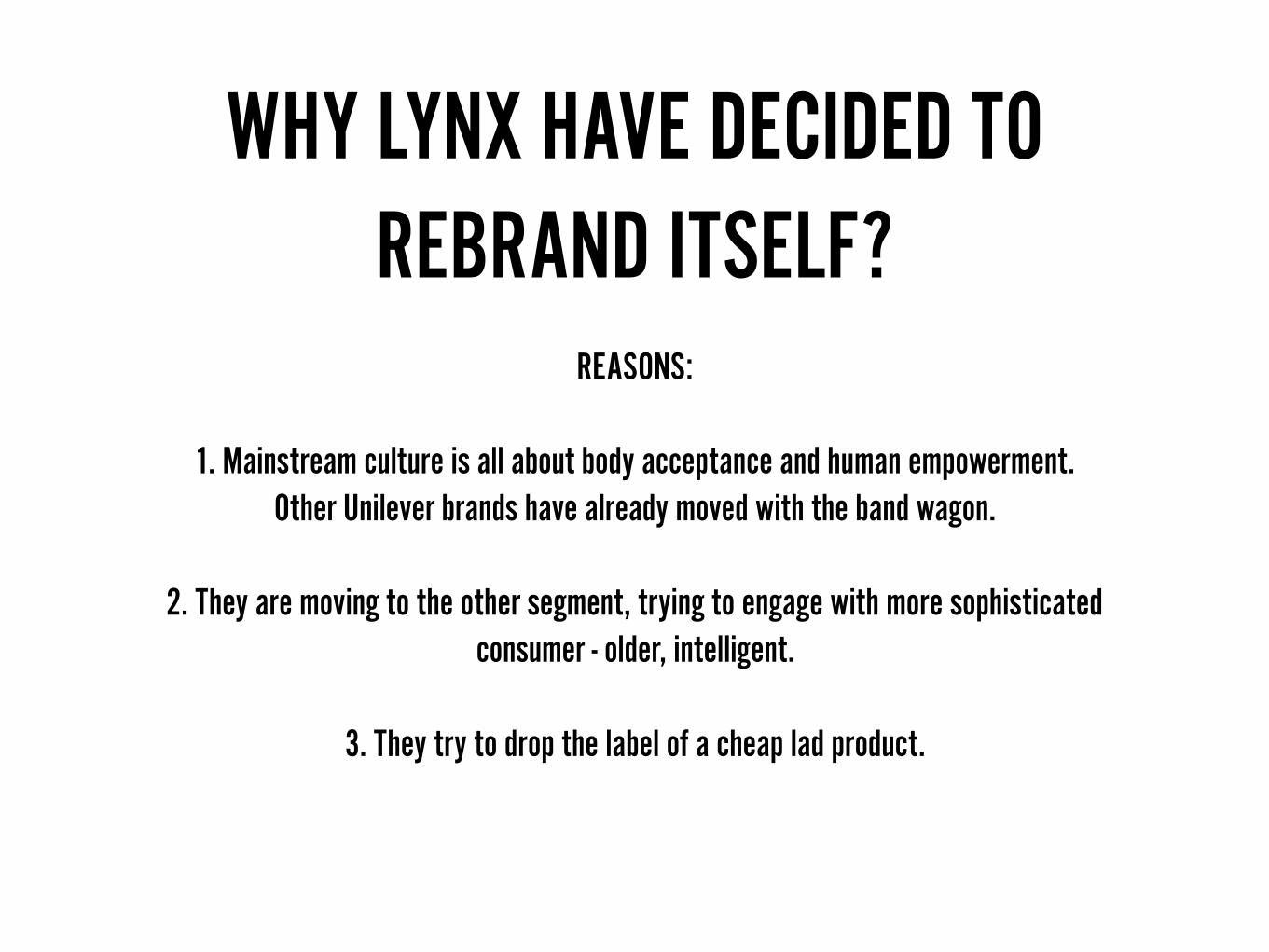
WHY LYNX HAVE DECIDED TO REBRAND ITSELF?
REASONS:
1. Mainstream culture is all about body acceptance and human empowerment. Other Unilever brands have already moved with the band wagon.
2. They are moving to the other segment, trying to engage with more sophisticated consumer - older, intelligent.
3. They try to drop the label of a cheap lad product.
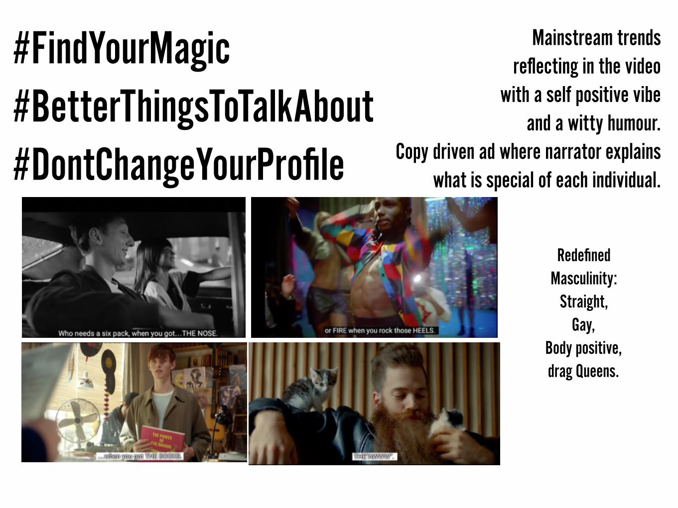
#FindYourMagic #BetterThingsToTalkAbout #DontChangeYourProfile
Mainstream trends reflecting in the video
with a self positive vibe and a witty humour.
Copy driven ad where narrator explains what is special of each individual.
Redefined Masculinity:
Straight, Gay,
Body positive, drag Queens.

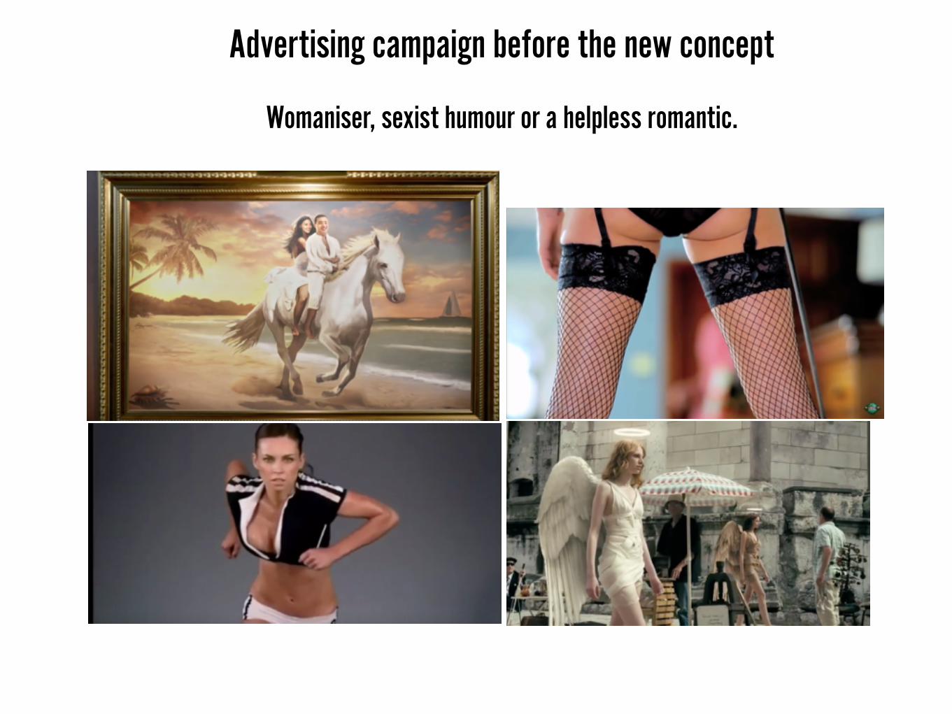
Advertising campaign before the new concept
Womaniser, sexist humour or a helpless romantic.
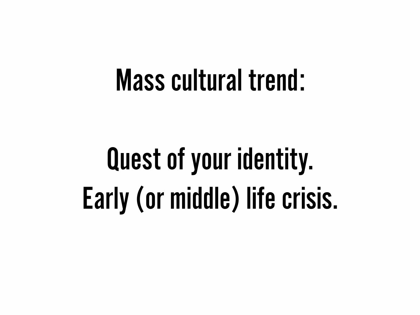
Mass cultural trend:
Quest of your identity. Early (or middle) life crisis.
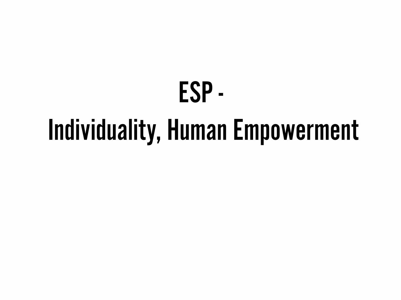
ESP - Individuality, Human Empowerment

BEFORE:
The current trend was
all about extreme sports, masculinity,
aggressiveness, superpower,
x-men.
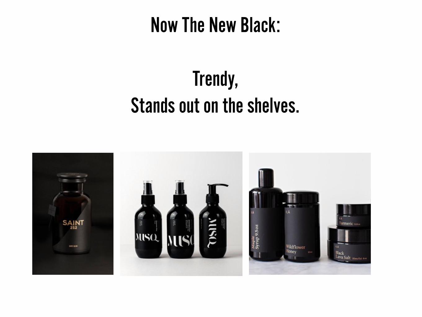
Now The New Black:
Trendy, Stands out on the shelves.

Visually stands out from the shelves.
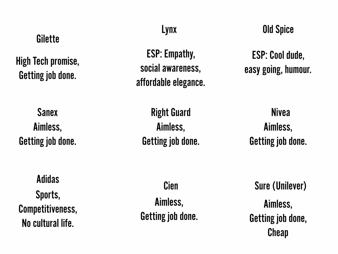
GiletteOld Spice
Sure (Unilever)Adidas
Cien
Lynx
Right GuardSanex Nivea
ESP: Cool dude, easy going, humour.
ESP: Empathy, social awareness,
affordable elegance.
Aimless, Getting job done.
Aimless, Getting job done,
Cheap
Aimless, Getting job done.
Aimless, Getting job done.
Aimless, Getting job done.
High Tech promise, Getting job done.
Sports, Competitiveness, No cultural life.
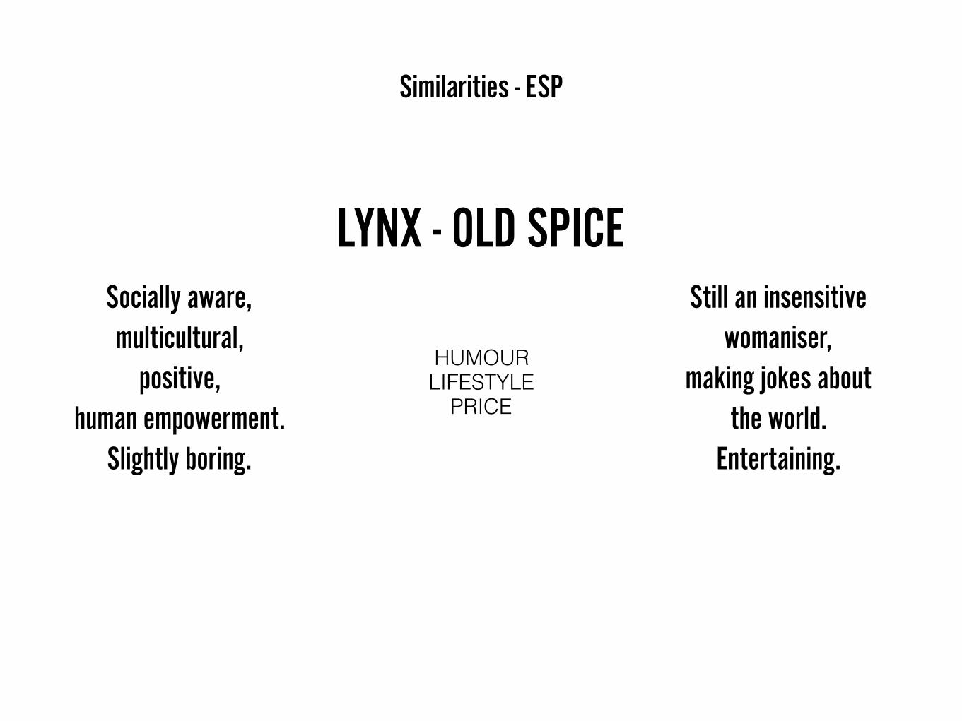
LYNX - OLD SPICE
HUMOUR LIFESTYLE
PRICE
Similarities - ESP
Still an insensitive womaniser,
making jokes about the world.
Entertaining.
Socially aware, multicultural,
positive, human empowerment.
Slightly boring.

Cheap, Lad orientated.Middle class,
easily accessible product.
————->
1983-2014 Now(2016) 2017
Higher income, Better educated,
Empathetic.
Appeal of a womaniser, Getting laid,
Sexist humour, Aggressive, Superficial,
Rude.
LYNX Brand evolution
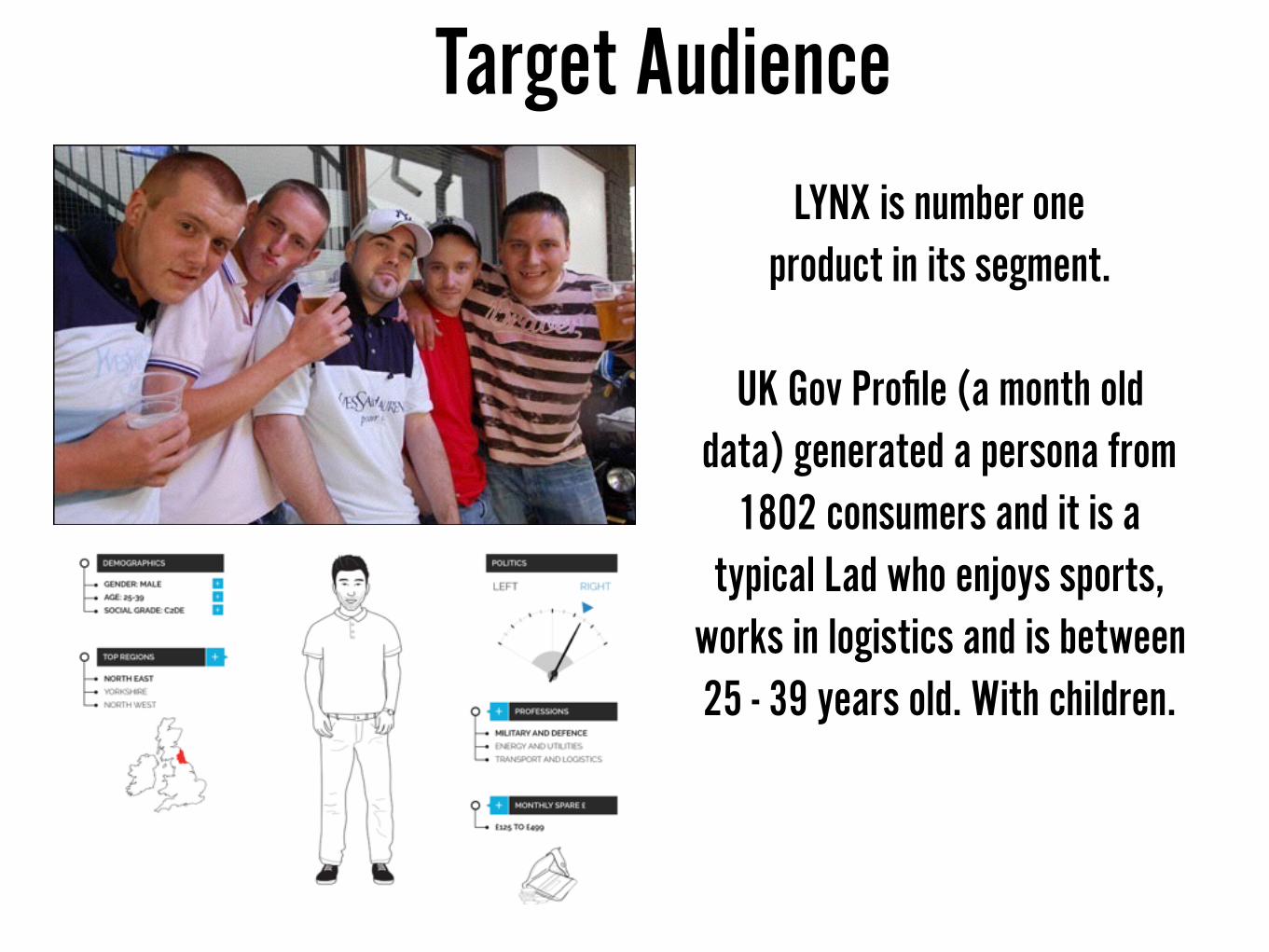
Target Audience
LYNX is number one product in its segment.
UK Gov Profile (a month old data) generated a persona from
1802 consumers and it is a typical Lad who enjoys sports,
works in logistics and is between 25 - 39 years old. With children.
Why lads would buy a hipster product?
1. Lads have feelings too, which they are not prone to talk about. (#biggerproblems - social campaign by Lynx emphasising to the discussion about male
suicides)
2. Lads have body image issues, they are bold and heavy around the waist line. They want to feel confident too.
(#dontchangeyourprofile - a hashtag created after their latest individuality ad)
3. Lads don't want a lifestyle advice from other lads, they would trust a stylish young person because ‘he knows his thing’.
(LYNX tutorials with Google on how to style your hair)
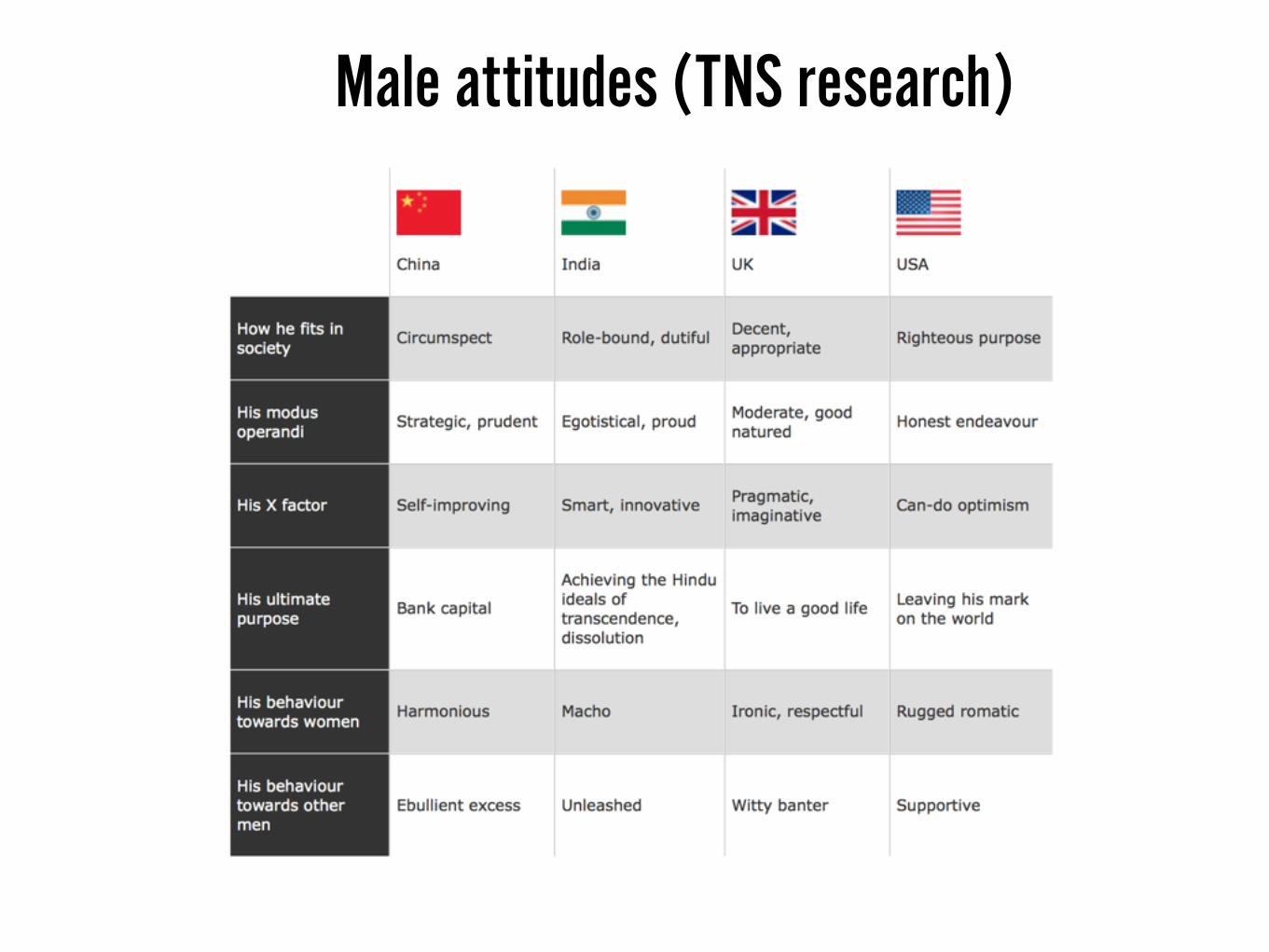
Male attitudes (TNS research)

Is there is a new segment that Lynx is reaching out? Maybe it in this Economy they are dropping off the cheap product feel and becoming a solution for someone
poor who has a taste? A student who can not afford the luxury fragrance? Is it a Flagship move?
A £6 pounds spray that improves the feel of the rest of brand’s products?

Attempt to create an association with a luxury feel (flagship product). Bringing the quality feel to the super market shelves among other one pound deodorants.

How Current Packaging could reflect the new brand image better?
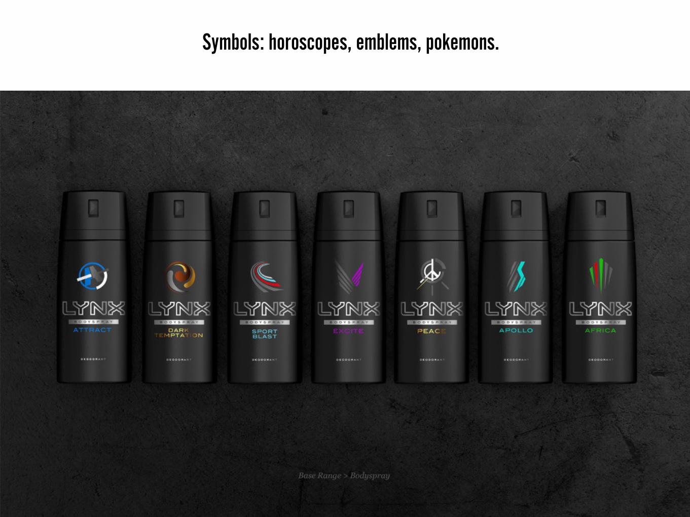
Symbols: horoscopes, emblems, pokemons.

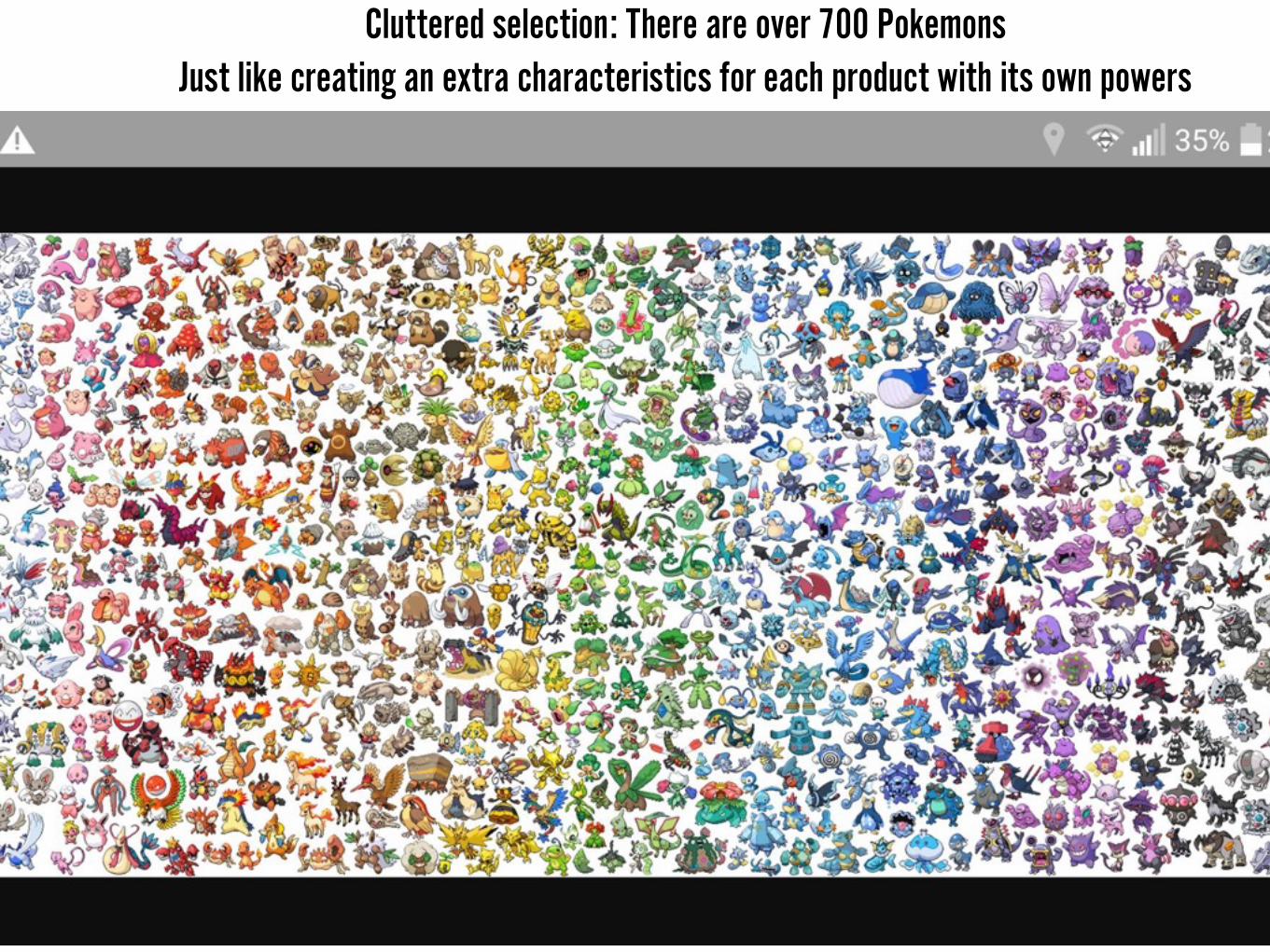
Cluttered selection: There are over 700 Pokemons Just like creating an extra characteristics for each product with its own powers
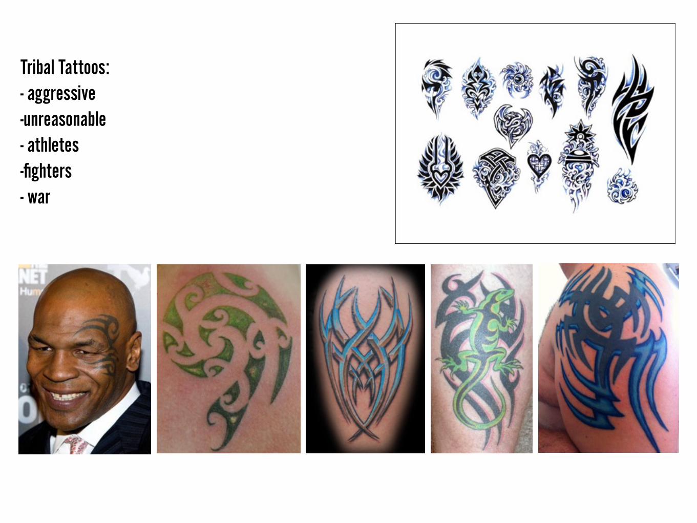
Tribal Tattoos: - aggressive -unreasonable - athletes -fighters - war
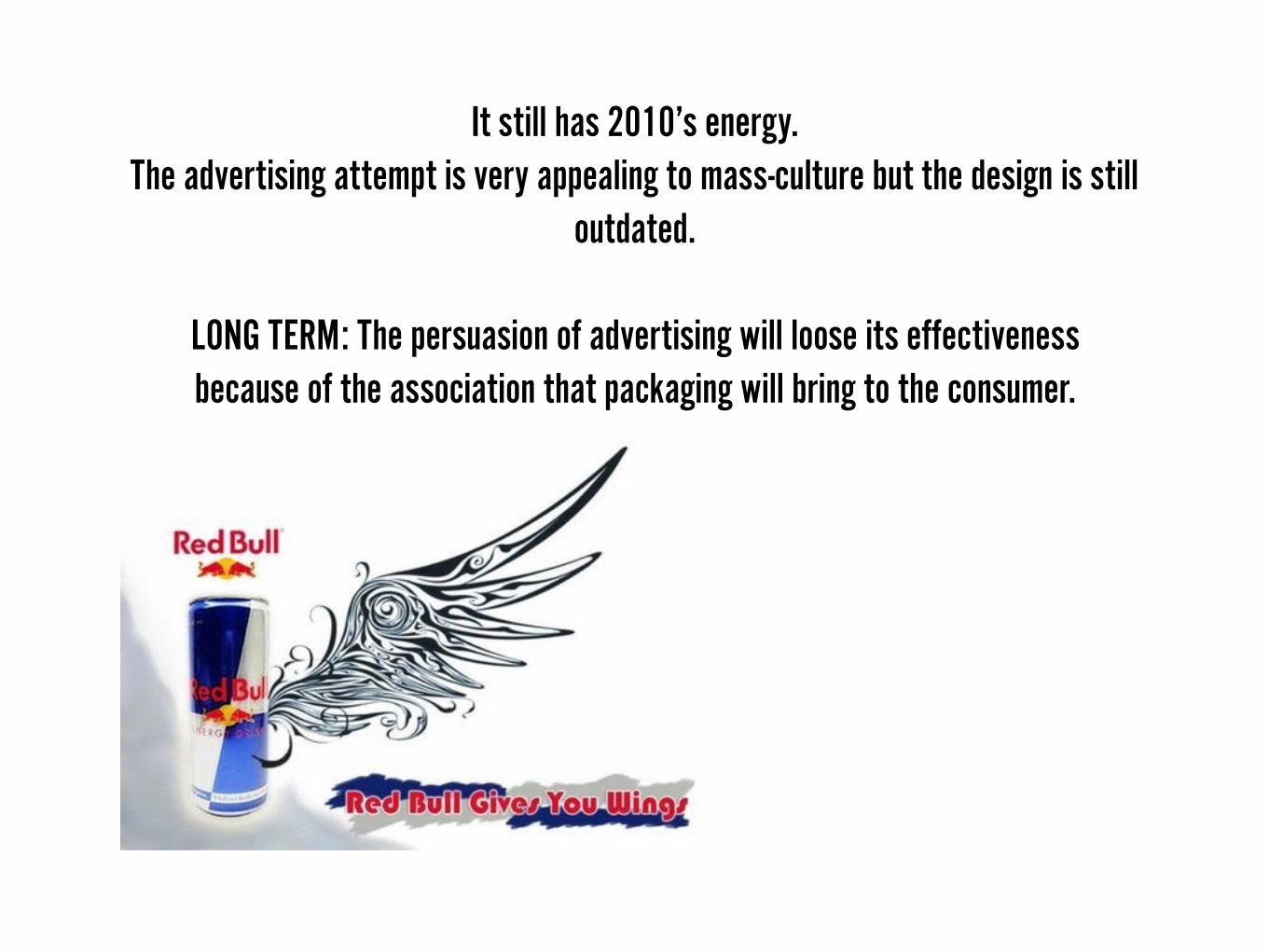
It still has 2010’s energy. The advertising attempt is very appealing to mass-culture but the design is still
outdated.
LONG TERM: The persuasion of advertising will loose its effectiveness because of the association that packaging will bring to the consumer.
PROBLEM: Cluttered design. Primitive interpretation of ‘Find Your Magic’ concept.
Individuality expressed as tiny icons with special powers.
Contradicts with brand image of maturity, social awareness, quietness, human empathy.

Thank You