Embed Size (px)
Citation preview

#SMX #21A @itsleslieto
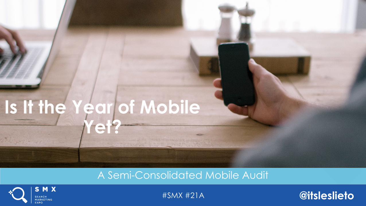
A Semi-Consolidated Mobile Audit
Is It the Year of Mobile Yet?
#SMX #21A @itsleslieto
A Semi-Consolidated Mobile Audit
Is It the Year of Mobile Yet?
#SMX #21A @itsleslieto
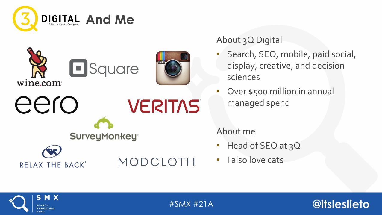
About 3Q Digital
• Search, SEO, mobile, paid social, display, creative, and decision sciences
• Over $500 million in annual managed spend
About me• Head of SEO at 3Q
• I also love cats
And Me
#SMX #21A @itsleslieto
Configuration-Agnostic Mobile AuditingConfiguration-Based Auditing Schema
Separate URLsDynamic ServingResponsive
Agenda
#SMX #21A @itsleslieto
Configuration-Agnostic Mobile AuditingConfiguration-Based Auditing Schema
Separate URLsDynamic ServingResponsive
Agenda
#SMX #21A @itsleslieto
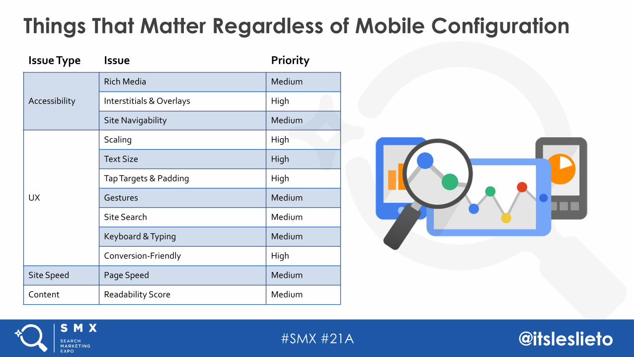
Things That Matter Regardless of Mobile ConfigurationIssue Type Issue Priority
Accessibility
Rich Media Medium
Interstitials & Overlays High
Site Navigability Medium
UX
Scaling High
Text Size High
Tap Targets & Padding High
Gestures Medium
Site Search Medium
Keyboard & Typing Medium
Conversion-Friendly High
Site Speed Page Speed Medium
Content Readability Score Medium
#SMX #21A @itsleslieto
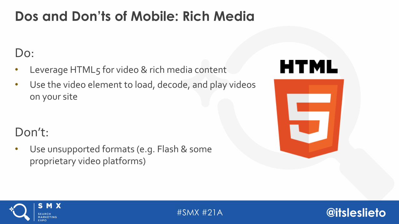
Do: • Leverage HTML5 for video & rich media content
• Use the video element to load, decode, and play videos on your site
Don’t:• Use unsupported formats (e.g. Flash & some
proprietary video platforms)
Dos and Don’ts of Mobile: Rich Media
#SMX #21A @itsleslieto
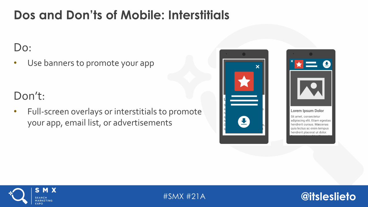
Do: • Use banners to promote your app
Don’t:• Full-screen overlays or interstitials to promote
your app, email list, or advertisements
Dos and Don’ts of Mobile: Interstitials
#SMX #21A @itsleslieto
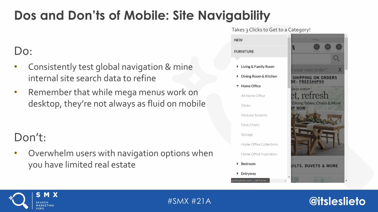
Do: • Consistently test global navigation & mine
internal site search data to refine• Remember that while mega menus work on
desktop, they’re not always as fluid on mobile
Don’t:• Overwhelm users with navigation options when
you have limited real estate
Dos and Don’ts of Mobile: Site Navigability Takes 3 Clicks to Get to a Category!
#SMX #21A @itsleslieto
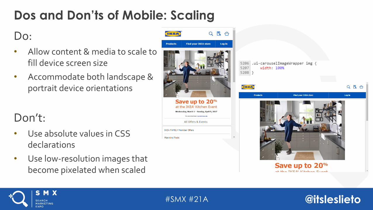
Do: • Allow content & media to scale to
fill device screen size• Accommodate both landscape &
portrait device orientations
Don’t:• Use absolute values in CSS
declarations• Use low-resolution images that
become pixelated when scaled
Dos and Don’ts of Mobile: Scaling
#SMX #21A @itsleslieto
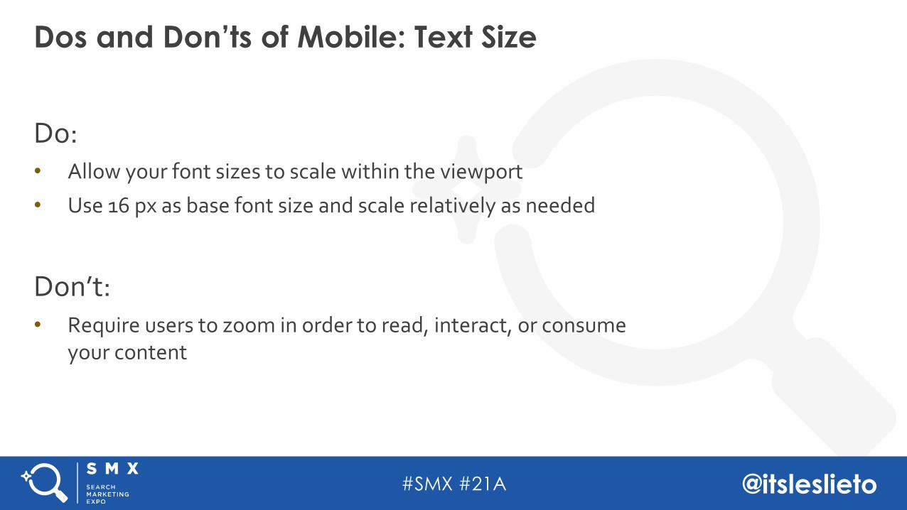
Do: • Allow your font sizes to scale within the viewport
• Use 16 px as base font size and scale relatively as needed
Don’t:• Require users to zoom in order to read, interact, or consume
your content
Dos and Don’ts of Mobile: Text Size
#SMX #21A @itsleslieto
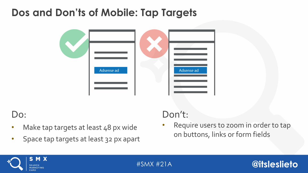
Do: • Make tap targets at least 48 px wide
• Space tap targets at least 32 px apart
Dos and Don’ts of Mobile: Tap Targets
Don’t:• Require users to zoom in order to tap
on buttons, links or form fields
#SMX #21A @itsleslieto
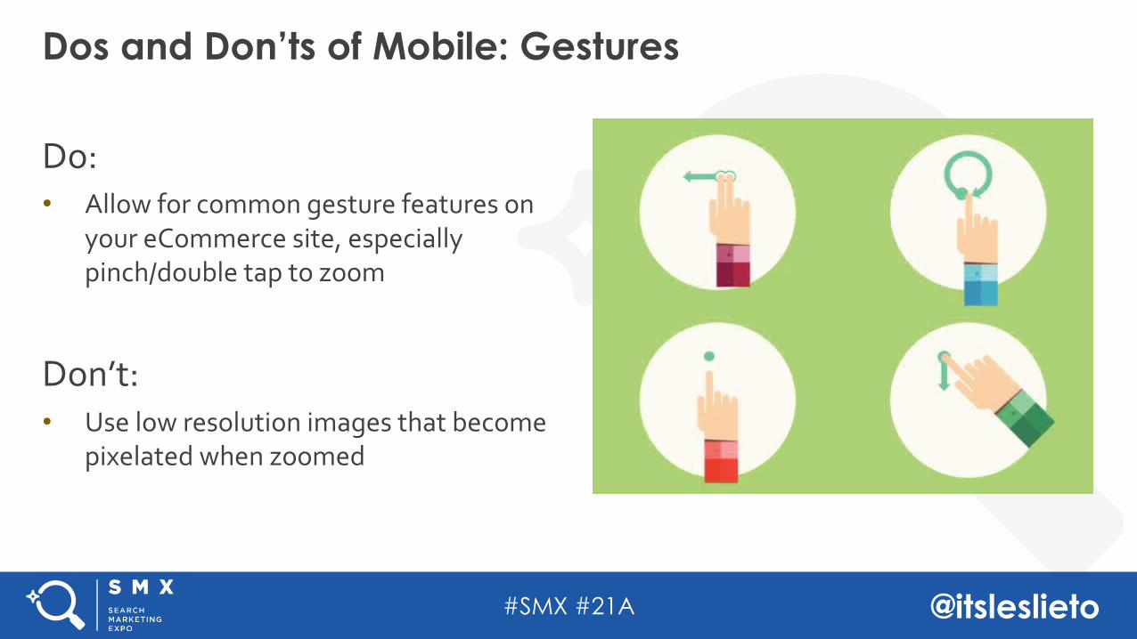
Do: • Allow for common gesture features on
your eCommerce site, especially pinch/double tap to zoom
Don’t:• Use low resolution images that become
pixelated when zoomed
Dos and Don’ts of Mobile: Gestures
#SMX #21A @itsleslieto
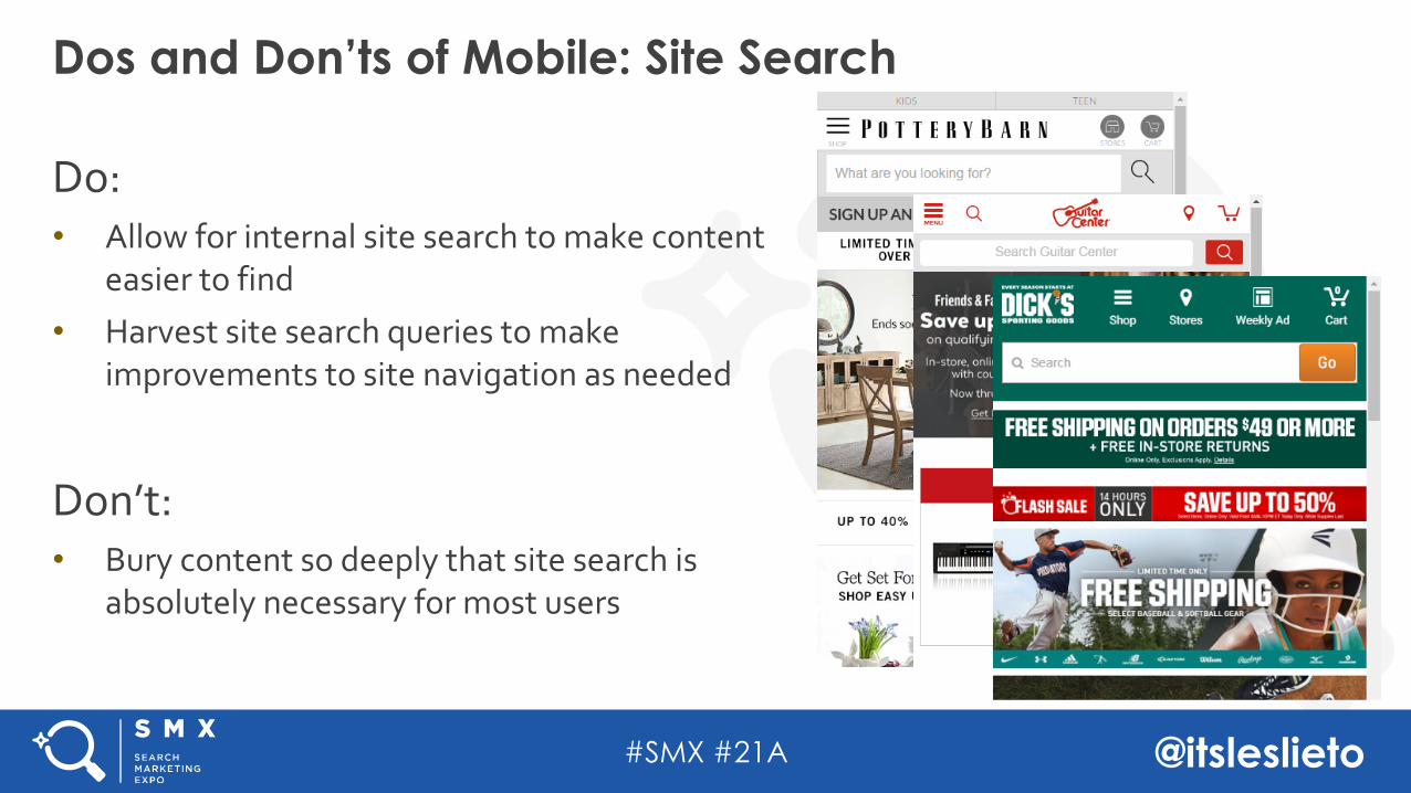
Do: • Allow for internal site search to make content
easier to find • Harvest site search queries to make
improvements to site navigation as needed
Don’t:• Bury content so deeply that site search is
absolutely necessary for most users
Dos and Don’ts of Mobile: Site Search
#SMX #21A @itsleslieto
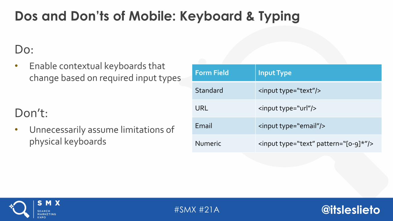
Do: • Enable contextual keyboards that
change based on required input types
Don’t:• Unnecessarily assume limitations of
physical keyboards
Dos and Don’ts of Mobile: Keyboard & Typing
Form Field Input Type
Standard <input type=“text”/>
URL <input type=“url”/>
Email <input type=“email”/>
Numeric <input type=“text” pattern=“[0-9]*”/>
#SMX #21A @itsleslieto
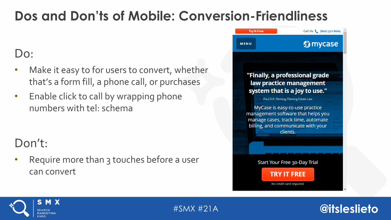
Do: • Make it easy to for users to convert, whether
that’s a form fill, a phone call, or purchases• Enable click to call by wrapping phone
numbers with tel: schema
Don’t:• Require more than 3 touches before a user
can convert
Dos and Don’ts of Mobile: Conversion-Friendliness
#SMX #21A @itsleslieto
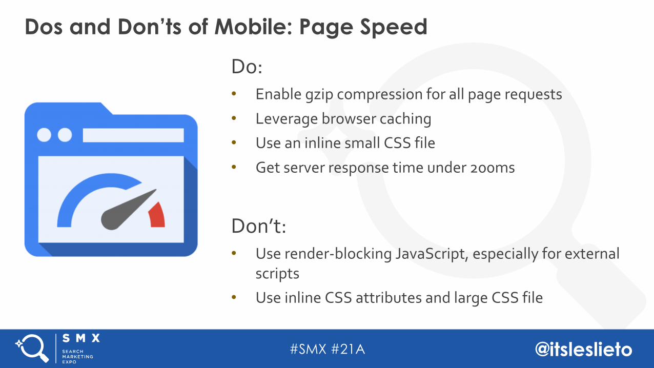
Do: • Enable gzip compression for all page requests
• Leverage browser caching• Use an inline small CSS file
• Get server response time under 200ms
Don’t:• Use render-blocking JavaScript, especially for external
scripts• Use inline CSS attributes and large CSS file
Dos and Don’ts of Mobile: Page Speed
#SMX #21A @itsleslieto
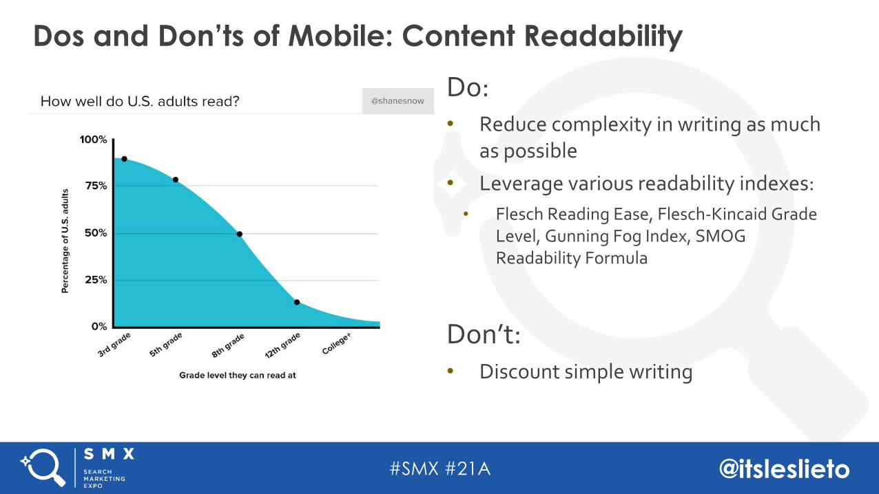
Do: • Reduce complexity in writing as much
as possible• Leverage various readability indexes: • Flesch Reading Ease, Flesch-Kincaid Grade
Level, Gunning Fog Index, SMOG Readability Formula
Don’t:• Discount simple writing
Dos and Don’ts of Mobile: Content Readability
#SMX #21A @itsleslieto
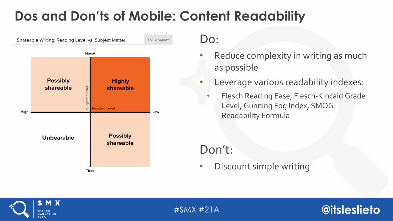
Do: • Reduce complexity in writing as much
as possible• Leverage various readability indexes: • Flesch Reading Ease, Flesch-Kincaid Grade
Level, Gunning Fog Index, SMOG Readability Formula
Don’t:• Discount simple writing
Dos and Don’ts of Mobile: Content Readability
#SMX #21A @itsleslieto
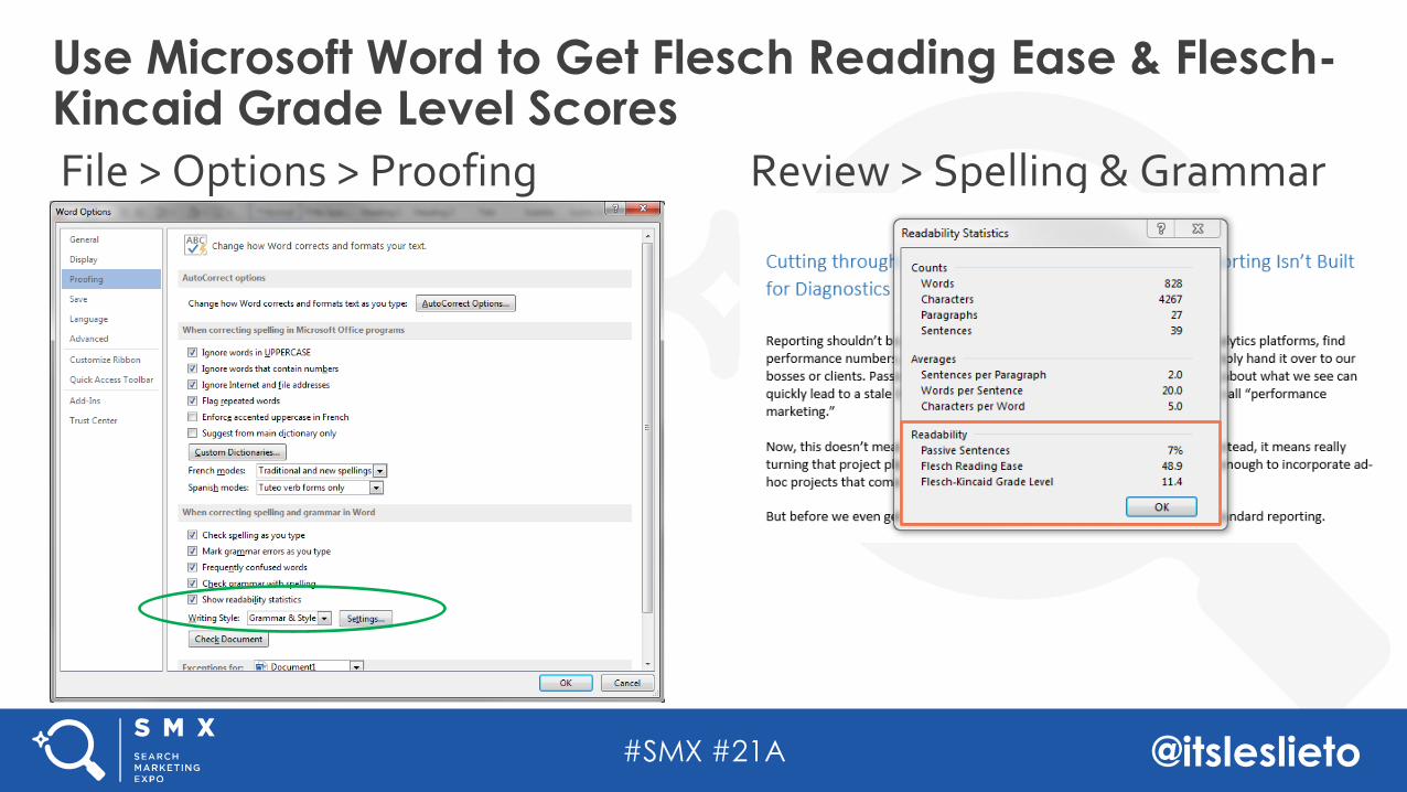
File > Options > Proofing
Use Microsoft Word to Get Flesch Reading Ease & Flesch-Kincaid Grade Level Scores
Review > Spelling & Grammar
#SMX #21A @itsleslieto
Configuration-Agnostic Mobile AuditingConfiguration-Based Auditing Schema
Separate URLsDynamic ServingResponsive
Agenda
#SMX #21A @itsleslieto
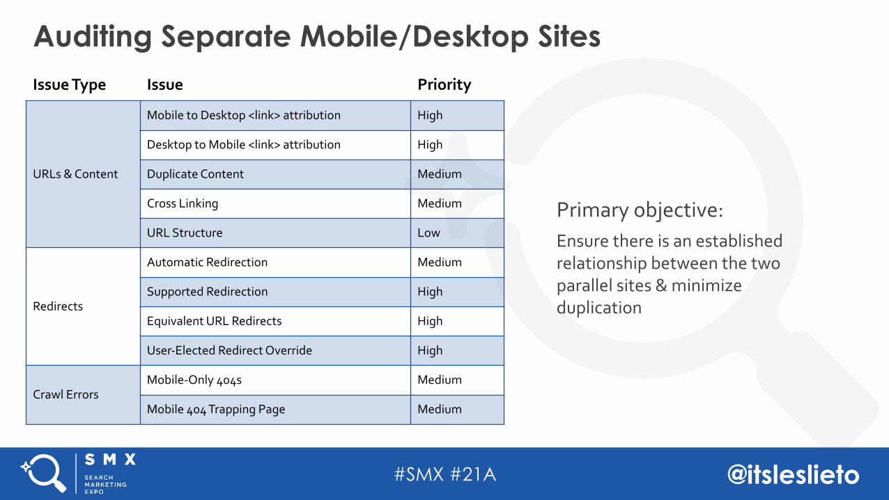
Primary objective: Ensure there is an established relationship between the two parallel sites & minimize duplication
Auditing Separate Mobile/Desktop Sites Issue Type Issue Priority
URLs & Content
Mobile to Desktop <link> attribution High
Desktop to Mobile <link> attribution High
Duplicate Content Medium
Cross Linking Medium
URL Structure Low
Redirects
Automatic Redirection Medium
Supported Redirection High
Equivalent URL Redirects High
User-Elected Redirect Override High
Crawl ErrorsMobile-Only 404s Medium
Mobile 404 Trapping Page Medium
#SMX #21A @itsleslieto
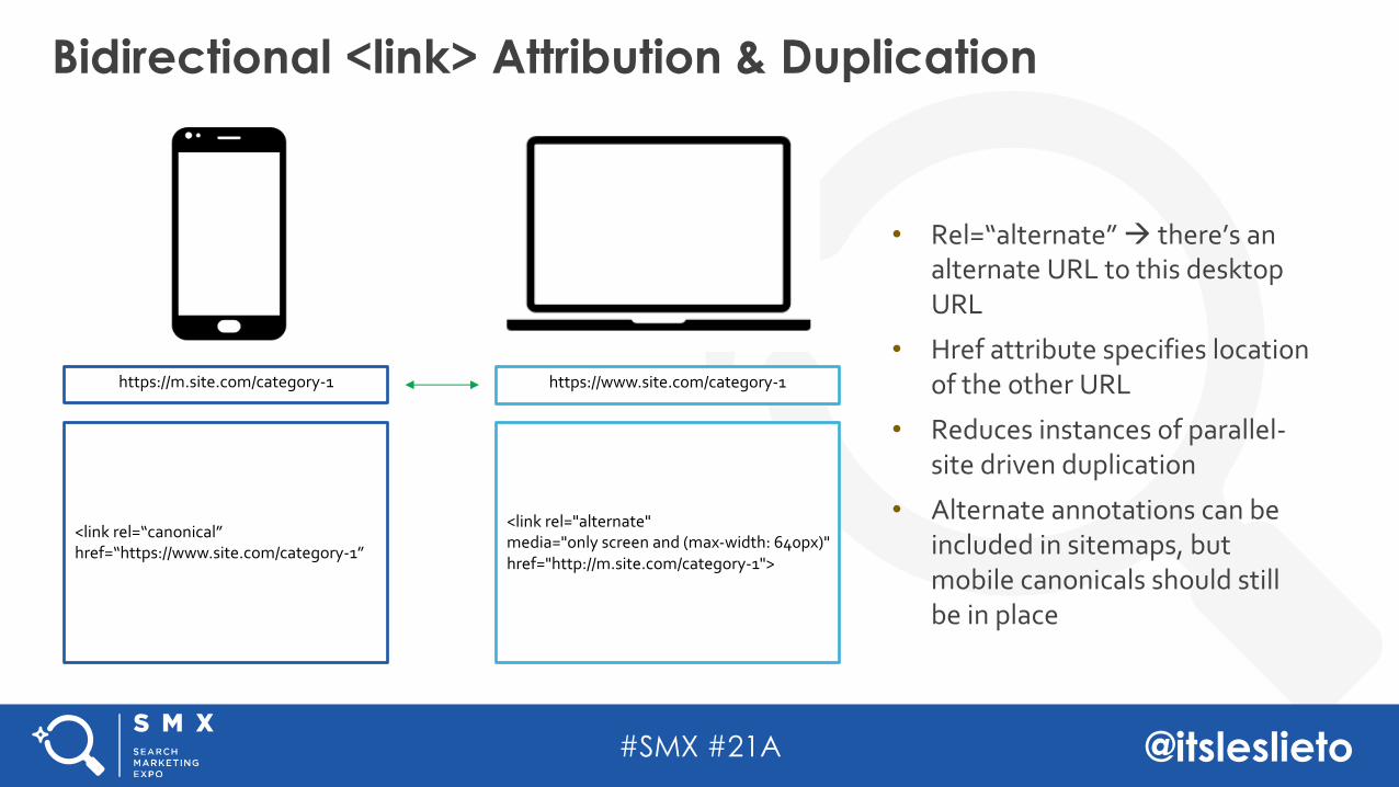
• Rel=“alternate” à there’s an alternate URL to this desktop URL
• Href attribute specifies location of the other URL
• Reduces instances of parallel-site driven duplication
• Alternate annotations can be included in sitemaps, but mobile canonicals should still be in place
Bidirectional <link> Attribution & Duplication
https://www.site.com/category-1
<link rel=“canonical” href=“https://www.site.com/category-1”
<link rel="alternate" media="only screen and (max-width: 640px)"href="http://m.site.com/category-1">
https://m.site.com/category-1
#SMX #21A @itsleslieto
But What About Mobile First?
#SMX #21A @itsleslieto
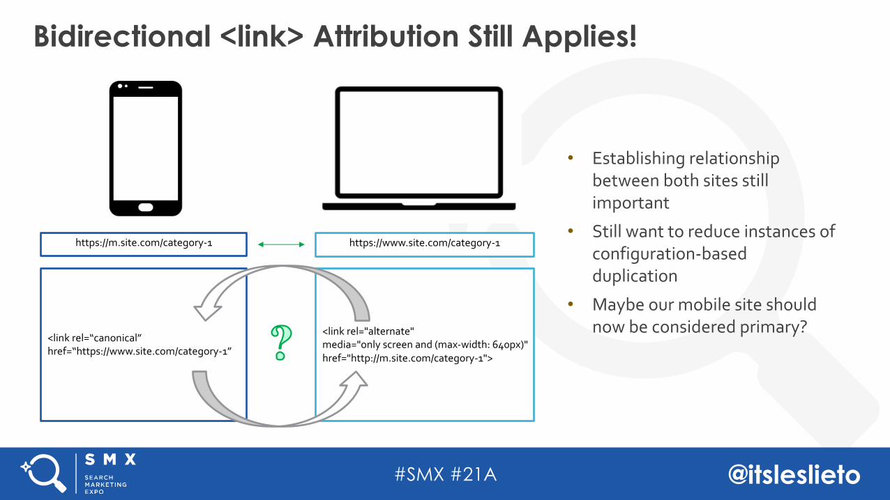
• Establishing relationship between both sites still important
• Still want to reduce instances of configuration-based duplication
• Maybe our mobile site should now be considered primary?
Bidirectional <link> Attribution Still Applies!
https://www.site.com/category-1
<link rel=“canonical” href=“https://www.site.com/category-1”
<link rel="alternate" media="only screen and (max-width: 640px)"href="http://m.site.com/category-1">
https://m.site.com/category-1
#SMX #21A @itsleslieto
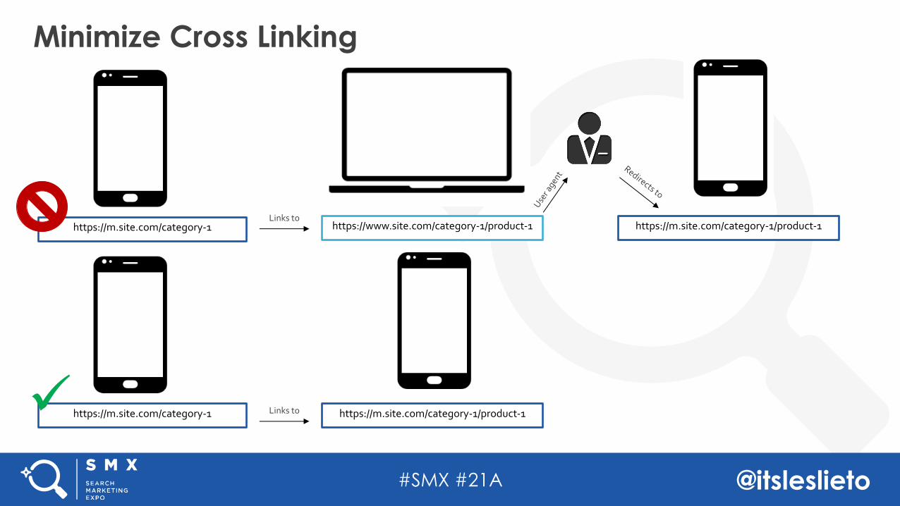
Minimize Cross Linking
https://m.site.com/category-1 https://www.site.com/category-1/product-1 https://m.site.com/category-1/product-1Links to
https://m.site.com/category-1 https://m.site.com/category-1/product-1Links toü
#SMX #21A @itsleslieto
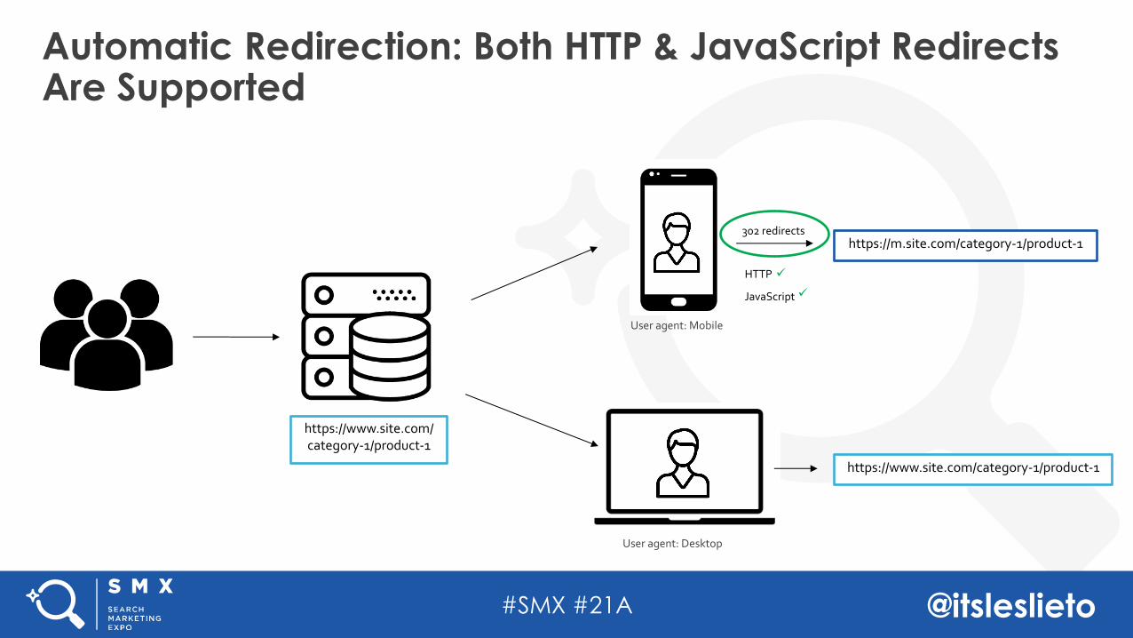
Automatic Redirection: Both HTTP & JavaScript Redirects Are Supported
https://www.site.com/category-1/product-1
User agent: Mobile
User agent: Desktop
302 redirects
https://www.site.com/category-1/product-1
https://m.site.com/category-1/product-1
HTTP
JavaScript
ü
ü
#SMX #21A @itsleslieto
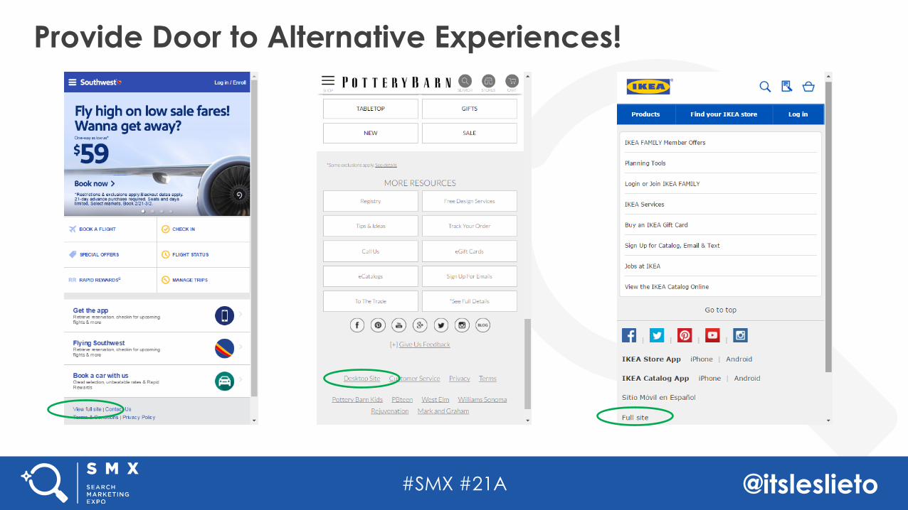
Provide Door to Alternative Experiences!
#SMX #21A @itsleslieto
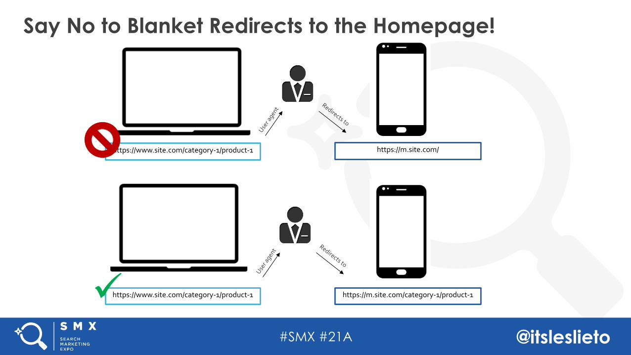
Say No to Blanket Redirects to the Homepage!
https://www.site.com/category-1/product-1 https://m.site.com/
https://www.site.com/category-1/product-1 https://m.site.com/category-1/product-1ü
#SMX #21A @itsleslieto
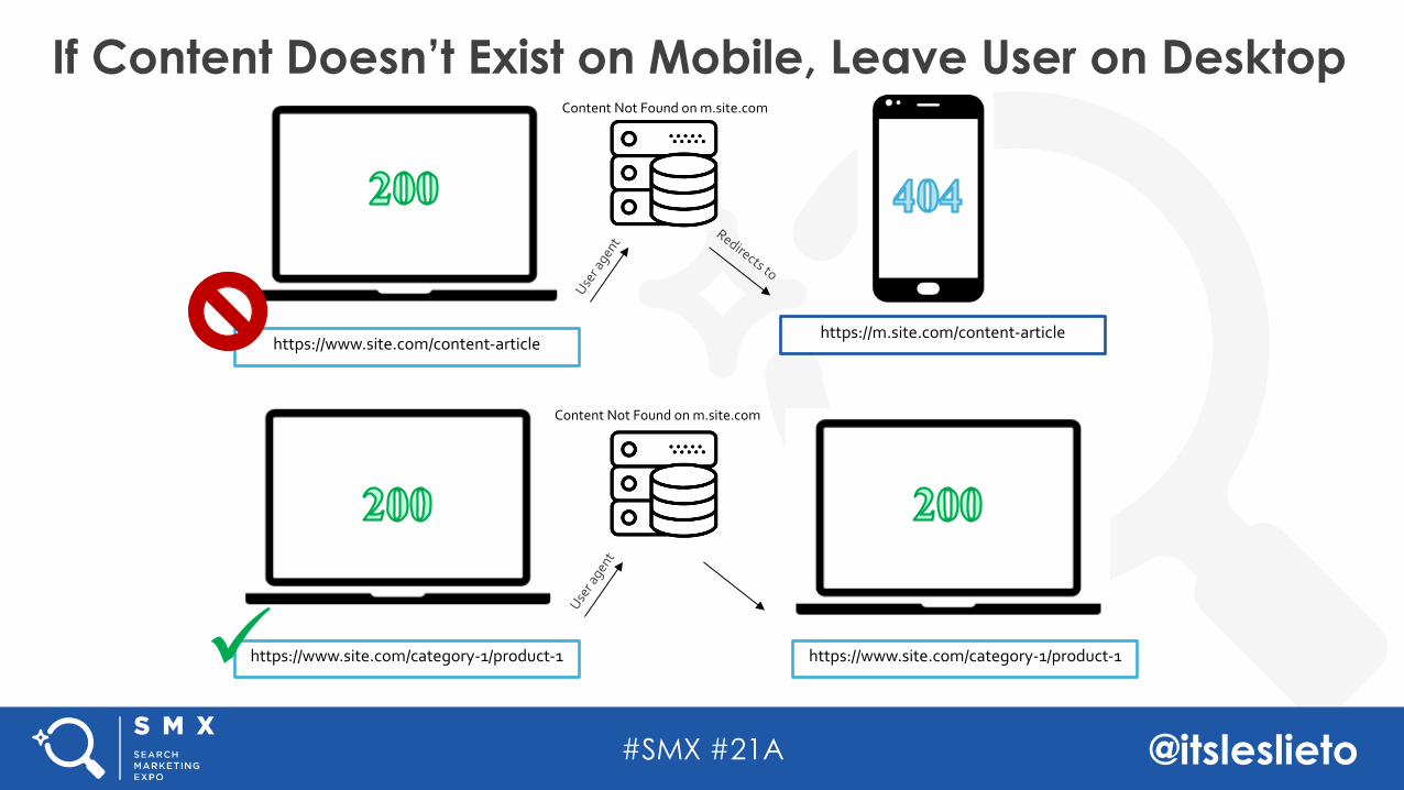
If Content Doesn’t Exist on Mobile, Leave User on Desktop
https://www.site.com/content-articlehttps://m.site.com/content-article
https://www.site.com/category-1/product-1ü
Content Not Found on m.site.com
Content Not Found on m.site.com
https://www.site.com/category-1/product-1
#SMX #21A @itsleslieto
Configuration-Agnostic Mobile AuditingConfiguration-Based Auditing Schema
Separate URLsDynamic ServingResponsive
Agenda
#SMX #21A @itsleslieto
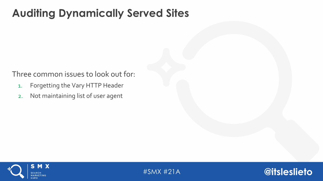
Three common issues to look out for: 1. Forgetting the Vary HTTP Header
Auditing Dynamically Served Sites
#SMX #21A @itsleslieto
Three common issues to look out for: 1. Forgetting the Vary HTTP Header
2. Not maintaining list of user agent
Auditing Dynamically Served Sites
#SMX #21A @itsleslieto
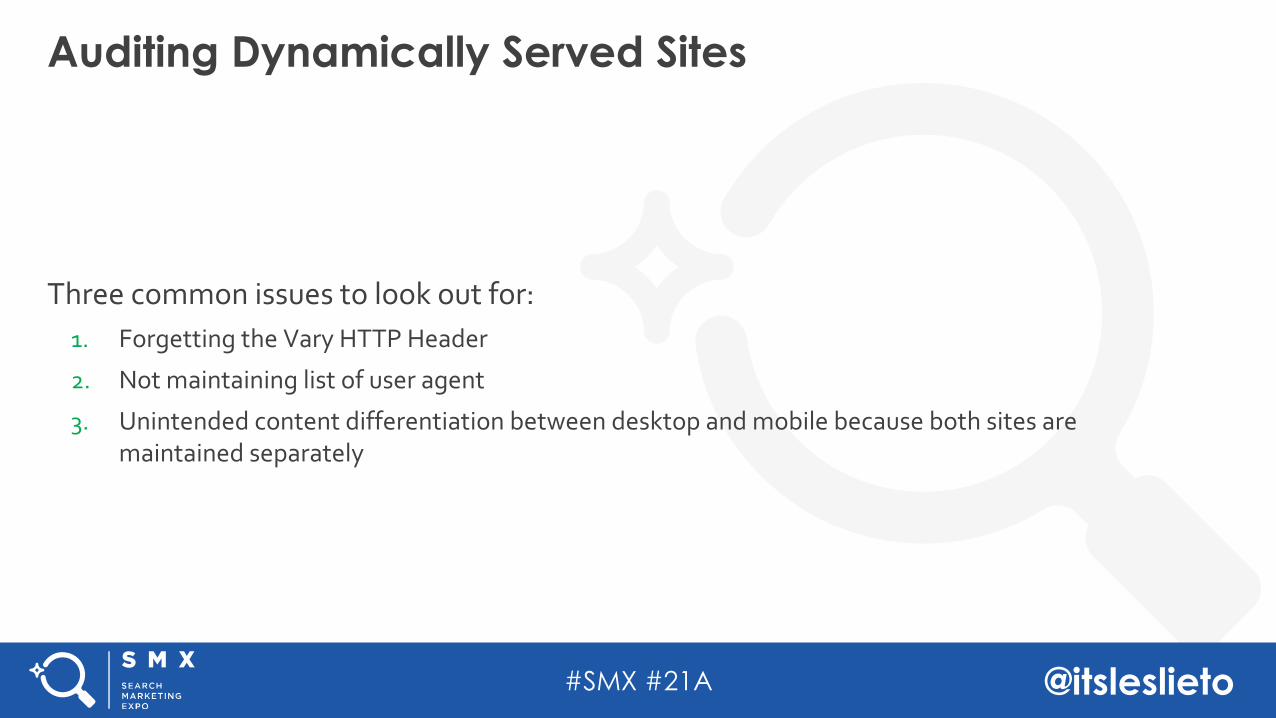
Three common issues to look out for: 1. Forgetting the Vary HTTP Header
2. Not maintaining list of user agent
3. Unintended content differentiation between desktop and mobile because both sites are maintained separately
Auditing Dynamically Served Sites
#SMX #21A @itsleslieto
Configuration-Agnostic Mobile AuditingConfiguration-Based Auditing Schema
Separate URLsDynamic ServingResponsive
Agenda
#SMX #21A @itsleslieto
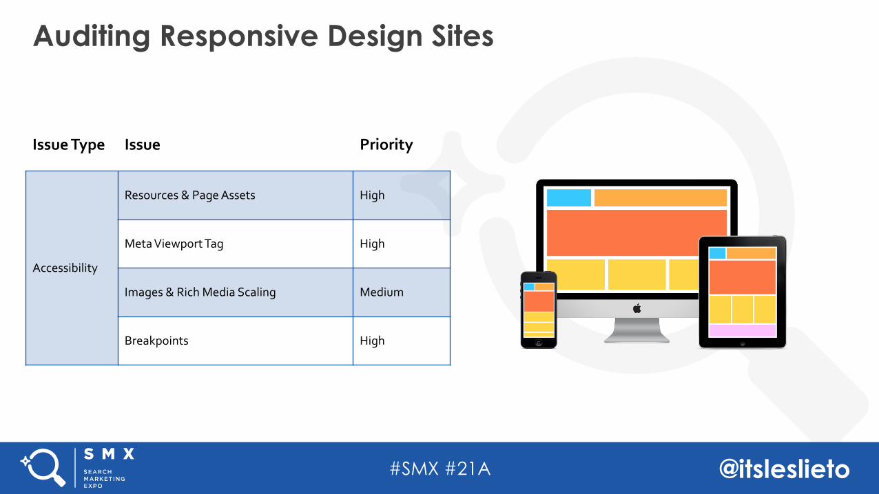
Auditing Responsive Design Sites
Issue Type Issue Priority
Accessibility
Resources & Page Assets High
Meta Viewport Tag High
Images & Rich Media Scaling Medium
Breakpoints High
#SMX #21A @itsleslieto
This includes CSS & JavaScript
The Ultimate No-No: Blocking Resources in Robots.txt
#SMX #21A @itsleslieto
This includes CSS & JavaScript
Just don’t do it.
The Ultimate No-No: Blocking Resources in Robots.txt
#SMX #21A @itsleslieto
This includes CSS & JavaScript
Just don’t do it.
The Ultimate No-No: Blocking Resources in Robots.txt
#SMX #21A @itsleslieto
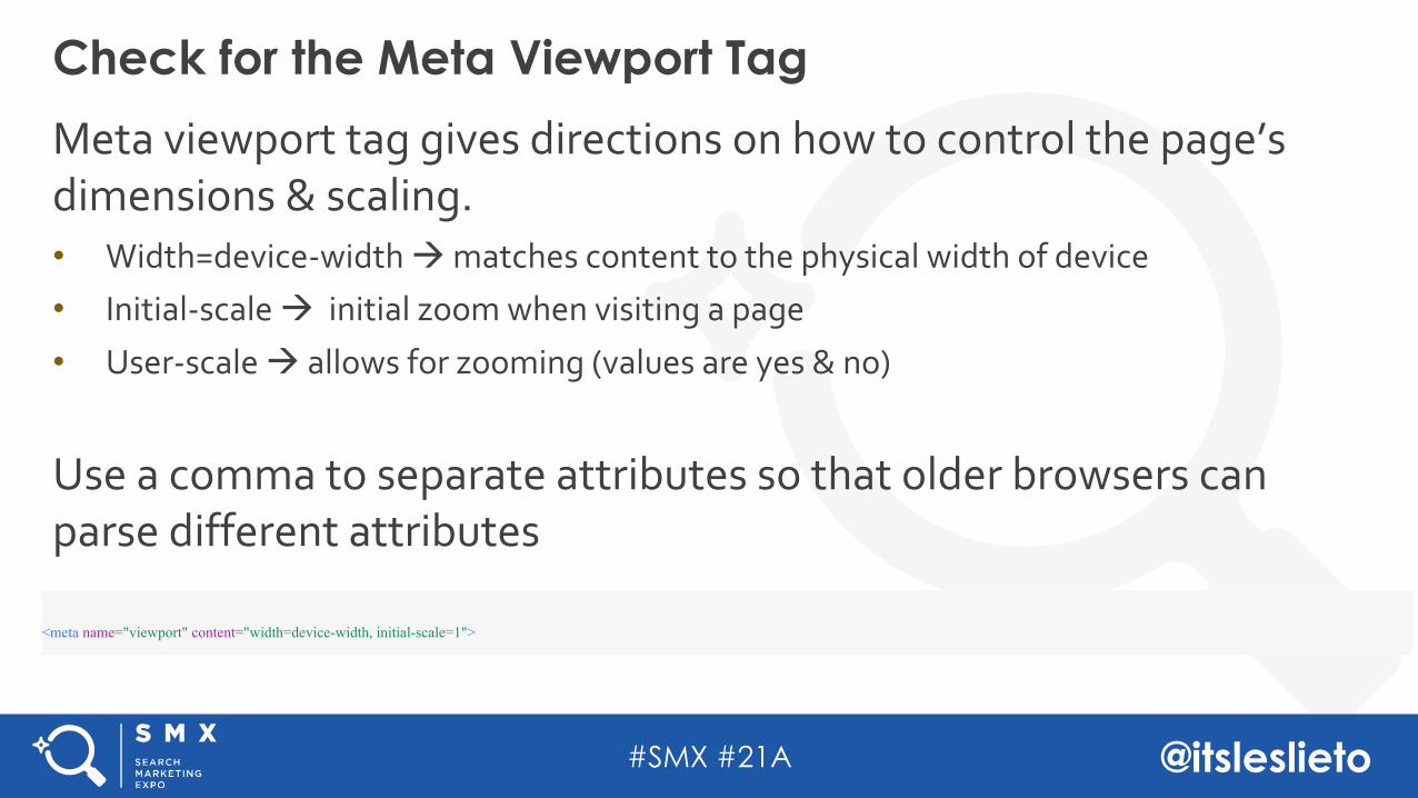
Meta viewport tag gives directions on how to control the page’s dimensions & scaling. • Width=device-width à matches content to the physical width of device• Initial-scale à initial zoom when visiting a page
• User-scale à allows for zooming (values are yes & no)
Use a comma to separate attributes so that older browsers can parse different attributes
Check for the Meta Viewport Tag
<meta name="viewport" content="width=device-width, initial-scale=1">
#SMX #21A @itsleslieto
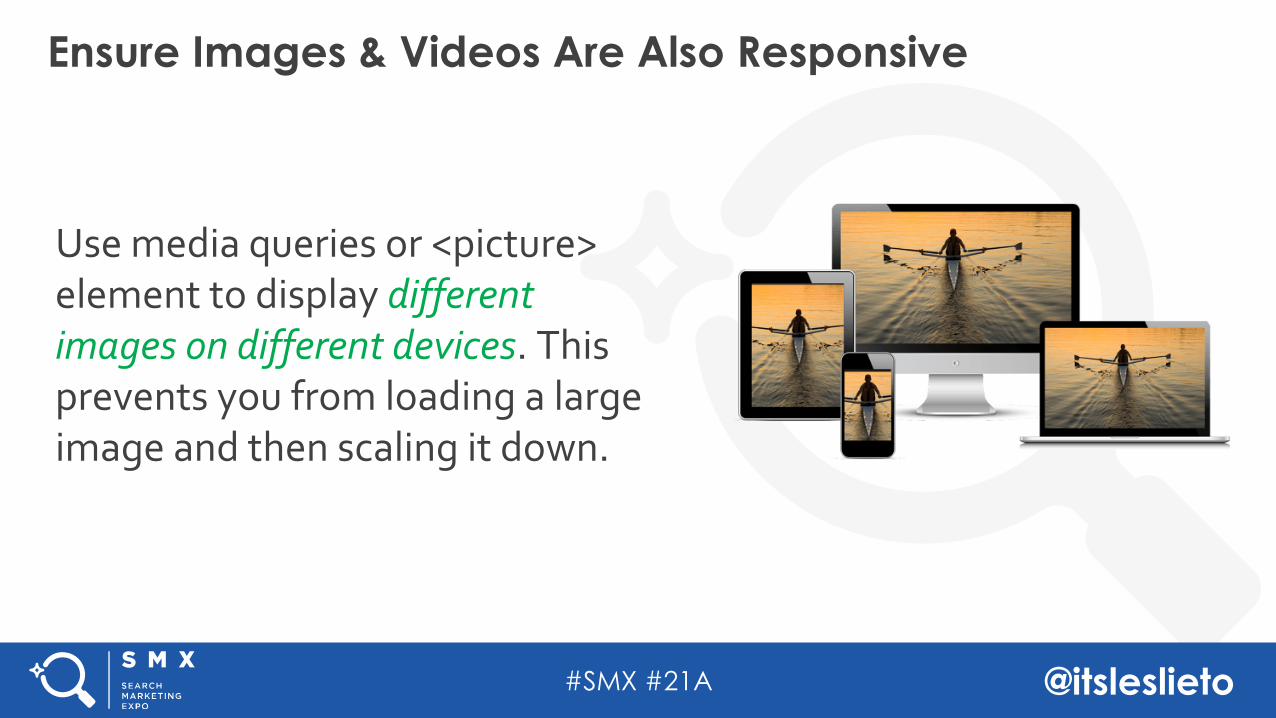
Use media queries or <picture> element to display different images on different devices. This prevents you from loading a large image and then scaling it down.
Ensure Images & Videos Are Also Responsive
#SMX #21A @itsleslieto
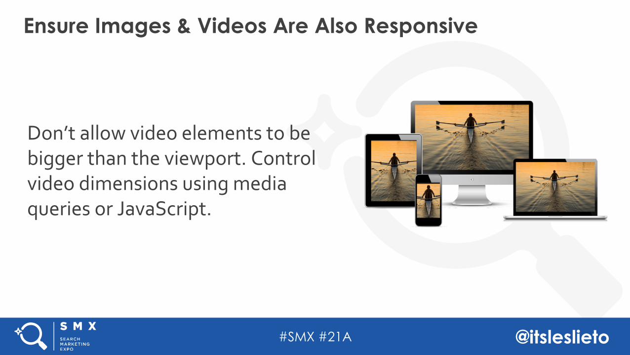
Don’t allow video elements to be bigger than the viewport. Control video dimensions using media queries or JavaScript.
Ensure Images & Videos Are Also Responsive
#SMX #21A @itsleslieto
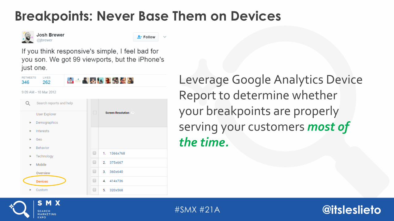
Leverage Google Analytics Device Report to determine whether your breakpoints are properly serving your customers most of the time.
Breakpoints: Never Base Them on Devices
#SMX #21A @itsleslieto
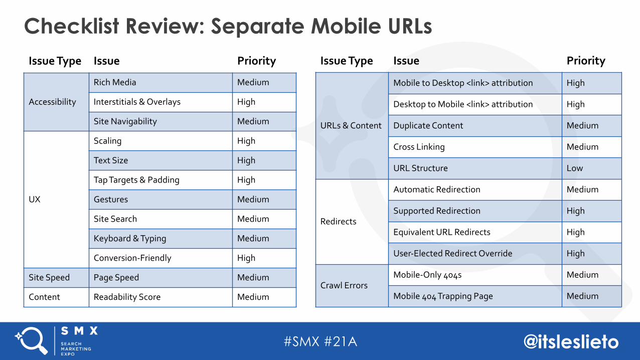
Checklist Review: Separate Mobile URLsIssue Type Issue Priority
Accessibility
Rich Media Medium
Interstitials & Overlays High
Site Navigability Medium
UX
Scaling High
Text Size High
Tap Targets & Padding High
Gestures Medium
Site Search Medium
Keyboard & Typing Medium
Conversion-Friendly High
Site Speed Page Speed Medium
Content Readability Score Medium
Issue Type Issue Priority
URLs & Content
Mobile to Desktop <link> attribution High
Desktop to Mobile <link> attribution High
Duplicate Content Medium
Cross Linking Medium
URL Structure Low
Redirects
Automatic Redirection Medium
Supported Redirection High
Equivalent URL Redirects High
User-Elected Redirect Override High
Crawl ErrorsMobile-Only 404s Medium
Mobile 404 Trapping Page Medium
#SMX #21A @itsleslieto
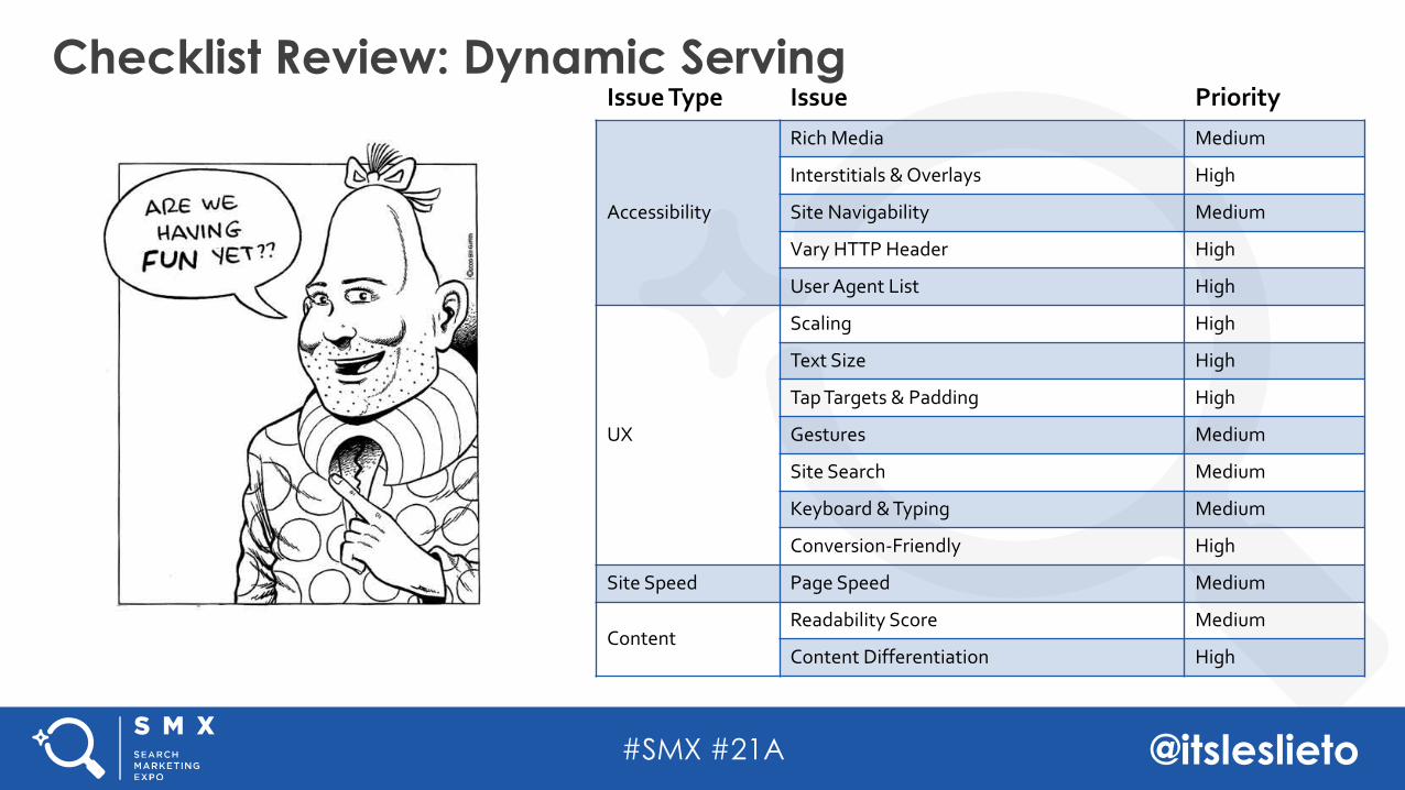
Checklist Review: Dynamic ServingIssue Type Issue Priority
Accessibility
Rich Media Medium
Interstitials & Overlays High
Site Navigability Medium
Vary HTTP Header High
User Agent List High
UX
Scaling High
Text Size High
Tap Targets & Padding High
Gestures Medium
Site Search Medium
Keyboard & Typing Medium
Conversion-Friendly High
Site Speed Page Speed Medium
ContentReadability Score Medium
Content Differentiation High
#SMX #21A @itsleslieto
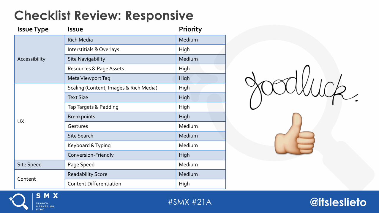
Checklist Review: ResponsiveIssue Type Issue Priority
Accessibility
Rich Media Medium
Interstitials & Overlays High
Site Navigability Medium
Resources & Page Assets High
Meta Viewport Tag High
UX
Scaling (Content, Images & Rich Media) High
Text Size High
Tap Targets & Padding High
Breakpoints High
Gestures Medium
Site Search Medium
Keyboard & Typing Medium
Conversion-Friendly High
Site Speed Page Speed Medium
ContentReadability Score Medium
Content Differentiation High
#SMX #21A @itsleslieto
SEE YOU AT THE NEXT #SMX!
Thank You!