Embed Size (px)
Citation preview
EVALUATION
Q1. In what ways does your media product use, develop or challenge forms and conventions of real media products?
The layout of my magazine is complex and in some aspects un-tidy, this is using the conventions of similar music magazines. For example, on the cover of my magazine I used a bold cover line that is slanted and is varied in colour, this was influenced by the magazine ‘Kerrang’ who also use identical cover lines.Also, like Kerrang and Rock Sound I placed the masthead of my front cover behind the image of the band, again this uses conventions and replicates well known magazines features, to attract the audience without them even reading the cover.
The colour scheme throughout my magazine has been chosen to specifically represent my chosen music genres, using the continuous Red, Yellow, Black. I immediately indicate or augment the genre of my magazine without going into detail on the content itself.In a way this could be seen as a development of conventions as I have included other colours such as blues and purples in all 3 areas of my magazine to add variation and keep the pages interesting rather than repetitive and dull.
Another use of conventions would be the title of my magazine, ‘Reckless’. Obviously it has been spelt incorrectly, but this was purposely done to show informality and maybe a sense of rebellion, stereotypically associated with Rock which is perfect as that is the genre for my magazine.
My photographs of bands challenge the typical conventions, this is mainly down to the limitation of professional equipment and locations. Often the images in a rock music magazine are either with a green screen or are outside in rural and urban areas, but I only used 1 urban location, and the rest of my images were taken in a studio with a white background. Therefore my photography doesn’t quite fit into normal images you would find in a similar styled magazine.

Q2. How does your media product represent particular social groups?
The Bands that were included in my magazine represented a particular music genre or group of people who are influenced by their music, in the case my bands related to Rock/Punk-Rock music genres. I used famous names in my contents page that are clearly associated with Rock music, but the models I used to represent a band had to be put into clothing that would be recognised by rock lovers. So using particular clothing and represents the style that a social group aims to show through fashion and accessories, maybe even appearance.
Due to the ages of my target audience I had to use a bright and bold colours tocapture attention mixed with a complex and full layoutHaving young and relevant bands/artists involved and included in my magazinealso adds to the intentions of my magazine attracting and reflecting younger ages.
Both genders will be attracted to my magazine, as I have used gender neutral tones, gender isn't the key feature of the social groups I'm trying to represent, it’s the music genres and tastes o my audience.
Social Status is also an irrelevant or less important aspect of my audience, anyone can read my magazine if they like the look of it, but ideally my magazine is aimed towards working/middle class teenagers who have similar preferences in music.
The attitudes and representations of the members in the bandscan represent the social class also, depending on the look of theband (Slipknot compared to We are the in crowd).
Q3. What kind of media institution might distribute your media product and why?
If Bauer Media Group was my institution who distribute my magazine the advantages and disadvantages would be:• Might me competition against Kerrang!• May not want to release a similar magazine, to theirs as there is a possibility of failure if kerrang
stays the most popular between the two.• Although they might like the subtle differences between Kerrang and Reckless, hopefully they
would feel as if a gap has been filled..• They made Kerrang so popular and well known, so they may want to do it again with a similar
magazine, Kerrang could be losing popularity so bringing out something new and relevant may entice those lost customers back.
If Rock Sound was my institution to distribute my magazine, there would be advantages and disadvantages:• They might just want to stick with their one magazine, and stay independent.• Mine is similar in different ways, so they could dominate a certain area or music genre, making
them seem reliable for good bands and information, could be a bigger competition against Bauer.
If Alternative Press were chosen to distribute my magazine the advantages and disadvantages are:• My magazine might not fit in with their specific music types and genres, this could change their
appearance.• They could be reluctant as there is a lot of competition against bigger media institutions such as
Bauer, so they may decide that mine is too similar to Kerrang so what would be the point as they knew that it wouldn’t be as well known and popular.
Q4. Who would be the audience for your media product?
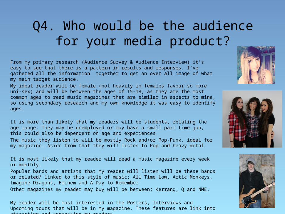
From my primary research (Audience Survey & Audience Interview) it’s easy to see that there is a pattern in results and responses. I’ve gathered all the information together to get an over all image of what my main target audience.My ideal reader will be female (not heavily in females favour so more uni-sex) and will be between the ages of 15-18, as they are the most common ages to read music magazines that are similar in aspects to mine, so using secondary research and my own knowledge it was easy to identify ages.
It is more than likely that my readers will be students, relating the age range. They may be unemployed or may have a small part time job; this could also be dependent on age and experiences.The music they listen to will be mostly Rock and/or Pop-Punk, ideal for my magazine. Aside from that they will listen to Pop and heavy metal.
It is most likely that my reader will read a music magazine every week or monthly. Popular bands and artists that my reader will listen will be these bands or related/ linked to this style of music; All Time Low, Artic Monkeys, Imagine Dragons, Eminem and A Day to Remember.Other magazines my reader may buy will be between; Kerrang, Q and NME.
My reader will be most interested in the Posters, Interviews and Upcoming tours that will be in my magazine. These features are link into attracting and addressing my readers.
The key ingredient that gathers the audience who will like my product all comes back to music tastes and preferences, so no matter what age, gender, social status or social group they belong to anyone can enjoy this magazine if they like the bands and music genres that are featured.
Q5. How did you attract/address your audience?
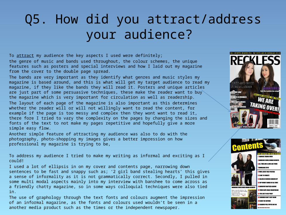
To attract my audience the key aspects I used were definitely;the genre of music and bands used throughout, the colour schemes, the unique features such as posters and special interviews and how I laid out my magazine from the cover to the double page spread.The bands are very important as they identify what genres and music styles my magazine is based around, and this is what will get my target audience to read my magazine, if they like the bands they will read it. Posters and unique articles are just part of some persuasive techniques, these make the reader want to buy the magazine which is very important for circulation as well as readership. The layout of each page of the magazine is also important as this determines whether the reader will or will not willingly want to read the content, for example if the page is too messy and complex then they wont want to read it, there fore I tried to vary the complexity on the pages by changing the sizes and fonts of the text to not make my pages repetitive and hopefully give a more simple easy flow.Another simple feature of attracting my audience was also to do with the photography, photo-shopping my images gives a better impression on how professional my magazine is trying to be,
To address my audience I tried to make my writing as informal and exciting as I could!I used a lot of ellipsis in on my cover and contents page, narrowing down sentences to be fast and snappy such as; ‘2 girl band stealing hearts’ this gives a sense of informality as it is not grammatically correct. Secondly, I pulled in some multi modal aspects mainly into my interview with banshee to come across as a friendly chatty magazine, so in some ways colloquial techniques were also tied in.The use of graphology through the text fonts and colours augment the impression of an informal magazine, as the fonts and colours used wouldn’t be seen in a another media product such as the times or the independent newspaper.
Q6. What have you learnt about technologies from the process of
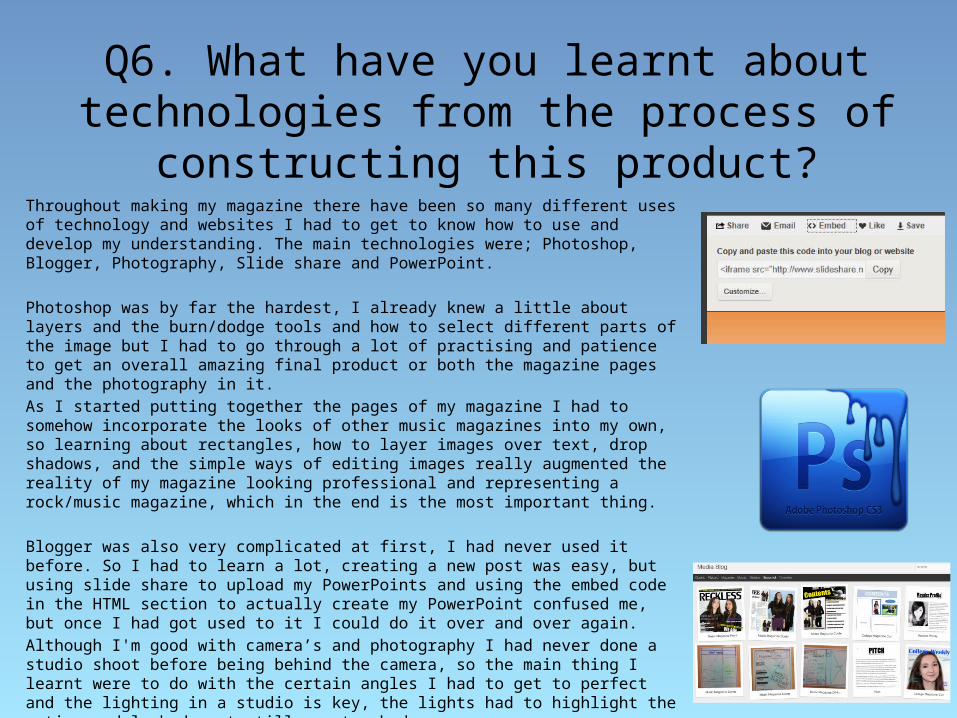
constructing this product?Throughout making my magazine there have been so many different uses of technology and websites I had to get to know how to use and develop my understanding. The main technologies were; Photoshop, Blogger, Photography, Slide share and PowerPoint.
Photoshop was by far the hardest, I already knew a little about layers and the burn/dodge tools and how to select different parts of the image but I had to go through a lot of practising and patience to get an overall amazing final product or both the magazine pages and the photography in it.As I started putting together the pages of my magazine I had to somehow incorporate the looks of other music magazines into my own, so learning about rectangles, how to layer images over text, drop shadows, and the simple ways of editing images really augmented the reality of my magazine looking professional and representing a rock/music magazine, which in the end is the most important thing.
Blogger was also very complicated at first, I had never used it before. So I had to learn a lot, creating a new post was easy, but using slide share to upload my PowerPoints and using the embed code in the HTML section to actually create my PowerPoint confused me, but once I had got used to it I could do it over and over again.Although I'm good with camera’s and photography I had never done a studio shoot before being behind the camera, so the main thing I learnt were to do with the certain angles I had to get to perfect and the lighting in a studio is key, the lights had to highlight the entire models body yet still create shadows.
Over all, these elements of technology all came together to contribute towards completing and perfecting my final media product, although some were more important than others each one that I mentioned and more really helped represent my magazine in the way I intended it to.
Q7. Looking back at your preliminary task, what do you feel you have learnt
in the progression from it to the full product?
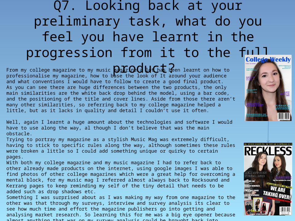
From my college magazine to my music magazine a lot has been learnt on how to professionalise my magazine, how to base the look of It around your audience and what conventions I would have to follow to create a good final product. As you can see there are huge differences between the two products, the only main similarities are the white back drop behind the model, using a bar code, and the positioning of the title and cover lines. Aside from those there aren’t many other similarities, so referring back to my college magazine helped a little, but as it lacks in quality and detail I couldn’t use it often.
Well, again I learnt a huge amount about the technologies and software I would have to use along the way, al though I don’t believe that was the main obstacle.Trying to portray my magazine as a stylish Music Mag was extremely difficult, having to stick to specific rules along the way, although sometimes these rules were broken a little so I could add something unique or quirky to certain pages.With both my college magazine and my music magazine I had to refer back to other already made products on the internet, using google images I was able to find photos of other college magazines which were a great help for overcoming a mental block, for my music mag I referred almost always back to Rocksound and Kerrang pages to keep reminding my self of the tiny detail that needs to be added such as drop shadows etc. Something I was surprised about as I was making my way from one magazine to the other was that through my surveys, interview and survey analysis its clear to see how much time and effort the magazine publishers go into getting and analysing market research. So learning this for me was a big eye opener because almost anything that was on my survey analysis could be brought back into helping me finish off tiny details of my magazine.
Over all I have learnt an amazing amount, not only these points I’ve mentioned but looking back again at; Photoshop, photography, layouts, colour schemes, text colour and fonts, angles and positioning, cover lines and the actual content. So now from being so naïve I’m now a lot more comfortable with being given a task that could be related to this, and will use skills I’ve learnt throughout my media course.