Embed Size (px)
Citation preview
3 Strategies for Awesome Mobile-Optimized Emails January 30th 2014
Who Am I?
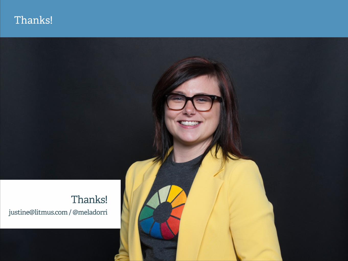
Justine Jordan Marketing Director, Litmus
@meladorri @litmusapp #KISSwebinar
Join us on Twi!er
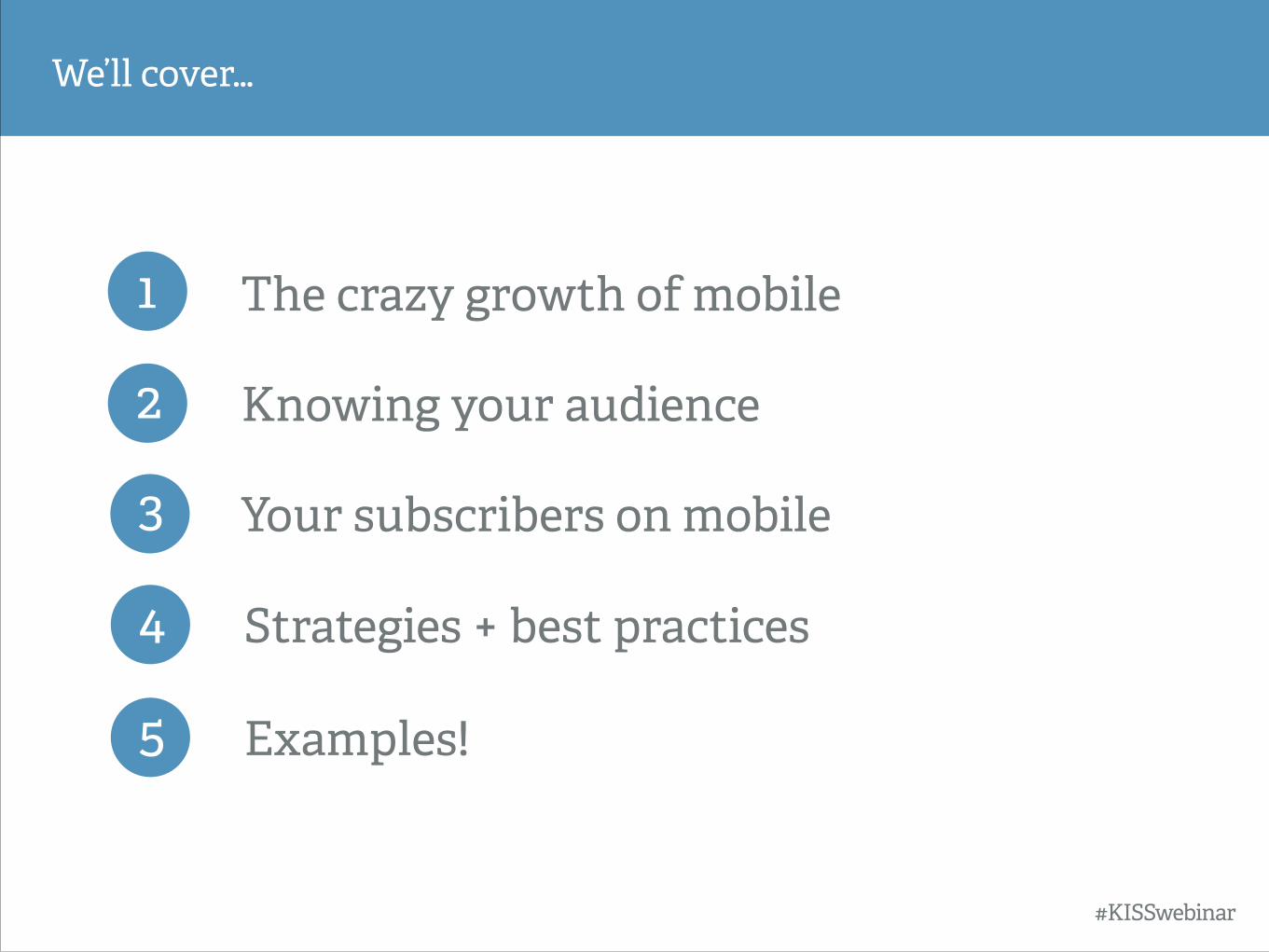
1 The crazy growth of mobile
We’ll cover…
2 Knowing your audience
3 Your subscribers on mobile
#KISSwebinar
4 Strategies + best practices
5 Examples!
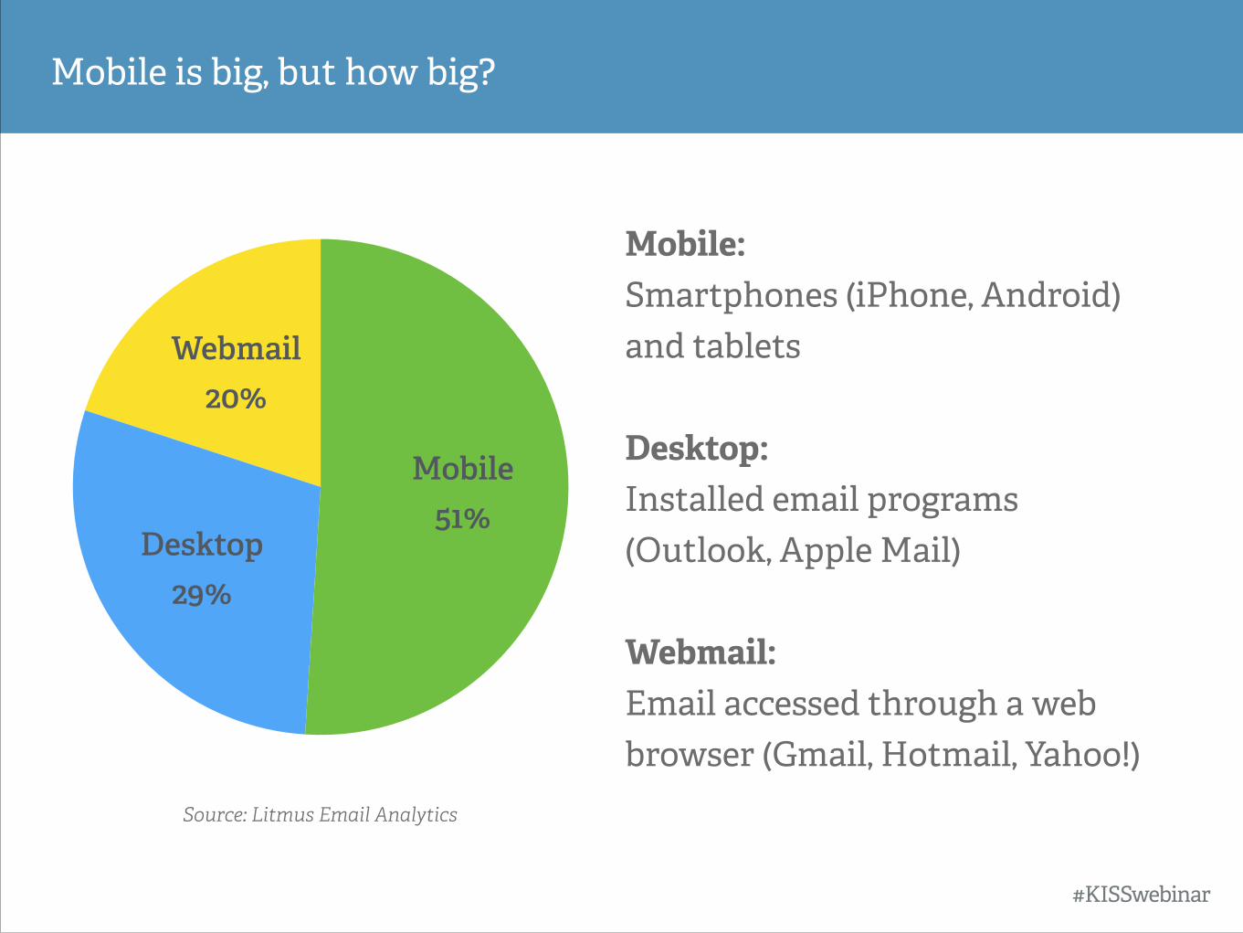
Mobile is big, but how big?
#KISSwebinar
Webmail 20%
Desktop 29%
Mobile 51%
Mobile: Smartphones (iPhone, Android) and tablets !Desktop: Installed email programs (Outlook, Apple Mail) !Webmail: Email accessed through a web browser (Gmail, Hotmail, Yahoo!)
Source: Litmus Email Analytics
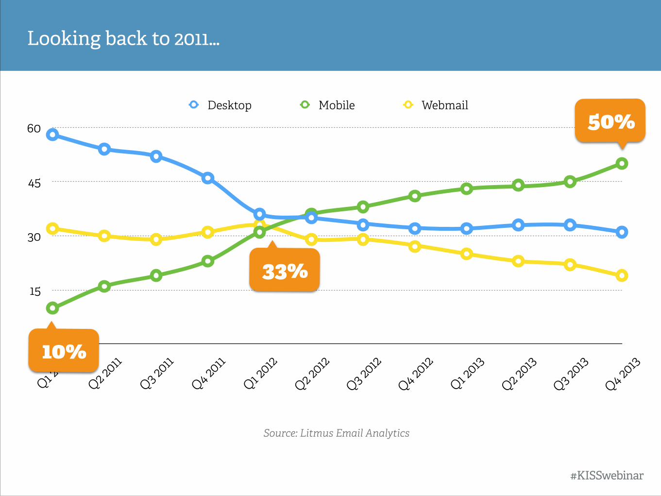
Looking back to 2011…
#KISSwebinar
Source: Litmus Email Analytics
15
30
45
60
Q1 2011
Q2 2011
Q3 2011
Q4 2011
Q1 2012
Q2 2012
Q3 2012
Q4 2012
Q1 2013
Q2 2013
Q3 2013
Q4 2013
Desktop Mobile Webmail
10%
50%
33%
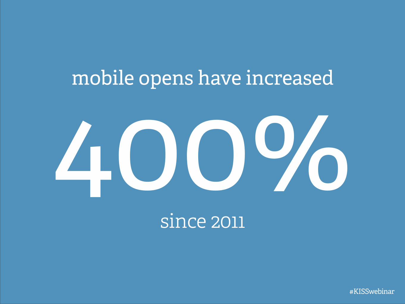
400%mobile opens have increased
since 2011
#KISSwebinar
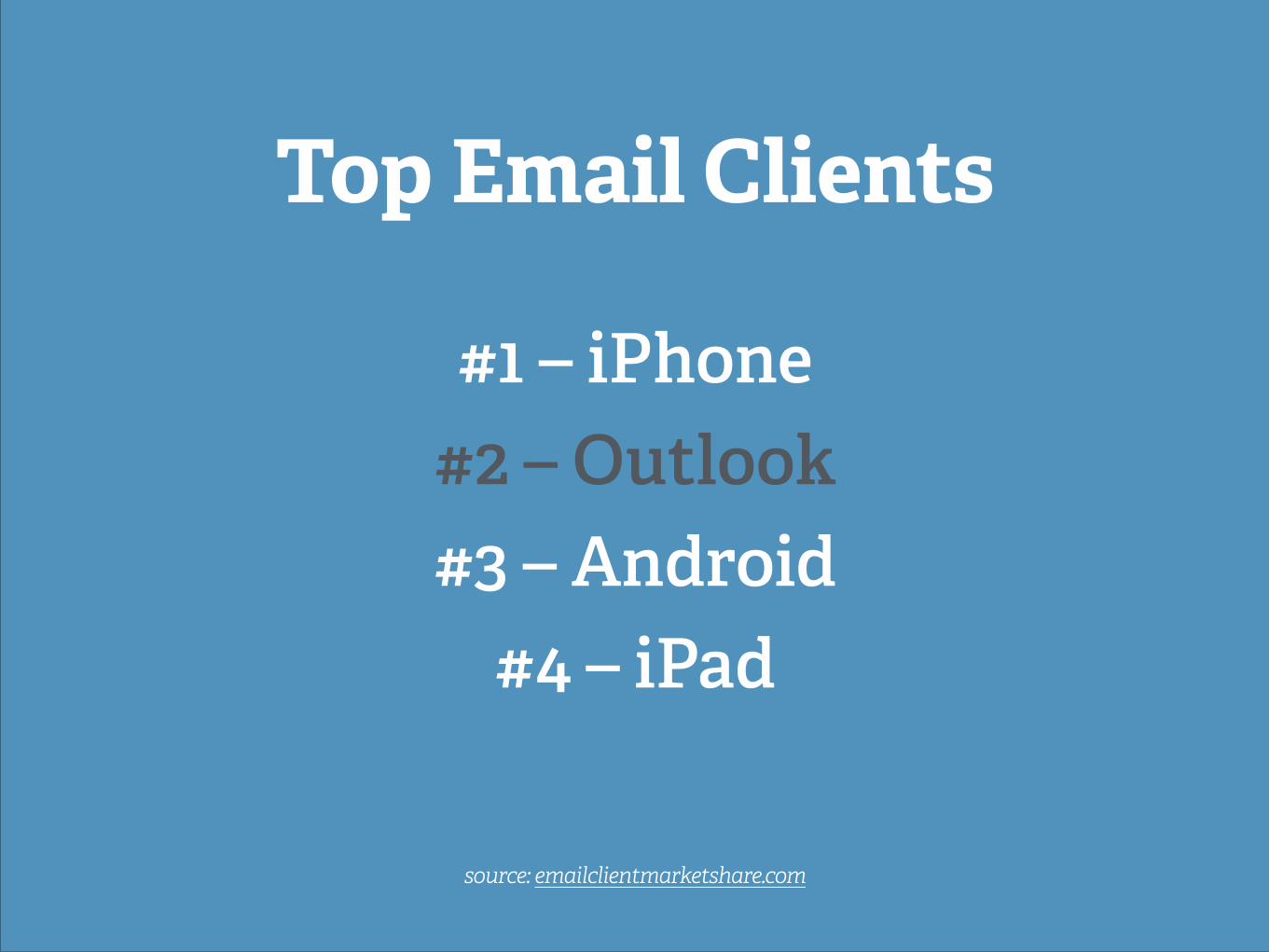
Top Email Clients !
#1 – iPhone #2 – Outlook #3 – Android
#4 – iPad
source: emailclientmarketshare.com
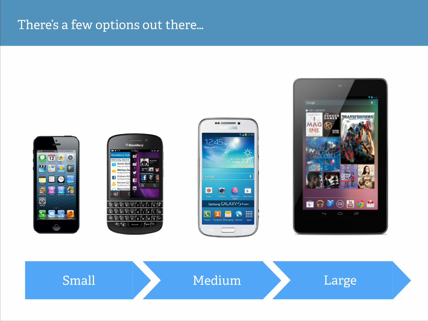
There’s a few options out there…
LargeMediumSmall
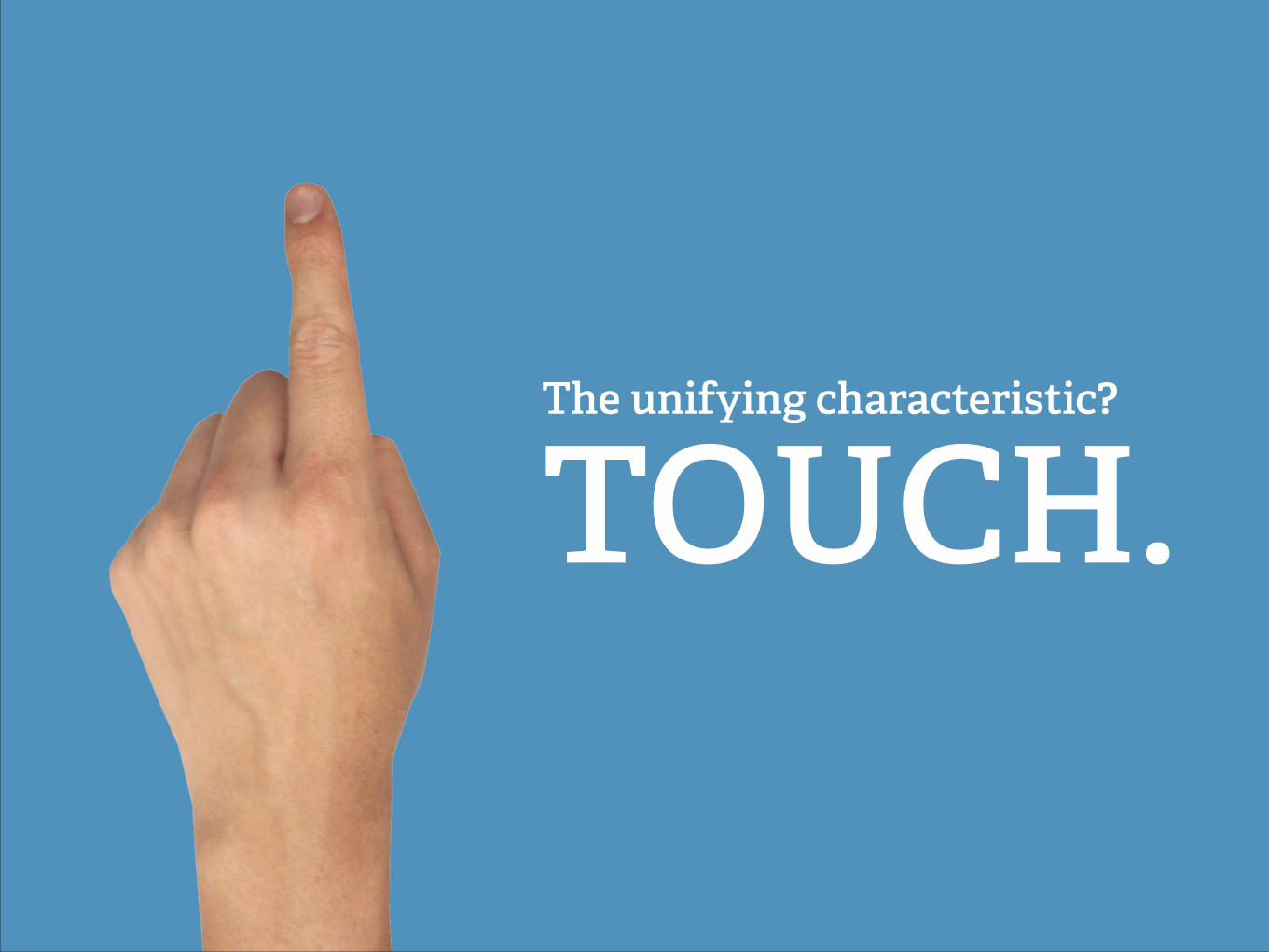
The unifying characteristic?
TOUCH.
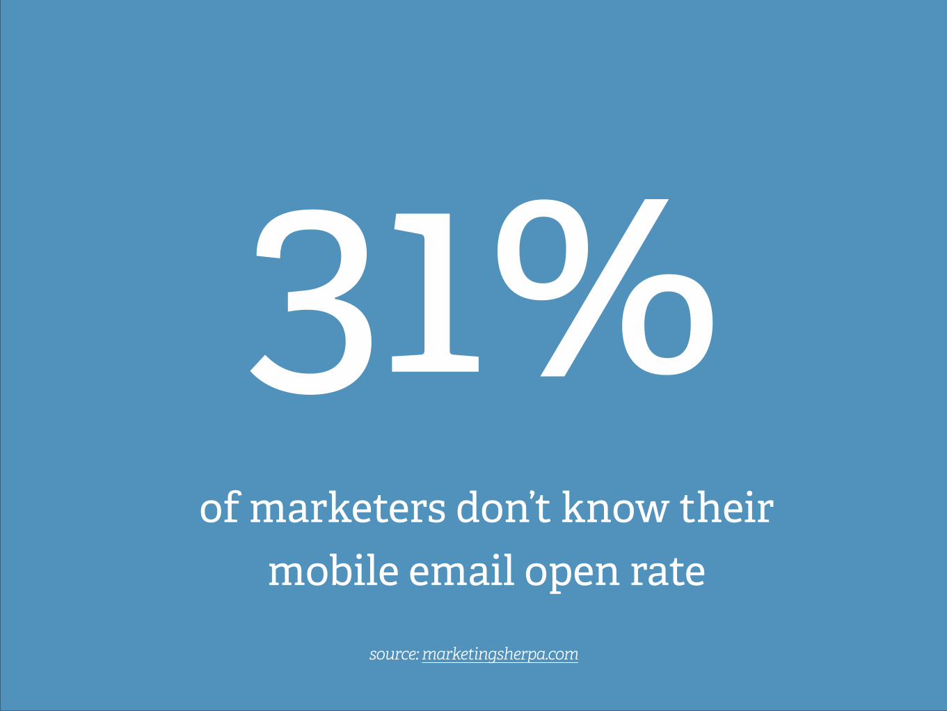
31% of marketers don’t know their
mobile email open rate
source: marketingsherpa.com
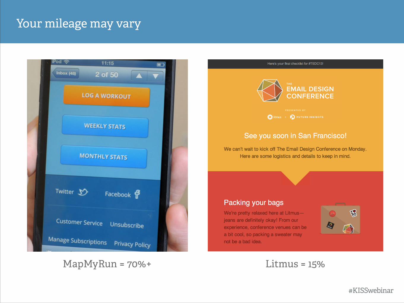
Your mileage may vary
#KISSwebinar
Litmus = 15% MapMyRun = 70%+
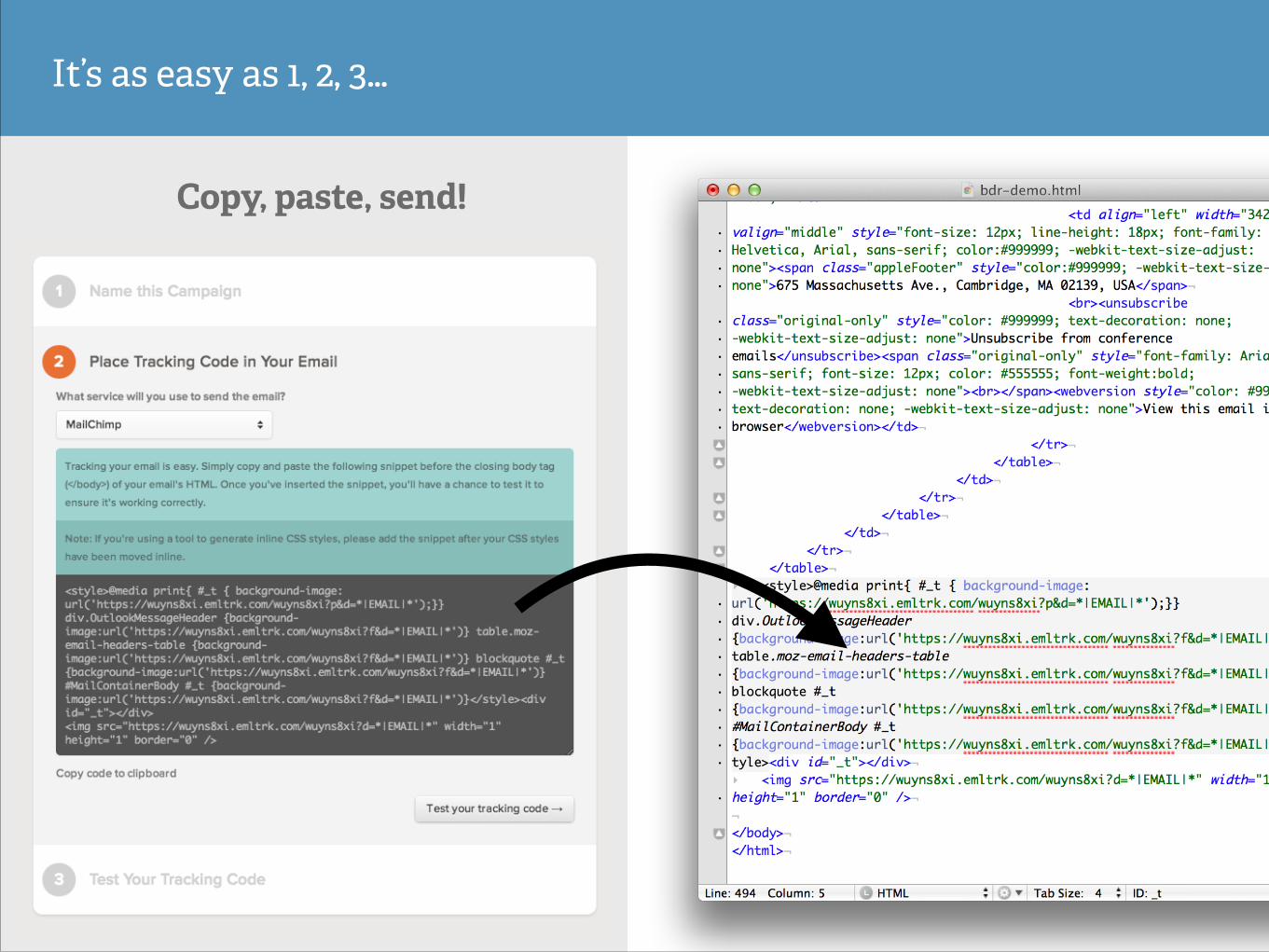
It’s as easy as 1, 2, 3…
Copy, paste, send!
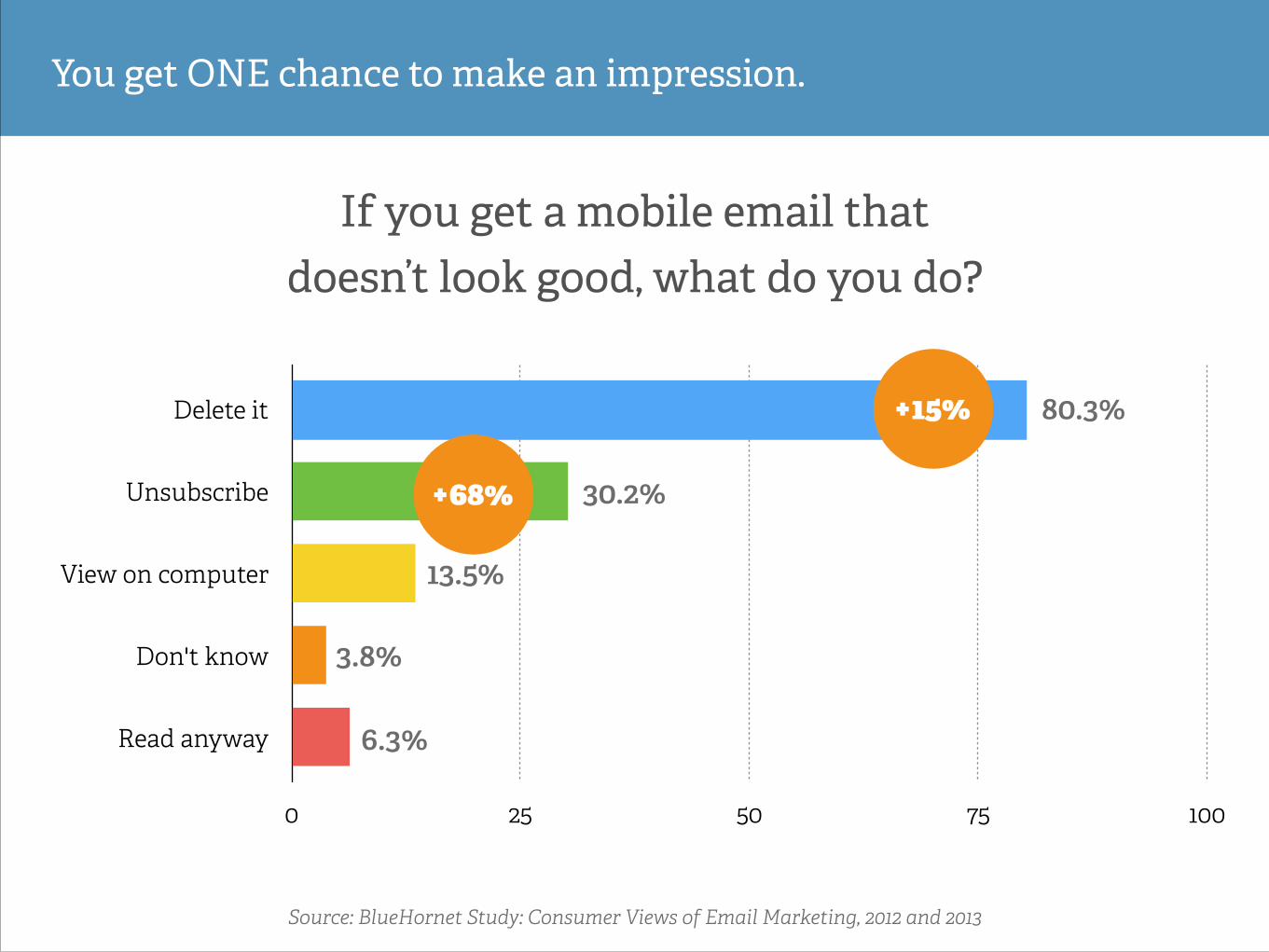
You get ONE chance to make an impression.
Source: BlueHornet Study: Consumer Views of Email Marketing, 2012 and 2013
10%
Delete it
Unsubscribe
View on computer
Don't know
Read anyway
0 25 50 75 100
If you get a mobile email that doesn’t look good, what do you do?
80.3%
30.2%
13.5%
3.8%
6.3%
+68%
+15%
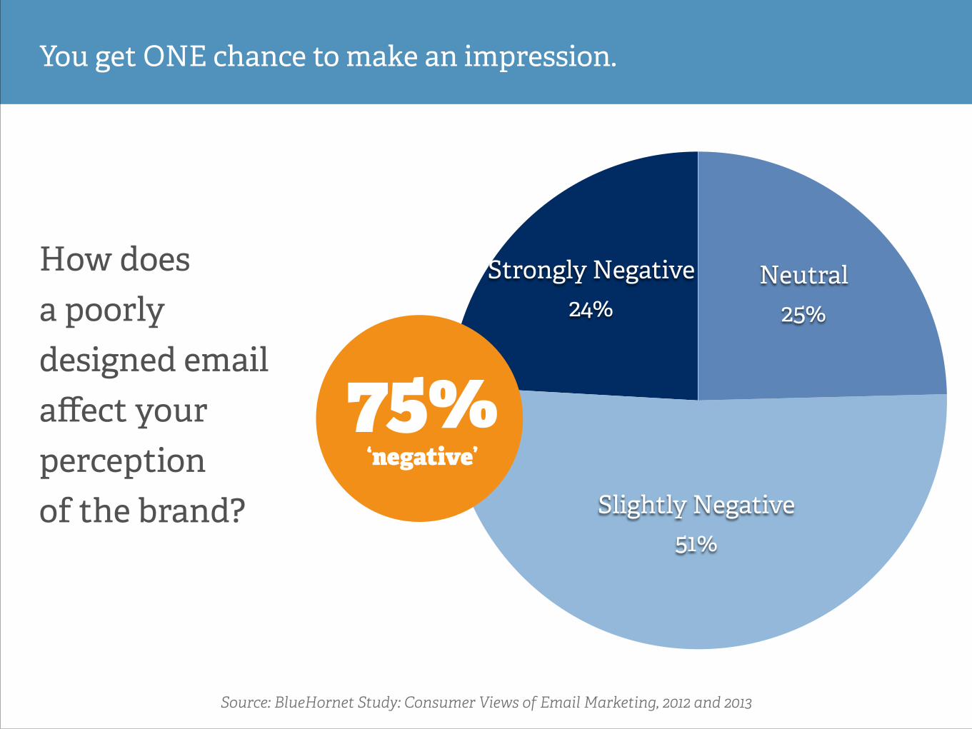
Strongly Negative 24%
Slightly Negative 51%
Neutral 25%
You get ONE chance to make an impression.
Source: BlueHornet Study: Consumer Views of Email Marketing, 2012 and 2013
How does a poorly designed email affect your perception of the brand?
75% ‘negative’
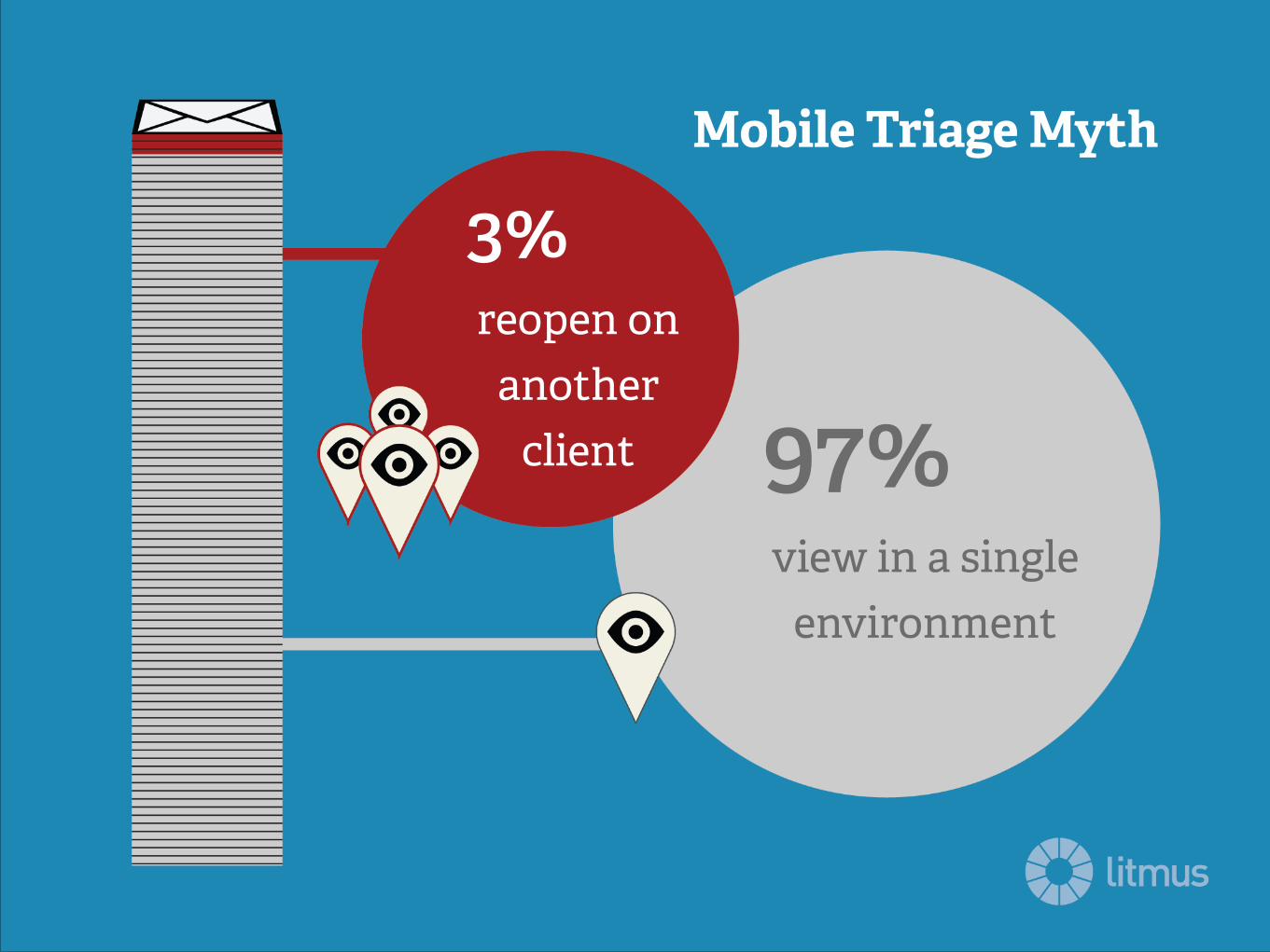
3% reopen on
another client 97%
view in a single environment
Mobile Triage Myth
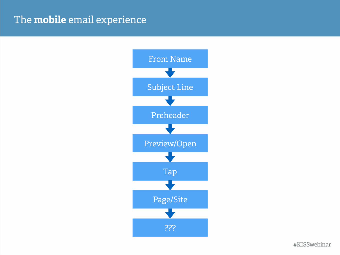
The mobile email experience
???
From Name
Subject Line
Preheader
Preview/Open
Tap
Page/Site
#KISSwebinar
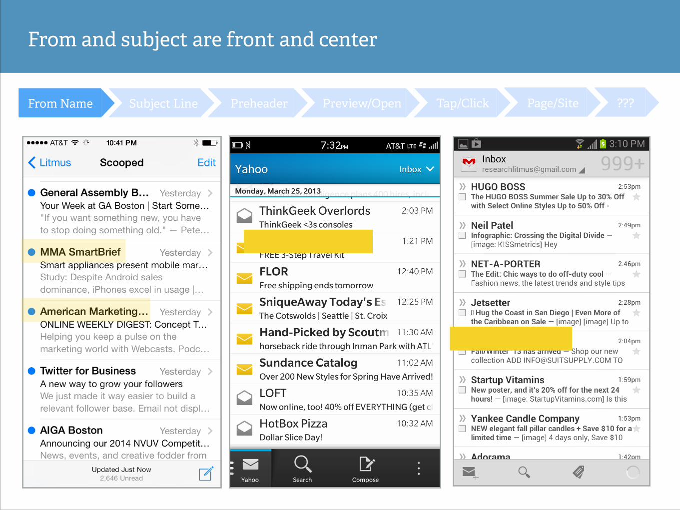
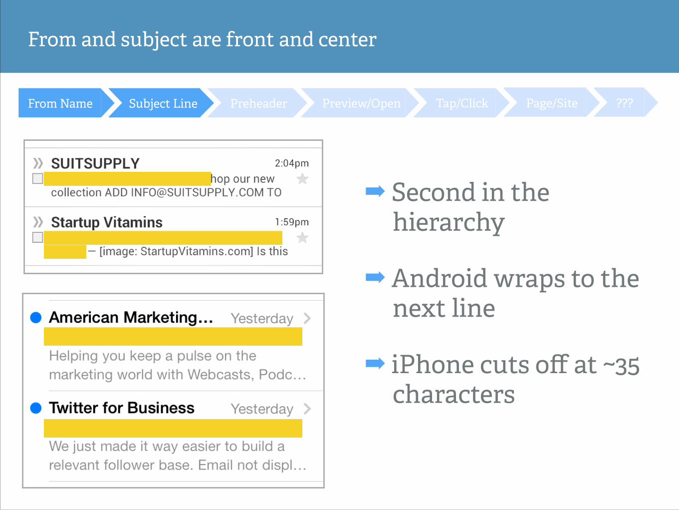
From and subject are front and center
???Page/SiteTap/ClickPreview/OpenPreheaderSubject LineFrom Name
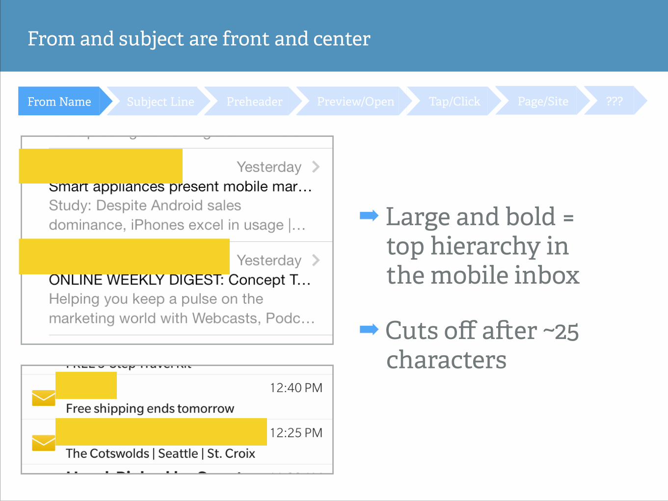
From and subject are front and center
???Page/SiteTap/ClickPreview/OpenPreheaderSubject LineFrom Name
➡ Large and bold = top hierarchy in the mobile inbox
➡ Cuts off a#er ~25 characters
???Page/SiteTap/ClickPreview/OpenPreheaderSubject LineFrom Name
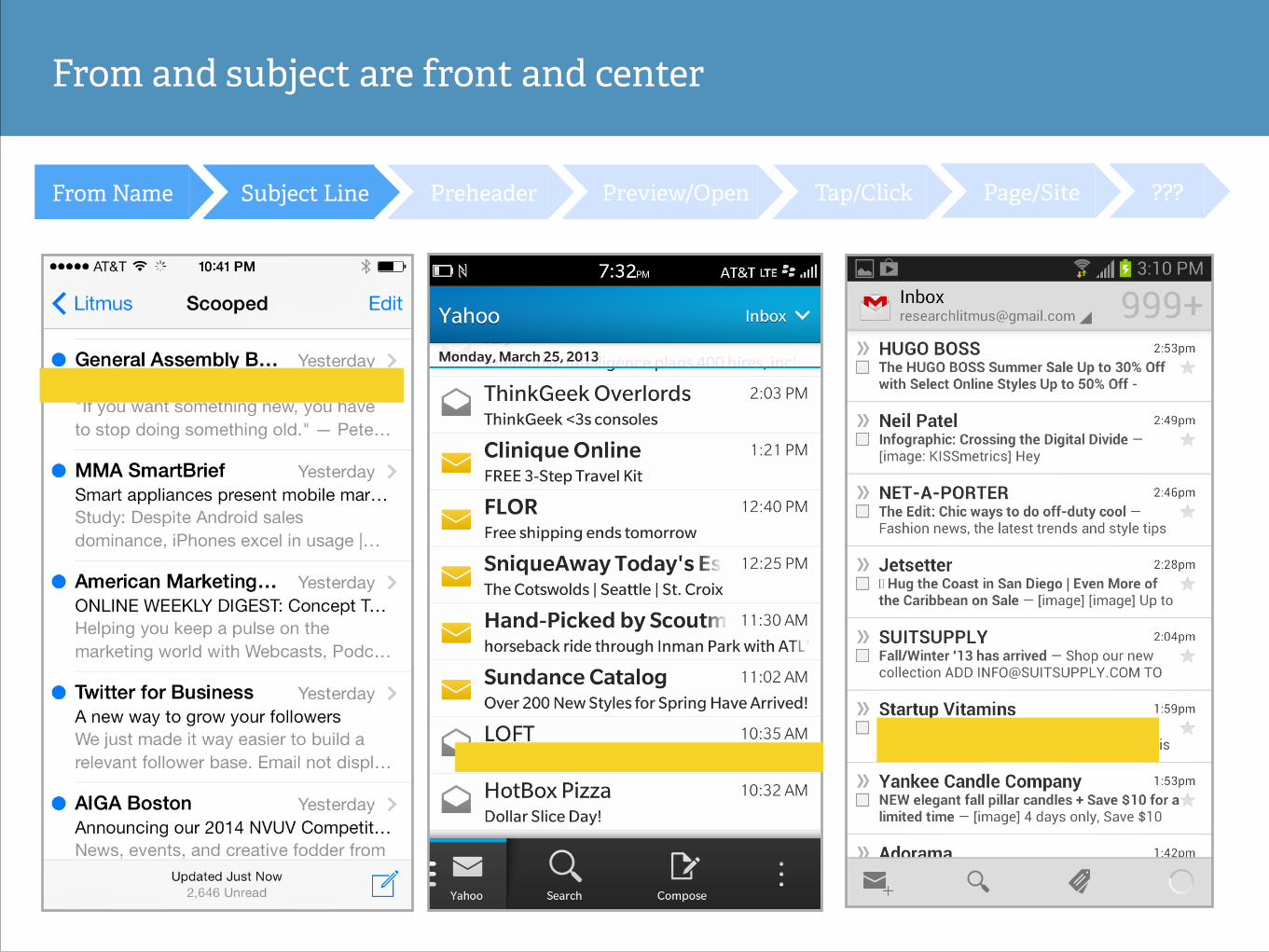
From and subject are front and center
???Page/SiteTap/ClickPreview/OpenPreheaderSubject LineFrom Name
From and subject are front and center
➡ Second in the hierarchy
➡ Android wraps to the next line
➡ iPhone cuts off at ~35 characters
???Page/SiteTap/ClickPreview/OpenPreheaderSubject LineFrom Name
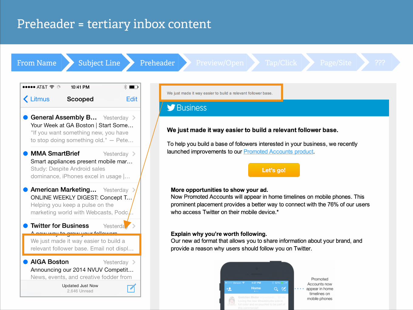
Preheader = tertiary inbox content
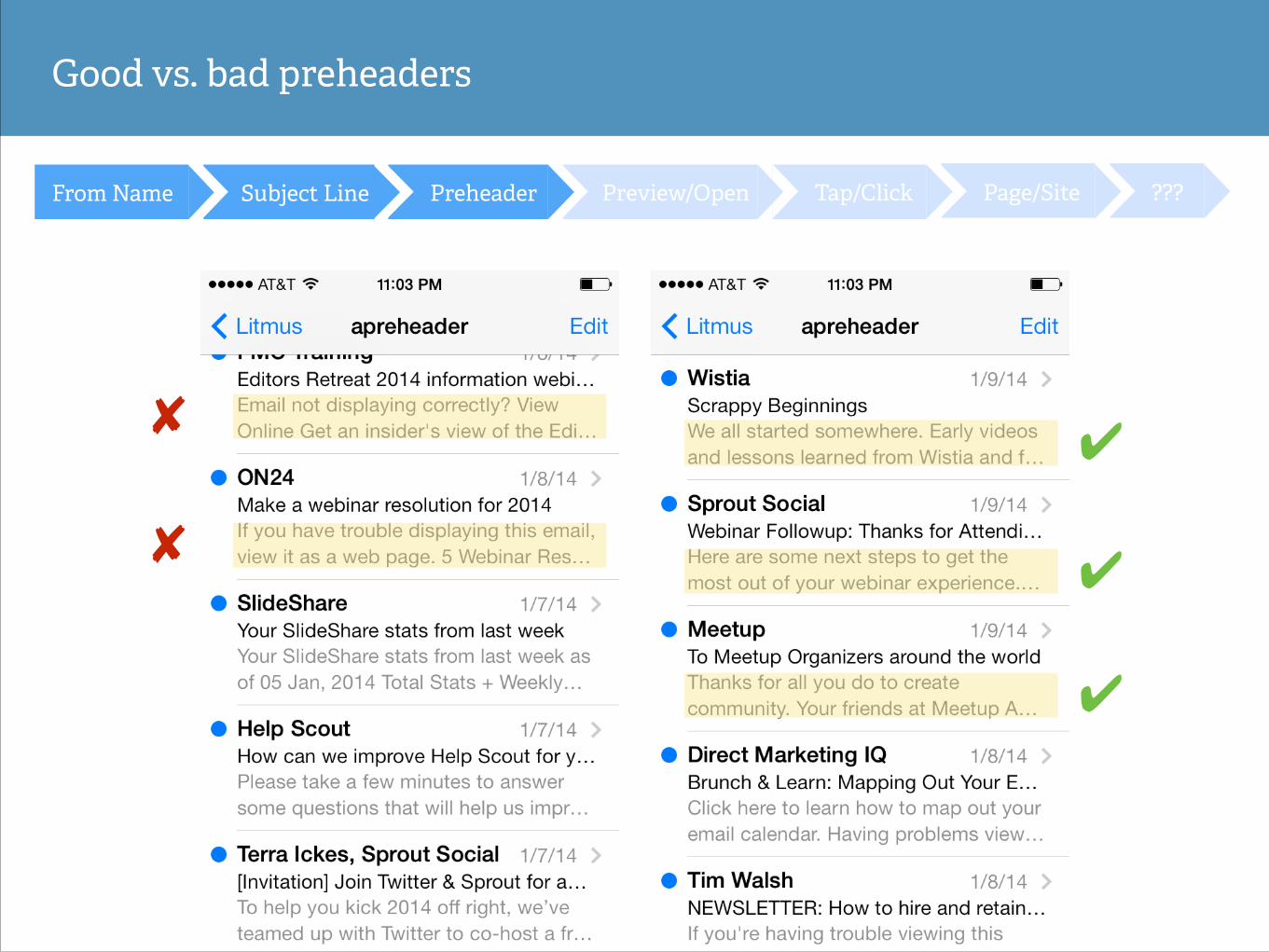
Good vs. bad preheaders
✔
✔
✔
✘
✘
???Page/SiteTap/ClickPreview/OpenPreheaderSubject LineFrom Name
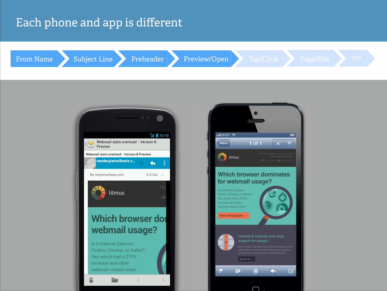
Each phone and app is different
???Page/SiteTap/ClickPreview/OpenPreheaderSubject LineFrom Name
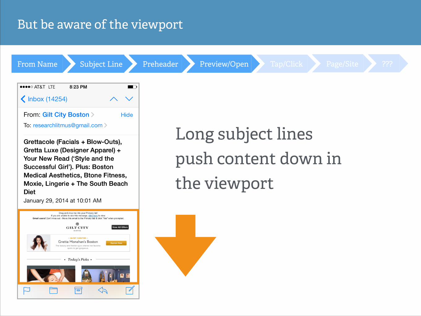
But be aware of the viewport
???Page/SiteTap/ClickPreview/OpenPreheaderSubject LineFrom Name
Long subject lines push content down in the viewport
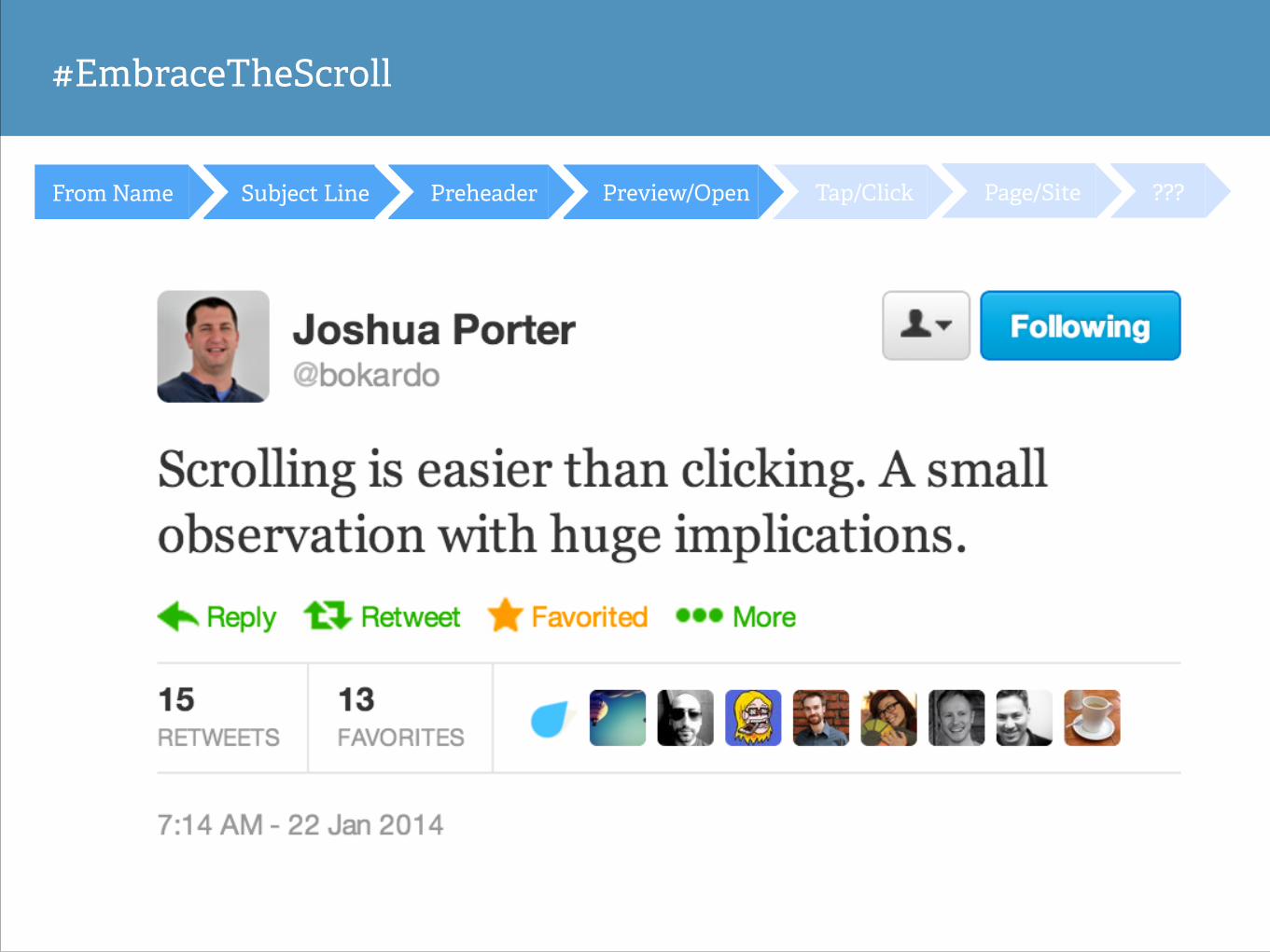
#EmbraceTheScroll
???Page/SiteTap/ClickPreview/OpenPreheaderSubject LineFrom Name
#EmbraceTheScroll
???Page/SiteTap/ClickPreview/OpenPreheaderSubject LineFrom Name
Scrolling is a continuation. Clicking is a decision.
!
Hundreds or thousands of decisions taken together add up to real friction.
@bokardo
???Page/SiteTap/ClickPreview/OpenPreheaderSubject Line
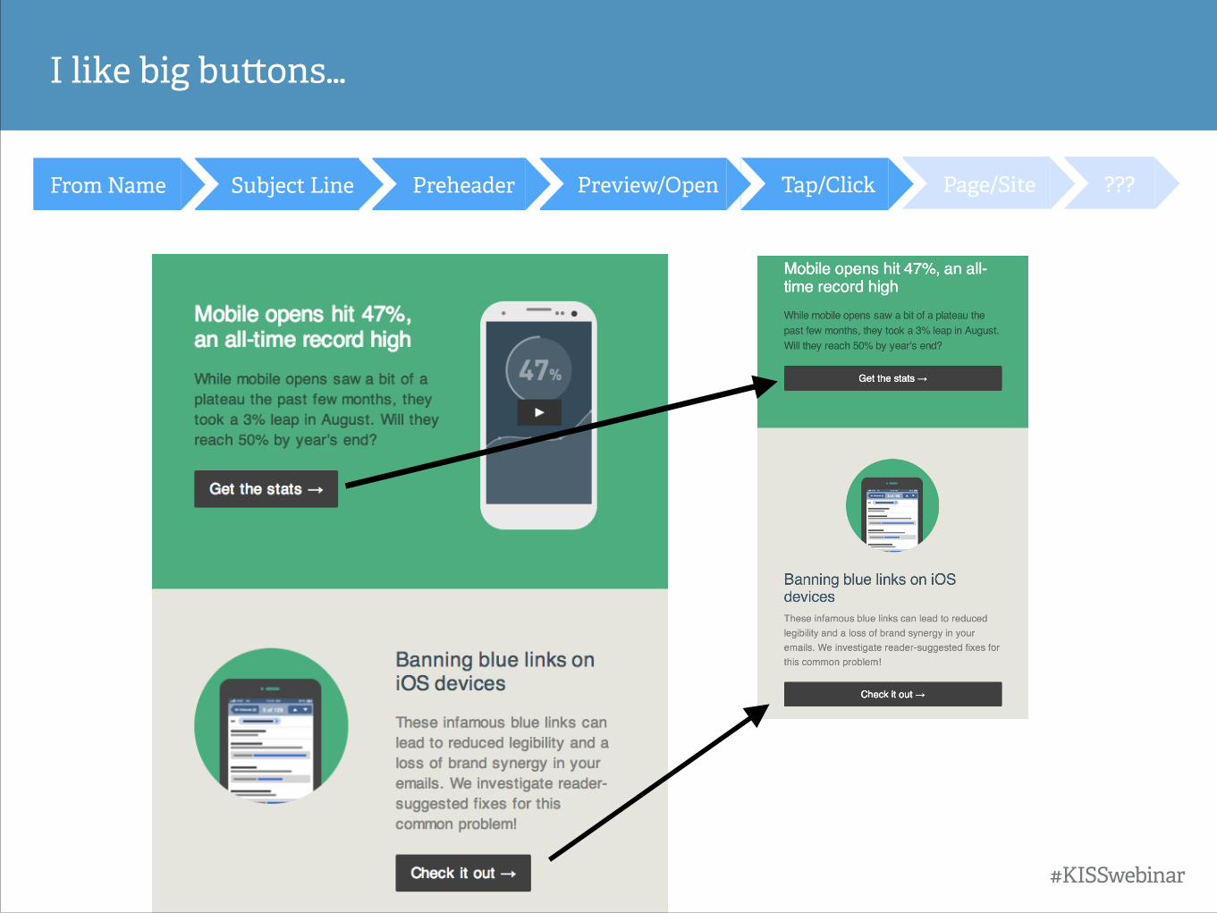
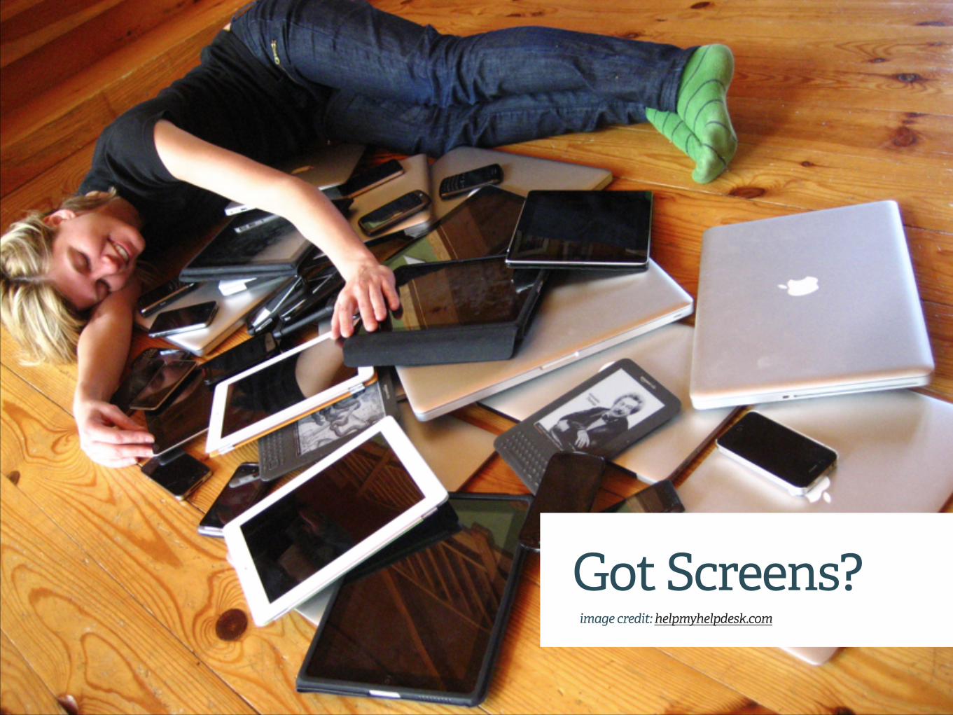
I like big bu!ons…
From Name
#KISSwebinar
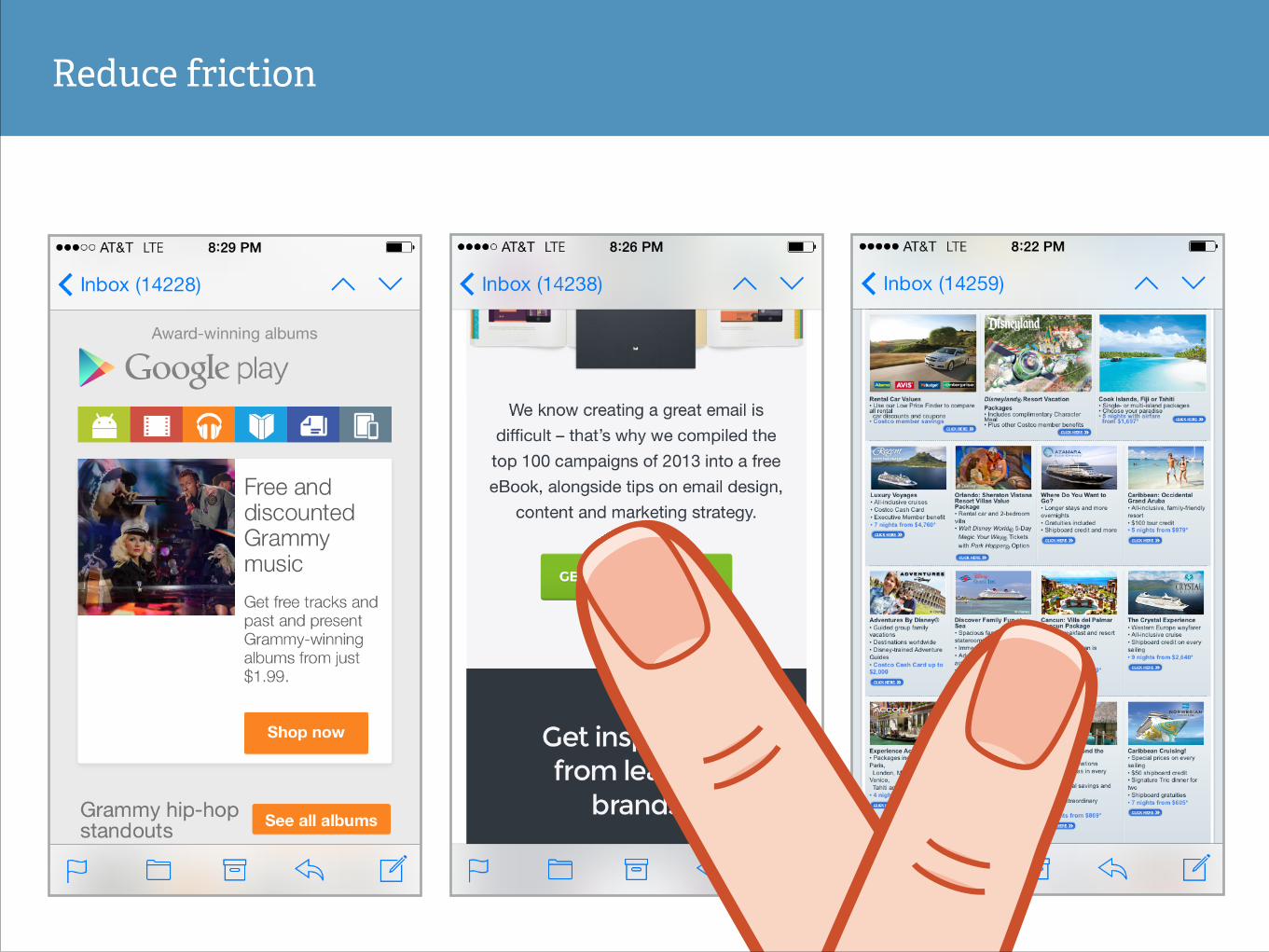
Reduce friction
???Page/SiteTap/ClickPreview/OpenPreheaderSubject Line
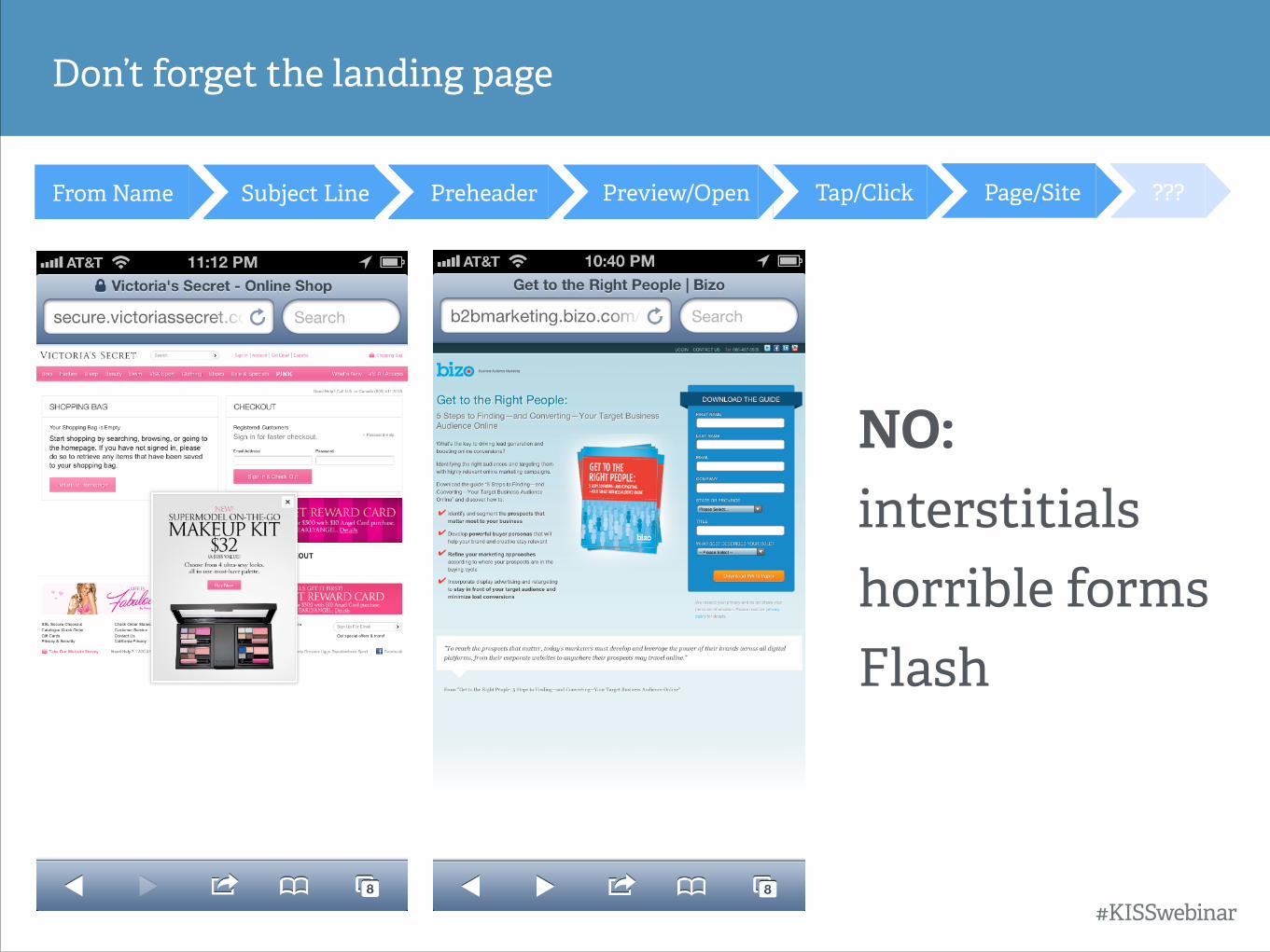
Don’t forget the landing page
From Name
NO: interstitials horrible forms Flash
#KISSwebinar
???Page/SiteTap/ClickPreview/OpenPreheaderSubject Line
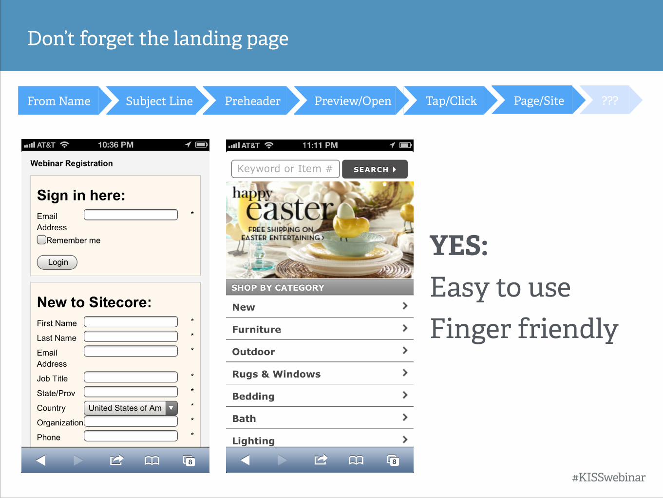
Don’t forget the landing page
From Name
YES: Easy to use Finger friendly
#KISSwebinar
???Page/SiteTap/ClickPreview/OpenPreheaderSubject Line
Consider the conversion path
From Name
➡ What is your goal?
➡ Can the CTA be achieved on mobile?
➡ Is it tappable?
➡ How many clicks/taps/actions are required?
➡ Is the landing page optimized? Should it be?
#KISSwebinar
strategy #1
mobile first !
aka agnostic, aware, scalable
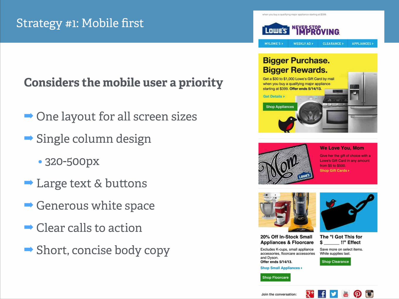
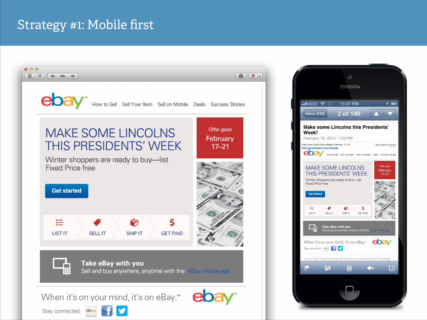
Strategy #1: Mobile first
Considers the mobile user a priority
➡ One layout for all screen sizes
➡ Single column design
• 320-500px
➡ Large text & bu!ons
➡ Generous white space
➡ Clear calls to action
➡ Short, concise body copy
Strategy #1: Mobile first

strategy #2
fluid
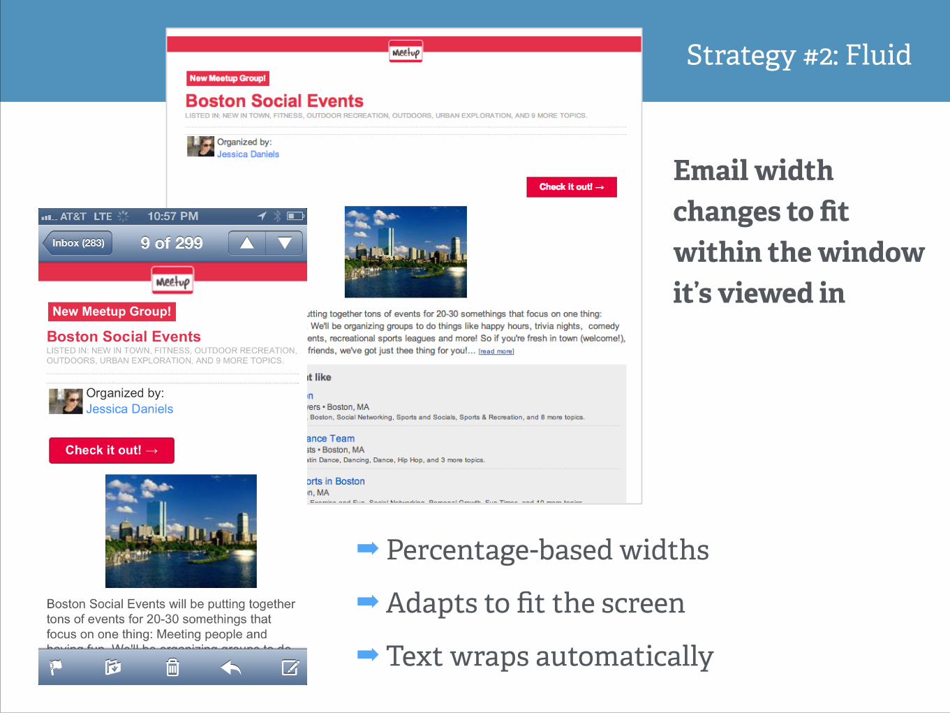
Strategy #2: Fluid
Email width changes to fit within the window it’s viewed in
!
➡ Percentage-based widths
➡ Adapts to fit the screen
➡ Text wraps automatically
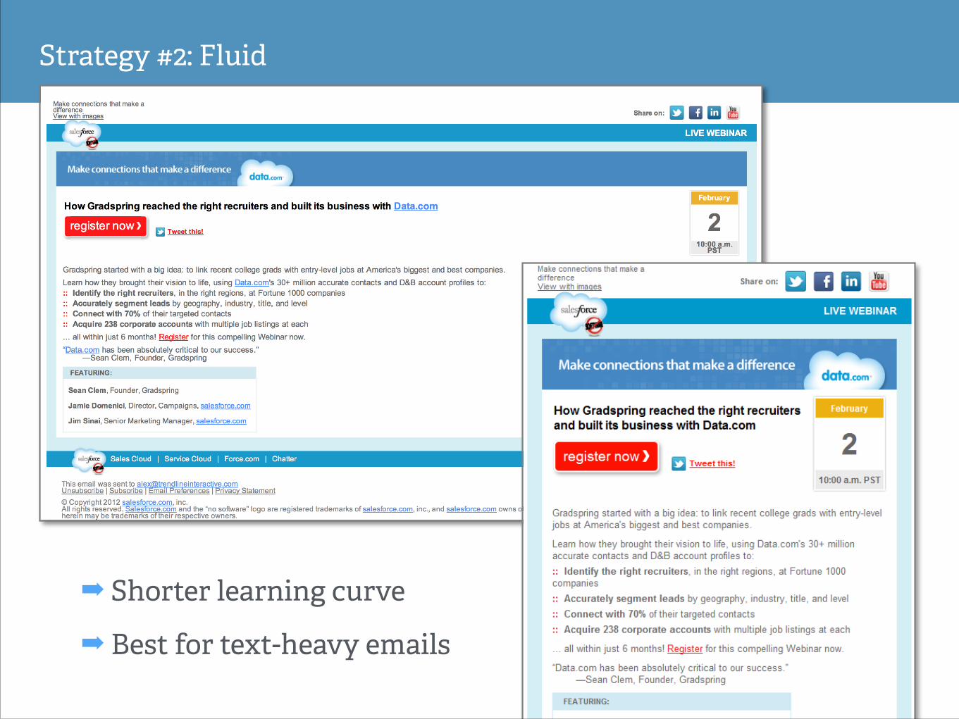
Strategy #2: Fluid
!
➡ Shorter learning curve
➡ Best for text-heavy emails
strategy #3
responsive
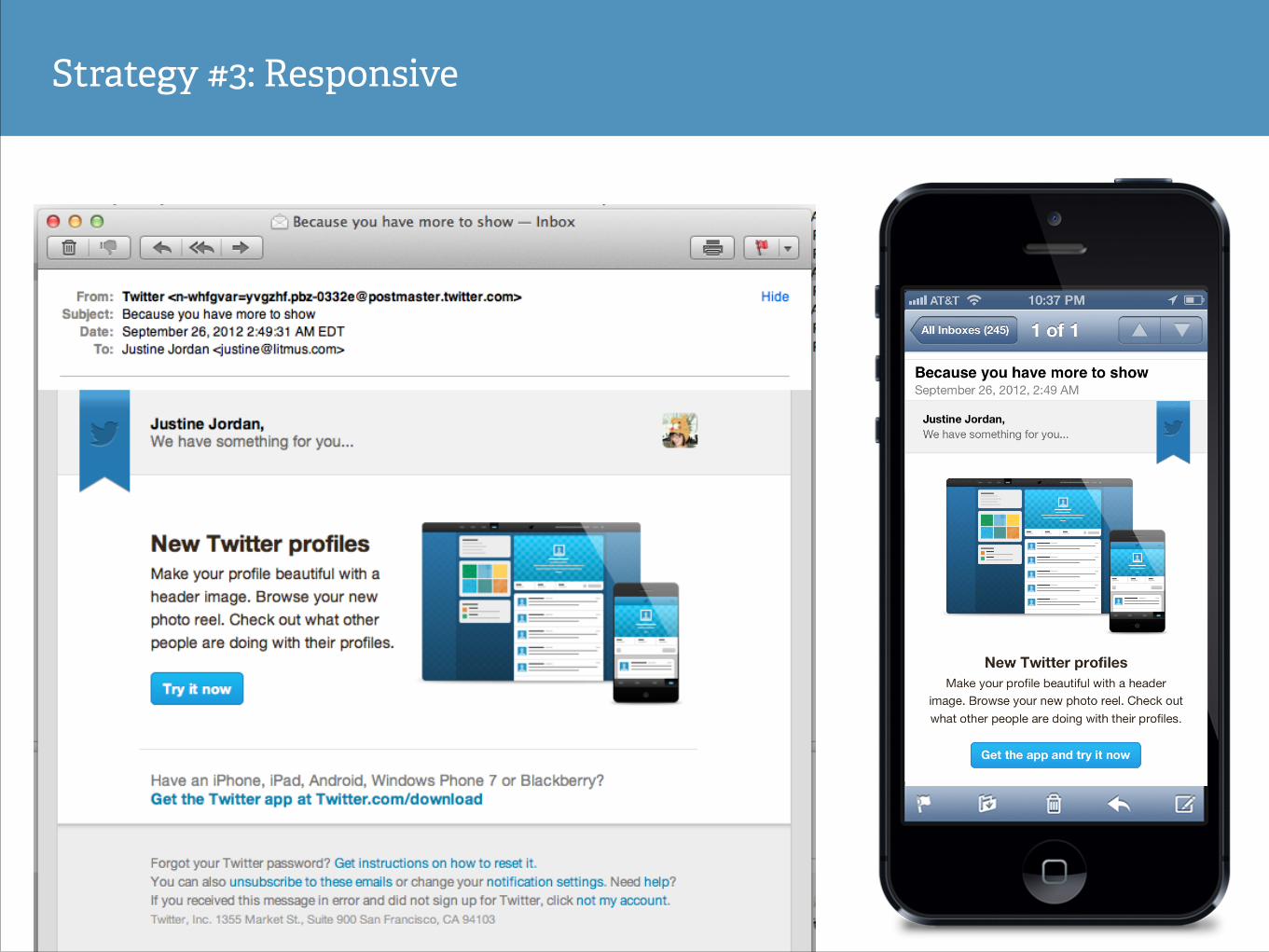
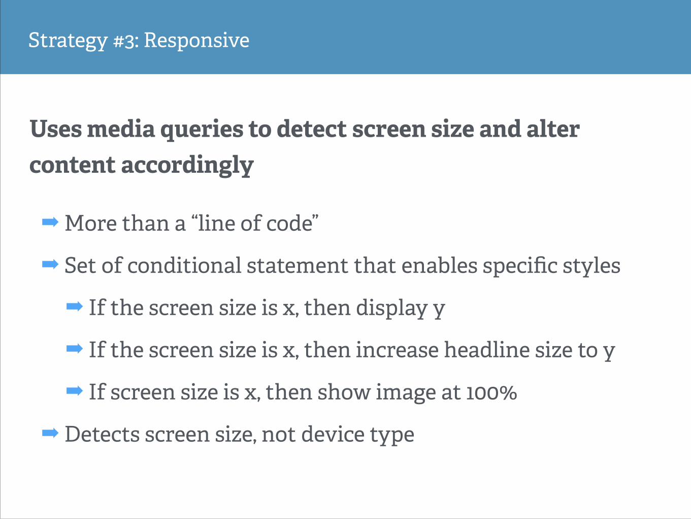
Strategy #3: Responsive
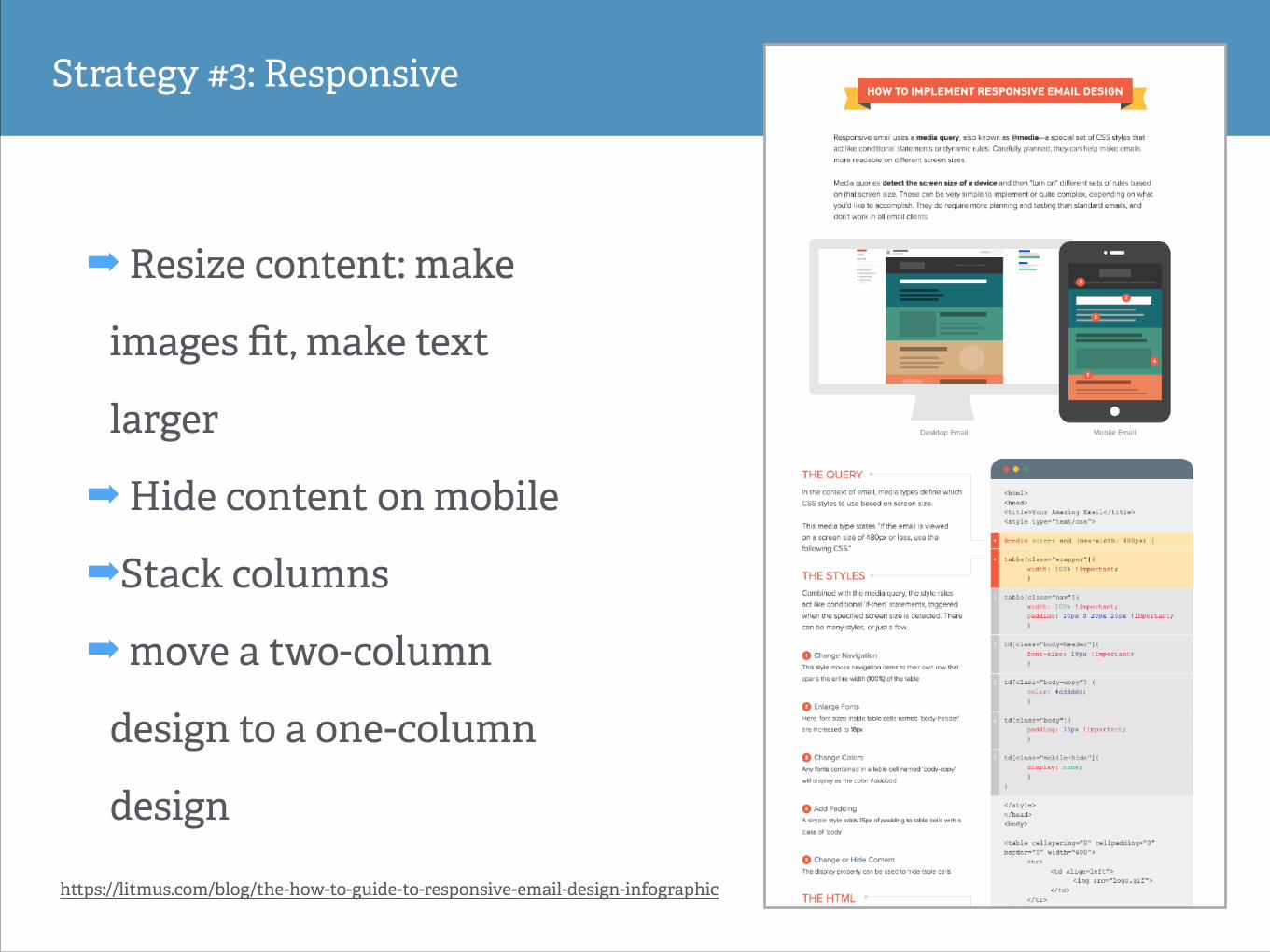
Strategy #3: Responsive
➡ Resize content: make
images fit, make text
larger
➡ Hide content on mobile
➡Stack columns
➡ move a two-column
design to a one-column
design
h!ps://litmus.com/blog/the-how-to-guide-to-responsive-email-design-infographic
Strategy #3: Responsive
➡ More than a “line of code”
➡ Set of conditional statement that enables specific styles
➡ If the screen size is x, then display y
➡ If the screen size is x, then increase headline size to y
➡ If screen size is x, then show image at 100%
➡ Detects screen size, not device type
Uses media queries to detect screen size and alter content accordingly
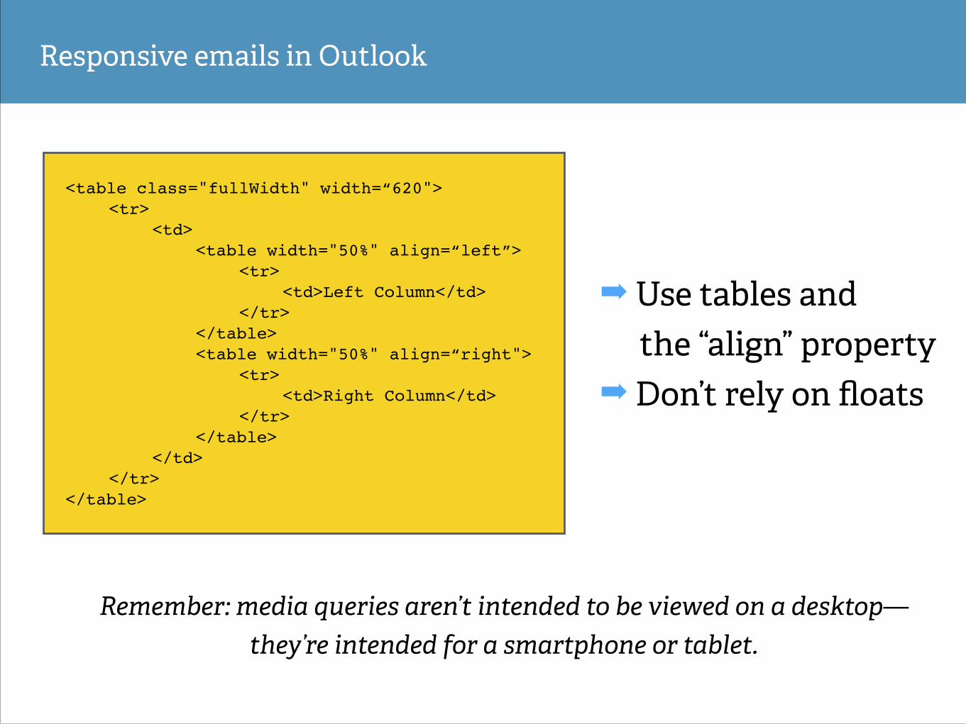
Responsive emails in Outlook
➡ Use tables and the “align” property
➡ Don’t rely on floats
<table class="fullWidth" width=“620">!! <tr>!! ! <td>!! ! ! <table width="50%" align=“left”>!! ! ! ! <tr>!! ! ! ! ! <td>Left Column</td>!! ! ! ! </tr>!! ! ! </table>!! ! ! <table width="50%" align=“right">!! ! ! ! <tr>!! ! ! ! ! <td>Right Column</td>!! ! ! ! </tr>!! ! ! </table>!! ! </td> !! </tr>!</table>
Remember: media queries aren’t intended to be viewed on a desktop— they’re intended for a smartphone or tablet.
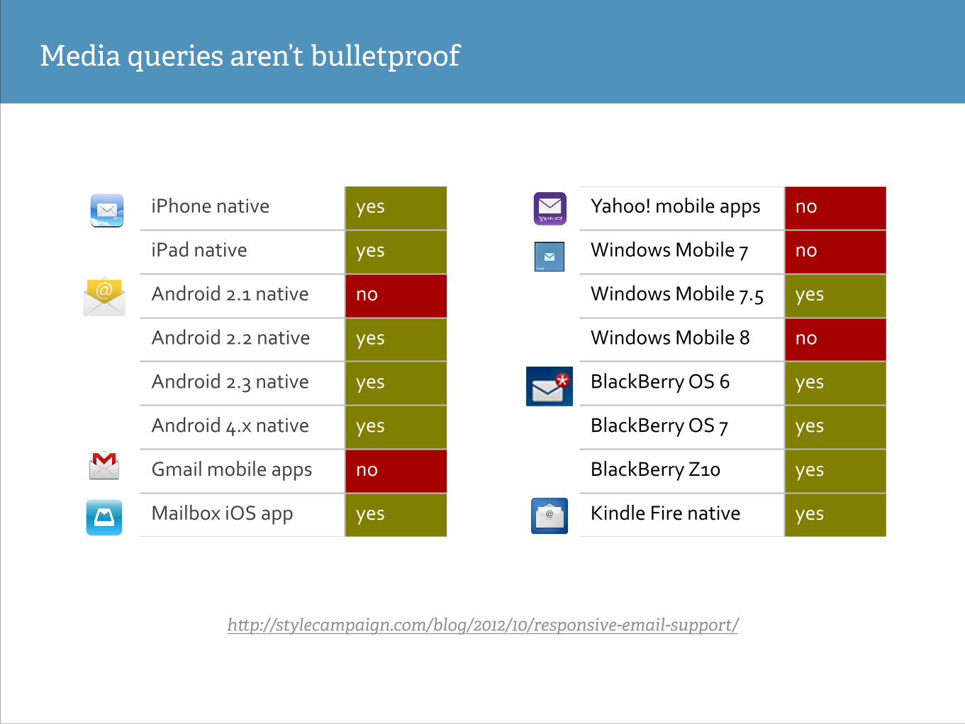
Media queries aren’t bulletproof
h!p://stylecampaign.com/blog/2012/10/responsive-email-support/
iPhone'native' yes'
iPad'native' yes'
Android'2.1'native' no'
Android'2.2'native' yes'
Android'2.3'native' yes'
Android'4.x'native' yes'
Gmail'mobile'apps' no'
Mailbox'iOS'app' yes'
Yahoo!'mobile'apps' no'
Windows'Mobile'7' no'
Windows'Mobile'7.5' yes'
Windows'Mobile'8' no'
BlackBerry'OS'6' yes'
BlackBerry'OS'7' yes'
BlackBerry'Z10' yes'
Kindle'Fire'native' yes'
Email is a unique medium with unique considerations
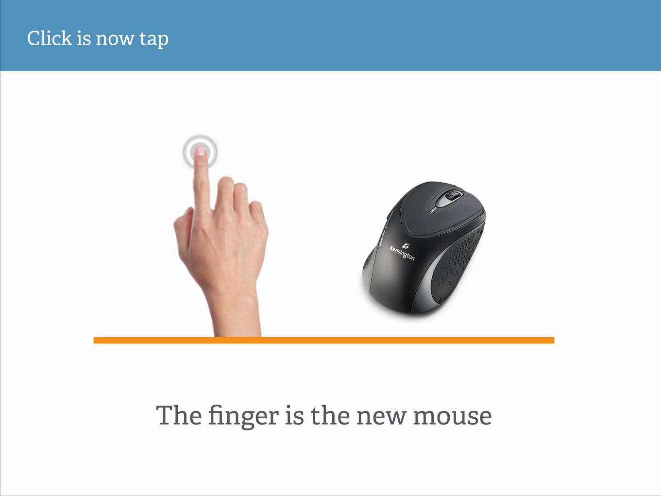
Click is now tap
The finger is the new mouse
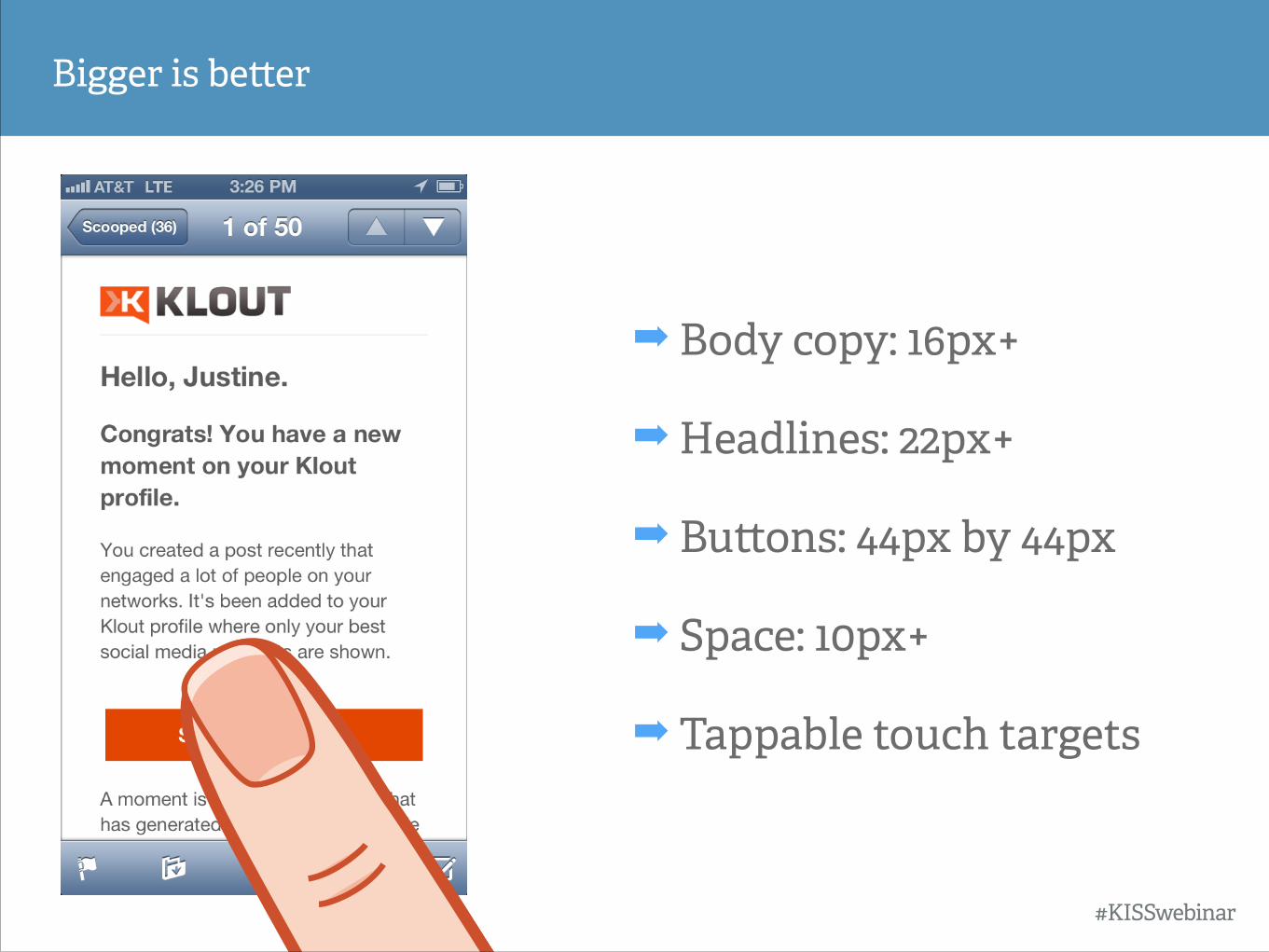
Bigger is be!er
➡ Body copy: 16px+
➡ Headlines: 22px+
➡ Bu!ons: 44px by 44px
➡ Space: 10px+
➡ Tappable touch targets
#KISSwebinar
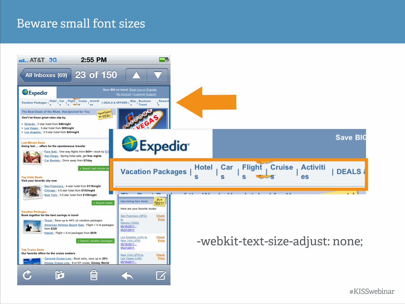
Beware small font sizes
-webkit-text-size-adjust: none;
#KISSwebinar
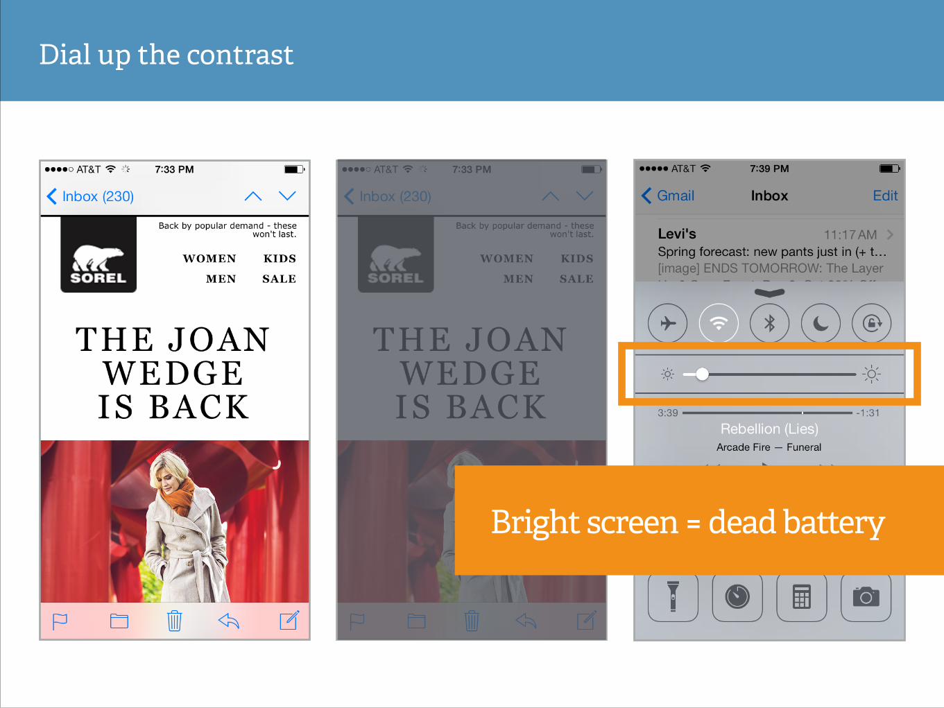
Dial up the contrast
Bright screen = dead battery
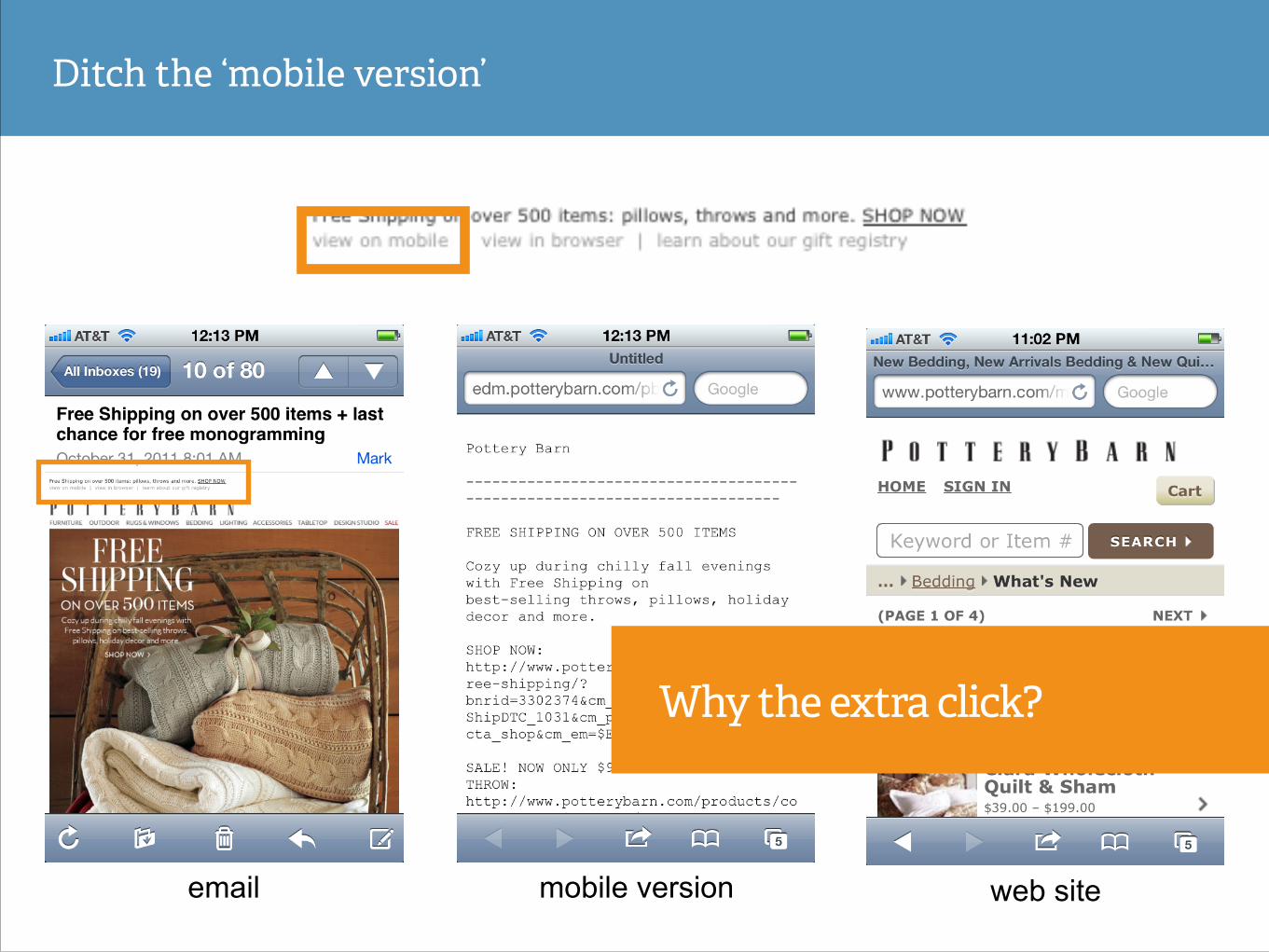
email mobile version web site
Ditch the ‘mobile version’
Why the extra click?
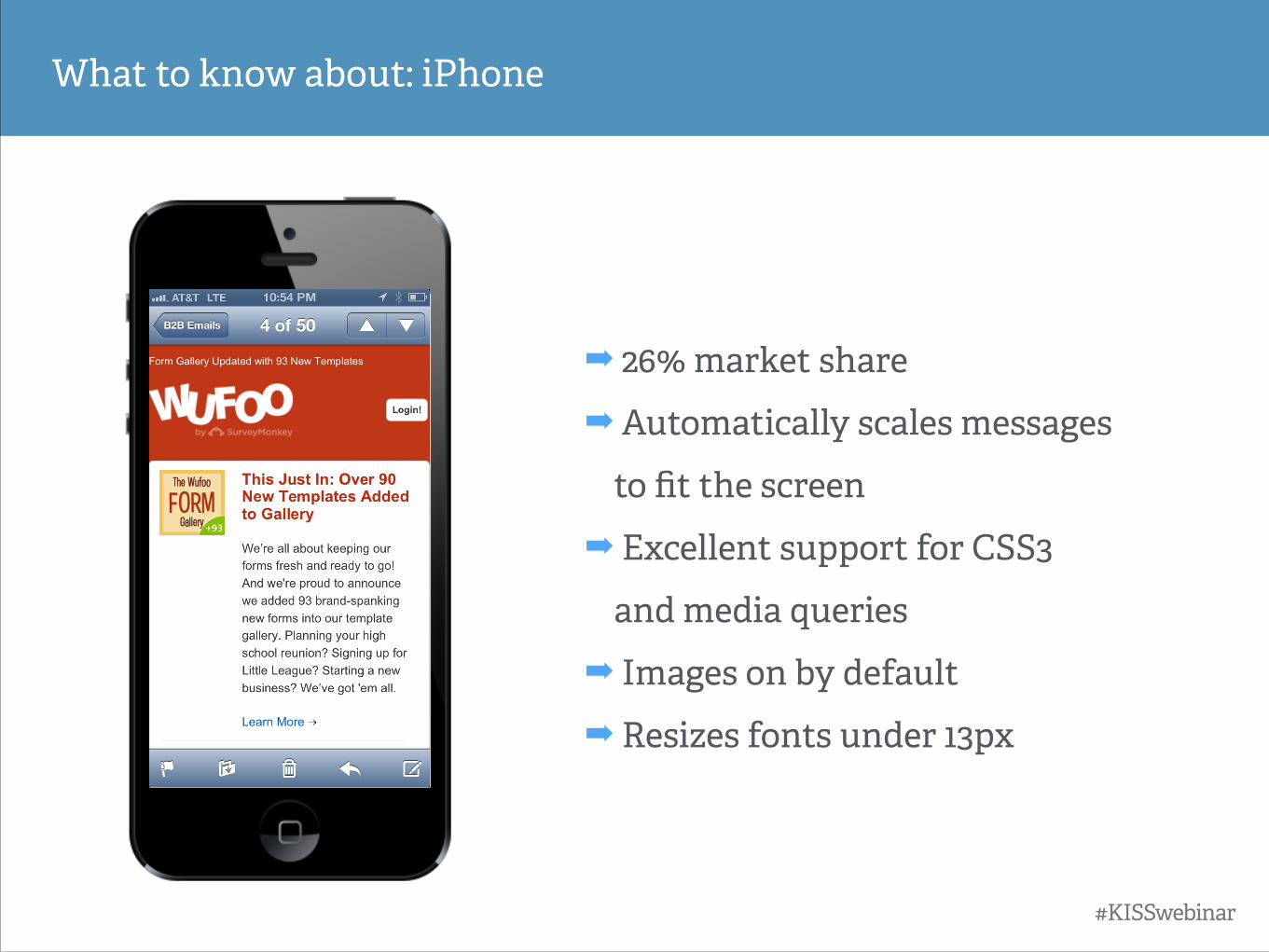
What to know about: iPhone
➡ 26% market share
➡ Automatically scales messages to fit the screen
➡ Excellent support for CSS3
and media queries
➡ Images on by default
➡ Resizes fonts under 13px
#KISSwebinar
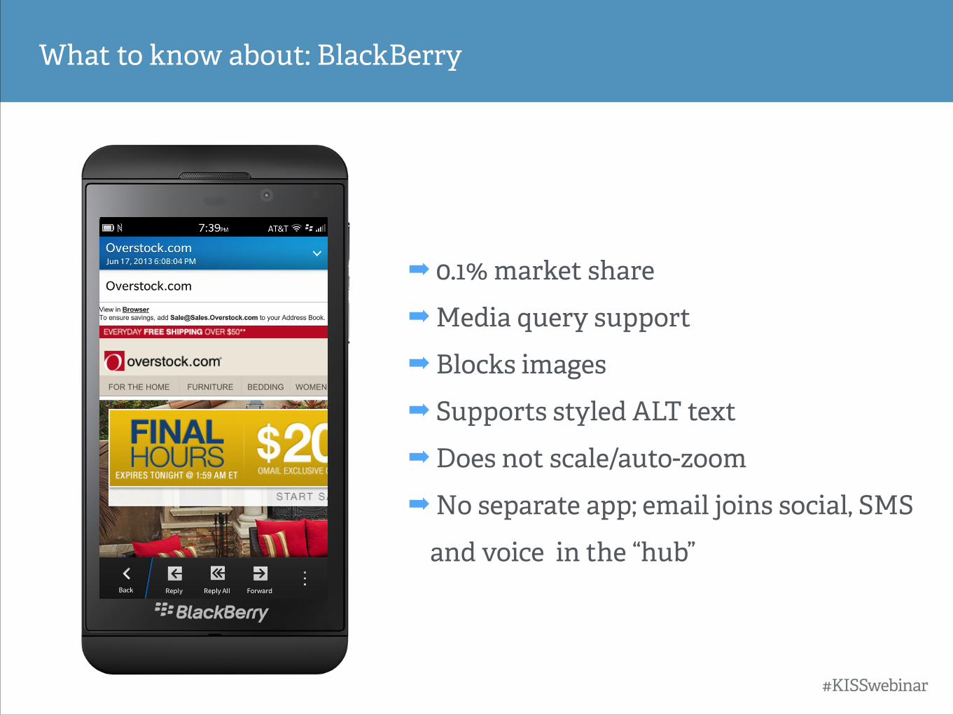
What to know about: BlackBerry
➡ 0.1% market share
➡ Media query support
➡ Blocks images
➡ Supports styled ALT text
➡ Does not scale/auto-zoom
➡ No separate app; email joins social, SMS
and voice in the “hub”
#KISSwebinar
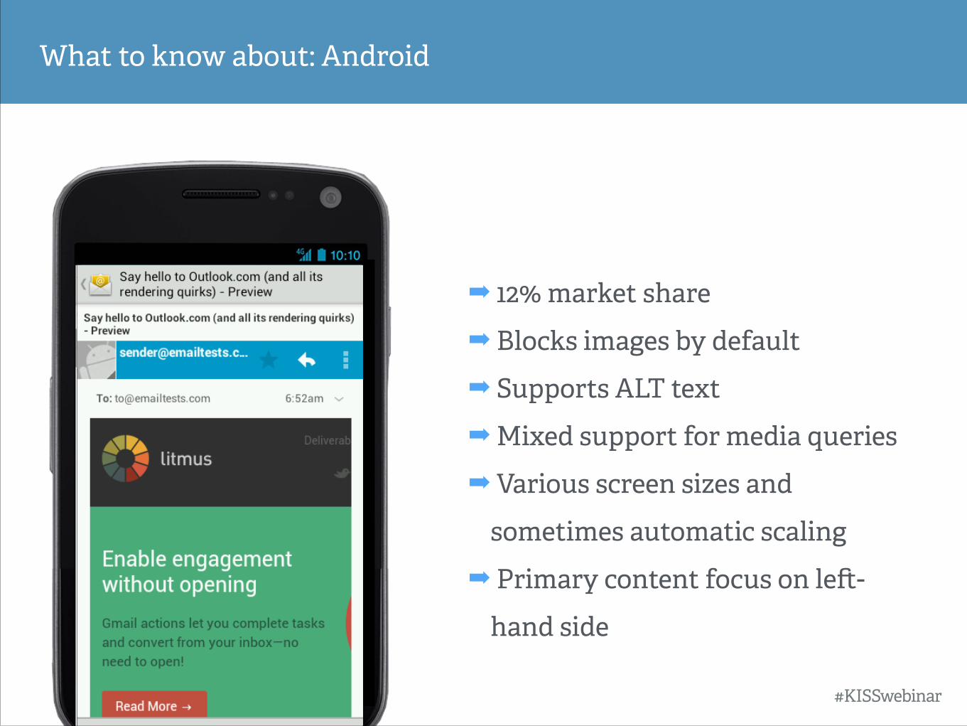
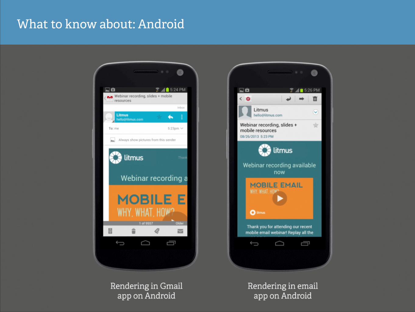
What to know about: Android
➡ 12% market share
➡ Blocks images by default
➡ Supports ALT text
➡ Mixed support for media queries
➡ Various screen sizes and
sometimes automatic scaling
➡ Primary content focus on le#-
hand side
#KISSwebinar
What to know about: Android
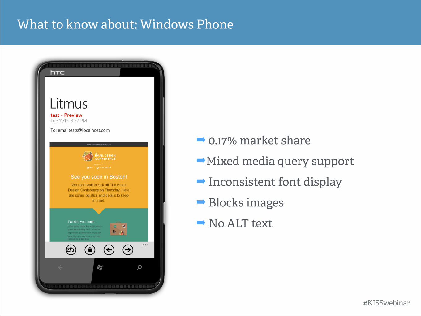
What to know about: Windows Phone
➡ 0.17% market share
➡Mixed media query support
➡ Inconsistent font display
➡ Blocks images
➡ No ALT text
#KISSwebinar
Device ≠ email client
Device ≠ email client
Email is an application and occasionally a mobile browser
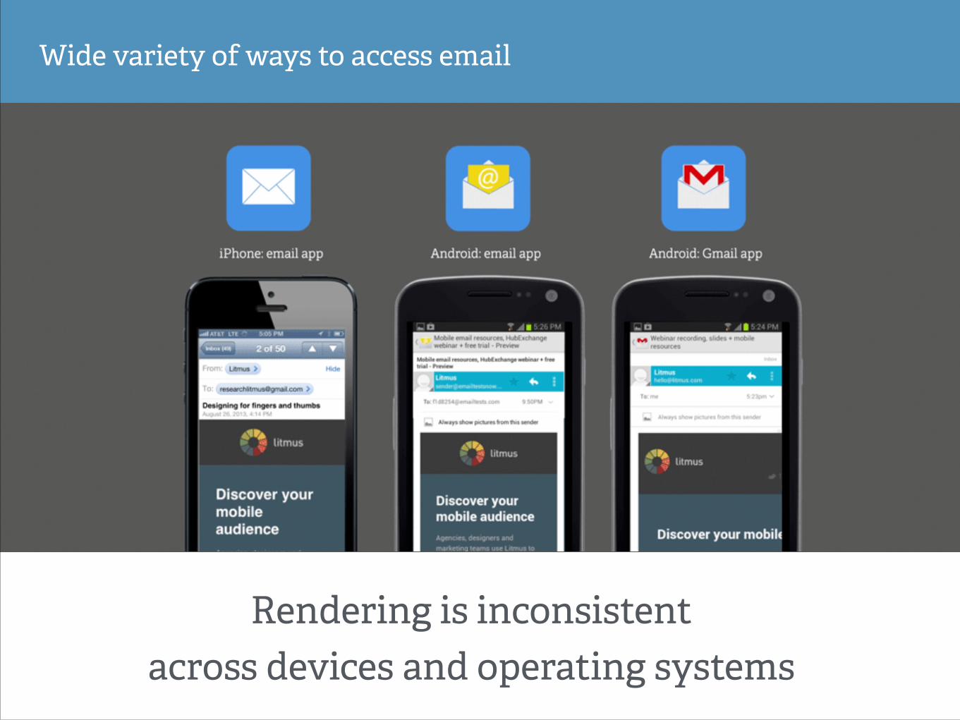
Wide variety of ways to access email
Rendering is inconsistent across devices and operating systems
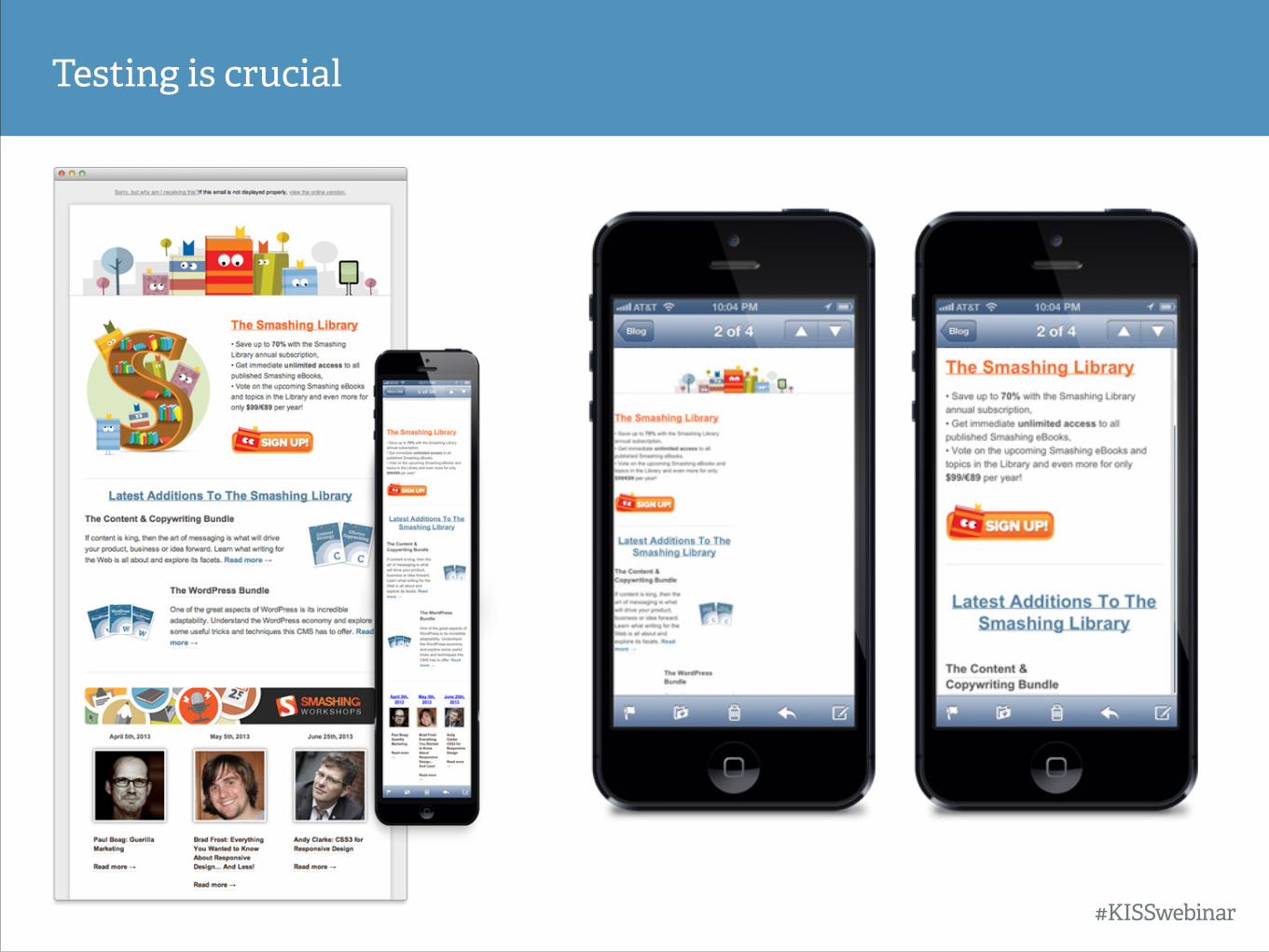
Testing is crucial
#KISSwebinar
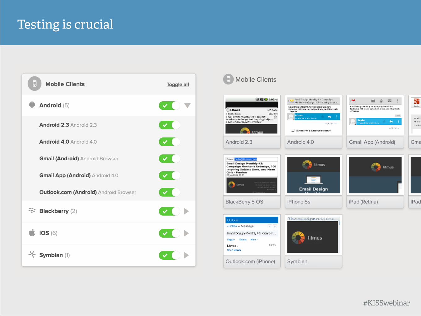
Testing is crucial
#KISSwebinar
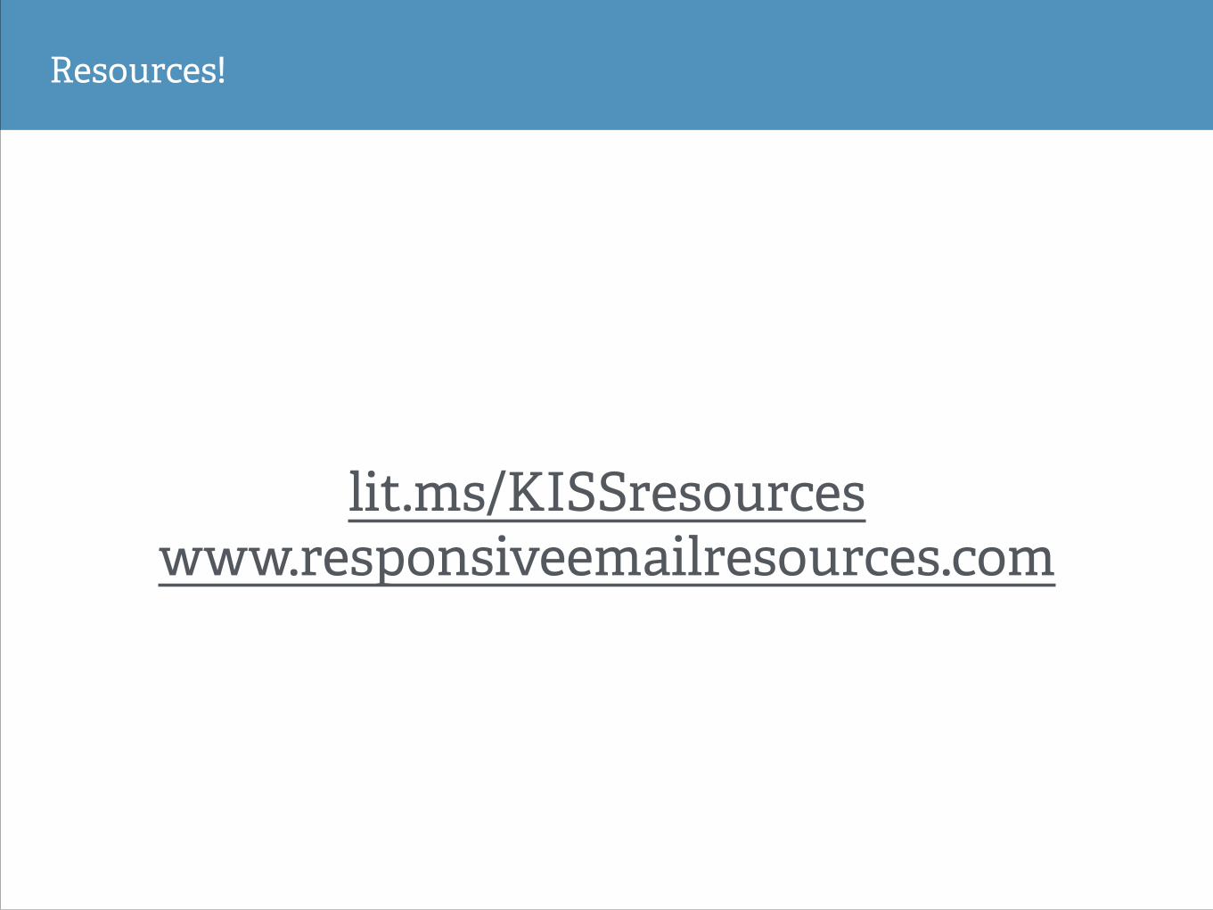
Resources!
lit.ms/KISSresources www.responsiveemailresources.com
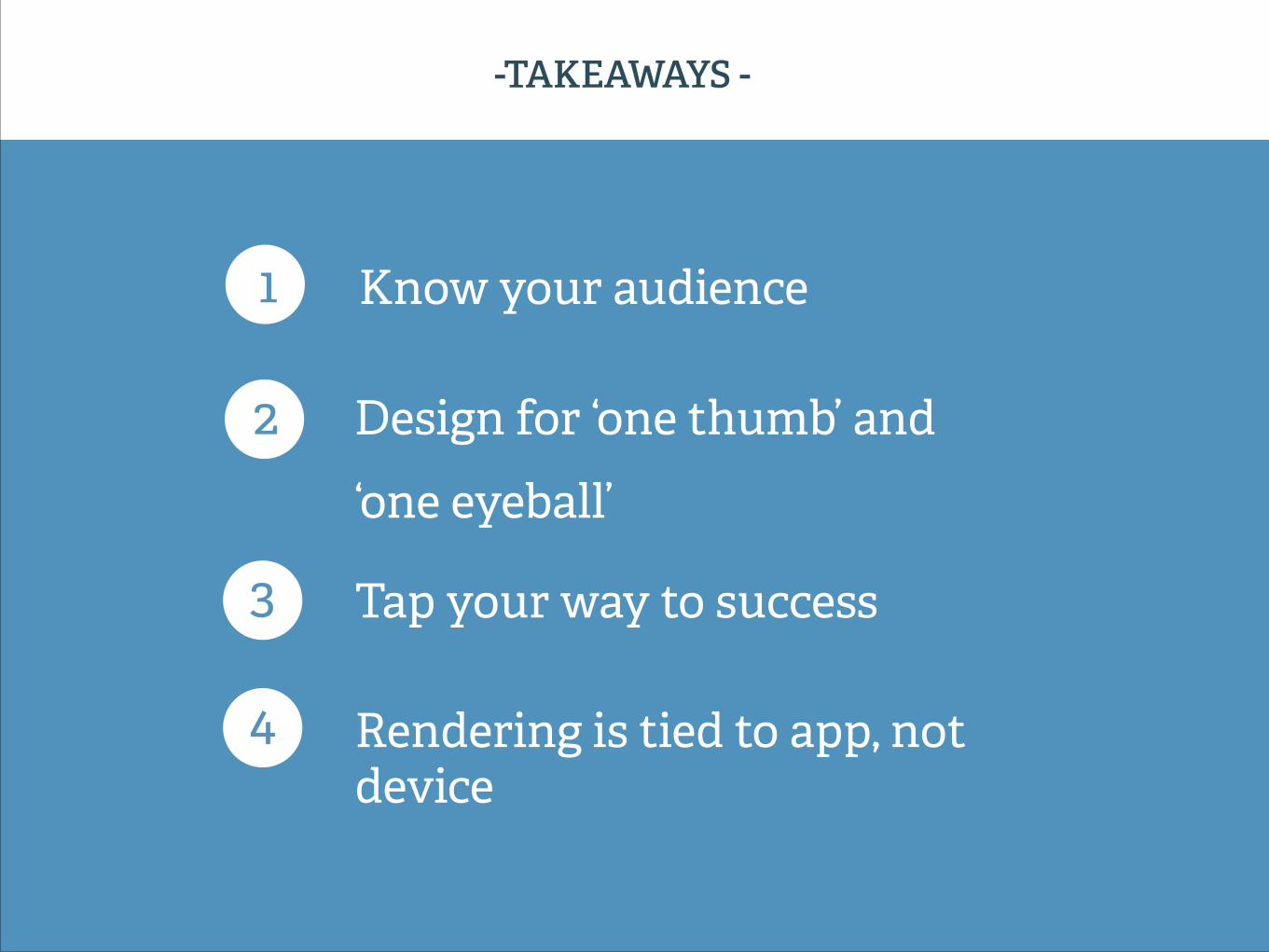
1 Know your audience
2 Design for ‘one thumb’ and ‘one eyeball’
3 Tap your way to success
-TAKEAWAYS -
4 Rendering is tied to app, not device
Questions? I (may) have answers.


