Embed Size (px)
Citation preview
Sixth Form magazine Analysis;
By Sophie Rudd
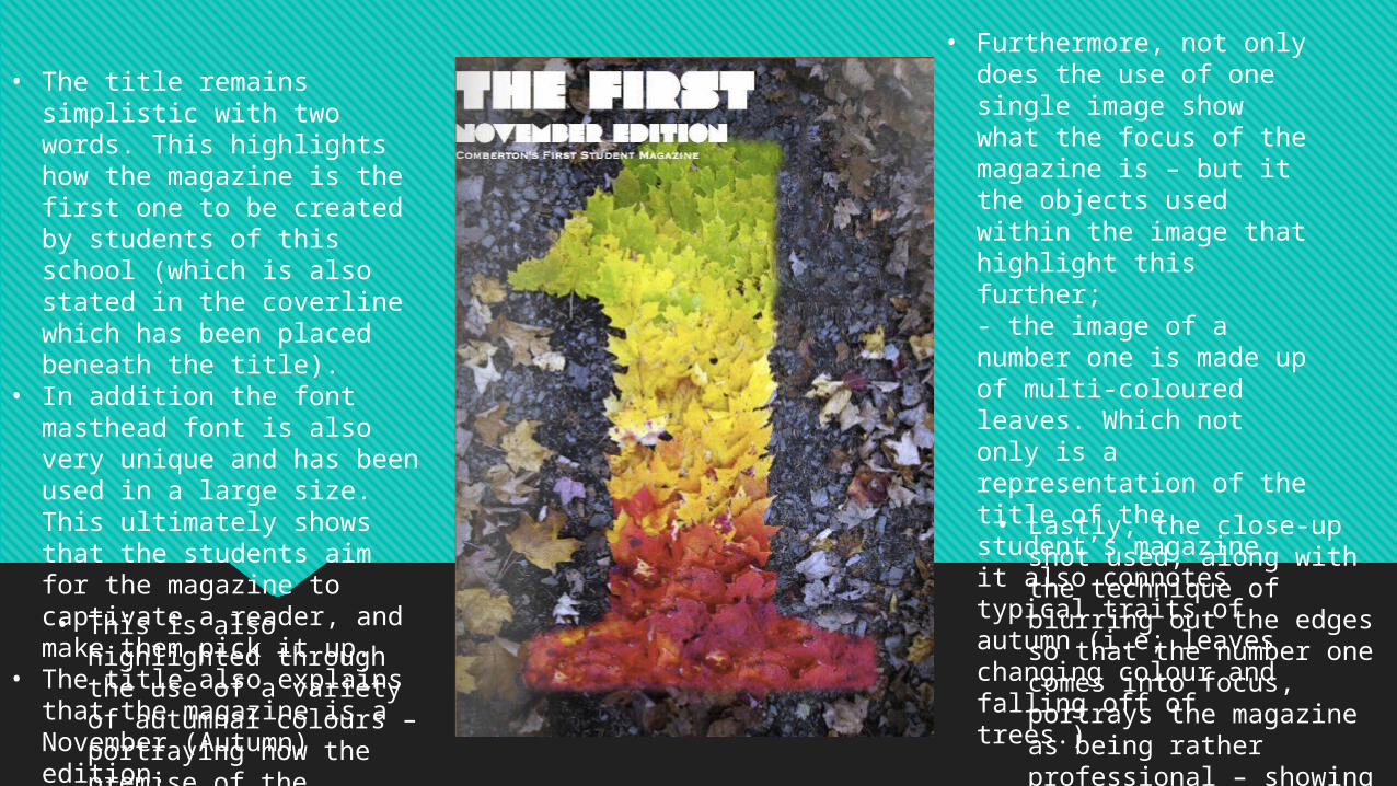
• The title remains simplistic with two words. This highlights how the magazine is the first one to be created by students of this school (which is also stated in the coverline which has been placed beneath the title).
• In addition the font masthead font is also very unique and has been used in a large size. This ultimately shows that the students aim for the magazine to captivate a reader, and make them pick it up.
• The title also explains that the magazine is a November (Autumn) edition.• This is also highlighted
through the use of a variety of autumnal colours – portraying how the premise of the magazine is possibly the theme of autumn.
• Furthermore, not only does the use of one single image show what the focus of the magazine is – but it the objects used within the image that highlight this further;- the image of a number one is made up of multi-coloured leaves. Which not only is a representation of the title of the student’s magazine, it also connotes typical traits of autumn (i.e; leaves changing colour and falling off of trees.)
• Lastly, the close-up shot used, along with the technique of blurring out the edges so that the number one comes into focus, portrays the magazine as being rather professional – showing that the students take pride in their work, and their school.
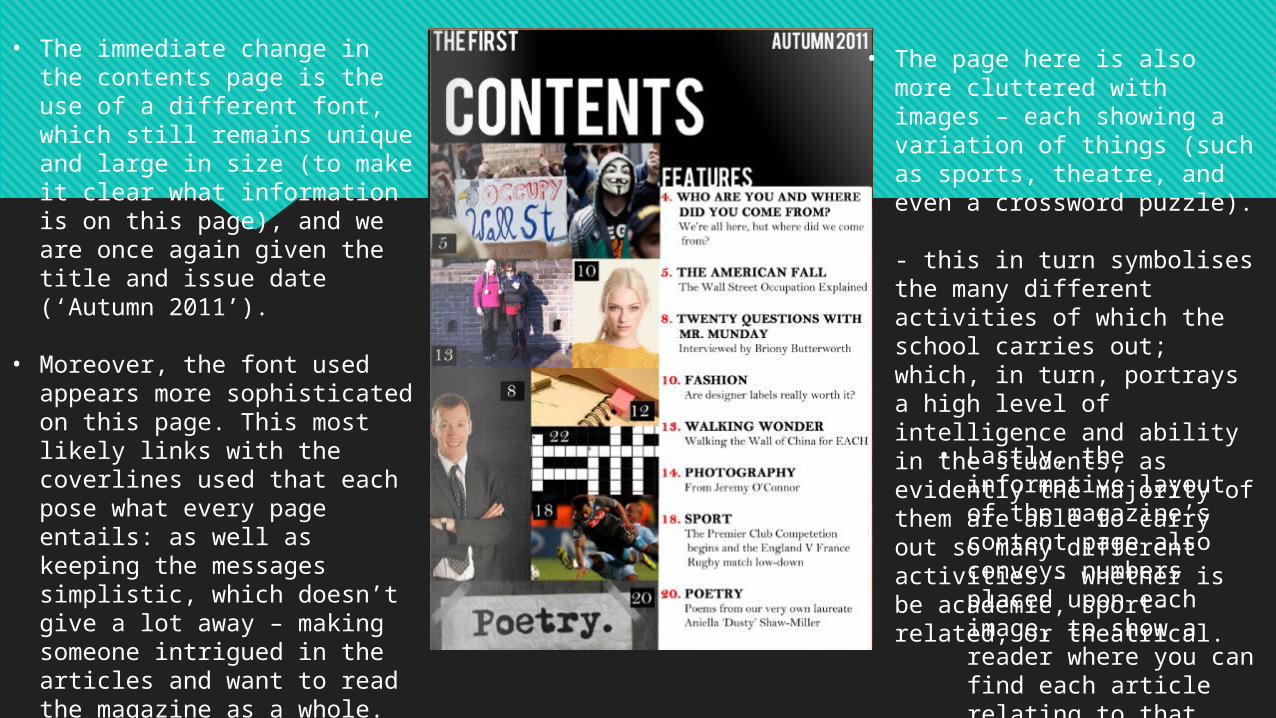
• The immediate change in the contents page is the use of a different font, which still remains unique and large in size (to make it clear what information is on this page), and we are once again given the title and issue date (‘Autumn 2011’).
• Moreover, the font used appears more sophisticated on this page. This most likely links with the coverlines used that each pose what every page entails: as well as keeping the messages simplistic, which doesn’t give a lot away – making someone intrigued in the articles and want to read the magazine as a whole. - ultimately this also symbolises the sophisticated nature of the students; once again highlighting their pride in their school and the maturity of everyone who attends it.
• The page here is also more cluttered with images – each showing a variation of things (such as sports, theatre, and even a crossword puzzle). - this in turn symbolises the many different activities of which the school carries out; which, in turn, portrays a high level of intelligence and ability in the students, as evidently the majority of them are able to carry out so many different activities – whether is be academic, sport-related, or theatrical.
• Lastly, the informative layout of the magazine’s content page also conveys numbers placed upon each image, to show a reader where you can find each article relating to that image in the magazine (which is also useful is someone is only interested in certain articles.)