Embed Size (px)
Citation preview
Media Production LogLuke Brazier
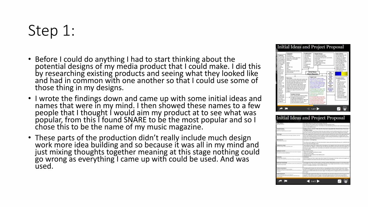
Step 1:
• Before I could do anything I had to start thinking about the potential designs of my media product that I could make. I did this by researching existing products and seeing what they looked like and had in common with one another so that I could use some of those thing in my designs.
• I wrote the findings down and came up with some initial ideas and names that were in my mind. I then showed these names to a few people that I thought I would aim my product at to see what was popular, from this I found SNARE to be the most popular and so I chose this to be the name of my music magazine.
• These parts of the production didn’t really include much design work more idea building and so because it was all in my mind and just mixing thoughts together meaning at this stage nothing could go wrong as everything I came up with could be used. And was used.
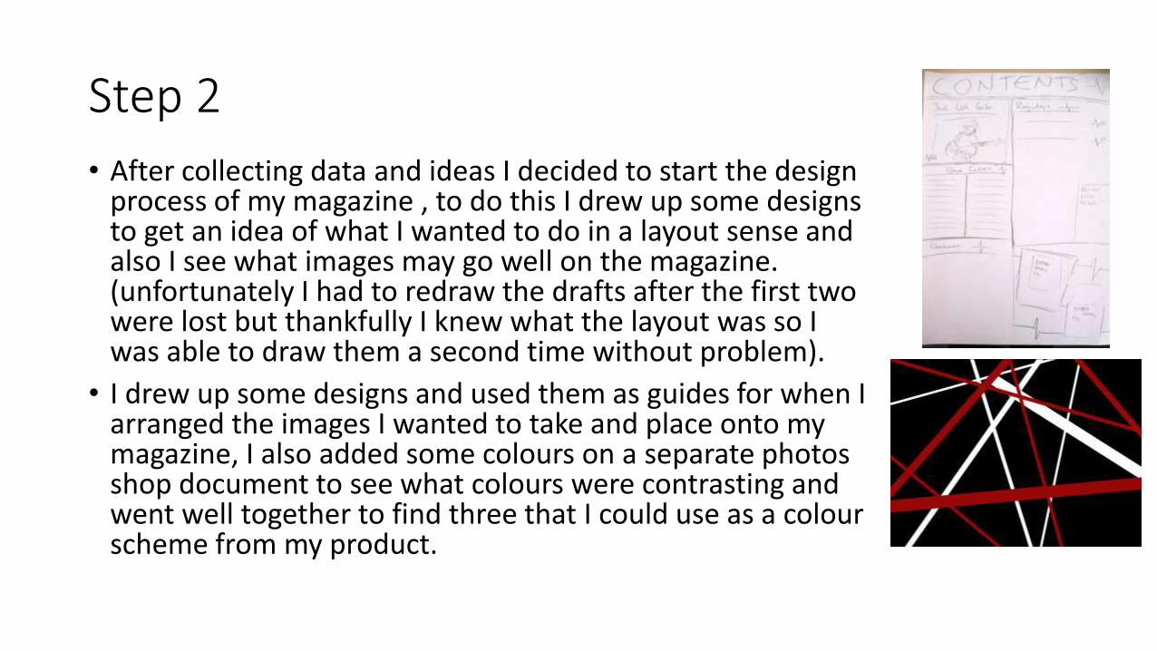
Step 2
• After collecting data and ideas I decided to start the design process of my magazine , to do this I drew up some designs to get an idea of what I wanted to do in a layout sense and also I see what images may go well on the magazine. (unfortunately I had to redraw the drafts after the first two were lost but thankfully I knew what the layout was so I was able to draw them a second time without problem).
• I drew up some designs and used them as guides for when I arranged the images I wanted to take and place onto my magazine, I also added some colours on a separate photos shop document to see what colours were contrasting and went well together to find three that I could use as a colour scheme from my product.
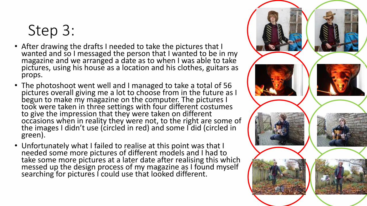
Step 3: • After drawing the drafts I needed to take the pictures that I
wanted and so I messaged the person that I wanted to be in my magazine and we arranged a date as to when I was able to take pictures, using his house as a location and his clothes, guitars as props.
• The photoshoot went well and I managed to take a total of 56 pictures overall giving me a lot to choose from in the future as I begun to make my magazine on the computer. The pictures I took were taken in three settings with four different costumes to give the impression that they were taken on different occasions when in reality they were not, to the right are some of the images I didn’t use (circled in red) and some I did (circled in green).
• Unfortunately what I failed to realise at this point was that I needed some more pictures of different models and I had to take some more pictures at a later date after realising this which messed up the design process of my magazine as I found myself searching for pictures I could use that looked different.
Step 4:
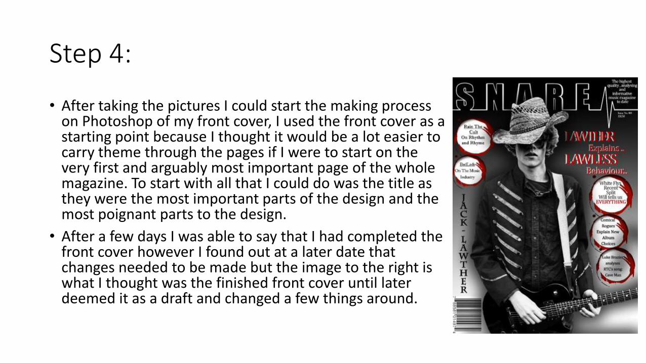
• After taking the pictures I could start the making process on Photoshop of my front cover, I used the front cover as a starting point because I thought it would be a lot easier to carry theme through the pages if I were to start on the very first and arguably most important page of the whole magazine. To start with all that I could do was the title as they were the most important parts of the design and the most poignant parts to the design.
• After a few days I was able to say that I had completed the front cover however I found out at a later date that changes needed to be made but the image to the right is what I thought was the finished front cover until later deemed it as a draft and changed a few things around.
Step 5:
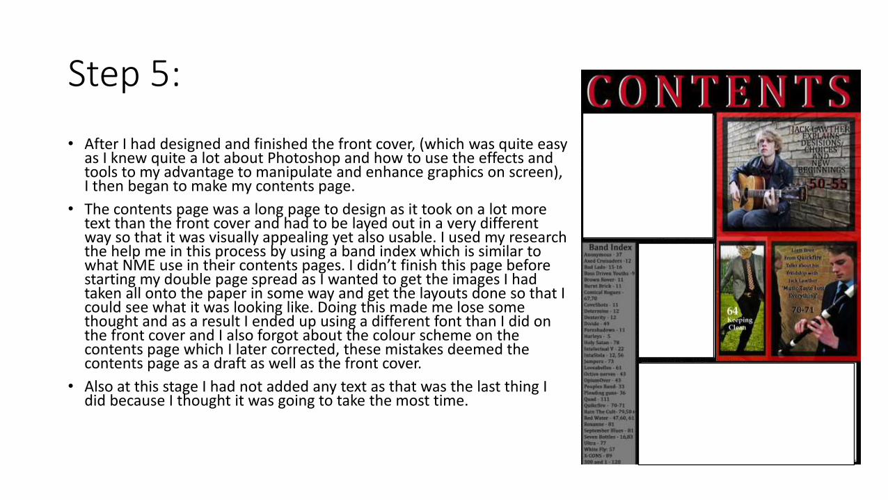
• After I had designed and finished the front cover, (which was quite easy as I knew quite a lot about Photoshop and how to use the effects and tools to my advantage to manipulate and enhance graphics on screen), I then began to make my contents page.
• The contents page was a long page to design as it took on a lot more text than the front cover and had to be layed out in a very different way so that it was visually appealing yet also usable. I used my research the help me in this process by using a band index which is similar to what NME use in their contents pages. I didn’t finish this page before starting my double page spread as I wanted to get the images I had taken all onto the paper in some way and get the layouts done so that I could see what it was looking like. Doing this made me lose some thought and as a result I ended up using a different font than I did on the front cover and I also forgot about the colour scheme on the contents page which I later corrected, these mistakes deemed the contents page as a draft as well as the front cover.
• Also at this stage I had not added any text as that was the last thing I did because I thought it was going to take the most time.
Step 6:
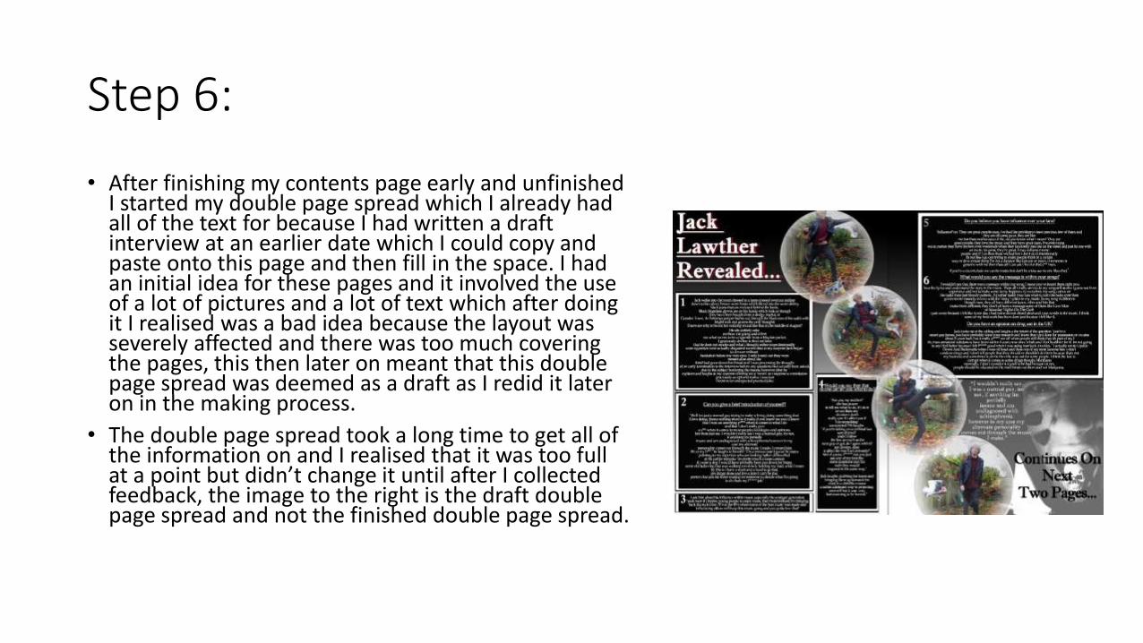
• After finishing my contents page early and unfinished I started my double page spread which I already had all of the text for because I had written a draft interview at an earlier date which I could copy and paste onto this page and then fill in the space. I had an initial idea for these pages and it involved the use of a lot of pictures and a lot of text which after doing it I realised was a bad idea because the layout was severely affected and there was too much covering the pages, this then later on meant that this double page spread was deemed as a draft as I redid it later on in the making process.
• The double page spread took a long time to get all of the information on and I realised that it was too full at a point but didn’t change it until after I collected feedback, the image to the right is the draft double page spread and not the finished double page spread.
Step 7:
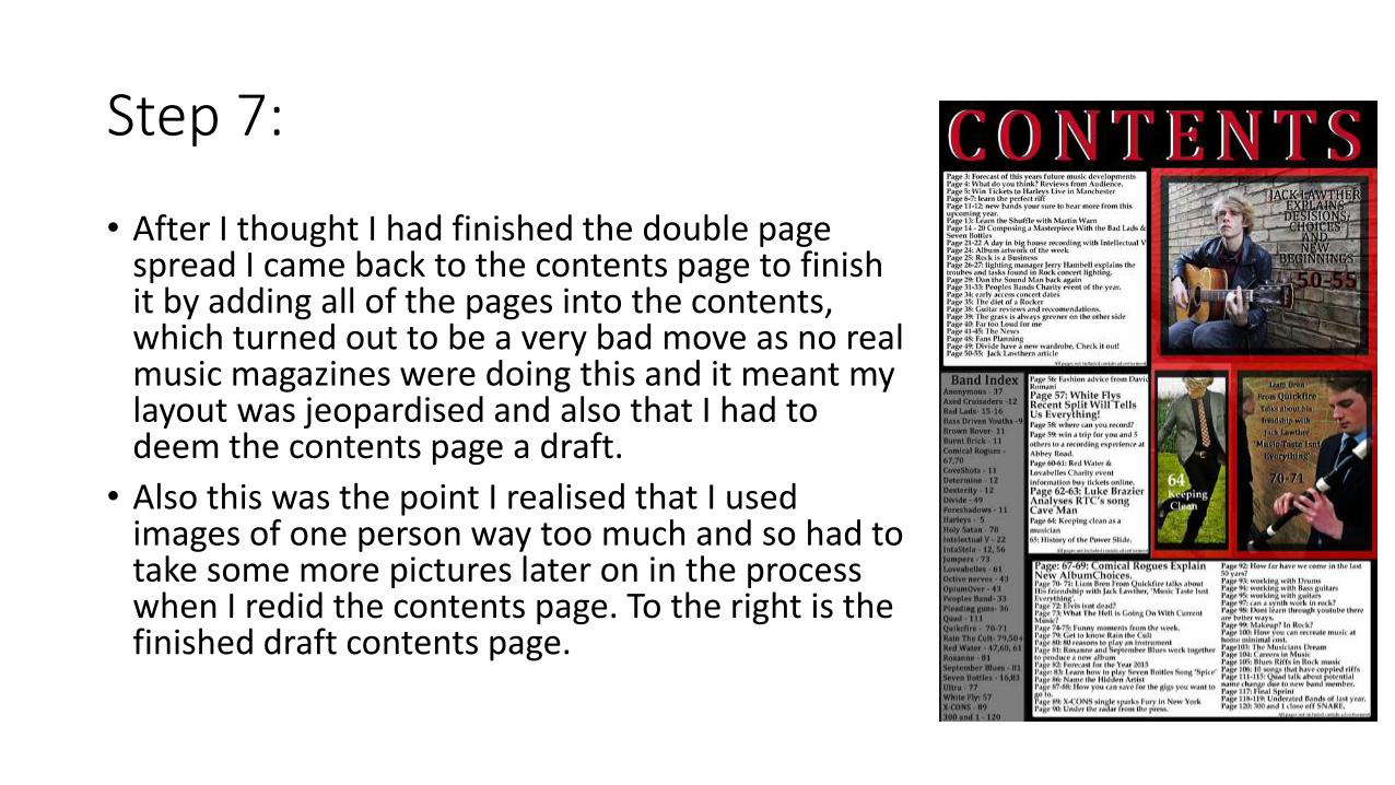
• After I thought I had finished the double page spread I came back to the contents page to finish it by adding all of the pages into the contents, which turned out to be a very bad move as no real music magazines were doing this and it meant my layout was jeopardised and also that I had to deem the contents page a draft.
• Also this was the point I realised that I used images of one person way too much and so had to take some more pictures later on in the process when I redid the contents page. To the right is the finished draft contents page.
Step 8:
• At this point I thought I was finished with the designing of the magazine and I gathered thoughts from peers and people that fitted my target markets age and specification.
• I then posted the relevant data onto my blog and left it there until I received comments that said I should change things in the magazines which I agreed with after looking back again at real music magazines, it was at this point I deemed my previous efforts as drafts and placed them into a PowerPoint to say what went wrong and what needed to be improved upon.
• Then after this I started changing the designs.
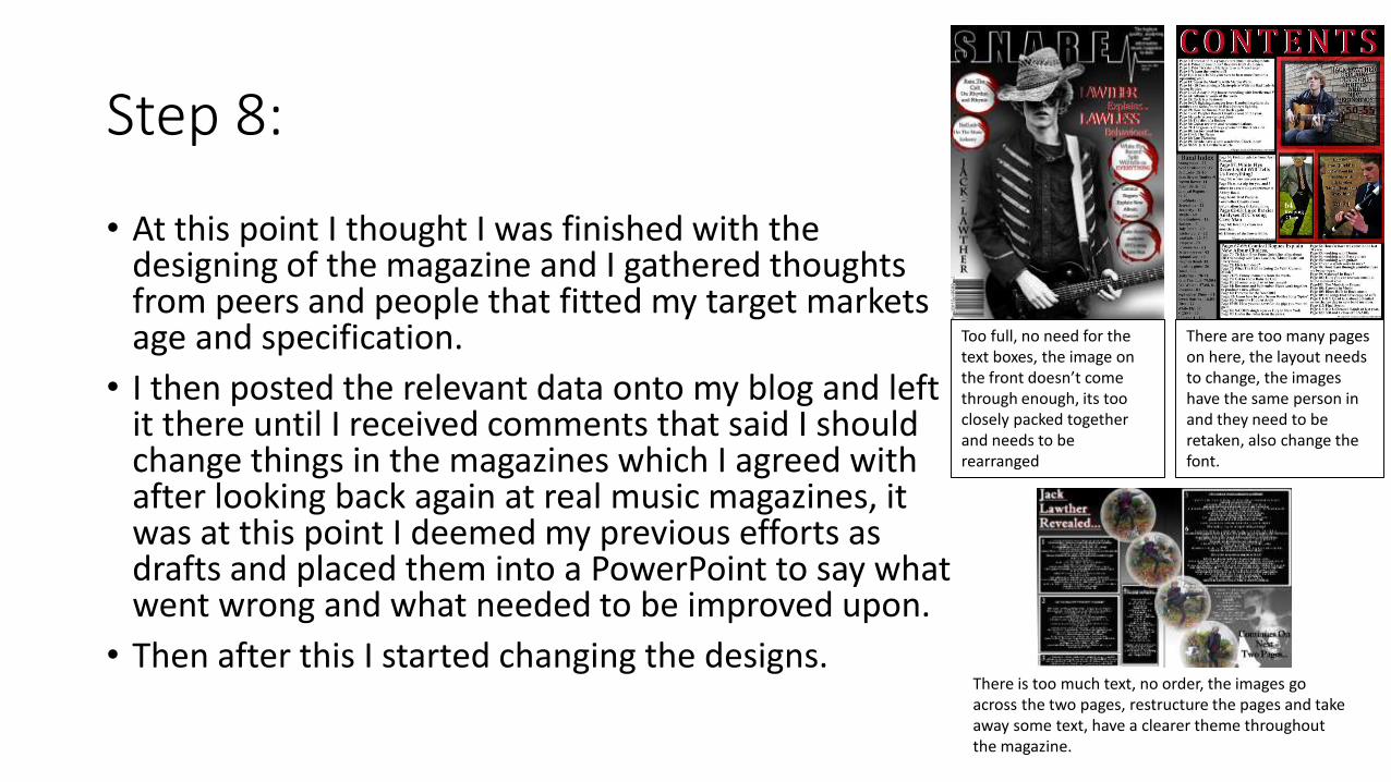
Too full, no need for the text boxes, the image on the front doesn’t come through enough, its too closely packed together and needs to be rearranged
There are too many pages on here, the layout needs to change, the images have the same person in and they need to be retaken, also change the font.
There is too much text, no order, the images go across the two pages, restructure the pages and take away some text, have a clearer theme throughout the magazine.
Step 9:
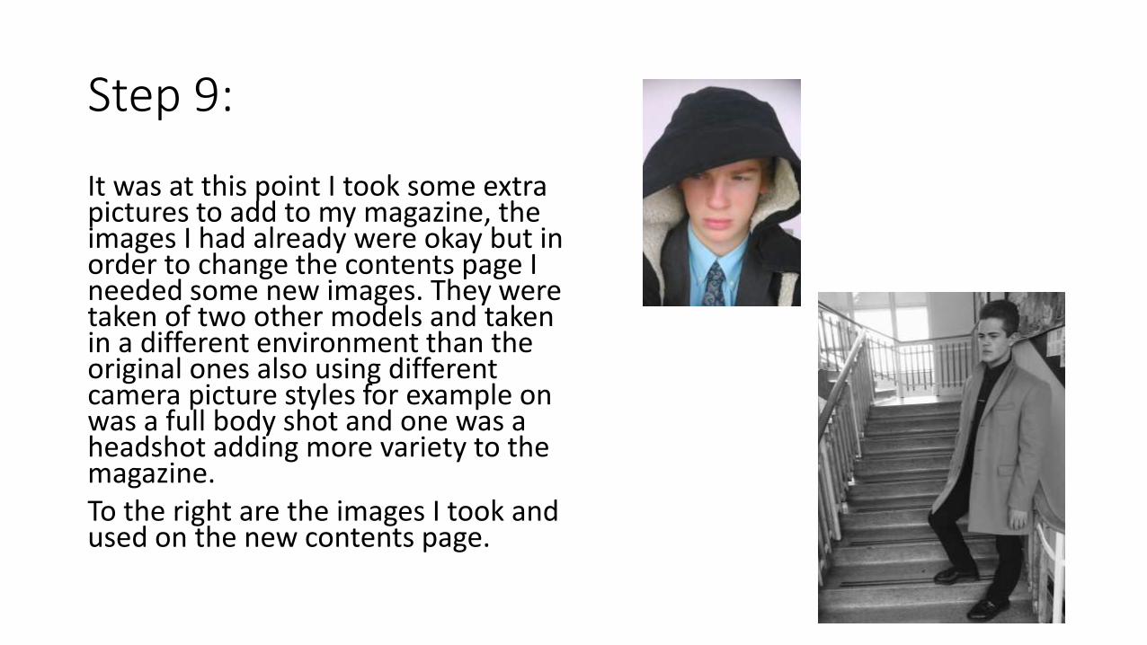
It was at this point I took some extra pictures to add to my magazine, the images I had already were okay but in order to change the contents page I needed some new images. They were taken of two other models and taken in a different environment than the original ones also using different camera picture styles for example on was a full body shot and one was a headshot adding more variety to the magazine. To the right are the images I took and used on the new contents page.
Step 10:
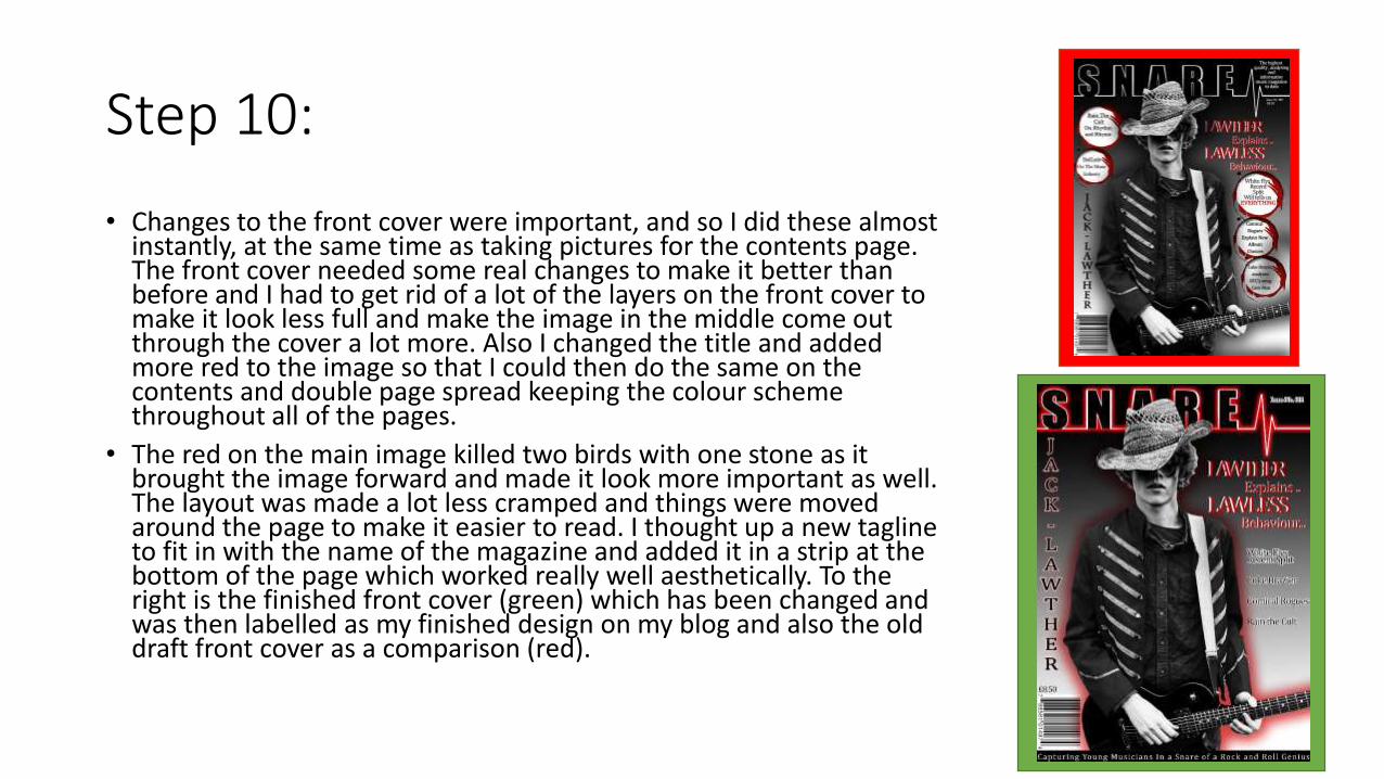
• Changes to the front cover were important, and so I did these almost instantly, at the same time as taking pictures for the contents page. The front cover needed some real changes to make it better than before and I had to get rid of a lot of the layers on the front cover to make it look less full and make the image in the middle come out through the cover a lot more. Also I changed the title and added more red to the image so that I could then do the same on the contents and double page spread keeping the colour scheme throughout all of the pages.
• The red on the main image killed two birds with one stone as it brought the image forward and made it look more important as well. The layout was made a lot less cramped and things were moved around the page to make it easier to read. I thought up a new tagline to fit in with the name of the magazine and added it in a strip at the bottom of the page which worked really well aesthetically. To the right is the finished front cover (green) which has been changed and was then labelled as my finished design on my blog and also the old draft front cover as a comparison (red).
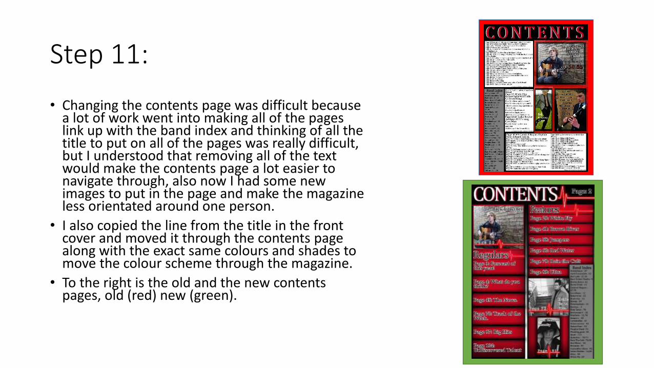
Step 11:
• Changing the contents page was difficult because a lot of work went into making all of the pages link up with the band index and thinking of all the title to put on all of the pages was really difficult, but I understood that removing all of the text would make the contents page a lot easier to navigate through, also now I had some new images to put in the page and make the magazine less orientated around one person.
• I also copied the line from the title in the front cover and moved it through the contents page along with the exact same colours and shades to move the colour scheme through the magazine.
• To the right is the old and the new contents pages, old (red) new (green).
Step 12
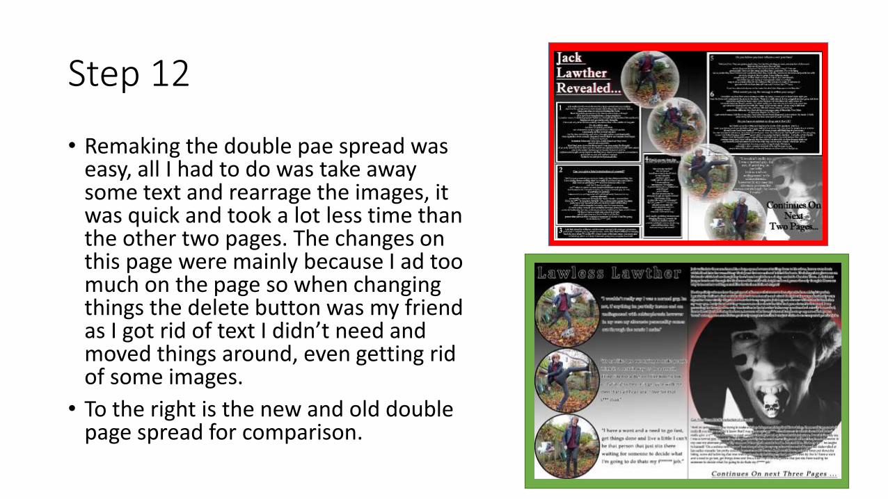
• Remaking the double pae spread was easy, all I had to do was take away some text and rearrage the images, it was quick and took a lot less time than the other two pages. The changes on this page were mainly because I ad too much on the page so when changing things the delete button was my friend as I got rid of text I didn’t need and moved things around, even getting rid of some images.
• To the right is the new and old double page spread for comparison.
Step 13:
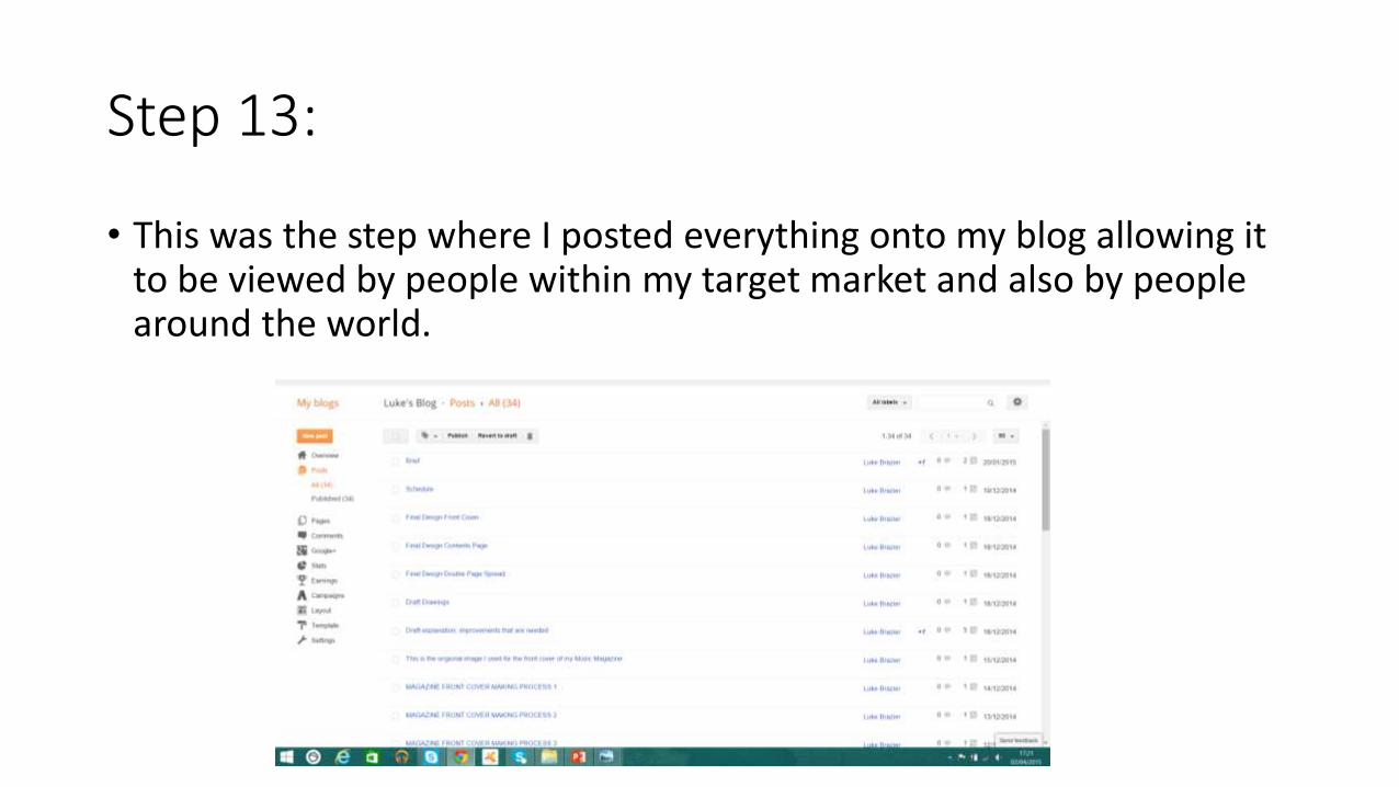
• This was the step where I posted everything onto my blog allowing it to be viewed by people within my target market and also by people around the world.