Embed Size (px)
Citation preview
High Performance Images in WordPress
WordCamp London April 2016 by Keith Devon

About me
Keith Devon
‣ Born in Canada, raised in Northern Ireland, living in Kent, UK
‣ WordPress developer for 6 years
‣ Co-founder of Highrise Digital
@keithdevon
https://highrise.digital
The problem
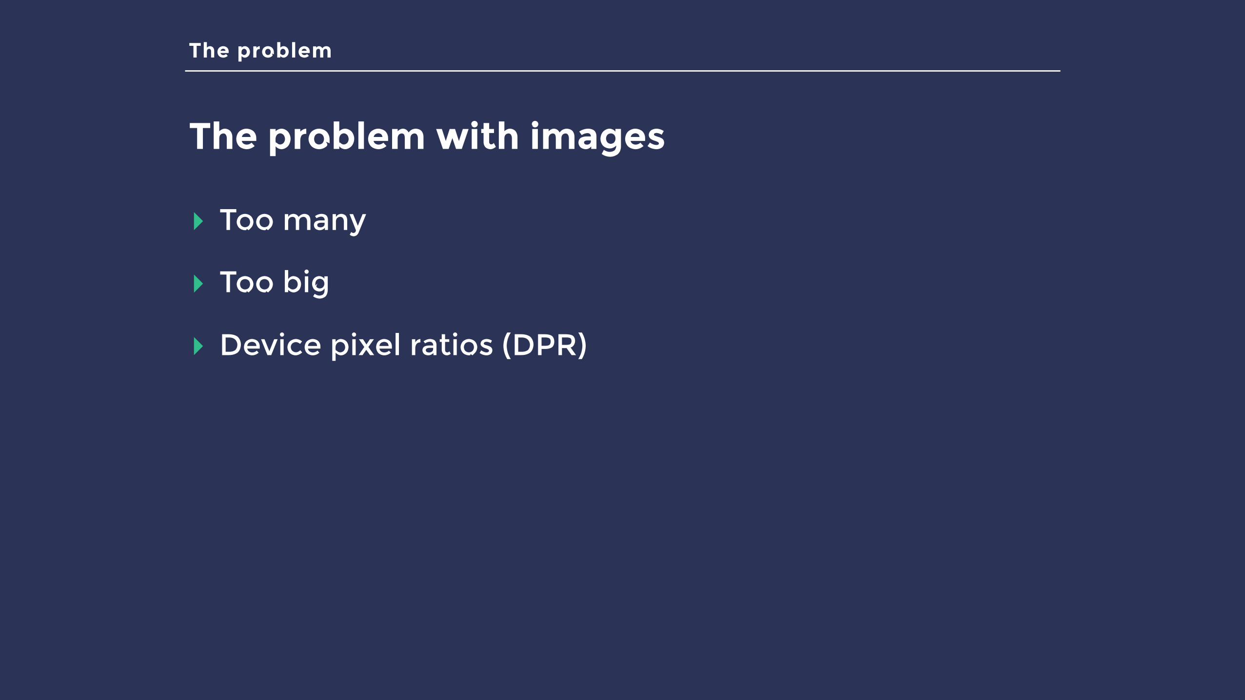
The problem with images
▸ Too many
▸ Too big
▸ Device pixel ratios (DPR)
The problem
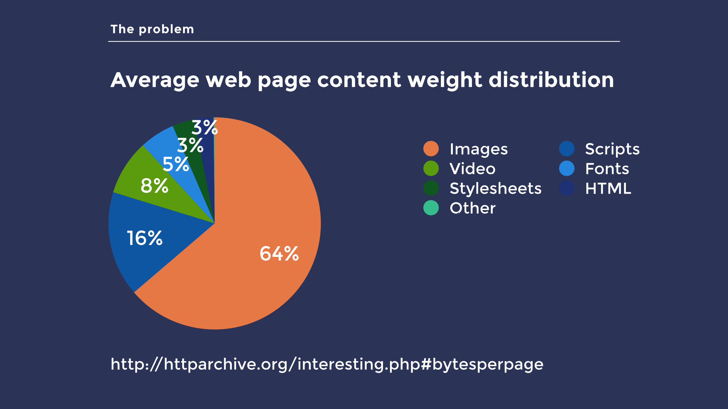
Average web page content weight distribution
3%3%
5%8%
16%64%
Images ScriptsVideo FontsStylesheets HTMLOther
http://httparchive.org/interesting.php#bytesperpage
The solution
How can we fix our image problem?
▸ Image sprites
▸ Icon fonts
▸ Choosing the right format (.gif, .png, .jpg, SVG, etc.)
▸ Image optimisation (size and compression)
▸ Lazy loading
▸ Responsive images
The solution
How can we fix our image problem?
▸ Image sprites
▸ Icon fonts
▸ Choosing the right format (.gif, .png, .jpg, etc.)
▸ Image optimisation (size and compression)
▸ Lazy loading
▸ Responsive images
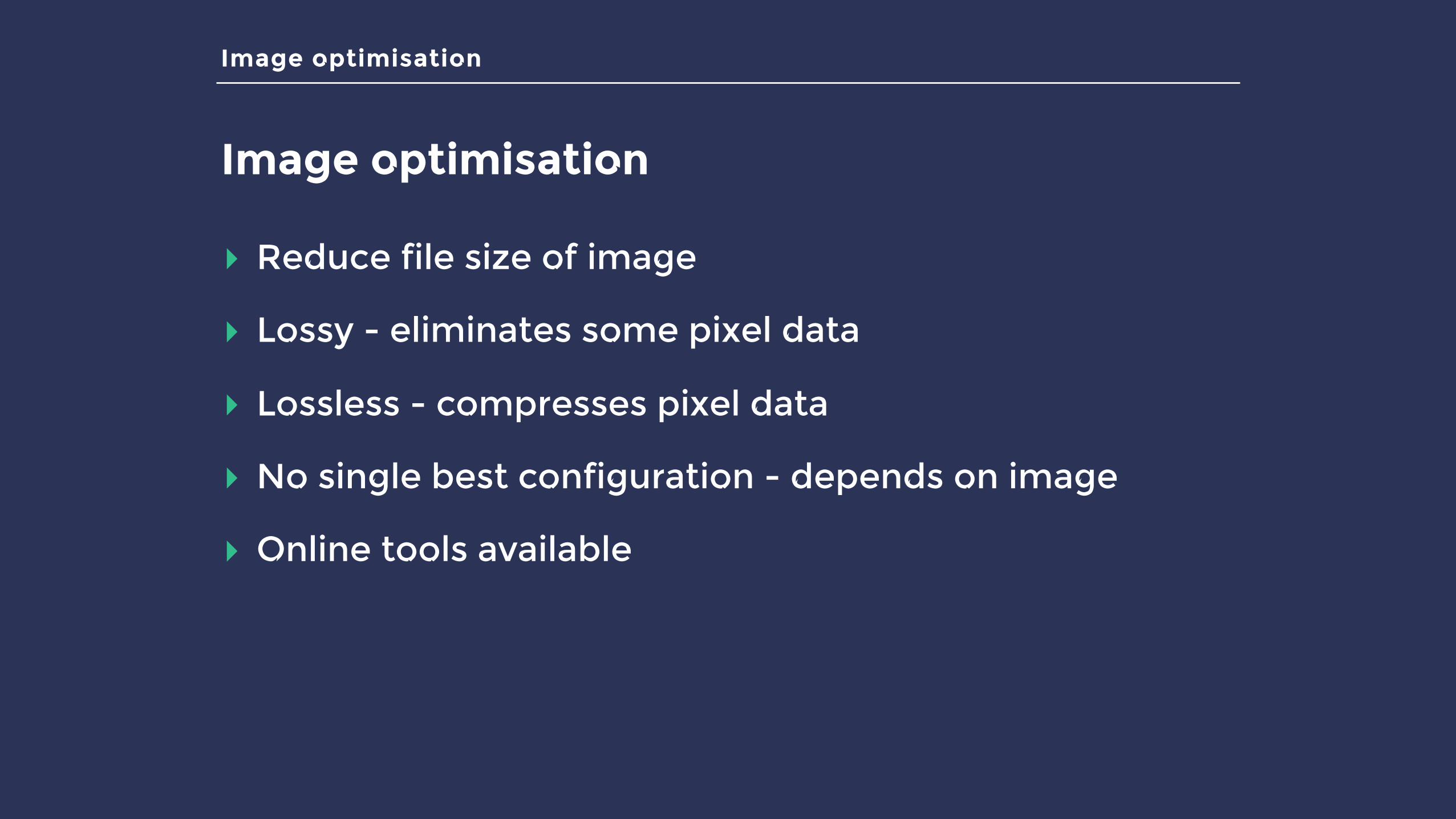
Image optimisation
Image optimisation
▸ Reduce file size of image
▸ Lossy - eliminates some pixel data
▸ Lossless - compresses pixel data
▸ No single best configuration - depends on image
▸ Online tools available
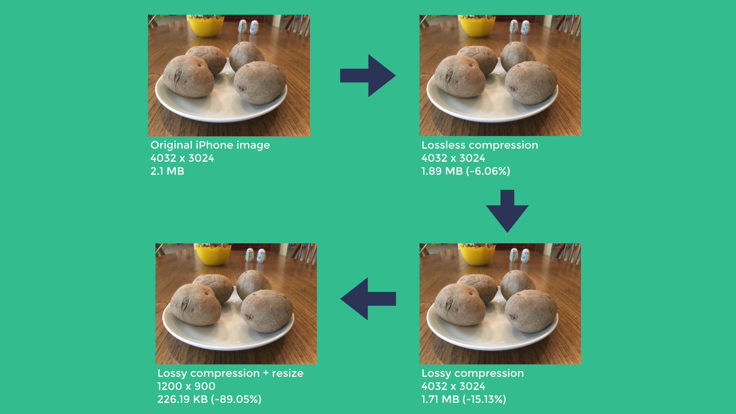
Original iPhone image4032 x 30242.1 MB
Lossless compression4032 x 3024 1.89 MB (-6.06%)
Lossy compression + resize 1200 x 900 226.19 KB (-89.05%)
Lossy compression4032 x 3024 1.71 MB (-15.13%)
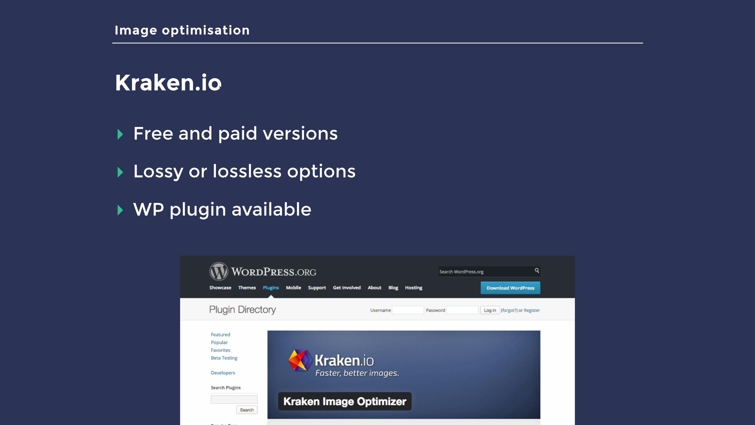
Image optimisation
Kraken.io
▸ Free and paid versions
▸ Lossy or lossless options
▸ WP plugin available
Lazy loading
Lazy loading
▸ Loads images as they come into view
▸ Saves on initial page weight and HTTP requests
▸ Relies on JavaScript
▸ Lots of JS plugins available
▸ WP plugins available

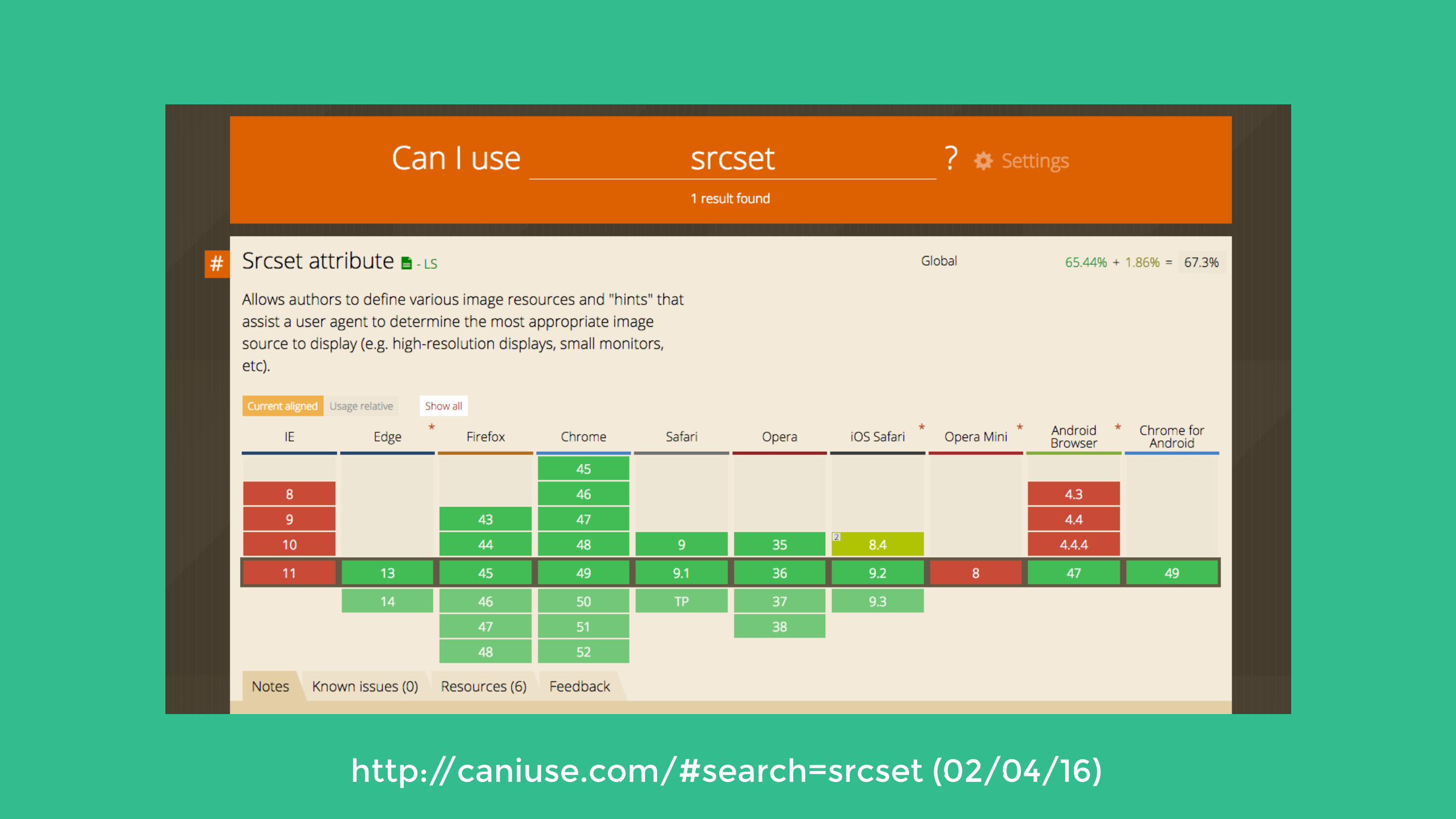
Responsive images
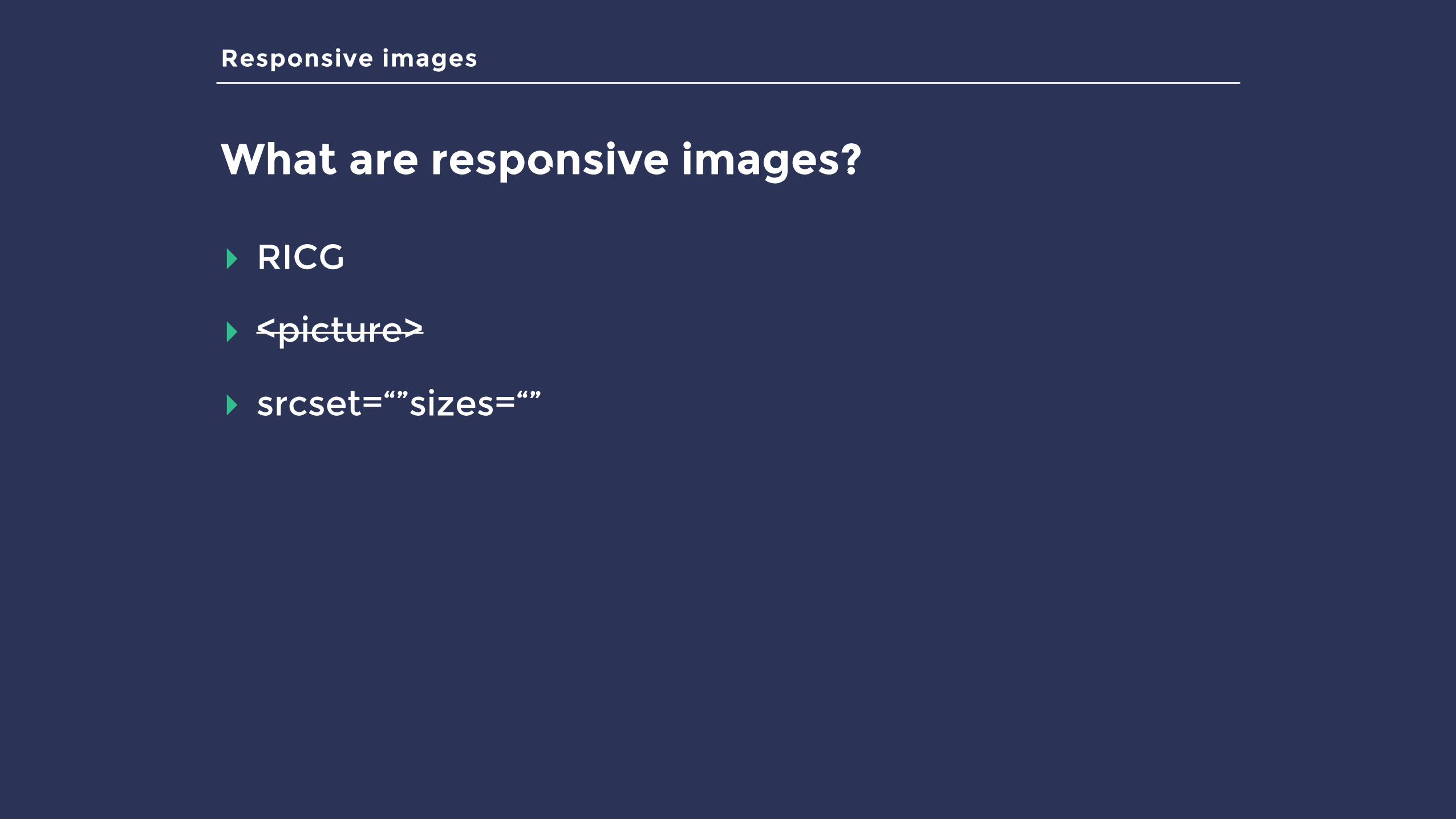
What are responsive images?
▸ RICG
▸ <picture>
▸ srcset=“”sizes=“”
Responsive images
What are responsive images?
▸ RICG
▸ <picture>
▸ srcset=“”sizes=“”
Responsive images
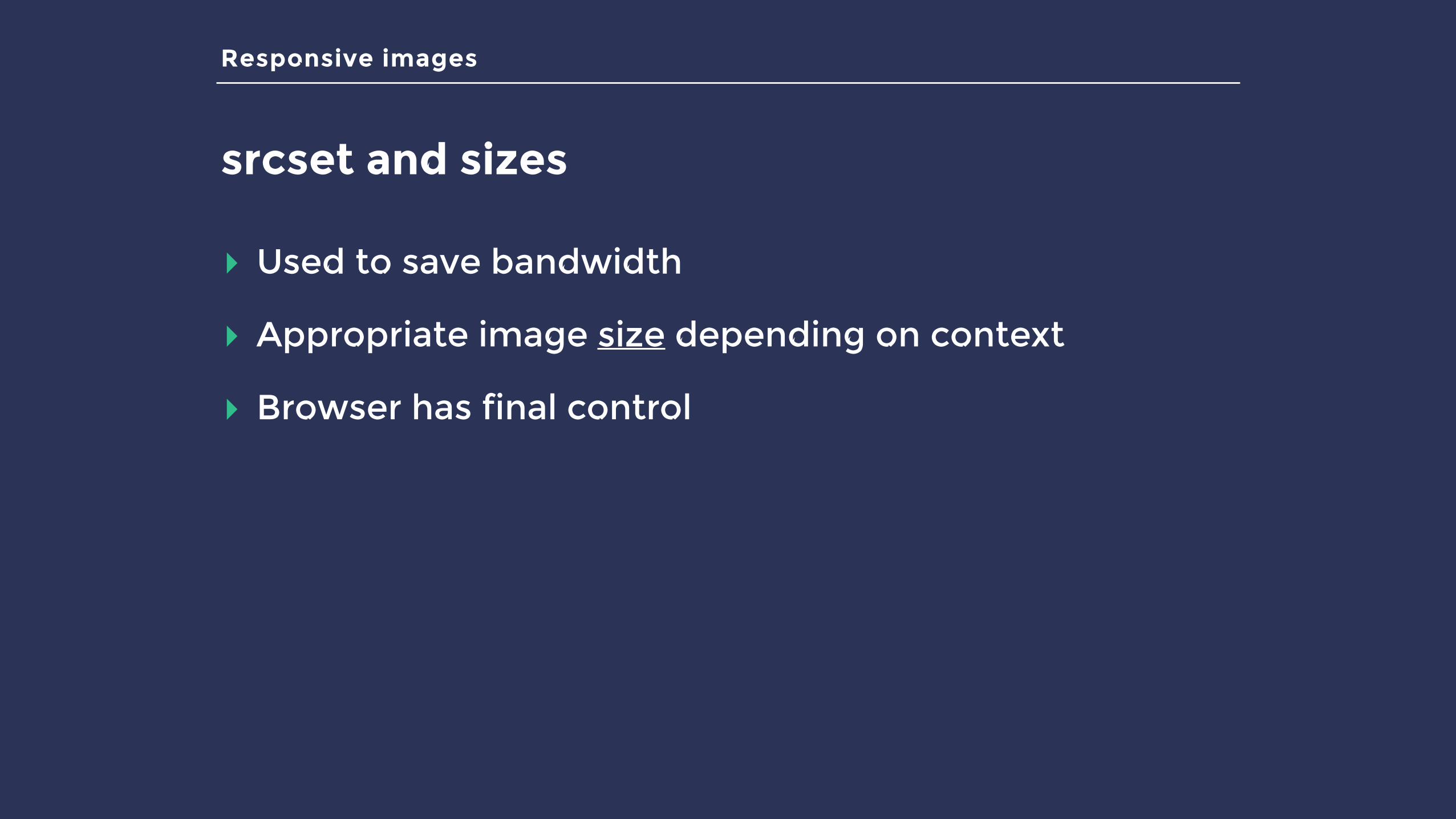
srcset and sizes
▸ Used to save bandwidth
▸ Appropriate image size depending on context
▸ Browser has final control
Responsive images
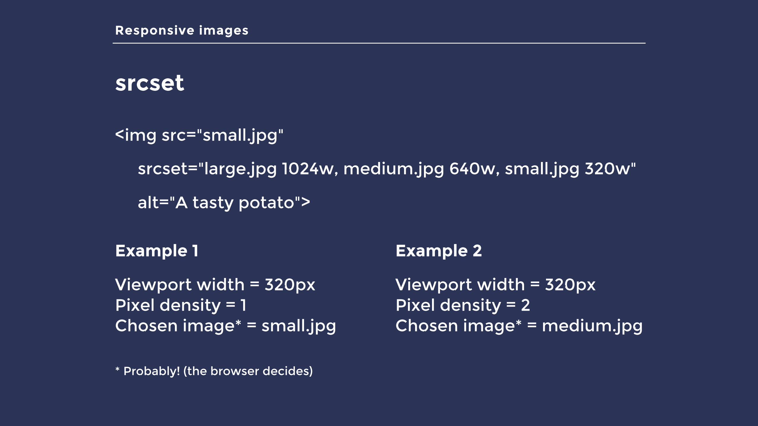
srcset
<img src="small.jpg"
srcset="large.jpg 1024w, medium.jpg 640w, small.jpg 320w"
alt="A tasty potato">
Example 1
Viewport width = 320pxPixel density = 1Chosen image* = small.jpg
Example 2
Viewport width = 320pxPixel density = 2Chosen image* = medium.jpg
* Probably! (the browser decides)
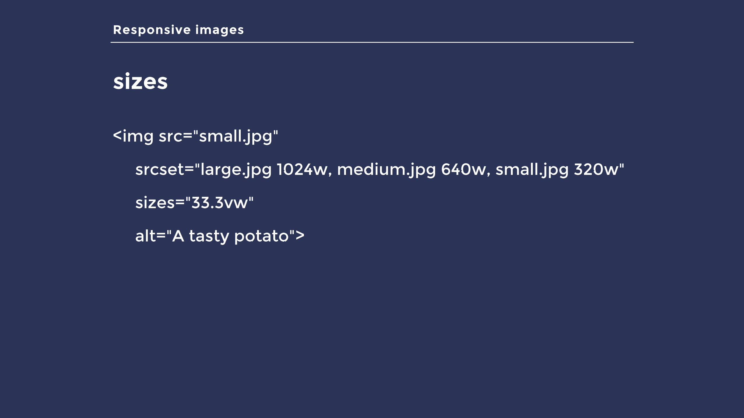
Responsive images
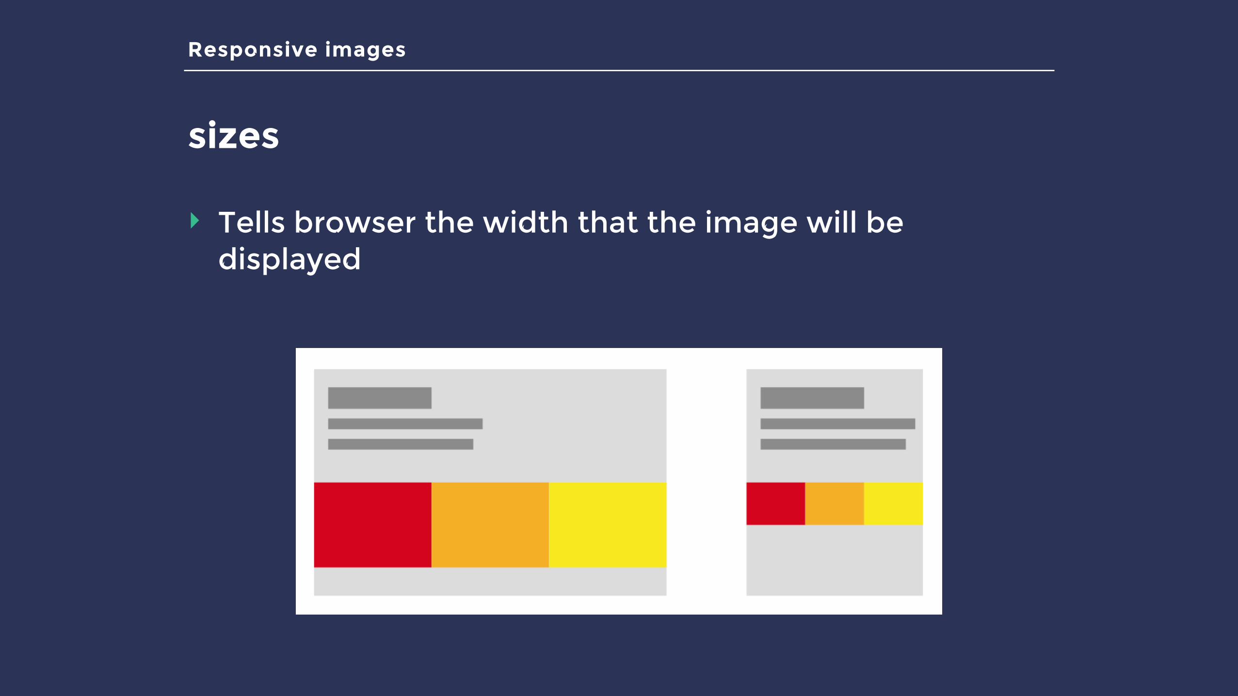
sizes
‣ Tells browser the width that the image will be displayed
Responsive images
sizes
<img src="small.jpg"
srcset="large.jpg 1024w, medium.jpg 640w, small.jpg 320w"
sizes="33.3vw"
alt="A tasty potato">
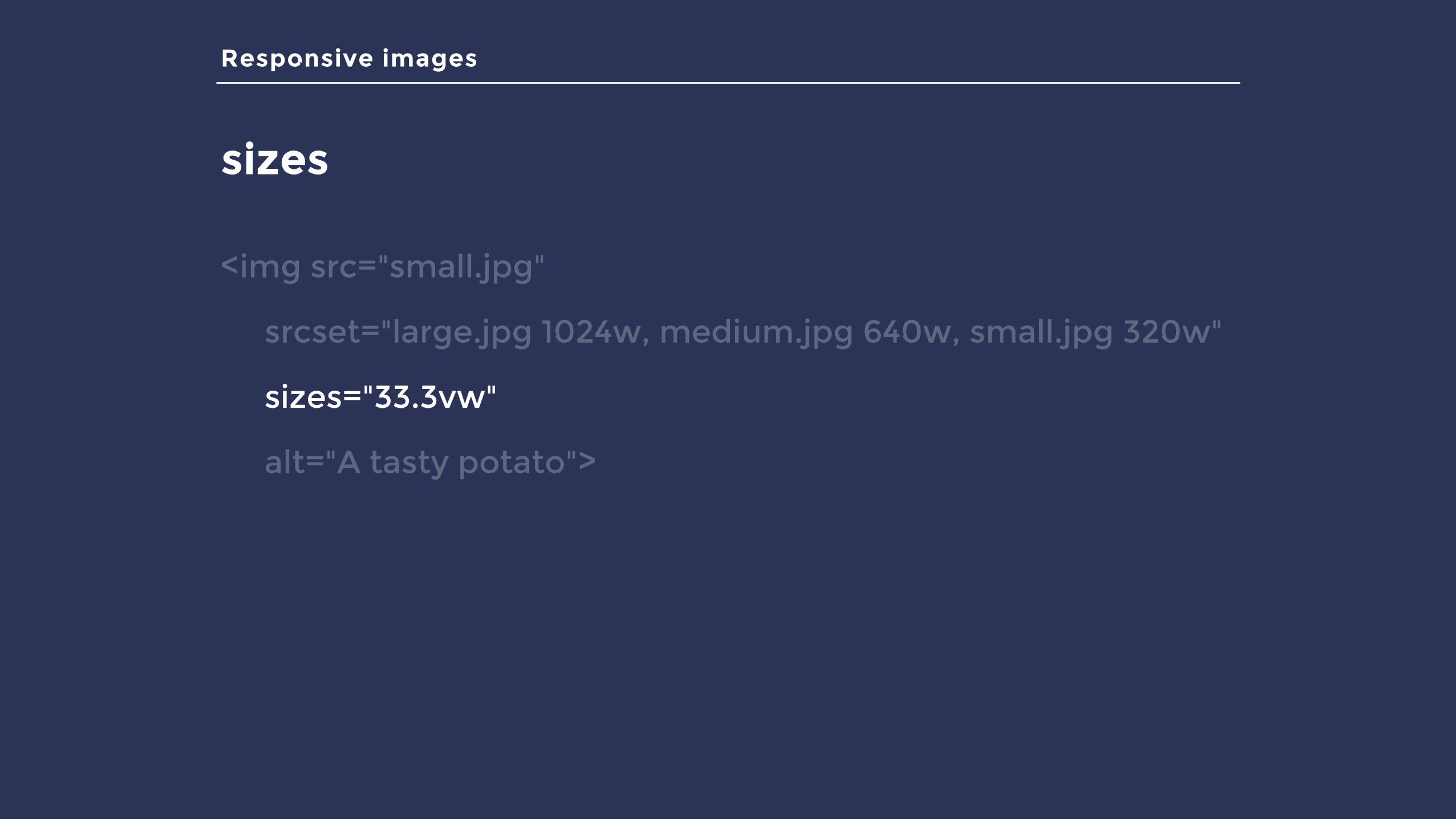
Responsive images
sizes
<img src="small.jpg"
srcset="large.jpg 1024w, medium.jpg 640w, small.jpg 320w"
sizes="33.3vw"
alt="A tasty potato">

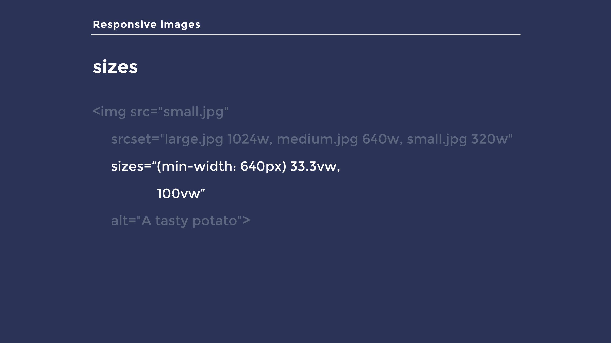
Responsive images
sizes
<img src="small.jpg"
srcset="large.jpg 1024w, medium.jpg 640w, small.jpg 320w"
sizes=“(min-width: 640px) 33.3vw,
100vw”
alt="A tasty potato">
Responsive images
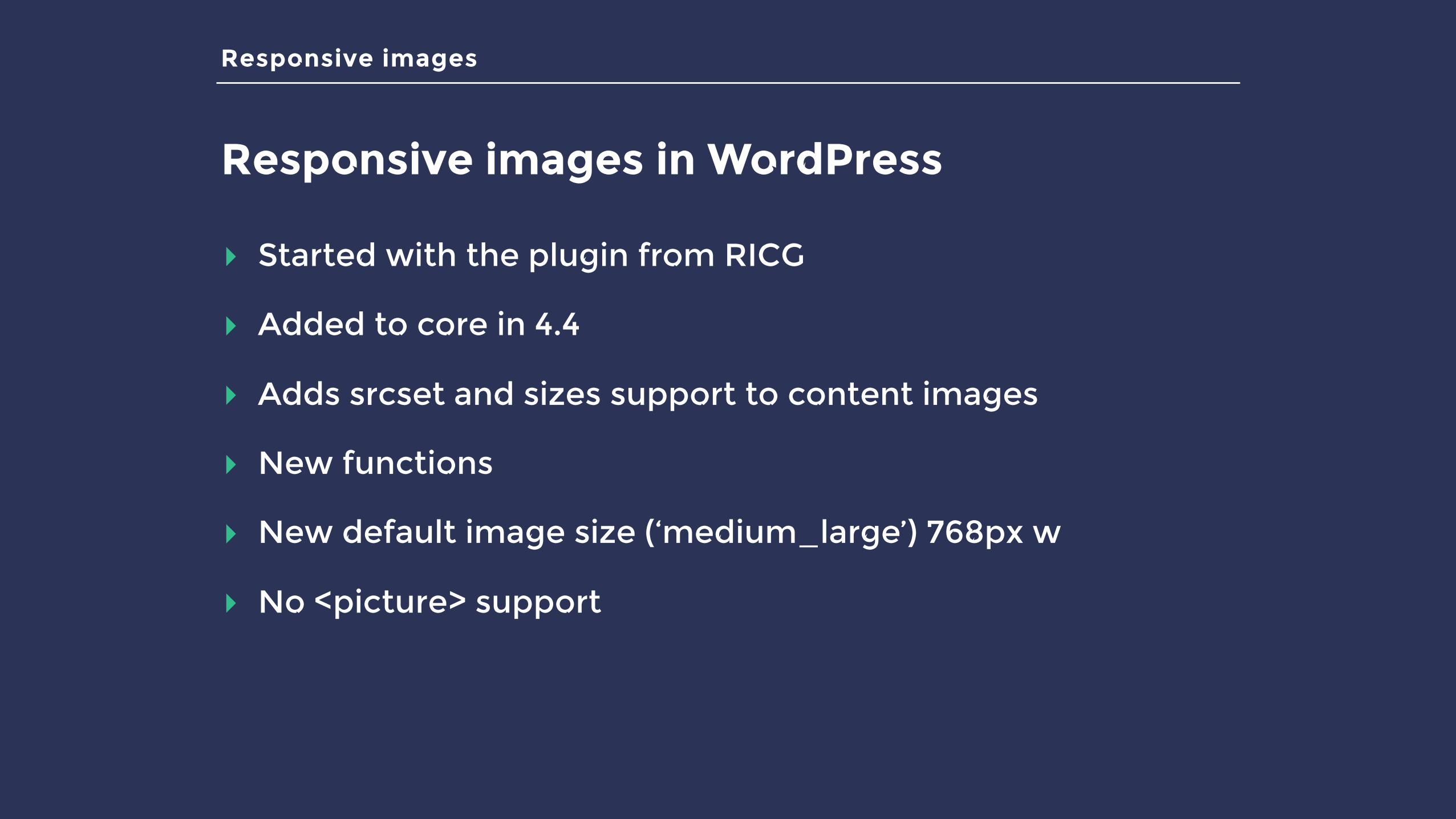
Responsive images in WordPress
▸ Started with the plugin from RICG
▸ Added to core in 4.4
▸ Adds srcset and sizes support to content images
▸ New functions
▸ New default image size (‘medium_large’) 768px w
▸ No <picture> support
Responsive images
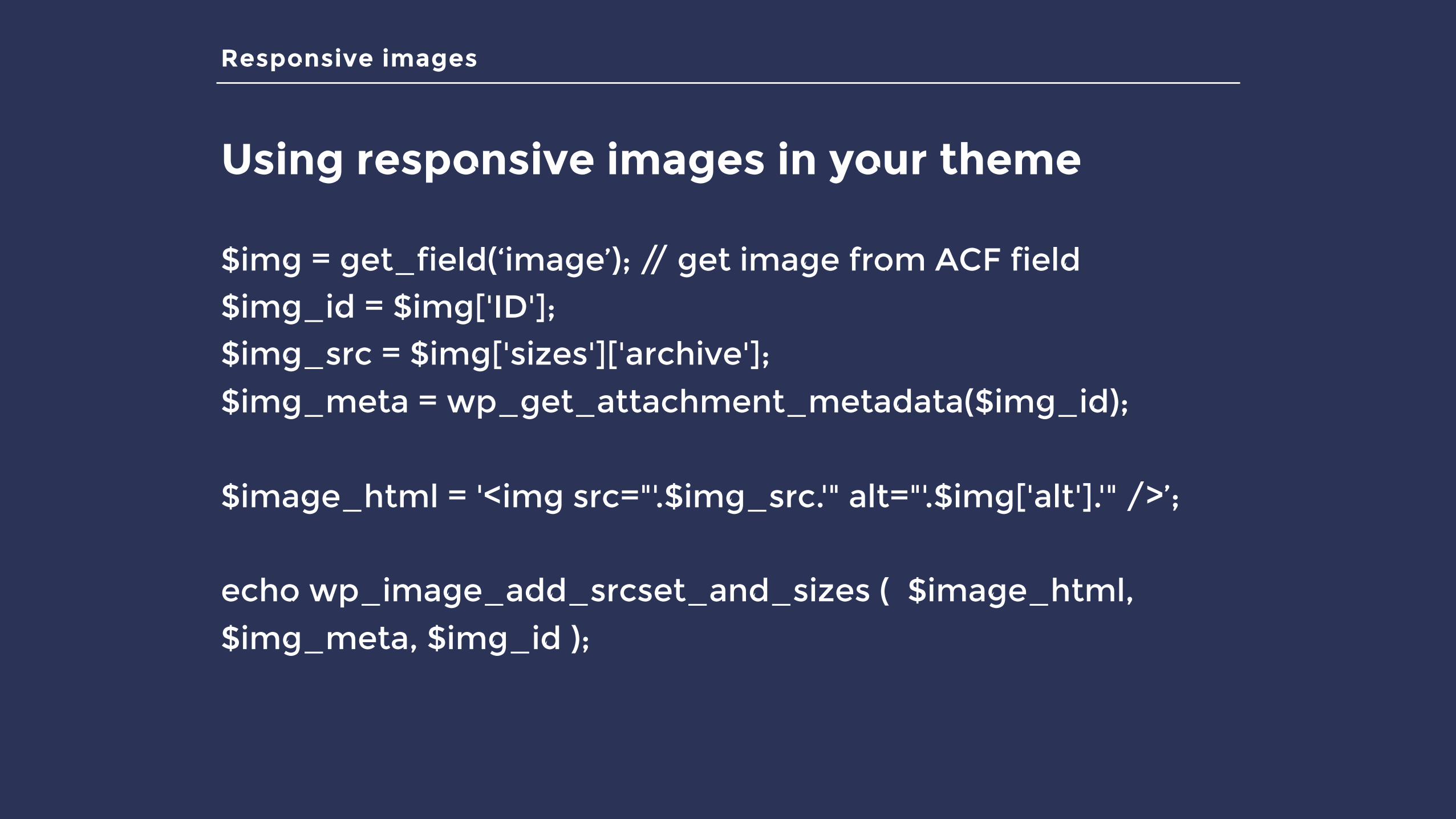
Using responsive images in your theme
$img = get_field(‘image’); // get image from ACF field $img_id = $img['ID']; $img_src = $img['sizes']['archive']; $img_meta = wp_get_attachment_metadata($img_id);
$image_html = '<img src="'.$img_src.'" alt="'.$img['alt'].'" />’;
echo wp_image_add_srcset_and_sizes ( $image_html,
$img_meta, $img_id );
Responsive images
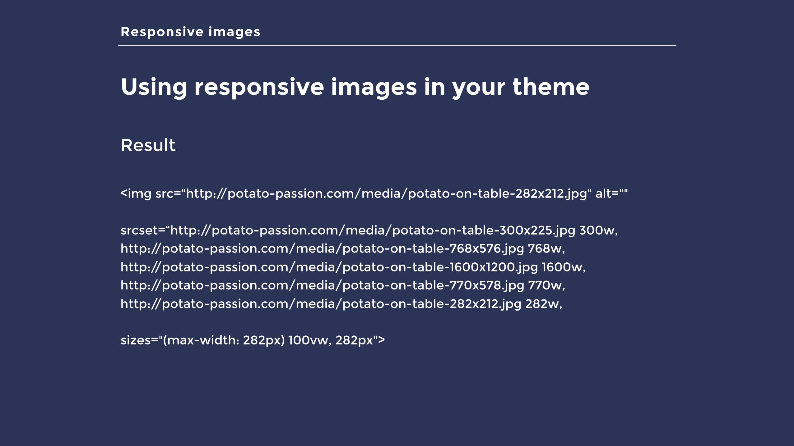
Using responsive images in your theme
Result
<img src="http://potato-passion.com/media/potato-on-table-282x212.jpg" alt=""
srcset=“http://potato-passion.com/media/potato-on-table-300x225.jpg 300w, http://potato-passion.com/media/potato-on-table-768x576.jpg 768w,
http://potato-passion.com/media/potato-on-table-1600x1200.jpg 1600w, http://potato-passion.com/media/potato-on-table-770x578.jpg 770w,
http://potato-passion.com/media/potato-on-table-282x212.jpg 282w,
sizes="(max-width: 282px) 100vw, 282px">
Responsive images
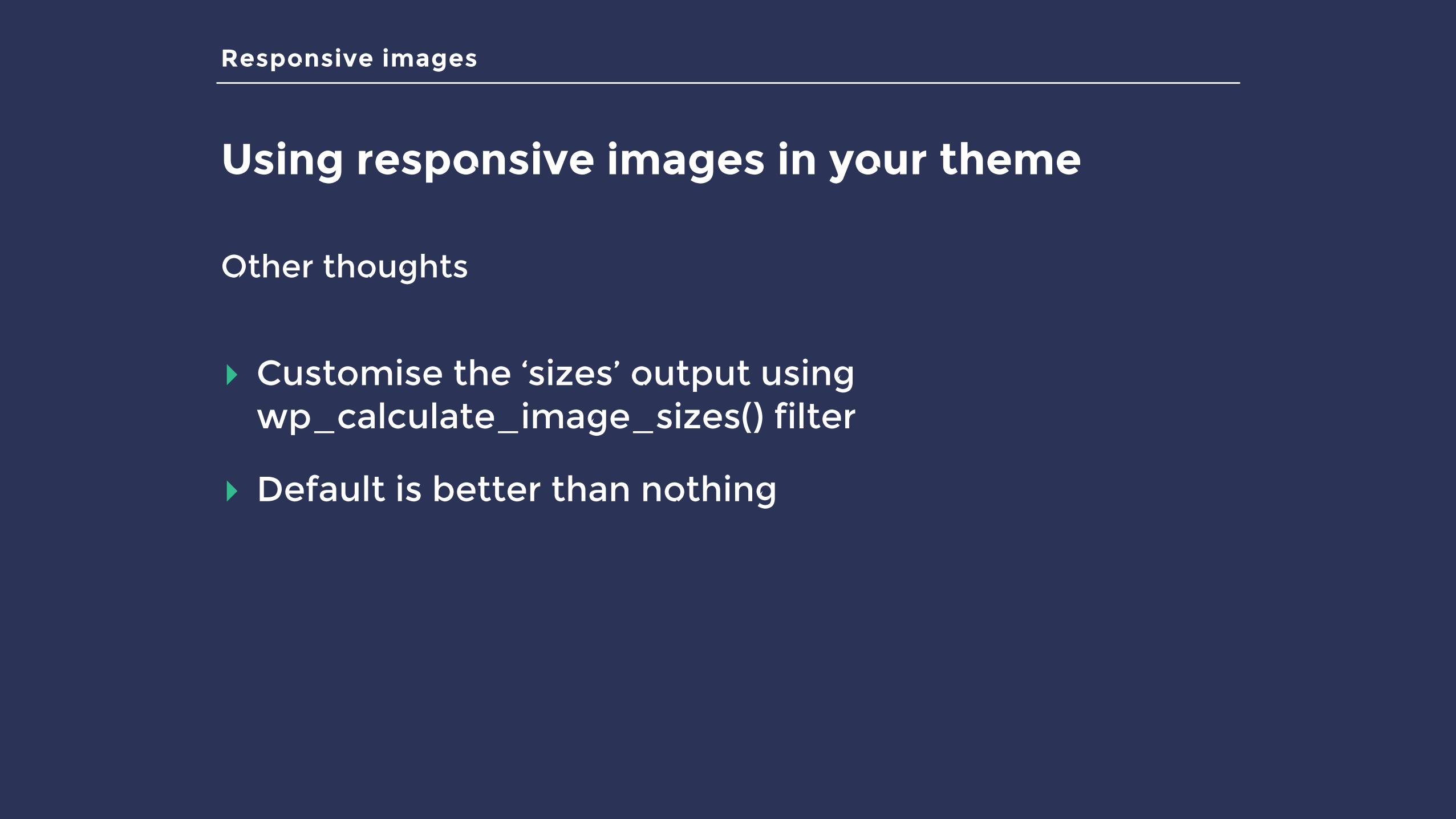
Using responsive images in your theme
Other thoughts
▸ Customise the ‘sizes’ output using wp_calculate_image_sizes() filter
▸ Default is better than nothing
Responsive images
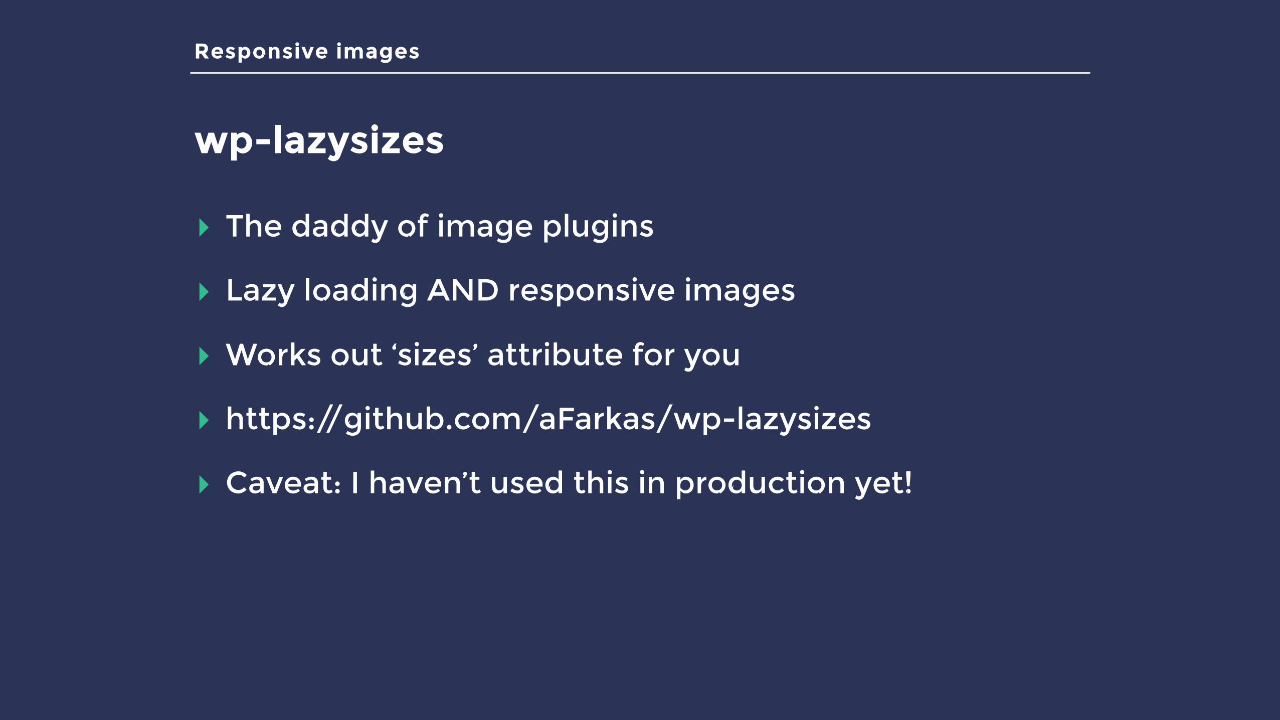
wp-lazysizes
▸ The daddy of image plugins
▸ Lazy loading AND responsive images
▸ Works out ‘sizes’ attribute for you
▸ https://github.com/aFarkas/wp-lazysizes
▸ Caveat: I haven’t used this in production yet!
Summary
What did we learn?
▸ We have an image problem
▸ We have the tools to solve it!
▸ Optimise your images
▸ Lazy-load your images
▸ Use responsive images

THANKS!@keithdevon