Embed Size (px)
Citation preview
ACCESSIBLE WEBSITES FOR PEOPLE WITH DISABILITIESAAYUSH SHRESTHA
Chief of Design, nLocate
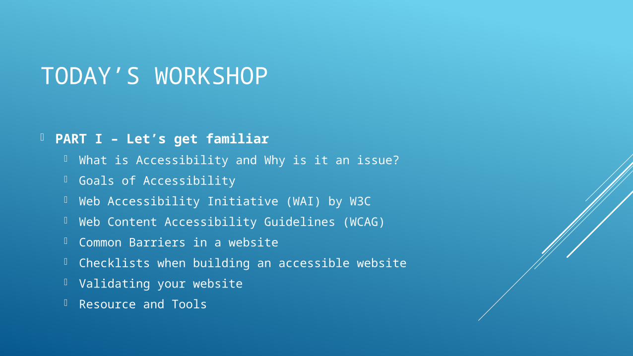
TODAY’S WORKSHOP
PART I – Let’s get familiar What is Accessibility and Why is it an issue?
Goals of Accessibility
Web Accessibility Initiative (WAI) by W3C
Web Content Accessibility Guidelines (WCAG)
Common Barriers in a website
Checklists when building an accessible website
Validating your website
Resource and Tools
TODAY’S WORKSHOP
PART II – Disability Perspective How do Visually Impaired people browse the web
TODAY’S WORKSHOP
PART III – Building Blocks The Low Hanging Fruits
Proper DOM structure
Managing Interactive Controls
Managing Focus and Navigation
Proper Labelling
When things get complicated Introducing ARIA
Proactively managing focus
Simulating native behavior on custom controls
Validation using Validating tools
PART I - LET’S GET FAMILIAR
WHAT IS ACCESSIBILITY AND WHY IS IT AN ISSUE?

The power of the Web is in its universality.
Access by everyone regardless of disability is an essential aspect.
-Tim Berners-LeeW3C Director and inventor of the World Wide
Web
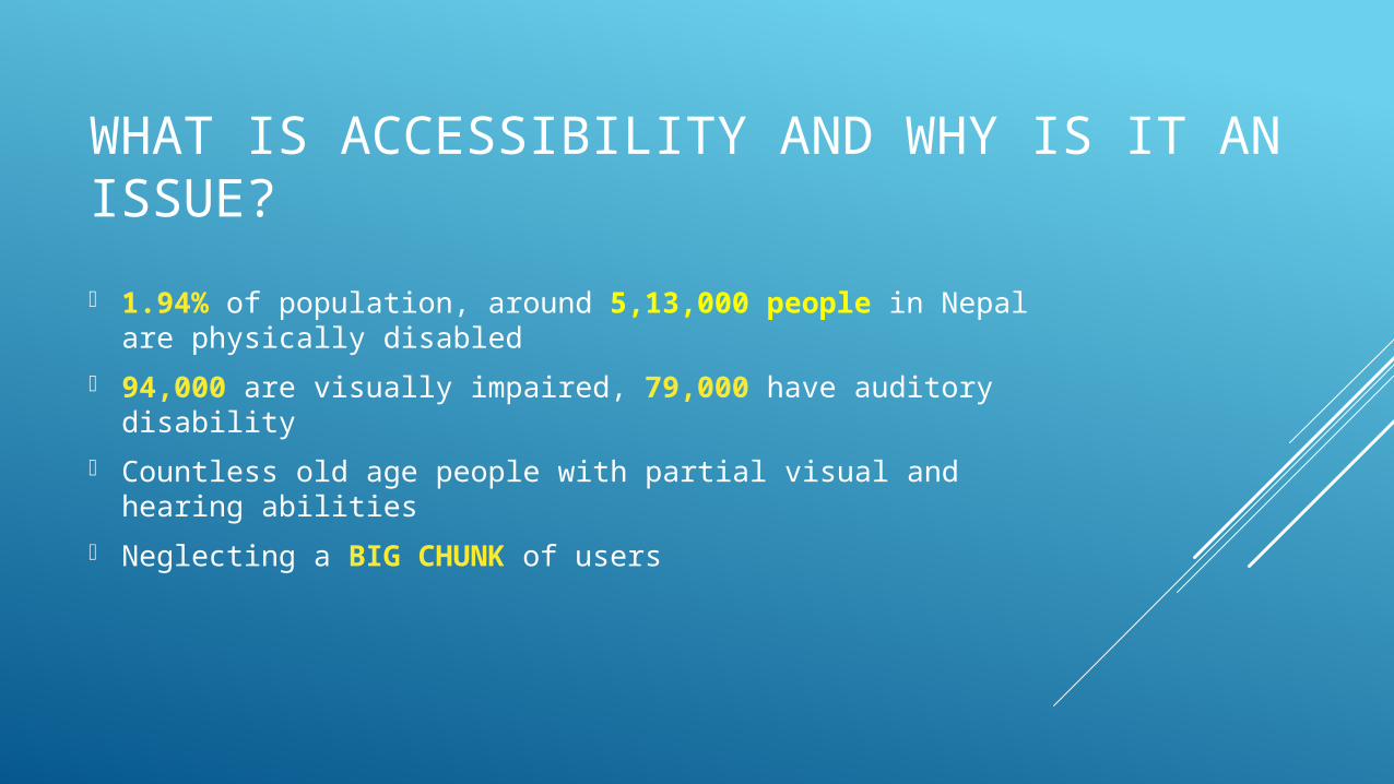
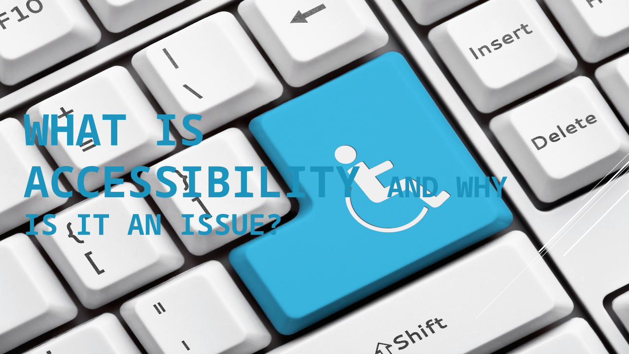
WHAT IS ACCESSIBILITY AND WHY IS IT AN ISSUE?
1.94% of population, around 5,13,000 people in Nepal are physically disabled
94,000 are visually impaired, 79,000 have auditory disability
Countless old age people with partial visual and hearing abilities
Neglecting a BIG CHUNK of users
WHAT IS ACCESSIBILITY AND WHY IS IT AN ISSUE?
Web is an essential communication tool
People with disabilities should have an equal and barrier-free access to information
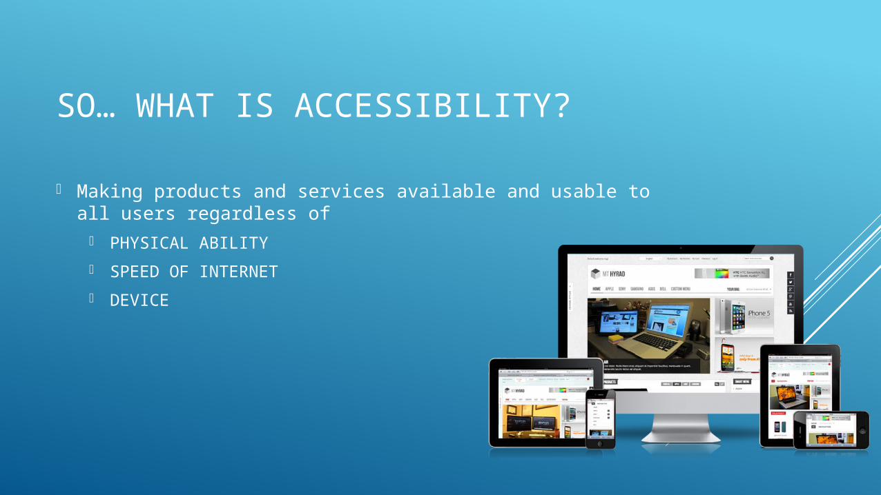
SO… WHAT IS ACCESSIBILITY?
Making products and services available and usable to all users regardless of
PHYSICAL ABILITY
SPEED OF INTERNET
DEVICE
GOALS OF ACCESSIBILITY
Improve usability of technology for all users through Universal Design as an underlying approach
Support social inclusion and equal opportunities for people with disabilities
Business-wise Accessibility overlaps with best web practices
Universal device independent design
Optimized usability and user experience
Search Engine Optimization
WEB ACCESSIBILITY INITIATIVE (WAI) BY W3C
Initiative by W3c to bring together people from industries, disability organizations, policy makers, and research labs to develop rules and guidelines to help make web accessible
WAI has five levels of work Ensuring that web technologies support accessibility
Developing guidelines for accessibility
Improving tools to evaluate and repair accessibility issues
Developing materials for education and outreach
Coordinating with research and development
WEB CONTENT ACCESSIBILITY GUIDELINES (WCAG)
Guidelines defined by WAI
Describing how to make websites accessible
12 Guidelines. Under 4 Principles.
Each guideline has testable success criteria
PRINCIPLE 1
PERCIEVABLE
PERCEIVABLE
Information and User Interface must be presentable to users in a way they can perceive.
Text Alternatives: Provide text alternatives for any non-text content.
Time based media : Provide alternatives for time based media (Captions and Transcriptions for audio or video elements)
Adaptable: Create content that can be presented in different ways without using information or structure. Remove reliance on shape, size, location and/or orientation to navigate and understand
Distinguishable: Proper use of color with proper contrast and meaningful color representation. Text Resize Options. Do not use images of text as information.
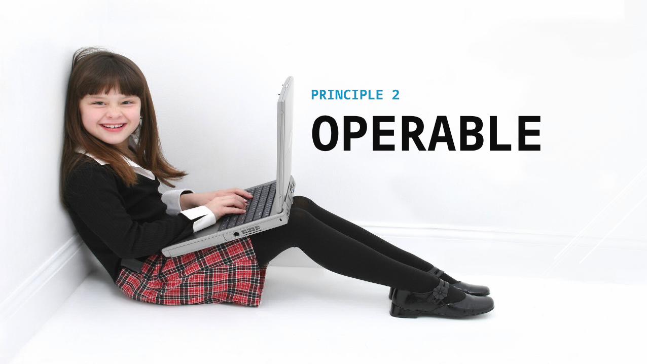
PRINCIPLE 2
OPERABLE
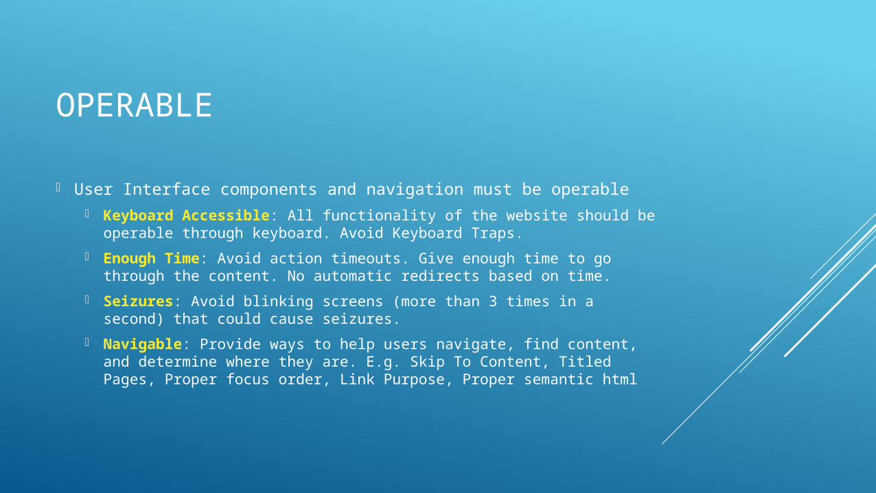
OPERABLE
User Interface components and navigation must be operable Keyboard Accessible: All functionality of the website should be
operable through keyboard. Avoid Keyboard Traps.
Enough Time: Avoid action timeouts. Give enough time to go through the content. No automatic redirects based on time.
Seizures: Avoid blinking screens (more than 3 times in a second) that could cause seizures.
Navigable: Provide ways to help users navigate, find content, and determine where they are. E.g. Skip To Content, Titled Pages, Proper focus order, Link Purpose, Proper semantic html

PRINCIPLE 3
UNDERSTANDABLE
UNDERSTANDABLE
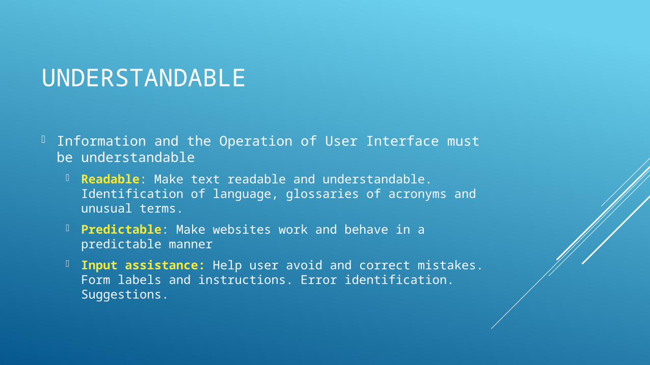
Information and the Operation of User Interface must be understandable
Readable: Make text readable and understandable. Identification of language, glossaries of acronyms and unusual terms.
Predictable: Make websites work and behave in a predictable manner
Input assistance: Help user avoid and correct mistakes. Form labels and instructions. Error identification. Suggestions.
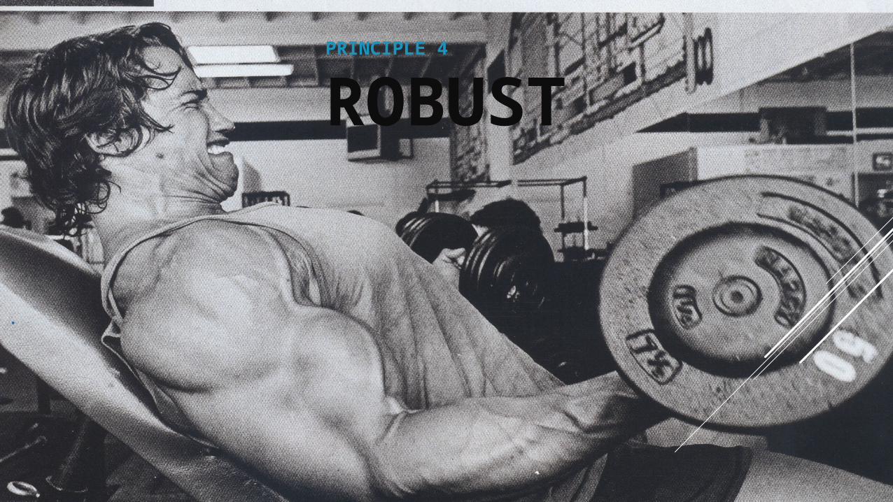
PRINCIPLE 4
ROBUST
ROBUST
Content must be robust enough that it can be interpreted reliably by a wide variety of user agents including assistive technologies.
Compatibility: Maximizing compatibility with current and future user agents including assistive features.
SOME COMMON BARRIERS
VISUAL BARRIERS
Information contained within images without proper alt tags
Inconsistent navigation or content
Lack of adequate color contrast
Bad color combinations
AUDIO BARRIERS
Lack of transcription or captioning
“Downloadable Files”
Auditory Stimulus without proper alternatives
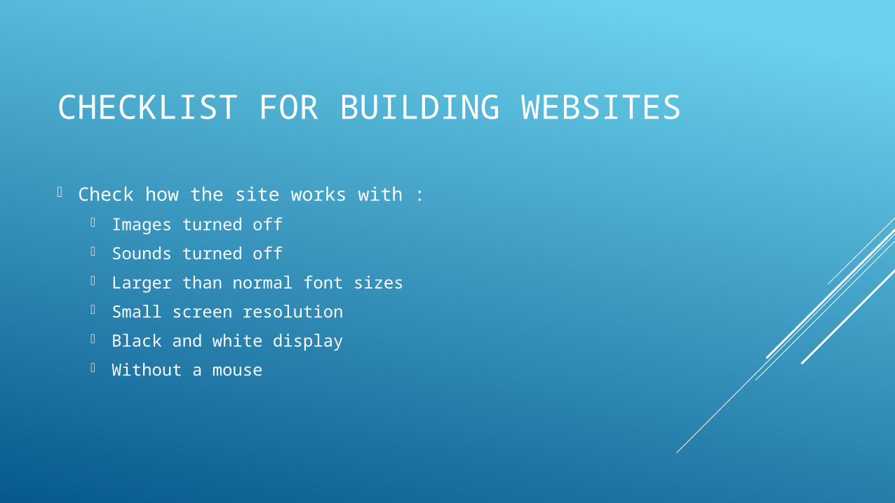
CHECKLIST FOR BUILDING WEBSITES
Check how the site works with : Images turned off
Sounds turned off
Larger than normal font sizes
Small screen resolution
Black and white display
Without a mouse
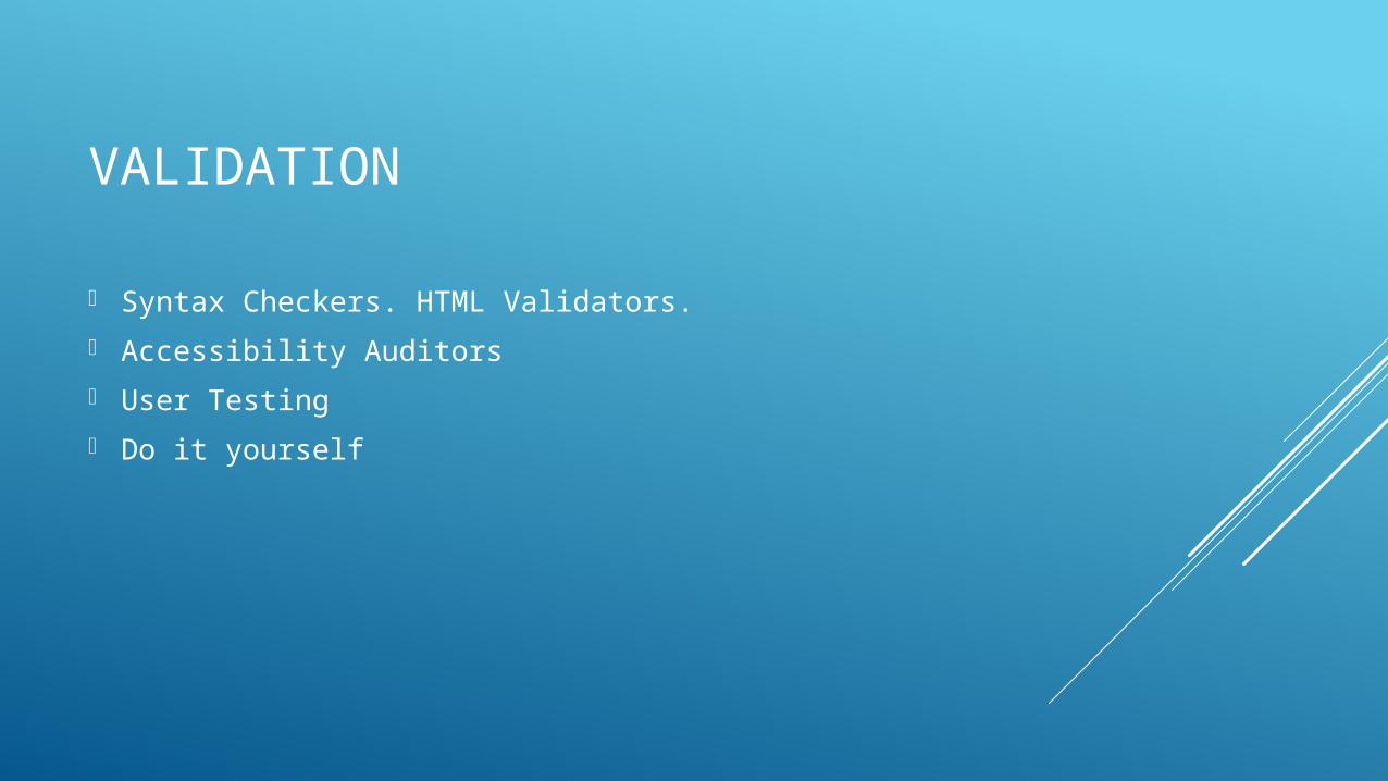
VALIDATION
Syntax Checkers. HTML Validators.
Accessibility Auditors
User Testing
Do it yourself
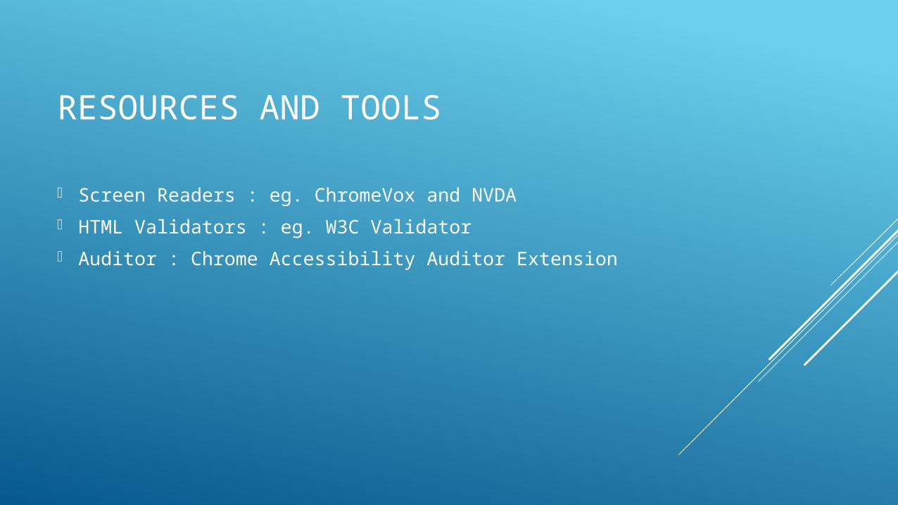
RESOURCES AND TOOLS
Screen Readers : eg. ChromeVox and NVDA
HTML Validators : eg. W3C Validator
Auditor : Chrome Accessibility Auditor Extension
PART II – DISABILITY PERSPECTIVEWITH SUSHIL ADHIKARI
PART III – BUILDING BLOCKS
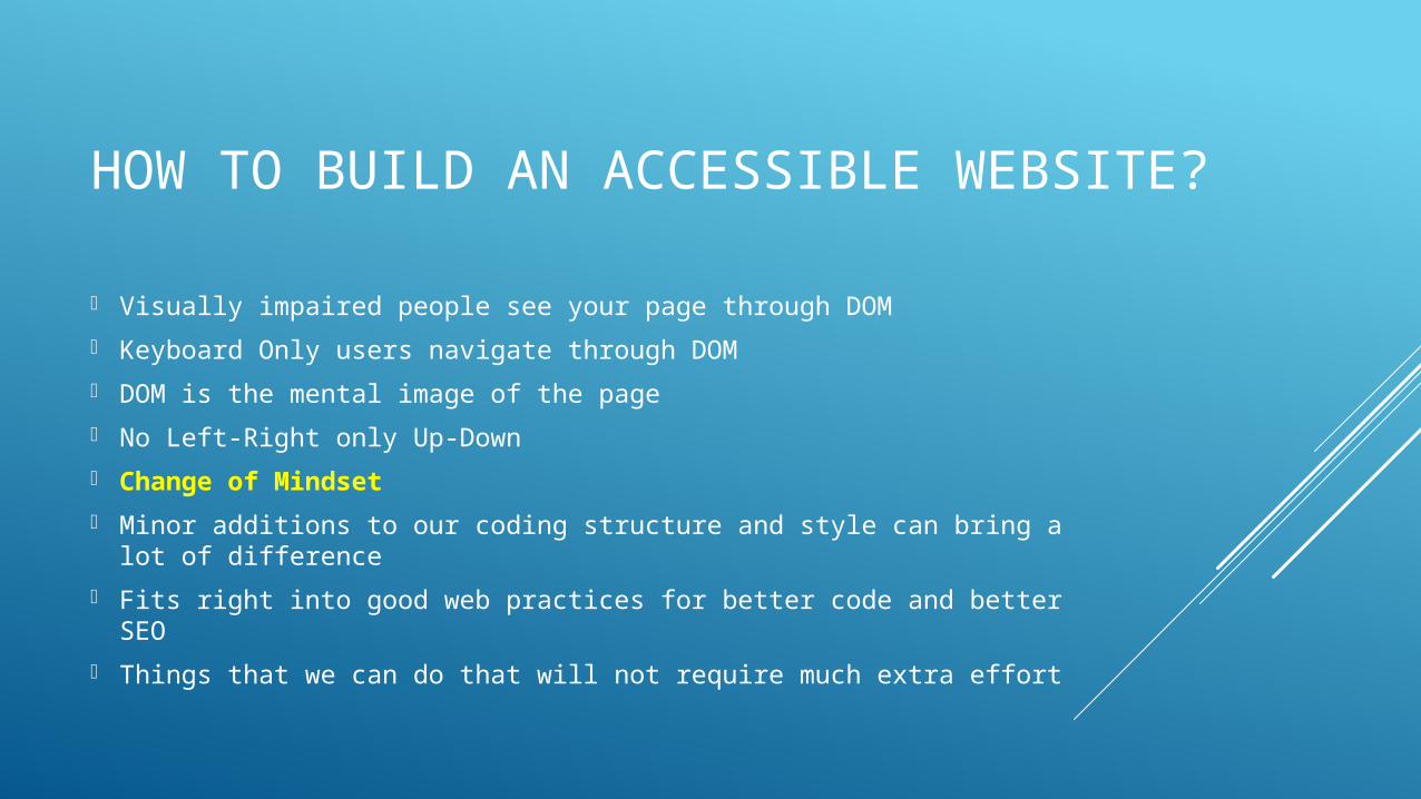
HOW TO BUILD AN ACCESSIBLE WEBSITE?
Visually impaired people see your page through DOM
Keyboard Only users navigate through DOM
DOM is the mental image of the page
No Left-Right only Up-Down
Change of Mindset
Minor additions to our coding structure and style can bring a lot of difference
Fits right into good web practices for better code and better SEO
Things that we can do that will not require much extra effort
LOW HANGING FRUITS

PROPER DOM
STRUCTURE
PROPER DOM STRUCTURE
Make sure the page makes sense. DOM-wise.
Just because it looks right might not mean it will make sense to Keyboard-only users.
Keep keyboard navigation in mind.
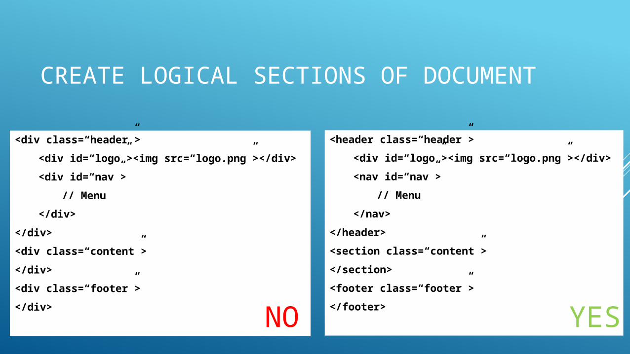
CREATE LOGICAL SECTIONS OF DOCUMENT
<div class=“header”>
<div id=“logo”><img src=“logo.png”></div>
<div id=“nav”>
// Menu
</div>
</div>
<div class=“content”>
</div>
<div class=“footer”>
</div>
<header class=“header”>
<div id=“logo”><img src=“logo.png”></div>
<nav id=“nav”>
// Menu
</nav>
</header>
<section class=“content”>
</section>
<footer class=“footer”>
</footer>NO YES
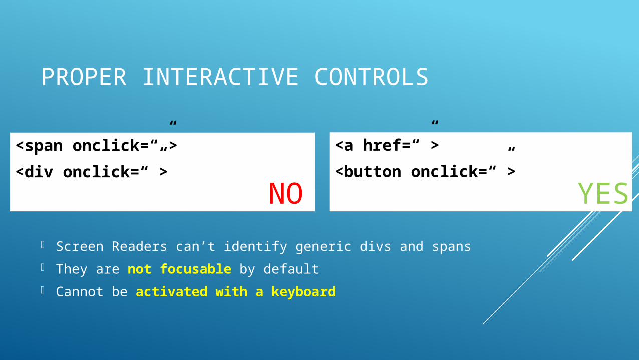
PROPER INTERACTIVE CONTROLS
<span onclick=“”>
<div onclick=“”>
<a href=“”>
<button onclick=“”>
NO YES
Screen Readers can’t identify generic divs and spans
They are not focusable by default
Cannot be activated with a keyboard
LABELLING
Label form elements properly
Alt text for ALL images
Descriptive alt text for informative images
Blank alt text for decorative images (like bullets or icons)
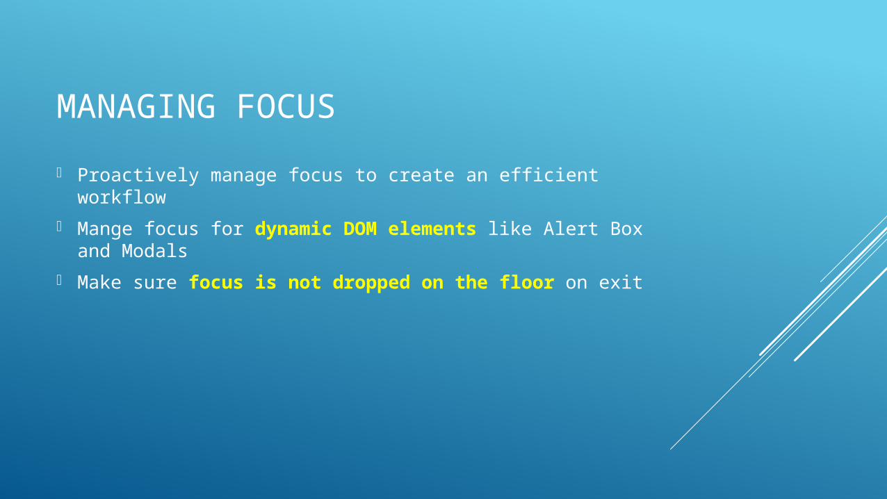
MANAGING FOCUS
Proactively manage focus to create an efficient workflow
Mange focus for dynamic DOM elements like Alert Box and Modals
Make sure focus is not dropped on the floor on exit
DOCUMENT GOT COMPLEX.
NOW WHAT?
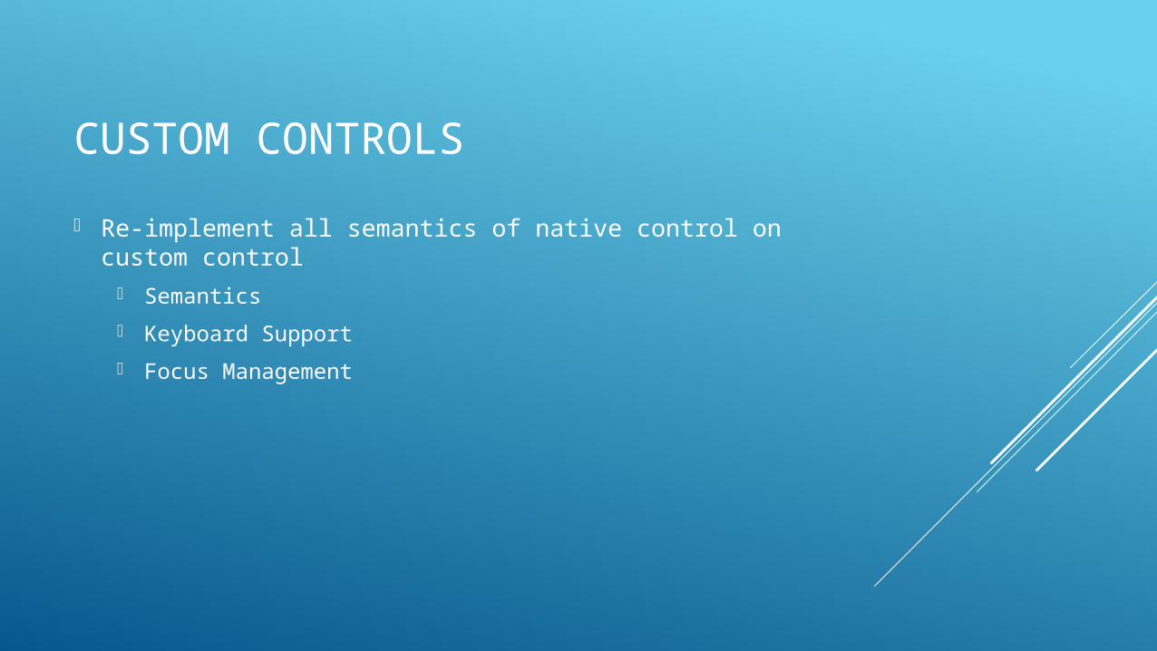
CUSTOM CONTROLS
Re-implement all semantics of native control on custom control
Semantics
Keyboard Support
Focus Management

ARIATO THE RESCUE
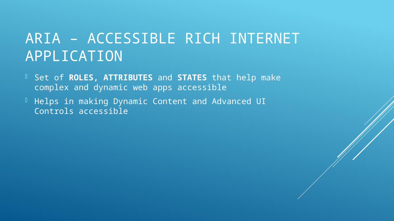
ARIA – ACCESSIBLE RICH INTERNET APPLICATION Set of ROLES, ATTRIBUTES and STATES that help make
complex and dynamic web apps accessible
Helps in making Dynamic Content and Advanced UI Controls accessible
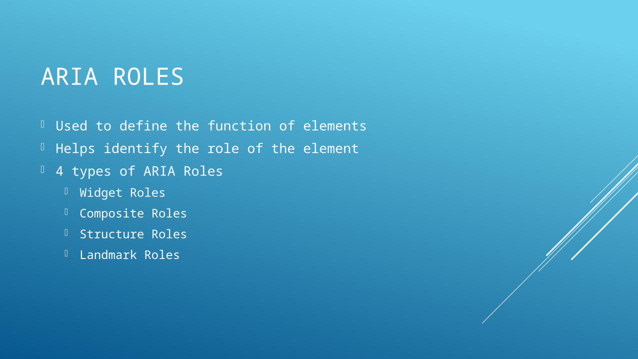
ARIA ROLES
Used to define the function of elements
Helps identify the role of the element
4 types of ARIA Roles Widget Roles
Composite Roles
Structure Roles
Landmark Roles
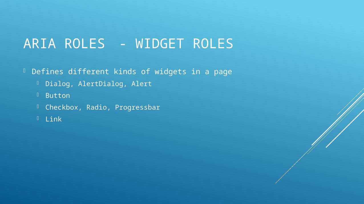
ARIA ROLES- WIDGET ROLES
Defines different kinds of widgets in a page Dialog, AlertDialog, Alert
Button
Checkbox, Radio, Progressbar
Link
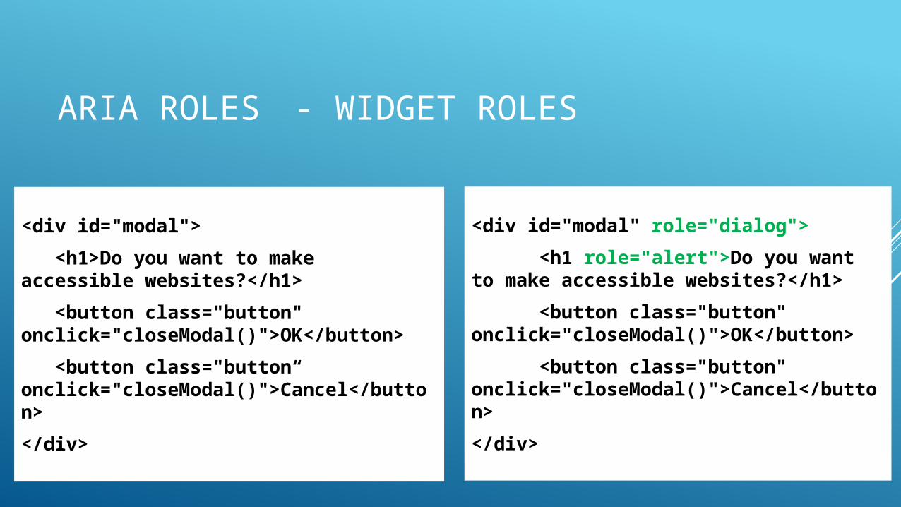
ARIA ROLES- WIDGET ROLES
<div id="modal">
<h1>Do you want to make accessible websites?</h1>
<button class="button" onclick="closeModal()">OK</button>
<button class="button“ onclick="closeModal()">Cancel</button>
</div>
<div id="modal" role="dialog">
<h1 role="alert">Do you want to make accessible websites?</h1>
<button class="button" onclick="closeModal()">OK</button>
<button class="button" onclick="closeModal()">Cancel</button>
</div>
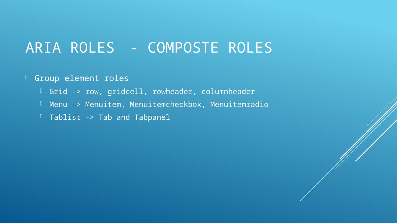
ARIA ROLES- COMPOSTE ROLES
Group element roles Grid -> row, gridcell, rowheader, columnheader
Menu -> Menuitem, Menuitemcheckbox, Menuitemradio
Tablist -> Tab and Tabpanel
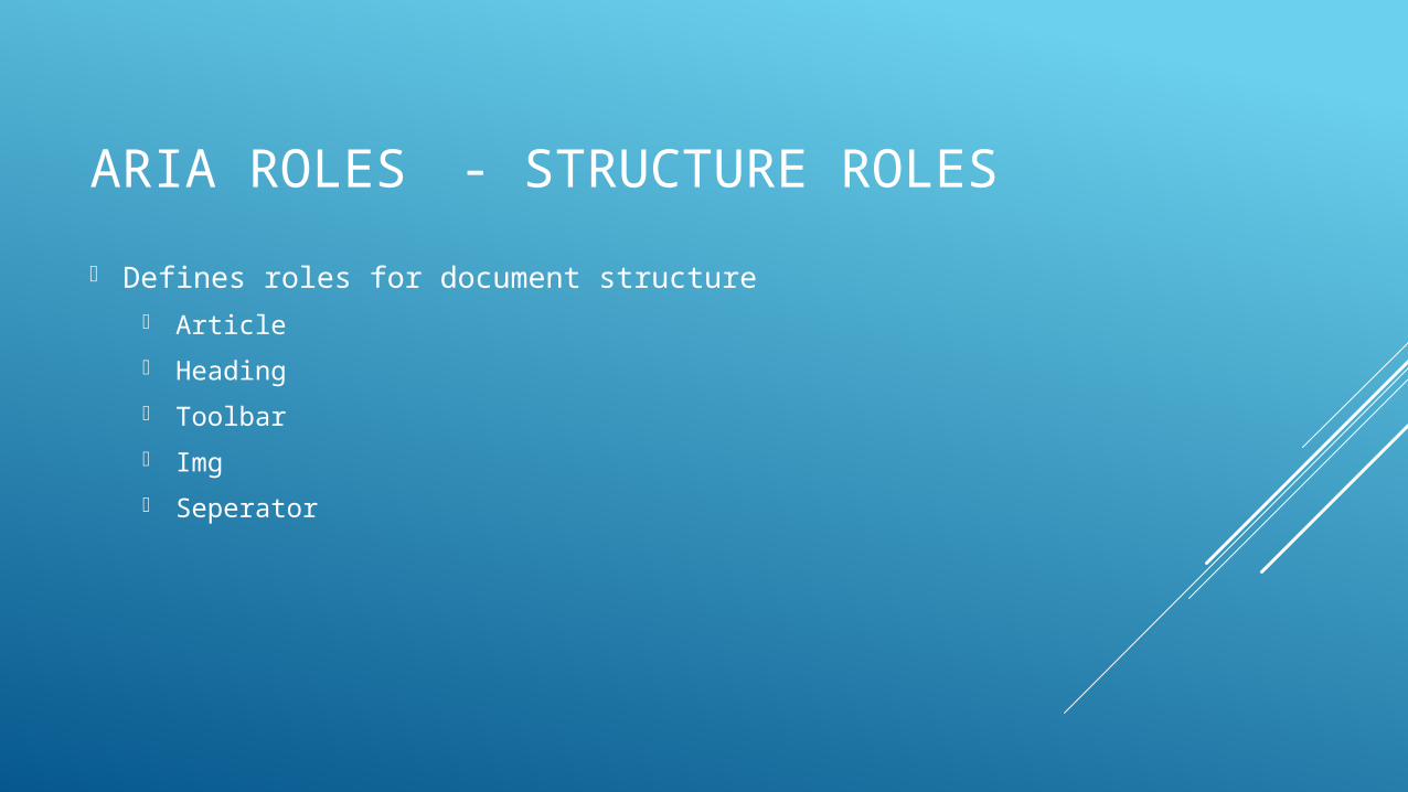
ARIA ROLES- STRUCTURE ROLES
Defines roles for document structure Article
Heading
Toolbar
Img
Seperator
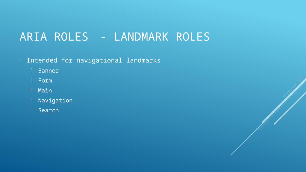
ARIA ROLES- LANDMARK ROLES
Intended for navigational landmarks Banner
Form
Main
Navigation
Search
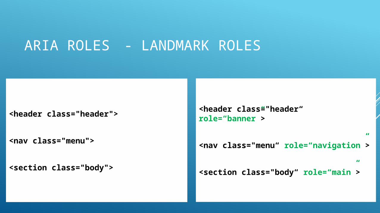
ARIA ROLES- LANDMARK ROLES
<header class="header">
<nav class="menu">
<section class="body">
<header class="header“ role=“banner”>
<nav class="menu“ role=“navigation”>
<section class="body“ role=“main”>
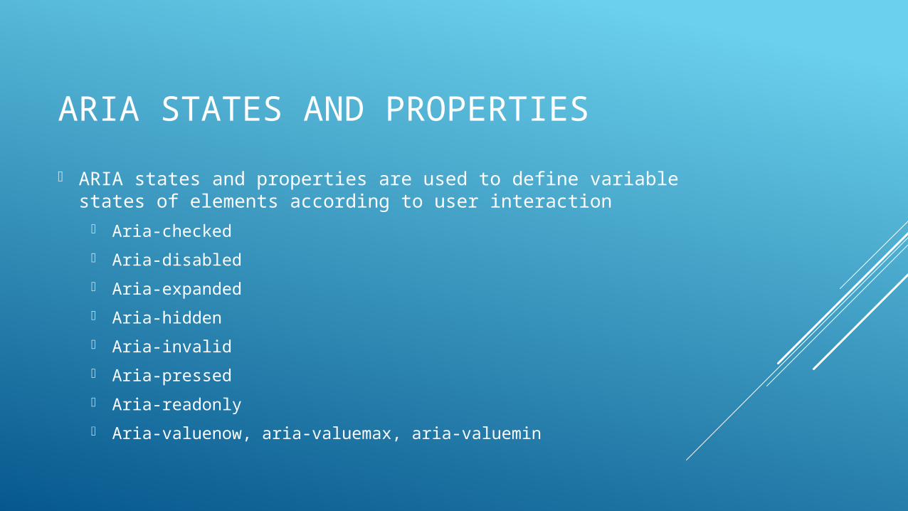
ARIA STATES AND PROPERTIES
ARIA states and properties are used to define variable states of elements according to user interaction
Aria-checked
Aria-disabled
Aria-expanded
Aria-hidden
Aria-invalid
Aria-pressed
Aria-readonly
Aria-valuenow, aria-valuemax, aria-valuemin
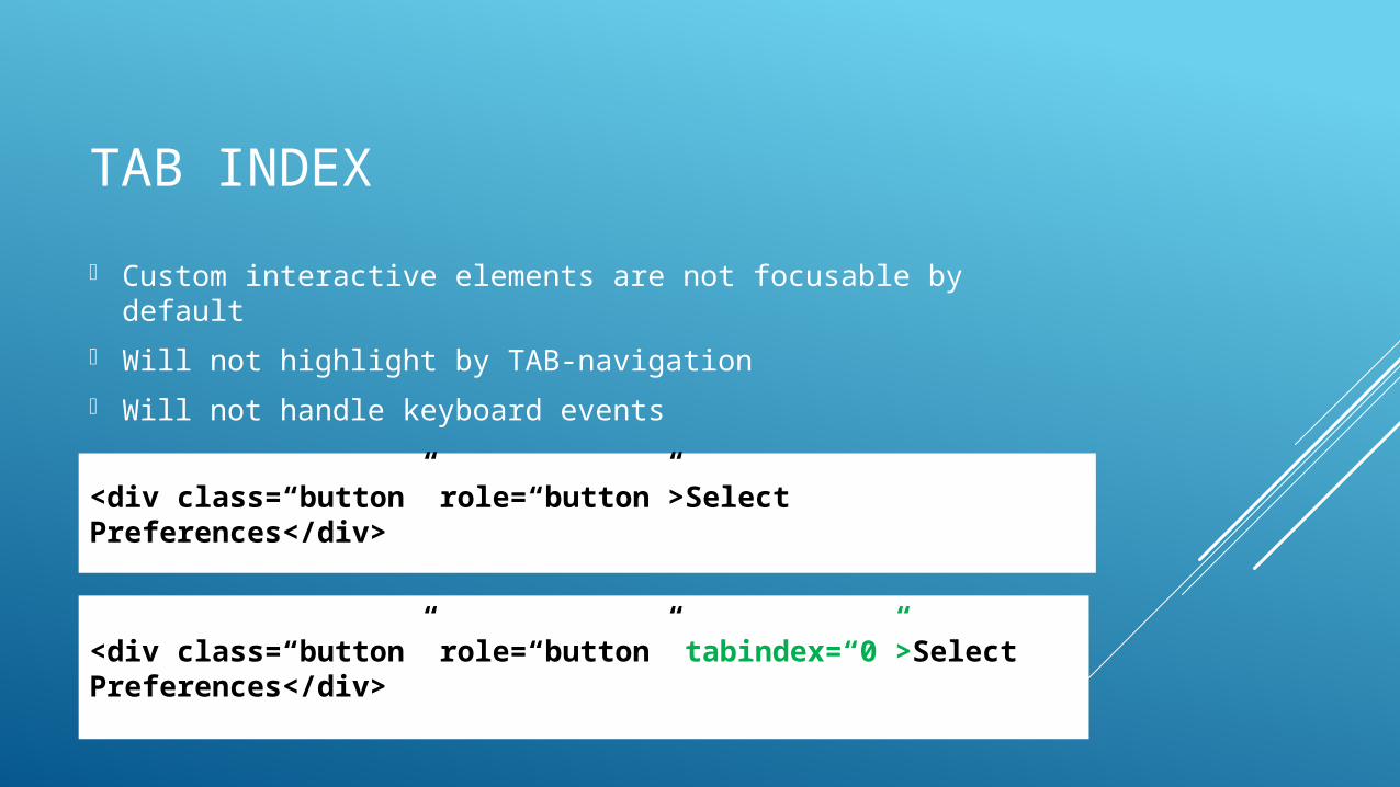
TAB INDEX
Custom interactive elements are not focusable by default
Will not highlight by TAB-navigation
Will not handle keyboard events
<div class=“button” role=“button”>Select Preferences</div>
<div class=“button” role=“button” tabindex=“0”>Select Preferences</div>
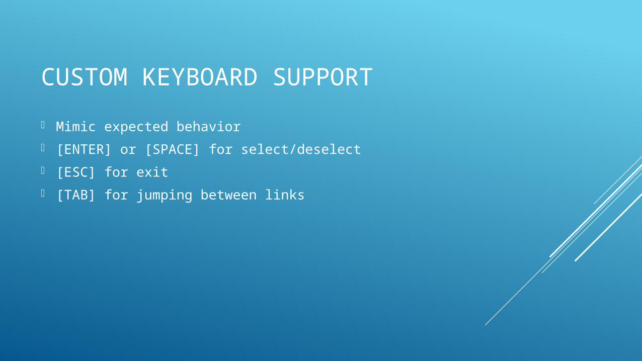
CUSTOM KEYBOARD SUPPORT
Mimic expected behavior
[ENTER] or [SPACE] for select/deselect
[ESC] for exit
[TAB] for jumping between links
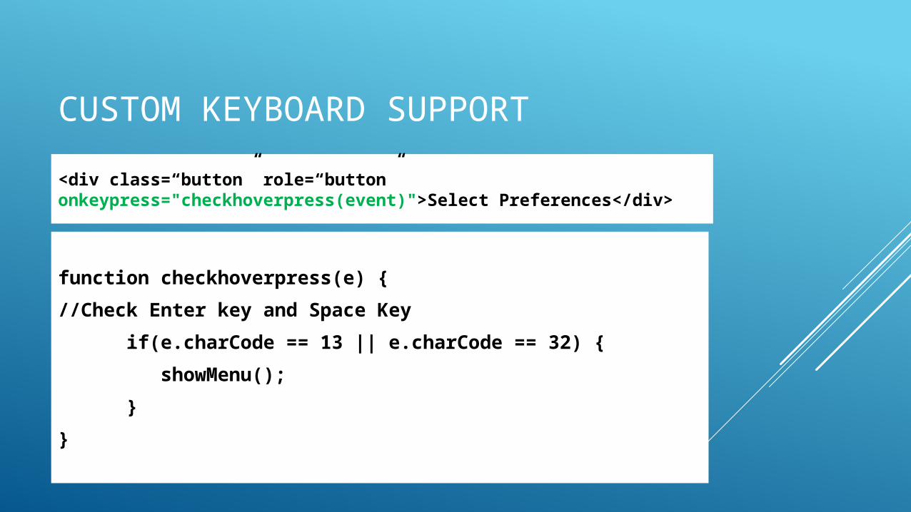
CUSTOM KEYBOARD SUPPORT
<div class=“button” role=“button” onkeypress="checkhoverpress(event)">Select Preferences</div>
function checkhoverpress(e) {
//Check Enter key and Space Key
if(e.charCode == 13 || e.charCode == 32) {
showMenu();
}
}
CONTRAST
Visual presentation of text and images of text should have proper contrast between background and color of the text for proper usability
Conrast Ratio of 4.5:1 for normal text
For large text, 3:1
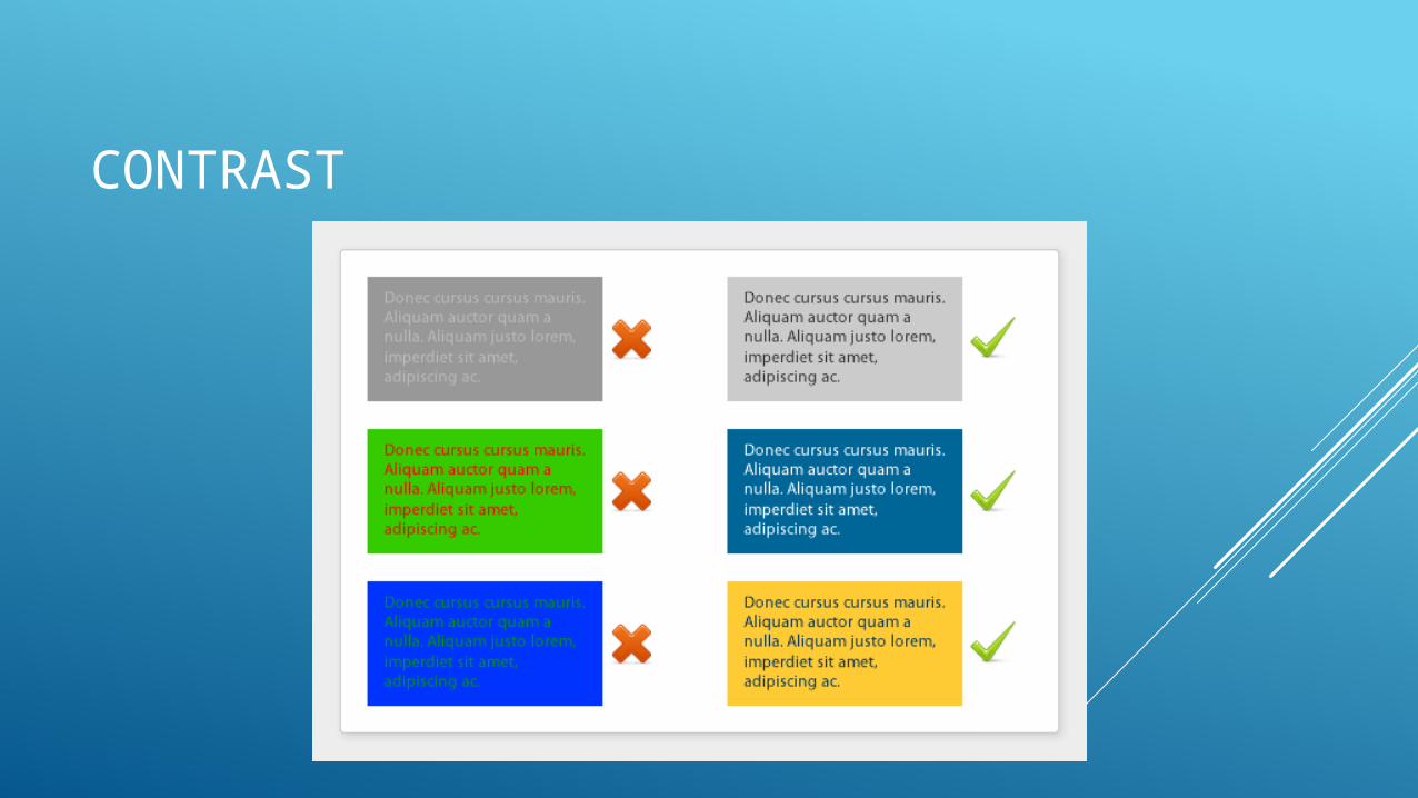
CONTRAST
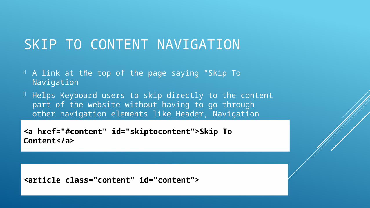
SKIP TO CONTENT NAVIGATION
A link at the top of the page saying “Skip To Navigation”
Helps Keyboard users to skip directly to the content part of the website without having to go through other navigation elements like Header, Navigation Menu, etc
<a href="#content" id="skiptocontent">Skip To Content</a>
<article class="content" id="content">
VALIDATING USING ACCESSIBILITY AUDIT TOOL Accessibility Audit Chrome Extension