Embed Size (px)
Citation preview

7 Inspiring Tests to Create High-Converting eCommerce
Product Pages

About Visual Website Optimizer
● A/B testing personalization platform for marketers
● Customers include JustFab, Dafiti, ShoeDazzle and 3700 others
● https://vwo.com
● http://twitter.com/wingify

About Siddharth Deswal
● Senior Marketer at VWO
● Passionate about analytics, optimization and storytelling
● Connect with him on Twitter:
@SiddharthDeswal

Product pages are NOT product detail pages.
They are your chance to differentiate your brand from competitors, deepen customer engagement with your brand, and….

Make customers fall in love with your product

But how do you get customers to move from your product pages to the checkout section?

“Classic Conversion Hacks” aka Best Practices
● Use large, high-quality, 360 degree views of products (with zoom in feature -too demanding, I know!)
● Make your call-to-action button stand out. Make them bigger and contrast it well.
● Let credibility indicators win some trust for your brand (Trust badges + any awards or accolades you may have won - display them proudly).
● Scarcity makes them want it more.

“Classic Conversion Hacks” aka Best Practices
● Never copy-paste manufacturer’s copy for descriptions. Craft a compelling product story in a voice that reinforces your brand’s personality.
● Focus on highlighting benefits, not features.
● Add a product video to make them imagine the products in their hands.
● Add a ‘Notify me’ option to capture email addresses on ‘Out of stock’ pages.
● Allow customer reviews/user-generated content

7 Inspiring Product Page Case Studies (And Potential Test Ideas for Your Store)

#1 The Olympic Store Boost Conversions by 19.2%

Company: Online store selling Olympic game mascots, apparels, key chains, collectibles, and many other products
Goal: To increase online sales
Test Background

What The New Buyer is Thinking
● What exactly is this product?
● How does it look like?
● Do they have any other colors in
this?
● Do they have my size?
● Is this jacket warm enough? What
do people say about it?
● What’s the fabric?
● What’s the price?
● Am I getting a good deal? What if I
can get a better price elsewhere?
● How trustworthy is this website?
● Where can I buy it?
● Do they have COD facility?
● Do they deliver in my area?

Some More Questions...
● Do I have to pay shipping charges too?
● Are there any other hidden charges?
● What if I do not like the product?
● What’s their return policy?
● How much time will they take to deliver?

Original Page
Issues on the page:
Page design does not follow F-shaped reading pattern and thought sequence
Problems with drop-downs for size and color. For example, only the color names, like ‘fern,’ ‘pacific,’ etc. are not very intuitive without any visual cues.

Variation A and B

Result: Variation B Converted 19.9% Better than the Original Page
Read the complete case study here
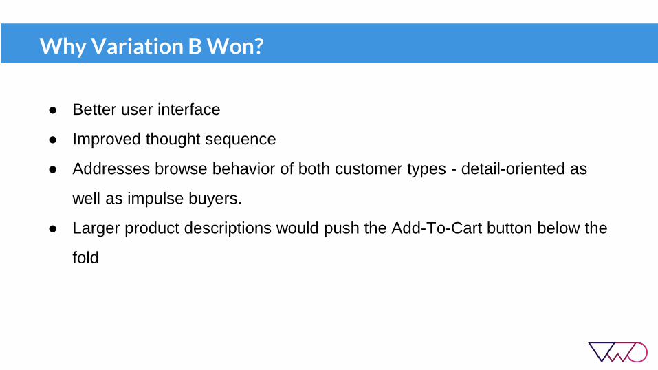
Why Variation B Won?
● Better user interface
● Improved thought sequence
● Addresses browse behavior of both customer types - detail-oriented as
well as impulse buyers.
● Larger product descriptions would push the Add-To-Cart button below the
fold

Product Page Framework (Gestalt Principle of Proximity)

Gestalt Principle of Proximity
Proximity occurs when elements are placed close together. They tend to be
perceived as a group.
These are 10 separate shapes

Gestalt Principle of Proximity
This is a square made up of 9 different shapes

#2 Bon’a Parte Increased Millions in Yearly Revenue

Test Background
Company: Denmark-based international apparel fashion brand founded in 1987
Goal: To increase online sales, Pageviews per Session, and Average Session Duration
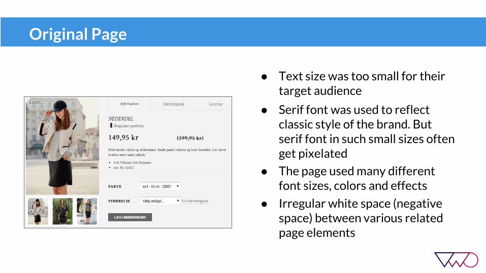
Original Page
● Text size was too small for their target audience
● Serif font was used to reflect classic style of the brand. But serif font in such small sizes often get pixelated
● The page used many different font sizes, colors and effects
● Irregular white space (negative space) between various related page elements

Variation A
Changes Made:
● New font: Droid Serif was used;
serif font with harder feet.
● Larger font size
● No unnecessary font effects
(italicize, bold, etc.). Only price
and product name was made
bold.

More Changes:
● Grouped related page elements
into four parts, each separated by
larger whitespace.
● Reduced negative space between
the elements using uniform
white space between them.
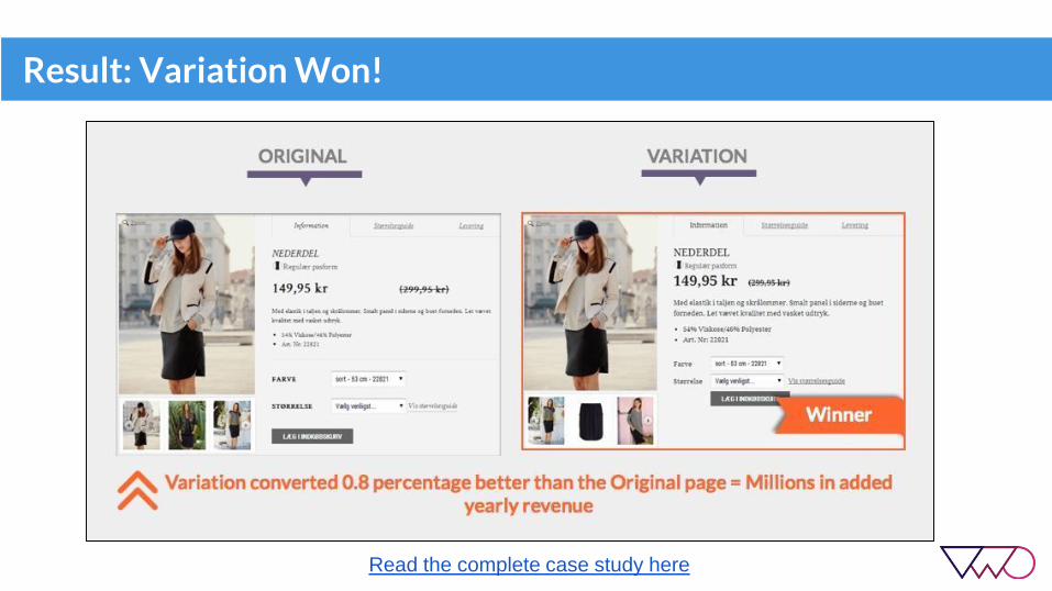
Result: Variation Won!
Read the complete case study here

#3 Taloon.com Increased Conversions by 7%

Test Background
Company: Finland-based hardware eCommerce store that sells plumbing,
electrical, gardening, and other construction material.
Goal: To increase clickthroughs to the ‘Add to Cart’ button

Social Share Buttons on Product Pages
Two schools of thoughts:
1) You should have it2) You shouldn’t have it
It’s an exhaustive debate!

Original Page

Variation Page

Result: Variation with No Share Buttons Won!
Read the complete case study here

Why Did This Happen?
● Negative social proof might have posed the product as undesirable.
● Share buttons reduced the attention ratio of the main call-to-action ‘Add to cart’ and distracted visitors.
● Share buttons might have slowed the page load time for the original page. Removing them thus probably increased page’s load speed and had a positive impact on conversions.

#4 Express Watches Increased Sales by 107%

Test Background
Company: UK based online retailer of Seiko watches
Goal: Increase online sales

Original Page

Variation Page
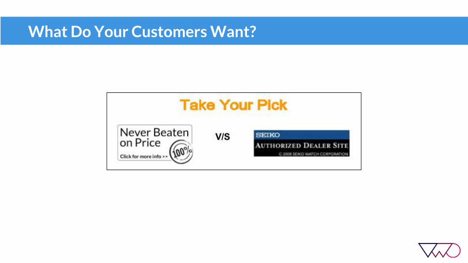
What Do Your Customers Want?

Result: Variation with Authenticity Badge Won!
Read the complete case study here

Why Did This Happen?
● With so many counterfeit product websites online, it’s a pressing concern for brand-conscious shoppers to get the authentic product.
● Clearly, Express Watches’ target audience care more about product authenticity than price.

Look at the Bigger Picture
● Testing goes beyond the basic idea of which version won.
● Understand your audience with on-site surveys
● Utilize valuable customer learnings to improve the effectiveness of your overall marketing strategy, both online and offline.

#5 Underwater Audio Increased Online Sales by 40.81%
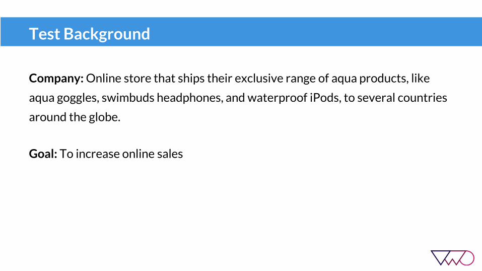
Test Background
Company: Online store that ships their exclusive range of aqua products, like
aqua goggles, swimbuds headphones, and waterproof iPods, to several countries
around the globe.
Goal: To increase online sales

Original Page
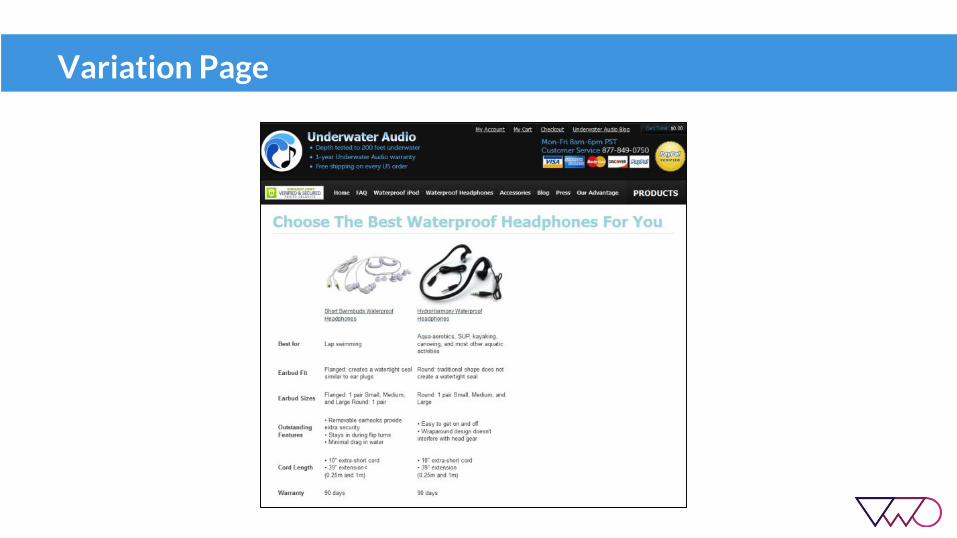
Comparison page to help prospects decide between two of their popular waterproof headphones.
When your customers choose the right products, it increases their customer satisfaction with your brand. Guide them well and make this purchase decision easier for them.

Problem
“The (rather) unattractive table had information in terse phrases organized in no particular fashion (activity, seal, size, features, warranty, depth). The paragraphs
continued below the fold and essentially repeated the table, with only a few unique additions hidden in the text. In short, it was not the most engaging page!”
~ Emily, Underwater Audio

Too Much Clutter
● Multiple call-to-action links = Lesser attention ratio for each CTA = Reduced conversions
● Additional paragraphs repeated table information
● Some categories mentioned in the table were not particularly useful for prospects’ purchase decisions and seemed more like jargon
Variation Page

Changes Made
● Any unique information in additional paragraphs included in the table.
● Clearer table categories written from customers’ perspective.
● Only two call-to-actions, one per product.
● Cleaner table layout.
● Font changed to make it consistent with the rest of the site.
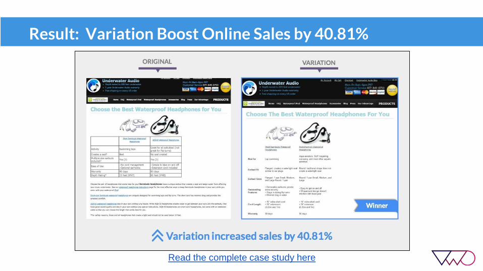
Result: Variation Boost Online Sales by 40.81%
Read the complete case study here

#6 Paperstone Increased Online Sales by 10.67%

Test Background
Company: UK-based office supplies store
Goal: To increase ‘Add to Basket’ clickthroughs and online sales

Original Page

Problem + Opportunity Gap
● Problem:
UK office supplies market dominated by 2-3 established brands, like Staples and Vikings.
● Opportunity Gap:
Price sensitive customers buy from these established brands that often charge higher. Paperstone offers cheaper prices for many (not all) popular products. (Test was ran on these product pages only - about 5,000 products)
Solution? Making buyers aware of their competitive prices can help them increase their online sales.

Variation Page #1

Changes Made
● Added competitor comparison module that displayed product prices on Staples and Vikings for the same product.
● Displayed date of price comparison for maximum clarity.

Result: Variation Lost! (Inconclusive)
● 50:50 traffic split
● The test ran for over 12,000 unique visitors
● Both the goals -- ‘Add to basket’ clickthroughs’ and online sales -- reported poorer performance compared to the original. These results were still inconclusive though when the test was stopped.
● Possible reason why variation lost? The module shifted the ‘Add-to-basket’ button below the fold.
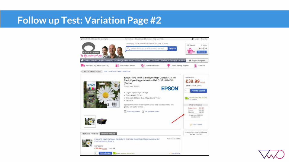
Follow up Test: Variation Page #2

Changes Made
● Added the competitor comparison module below the ‘Add to Basket’ button.
● This time the module also included the Paperstone price alongside the product prices offered on Staples and Vikings to make the comparison (and the saving) more apparent.
● The header ‘Price Comparison’ was added above the module to avoid banner blindness and make it easily noticeable in visitors’ eye path on the page.

Result: Variation #2 Increased Online Sales by 10.67%
Read the complete case study here

#7 Czc.cz Increased Online Revenue by 7.5%
Test Background
Company: Electronics gadgets store based in Czech Republic
Goal: To increase revenue generated online

More About the Test
Czc.cz wanted to test two things:
1. Impact of the Heureka widget on product pages2. Strategic placement of the widget for maximum impact
To test this, four variations were pitted against the original page.

Original Page

Variation Page - 1
Heureka Widget and ratings placed right below the Add to cart button.

Variation Page - 2
Only the Heureka Widget was placed below the Add to cart button (No ratings)

Variation Page - 3
Slide-in ratings widget on the right

Variation Page - 4
Slide-in ratings widget on the left

Result: Variation 4 Won
Read the complete case study here

Analyzing the Results: Why other Variations Failed?
The circular widget in variation 1 and 2 most likely distracted visitors to the
Heureka website, as the clickthroughs for the slide-in rating widget in variation 3
and 4 were almost negligible.

Why Variation 4 Won?
● The widget acted as a great credibility booster for the site.
● The left side placement aligned well with the F-shaped reading pattern of web visitors.
● The slide-in ratings didn’t distract visitors and instead had a positive impact on their purchase decisions.

Try out These Tests for Yourself!
Start with a 30 day free trial of VWO to quickly implement these changes on your landing page and test whether they work or not.
Setting up tests with VWO is incredibly simple and takes minutes. 3700 other data-driven brands use VWO to optimize their websites and significantly improve lead generation.
Get started with your FREE trial now!

Thank You