Embed Size (px)
Citation preview
The Chart Is All You Need http://www.netpicks.com/chart-no-volume-indicator/
I want to continue on with my look back on some of the pearls of wisdom from Richard Donchian. There are so many things that were valid decades
ago that are still applicable to the trading of today.
My first look can be found at: http://www.netpicks.com/trading-wisdom-from-yesteryear/
These two Donchian wisdom's center around volume however markets such
as Forex, being a market without a central exchange, don't have an
accurate measure of volume.
Trading Tip: Many traders who like to incorporate volume will use the
currency futures markets in their analysis but execute in the spot
market.
That being said, there are quite a few traders who don't use volume for any reason citing that they could not find
any statistical edge using volume.
Instead, the term "that's different" is used which simply indicates that
something unusual has happened compared to recent price action.
When something different happens, trading opportunities are looked for.
I am going to use charts without volume so you can see how you can
use the "that's different" term in relation to two more Donchian
guidelines
Donchian talks about looking for a volume climax especially when the markets have made extended runs.
They can be tricky because there are times that what looks like a climax, is
really renewed interest in the instrument you are watching.
Ensuring that price has advanced for a length of time can be a variable in your
trading plan that you need to see before thinking that the climax may
signal a change of state of the market.
Trading Tip: Just because the market "blows off", it does not necessarily
mean that a reversal is taking place. Markets rarely immediately reverse
but tend to balance out before changing direction.
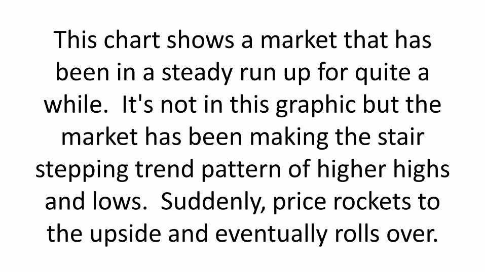
This chart shows a market that has been in a steady run up for quite a
while. It's not in this graphic but the market has been making the stair
stepping trend pattern of higher highs and lows. Suddenly, price rockets to the upside and eventually rolls over.
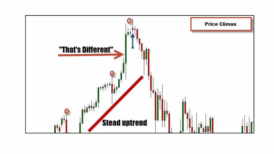
Also highlighted on this chart with the red circles is a pattern that is called "3
pushes". While this is one is a little sloppy, combined with the "that's
different" pattern, and occurring after the market breaks out of a range
(again just off this chart), I think it is worthwhile to show.
At times it can be difficult to differentiate between a climax move and just a strong thrust that sets up a good pullback trade. The key is to look for some type of price
action that shows that the lengthy move is coming to an end as in the candle I've highlighted with a green arrow in the
previous chart.
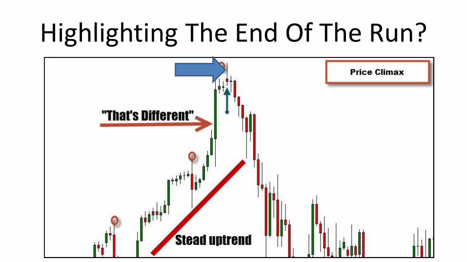
Highlighting The End Of The Run?
I find the blow off type of action very useful when using a multiple time-
frame approach. For example: This chart shows your standard trend-lines
and the break through the bottom plus the "that's different" look of the three preceding red candles, can alert you to be cautious on the lower time-frame.
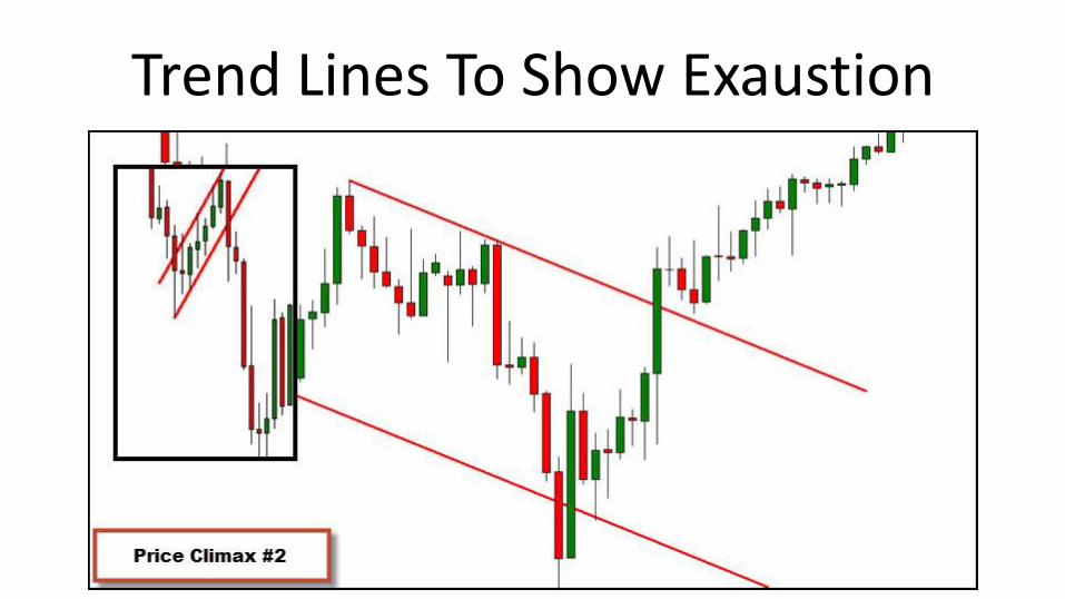
Trend Lines To Show Exaustion
Looking at the smaller chart laid on top, if you were short after the flag you'd be able to see that the strong
move down is actually not just strong selling interest but possibly the end of the move. That would have you either tightening up the stop or getting out
when the market begins to turn.
When price moves from advancing to a period of dull price action, you can get a great position and be in for the
meat of the price move.
So what do you look for in the period of dullness?
This is another guideline that can be a little tricky when not actually watching
the volume indicator. It relies on watching a few patterns emerge on
the chart that may indicate that there is a buildup of either buying or selling pressure. There are three things that I
personally look for and they are:
1. Failure test of the low/high of the range 2. A buildup of a range of price 3. A continuation of the move with a higher time-frame context Let's break down this next chart
and for context, we are coming into this off an uptrend on this time frame. I used a weekly chart for clarity but the
daily chart shows the range in better detail. We are also overextended on a
higher time frame so while not a perfect trading example, it's the
concept that is important.
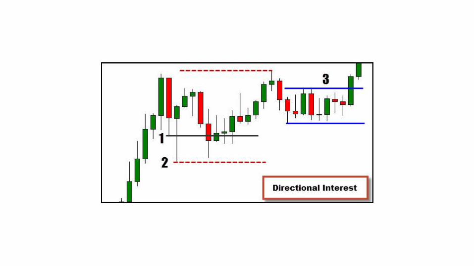
The #1 black line indicates the bottom of the red candle which at that time represented a the bottom of a small
range. You can see the test of the low and price was soundly rejected and would have made a tempting trade
location.
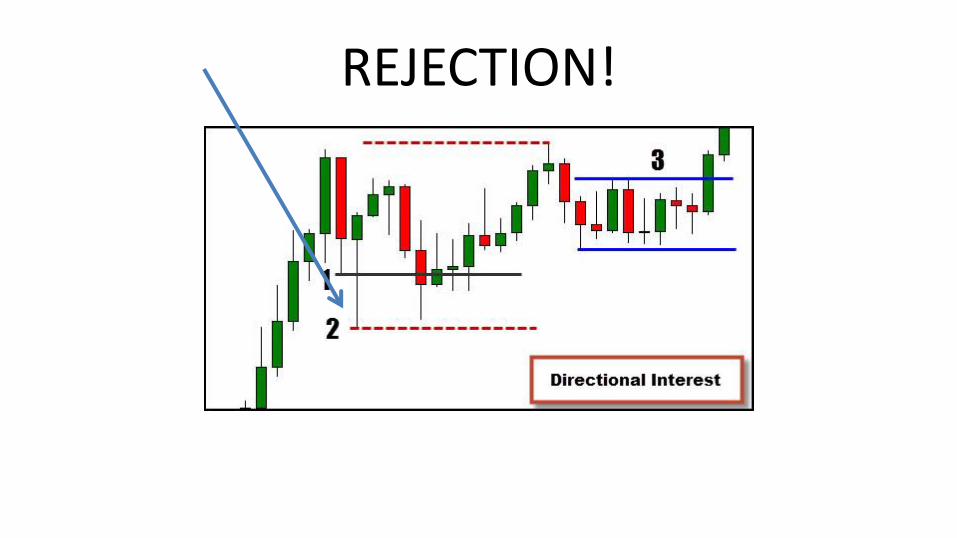
REJECTION!
Price didn't follow through and often times moves beyond the current
extremes just represent an expansion of the range as seen with #2.
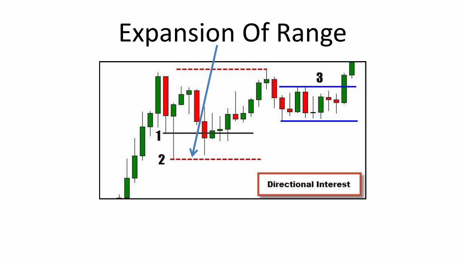
Expansion Of Range
We get a smaller range indicated at #3 that is inside of the bigger expanded range. The location is key as we see
that range forming in the upper half of the larger range.
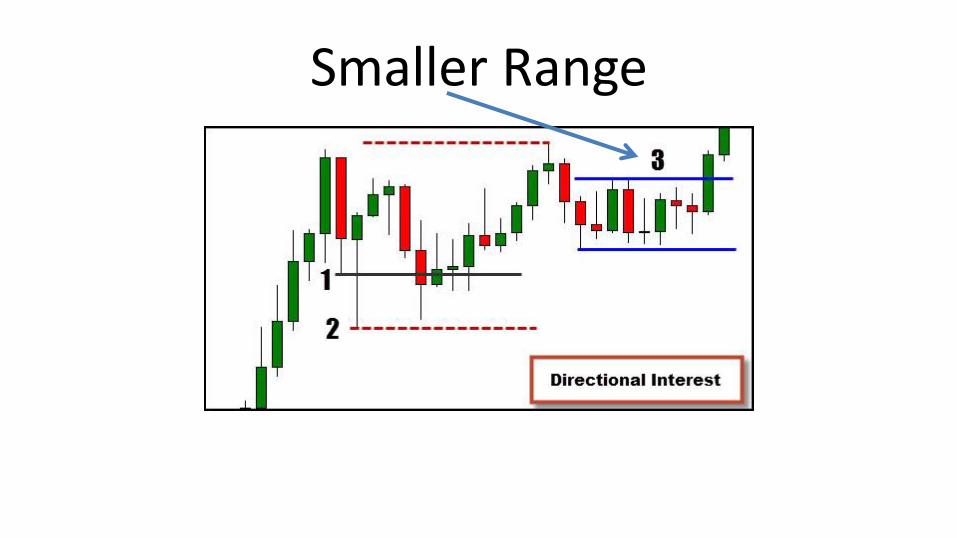
Smaller Range
Finding a trade location inside of this smaller range given the location and
same time frame context, is not a bad play. You get a favorable position in
this example prior to the break out of price.
However, as mentioned previously, the larger time frame does appear over
extended and at this point, a reversal candle has formed on the higher time
frame.
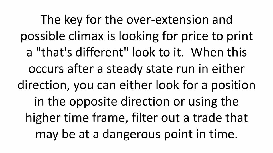
The key for the over-extension and possible climax is looking for price to print a "that's different" look to it. When this occurs after a steady state run in either
direction, you can either look for a position in the opposite direction or using the
higher time frame, filter out a trade that may be at a dangerous point in time.
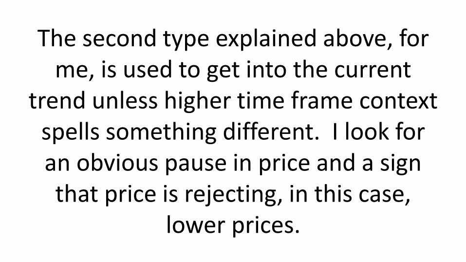
The second type explained above, for me, is used to get into the current
trend unless higher time frame context spells something different. I look for an obvious pause in price and a sign that price is rejecting, in this case,
lower prices.
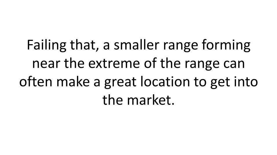
Failing that, a smaller range forming near the extreme of the range can
often make a great location to get into the market.
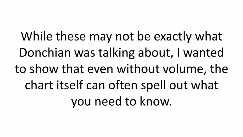
While these may not be exactly what Donchian was talking about, I wanted
to show that even without volume, the chart itself can often spell out what
you need to know.
I encourage you to break out your charts and see if you can identify
commonalities in various instruments to not only verify this information, but
perhaps also build upon your own trading plan.