Embed Size (px)
Citation preview

CKX SummitWellbeing Toronto: Lessons Learned
November 20, 2014

Page 2
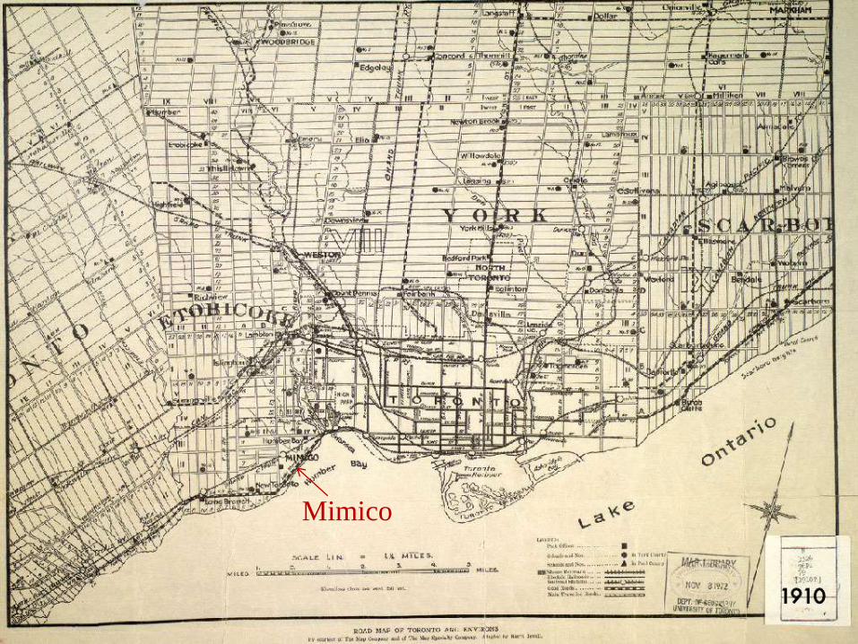
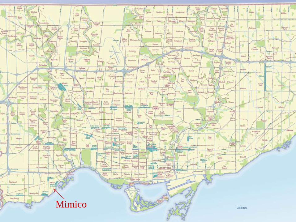
Toronto: a city of neighbourhoods
Source: Ontariotravel.net
What is a neighbourhood?
INCREASING PRODUCTIVITY, POTENTIAL AND PROFITS
Mimico
INCREASING PRODUCTIVITY, POTENTIAL AND PROFITSMimico


Page 8
What is a neighbourhood?
Neighbourhoods are historical, social, ethno-cultural and perceptual constructs
defining part of an urban area.
They are assigned an identity by the people who work, play and live in them. In a
few cases, identity is manufactured, as in the case of neighbourhood names
created by real estate boards or government planners (“Regent Park”).
Such identity is often based around landmarks (“the clocktower”, “high park”),
institutions (“the hospital”), ethnic affiliation (“little Italy”) or sometimes historical
events.
Strongly associated with history and tradition – hence controversial.
Boundaries are often vague and disputed; everyone has a slightly different idea
of the edges of a neighbourhood.
GIS does not support fuzzy boundaries or trinary logic very well.
Demographic change can be rapid, and GIS administrators struggle to keep up.

Wellbeing Toronto is new web-tool that helps measure & monitor community
wellbeing across 140 neighbourhoods.
A support tool for staff and Council in the development of policies and programs
that require a place-based neighbourhood perspective.
A multi-year long-term indicators tool that provides a common fact base across
both neighbourhoods, and over time.
Consolidates a variety of City operational metrics, socio-demographics and
infrastructure service data.
A system-level lens at addressing neighbourhood issues.
Data from many different sources both internally (across Divisions) and
externally (Statistics Canada).
Open Data Open Mapping Open Analysis.
Built on community & stakeholder input.
Page 9
Wellbeing Toronto: What is it?

Page 10
BACKGROUND
TO THE PROJECT

Background: Old SNTF Report
Key Outcome from Strong Neighbourhoods Task Force:
Established legitimacy of analysis and targeted investment at the neighbourhood level
Achieved through:
Development of fact base to inform the identification of service inequities
New method for measuring service accessibility
Overlaid service accessibility information with demographic data
Result central to the identification of 13 priority areas
Now lays the foundation for new system of monitoring wellbeing across all neighbourhoods
Page 11

New web tool that helps measure neighbourhood wellbeing.
Select indicators and see your results instantly on a map, graph or table.
Combine and weight data to suit your own needs.
Improves decision-making, and government transparency when a place-based lens is needed.
Leverages & consolidates data across “silos”.
A collaborative Open Data approach, full range of indicators across domains, value-free, and accessed for free.
LESSON: Set your goals clearly. Free or paid? Internal or external users? Management or frontline staff? Simple or complex? One-use or multi-function?
This dictum is easier to write than to follow given competing partner interests (more later).
Page 12
Background: New SNTF Project Goals

Page 13
CONCEPTUAL
DESIGN

Operational Metrics
Human Services Infrastructure
Socio-demographics
Neighbourhood Well-Being Indices
Fires, shootings, voter participation, program registrants, etc.
Schools, libraries, recreation centres, etc.
Age, sex, income, education, etc.
Housing Environment Health Safety Education
Civics Transport Recreation Culture Economics

Page 15
Lessons Learned 1: Finding Builders
Complicated City of Toronto RFP process – expedited and finished in 3 months (a
record, believe it or not). Sole source vendor did not work out.
LESSON: Go open RFP, there are tonnes of hidden startups that do amazing
work… often for cheap. More established players can be slow.
RFP terms included ownership of final software code + warranty.
LESSON: don’t get locked into vendor “loss leader” strategies of cheap upfront
and very expensive maintenance/proprietary code, like municipalities usually do.
Avoid the software “black box” phenomena; vendors move on, black boxes are
impossible to repair or upgrade without the original designers. (cf. Grantium)
Extensive work with Legal and City’s IT Legal team to get RFP and final contract.
LESSON: Budget 1 year for large government organization to get full
RFC/RFP/Contract done. If less, consider yourself lucky.
LESSON: IT Lawyers will understand the intricacies of software design contracts
much better than regular lawyers. Know the difference, get a specialist.

Our Partners
Page 16
-FindHelp Toronto
(211)
-School Boards
- LHINs
- United Way
- St. Christopher
House
- CRICH at St.
Michael's Hospital
- Social Planning
Toronto
- Housing
Connections
- TCHC
- Toronto Community
Foundation
- Woodgreen
Community Services
- Wellesley Institute
- Academia
- Citizenship Immigration Canada
- Statistics Canada
ACADEMIC EXPERT PANEL
-McMaster University (Health)
-Ryerson University (Geography,
Journalism, Politics, Public Policy,
Urban & Regional Planning)
-St Michael’s Hospital
-University of Toronto (Geography,
Medicine, Planning, Social Work)
-Wellesley Institute
-York University (Geography)
Licensing
Shelter &
Housing
Emp. &
Social
Services
Parks
Forestry &
Recreation
Transportation
External
Partners
EMS,
Police, Fire
City Mgr
Office
Works
Other
Orders of
Government
Environment
Social
Development
(Lead)
Geo Spatial
Competency
Centre (Infrastr.)
Wellbeing Toronto
LibraryPlanning
Public Health
Economic
Development, &
Culture
Environment

Page 17
Lessons Learned 2: Working With Partners
Few people can do this alone: nobody has ALL THE DATA. However, Design by
Committee is not the goal. Partners must be subordinate.
LESSON: Find lots of partners but don’t let them run the show. Offer functionality
and assistance in geo-enabling their data in exchange for raw data.
• Data collated by City’s social policy unit, sourced from dozens of other groups.
Consultations with each expert group and data provider to make them
comfortable with sharing their data, that their needs will be met.
• LESSON: Assuage data provider fears long before release date.
• FAILURE: Miscommunication with TDSB resulted in educational indicators being
pulled, still trying to reintegrate them 3 years later.
• LESSON: Get raw data at the lowest level of geography (points) whenever
possible. Easy to aggregate higher, impossible to disaggregate lower.
• LESSON: Determine optimal geography; very hard to support every possible
level of geography. We chose neighbourhoods. Others may choose wards or
postal codes, but know the strengths and weaknesses of each.
• FAILURE: Corporate brand standards & corporate IT standards. Talk to these
people long before so that the necessary approvals get done early on.

Page 18
ARCHITECTURE

Under the Wellbeing Hood - City’s Geospatial Environment
Page 19
BASE MAPPING
o Street Fabric
o Address Repository
o Cadastral Fabric
o Operational/Administrative Areas - Police Patrol Areas, …
o Addresses of Business/Operational Interest - Fire/Police/Ambulance stations, …
o Ortho Imagery
o Topographic Mapping
REST MAP SERVICES
o ArcGIS Server 9.3 Map Services
o Cached/Tiled Map Service
o Dynamic Map Service

City’s Geospatial Environment – Architecture
Page 20
Client Tier
GIS Desktop Clients (ArcGIS, ArcExplorer,
MapInfo GeoMedia,
Microstation)
Web
Clients
Web Tier
Business
Logic Tier
Data Tier
Load
Balancer
Web Servers
Application
Servers
Map/GIS
Servers
InternetIBM HTTP
Server
Sun Solaris
InternetIBM HTTP
Server
Sun Solaris
IntranetIBM HTTP
Server
Sun Solaris
IntranetIBM HTTP
Server
Sun Solaris
Websphere
Sun Solaris
Websphere
Sun Solaris
Websphere
Sun Solaris
Websphere
Sun Solaris
ArcIMS,
ArcGIS Server
Sun Solaris *
ArcIMS,
ArcGIS Server
Sun Solaris *
Unix Oracle
Geodatabases
Servers
Primary View ArcSDE Oracle
Spatial
Sun Solaris
Failover
ViewArcSDE
Oracle Spatial
Sun Solaris
* In 2010 Replaced by
Four MS Windows
Servers
GCC Management
IAG Management
Maintenance ArcSDE Oracle
Spatial
Sun Solaris

Wellbeing Toronto Leverages City’s Geospatial Environment
Page 21
City Components used in Wellbeing
REST Map Service • Base Map & Imagery
• Reference Layers (Addresses of Business/Operational Interest)
• Neighborhood Layer ( Operational/Administrative Layer)
REST Locate
Service
• One string Search
• For Address, Intersection, Name
• Soundex
REST DB Connect
Service
• Access indicators from DB
• Websphere connection pooling instead of JDBC connect.
Display in Wellbeing
REST Service for Neighborhood –
Dynamic AGS Map Service
Used as a Feature Layer on the client side –
allows mouse over
REST Service for Reference Layers –
Dynamic AGS Map Service
Used as a Dynamic layer on the client side

Page 22
Lessons Learned 3 – Techie Stuff
Detail specific functionality; blue-skying does not yield optimal results. Focus on
no more than 5 major features for the builder to implement.
• Back-end server implementation performed by the City’s Geospatial Competency
Centre (ArcGIS Server 9.3.1, SDE, Websphere, Java REST interfaces).
• Front-end developed by Azavea, a cutting-edge web map developer from
Philadelphia (JS, JQuery, OpenLayers, Raphael, etc.).
• LESSON: One central developer; One central system integrator.
• Learn existing system architecture first, builder must adapt to it. Easy to build
from scratch, much harder to fit into existing older systems. (startup mentality will
seriously irritate established Corporate IT developers).
• Dev, Test & Production environment mismatches have to be tested long before.
Vendor and corporate test environments may seem similar but have huge
differences (eg, Websphere 6 versus Websphere 7).
• LESSON: First-day demand is always crazy; get ready for crashes. The web app
developer’s dream – and nightmare – is that everyone in the world will want to
see the app on the first day. Plan failover and get your app on clustered servers.

Page 23
Lessons Learned 3b – Techie Stuff
• Security is not an after-thought for large organizations; penetration testing is long
and expensive. In our case it revealed a serious flaw in ArcGIS Server which was
referred to ESRI in Redlands for fixing. Took a lot of time.
• LESSON: Make time for security flaws.
• New Javascript and HTML5 functionality can help avoid proprietary standards
such as Flash or Silverlight. Consider using open-source components to help with
code ownership. In our case these were OpenLayers, Git, Ant, kTable, Raphael,
geotools, and more.
• LESSON: don’t get locked into proprietary web tech; it changes too fast.
• Initial browser targeting was for IE8, Firefox 5, Chrome 8. We’re now on IE11,
Firefox 33, Chrome 38…along with all the changes that brought. WT still works.
• LESSON: Plan for rapid change in browser tech. Ideally plan an upgrade cycle in
advance of launch and budget for it with your vendor/partners.

Page 24
APPLICATION CONCEPTS

BASIC CONCEPTS 1
Page 25
Indicator – a piece of data associated with some phenomena in real life, and in this case
assigned a geographic location (neighbourhood). Eg, an Indicator of Violent Crime shows
the frequency of violent crimes in a geographic area such as a neighbourhoods or wards.
Composite Index – several indicators added together. In order to be added together
(composited), indicators have to be normalized. It’s an index because it serves to indicate
some relation between two or more phenomena. Now called Combined Indicators.
Normalization – the process of standardizing data so that it can be compared. For example,
tree coverage may be in hectares while crimes may be counts of incidents. Those are
different things, but using normalization calculations they can be compared.
Time series – a collection of data for specific points in time. Eg, crime rates in 2001, 2006
and 2011. Time series have to be normalized to be comparable.
Weighting – giving less or more importance to an indicator. Eg, if you feel that Premature
Mortality is more important than # of TTC Stops, you can give it a heavier weight in the
calculations that create the Composite Index. In WT weighting is controlled by the user.
Reference Layers – the streets, churches, comm centres, etc. that you see in the background
of the main map. These can be lines (eg, streets), polygons (eg, wards) or points (eg,
hospitals).

BASIC CONCEPTS 2
Page 26
Base Map – the background map. It can show either streets or aerial imagery.
Metadata – data about data. Metadata gives you info about when an indicator was collected,
who did the collection, the source, the methods and other information.
Currency – how current a particular indicator may be, usually expressed as a date or year.
Eg, “the currency of the Library data is 2008”. This can usually be found in the metadata.
Histogram – a histogram is a bar chart that shows the distribution of values in a dataset. For
example, when looking at the Seniors Living Alone indicator, most of the values are in the
1-40 range, with only a few in the 41-100 range. The histogram shows this distribution
visually.
Scaling/Scoring – a normalization process that converts raw indicator data to a scale of 1-100
used in Wellbeing Toronto. If everything is scaled to 1-100 it can be added and compared.
Data values can either be raw or a score which uses a 1-100 scale.
Polarity – whether something is negative or positive. A positive indicator might be Voting
Turnout, while a negative one might be Premature Mortality. Some indicators - like Social
Housing or Businesses – can be ambiguous or controversial, so in WT the user sets the
polarity of indicators according to their own preferences.

TWO TYPES OF DATA
Page 27
RAW DATA
Any number.
Eg, 214 people or 130.5 hectares of
trees.
Not normalized, cannot be added
together.
Scale is indefinite (-billion to
+billion?).
Not compared to anything.
SCALED DATA (SCORES)
1 to 100 only.
Eg, 52 or 89.
Normalized, can be added together.
Scale is always 1 to 100, with 1 being a
low amount of something and 100
being a large amount of something.
Each neighbourhood value is compared
to the other 139 neighbourhoods.

REFERENCE PERIODS
Page 28
Reference Period – a grouping of data sets
that contains data from several similar years.
We cannot collect data fast enough to have
annual data sets for each indicator, so we
have to group them together.
The Canadian Census takes place only once
every 5 years.
Wellbeing Toronto will try to align reference
periods with the Census (eg, 2011, 2016,
2021) to show change over time.
A time series is a special set of indicators that
shows percentage (%) change for indicators
between two reference periods (eg, 2008-
2011 or 2011-2016)

TIME SERIES
Page 29
• The problem of value ranges in multi-year datasets complicates indexing.
• If you adjust for changing ranges for each year, previous values are incomparable.
• If you don’t adjust, values will inevitably fall outside defined range at some point.
• If value scores are incomparable, they cannot be added to make a composite index.
• Our solution: Wellbeing Toronto v2 will use adjusted % Change Values as “raw values”, which are then converted to the standard 1-100 score.
• Most phenomena fall within a -100% to +100% range. Anything outside of this range is compressed to -100% or +100%.
• The % change values are converted to the 1-100 score, then mapped.
• The time series indicators show how much or how little change there is over time.
• For actual raw values (not percentages), use the indicators for each individual year.

-100%
1
+100%
100
raw % change
…+100,000%-100% +100%
50
±0%
±0%
Final score
Adjusted % change
TIME SERIES CALCULATION
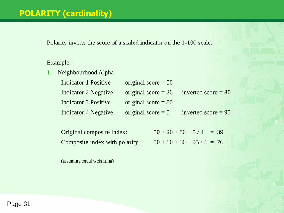
POLARITY (cardinality)
Page 31
Polarity inverts the score of a scaled indicator on the 1-100 scale.
Example :
1. Neighbourhood Alpha
Indicator 1 Positive original score = 50
Indicator 2 Negative original score = 20 inverted score = 80
Indicator 3 Positive original score = 80
Indicator 4 Negative original score = 5 inverted score = 95
Original composite index: 50 + 20 + 80 + 5 / 4 = 39
Composite index with polarity: 50 + 80 + 80 + 95 / 4 = 76
(assuming equal weighting)

The Composite Index Explained
Page 32
How the Composite (user) Index is built:
Raw hood aggregates 0-100 scale 1-100 scale weighted
composite index
0-100 scaled value = a = 100 * ( (raw value – minimum) / range)
1-100 scaled value = b = a + ( (100 – a) / 100)
Composite Index (inside app) = (v1 * w1) + (v2 * w2) / (w1 + w2)
Weighting options in the app are 0-5 (0=off, 1=lowest, 5=highest)

Page 33
Lessons Learned 4 – Difficult Concepts
• LESSON: FAQs, documentation and help files are a must…but nobody will read
them. Hands-on training is best: time-consuming but think of it as advertising.
• Videos are great and can be generated with a moderate amount of work using
cheap video tools like Camtasia Recorder.
• LESSON: Always label your data with currency (what year/time period it is valid
for), when it was published, when it becomes obsolete or superceded (if
possible). It’s frustrating to look at data and then only later realize it’s from 1998.
• Indicators that have time series that are meant to be compared on a common
scale (index value) will have problems as dataset ranges change.
• FAILURE: no easy solution to data time series bounding problem.
• Expect users to be baffled by even simple-sounding concepts like ‘average’ or
‘scale’. Try to eliminate technical jargon if you can. Get a layperson friend or 5 to
preview the app/data before launch and watch their reaction.
• LESSON: if your app is complex, keep an area of the interface for simple
operations for those people who don’t want complexity. Foldouts for more
complex operations for expert users. They know how to open a tab.

Page 34
DATA QUALITY & MANAGEMENT

Data Quality Techniques
Page 35
Wellbeing Toronto indicators are assessed for:
Accessibility: data can be obtained easily and at an affordable cost.
Comparability: can be related to other indicators and standardized.
Consistency: geographically spread and does not change much over time.
Credibility: believable to domain experts and comes from a reliable source.
Relevance: indicator measures progress towards a goal, not just random
number-counting. It resonates with the audience, both public and expert.
Measurability: indicator can be framed as a number, percentage or proportion.
Validity: the indicator measures what it is intended to measure and not a by-
product/proxy. Well-grounded in theory and fact. Can be defended and justified
in logical or scientific terms.

Page 36
Lessons Learned 5 – Data
• Everybody wants a tonne of data; what if you get it? Be careful what you wish for.
• LESSON: Have a system in place for handling large amounts of heterogenous
data. We settled on a custom app, the Bulk Loader.
• Cleaning & verifying data will take a lot of your time. Most people do not work in
nice clean Excel sheets or XML feeds, and their datasets will reflect a variety of
formats, systems, management techniques. Get ready for a big mess.
• Even good data may not be appropriate for the work you are doing or the app you
are developing.
• LESSON: Have sorting and selection criteria for your data. But don’t be a
perfectionist, there’s no such thing as perfect data (cf. Google Maps). Good-
Enough Data is still suitable for everything short of an academic scientific test.
• LESSON: Learn to live with data discontinuity. Datasets die, methodologies
change, people move on, organizations merge, SQL queries get lost.
• LESSON: Ask for detailed documentation from data providers (down to SQL
queries and definitions of terms if possible). Metadata is king.

Bulk Loader
Page 37
Research team is working on a bulk loading tool that will allow anyone to
upload raw data and turn it into a Wellbeing Toronto indicator. This is
probably the system that will be used for Grants and Crisis in the future.

Page 38
Lessons Learned 5b – Data
• 2006 and 2011 Census and NHS are not truly comparable.
• LESSON: Know your data, plan for data time-series incompatibility. It happens.
• LESSON: If you rely on the Census, synchronize your data collection with the
Census; every 5 years, 2006, 2011, 2016, 2021, etc.
• Wellbeing Toronto was designed for 5-year time intervals, but there is huge
pressure to present annual data. System not built for it, difficult to get annual or
monthly data (eg, Census).
• LESSON: Plan your time series. How often is your data going to be updated?
What if that time period changes? Amazon can afford by-the-pico-second
transactional systems, but can you?
• FAILURE: Communicating complex concepts to the general public (eg,
Composite Index or Polarity).
• Some geographies are so small (eg, Dissemination Areas) that they incur
suppression or don’t have enough data points to create a statistically-valid
indicator.
• LESSON: Average datasets over multiple years for small datasets and small
geographies, or pick a larger geography.

Page 39
MIS-USE & OPTIONS FOR MITIGATION
Like any data resource, there can be mis-use or errors in usage:
Combining indicators and assuming causation.
Ecological Fallacy: making incorrect inferences about individuals based on group data. Don’t assume neighbourhood data is exactly the same across the entire neighbourhood.
Don’t assume that the greater presence of service locations means that “an area is well served”.
WT presents mostly raw count data; it is up to the user to normalize it for population, area, etc.
Modifiable Areal Unit Problem (MAUP): point data aggregated to polygon areas can become distorted. Point data sitting right on the intersection of polygon boundaries can be averaged out. Eg, 5 poor areas + 1 rich area can create a “rich” neighbourhood.
Simpson’s Paradox: in some cases aggregation can reverse the signs of causality. For detailed analysis, data may have to be partitioned below the neighbourhood level.
Ignoring change if the data is available. Some indicators fluctuate wildly year to year (eg, Murders).

Page 40
MIS-USE & OPTIONS FOR MITIGATION
Mitigation:
All indicators will be accompanied by descriptions of the data.
Embedded links to data providers have detailed methodological notes which should be read by all practitioners.
Detailed guidebook is available including FAQ.
It is best to present sound data and good notation to user community openly; this fosters healthy debate on neighbourhood issues.
Explanatory videos if possible.
Run workshops for all interested organizations. Explore use of corporate training facilities and train-the-trainer options.
For more detailed analysis, download the data. The app is not a substitute for complex desktop applications like SAS.
Always be open to user suggestions, data & indicator requests.

Page 41
APP FEEDBACK

FEEDBACK
Page 42
Successful launch in 2011, upgraded in 2013.
Steady demand over the 3 years, about 5X more visitors to Wellbeing Toronto than to old demographics portal, though it has tailed off.
Fair reception in newspapers and online; some criticism.
Won 4 awards so far: Corporate IT Award of Excellence, MISA Excellence in Municipal Systems Partnership Award, IPAC Finalist Award, federal GTEC Distinction Award.
Set a new, high standard for web mapping interfaces inside the Corporation.
Feedback received via email, phone and the online survey.
Biggest criticism was about neighbourhood names.
Browser technology has advanced very quickly (Chrome v9 Chrome v26)
2012 User Acceptance Testing showed weaknesses in some parts of the user experience; problem hopefully mitigated by instructional videos.
Still receiving feedback from experts on how to improve certain indicators.

SURVEY RESULTS
Page 43
37%
27%
15%
12%
9% User Type
Resident
Government
NGO
Other
Student
59%
35%
6% Functionality
More
No change
Less
56%35%
9% Amount of Data
About Right
Too little
Too much
53%41%
6% Tutorials
Needs work
Thorough
Incomplete
n = 36

SURVEY RESULTS 2
Page 44
OVERALL SCORE (“Met
Needs”)
Mean: 6.3 (average)
Mode: 8.0 (most common)
Median: 7.0 (middle of list)
0 1 2 3 4 5 6 7 8
Housing
Economics
Health
Safety
Civics
Demographics
Environment
Transportation
Education
Most Popular Domains
Written/Oral Feedback:
• Want information about points
• Want “normalization by X”
• Want polarity
• Want more current data (eg, Census 2011)
• Want more features

Page 45
Lessons Learned 6 – Users
• A lot of people use Wellbeing Toronto… few understand it.
• LESSON: Train, train, train your users if the app is multi-function or make it a 1-
function app. Provide workshops for complex apps.
• Our intended target was researchers and City staff; our biggest users turned out
to be average citizens, according to an online feedback survey.
• LESSON: “The street finds its own use for things.” Your userbase may end up
being different from your intended one. Survey your users if you can, they may
tell you things about your data or app that never occurred to you.
• FAILURE: To this day, 3 years later, people are still amazed that the City of
Toronto came up with an app like Wellbeing Toronto. They had never heard of it
before. Word-of-mouth only gets you so far.
• LESSON: Advertise your app. If you’re a large organization, have a
communication strategy.
• FAILURE: People want video. We tried but did not have time to create a series of
explanatory videos to assist new users.
Page 46
Key Lessons
• Avoid black box software development.
• Find as many partners as you can handle. Everyone has data!
• Metadata is critical; time series always need meticulous data documentation.
• Trade data and functionality (can I map this for you?) with partners.
• Find your level of geography and stick to it.
• Have one central data collator, person and system.
• Advertise and explain your app beyond just a FAQ.
• Prepare a data management system beforehand.
• Get raw data as points whenever possible.
• Use open source technologies.
• Get your statistics straight.
• Learn to manage less-than-perfect data.
Hunting Data in the Digital Jungle

THANK YOU!
For more information contact:
Mat Krepicz
Senior Analyst
Telephone: 416-392-3143
Email: [email protected] or [email protected]
www.toronto.ca/wellbeing