Embed Size (px)
Citation preview
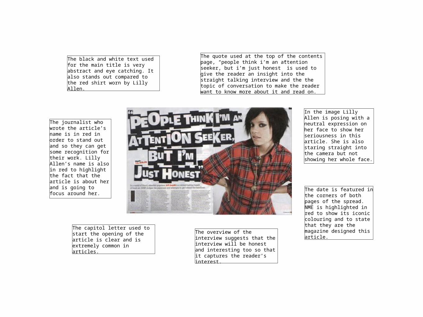
The black and white text used for the main title is very abstract and eye catching. It also stands out compared to the red shirt worn by Lilly Allen.
The quote used at the top of the contents page, “people think i’m an attention seeker, but i’m just honest” is used to give the reader an insight into the straight talking interview and the the topic of conversation to make the reader want to know more about it and read on.
The journalist who wrote the article’s name is in red in order to stand out and so they can get some recognition for their work. Lilly Allen’s name is also in red to highlight the fact that the article is about her and is going to focus around her.
The capitol letter used to start the opening of the article is clear and is extremely common in articles.
The overview of the interview suggests that the interview will be honest and interesting too so that it captures the reader’s interest.
In the image Lilly Allen is posing with a neutral expression on her face to show her seriousness in this article. She is also staring straight into the camera but not showing her whole face.
The date is featured in the corners of both pages of the spread. NME is highlighted in red to show its iconic colouring and to state that they are the magazine designed this article.

The image is a clearly visible picture of Lady Gaga. You can tell she has some significance as the image takes up half of the double page spread. The photo has been edited into greyscale which makes it look fairly old but sophisticated at the same time.
The colour scheme used for for this double page spread is made up of 3 colours which are black, white and red. These colours match the rest of the magazine and also the ‘Q’ logo.
The very large red ‘L’ takes up the whole of the other page. The letter refers to Lady Gaga’s name which is the first word on the text. The colour also links back to Q magazines style and logo.
Tho photo that Q chose to use of Lady Gaga is very sexual and is aimed to attract men. All she seems to be wearing is a few necklaces and is covering her breasts with her hands.
There doesn’t seem to be a title on this double page spread, just the artists name. The style of font that is used for ‘lady GAGA’ uses bold lettering and stands out to the reader.

The huge title and picture of Florence and the Machine take up the majority of this double page spread. I feel that for my double page spread, I will not waste so much space because the the amount of of space for an article is too little and makes it appear cramped on a page. However the large title does add an extra element to the double page.
This NME double page spread uses the same colour scheme of the magazines style, red, black and white. However Florence Welch’s name is highlighted in blue which is not very eye catching or bright. I would like to use the same sort of colours for my magazine.
In contrast to the other NME double page spread, the title here here is more elegant and sophisticated and isn’t as striking. I will need to consider whether I am going to use a elegant title or a more unique sort of style