Embed Size (px)
Citation preview
On the Design of a Responsive User Interface for a Multi-Device Web Service
Jari-Pekka Voutilainen, @Zharktas

Agenda● Background● Opendata.fi● Extending the Platform● Implementing Responsive User Interfaces● Tools for Responsive UIs

Background● Average consumer has at least 2 primary
computing devices: Personal computer and a smartphone.
● Mobile UIs are often still implemented as native apps or separate web interfaces with different features than the full browser app.

Background● Modern web app should have mobile UIs
built in, without settling for lesser experience.● Google just changed their search results to
favor websites with mobile UIs.

Opendata.fi● National catalogue for Finnish open data.● Based on two Open Source projects:
○ Drupal for CMS○ CKAN for the data catalogue
● Services are installed side-by-side behind Nginx with minimal integrations between them.

Extending the platform● CKAN is designed to be customizable.● Provides plugin architecture which allows
customization of styles and templates and even add new features.

Extending the platform● The plugin architecture provides means to
replace templates through inheritance.● Template engine is Jinja where templates
are divided into blocks.● Blocks can be replaced and the parent block
can still be used through calling super()

Implementing Responsive UIs
● CKAN uses Bootstrap but did not have mobile UIs implemented.
● Easiest way would have been to rewrite the templates from the ground up while modifying them to our other needs.
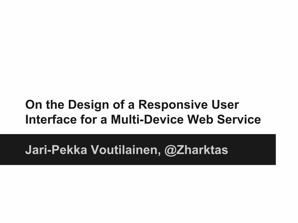
Default Ckan

Ckan mobile UI

Implementing Responsive UIs
● We wanted to retain as much as possible of the original templates so that in eventual platform upgrades, we get the new features to templates with minimal effort.

Implementing Responsive UIs
● Through template inheritance, we could add HTML elements around original blocks.○ Add some divs with appropriate Bootstrap classes
=> responsive UI○ Bootstrap’s responsive helpers allow repositioning
the elements in different screen sizes.○ Navigation elements were rewritten so that the main
content gets most of the small screen space.

Opendata.fi UI

Opendata.fi mobile UI

Implementing Responsive UIs
● This solution does not work in all cases.○ Simple template changes and CSS styling allows
many modifications in layouts.○ CSS is not designed to order elements vertically, we
had to copy-paste these templates and reorder the elements by hand.
● This should work in other applications as well which use inheritance based template engines○ Jade, Swig, Django templates, Nunjucks etc.

Tools for Responsive UIs● UI libraries
○ Bootstrap / Zurb Foundation● Pre-processed CSS
○ Less / Sass○ Variables, inheritance etc.
● Build Systems○ gulp / Grunt○ Single CSS / JS file for browser among other things.
Questions
?


![Web-based Hybrid Mobile Apps: State of the Practice and Research opportunities [MobileSoft 2016]](https://img.pdfslide.us/doc/110x75/5885d29e1a28ab42028b6cdd/web-based-hybrid-mobile-apps-state-of-the-practice-and-research-opportunities.jpg)