Embed Size (px)
Citation preview
Landing pageThis helps to catch the audiences attention to the website making them keen to carry on as well as an introduction to the artists website.
LogoThis is a very clear logo on the Royal Bloods website, which is kept really plain and simple but clearly shows the artists name. Showing the artists name along the taskbar.
Promotion video (multi media)
This helps to promote their recent debut album, because as soon as you go to their website, this will be the first thing that you see in the middle of the page.
Primary content area
This shows the main feature on this page
Secondary content areaThis area mostly helps to promote their album, and shows the audience where they can buy it
from
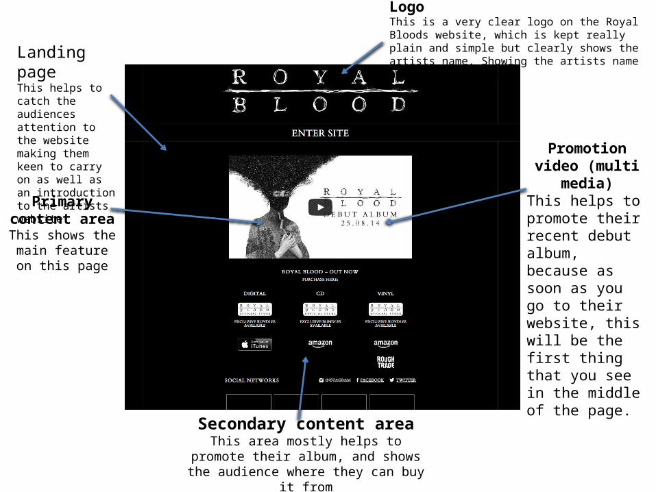
LogoUsually at the top, attracting most of the attention Social
network linksThis helps to keep the audience interacted with the band.
Bottom bannerThis is just a replica of the navigation bar at the top, so that once the viewer has reached the bottom of the page. They seem to be using the same font throughout, sticking to the theme of black and white.
Social network linksThis is to get the band heard from people who visit the site and to share what they have seen. This is a new way of getting a band famous.
StoreThis helps the viewer of the website to navigate where they can find merchandise from the band
Navigation BarThis helps the audience to find things about the artist along easier, also navigating them to what they want a lot quicker.
Primary content areaThis seems to be news and updates about what the artists are up to.
Secondary content areaThe secondary content is kept to the side, showing key dates.

LogoThe bands many logo is positioned right at the top and in the middle with the main image.
Navigation BarThis website also had many navigation bars which also send you to another site, such as opening a new window for the merchandise.
Social Network linksThis shows the fans how they can get connected with the band online.
Primary Content areaThis part just seems to be the photo of the five boys
Secondary Content AreaThis part seems to be the rest of the different types of text, showing their latest tweets, recent news and events.
The general theme of One Directions website seems almost very girly, as this would be their main audience type. So they have made there website like this so that it is appealing to their
aimed audience.
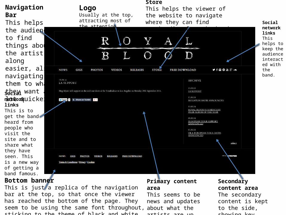
Navigation barThis seems to be more of a pop out from the whole website it self.
LogoThis seems to be the highlight of the page, with the advertisement of his latest album with the title to, which hyperlinks to the page where you can buy the album.
There only seems to be primary content on this page, which includes Bruno's latest events and news that he's been up to.
The theme shown here is very simple, with very little attraction to the viewer. So you would visit this website to mainly buy something or find out what Bruno Mars is up to.