Embed Size (px)
Citation preview
DPS Construction
Primary images (DPS)
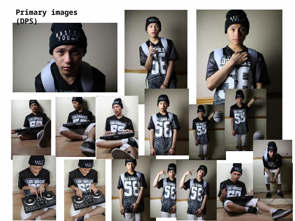
EDITS:• Cropped in from a mid-
shot to a close up • Black and White filter• Slightly sharpened• Enlarged length-ways to
make his face slimmer to make him look older
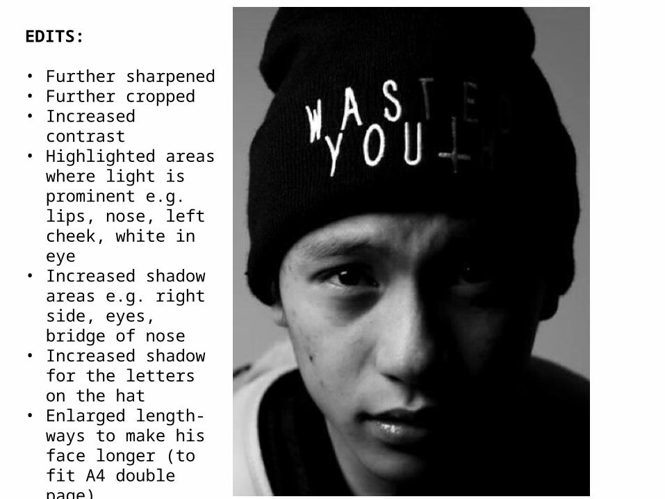
EDITS:
• Further sharpened• Further cropped• Increased contrast• Highlighted areas where
light is prominent e.g. lips, nose, left cheek, white in eye
• Increased shadow areas e.g. right side, eyes, bridge of nose
• Increased shadow for the letters on the hat
• Enlarged length-ways to make his face longer (to fit A4 double page)
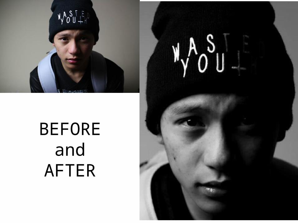
BEFORE and
AFTER
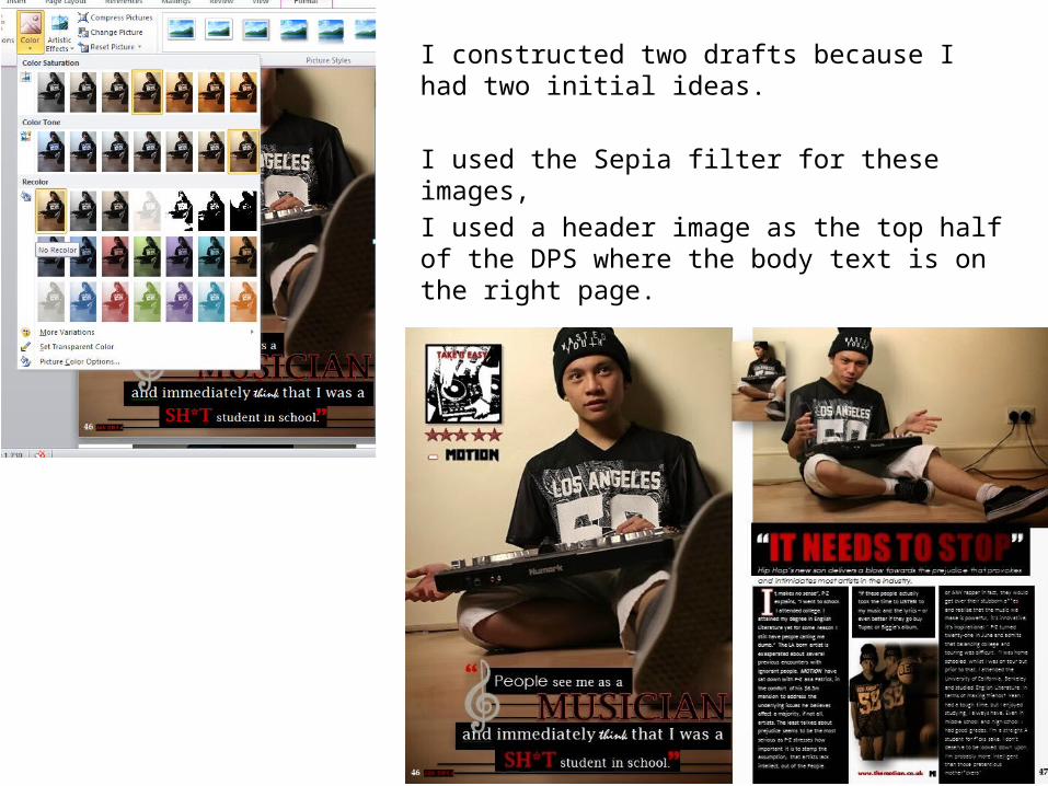
I constructed two drafts because I had two initial ideas.
I used the Sepia filter for these images, I used a header image as the top half of the DPS where the body text is on the right page.
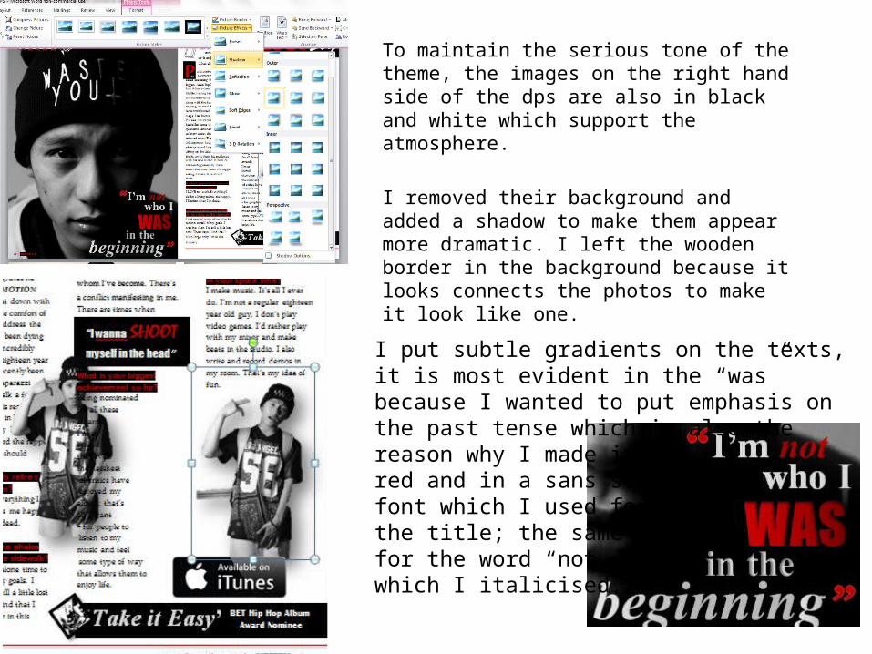
To maintain the serious tone of the theme, the images on the right hand side of the dps are also in black and white which support the atmosphere.
I removed their background and added a shadow to make them appear more dramatic. I left the wooden border in the background because it looks connects the photos to make it look like one.
I put subtle gradients on the texts, it is most evident in the “was” because I wanted to put emphasis on the past tense which is also the reason why I made itred and in a sans serif font which I used for the title; the same goesfor the word “not” which I italicised.
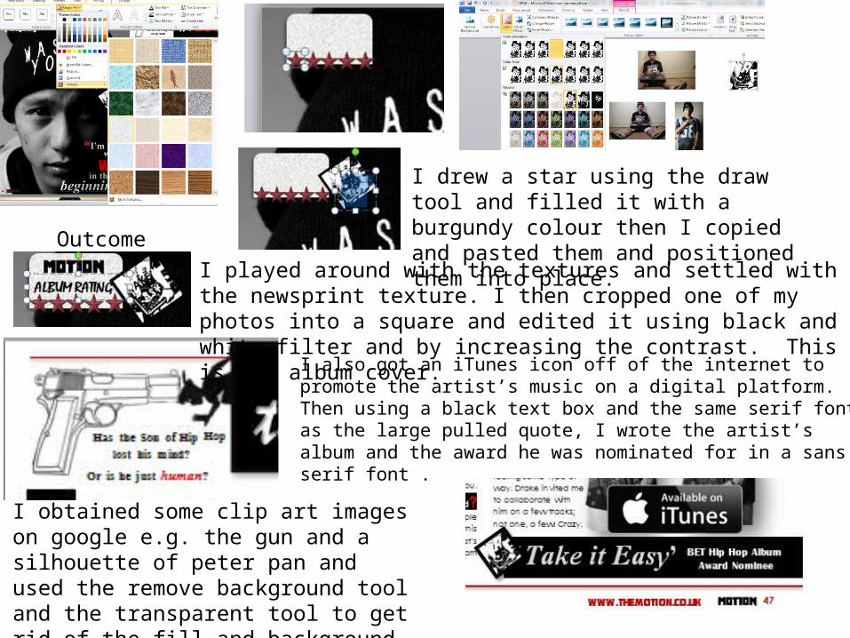
I obtained some clip art images on google e.g. the gun and a silhouette of peter pan and used the remove background tool and the transparent tool to get rid of the fill and background.
I also got an iTunes icon off of the internet to promote the artist’s music on a digital platform. Then using a black text box and the same serif font as the large pulled quote, I wrote the artist’s album and the award he was nominated for in a sans serif font .
I played around with the textures and settled with the newsprint texture. I then cropped one of my photos into a square and edited it using black and white filter and by increasing the contrast. This is the album cover.
I drew a star using the draw tool and filled it with a burgundy colour then I copied and pasted them and positioned them into place. Outcome
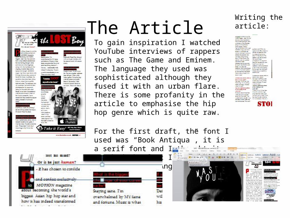
The ArticleTo gain inspiration I watched YouTube interviews of rappers such as The Game and Eminem. The language they used was sophisticated although they fused it with an urban flare. There is some profanity in the article to emphasise the hip hop genre which is quite raw.
For the first draft, the font I used was “Book Antiqua”, it is a serif font and I thought it matched the font I used for the pulled quote (“Angsana New”).
Writing the article:
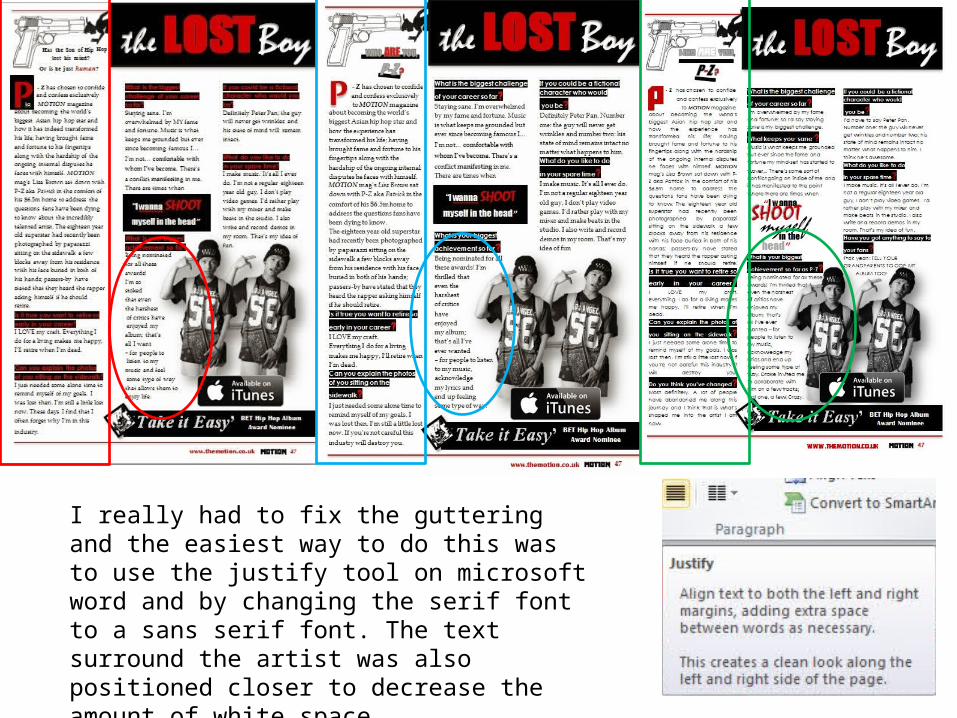
I really had to fix the guttering and the easiest way to do this was to use the justify tool on microsoft word and by changing the serif font to a sans serif font. The text surround the artist was also positioned closer to decrease the amount of white space.
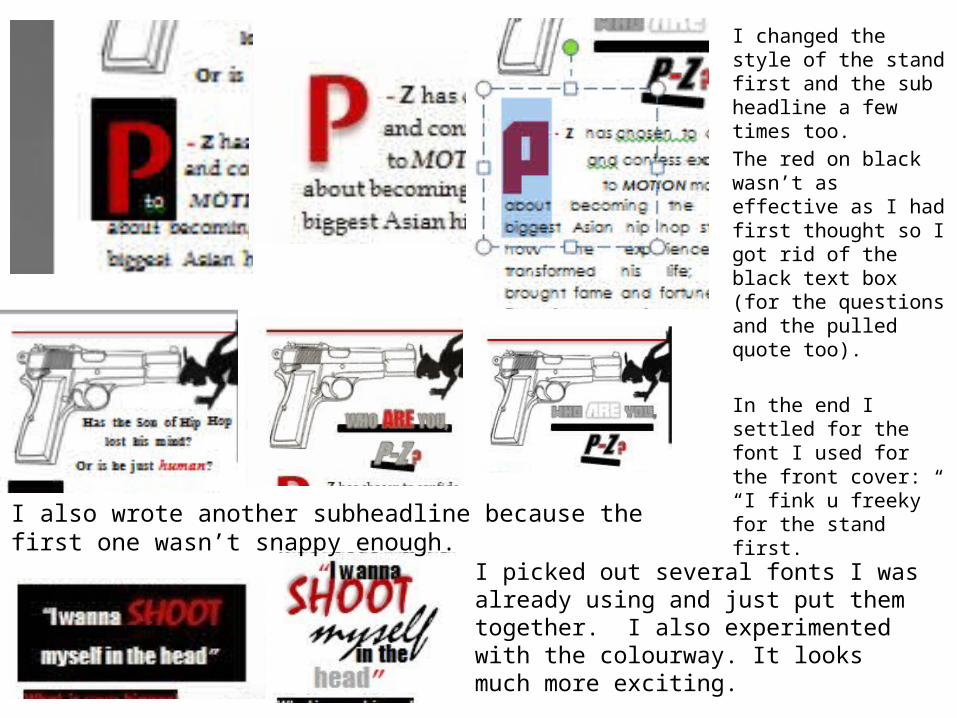
I changed the style of the stand first and the sub headline a few times too. The red on black wasn’t as effective as I had first thought so I got rid of the black text box (for the questions and the pulled quote too).
In the end I settled for the font I used for the front cover: “I fink u freeky” for the stand first. I also wrote another subheadline because the first one wasn’t snappy
enough.I picked out several fonts I was already using and just put them together. I also experimented with the colourway. It looks much more exciting.
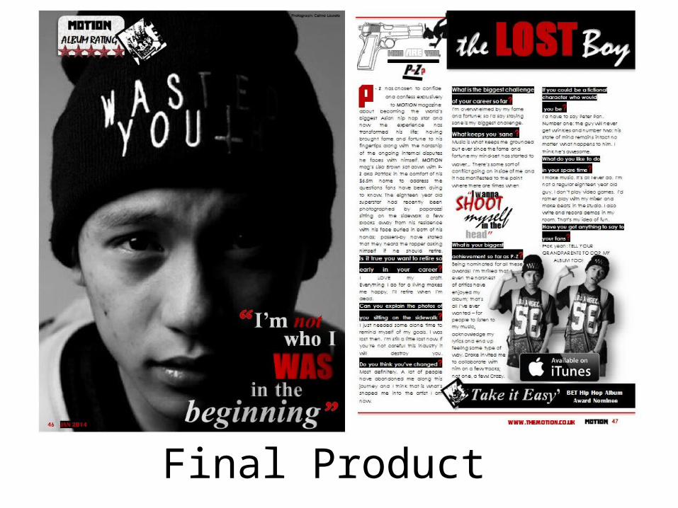
Final Product


![INDEX [dps-gandhinagar.com]dps-gandhinagar.com/Document/content-docs/5852326b-0662-4007 … · and dedication. The students of DPS Gandhinagar have performed exceedingly well in the](https://img.pdfslide.us/doc/110x75/5f9efef7fcb1337b2e459ec6/index-dps-dps-and-dedication-the-students-of-dps-gandhinagar-have-performed.jpg)