Embed Size (px)
Citation preview
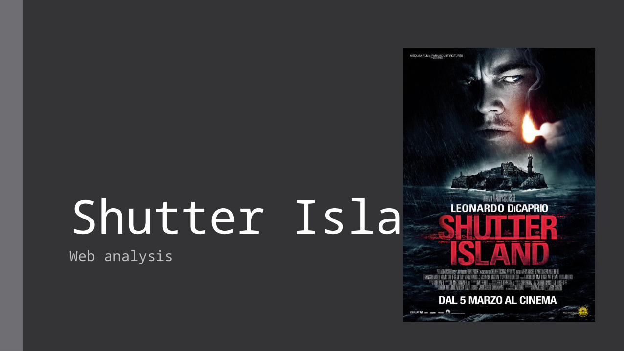
Shutter IslandWeb analysis
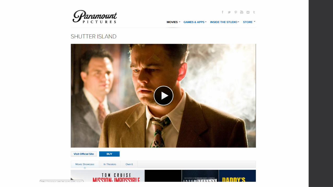
TitlesAgain Shutter Island doesn’t have its own dedicated webpage but can be found on Paramount's page as they're the distributer.The main eye-catching title is the Paramount logo at the top left of the page , this stand s out as its in a bold black font fitting in with the genre of thriller.At the top left of the page there are sub titles which say ‘Movie , games/apps/inside and store'. This is used to give a clear direction to other products that are relate to Paramount , as the audience of Shutter Island may be interested in Paramount's other work. This also helps to develop a large audience for paramount helping with the support for future productions which is a typical convention for a production company especially from the five Majors , The Calibri font used adds a professional, clear image which suits the style of their 21 century films. The black colour used for the font allows the title to stand out and to be easily recognisable on the white background.There are also links to social media sites on the webpage, this is used as a way for Paramount to interact with their audiences for this film , keeping them updated and attract new people to go and watch the film. The links shown include links to the Facebook page , YouTube , twitter and more .This is also a way for them to easily advertise the film spreading the film around attracting a wider audience. This also connotes that the target audience for this film will be younger people as they're more likely to use social media and spread the film around on the internet .
Background• The background for the website sticks to the colour white throughout keeping it
consistent through the page. The colour white for the background allows the black font to stand out making it clear for the viewers to easily identify what the webpage says. The white background is very plane and simple however gives off a professional image for the webpage. I believe that compare to the Perfect Guys webpage this lacks attraction as the page isn’t as eye catching as it only sticks to one colour.
• The colour white could be used to indicate a blank slate as the true story isn’t clear as the film is known to have a confusing ending to by having the page white it could be used to indicate for the audience to write their own ending ,This could link to the mystery aspects of the subgenre of thriller. The colour white is very good when associated with the colour black as they contrast well together and give a clear image .
TrailerThe trailer is the main focus on the page a s its centre framed as take up over half of the page connoting its dominance and importance. As the viewer enters the sight they instantly notice the trailer attracting them to watch it to find out more information on the film. By having a trailer here it allows the audience to gain an insight in the film , allowing them to see what its about without finding the whole story , making them want to watch it. This helps with the advertisement of the film as it attracts the audience to watch or buy the film. This also has a link to YouTube allowing the users to watch other videos associates with the film , attracting their interests.
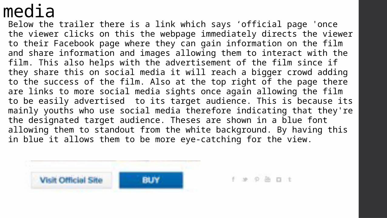
Links to social mediaBelow the trailer there is a link which says ‘official page 'once the viewer clicks on this the webpage immediately directs the viewer to their Facebook page where they can gain information on the film and share information and images allowing them to interact with the film. This also helps with the advertisement of the film since if they share this on social media it will reach a bigger crowd adding to the success of the film. Also at the top right of the page there are links to more social media sights once again allowing the film to be easily advertised to its target audience. This is because its mainly youths who use social media therefore indicating that they're the designated target audience. Theses are shown in a blue font allowing them to standout from the white background. By having this in blue it allows them to be more eye-catching for the view.
Alternative options
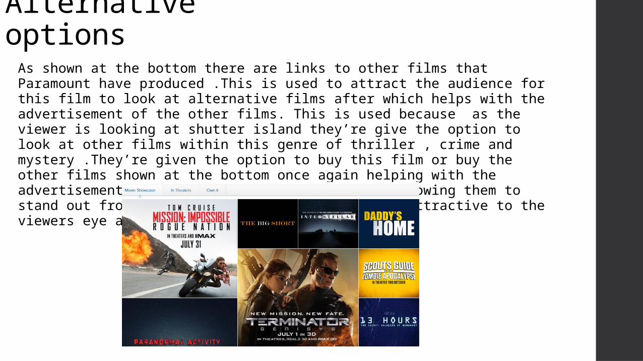
As shown at the bottom there are links to other films that Paramount have produced .This is used to attract the audience for this film to look at alternative films after which helps with the advertisement of the other films. This is used because as the viewer is looking at shutter island they’re give the option to look at other films within this genre of thriller , crime and mystery .They’re given the option to buy this film or buy the other films shown at the bottom once again helping with the advertisement. These are shown in a blue font allowing them to stand out from the white background and be more attractive to the viewers eye as its brighter than the black font
PIESThis webpage can link to PIES which Blumber and Katz suggest they meet the viewers needs.Personal identity –This is because they're in control of the site and have the power to discover information regarding the film which might reflect on them. Informed- The webpage informs them about this new upcoming film attracting their attention. The trailer allows them to be given hints to what the film involves. Entertain – The trailer is the main entertainer on the page as it instantly attracts the viewers attention and allows them to be given an insight into what the film is about. Social Interaction- The webpage instantly allows the audience to interact with the film. They are given options to watch the trailer or other video surrounding the film .This form of media mainly would attract a young audience mainly teenagers aged 15 and over, so by having a clear layout and links to social media t allows the film to be advertised which they can share with their friends.