Embed Size (px)
Citation preview
SCREENSHOTS FOR DOUBLE PAGE SPREAD
By Connor West
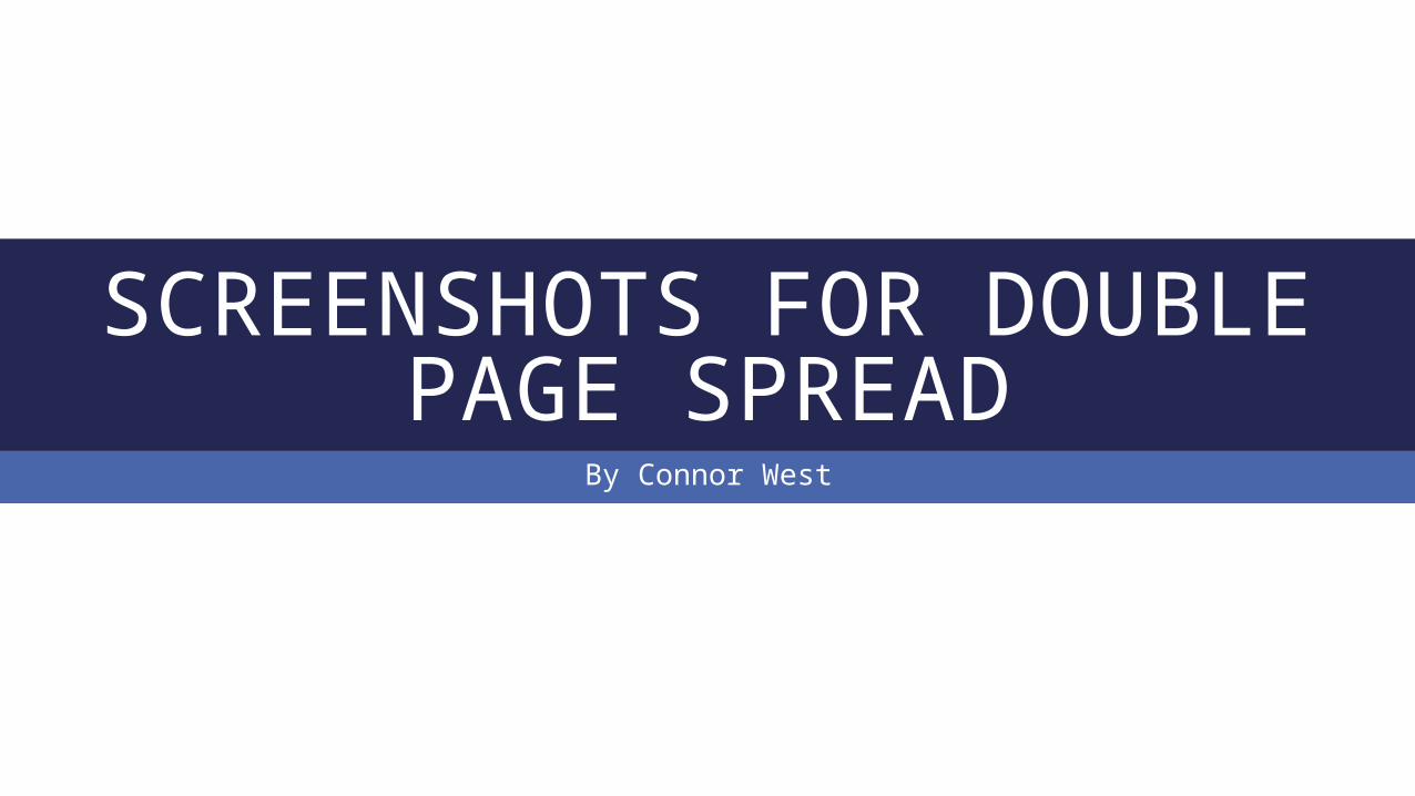
WHAT I BASED MY DOUBLE PAGE SPREAD ON
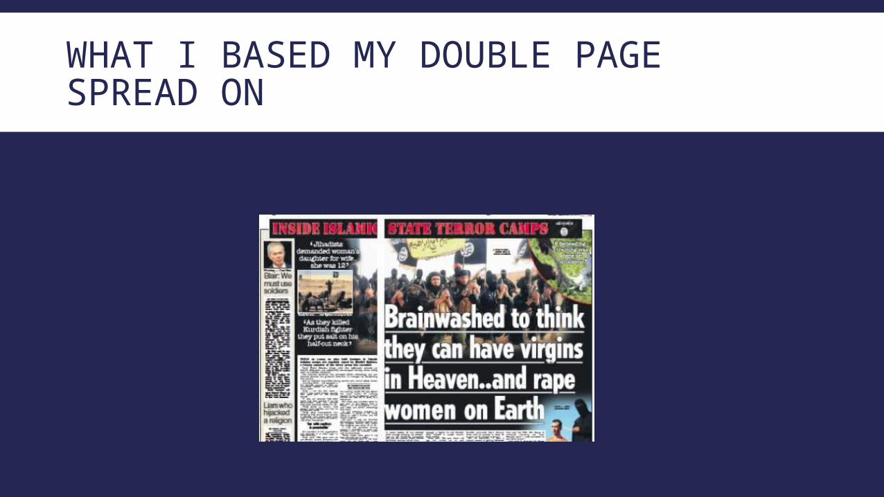
For my double page spread I decided to use InDesign as I thought it would be the best to make it as it has a good template to do a double page spread and also it has the tools that can make it look professional.
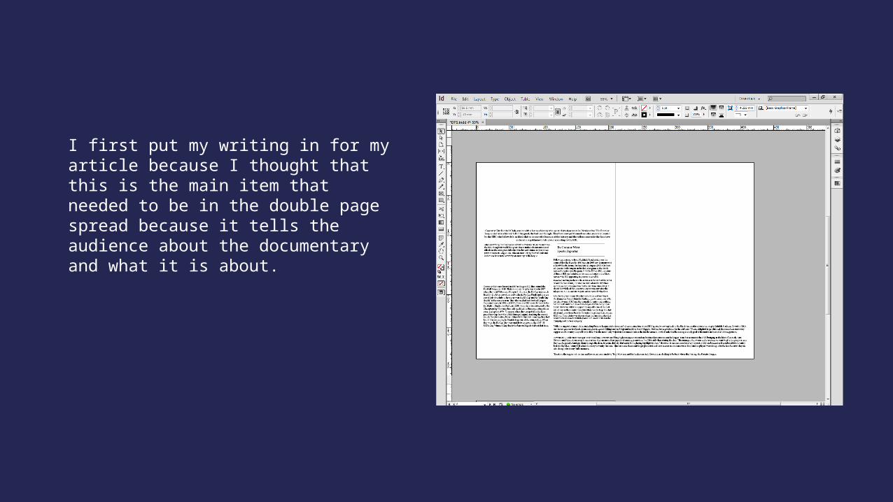
I first put my writing in for my article because I thought that this is the main item that needed to be in the double page spread because it tells the audience about the documentary and what it is about.
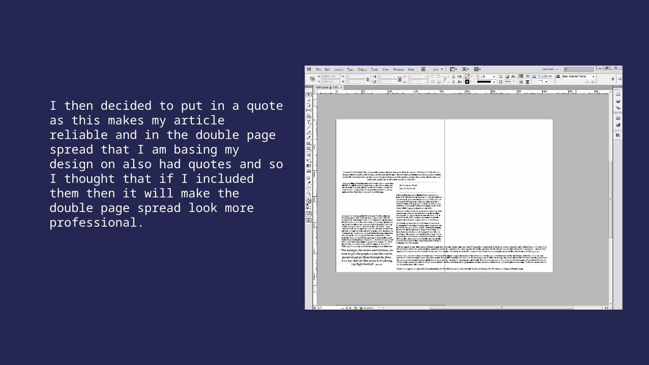
I then decided to put in a quote as this makes my article reliable and in the double page spread that I am basing my design on also had quotes and so I thought that if I included them then it will make the double page spread look more professional.
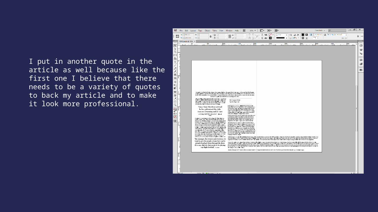
I put in another quote in the article as well because like the first one I believe that there needs to be a variety of quotes to back my article and to make it look more professional.
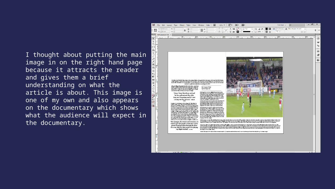
I thought about putting the main image in on the right hand page because it attracts the reader and gives them a brief understanding on what the article is about. This image is one of my own and also appears on the documentary which shows what the audience will expect in the documentary.
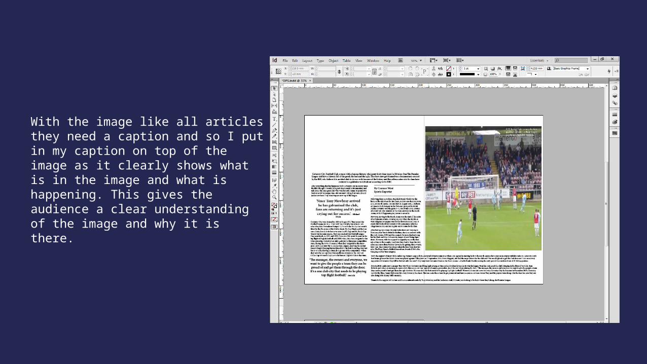
With the image like all articles they need a caption and so I put in my caption on top of the image as it clearly shows what is in the image and what is happening. This gives the audience a clear understanding of the image and why it is there.
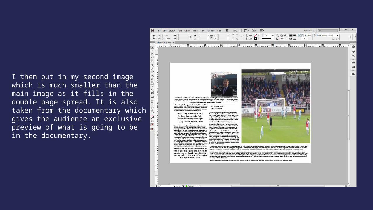
I then put in my second image which is much smaller than the main image as it fills in the double page spread. It is also taken from the documentary which gives the audience an exclusive preview of what is going to be in the documentary.
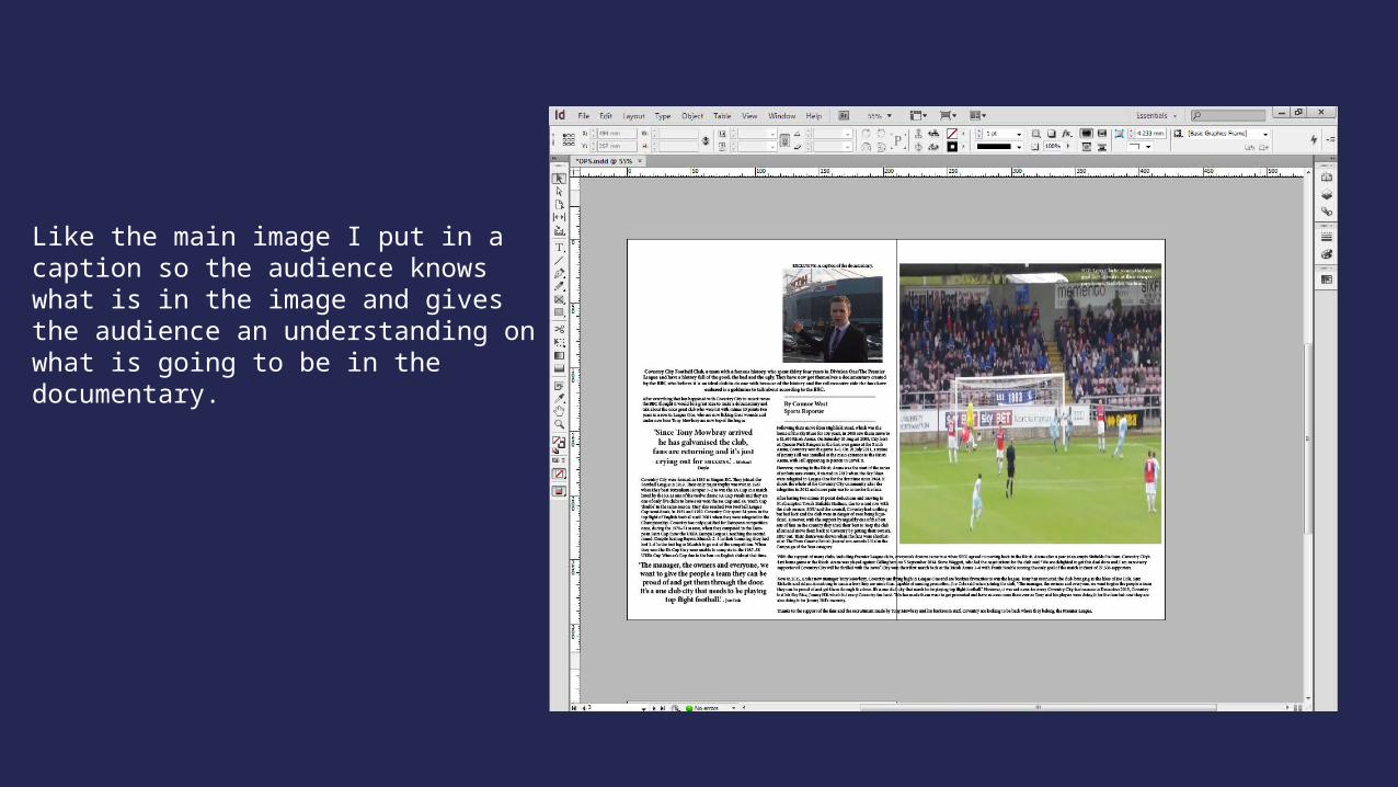
Like the main image I put in a caption so the audience knows what is in the image and gives the audience an understanding on what is going to be in the documentary.
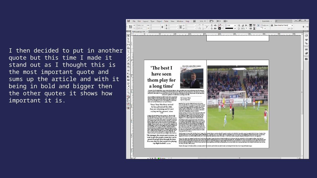
I then decided to put in another quote but this time I made it stand out as I thought this is the most important quote and sums up the article and with it being in bold and bigger then the other quotes it shows how important it is.
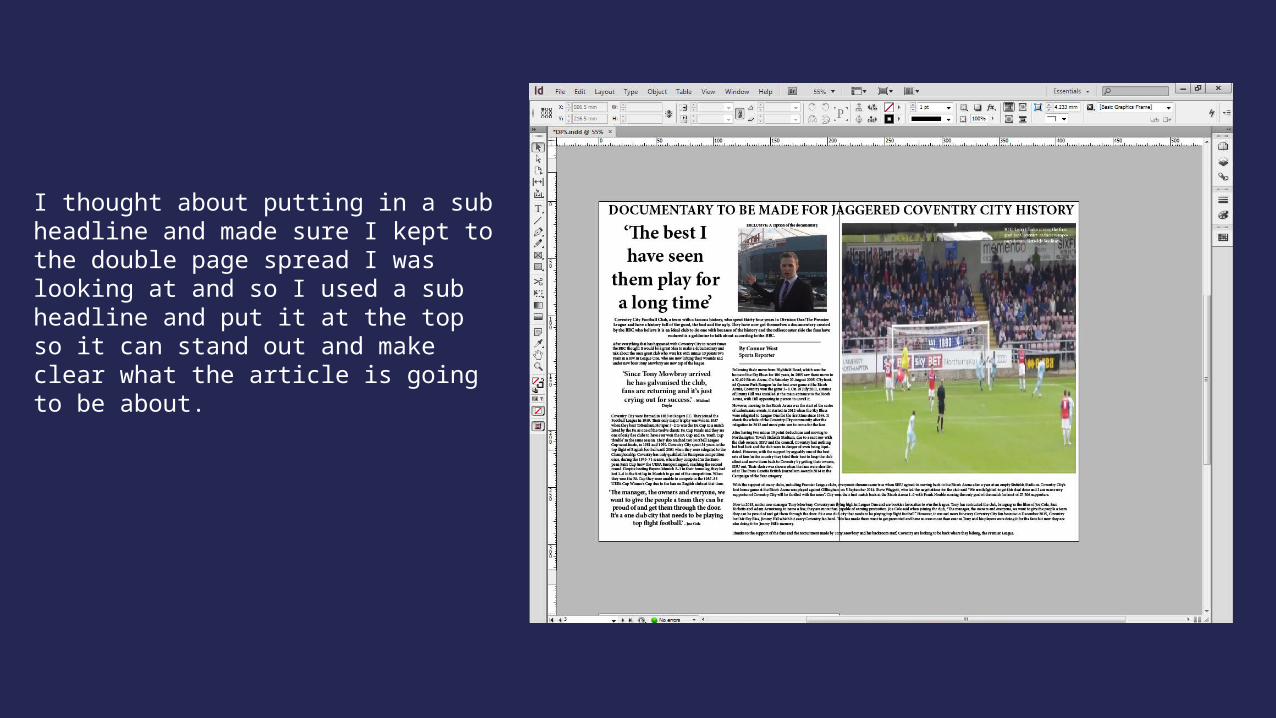
I thought about putting in a sub headline and made sure I kept to the double page spread I was looking at and so I used a sub headline and put it at the top so it can stand out and make clear what the article is going to be about.
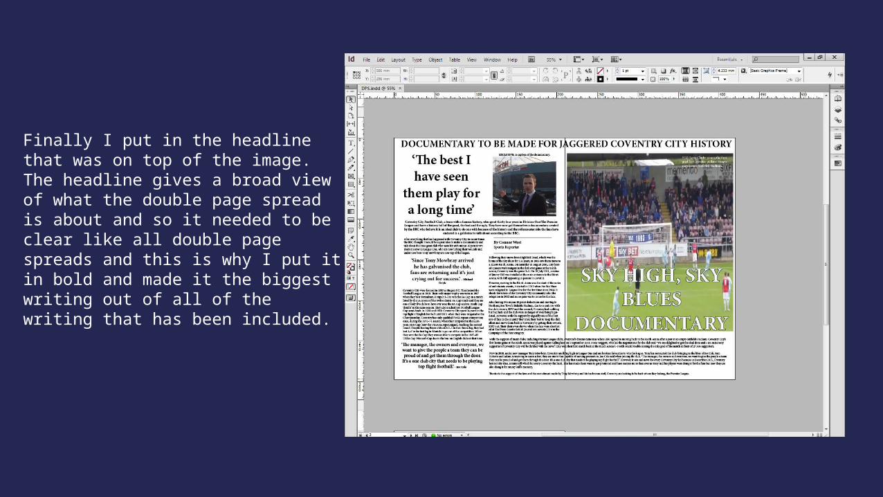
Finally I put in the headline that was on top of the image. The headline gives a broad view of what the double page spread is about and so it needed to be clear like all double page spreads and this is why I put it in bold and made it the biggest writing out of all of the writing that has been included.