Embed Size (px)
Citation preview
School magazine finalSchool magazine finalproductproduct
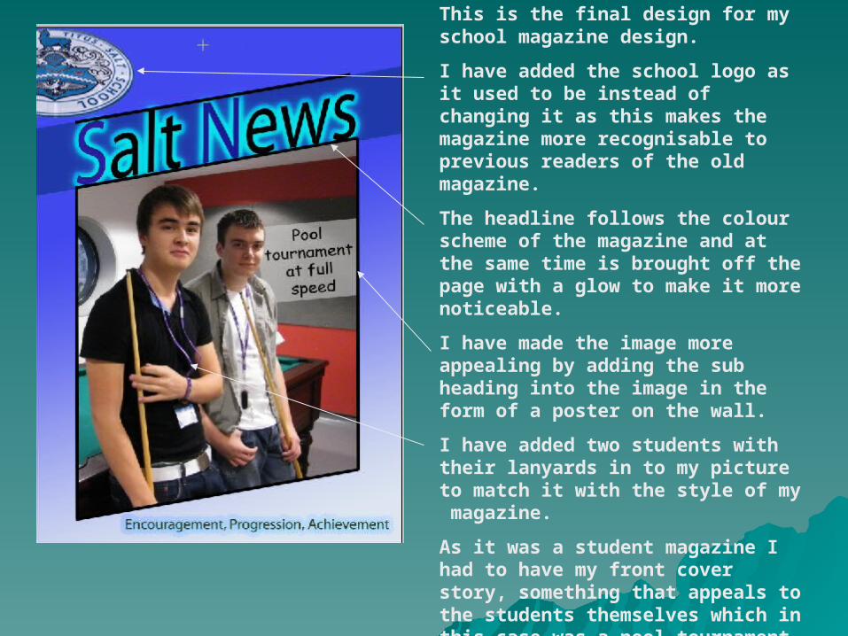
This is the final design for my school magazine design.
I have added the school logo as it used to be instead of changing it as this makes the magazine more recognisable to previous readers of the old magazine.
The headline follows the colour scheme of the magazine and at the same time is brought off the page with a glow to make it more noticeable.
I have made the image more appealing by adding the sub heading into the image in the form of a poster on the wall.
I have added two students with their lanyards in to my picture to match it with the style of my magazine.
As it was a student magazine I had to have my front cover story, something that appeals to the students themselves which in this case was a pool tournament.
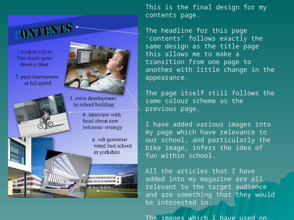
This is the final design for my contents page.
The headline for this page ‘contents’ follows exactly the same design as the title page this allows me to make a transition from one page to another with little change in the appearance.
The page itself still follows the same colour scheme as the previous page.
I have added various images into my page which have relevance to our school, and particularly the bike image, infers the idea of fun within school.
All the articles that I have added into my magazine are all relevant to the target audience and are something that they would be interested in.
The images which I have used on the bottom of the page allow the audience to make a connection between the school and my magazine.