Embed Size (px)
Citation preview
Audience FeedbackBy Luca Reidy
Movie Trailer
Positives• Audience identified the trailer to be in the crime genre from the use of
different conventions; such as speed of different cuts, and also the costumes and props used.
• The range of camera angles were good, such as the high angle shot in the meeting room, and the POV (point of view) shot at the beginning of the trailer.
• The use of music was good at building suspense. Towards the end of the trailer, the music crescendoed which allows the audience to concentrate more on the trailer as their hearts are racing more, and don’t know where the music is heading.
Negatives• Background sound in some scenes could be improved, such as
in the cafe. We tried to sort this out using a boom stick and a mic, but the equipment would not work.
• On screen text was too fast. The audience felt this text would help illustrate what the movie would be about, and would like to see this for a bit longer on screen
• Locations were quite local. Maybe we would have illustrate the crime genre a lot more if we filmed in more remote, dark regions.
Improvements• If we were to make another trailer we would make sure we;
–Use a wider variation of locations, and go more out of our local area, and away from the school grounds. Our location and recce research should have been followed by filming in places such as the Brunswick Centre and around Holborn. Also most of our shots were during daylight hours, which takes away from the crime aspect of a trailer.
–On screen text has to be improved, making it more like a long sentence throughout the trailer. Next time we’ll make sure this is kept on screen for much longer which allows the audience to understand what is happening.
–Finally, when going to film we should make sure all props and equipment work, such as a boom stick and the mic. Sound throughout the trailer would be to a better quality making the trailer look much more professional.
–I personally feel we should add more dialogue towards the end of the trailer, as it stops at the 1 minute mark. When looking at other crime movie trailers for inspiration there is more dialogue than action scenes, which we should have followed these conventions as well
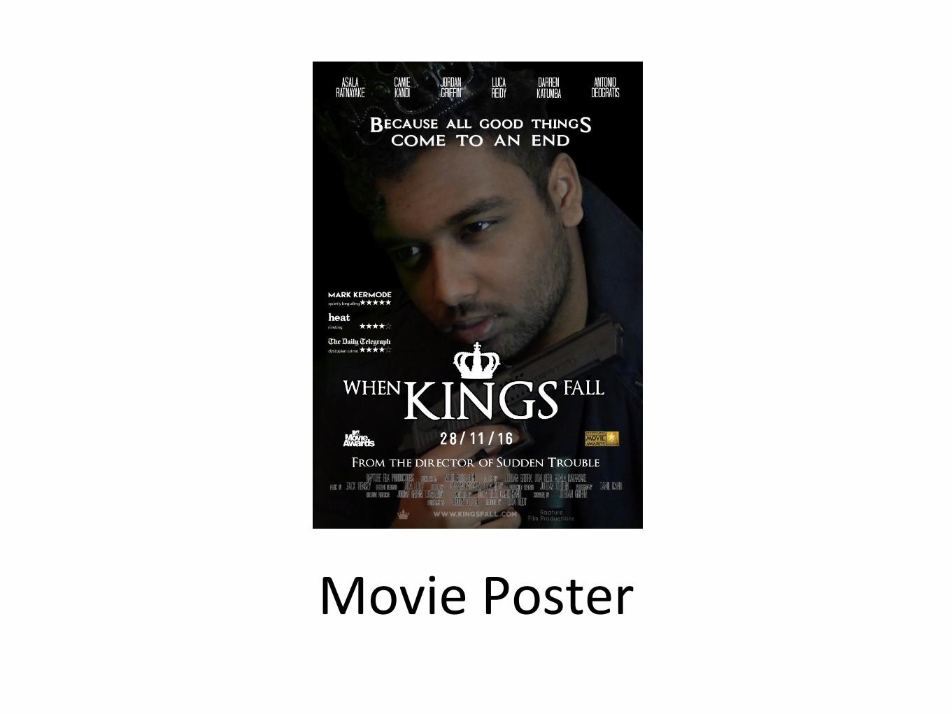
Movie Poster

Positives• Fonts are consistent; which is usually seen from movie posters, which
creates a certain movie brand, or franchise; something for the audience to recognize.
• Good colour scheme, all dark colours which conforms to many crime genres. The use of dark colours creates more suspence with the audience as there is a dark shadow casted on the main protagonist. The colours contast (black on white)
• The main conventions of a movie poster are shown, such as the actors at the top of the page, reviews and critics.
Negatives• The main colour scheme can be a bit bland, and some aspects on the
poster are hard to see such as the gun. One member of our focus group described the colour as a bit grainy.
• Credits are difficult to read, along with the main production logo at the bottom of the page. Usually audiences look at these components to identify whether they would like to watch the main film, such as looking at directors and music producers
Improvements• If we were to make another movie poster we would make sure we;
–Brighten up the movie poster. I think we would change the background from black to a dark grey, so the outline of the main character can be seen along with the gun. This would illustrate more to the audience that they are looking at a poster for a crime movie instead of a horror/thriller. We could also retake the image on a white background which would make photo shopping the image much easier.
–Change the components on the movie poster so they are much brighter and stand out more on the page. Some of the focus group made a reference to the magazine saying they would prefer a variation of colours such as dark red or blue.
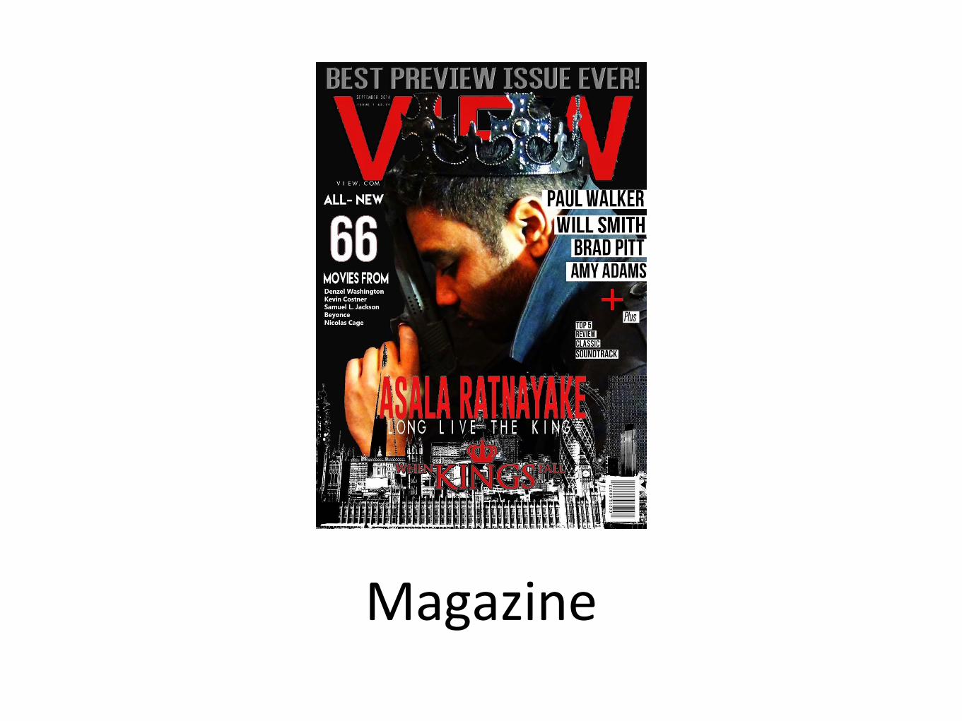
Magazine
Positives• Main image is appropriate for the magazine. Showing the one
character links to the movie poster creating a movie franchise which allows the audience to identify the particular film When Kings Fall. After seeing the trailer they also feel that the one image is appropriate as he is the main protagonist (anti-hero) and expect the majority of the film to be about him.
• Colour scheme of black, red and white is appropriate for the magazine page. This creates contrast as the main background is black, and the read allows the text to stand out off of the page drawing peoples attention to it.
• It links to the theme and genre of the trailer, which is quite dark and has a consistency in costumes and props.
Negatives• Add more images of characters to the magazine. This will allow the audience to
see all of the main cast, which allows them to identify their ‘favourite’ character before viewing the particular film. The image at the bottom of the screen creates too much confusion for the audience as there is lots of clash with the background, which stops the movie title from being clearly seen.
• The size of the movie title is too small. The focus group would expect the main movie component to be in the centre of the page which allows them to see what it is about straight away. Due to its size, they are struggling to see the ‘when’ and ‘fall’ text.
• The masthead is covered by the main image making the name of the magazine difficult to identify. Usually the title is the main component to the audience when buying a film magazine as it has already established an buying group (regular buyers of the product).
Improvements• If we were to make another movie poster we would make sure we;
–Change the colour scheme completely. Usually when shoppers are looking at magazines they look for products that stand out off of the shelf. This means we would change to background to something brighter like a light grey, which would make the image be seen more clearly. Comments were made about the gun not being easy to see, which is our main focus as we need to portray that the magazine is focusing on the crime genre.
–Also, we would add more cover lines that link to the actual genre which would draw in our expected target audience (males, 18-34). Cover lines are the most important aspect of a magazine as it illustrates what content is going to be involved in the magazine. We feel the main cover line ‘long live the king should be changed, as it clashes with the main title. The main cover line should involve some alliteration which makes it more memorable.
–We would make sure the masthead and main title are more visible to the reader. The masthead would be the main selling point as readers can identify the product more easily. Making the title more visible would allow the audience to see what the product is about, and hopefully create some speculations as to what the main film is about.