Embed Size (px)
Citation preview
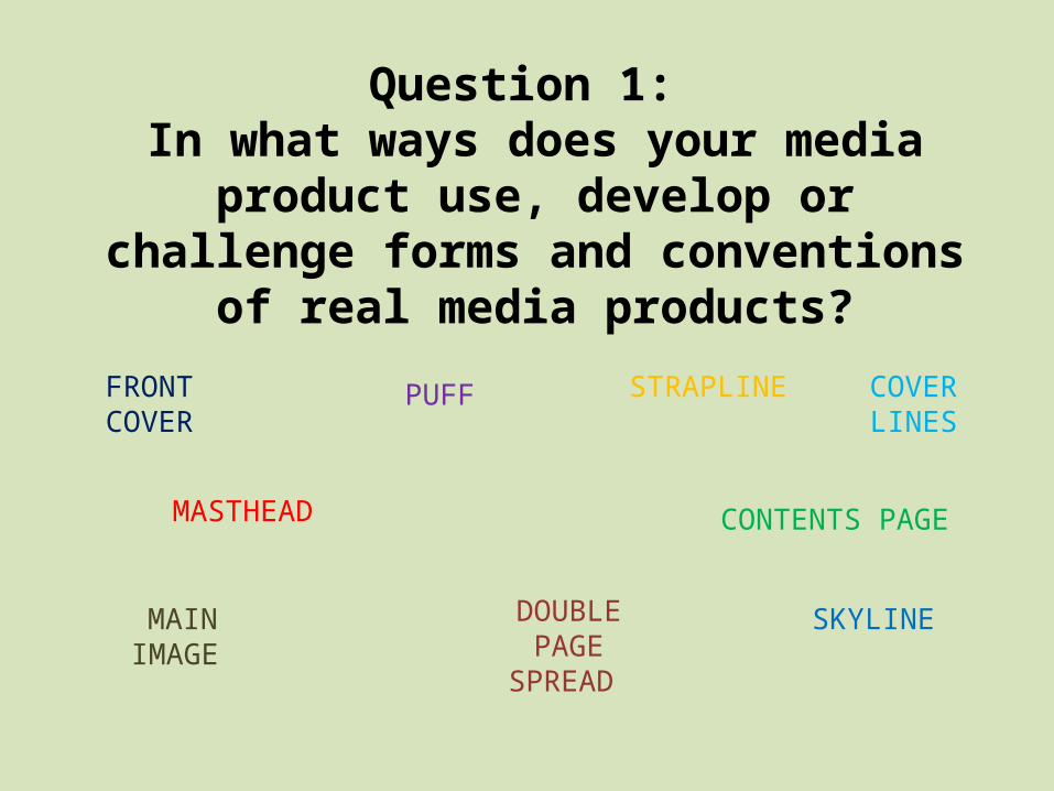
Question 1: In what ways does your media
product use, develop or challenge forms and
conventions of real media products?PUFF
MASTHEAD
SKYLINE
STRAPLINE FRONT COVER
CONTENTS PAGE
DOUBLE PAGE
SPREAD
MAIN IMAGE
COVER LINES

My media product; music magazine follows many common conventions of a real music magazine. Along with research and inspiring real-life magazines I was able to recreate many features I wished to use within my own
magazine. Throughout the process of annotating music magazine I learned how each feature can have an impact on the audience and so I was very aware of how to layout certain features of the magazine. Firstly, this Q magazine front
cover is one of the magazines I analysed as part of my research task. When comparing the two front covers it is clear I have challenged the use of text background to make the coverlines
more attractive and readable for the audience. This feature is very common on magazines as it prevents the background or main image blocking the text. I did use different colours for these however; this was in order to
follow the house style of my magazine.
My contents page and double page spread are very different from the contents and dps of this Q magazine. I used NME’s magazine to inspire me with these pages as I felt they were more attractive and I felt I could recreate
them much better. This is the contents page I challenged to recreate – as you can see I used the form of columns and ‘the moment that’
as a feature in my music magazine. I believe my contents page has reflected this one well and so through the use of real forms of this media product I have been able to recreate it.
COMMON CONVENTIONS
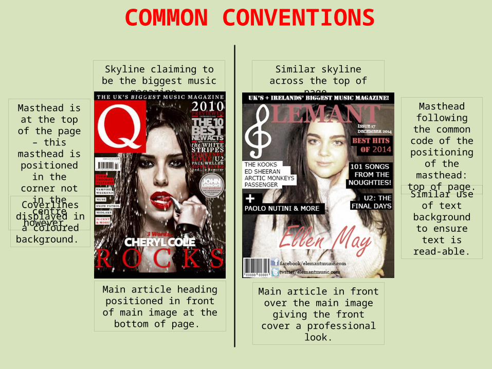
Masthead is at the top of the page – this masthead is positioned in the corner not in the centre however.
Main article heading positioned in front of main
image at the bottom of page.
Coverlines displayed in a
coloured background.
Skyline claiming to be the biggest music magazine.
Similar skyline across the top of page.
Masthead following the
common code of the positioning of the masthead: top
of page.
Similar use of text background to ensure text is
read-able.
Main article in front over the main image giving the front cover a professional look.
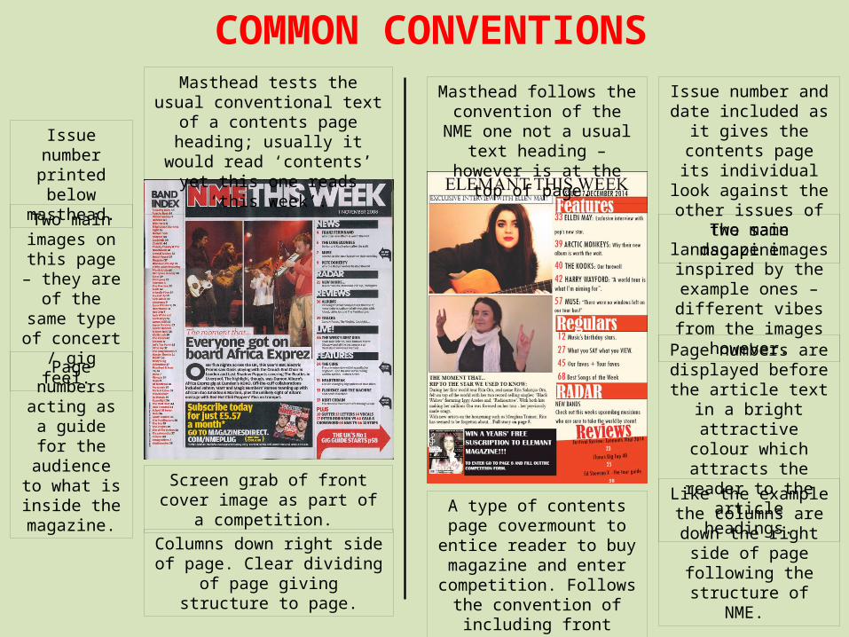
Masthead tests the usual conventional text of a contents page heading; usually it would
read ‘contents’ yet this one reads ‘this week’.
Columns down right side of page. Clear dividing of page giving
structure to page.
Screen grab of front cover image as part of a competition.
Page numbers acting as a
guide for the audience to
what is inside the magazine.
Two main images on this page – they are
of the same type of
concert / gig feel.
COMMON CONVENTIONS
Issue number printed below
masthead.
Like the example the columns are down the
right side of page following the structure
of NME.
Masthead follows the convention of the NME one not a usual text heading –
however is at the top of page.
Issue number and date included as it gives the
contents page its individual look against the other issues of the
same magazine.
Two main landscape images inspired by the
example ones – different vibes from the
images however.
Page numbers are displayed before the article text in a bright
attractive colour which attracts the reader to the article headings.
A type of contents page covermount to entice reader to buy magazine and enter competition. Follows the
convention of including front cover screen grab.
COMMON CONVENTIONS
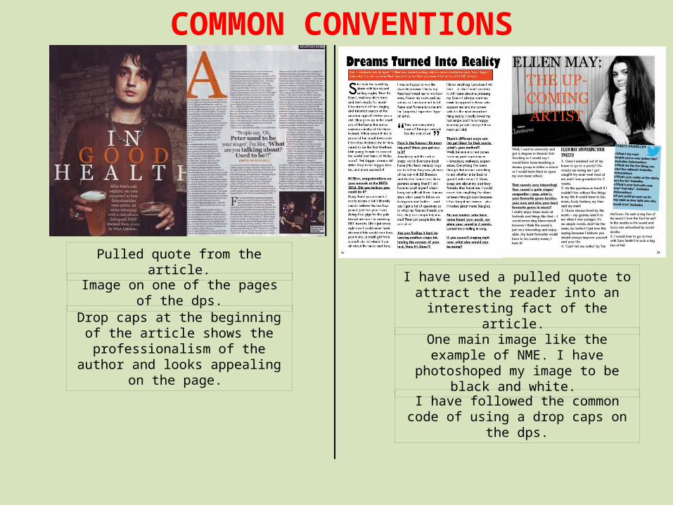
Drop caps at the beginning of the article shows the professionalism of the
author and looks appealing on the page.
Pulled quote from the article.
I have followed the common code of using a drop caps on the dps.
One main image like the example of NME. I have photoshoped my image to be black
and white.
Image on one of the pages of the dps.I have used a pulled quote to attract the
reader into an interesting fact of the article.
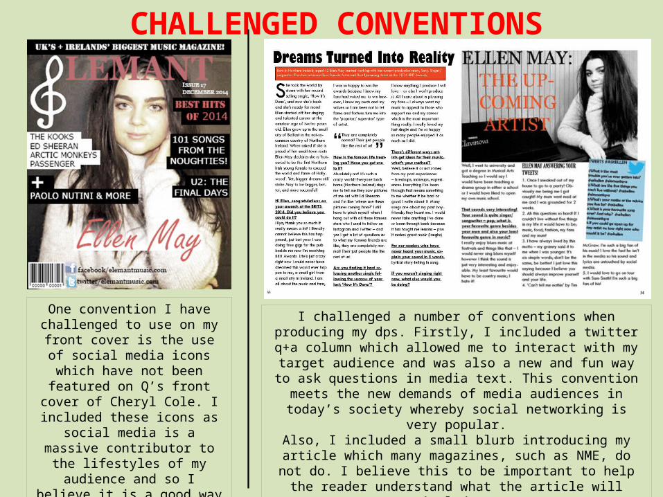
One convention I have challenged to use on my front cover is the use of social media icons which have not
been featured on Q’s front cover of Cheryl Cole. I included these icons
as social media is a massive contributor to the lifestyles of my
audience and so I believe it is a good way to address the target audience.
CHALLENGED CONVENTIONS
I challenged a number of conventions when producing my dps. Firstly, I included a twitter q+a column which allowed me to interact with my target audience and was also a new and fun way to ask questions in
media text. This convention meets the new demands of media audiences in today’s society whereby social networking is very popular.
Also, I included a small blurb introducing my article which many magazines, such as NME, do not do. I believe this to be important to
help the reader understand what the article will include.