Embed Size (px)
Citation preview
Font colour scheme: The colour scheme of the opening credits and title are both linked to the story as the use of red and blue with the flashing effects connotes that this film is going to be about cops and authority. They show whole element of the police sign only in the opening credits as it makes it easier for the audience to understand the narrative in a couple of seconds without showing any footages of the main film.
Font style: The style used for the title is ‘autumn’ and it is in uppercase, this with the flashing movement of the credits suggest a feeling of action and keeps the audience attention focused on what’s happening on the screen. The title has some parts that are in bold ‘JUMP’ and some that aren’t ‘STREET’ this can be a connection to the main characters.
Music: The use of non-diegetic music in the background ‘Eminem – The real slim shady’ suggest that this is a comedy film
Font Style cont.: The style used suggest the genre of this movie to be comedy-action, because some parts of the title are sharp ends to show seriousness but when you look at the word ‘JUMP’ which has funky style takes that seriousness away of the title.
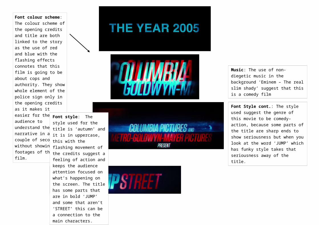
Teenagers are shown because this film will be about them and the use of the high angle suggests this as they’re shown as vulnerable, however when the main character is introduced the feeling of vulnerability is removed as the camera moves to normal position showing that he’s different from the rest.
Target audience: From the beginning of the film the targeted audience (teenagers) have been established, this has been done by the use of the iconic American yellow bus which connotes that this is happening in a high school. Other ways this has been achieved is by the actors coming off the bus all of them are teenagers, the way they are holding their bags and no adult is to be seen on the screen.
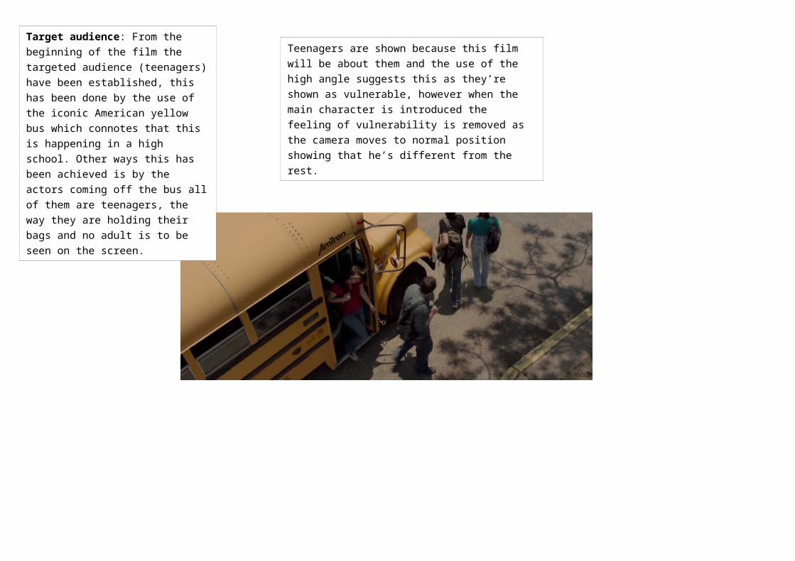
Music: The music lyrics chosen match the character’s costume and appearance, however he isn’t the ’real’ slim shady which again shows a sign of comedy as the director used the song to mock the character. The choice of music
Colour scheme: Use of colour in this scene is very important, the colours are bright as everyone is wearing colourful t-shirts. However not the main character which makes him stand out more but also shows that he’s an outsider especially the way he dresses and he doesn’t follow the rest of the people in the way they’re carrying their bags.
Camera: The camera started in a crane position showing the bus and then moved to a mid-shot as the bust started to empty. It is seen as a build up for the main character to appear, the camera then starts to track him all the way to the main entrance without revealing his face and this builds up our interest about the character. But this build and our interest has been let down at the moment the characters face has been revealed.
Mood/atmosphere: The mood shown in this scene is very relaxed as this is shown by the body language of the people in the scene, this shows that this film isn’t going to be a serious film but rather one were the audience can lay back and enjoy. This then reflects on the genre of the film
General conventions of action-comedy:
Introduction of main character(s)
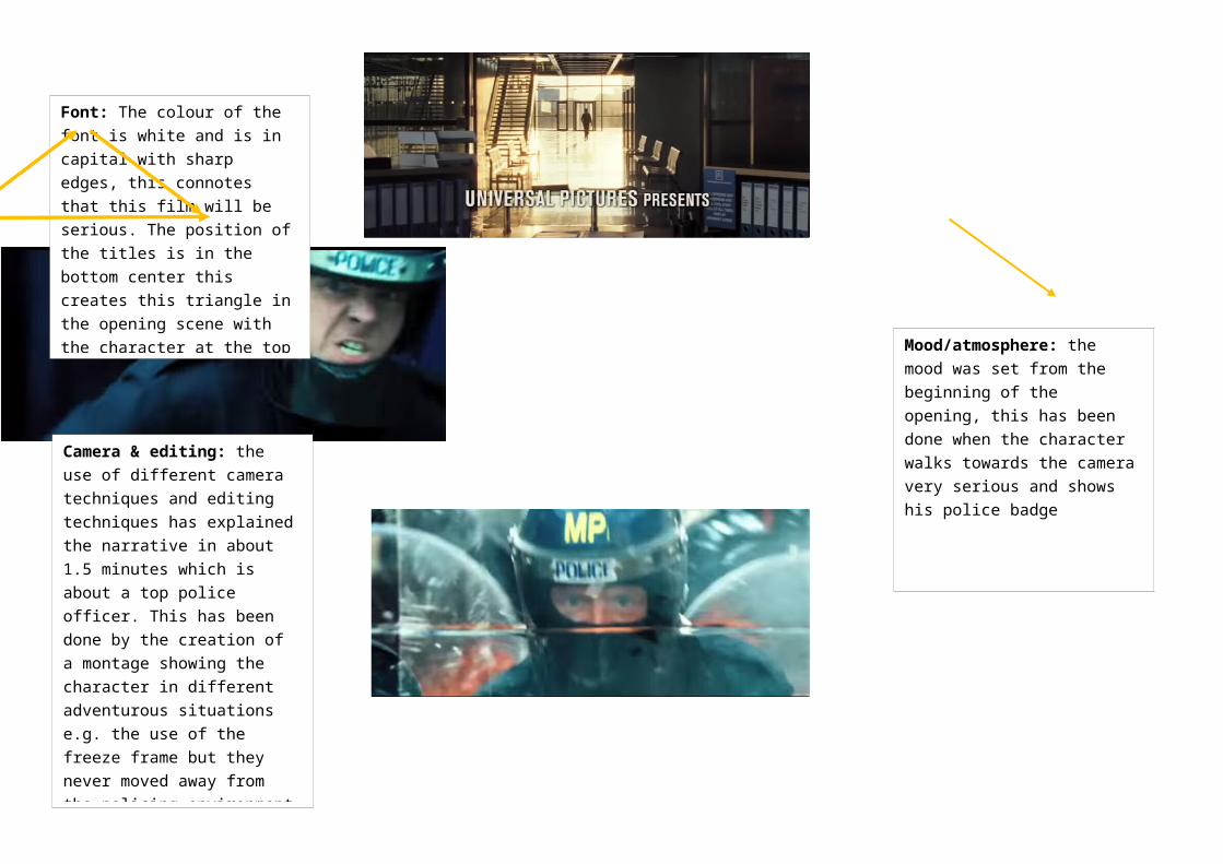
Font: The colour of the font is white and is in capital with sharp edges, this connotes that this film will be serious. The position of the titles is in the bottom center this creates this triangle in the opening scene with the character at the top of the triangle, showing that this will be the main character as he’s at the top but can also connote that he reached the highest level of policing.
Camera & editing: the use of different camera techniques and editing techniques has explained the narrative in about 1.5 minutes which is about a top police officer. This has been done by the creation of a montage showing the character in different adventurous situations e.g. the use of the freeze frame but they never moved away from the policing environment and he’s the only character involved in all of them with passion, seriousness and confidence.
Mood/atmosphere: the mood was set from the beginning of the opening, this has been done when the character walks towards the camera very serious and shows his police badge
Introduction of narrative Establishing the mood/atmosphere Titles and credits --- > linked to the narrative All of these establish the genre.