Embed Size (px)
Citation preview

TITLE SEQUENCE DESIGNER-NINA SAXON DESIGN
Michael KnightMedia Studies
WHO THEY ARE• Founded by Nina Saxon in 1981 in Santa Monica, CA, Nina
Saxon Design is one of the entertainment industry’s leading design production studios for feature film and television projects.
• Nina Saxon Design also acts to oversee title design budgets, art direction, and the postproduction process behind those titles and sequences.
• The company also serves as liaison between the title design process and each project’s producers, directors and editors, as well as between studio postproduction supervisors, executives and legal departments.

CATALOGUE OF WORK• Nina Saxon Design has contributed over 300 feature film
main titles, including those for such hit movies as-
• "SALT," "Departed," “Dear John,” “Music and Lyrics,” “Cider House Rules,” “The Fugitive,” “Forrest Gump,” “Beauty and the Beast,” “The Princess Diaries,” “Stepmom,” “The Little Mermaid,” “The Hunt for Red October,” “Primary Colors,” “Mrs. Doubtfire,” “Contact,” “Die Hard 2,” ““Rush Hour,” “Romancing the Stone,” “Snakes on a Plane,” “Scooby Doo,” “Big Momma’s House 1 & 2,” and the entire “Back to the Future” trilogy.
WHY I CHOSE NINA SAXON DESIGN
• The genre of my title sequence is feel good drama and Nina Saxon Design is known for many movies including those who are feel good drama’s.
• Forrest Gump is a feel good drama which I find very interesting and is a model to the title sequence I want to create.
• They also made the title sequence to popular movies like “Mrs Doubtfire”, “Big Momma’s house” and “Rush Hour”. They are all comedies and feel good drama is linked with comedy.

ANALYSIS OF TITLE SEQUENCE 1- FORREST GUMP
It is a very simple based title sequence which establishes the set and the main character. It focuses on the feather to show its importance and follows its journey to Forrest Gump to also show the importance of him. The feather is white and plain to show the innocence and purity of Forrest Gump who picks up the feather. The drifting through the wind suggests that Forrest drifts through life not knowing where he is going. When Forrest collects the feather it suggests that he is like a child because feather collecting is a childish thing. The typography of the title sequence is quite plain. It has curlicue's on the words but its very simple and pure once again reflecting the genre of the film and the subject of the film. It is in the colour white just like the feather. The soundtrack of the title sequence is very calm without any parts which become louder or stronger. This is because of the typography and clip which is also calm and simple. This helps to create this feel good drama genre.
ANALYSIS OF TITLE SEQUENCE 2- BACK TO THE FUTURE
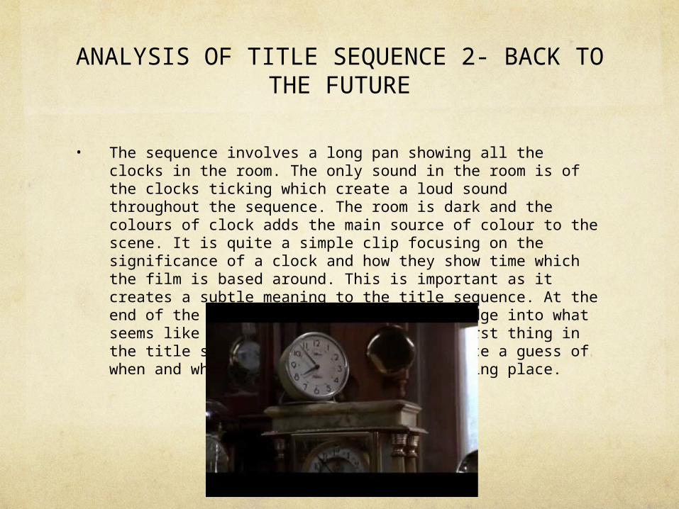
• The sequence involves a long pan showing all the clocks in the room. The only sound in the room is of the clocks ticking which create a loud sound throughout the sequence. The room is dark and the colours of clock adds the main source of colour to the scene. It is quite a simple clip focusing on the significance of a clock and how they show time which the film is based around. This is important as it creates a subtle meaning to the title sequence. At the end of the sequence there is a sound bridge into what seems like a news report. This is the first thing in the title sequence that gives the audience a guess of when and where the title sequence is taking place.
THANKS FOR
WATCHING !