Embed Size (px)
Citation preview
OCR Media Studies – AS Level
Unit G321: Advanced Portfolio
Name: Hannah HughesCandidate Number: 4067Center Name: St. Andrew’s Catholic SchoolCenter Number: 64135
Music Magazine –
Mind Map
Mind Map
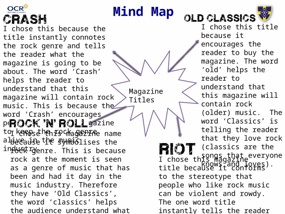
Magazine Titles
CrashI chose this because the title instantly connotes the rock genre and tells the reader what the magazine is going to be about. The word ‘Crash’ helps the reader to understand that this magazine will contain rock music. This is because the word ‘Crash’ encourages people to buy the magazine to keep the rock genre alive in the music industry.
Old ClassicsI chose this title because it encourages the reader to buy the magazine. The word ‘old’ helps the reader to understand that this magazine will contain rock (older) music. The word ‘Classics’ is telling the reader that they love rock (classics are the songs that everyone knows and loves).
Rock ‘N’ RollI chose this magazine name because it symbolises the rock genre. This is because rock at the moment is seen as a genre of music that has been and had it day in the music industry. Therefore they have ‘Old Classics’, the word ‘classics’ helps the audience understand what the magazine will be about because of other magazines such as ‘Classic Rock’
Riot I chose this magazine title because it conforms to the stereotype that people who like rock music can be violent and rowdy. The one word title instantly tells the reader what genre of music the magazine is.

Mind Map
Colour Schemes
Dark PurpleI chose this colour because I feel the dark purple works well with the genre. The darkness will attract the attention of the correct audience and will draw in the attention of more female readers. The purple will make my magazine more genre neutral and will ensure that everyone will want to read my magazine.
Red and yellowI like this scheme because it attracts the attention of the reader in. It ensures that the reader is looking at this magazine and not any other. This could be used on my magazine, however I don’t think that it would suit my magazine, so I therefore wont be using it in my magazine.
Blue and WhiteI believe that this colour scheme works, because it gives of a festival like atmosphere. This is the kind of atmosphere that I would like my magazine to have. It suggests that the magazine is for a more laid back audience, who simple like the artists and want to hear about their gigs and upcoming tours.
Red and yellowI think that this scheme is very stereotypical of the rock genre. The black suggests that the magazine will be dark, power and mystery. This draw the target audience in and make them want to read on.
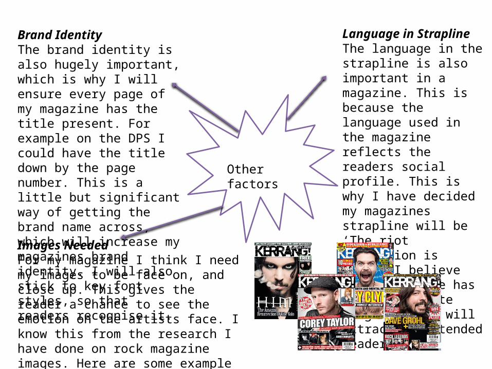
Brand Identity The brand identity is also hugely important, which is why I will ensure every page of my magazine has the title present. For example on the DPS I could have the title down by the page number. This is a little but significant way of getting the brand name across, which will increase my magazines brand identity. I will also stick to key font styles, so that readers recognise it.
Language in StraplineThe language in the strapline is also important in a magazine. This is because the language used in the magazine reflects the readers social profile. This is why I have decided my magazines strapline will be ‘The riot revolution is here’. I believe this strapline has the appropriate language that will attract my intended reader.
Images NeededFor my magazine I think I need my images to be face on, and close up. This gives the reader a chance to see the emotion on the artists face. I know this from the research I have done on rock magazine images. Here are some example image styles, that I will try to reproduce for my magazine:
Other factors