Embed Size (px)
Citation preview
Individual Analaysis of Magazine
Rock Sound, October 2013 Paramore edition
Audience
• Their target audience is predominantly male around the age of about 22 years old. Just under half of their audience are people who play guitar/ a musical instrument and most of them are in the working class sector. To attract this audience Metal Hammer include articles on artists within the heavy rock genre and they also report on artists that perform within it as well as events that link to the genre. They have a mobile app which people can download to receive articles on their phones, they also create podcasts on itunes and offer rock metal nights out as well as polls.
Elements that connect the 3 parts of the magazine
• All of the pages use red, white and black- all of which are relatively simple but the majority usage of black fits in with darkness of the heavy rock genre.
• All of the fonts used are rather gothic either being speckled or looking as if they are melting.
• Large pictures are used, often with the artists showing their enjoyment in music.
History of Metal Hammer
• Metal Hammer is a magazine which focuses on heavy metal music and is published in the UK by TeamRock. The first issue of Metal Hammer was published in 1986 and has over 35 thousands users in the UK. A new edition is published every month for Metal Hammer
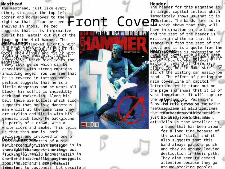
Front CoverThe masthead, just like every other, starts in the top left corner and moves over to the right so that it can be seen on shelves in shops. The red suggests that it is informative but it has ‘metal’ cut out of the image on the H of hammer. The masthead is flecked slightly with black and the sharp points of the words show danger and fit in with the heavy metal genre of the magazine.
Masthead
Main ImageThe main image is a long shot of a man playing guitar. He is looking very energetic, almost aggressive, which highlights the heavy rock genre which can be associated with strong emotions including anger. You can see that he is covered in tattoos which perhaps suggests that he is a little dangerous and he wears all black- his outfit is incredibly dark and rocker-ish. Along his belt there are bullets which also suggests that he is a dangerous man whilst at the same time they are stylish and fit in with his general rock look.The background is partly of a crowd, with a white cross and smoke. This tells us that this man is both religious and involved in one of the ‘darker’ genre’s of music. He is standing with his legs spread which suggests he is ‘rocking out’ hard and it tells us that he is really passionate about music and throws himself into it.
The header for this magazine is in large, capitol letters which immediately shows us that it is important. The bands name is in red which shows that they will have information on the band, and the rest of the header is written in white so that it stands out from the rest of the text, and it is a quote from the artists. There is suggestion of violence and breaking down doors which links to the general themes associated with the heavy rock genre.
The main cover line is the name ‘Paramore’ in big, bold, capitol writing. Behind it there is a tinted red box to make sure that all of the writing can easily be read . The effect of putting the main cover line in capitol letters makes it stand out on the page and shows that it is of vast importance. It will capture the attention of Paramore’s fans and because this magazine features them it will convince their fans to buy this magazine just to read about the one artist.
Header
Main Cover Line
Pull Quote
Date/ BarcodeThe barcode for this magazine is in the right corner of the image but it is still small. Because it is in the left third of the page suggests that the price is somewhat important to customers, but despite the cost they will still buy it.
The Pull Quote on this magazine is also apart of the header. “We’re still breaking the doors down.” Tells us that Metallica is a band that has been around for a long time because of the world ‘still’ and it also suggests that this band always packs a punch and they go around leaving destruction in their path. They also seem to demand attention because they go around breaking peoples doors, and people are forced to notice them.
Contents Page
Contents Headings/ Subheadings
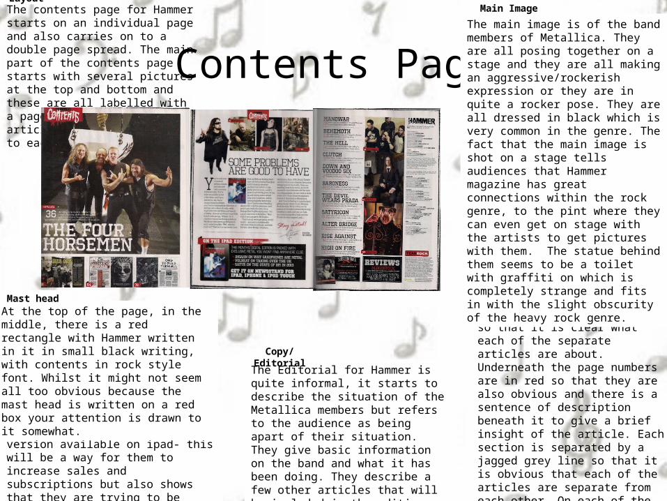
The content headings for these pages are all in black speckled writing, in capitol letters. All of the text is incredibly large and it makes the headings stand out so that it is clear what each of the separate articles are about. Underneath the page numbers are in red so that they are also obvious and there is a sentence of description beneath it to give a brief insight of the article. Each section is separated by a jagged grey line so that it is obvious that each of the articles are separate from each other. On each of the pictures there is a red box with a white page number and the name of an artist in black writing. This will be particularly easy to navigate for people who are fans of specific artists and only want to read the articles on them.
The main image is of the band members of Metallica. They are all posing together on a stage and they are all making an aggressive/rockerish expression or they are in quite a rocker pose. They are all dressed in black which is very common in the genre. The fact that the main image is shot on a stage tells audiences that Hammer magazine has great connections within the rock genre, to the pint where they can even get on stage with the artists to get pictures with them. The statue behind them seems to be a toilet with graffiti on which is completely strange and fits in with the slight obscurity of the heavy rock genre.
The Editorial for Hammer is quite informal, it starts to describe the situation of the Metallica members but refers to the audience as being apart of their situation. They give basic information on the band and what it has been doing. They describe a few other articles that will be included in the edition and the way they talk to their audience seems almost jokey, as if it is banter between friends.
Main Image
Copy/Editorial
LayoutThe contents page for Hammer starts on an individual page and also carries on to a double page spread. The main part of the contents page starts with several pictures at the top and bottom and these are all labelled with a page number for where the articles are which connect to each picture.
At the bottom of the contents page they contain a brief introduction to the magazine version available on ipad- this will be a way for them to increase sales and subscriptions but also shows that they are trying to be accommodating to their audience’s needs and are trying to make access of their magazine more widely available.
Extras
At the top of the page, in the middle, there is a red rectangle with Hammer written in it in small black writing, with contents in rock style font. Whilst it might not seem all too obvious because the mast head is written on a red box your attention is drawn to it somewhat.
Mast head
Double Page SpreadMain Image
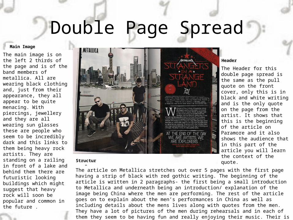
The main image is on the left 2 thirds of the page and is of the band members of metallica. All are wearing black clothing and, just from their appearance, they all appear to be quite menacing. With piercings, jewellery and they are all wearing sun glasses these are people who seem to be incredibly dark and this links to them being heavy rock artists. They are standing on a railing in front of a lake and behind them there are futuristic looking buildings which might suggest that heavy rock will soon be popular and common in the future .
Header
The Header for this double page spread is the same as the pull quote on the front cover, only this is in black and white writing and is the only quote on the page from the artist. It shows that this is the beginning of the article on Paramore and it also shows the audience that in this part of the article you will learn the context of the quote.
Structure
The article on Metallica stretches out over 5 pages with the first page having a strip of black with red gothic writing. The beginning of the article is written in 2 paragraphs- the first being a small introduction to Metallica and underneath being an introduction/ explanation of the image being China where the men are performing. The rest of the article goes on to explain about the men’s performances in China as well as including details about the mens lives along with quotes from the men. They have a lot of pictures of the men during rehearsals and in each of them they seem to be having fun and really enjoying their music. Their is a large section of a quote in white writing over a red background to make it stand out against the rest of the text. The article is written in a 3 column structure which is common in magazine articles.