Embed Size (px)
Citation preview

Question 1
In what ways does your media product use, develop and challenge forms and conventions of real media products?
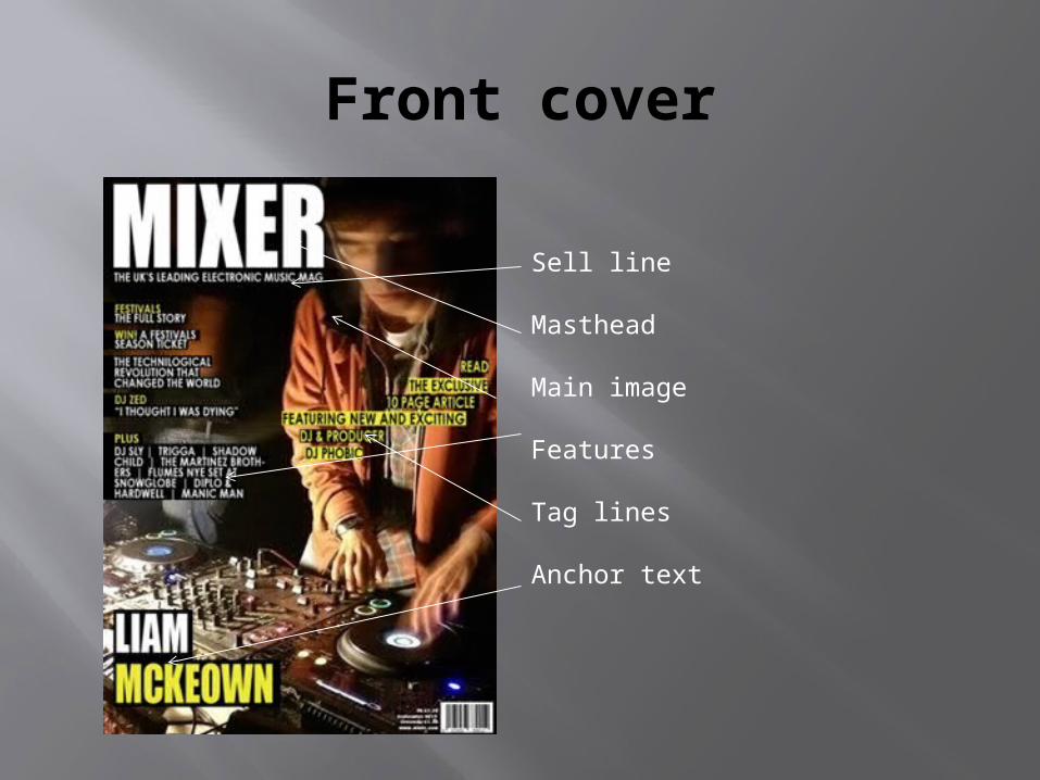
Front cover
Sell line
Masthead
Main image
Features
Tag lines
Anchor text

Sell line
I used the common convention of using a sell a line, this introduces the magazine. Usually situated near the masthead. The use of informing is the uses and grats theory, the white text in front of the black background highlights the text.

Masthead
Large, bold and placed northerly is the common conventions. The text is the top layer of the production, allowing it to be the most visible piece of text on the page. By it being placed on the top of the page, it is the first thing read. However after a few issues once I have developed a brand awareness I will put it behind the image, thus creating my own developed convention. The bold font and bold colour gains attention.

Main imageThe common convention of a medium close is broken in my main image, this is because I am trying to get the message across that the magazine isn't about one singular model and instead a DJ can be anyone, thus why the face is blurred. However by there only being one person I am showing how there is a story of a new DJ. I am challenging the idea of the male gaze (mulvey) by having a male on the front instead of a female.

Tag line
‘Exclusive’ creates engagement, exclusively provided, the effects model, buzz work ‘exclusive’ – informing on the unknown (uses and grats needs model)
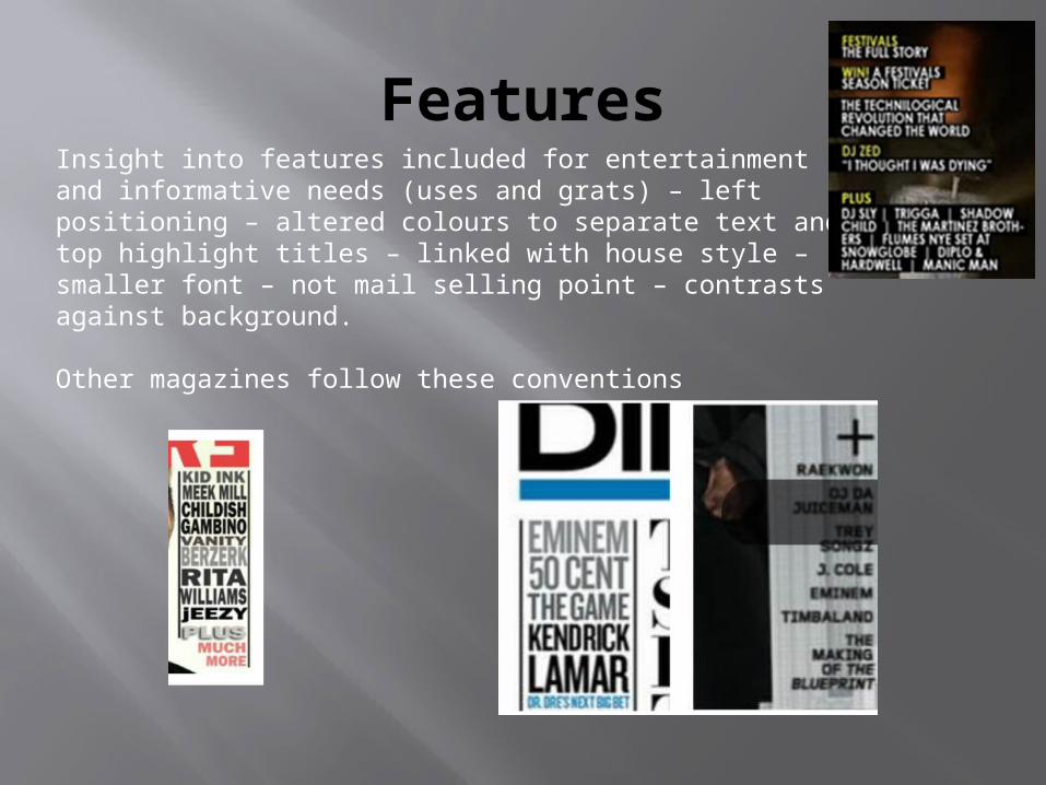
FeaturesInsight into features included for entertainment and informative needs (uses and grats) – left positioning – altered colours to separate text and top highlight titles – linked with house style – smaller font – not mail selling point – contrasts against background.
Other magazines follow these conventions

Anchor text
Name – entices fans, anchored to the image , insight into main story, bold and contrasting, links with house theme, encourages fans to buy.

House style
Black/yellow/white. I chose these colours as they contrast well against each other, meaning the text and image’s will be able to be distinguishable from one another. I suited the models mise en scene to continue the house theme of yellowish colours and blacks. The yellow text highlights the text around it, therefor encouraging the readers to read on. Using black and white is a common convention in a magazine, as shown below.

Contents page

Masthead
Features
Columns
What’s hot
Social media
Date
Numbering
Images

Date
The date shows informative information (uses and grats) – regular readers can keep up to date – but smaller text as less important – contrasting colours

Features
Eye catching – different font size – breaks down magazine – easy navigation.Short description of the featured page’s – enticed reader – informing of what's included (uses and grats)Wide range of features and artists. – shows variety – reflects the different image’s. Features commonly feature on the left hand side of the page. Altercation of the colours following the house theme, allowing for a more eye-catching and desirable.
Other magazines that use this are

Social networking
This isn't a convention found in any of the magazines I researched, however I found it to be a relevant feature to include. This is due to the fact that my target audience are the biggest users of social media, therefor they will find this useful and intriguing. It allows me to increase my customer base as well as staying in touch with my customers throughout the month and not just in the magazine. It can also work as advertisement to promote and market the magazine.
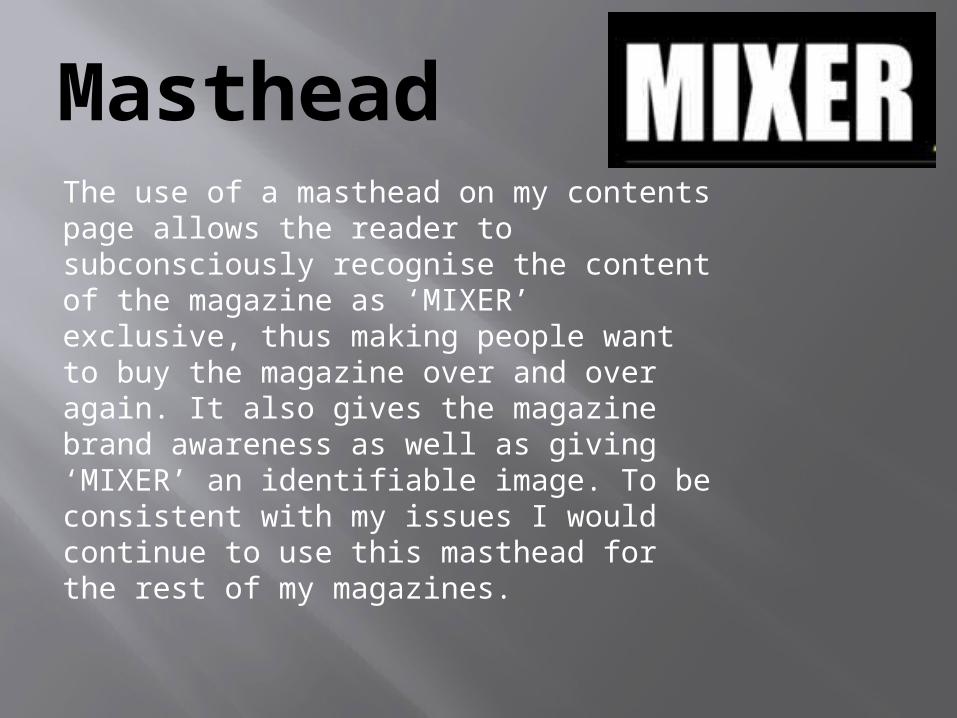
Masthead The use of a masthead on my contents page allows the reader to subconsciously recognise the content of the magazine as ‘MIXER’ exclusive, thus making people want to buy the magazine over and over again. It also gives the magazine brand awareness as well as giving ‘MIXER’ an identifiable image. To be consistent with my issues I would continue to use this masthead for the rest of my magazines.

Numbers
Bold, easily readable, easy to navigate, appeals to a younger audience, creates shortcuts, makes the page look more appealing, linked with the future article, informing of what's happens (uses and grats) & continues with the house theme.This convention can be seen in other magazines, for example :
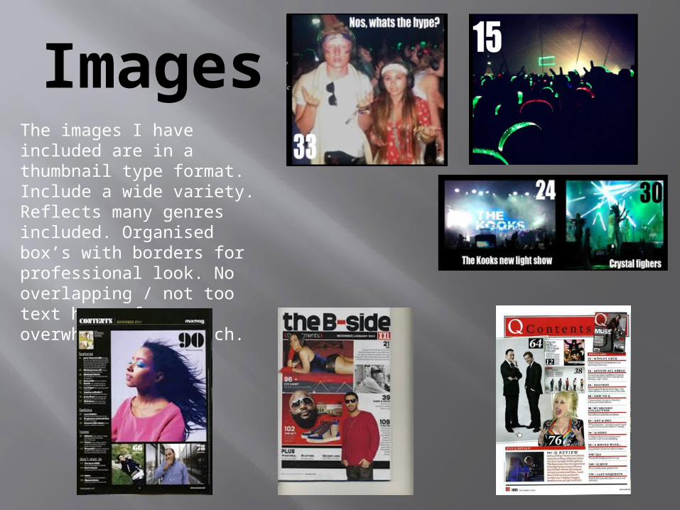
ImagesThe images I have included are in a thumbnail type format. Include a wide variety. Reflects many genres included. Organised box’s with borders for professional look. No overlapping / not too text heavy for overwhelming approach.

Double page
spread

Anchortext
Image
Quote
Tag line
Columns Text
Page numbers

Text
Common convention of altercations between colour of text and background. The text is what gives the information about the article.

Tag line
Creates engagement – exclusivity provided – text has influence – the effects model – buzzword.This effect is used in other magazines:

Anchor text
Anchors name to image, intro to article, entices fans, informative (uses and grats) – insight into main story topic – bold and contrasting
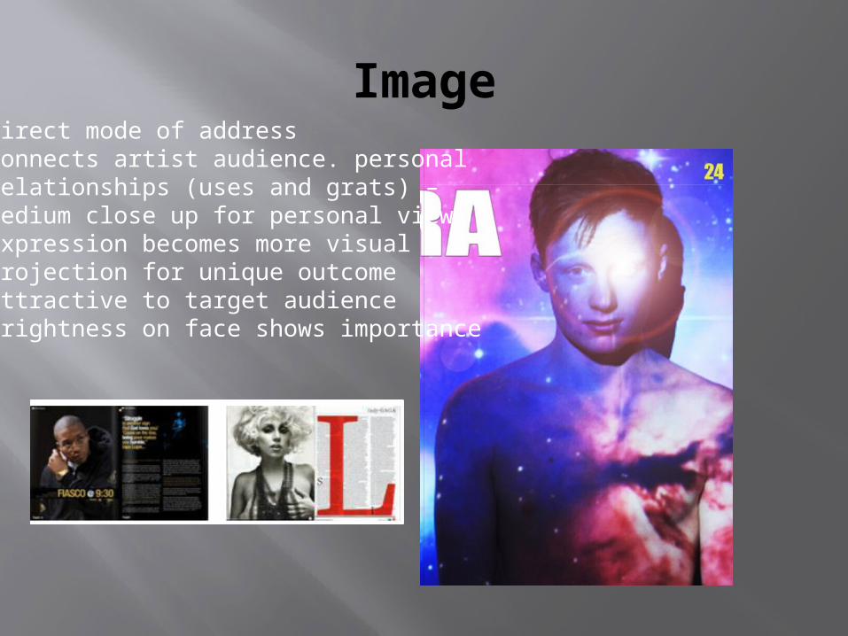
ImageDirect mode of addressConnects artist audience. personalRelationships (uses and grats) – Medium close up for personal view.Expression becomes more visualProjection for unique outcomeAttractive to target audienceBrightness on face shows importance

Quote
Insight into the rest of the story – creates engagement and questions – personal relationships to those experienced (uses and grats)
Other magazines use the same feature:

layout
I have challenged regular codes and conventions, as normally the artist is placed on the left and the text on the right. This is because the text and headings are considered the most crucial part of the article, and then the image to come second, therefor why its on the right. My image hasn’t been split down the middle, and actually continues throughout both pages. I positioned my text carefully as no important information was placed in the fold in the middle of the double page spread. Magazine’s that follow the normal common convention are as follow:

Page numbers
Convention developed to be positioned at the top, therefor making it more visible upon eye level. Makes for easier navigation, allows numbers to be separated for text. Continues house theme.

HOW DOES YOUR MEDIA PRODUCT REPRESENT
PARTICULAR SOCIAL GROUPS?
Question 2

Shot types
I have created the effect that the identity of the model in question is some what distorted/blurred, this creates the effect that the music industry doesn’t have to be controlled by a small few and instead anyone has the potential to make it big. This therefor helps to expand the target audience as it can relate to anyone.

Shot types
All images chosen in my production of models were medium close ups, this allows the reader to see the significance of the models and there importance in the music industry. By having male and female models in my production It allows both genders to be able to relate. I have followed the stereotypical design of having a male model on the front cover, as it suggests that most DJ’s are male, however by having a blurred face we are able to break these codes and conventions and strip away any stereotypical ideals of DJ’s.

I have followed the stereotypical ideals of a double page spread being mainly focused around one large image, relatable to the article. And then having a relatively small amount of text to the left or right of the spread. This is because a younger audience tend to be more attracted to an article if it is heavily covered in images/colour.

Mise en sceneThe model on my front cover wears an informal jacket and jumper, giving him a casual rugged look. This enables teenagers to be able to relate to the model and their youth. My research into magazine front covers suggests that most DJ type models continue this theme of having a casual look. Thus why I have mirrored it into my own magazine. Regarding props on my front cover, I haven’t featured any sort of prop which could normally be relatable to the electronic music scene (i.e. alcohol/drugs ) as imp not trying to suggest this is what should be acceptable. However the use of decks/mixer not only highlight the name of the magazine but also suggest what the main article is about.
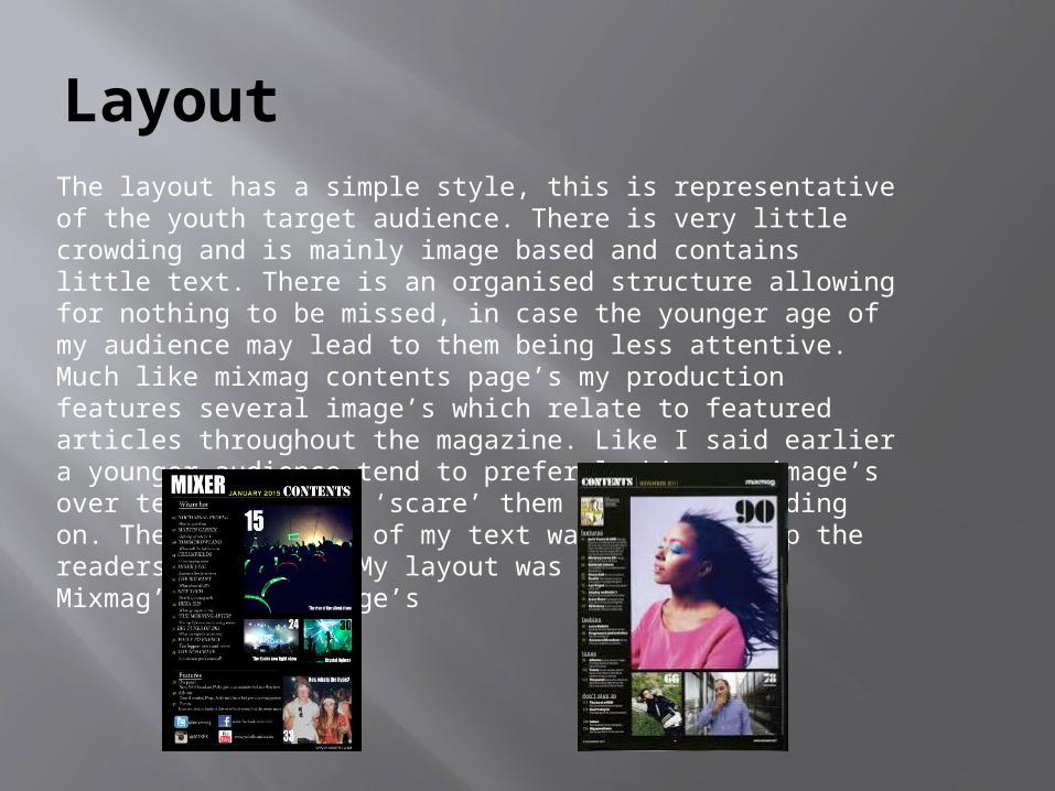
LayoutThe layout has a simple style, this is representative of the youth target audience. There is very little crowding and is mainly image based and contains little text. There is an organised structure allowing for nothing to be missed, in case the younger age of my audience may lead to them being less attentive. Much like mixmag contents page’s my production features several image’s which relate to featured articles throughout the magazine. Like I said earlier a younger audience tend to prefer looking at image’s over text which may ‘scare’ them away from reading on. The informality of my text was done to keep the readers attention. My layout was adopted from Mixmag’s content page’s

Images
The models featuring in my magazine are all of a youthful age, this leads to the audience feeling more obliged to relate to the magazine. This means they can relate to artists featured, which is essentially what I wanted to create by allowing the readers to feel they can become who they are reading about. Personal integration is created as it becomes relatable between young the young audience and the artist. The front cover image reverses and challenges Mulveys theory. Her theory consisted of the thought that females are used as sexual object to males gaze. By challenging this convention you could attract those males, and the females who admire the male under the reversed ‘gaze’

Question 3
What kind of media institution might distribute your media production and why?
IPC publishing company is a very popular magazine publisher. Time Warner is the companies owner, and his company publish many popular magazines such as ‘NME’, which is a hugely successful music magazine which covers the same target audience. This therefor adds the chance that they would make my production successful as they already have the skills to promote there products to this age group. Also due to IPC’s huge customer base, they could potentially get there already set fan base to also become interested in the electronic music industry which could hugely increase my customer base. Time Warner also owns television channels such as cartoon network and have stakes in MTV which is mainly target at a youthful audience. This could become a major advantage as they can use channels such as MTV to promote the magazine.

Harris publications is one of the leading magazine publishers in the world, publicising magazines such as XXL. This company would be ideal to publish my magazine, seeing as they have the skills and expertise to successfully promote my magazine to my target audience. Harris publications also publicise 10 other major music magazines around the country and continent. However the most important magazine they promote is the DJ magazine ‘scratch’, which integrates into my genre of magazine and ties in with my contents page features in my magazine. Again there expertise on the electronic music genre suggests they know the ways to promote around the country. Most importantly is the fact that Harris publications are the largest publishers of music magazines in the US. Selling over 285,000 copies every month. This gives for great promise as Mixmag could potentially be promoted throughout the U.S as well.

Bauer media are a well known privately owned publishing group which own over 300 products, including TV stations, radios, and other online products. Q and Kerrang magazines are both published by this group, thus meaning they have great expertise and knowledge in the music magazine market. These magazines also come under the same target audience as mine, thus why they would be very helpful to publicise my magazine. Bauer magazines publish 38 million magazines a week thus meaning the production of publishing my magazine would be relatively cheap to the hugely large scale they are already publicising on.

My magazine is mainly targeted at teens between 16-25 and based around the electronic music magazine genre. I would like my magazine to be mainly published and distributed by companies such as Bauer, IPC and Harris publications. Many institutions may be suitable, but the most suitable would be Harris Publications, this is due to huge scale they are producing meaning costs would be low as well as having such a large customer base promotion of the magazine would be very easy. Also due to Harris publications producing ‘scratch’ they have a lot of expertise in publishing electronic music magazines. Harris publications is a major conglomerate and have the financial benefits to distribute my magazine through horizontal and vertical integration. Horizontal and vertical integration is crucial in the distribution of magazines. Horizontal integration is when a company e.g. Harris owns multiple companies of the same structure including TV, radio, magazines and newspapers (all media). So horizontal integration would be using these media groups to help publicise my magazine in order to create a larger audience. Vertical integration is when the publishing company own different companies in the same selling genre. E.g. the sun owns multiple newspapers and magazines within the business. This is useful for my magazine as it can distribute it cheaply and in bulk as they already own the business within.

Synergy could come into play when distributing my magazine, synergy in media distribution means the sale of production through other media conglomerates. So companies such as Harris may put my magazine in different business’s such as music labels which can increase sales of my magazine through this technique. Social media and the internet which is a multi platform approach which can help target my product through Facebook and twitter which is also the main use of social media for my target audience. Social media for my target audience is hugely popular and is used daily. Thus meaning it can spread like wild fire throughout the internet and can be viewed and promoted rapidly and relatively free of charge. The idea of ‘sharing’ and ‘retweeting’ the magazine would allow many people to view there opinions and promote it through their friends. By using promotional strategies such as eyeline marketing, where the product is put at the customer’s eye level so they can constantly see the magazine and become subconsciously attracted to it. In conclusion Harris publications should distribute my magazine, due to there experience and skills in the target audience. As well as the sheer size that they publish meaning costs will remain lower then if it was published from a smaller independent publisher. Also due to my unique colour scheme and house layout my magazine will stand out against the other magazine they publish

Question 4 & 5
Who would be the audience for your media product?How did you attract/address your audience?

My target audience for my magazine is both genders aged between 16 – 25. I used my focus group on Facebook to address and get their opinions. They gave me feedback on my production on how people that fit into the age group would like to see it. By aiming my magazine at both male and female it allowed me to maximise my audience, I did this by using neutral colours and using male and female models in my production. I didn’t want to potentially deter anyone from my magazine by abiding by gender stereotypes.The class of my magazine was meant to be well rounded, as it is affordable by most and therefore means most people will be generally attracted to it if they are attracted to the electronic music genre. The nature of my audience would be to generalise the electronic music magazine and I didn’t want to create anything too niche that would limit my customer base. I covered everything in my magazine, such as up and coming artist in order to attract everyone I possibly could.

To attract my audience, as well as using the focus group for input and feedback. I concluded common conventions I found within my research, of magazines with the same age range. The codes included bold texts, imagery and no crowding within the layout.The images I used were eye catching, to attract my audience. For example the bright galaxy production onto my double page spread, this made the image bold and eye catching and attracted the young audience.Concerning the mise en scene, the models were dressed in clothing similar to what would be worn by the target audience, thus giving them a motive to relate to them.The direct mode of address in the front cover gives the model a blurred face, thus giving the ideals that an unidentifiable model could potentially be anyone.

Question 6
What have you learnt about technologies from the process of constructing this product?

During my production of my music magazine, the technologies I used varied to help reach my final product. These technologies have
helped to improve my final production. Throughout the production I referred to my blog and made posts including the use of
technologies.

Here are a list of technologies I used:Mobile phone
Adobe Photoshop cs3Internet explorer (blogger/google/YouTube/ slide share
Microsoft PowerPoint)projector
canon 600d

Digital Canon 600DThis camera was the one I used to take my photographs for my production. The camera being digital has its major perks, such as how I can instantly see the shot after taking it, meaning my ability to change and adapt was much quicker and efficient e.g. the lighting and angles. Also the camera’s large memory card meant I was able to store great amounts of photos at once, which once again made my production more efficient. I used multiple online tutorials for help with the camera, for example I looked into how to play around with the i.s.o in order to have the best quality photos possible. This merging of technologies enhanced the outcome and my knowledge of the device.

Internet explorer.
I used internet explorer for help with my research, to about command process of magazine codes and learn conventions and it aided to help me with the production of my final product. Blogger, YouTube, slide share and google are all dependant on internet explorer, so clearly it proves to be very useful. Blogger was incredibly useful as it allowed me to precisely lay out my production from start to finish, as well as allowing me to look at other blogs for help and inspiration. Without internet explorer my media coursework would have bene very difficult to complete.

Adobe Photoshop cs3Adobe Photoshop cs3 allowed me to manipulate my image’s, add text and create my whole production. I used multiple YouTube tutorials to help me make my production to the highest quality possible. These tutorials were step by step which meant they were very useful and easy to remember for future use.

Mobile phoneMy HTC one M8 mobile phone was another piece of technology that was extremely useful for taking photos of things where the camera becomes too much to carry around and becomes impractical. The lightweight 18 megapixel camera was very useful for taking photos at gigs. The high quality camera meant I could produce professional looking photos without having to pay a premium price for a camera. My phone was also useful as I was able to send photos via email on the go as well as constantly update my focus group without the need to be sitting at a computer. The accessibility of the phone meant I was able to organise and plan the set up of my photo’s with my colleagues. Convergence with this technology meant I could merge the convenience of emailing, photograph taking plus communicating with others all into one, making the production process much easier.

PowerPoint/slide share
I used PowerPoint to produce my evaluation, from PowerPoint I was able to transfer it to slide share, which makes it neater and easier to interpret. Slide share is the online website where you are able to share presentations online, this means I can show other people my work as well as look at other peoples work for reference. The exciting use of slides, colours and transitions means others will be engaged.

Lighting and projector.
The lighting and projector were relatively simple to use, however the positioning of the projector took quite a while to get right. The use of these for my production meant I could produce a professional looking final product which had an authentic look that could be in a professional magazine, and the unique idea of image projection allowed me to provide an individual result.

To conclude…
The technologies I have mentioned have all considerably helped me to produce my front cover, double page spread and contents page. Without them the production would not have had such a professional outcome. The technologies helped to make the product more presentable, organised and cohesive, and without this my production would be no way near as presentable, and therefor worth less marks. The technologies were nearly all alien to me, and with the help of the internet I was able to improve my skills on all of them. And now for the future I will be able to use all of these technologies with ease to help with future projects.

Question 7
Looking back at your preliminary task, what do you feel you have learnt in the progression from it to the full production?
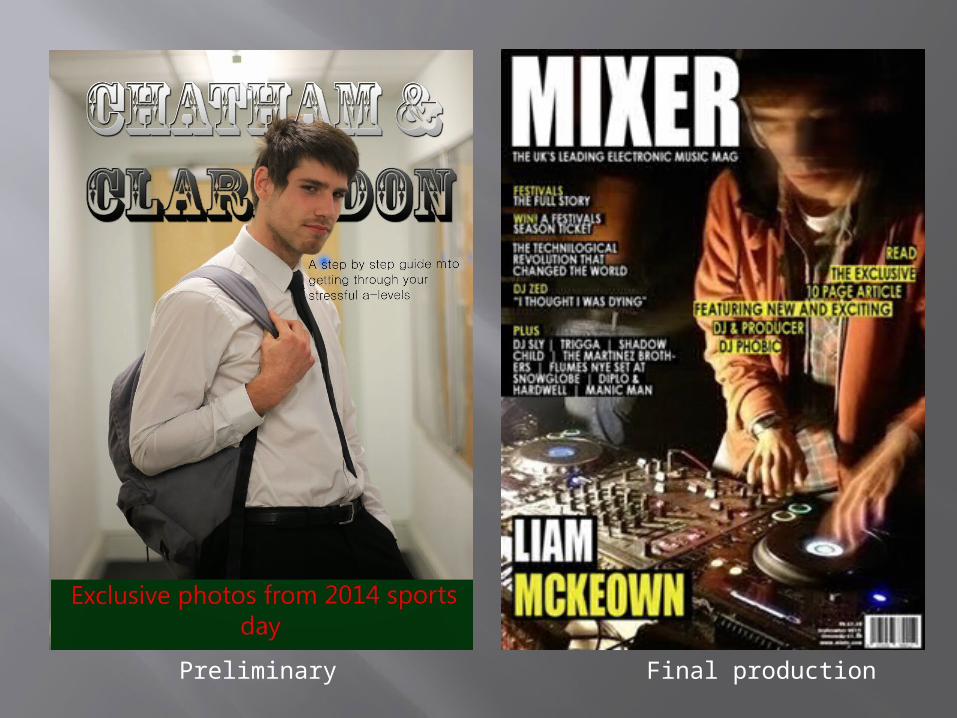
Preliminary Final production

Preliminary Final production
Progression
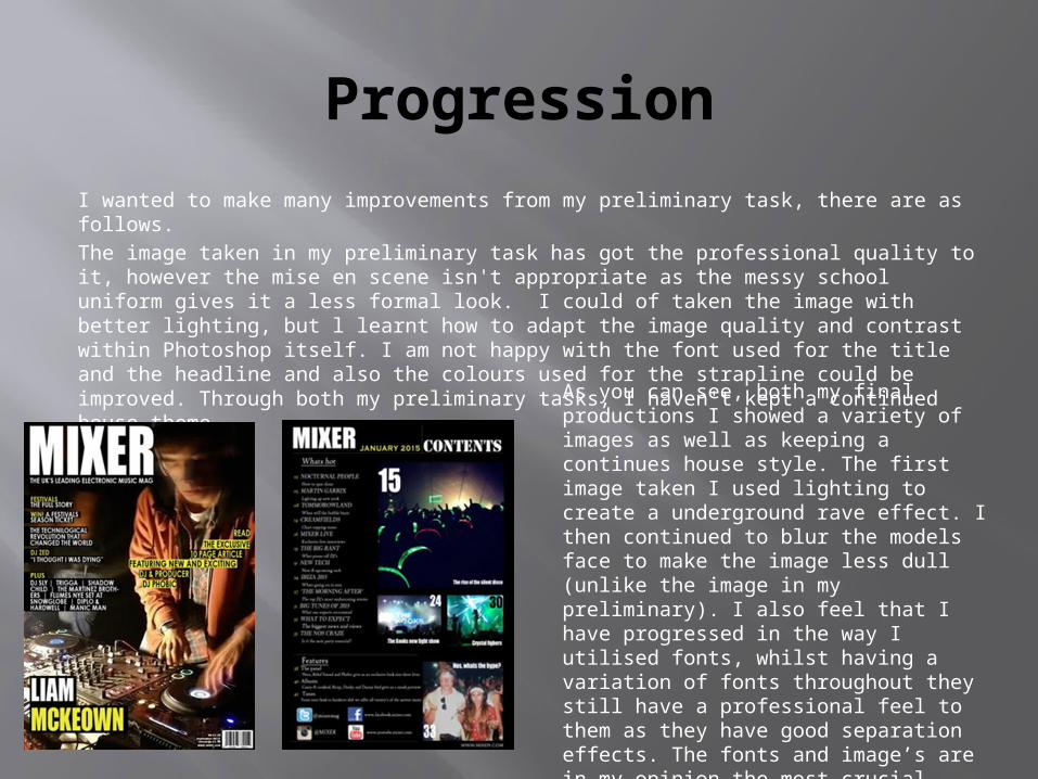
I wanted to make many improvements from my preliminary task, there are as follows.The image taken in my preliminary task has got the professional quality to it, however the mise en scene isn't appropriate as the messy school uniform gives it a less formal look. I could of taken the image with better lighting, but l learnt how to adapt the image quality and contrast within Photoshop itself. I am not happy with the font used for the title and the headline and also the colours used for the strapline could be improved. Through both my preliminary tasks, I haven't kept a continued house theme.
As you can see, both my final productions I showed a variety of images as well as keeping a continues house style. The first image taken I used lighting to create a underground rave effect. I then continued to blur the models face to make the image less dull (unlike the image in my preliminary). I also feel that I have progressed in the way I utilised fonts, whilst having a variation of fonts throughout they still have a professional feel to them as they have good separation effects. The fonts and image’s are in my opinion the most crucial factors to make a professional looking image.
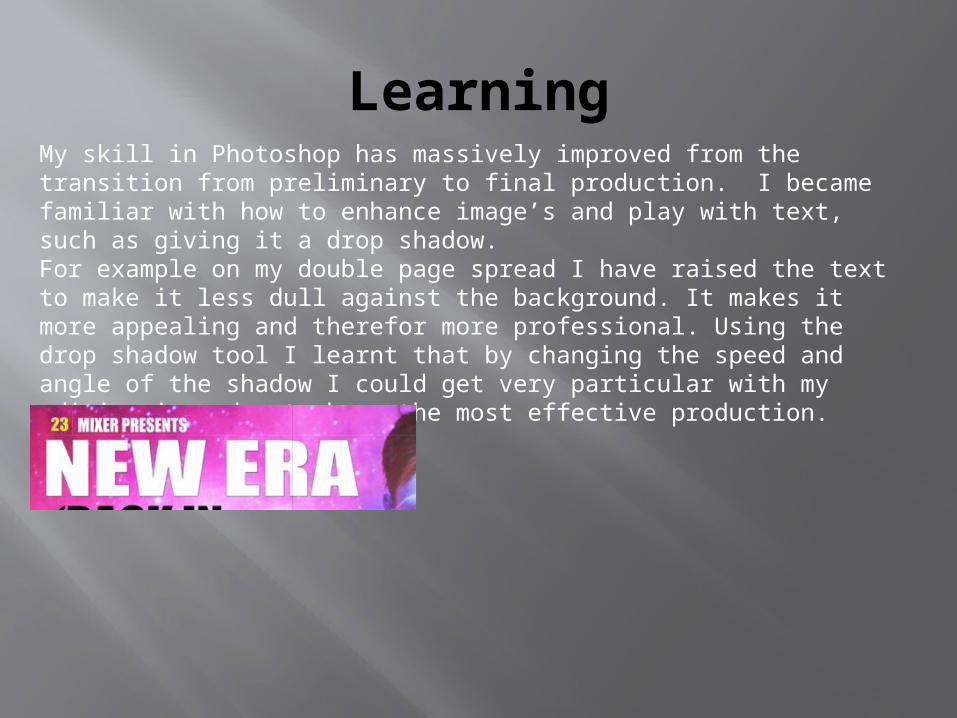
LearningMy skill in Photoshop has massively improved from the transition from preliminary to final production. I became familiar with how to enhance image’s and play with text, such as giving it a drop shadow. For example on my double page spread I have raised the text to make it less dull against the background. It makes it more appealing and therefor more professional. Using the drop shadow tool I learnt that by changing the speed and angle of the shadow I could get very particular with my editing in order to have the most effective production.

The complexity of my layout has changed also, as I have learnt how to add different layers into my production. Before my skills of Photoshop had developed my preliminary tasked looked flat and dull, but by utilising layers I was able to produce a more professional looking image. By following the codes and conventions of other music magazines I was able to use layers to produce a professional looking final product. Some of the techniques I learnt was how to colour text box’s, line spacing, and separation between letters to create variation.
By following my own advice from my preliminary task, I was able to remain to one constant structure, by always referring to my research it meant I didn’t just produce a mess of image’s and text that didn’t have any professional qualities to it. To do this I created mock ups and sketches of what I wanted my final production to look like. Unlike what I did for my preliminary which consisted of very little research .

I also learnt the importance of mastheads, as they are the initial thing a reader will read when viewing the magazine. In my preliminary task my masthead was unrecognisable and didn’t have a relatable font to the theme of a school. Also it had no qualities that could represent the magazine as a whole, unlike my final productions masthead. Due to this I decided my final masthead must look professional and be the symbol for the magazine, thus why I created several options and allowed my focus group to decide which looked the most professional.

From all of the lessons I’ve learnt from the transition between preliminary to final production, I was able to produce my double page spread, which considered all the factors I have learnt.

The unique bright colours against the topless model contrast and create a very eye-catching look. Through repetition and tutorials I managed to position the model just right in order to create the best ‘solar flare look’, thus making it look more professional. By utilising the projector, lighting and the iso I was able to highlight the transition from my preliminary to the final production. Overall these techniques aloud me to have a stand out image which would overall greatly increase the professional qualities of the magazine.

Conclusion
In conclusion the increase of quality from my preliminary task to my final production was large. This is mainly due the fact I have acquired many skills throughout the process of this production. For example my skills in Photoshop have greatly improved, thus allowing me to be able to produce a more professional piece of work. By learning the codes and conventions of different genres of magazine I was able to put them into my magazine by utilising my Photoshop skills. The variety of fonts, house colours, design planning and spacing were all conventions necessary to have a successful final production. If I had not learnt how to use this software to its full extent I would not have been able to produce such a high quality piece of work.