Embed Size (px)
Citation preview
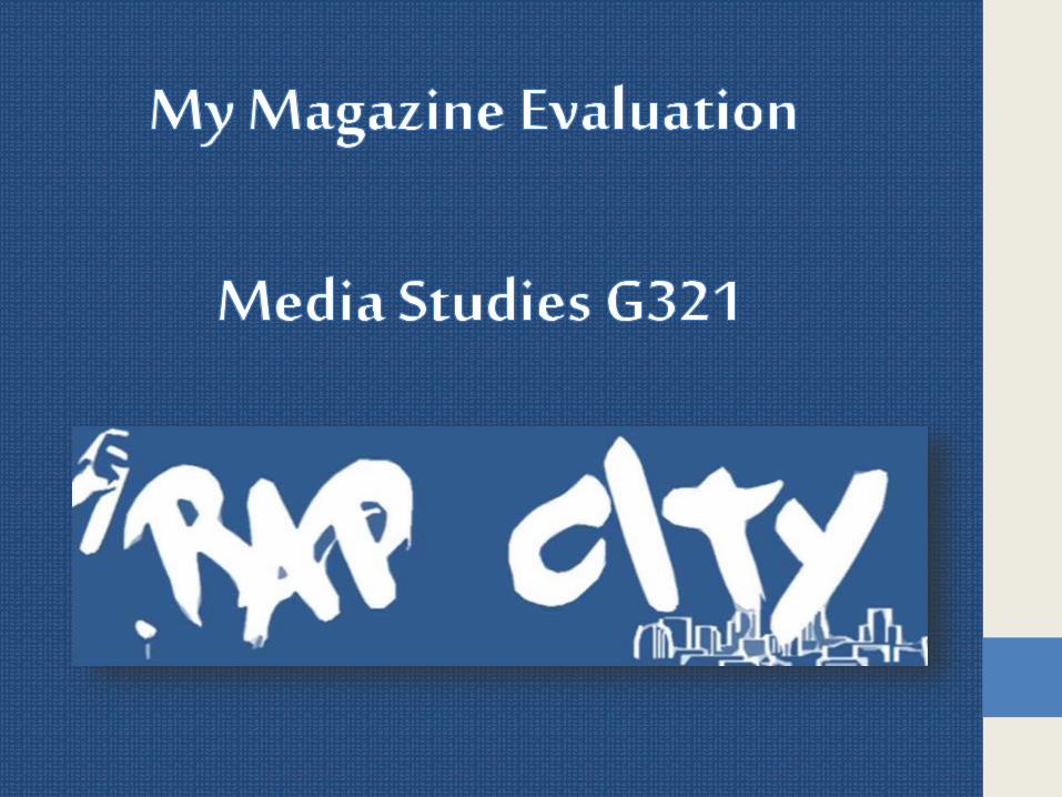
1 In what ways does your media product use develop or challenge forms and conventions of real media products
My magazine is focused on Hip-Hop I therefore used graffiti as the mastheads font this is blatant as I have a spray-can on the top left of the masthead
Graffiti is a Hip-Hop convention like wise to Hip-Hop it is an urban culture and they both link to one another graffiti can be used to express views whereas hip-hop expresses it vocally
There is a fair amount of graffiti in my magazine its simply fits my magazine conventions because Hip-Hop and graffiti come from the same background
Fancy writing is completely unnecessary for my magazine because it represents more luxurious one Rap City means street
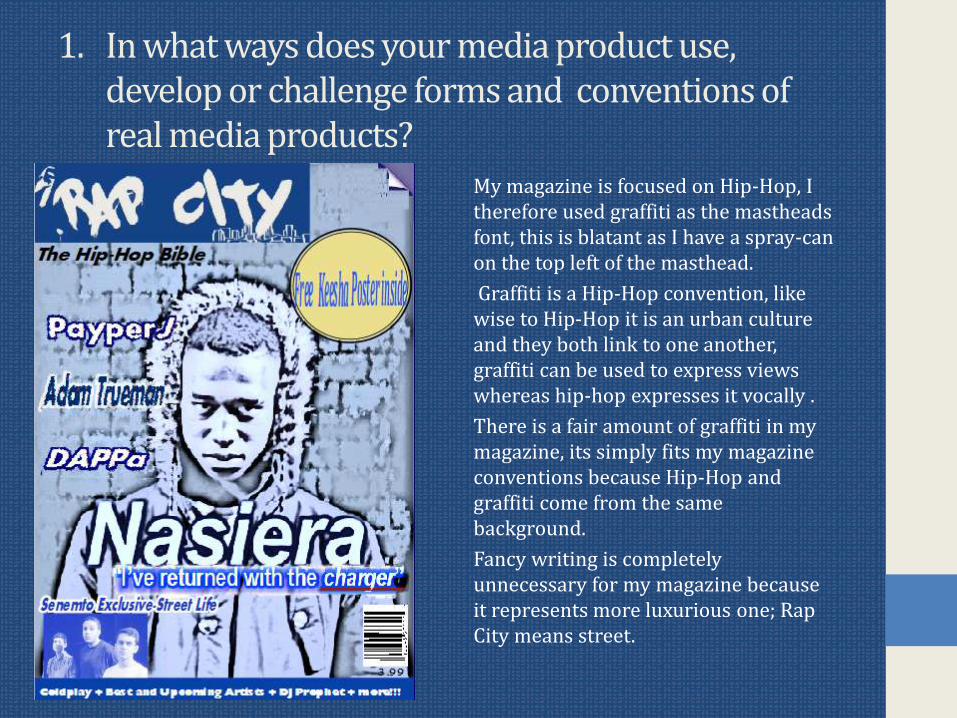
Pug ndash to usually share exclusive content inside
Main Cover-line ndash not in its usual dominating size still stands out however
Barcode
Cover-lines
Footer - Bar
Masthead
Cover-Star
Motto
httpnasiera1blogspotcouk201309magazine-front-cover-componentshtml
XXL Cover-page conventions in comparison to mine
1In what ways does your media product use develop or challenge forms and conventions of real media products
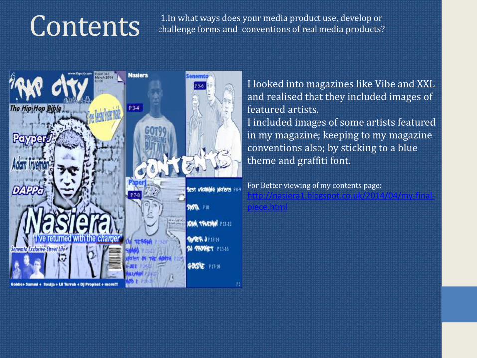
Contents
I looked into magazines like Vibe and XXL and realised that they included images of featured artists I included images of some artists featured in my magazine keeping to my magazine conventions also by sticking to a blue theme and graffiti font
For Better viewing of my contents page
httpnasiera1blogspotcouk201404my-final-piecehtml
1In what ways does your media product use develop or challenge forms and conventions of real media products
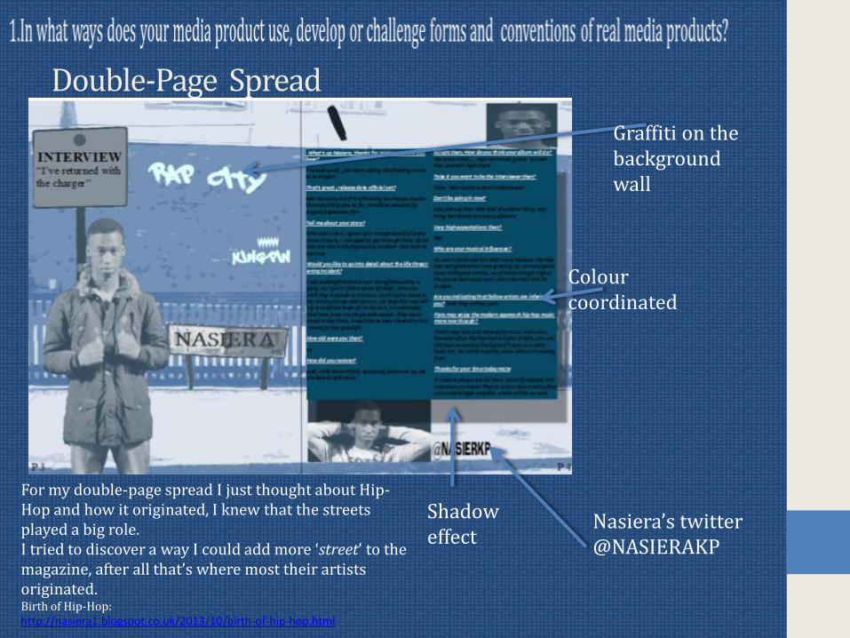
Double-Page Spread
Nasierarsquos twitter NASIERAKP
Graffiti on the background wall
Colour coordinated
Shadow effect
For my double-page spread I just thought about Hip-Hop and how it originated I knew that the streets played a big role I tried to discover a way I could add more lsquostreetrsquo to the magazine after all thatrsquos where most their artists originatedBirth of Hip-Hophttpnasiera1blogspotcouk201310birth-of-hip-hophtml
2 How does your media product represent particular social groups
My magazine is aimed at a young male audience between 14 and 27 that are fans of RapHip-Hop although this does not include females or people of certain ages itrsquoll be a bonus if there was a mass interest
The magazine does appear to have a street theme as Rap City aims to visually attracts a male audience the magazine is blue themed which is stereotypically a male colour and the masthead font as well as its own name shows the male focus by graffiti and the noun lsquoRaprsquo alone
Hip-Hop commonly attracts interest from groups that are in the inner city and the street conventions like graffiti further influences their interest
Hip-Hop is highly dominated by males artists so some could say that the genre alone attracts a young male audience
Questionnaire on target audience httpnasiera1blogspotcouk201312magazine-questionnairehtml
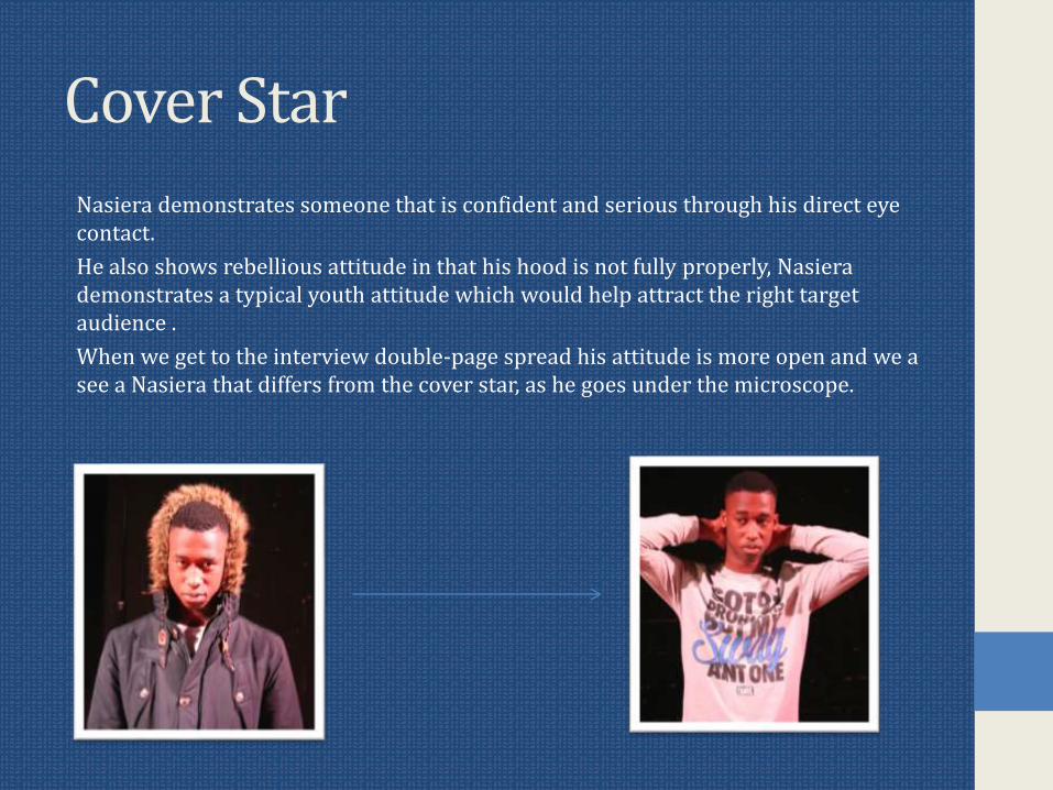
Cover Star
Nasiera demonstrates someone that is confident and serious through his direct eye contact
He also shows rebellious attitude in that his hood is not fully properly Nasierademonstrates a typical youth attitude which would help attract the right target audience
When we get to the interview double-page spread his attitude is more open and we a see a Nasiera that differs from the cover star as he goes under the microscope
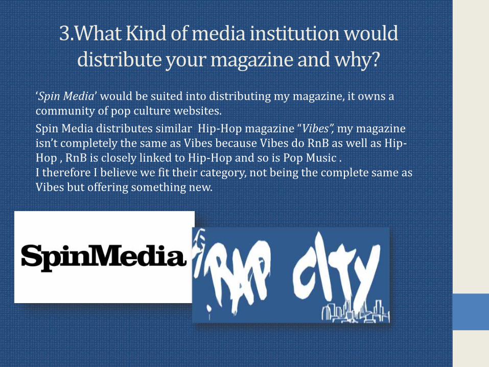
3What Kind of media institution would distribute your magazine and why
lsquoSpin Mediarsquo would be suited into distributing my magazine it owns a community of pop culture websites
Spin Media distributes similar Hip-Hop magazine ldquoVibesrdquo my magazine isnrsquot completely the same as Vibes because Vibes do RnB as well as Hip-Hop RnB is closely linked to Hip-Hop and so is Pop Music I therefore I believe we fit their category not being the complete same as Vibes but offering something new
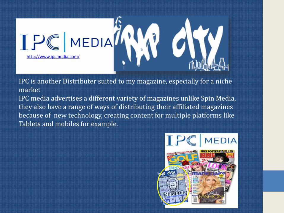
IPC is another Distributer suited to my magazine especially for a niche marketIPC media advertises a different variety of magazines unlike Spin Media they also have a range of ways of distributing their affiliated magazines because of new technology creating content for multiple platforms like Tablets and mobiles for example
httpwwwipcmediacom
4 Who would be the audience of your media product
My Target Audience is for Young Males ranging between teens and mid-20s (14-27) this is a big gap but most males that listen to Hip-Hop are of this age range
Rap City is similar to Hip-Hop magazine to XXL which is not only a Hip-Hop magazine but it is also aimed at a male audience
The quiz results httpnasiera1blogspotcouk201312magazine-questionnaire-analysishtml
The purpose on me doing a quiz was to see what my target audience generally prefer more Hip-Hop fans told me that they prefer ones opinions and values as well as their inspiration when I did my interview with Nasiera he gave his opinions and values
5How did you attractaddress your audience
My Masthead simply tells you it focuses on Rap by the name lsquoRap cityrsquo you already know that itrsquos a Music magazine by its name something that isnrsquot always easy to tell by magazine mastheads It also uses typography as you get a drawing of a city in bottom right corner of the Masthead There is also a spray can on the top left that goes with the graffiti font graffiti is a Hip-Hop convention so this very effective in drawing in the right target audience
The main Colour used on my magazine is blue using blue aims to attract my male audience as the colour is highly link to males
Secondary colour is white itrsquos a positive clear view and I believe it reflects a positive attitude amongst viewers
httpnasiera1blogspotcouk201401why-is-rap-city-bluehtmlMore on Rap City being Blue
httpnasiera1blogspotcouk201401magazine-mastheadshtml
httpnasiera1blogspotcouk201311my-masthead-drafthtml
More on Mastheads
Cover Lines 5How did you attractaddress your audience
I Knew my cover-lines had to be either catchy persuasive or controversial to make people want to read it cover-lines play an important role in selling your magazine
This is my main cover-line ldquoIrsquove returned with the chargerrdquo Viewers have no idea what is meant by this headline it therefore persuades them to buy it The Main cover-line is not only persuasive towards them but itrsquos a controversial quote as what Nasiera means is Hip-Hop has been struggling and he has come to rejuvenate the genre other artists may take this to offence but him saying this will create publicity and make more people want to read into the magazine and into Nasiera himself
Other headlines I thought of using
httpnasiera1blogspotcouk201401potential-magazine-main-headlineshtml
Images
My Images successfully shows that rebellious teenage attitude that was needed to attract the right viewers Hip-Hop artists like to show this attitude also
This is the cover-star image it not only shows that lsquoSeriousrsquo look but not being hooded up properly shows that he donrsquot really care ldquo Irsquoll Wear it how I wantrdquo Teenagers donrsquot usually care and neither do Hip-Hop artists Hip-Hop conventions
6 What have you learnt about technologies from the process of constructing the product
Strengths of the programs Irsquove usedMicrosoft Word Page Plus Microsoft
PublisherPaintNet Blogger
Very simple to use Variety of ways edit pictures
Extremelysimple to use I used it for older Drafts of my magazine
Has layers thatyou can use to structure your project
Reliable blog
Found Artistic effects for my magazine
Additional tools including cut-out
Spell -check on this also
Able edit images with effects
You can edit oldposts if you recognise a mistake etc
Flexible I can change colour contrast or brightness of the picture
Able to save work as JPEG
You can drag fonts and pictures around the page
Can save work as PNG
Add pictures to posts
Spell-check to prevent mistakes
Can save work as JPEG and PNG
Flatten work meaning all the layers are established together as one picture
6 What have you learnt about technologies from the process of constructing the product
MicrosoftWord
Page Plus Microsoft Publisher
PaintNet Blogger
Unable to save documents JPEGPNG
Can be complicated to use and takes some getting used to
Doesnrsquot have enough tools like Cut-out
Can get confusing by not knowing what layer has what component
Sometimes posts donrsquot get paragraphed
Difficult to move pictures and text
With a wide range of options the program can be overused
Limited choice of shapes and brushes
Had to screen grab some fonts making it less visible
Mistakes can be hard to erase
6 What have you learnt about technologies from the process of constructing the product
I Regret not making the most of programs like Page Plus it had so much to offer but my artistic effects were from Microsoft Word I used lsquoPhotocopy effectrsquo
Each program played their part in the development of my magazine however
6 What have you learnt about technologies from the process of constructing the product
Drafting and PlanningIn the planning of my magazine I looked into graffiti fonts off the website wwwdafontcom and this is what came up httpnasiera1blogspotcouk201311my-masthead-drafthtmlMy initial plan for my contents page was to take a picture of a street and replace its street signs with artists featured in the magazine I felt that itrsquoll be over creative and complicated for readers I looked into other magazine contents pages they were very simple so I decided to keep my contents page simple and move ideas into the interview pageMy Cover page features lsquophotocopyrsquo effect there was no typography related reason as to why I done this I just believed it looked more appealing
Contents planhttpnasiera1blogspotcouk201311contents-draft-1html
Vibes Contents page httpnasiera1blogspotcouk201312contents-page-researchhtml
6 What have you learnt about technologies from the process of constructing the product
PhotographsI aimed to make my photographs link to the text this way you can recognise the context in which something was said for example there is a smiling image of Nasierain the humorous part of the interview but as it gets more serious therersquos a snap of
him with hands on the back of his head
Some images like the cover-page picture had colours adjusted to blue to contribute to the magazine conventions
Looking back at my Preliminary task
Preliminary Main Task
Barcode is never usually left-sided on cover-page
Cover lines way to small
Main cover-line doesnrsquot relate the picture an appropriate cover-line would of have been the cover-star in his school clothes at least
Barcode in traditional position
Artist giving direct eye contact
OverallOverall I am happy with my final draft I could have taken more advantage of tools on Page Plus and could have posted more Blog posts but I am still satisfied with my work
Coursework helped me realise what is needed for certain music magazines and certain age groupsgenders and social groups I feel my strongest page is my cover-page as it tempts readers to buy the product with cover-lines including phrases ldquoexclusiverdquo and my Main Cover-line ldquo Irsquove returned with the chargerrdquo is tempting and plays a big role in selling the product
Pug ndash to usually share exclusive content inside
Main Cover-line ndash not in its usual dominating size still stands out however
Barcode
Cover-lines
Footer - Bar
Masthead
Cover-Star
Motto
httpnasiera1blogspotcouk201309magazine-front-cover-componentshtml
XXL Cover-page conventions in comparison to mine
1In what ways does your media product use develop or challenge forms and conventions of real media products
Contents
I looked into magazines like Vibe and XXL and realised that they included images of featured artists I included images of some artists featured in my magazine keeping to my magazine conventions also by sticking to a blue theme and graffiti font
For Better viewing of my contents page
httpnasiera1blogspotcouk201404my-final-piecehtml
1In what ways does your media product use develop or challenge forms and conventions of real media products
Double-Page Spread
Nasierarsquos twitter NASIERAKP
Graffiti on the background wall
Colour coordinated
Shadow effect
For my double-page spread I just thought about Hip-Hop and how it originated I knew that the streets played a big role I tried to discover a way I could add more lsquostreetrsquo to the magazine after all thatrsquos where most their artists originatedBirth of Hip-Hophttpnasiera1blogspotcouk201310birth-of-hip-hophtml
2 How does your media product represent particular social groups
My magazine is aimed at a young male audience between 14 and 27 that are fans of RapHip-Hop although this does not include females or people of certain ages itrsquoll be a bonus if there was a mass interest
The magazine does appear to have a street theme as Rap City aims to visually attracts a male audience the magazine is blue themed which is stereotypically a male colour and the masthead font as well as its own name shows the male focus by graffiti and the noun lsquoRaprsquo alone
Hip-Hop commonly attracts interest from groups that are in the inner city and the street conventions like graffiti further influences their interest
Hip-Hop is highly dominated by males artists so some could say that the genre alone attracts a young male audience
Questionnaire on target audience httpnasiera1blogspotcouk201312magazine-questionnairehtml
Cover Star
Nasiera demonstrates someone that is confident and serious through his direct eye contact
He also shows rebellious attitude in that his hood is not fully properly Nasierademonstrates a typical youth attitude which would help attract the right target audience
When we get to the interview double-page spread his attitude is more open and we a see a Nasiera that differs from the cover star as he goes under the microscope
3What Kind of media institution would distribute your magazine and why
lsquoSpin Mediarsquo would be suited into distributing my magazine it owns a community of pop culture websites
Spin Media distributes similar Hip-Hop magazine ldquoVibesrdquo my magazine isnrsquot completely the same as Vibes because Vibes do RnB as well as Hip-Hop RnB is closely linked to Hip-Hop and so is Pop Music I therefore I believe we fit their category not being the complete same as Vibes but offering something new
IPC is another Distributer suited to my magazine especially for a niche marketIPC media advertises a different variety of magazines unlike Spin Media they also have a range of ways of distributing their affiliated magazines because of new technology creating content for multiple platforms like Tablets and mobiles for example
httpwwwipcmediacom
4 Who would be the audience of your media product
My Target Audience is for Young Males ranging between teens and mid-20s (14-27) this is a big gap but most males that listen to Hip-Hop are of this age range
Rap City is similar to Hip-Hop magazine to XXL which is not only a Hip-Hop magazine but it is also aimed at a male audience
The quiz results httpnasiera1blogspotcouk201312magazine-questionnaire-analysishtml
The purpose on me doing a quiz was to see what my target audience generally prefer more Hip-Hop fans told me that they prefer ones opinions and values as well as their inspiration when I did my interview with Nasiera he gave his opinions and values
5How did you attractaddress your audience
My Masthead simply tells you it focuses on Rap by the name lsquoRap cityrsquo you already know that itrsquos a Music magazine by its name something that isnrsquot always easy to tell by magazine mastheads It also uses typography as you get a drawing of a city in bottom right corner of the Masthead There is also a spray can on the top left that goes with the graffiti font graffiti is a Hip-Hop convention so this very effective in drawing in the right target audience
The main Colour used on my magazine is blue using blue aims to attract my male audience as the colour is highly link to males
Secondary colour is white itrsquos a positive clear view and I believe it reflects a positive attitude amongst viewers
httpnasiera1blogspotcouk201401why-is-rap-city-bluehtmlMore on Rap City being Blue
httpnasiera1blogspotcouk201401magazine-mastheadshtml
httpnasiera1blogspotcouk201311my-masthead-drafthtml
More on Mastheads
Cover Lines 5How did you attractaddress your audience
I Knew my cover-lines had to be either catchy persuasive or controversial to make people want to read it cover-lines play an important role in selling your magazine
This is my main cover-line ldquoIrsquove returned with the chargerrdquo Viewers have no idea what is meant by this headline it therefore persuades them to buy it The Main cover-line is not only persuasive towards them but itrsquos a controversial quote as what Nasiera means is Hip-Hop has been struggling and he has come to rejuvenate the genre other artists may take this to offence but him saying this will create publicity and make more people want to read into the magazine and into Nasiera himself
Other headlines I thought of using
httpnasiera1blogspotcouk201401potential-magazine-main-headlineshtml
Images
My Images successfully shows that rebellious teenage attitude that was needed to attract the right viewers Hip-Hop artists like to show this attitude also
This is the cover-star image it not only shows that lsquoSeriousrsquo look but not being hooded up properly shows that he donrsquot really care ldquo Irsquoll Wear it how I wantrdquo Teenagers donrsquot usually care and neither do Hip-Hop artists Hip-Hop conventions
6 What have you learnt about technologies from the process of constructing the product
Strengths of the programs Irsquove usedMicrosoft Word Page Plus Microsoft
PublisherPaintNet Blogger
Very simple to use Variety of ways edit pictures
Extremelysimple to use I used it for older Drafts of my magazine
Has layers thatyou can use to structure your project
Reliable blog
Found Artistic effects for my magazine
Additional tools including cut-out
Spell -check on this also
Able edit images with effects
You can edit oldposts if you recognise a mistake etc
Flexible I can change colour contrast or brightness of the picture
Able to save work as JPEG
You can drag fonts and pictures around the page
Can save work as PNG
Add pictures to posts
Spell-check to prevent mistakes
Can save work as JPEG and PNG
Flatten work meaning all the layers are established together as one picture
6 What have you learnt about technologies from the process of constructing the product
MicrosoftWord
Page Plus Microsoft Publisher
PaintNet Blogger
Unable to save documents JPEGPNG
Can be complicated to use and takes some getting used to
Doesnrsquot have enough tools like Cut-out
Can get confusing by not knowing what layer has what component
Sometimes posts donrsquot get paragraphed
Difficult to move pictures and text
With a wide range of options the program can be overused
Limited choice of shapes and brushes
Had to screen grab some fonts making it less visible
Mistakes can be hard to erase
6 What have you learnt about technologies from the process of constructing the product
I Regret not making the most of programs like Page Plus it had so much to offer but my artistic effects were from Microsoft Word I used lsquoPhotocopy effectrsquo
Each program played their part in the development of my magazine however
6 What have you learnt about technologies from the process of constructing the product
Drafting and PlanningIn the planning of my magazine I looked into graffiti fonts off the website wwwdafontcom and this is what came up httpnasiera1blogspotcouk201311my-masthead-drafthtmlMy initial plan for my contents page was to take a picture of a street and replace its street signs with artists featured in the magazine I felt that itrsquoll be over creative and complicated for readers I looked into other magazine contents pages they were very simple so I decided to keep my contents page simple and move ideas into the interview pageMy Cover page features lsquophotocopyrsquo effect there was no typography related reason as to why I done this I just believed it looked more appealing
Contents planhttpnasiera1blogspotcouk201311contents-draft-1html
Vibes Contents page httpnasiera1blogspotcouk201312contents-page-researchhtml
6 What have you learnt about technologies from the process of constructing the product
PhotographsI aimed to make my photographs link to the text this way you can recognise the context in which something was said for example there is a smiling image of Nasierain the humorous part of the interview but as it gets more serious therersquos a snap of
him with hands on the back of his head
Some images like the cover-page picture had colours adjusted to blue to contribute to the magazine conventions
Looking back at my Preliminary task
Preliminary Main Task
Barcode is never usually left-sided on cover-page
Cover lines way to small
Main cover-line doesnrsquot relate the picture an appropriate cover-line would of have been the cover-star in his school clothes at least
Barcode in traditional position
Artist giving direct eye contact
OverallOverall I am happy with my final draft I could have taken more advantage of tools on Page Plus and could have posted more Blog posts but I am still satisfied with my work
Coursework helped me realise what is needed for certain music magazines and certain age groupsgenders and social groups I feel my strongest page is my cover-page as it tempts readers to buy the product with cover-lines including phrases ldquoexclusiverdquo and my Main Cover-line ldquo Irsquove returned with the chargerrdquo is tempting and plays a big role in selling the product
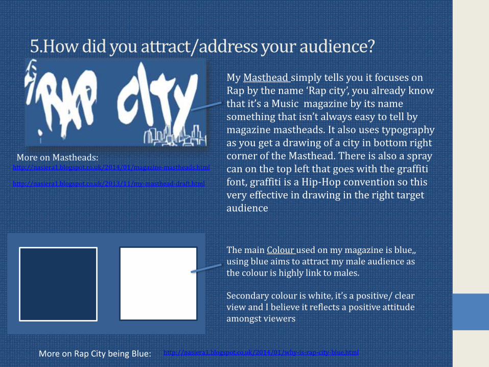
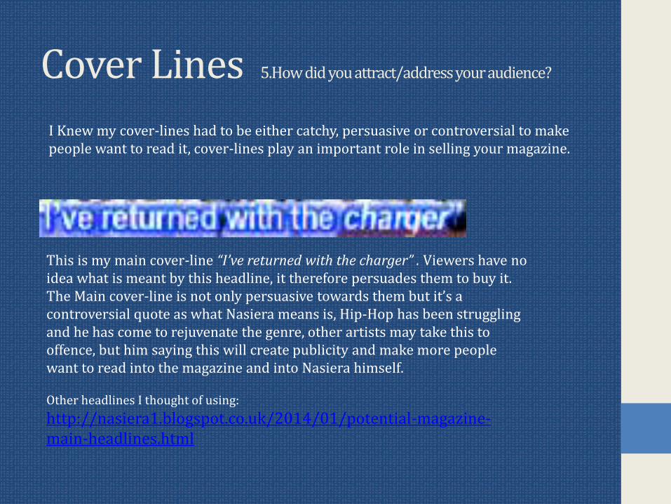
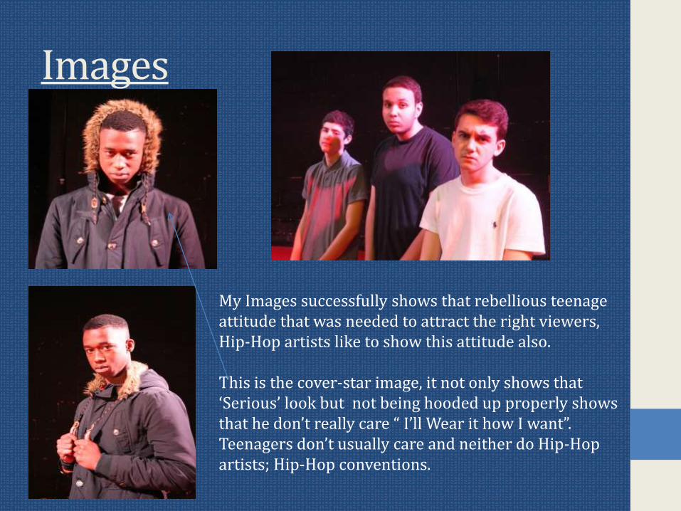
6 What have you learnt about technologies from the process of constructing the product
Strengths of the programs Irsquove usedMicrosoft Word Page Plus Microsoft
PublisherPaintNet Blogger
Very simple to use Variety of ways edit pictures
Extremelysimple to use I used it for older Drafts of my magazine
Has layers thatyou can use to structure your project
Reliable blog
Found Artistic effects for my magazine
Additional tools including cut-out
Spell -check on this also
Able edit images with effects
You can edit oldposts if you recognise a mistake etc
Flexible I can change colour contrast or brightness of the picture
Able to save work as JPEG
You can drag fonts and pictures around the page
Can save work as PNG
Add pictures to posts
Spell-check to prevent mistakes
Can save work as JPEG and PNG
Flatten work meaning all the layers are established together as one picture
6 What have you learnt about technologies from the process of constructing the product
MicrosoftWord
Page Plus Microsoft Publisher
PaintNet Blogger
Unable to save documents JPEGPNG
Can be complicated to use and takes some getting used to
Doesnrsquot have enough tools like Cut-out
Can get confusing by not knowing what layer has what component
Sometimes posts donrsquot get paragraphed
Difficult to move pictures and text
With a wide range of options the program can be overused
Limited choice of shapes and brushes
Had to screen grab some fonts making it less visible
Mistakes can be hard to erase
6 What have you learnt about technologies from the process of constructing the product
I Regret not making the most of programs like Page Plus it had so much to offer but my artistic effects were from Microsoft Word I used lsquoPhotocopy effectrsquo
Each program played their part in the development of my magazine however
6 What have you learnt about technologies from the process of constructing the product
Drafting and PlanningIn the planning of my magazine I looked into graffiti fonts off the website wwwdafontcom and this is what came up httpnasiera1blogspotcouk201311my-masthead-drafthtmlMy initial plan for my contents page was to take a picture of a street and replace its street signs with artists featured in the magazine I felt that itrsquoll be over creative and complicated for readers I looked into other magazine contents pages they were very simple so I decided to keep my contents page simple and move ideas into the interview pageMy Cover page features lsquophotocopyrsquo effect there was no typography related reason as to why I done this I just believed it looked more appealing
Contents planhttpnasiera1blogspotcouk201311contents-draft-1html
Vibes Contents page httpnasiera1blogspotcouk201312contents-page-researchhtml
6 What have you learnt about technologies from the process of constructing the product
PhotographsI aimed to make my photographs link to the text this way you can recognise the context in which something was said for example there is a smiling image of Nasierain the humorous part of the interview but as it gets more serious therersquos a snap of
him with hands on the back of his head
Some images like the cover-page picture had colours adjusted to blue to contribute to the magazine conventions
Looking back at my Preliminary task
Preliminary Main Task
Barcode is never usually left-sided on cover-page
Cover lines way to small
Main cover-line doesnrsquot relate the picture an appropriate cover-line would of have been the cover-star in his school clothes at least
Barcode in traditional position
Artist giving direct eye contact
OverallOverall I am happy with my final draft I could have taken more advantage of tools on Page Plus and could have posted more Blog posts but I am still satisfied with my work
Coursework helped me realise what is needed for certain music magazines and certain age groupsgenders and social groups I feel my strongest page is my cover-page as it tempts readers to buy the product with cover-lines including phrases ldquoexclusiverdquo and my Main Cover-line ldquo Irsquove returned with the chargerrdquo is tempting and plays a big role in selling the product
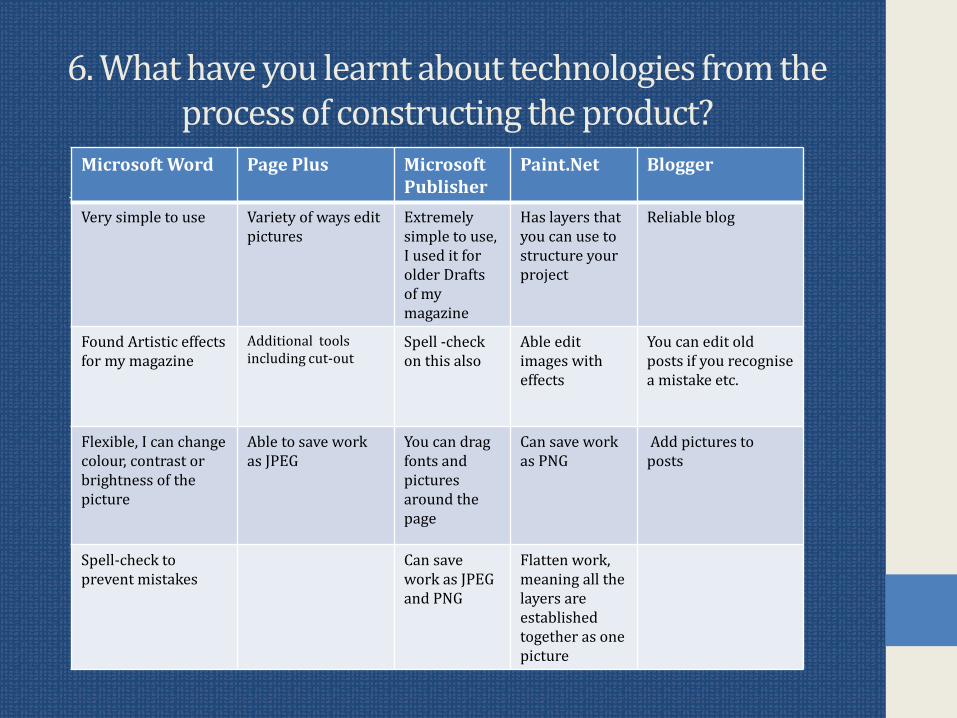
6 What have you learnt about technologies from the process of constructing the product
MicrosoftWord
Page Plus Microsoft Publisher
PaintNet Blogger
Unable to save documents JPEGPNG
Can be complicated to use and takes some getting used to
Doesnrsquot have enough tools like Cut-out
Can get confusing by not knowing what layer has what component
Sometimes posts donrsquot get paragraphed
Difficult to move pictures and text
With a wide range of options the program can be overused
Limited choice of shapes and brushes
Had to screen grab some fonts making it less visible
Mistakes can be hard to erase
6 What have you learnt about technologies from the process of constructing the product
I Regret not making the most of programs like Page Plus it had so much to offer but my artistic effects were from Microsoft Word I used lsquoPhotocopy effectrsquo
Each program played their part in the development of my magazine however
6 What have you learnt about technologies from the process of constructing the product
Drafting and PlanningIn the planning of my magazine I looked into graffiti fonts off the website wwwdafontcom and this is what came up httpnasiera1blogspotcouk201311my-masthead-drafthtmlMy initial plan for my contents page was to take a picture of a street and replace its street signs with artists featured in the magazine I felt that itrsquoll be over creative and complicated for readers I looked into other magazine contents pages they were very simple so I decided to keep my contents page simple and move ideas into the interview pageMy Cover page features lsquophotocopyrsquo effect there was no typography related reason as to why I done this I just believed it looked more appealing
Contents planhttpnasiera1blogspotcouk201311contents-draft-1html
Vibes Contents page httpnasiera1blogspotcouk201312contents-page-researchhtml
6 What have you learnt about technologies from the process of constructing the product
PhotographsI aimed to make my photographs link to the text this way you can recognise the context in which something was said for example there is a smiling image of Nasierain the humorous part of the interview but as it gets more serious therersquos a snap of
him with hands on the back of his head
Some images like the cover-page picture had colours adjusted to blue to contribute to the magazine conventions
Looking back at my Preliminary task
Preliminary Main Task
Barcode is never usually left-sided on cover-page
Cover lines way to small
Main cover-line doesnrsquot relate the picture an appropriate cover-line would of have been the cover-star in his school clothes at least
Barcode in traditional position
Artist giving direct eye contact
OverallOverall I am happy with my final draft I could have taken more advantage of tools on Page Plus and could have posted more Blog posts but I am still satisfied with my work
Coursework helped me realise what is needed for certain music magazines and certain age groupsgenders and social groups I feel my strongest page is my cover-page as it tempts readers to buy the product with cover-lines including phrases ldquoexclusiverdquo and my Main Cover-line ldquo Irsquove returned with the chargerrdquo is tempting and plays a big role in selling the product
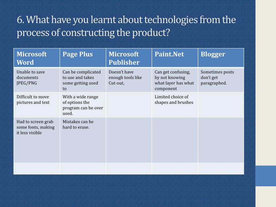
6 What have you learnt about technologies from the process of constructing the product
I Regret not making the most of programs like Page Plus it had so much to offer but my artistic effects were from Microsoft Word I used lsquoPhotocopy effectrsquo
Each program played their part in the development of my magazine however
6 What have you learnt about technologies from the process of constructing the product
Drafting and PlanningIn the planning of my magazine I looked into graffiti fonts off the website wwwdafontcom and this is what came up httpnasiera1blogspotcouk201311my-masthead-drafthtmlMy initial plan for my contents page was to take a picture of a street and replace its street signs with artists featured in the magazine I felt that itrsquoll be over creative and complicated for readers I looked into other magazine contents pages they were very simple so I decided to keep my contents page simple and move ideas into the interview pageMy Cover page features lsquophotocopyrsquo effect there was no typography related reason as to why I done this I just believed it looked more appealing
Contents planhttpnasiera1blogspotcouk201311contents-draft-1html
Vibes Contents page httpnasiera1blogspotcouk201312contents-page-researchhtml
6 What have you learnt about technologies from the process of constructing the product
PhotographsI aimed to make my photographs link to the text this way you can recognise the context in which something was said for example there is a smiling image of Nasierain the humorous part of the interview but as it gets more serious therersquos a snap of
him with hands on the back of his head
Some images like the cover-page picture had colours adjusted to blue to contribute to the magazine conventions
Looking back at my Preliminary task
Preliminary Main Task
Barcode is never usually left-sided on cover-page
Cover lines way to small
Main cover-line doesnrsquot relate the picture an appropriate cover-line would of have been the cover-star in his school clothes at least
Barcode in traditional position
Artist giving direct eye contact
OverallOverall I am happy with my final draft I could have taken more advantage of tools on Page Plus and could have posted more Blog posts but I am still satisfied with my work
Coursework helped me realise what is needed for certain music magazines and certain age groupsgenders and social groups I feel my strongest page is my cover-page as it tempts readers to buy the product with cover-lines including phrases ldquoexclusiverdquo and my Main Cover-line ldquo Irsquove returned with the chargerrdquo is tempting and plays a big role in selling the product
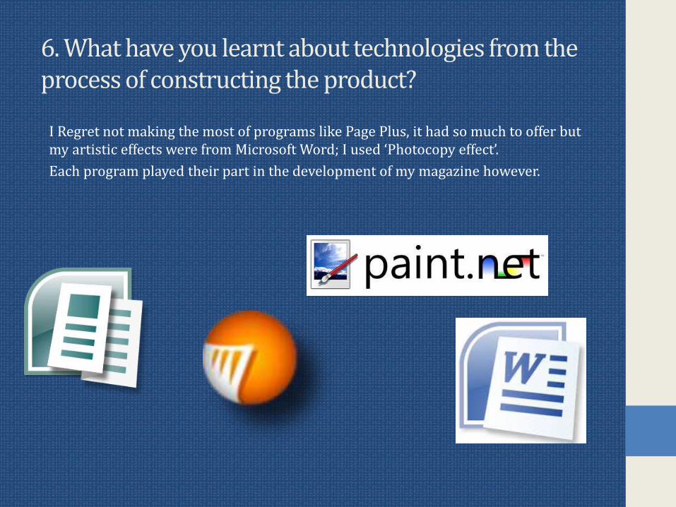
6 What have you learnt about technologies from the process of constructing the product
Drafting and PlanningIn the planning of my magazine I looked into graffiti fonts off the website wwwdafontcom and this is what came up httpnasiera1blogspotcouk201311my-masthead-drafthtmlMy initial plan for my contents page was to take a picture of a street and replace its street signs with artists featured in the magazine I felt that itrsquoll be over creative and complicated for readers I looked into other magazine contents pages they were very simple so I decided to keep my contents page simple and move ideas into the interview pageMy Cover page features lsquophotocopyrsquo effect there was no typography related reason as to why I done this I just believed it looked more appealing
Contents planhttpnasiera1blogspotcouk201311contents-draft-1html
Vibes Contents page httpnasiera1blogspotcouk201312contents-page-researchhtml
6 What have you learnt about technologies from the process of constructing the product
PhotographsI aimed to make my photographs link to the text this way you can recognise the context in which something was said for example there is a smiling image of Nasierain the humorous part of the interview but as it gets more serious therersquos a snap of
him with hands on the back of his head
Some images like the cover-page picture had colours adjusted to blue to contribute to the magazine conventions
Looking back at my Preliminary task
Preliminary Main Task
Barcode is never usually left-sided on cover-page
Cover lines way to small
Main cover-line doesnrsquot relate the picture an appropriate cover-line would of have been the cover-star in his school clothes at least
Barcode in traditional position
Artist giving direct eye contact
OverallOverall I am happy with my final draft I could have taken more advantage of tools on Page Plus and could have posted more Blog posts but I am still satisfied with my work
Coursework helped me realise what is needed for certain music magazines and certain age groupsgenders and social groups I feel my strongest page is my cover-page as it tempts readers to buy the product with cover-lines including phrases ldquoexclusiverdquo and my Main Cover-line ldquo Irsquove returned with the chargerrdquo is tempting and plays a big role in selling the product
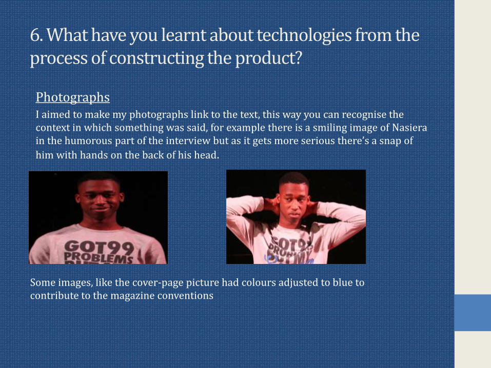
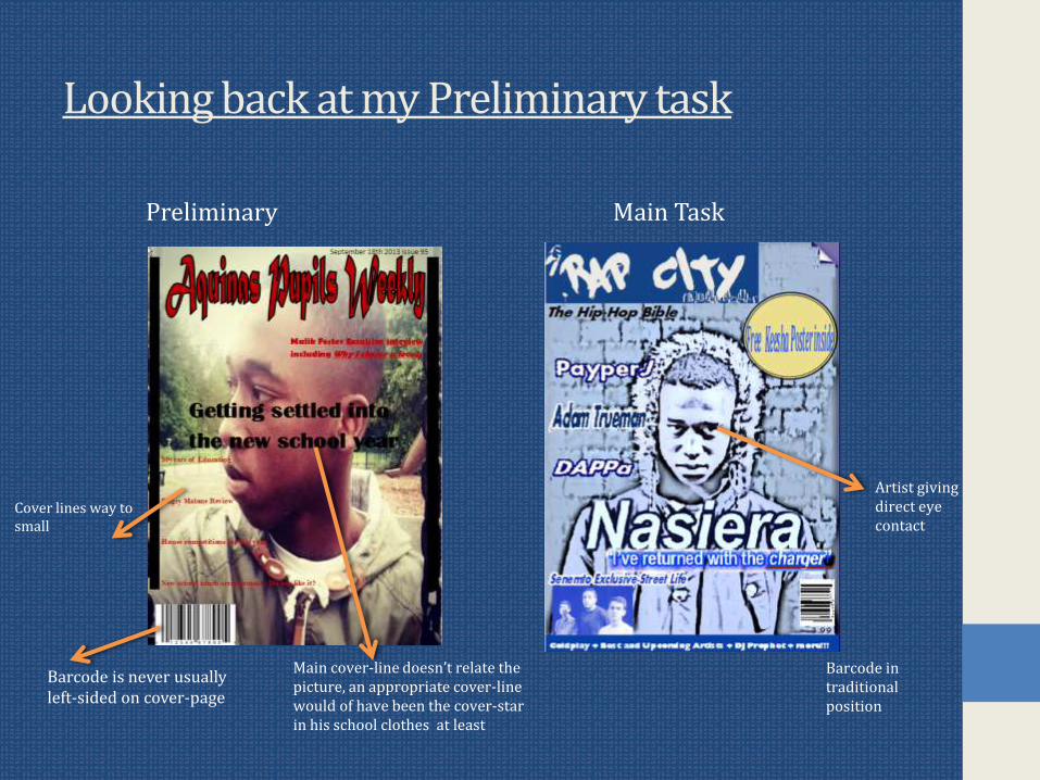