Embed Size (px)
Citation preview

MAGAZINE COVER ANALYSISBY: RAMSHA IMRAN

Date/ issue
number/ price
Feature, article
photograph
PlugsBarco
de
Cover lines
Main cover line
Masthead/ title
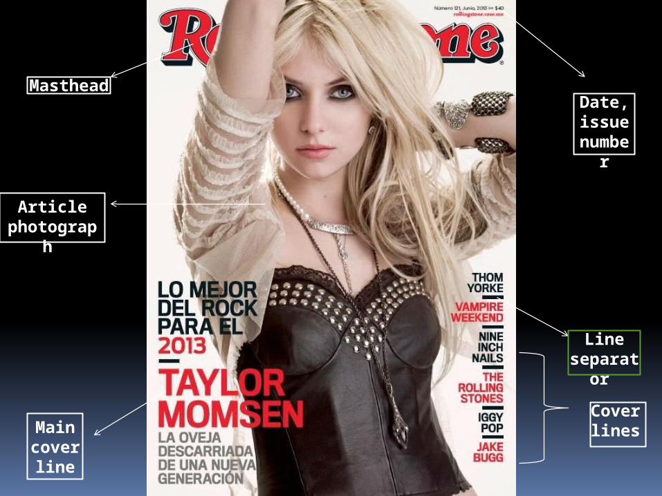
Masthead
Article photogra
ph
Main cover line
Date, issue numb
er
Line separa
tor
Cover lines

Masthead / title
Cover line
Barcode
Cover line/ can be
also considered
as the main
cover line
Article photogra
ph
Main cover line
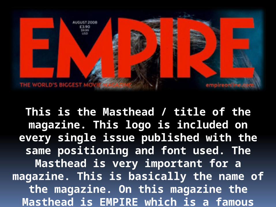
This is the Masthead / title of the magazine. This logo is included on every
single issue published with the same positioning and font used. The Masthead is very important for a magazine. This is basically the name of the magazine. On this magazine the Masthead is EMPIRE which is a famous magazine and the
masthead is mostly in this red color and font is same for all the issues.

This is the date and issue number of the magazine. Sometimes the price is also given along with it. This informs the reader of how much the magazine will cost and what is the
issue number. The issue number is more helpful for the regular reader of a specific magazine
whereas the price is helpful for the people who do not always read that magazine.
The barcode is an essential part of the magazine. They are used in the sales of the magazine. Over here this barcode is placed upright to
take up a small space on the cover. This is the last thing a reader
would wish to see on a magazine cover.

This is the main cover photograph
which is a mid shot in this cover. In this
magazine cover Amanda Seyfried is the main idol of the
issue. Her image acts as a
background to the magazine, but is
layered to overlap things. This is the feature that may make someone
more inclined to read the magazine. The image fits well
with the color scheme for
example the text matches Amanda’s
clothes and her makeup too.

This is the main cover line of the magazine. This shows the reader
the main story in the magazine and often relates to the cover star. (In this magazine it does not though ). The text is written in a serif pink and white which goes perfectly with the color scheme and them
text is in bold form.