Embed Size (px)
Citation preview
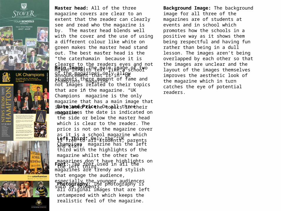
Master head: All of the three magazine covers are clear to an extent that the reader can clearly see and read who the magazine is by. The master head blends well with the cover and the use of using a different colour like white on green makes the master head stand out. The best master head is the “the caterhamain” because it is clearer to the readers eyes and not mixed in with text like a school announcement that is in “UK Champions” magazine.
Main Image: The main image of two of the magazines only allow students there moment of fame and not images related to their topics that are in the magazine. “UK Champions” magazine is the only magazine that has a main image that is related to the topics in their magazine.
Photography: The photography is all original images that are left untampered with which keeps the realistic feel of the magazine.
Date and Price: On all three magazines the date is indicated on the side or below the master head which is clear to the reader. The price is not on the magazine cover as it is a school magazine which is free to all students, parents and staff.
Left Third: Only the “UK Champions” magazine has the left third with the highlights of the magazine whilst the other two magazines don’t have highlights on the left third.
Font: The font used in all the magazines are trendy and stylish that engage the audience, especially the younger audiences such as students.
Background Image: The background image for all three of the magazines are of students at events and in school which promotes how the schools in a positive way as it shows them being respectful and having fun rather than being in a dull lesson. The images aren’t being overlapped by each other so that the images are unclear and the layout of the images themselves improves the aesthetic look of the magazine which in turn catches the eye of potential readers.

Title: Both magazines use the same font that they used for their cover so that they can keep the trend and them going on throughout the magazine. In addition, the bold font and colours makes the title stand out so it is eye catching to readers.
Content Structure: The “Stover” magazine uses a simple column structure for the contents to avoid alienating the reader with unfamiliar structures that look odd. The “carterhamian” magazine uses images to mould the structure of the text so that the page is more engaging and entertaining to the reader.
Photography: Only the “carterhamian” magazine has images and only the top left image is a real image but is has no relation to the topics of the magazine. The other images are of BBC News and Obama which show what topics are being covered in the magazine.
Page Numbers: Only the “carterhamian” has page numbers which is an essential part of an contents page as the reader would have no way of knowing what article is on what page. The fact that the “Stover” has no page numbers is very page as the reader won’t be able to quickly locate an article he/she wants to read.
The “UK Champions” magazine has no contents page which is very negative thing for the magazine as the reader won’t be bale to know what topics are located in the magazine.

Title: All the three magazines use bold titles that stand out by using colours such as black on white to make it stand out to the reader. However, the “UK Champions” magazine does not have a title as clear as the other magazines because the title is blended in with the background image rather than popping out and being easily noticed.
Graphics: the graphics are very good for all of the magazines as they all use clear and stylish text that allows the reader to clearly read .
The Photography: The photography is all original images that are left untampered with which keeps the realistic feel of the magazine.