Embed Size (px)
Citation preview
Magazine advert planning
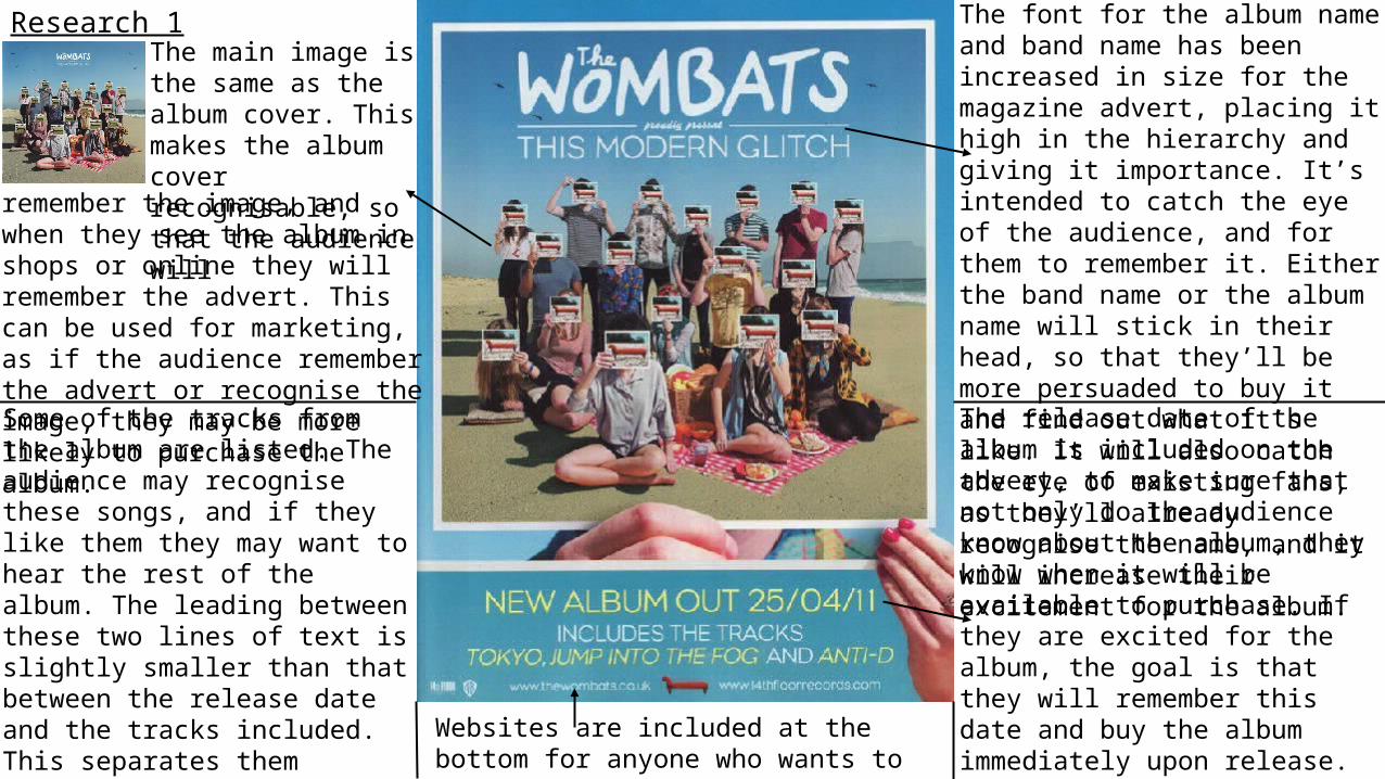
Research 1The main image is the same as the album cover. This makes the album cover recognisable, so that the audience will
remember the image, and when they see the album in shops or online they will remember the advert. This can be used for marketing, as if the audience remember the advert or recognise the image, they may be more likely to purchase the album.
The font for the album name and band name has been increased in size for the magazine advert, placing it high in the hierarchy and giving it importance. It’s intended to catch the eye of the audience, and for them to remember it. Either the band name or the album name will stick in their head, so that they’ll be more persuaded to buy it and find out what it’s like. It will also catch the eye of existing fans, as they’ll already recognise the name, and it will increase their excitement for the album.The release date of the album is included on the advert, to make sure that not only do the audience know about the album, they know when it will be available to purchase. If they are excited for the album, the goal is that they will remember this date and buy the album immediately upon release. The font for this text is the same as the one used on the album cover, creating coherence. This font is all in capitals so that it stands out.
Some of the tracks from the album are listed. The audience may recognise these songs, and if they like them they may want to hear the rest of the album. The leading between these two lines of text is slightly smaller than that between the release date and the tracks included. This separates them slightly so that they stand out separately with a bit more clarity, making the article easier to read as there’s no big block of text.
Websites are included at the bottom for anyone who wants to find out more information.
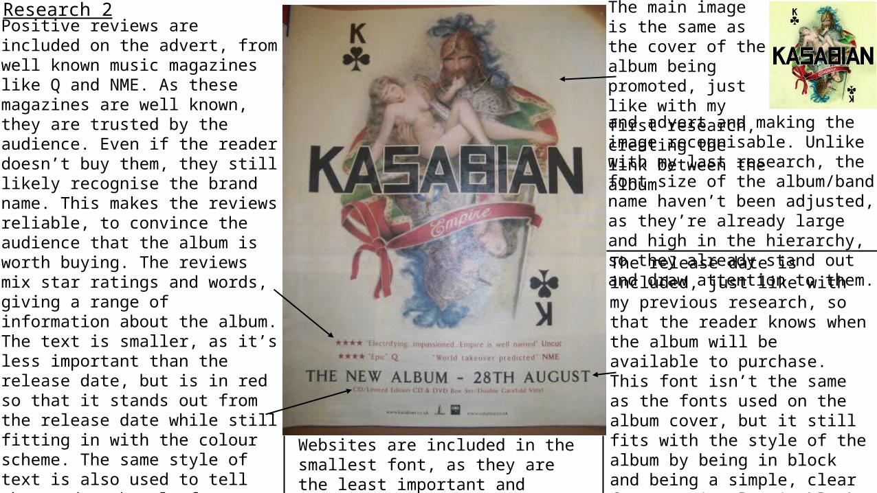
Research 2 The main image is the same as the cover of the album being promoted, just like with my first research, creating the link between the albumand advert and making the image recognisable. Unlike with my last research, the font size of the album/band name haven’t been adjusted, as they’re already large and high in the hierarchy, so they already stand out and draw attention to them.
Positive reviews are included on the advert, from well known music magazines like Q and NME. As these magazines are well known, they are trusted by the audience. Even if the reader doesn’t buy them, they still likely recognise the brand name. This makes the reviews reliable, to convince the audience that the album is worth buying. The reviews mix star ratings and words, giving a range of information about the album. The text is smaller, as it’s less important than the release date, but is in red so that it stands out from the release date while still fitting in with the colour scheme. The same style of text is also used to tell the reader the platforms that the album can be bought on, like CD and vinyl. This is placed below the release date, and the reviews above, so that they are separated by the different font of the release date and stand out individually. They’re helpful extra information, but not the most important, so they are lower down on the hierarchy.
The release date is included, just like with my previous research, so that the reader knows when the album will be available to purchase. This font isn’t the same as the fonts used on the album cover, but it still fits with the style of the album by being in block and being a simple, clear font. It is also in black, so that it fits in with the colour scheme. The tracking is slightly wider, making the text a bit clearer to read, so that it stands out more.
Websites are included in the smallest font, as they are the least important and lowest on the hierarchy.
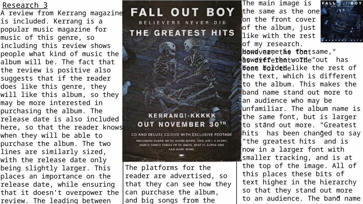
Research 3 The main image is the same as the one on the front cover of the album, just like with the rest of my research. However, the font is different. The font for theband name is the same, however the word “out” has been bolded like the rest of the text, which is different to the album. This makes the band name stand out more to an audience who may be unfamiliar. The album name is the same font, but is larger to stand out more. “Greatest hits” has been changed to say “the greatest hits” and is now in a larger font with smaller tracking, and is at the top of the image. All of this places these bits of text higher in the hierarchy so that they stand out more to an audience. The band name and “the greatest hits” are highlighted as the most important text, as these give the most information, then the band name is included between them so that it also is read by the reader, though it is slightly smaller as it is less important.
A review from Kerrang magazine is included. Kerrang is a popular music magazine for music of this genre, so including this review shows people what kind of music the album will be. The fact that the review is positive also suggests that if the reader does like this genre, they will like this album, so they may be more interested in purchasing the album. The release date is also included here, so that the reader knows when they will be able to purchase the album. The two lines are similarly sized, with the release date only being slightly larger. This places an importance on the release date, while ensuring that it doesn’t overpower the review. The leading between them is quite large to keep them separate and clear to read. All of this text is in the same font as the band name, so that the style of the advert is coherent. The font is also all in white, just like the band and album names, so that they fit with the colour scheme, as well as standing out from the darker coloured background.
The platforms for the reader are advertised, so that they can see how they can purchase the album, and big songs from the album are listed to increase interest.
ConventionsThese are the main conventions that I noticed from my research.• The main image for the advert is the same as the front cover of the album. This is helpful for the audience, as they will
remember the image and recognise it when they see it again on the album. • The colour scheme is often based off of the main image. Often, colours from the main image are used for the text, and the
colours are carefully chosen so that they stand out to the audience. • The release date is always included on the advert, often in a large font to place it higher in the hierarchy, as it’s an
important piece of text. The release date is necessary to an advert as it allows the audience to know when they can purchase the album.
• Reviews for the album are often included on the advert, and are from trusted and well known music magazines. These are persuasive techniques, as the reader will see that a company that is well known for discussing music and artists has given the album a positive review, and they will be convinced that the album is worth purchasing.
• The platforms that the album will be available on, like CD and vinyl, are included, as people like to purchase albums in different ways, and this easily allows them to see if their preferred way is included. This is less common, as it wasn’t on all of the magazine adverts, but it was still prominent.
I will use these conventions to design and make my own magazine cover. Following conventions makes a product easily recognisable to the audience.
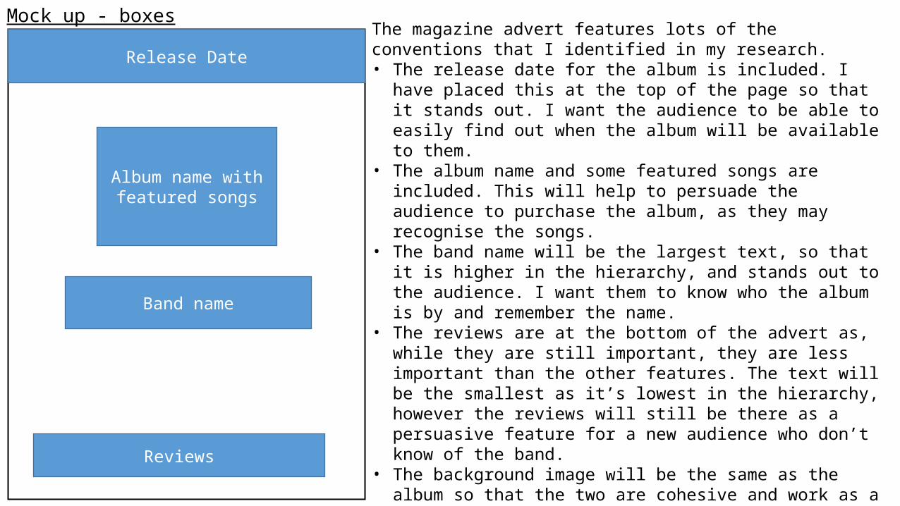
Mock up - boxes
Release Date
Album name with featured songs
Band name
Reviews
The magazine advert features lots of the conventions that I identified in my research. • The release date for the album is included. I have placed this at the top
of the page so that it stands out. I want the audience to be able to easily find out when the album will be available to them.
• The album name and some featured songs are included. This will help to persuade the audience to purchase the album, as they may recognise the songs.
• The band name will be the largest text, so that it is higher in the hierarchy, and stands out to the audience. I want them to know who the album is by and remember the name.
• The reviews are at the bottom of the advert as, while they are still important, they are less important than the other features. The text will be the smallest as it’s lowest in the hierarchy, however the reviews will still be there as a persuasive feature for a new audience who don’t know of the band.
• The background image will be the same as the album so that the two are cohesive and work as a whole promotional package, rather than as individual products.