Embed Size (px)
Citation preview
In what ways does your media product develop or challenge the forms of conventions of real
media texts
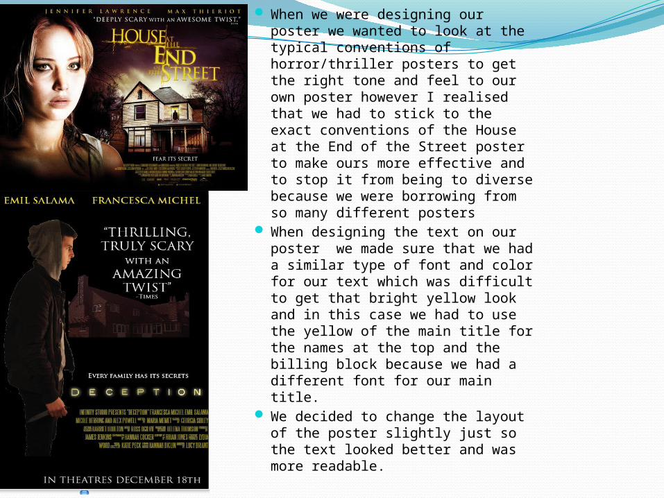
When we were designing our poster we wanted to look at the typical conventions of horror/thriller posters to get the right tone and feel to our own poster however I realised that we had to stick to the exact conventions of the House at the End of the Street poster to make ours more effective and to stop it from being to diverse because we were borrowing from so many different posters
When designing the text on our poster we made sure that we had a similar type of font and color for our text which was difficult to get that bright yellow look and in this case we had to use the yellow of the main title for the names at the top and the billing block because we had a different font for our main title.
We decided to change the layout of the poster slightly just so the text looked better and was more readable.
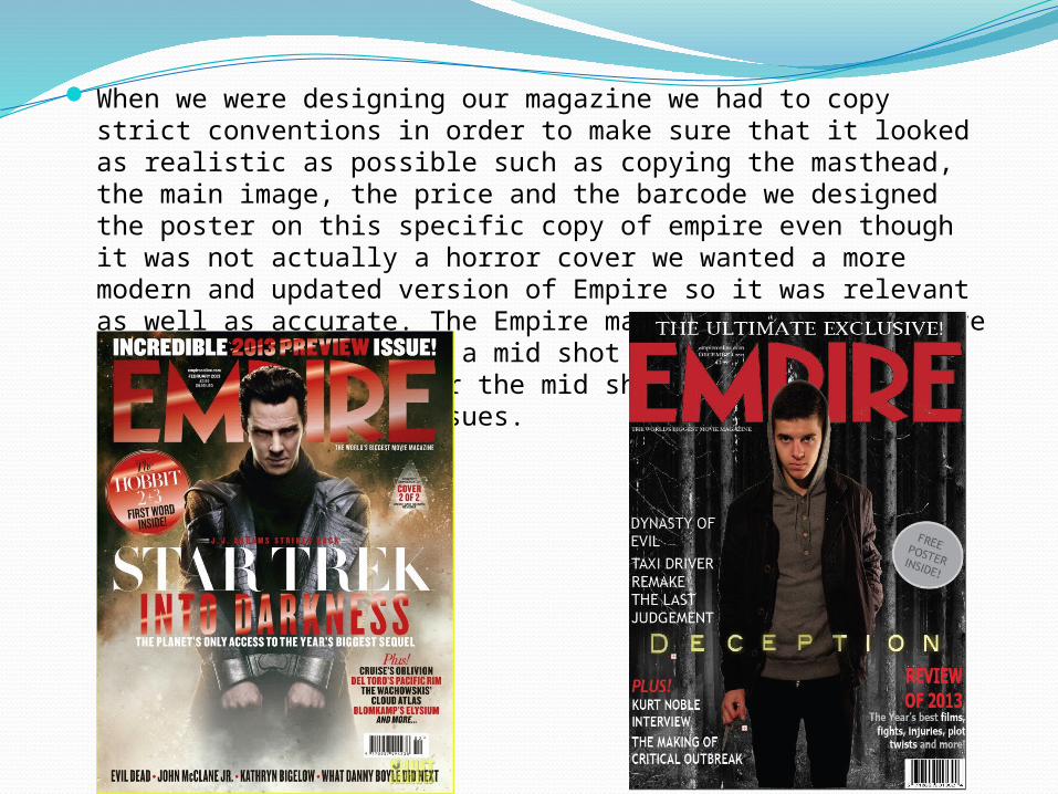
When we were designing our magazine we had to copy strict conventions in order to make sure that it looked as realistic as possible such as copying the masthead, the main image, the price and the barcode we designed the poster on this specific copy of empire even though it was not actually a horror cover we wanted a more modern and updated version of Empire so it was relevant as well as accurate. The Empire magazines generally have their main image being a mid shot of a character or a close up so we went for the mid shot as it was more common among recent issues.
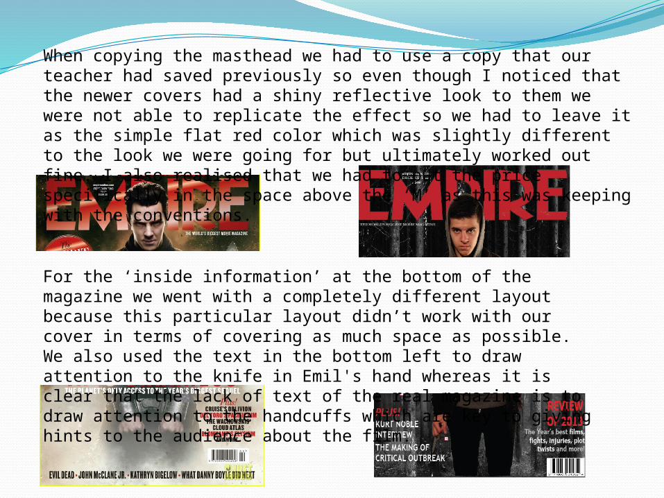
When copying the masthead we had to use a copy that our teacher had saved previously so even though I noticed that the newer covers had a shiny reflective look to them we were not able to replicate the effect so we had to leave it as the simple flat red color which was slightly different to the look we were going for but ultimately worked out fine. I also realised that we had to put the price specifically in the space above the ‘M’ as this was keeping with the conventions.
For the ‘inside information’ at the bottom of the magazine we went with a completely different layout because this particular layout didn’t work with our cover in terms of covering as much space as possible. We also used the text in the bottom left to draw attention to the knife in Emil's hand whereas it is clear that the lack of text of the real magazine is to draw attention to the handcuffs which are key to giving hints to the audience about the film.
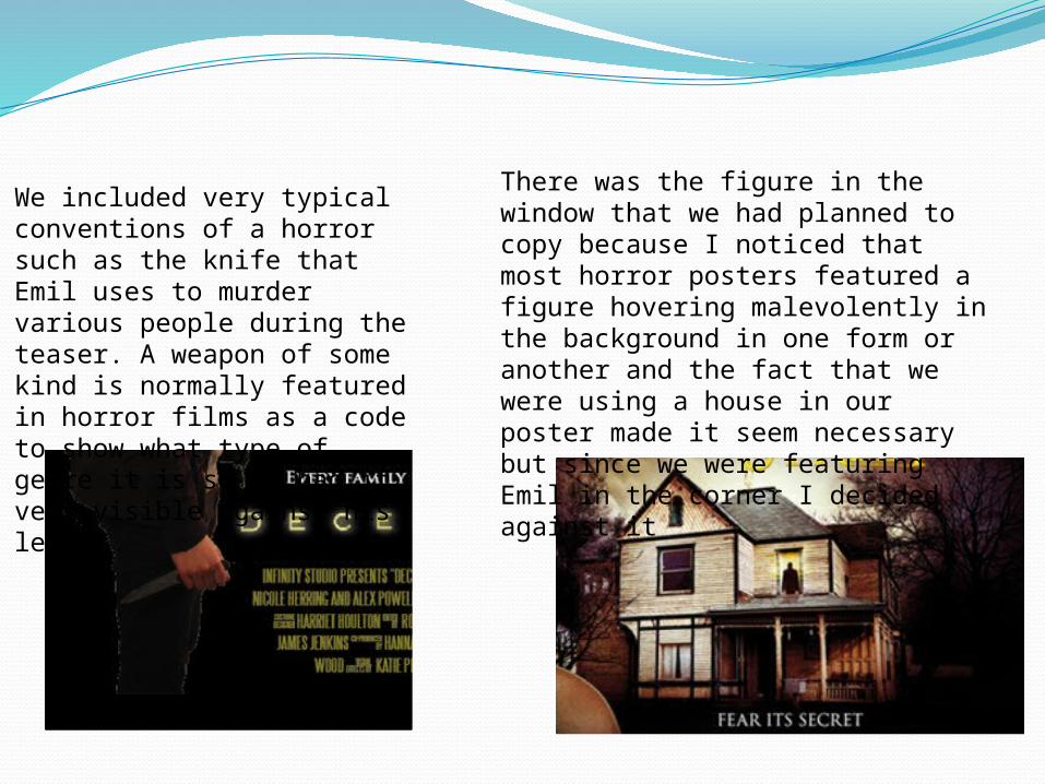
We included very typical conventions of a horror such as the knife that Emil uses to murder various people during the teaser. A weapon of some kind is normally featured in horror films as a code to show what type of genre it is so we had it very visible against his leg.
There was the figure in the window that we had planned to copy because I noticed that most horror posters featured a figure hovering malevolently in the background in one form or another and the fact that we were using a house in our poster made it seem necessary but since we were featuring Emil in the corner I decided against it