Embed Size (px)
Citation preview

EVALUATION - QUESTION ONEIN WHAT WAYS DOES YOUR MEDIA PRODUCT USE, DEVELOP, OR CHALLENGE FORMS AND CONVENTIONS OF REAL MEDIA PRODUCTS?

MAGAZINE COVER

The image is conventional as it is a close-up/mid shot of a relevant artists face which appeals to the target audience as they are mainly male and so a female artist on the cover is appealing to males (especially as the mid shot allows the audience to see the female artists’ body)

The image is unconventional in that there is a shallow focus of the image which makes the artist’s hand the main focus of the image and draws in the audience to the artists’ aggression and subversion of a female being at the source of violence. This is good in its unconventionality as it subverts gender stereotypes and appeals to my male-leaning target audience (with the violence and the female on the cover)

The layout is conventional as the masthead is across the top of the magazine and draws in the target audience from the primary optical area

I have used some puns on the cover of my magazine – “We sail soundly with Bonney Pirate”; “Arctic Monk-Tees!” – to appeal to my target audience – they are conventional as Q magazine likes to have an element of humour in their magazines which appeals to my target audience as they enjoy humour
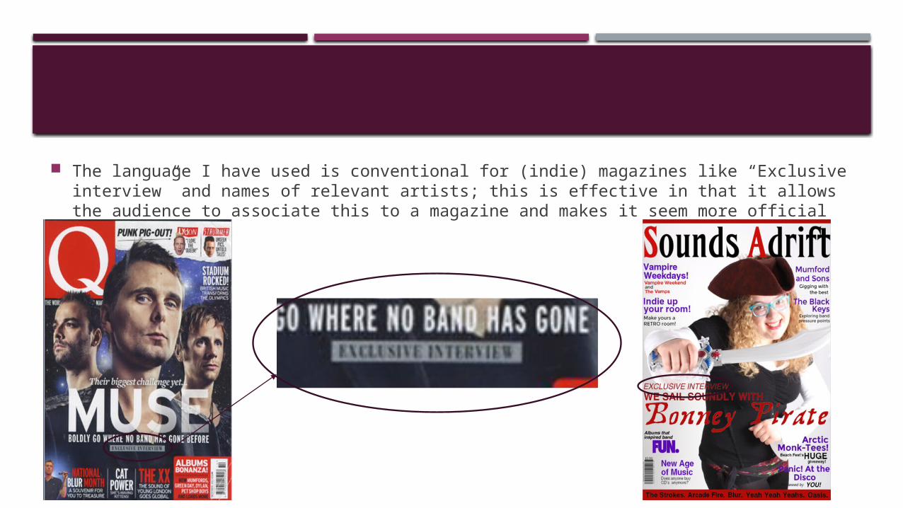
The language I have used is conventional for (indie) magazines like “Exclusive interview” and names of relevant artists; this is effective in that it allows the audience to associate this to a magazine and makes it seem more official

The header and footer I have used is conventional for a magazine; this is effective as it breaks up the route of the eye a little and makes the cover look more interesting

I have used coverlines on my cover which are conventional for a magazine cover – most of my coverlines are in the first vertical third of the principle of thirds which is also conventional for (my genre of) magazine and means that my route of the eye will lead the audience

The barcode of my magazine is conventionally vertical against the side of the magazine – this is to make sure it is out of the way but still easy to find if you want to

My coverlines are conventional as they are in the spaces where the image isn’t and they make up most of the blank space – this is effective as it allows the audience to look at a bit of the content of the magazine

The brand identity of this magazine cover is conventional for the indie genre as it is slightly sexual (through the female artist, the mid shot and the use of a prop which makes her look aggressive) and humorous (due to the pirate costume and the faux aggressive expression); these modes of address that I have used to create my conventional brand identity are appealing to my target audience as it is familiar to the audience, interesting and also corresponds to the target audience’s interests (i.e. sex, humour etc.)
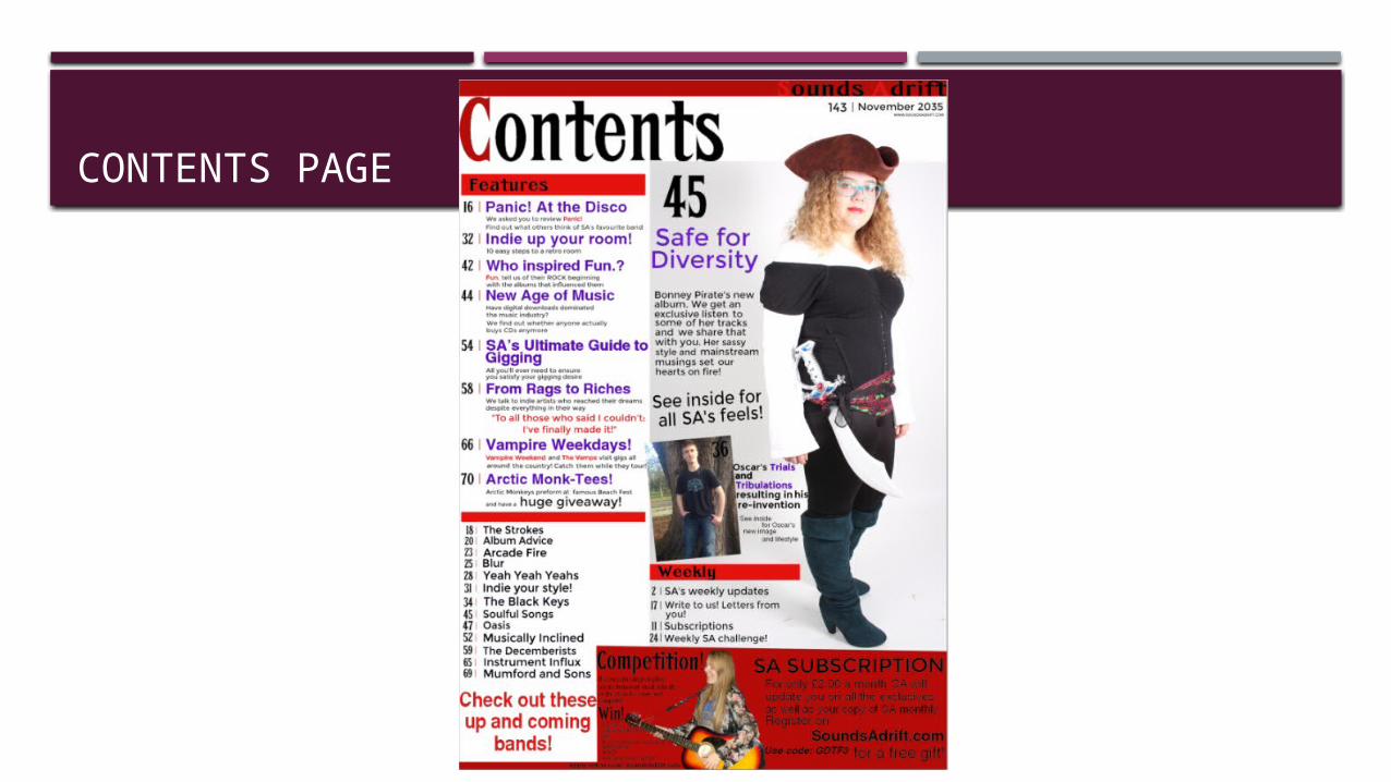
CONTENTS PAGE

Features conventionally listed down the first vertical third of the principle of thirds which is conventional (of a magazine) and appeals to the target audience as it allows for easy navigation

Conventional long shot of featured artists across three quarters of the last two vertical thirds

Conventional Contents title across the top of the page which the audience see first

Header conventionally at the top of the magazine with the masthead in

Conventionally for my genre, the numbers that list the contents are followed by a line separating the number and the contents

The sections of the contents has been conventionally (for the genre) separated – usually with headings in them – using bars of red (in keeping with my house style)

Conventionally placed issue number, date and magazine website

A conventional use of a box adding in some more information about the magazine (coloured in keeping with my house style)

An unconventional placement of images to make the contents page look more creative and thus more appealing to the target audience

The brand identity of this contents page is conventional as it is approachable (due to the easy navigation and relaxed poses of the artists in the smaller images); humorous (due to the pirate costume) and slightly sexual (created by the dominant stance taken by the artists in the long shot image); these modes of address that I have used to create my conventional brand identity are appealing to my target audience as it is familiar to the audience, interesting and also corresponds to the target audience’s interests (i.e. sex, humour etc.)

DOUBLE PAGE SPREAD

Page numbers are at the bottom of the page which follows the conventions of a magazine and makes the magazine seem more real and official

I have used two images – a large image and a smaller image superimposed – this is effective as it allows a variety of imagery and adds more context to the artist (in my double page spread, I have added the artists’ latest album as a superimposed image to add more context to her music and to promote her new album – promotion is conventional for a music magazine)
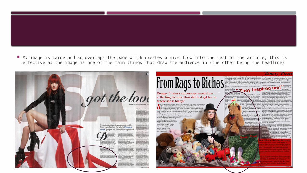
My image is large and so overlaps the page which creates a nice flow into the rest of the article; this is effective as the image is one of the main things that draw the audience in (the other being the headline)

The article is conventional for a magazine as it is separated into columns and shapes around the main image which is conventional for a double page spread article and appealing to my target audience as it makes the image stand out more and look more interesting (therefore more interesting to read as the writing is aesthetically pleasing and compliments the image)
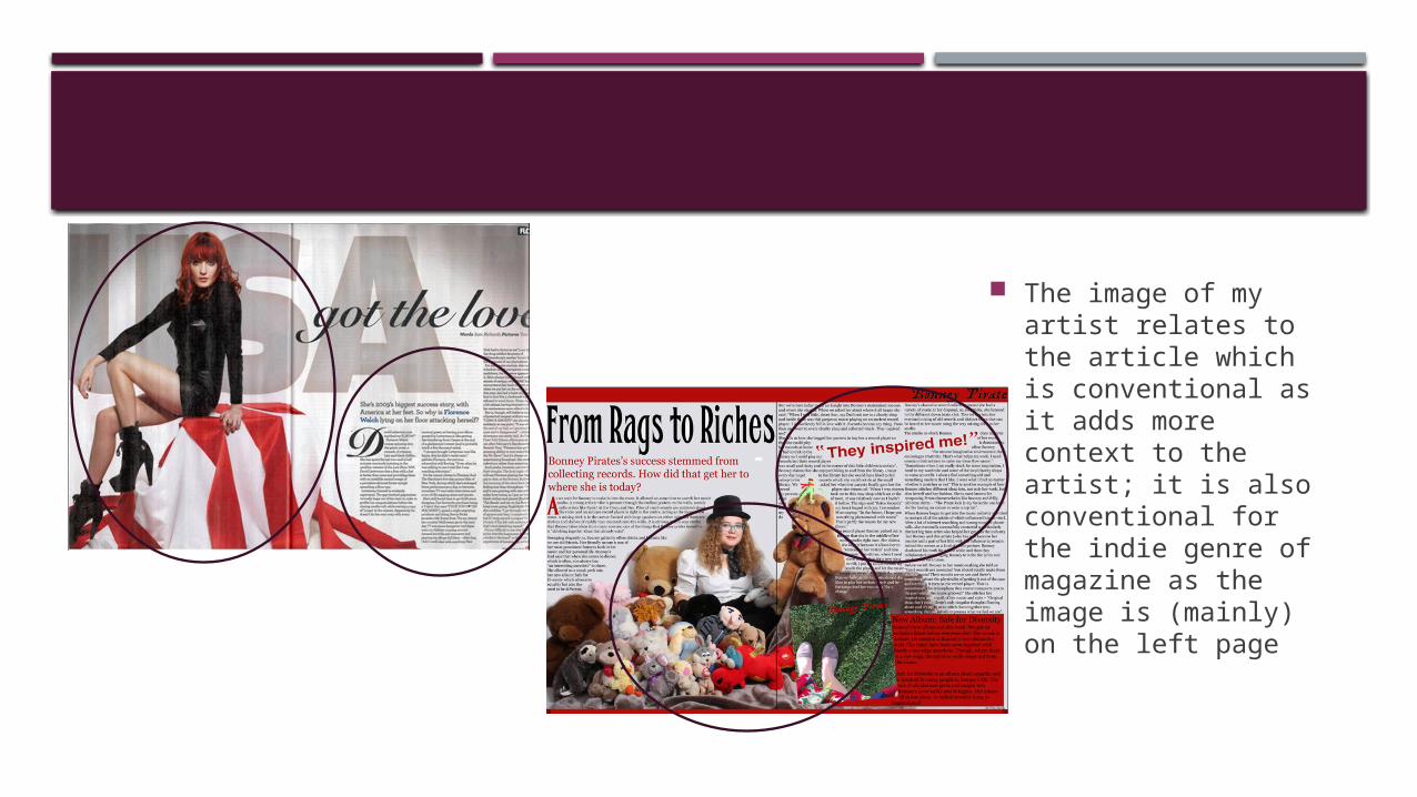
The image of my artist relates to the article which is conventional as it adds more context to the artist; it is also conventional for the indie genre of magazine as the image is (mainly) on the left page

The pull quote on my double page spread is appealing to my target audience as it is in the middle of the article and conventionally uses deictic language which intrigues the target audience into reading the article. I have also shaped the article around the pull quote which compliments the article and also makes the pull quote more eye catching

My headline is conventionally large, bold, at the top of the page and in a serif font so that the audience are drawn to it and makes the audience want to read the article; this is effective as it is the first thing the audience will see and so is one of the main things that draw the audience in so that they will read the article (the other thing being the image)

My stand-first is unconventionally large to make sure it catches the readers’ eye and makes them want to read the article

My kicker is conventional for magazines as it displace approximately four lines of the article; this makes it appealing and eye-catching and encourages the audience to read the rest of the article

The brand identity of my double page spread is conventional to the genre as it is inviting, approachable and humorous (due to the large image of the artist surrounded by cuddly toys and also due to the stereotypical use of magazine conventions (i.e. page numbers at the bottom; bold headline etc.); these modes of address that I have used to create my conventional brand identity are appealing to my target audience as it is familiar and comfortable to the audience, interesting and also corresponds to the target audience’s interests (i.e. sex, humour etc.)